Warm Palette Art Style
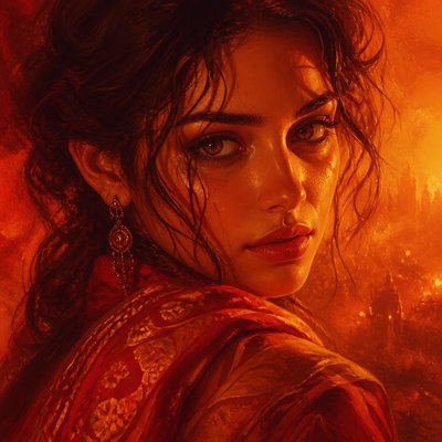
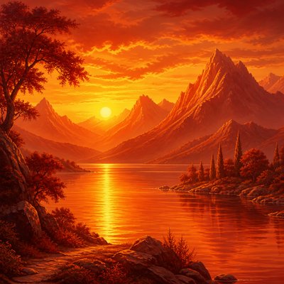
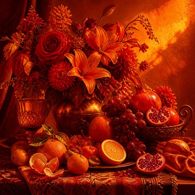
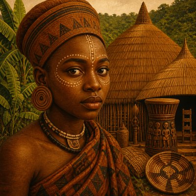
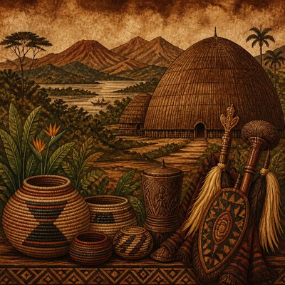
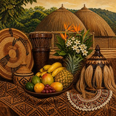
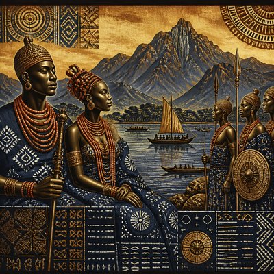
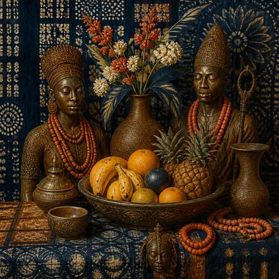
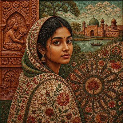
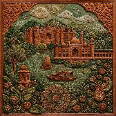
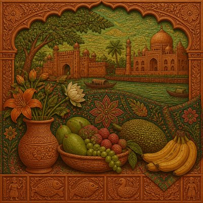
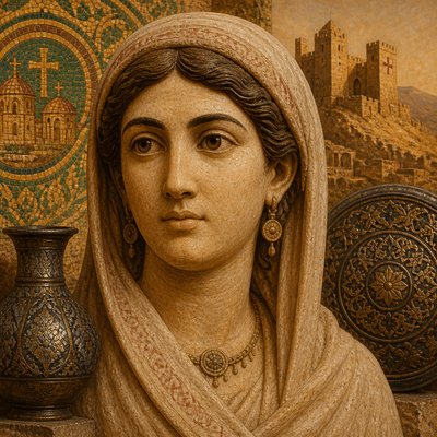
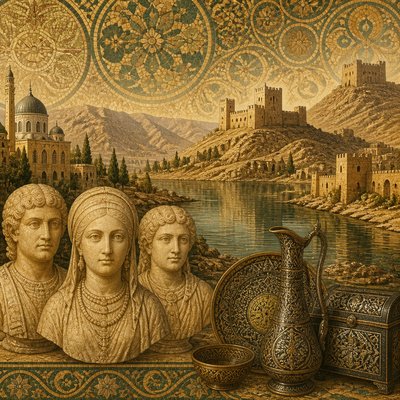
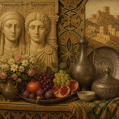
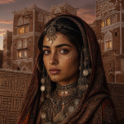
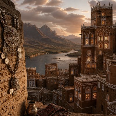
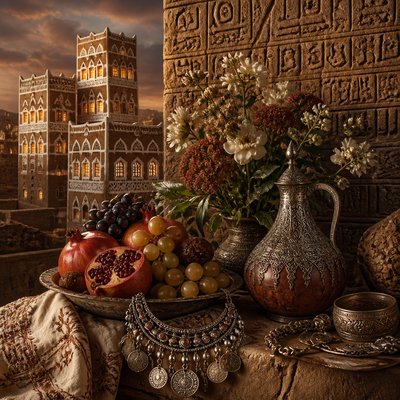
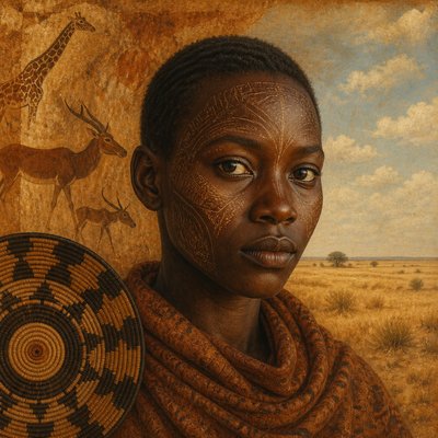
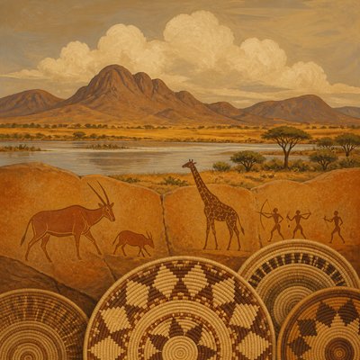
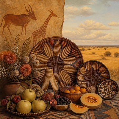
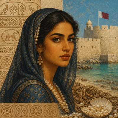
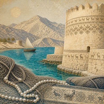
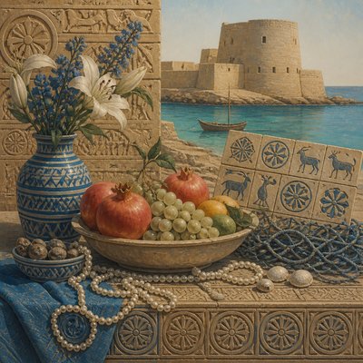
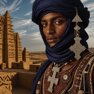
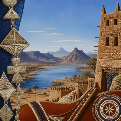
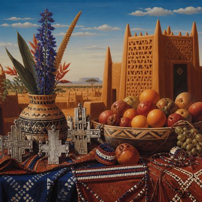
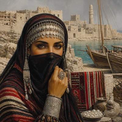
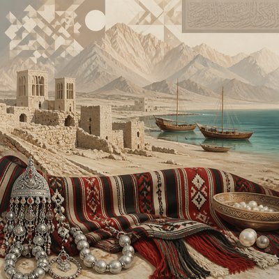
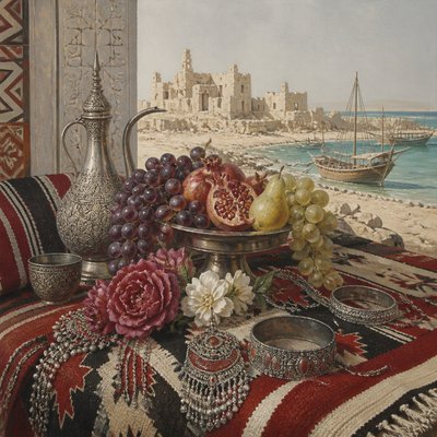
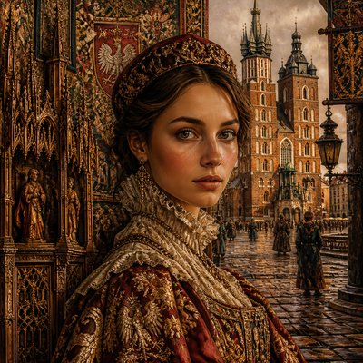
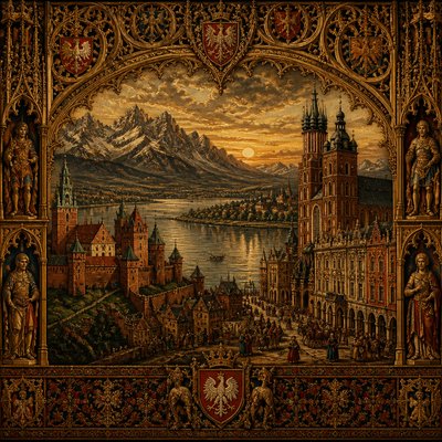
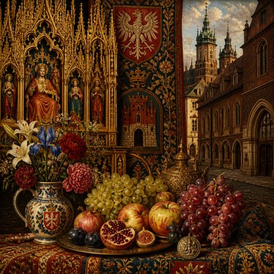
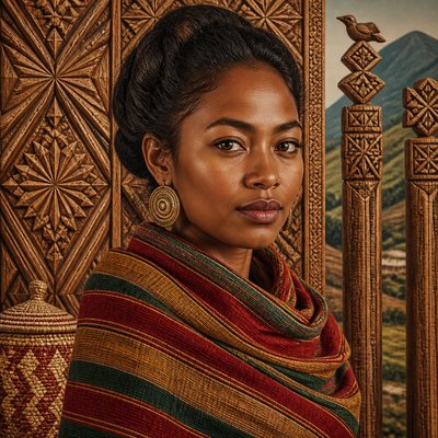
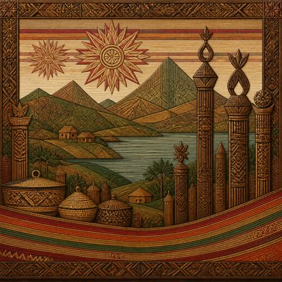
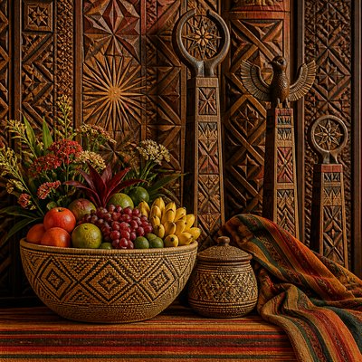
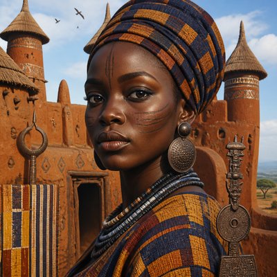
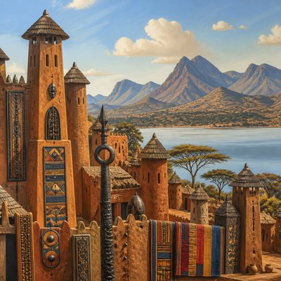
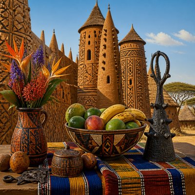
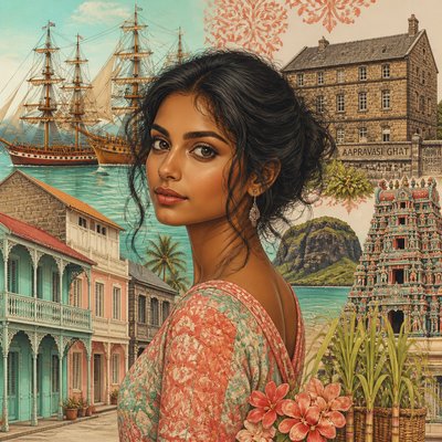
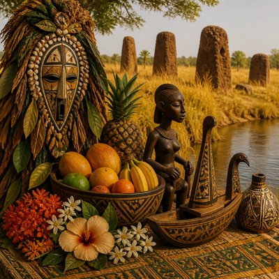
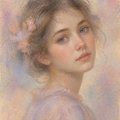
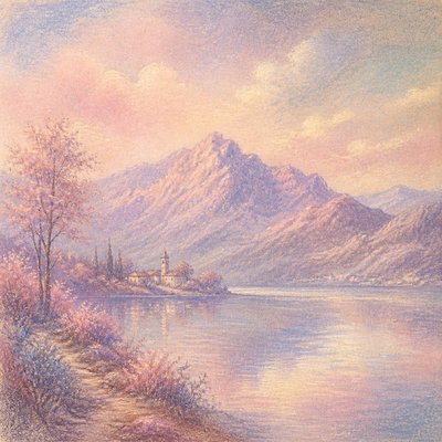
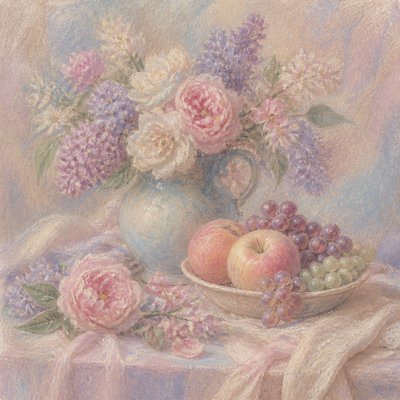
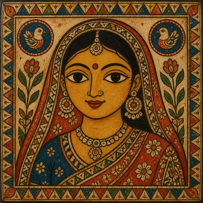
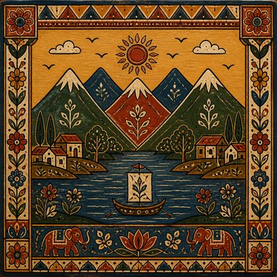
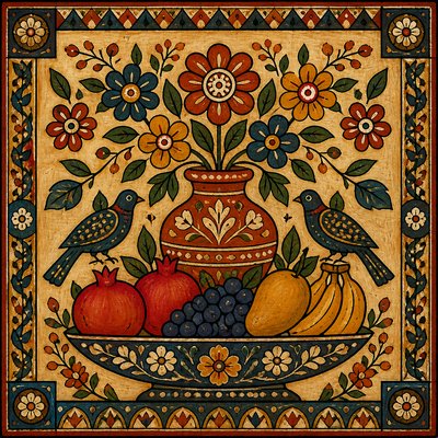
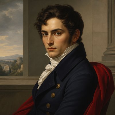
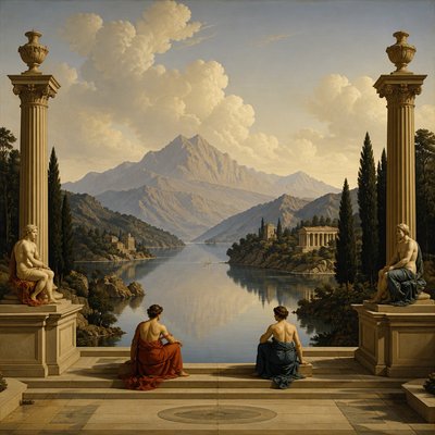
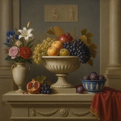
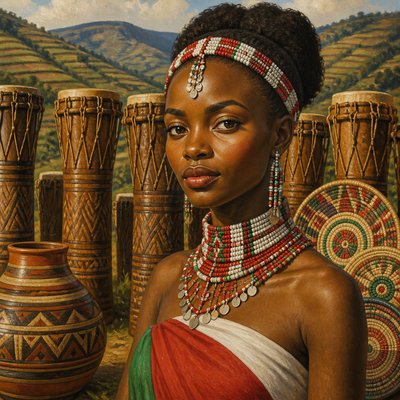
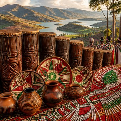
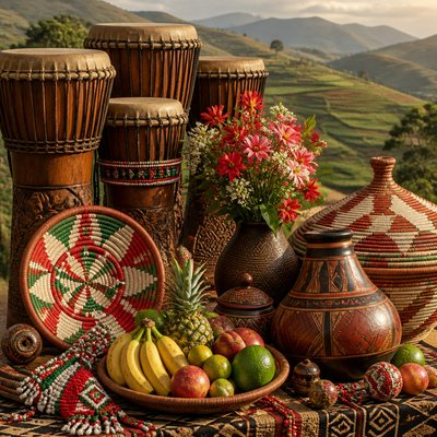
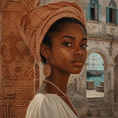
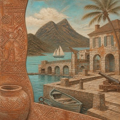
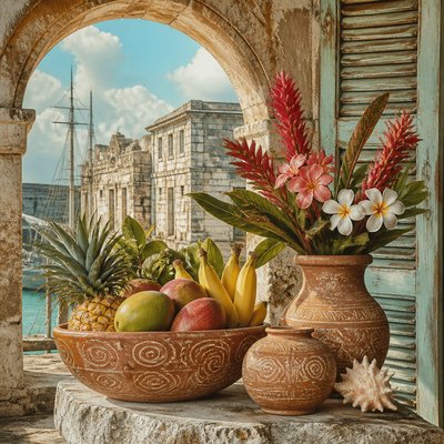
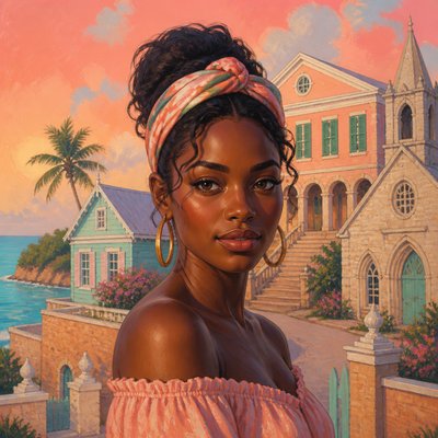
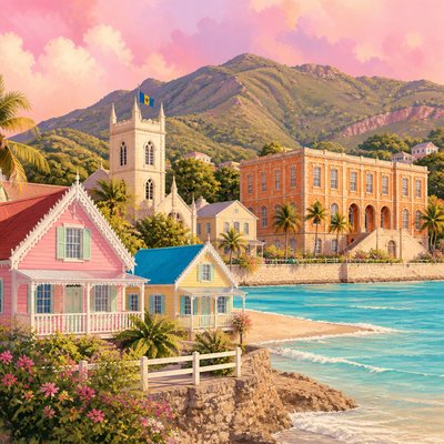
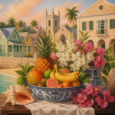
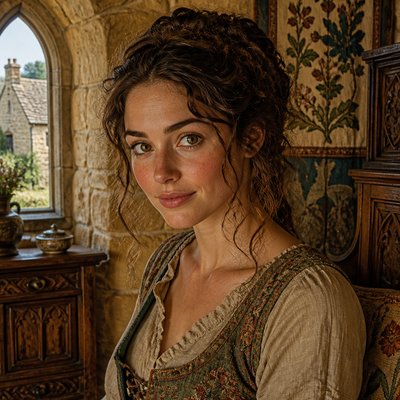
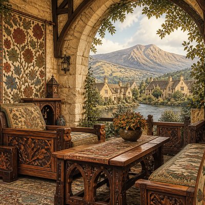
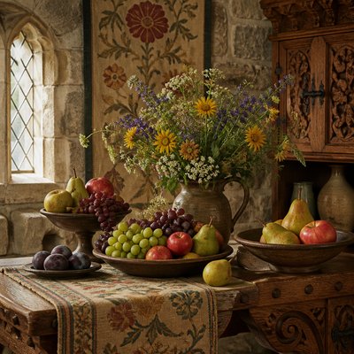
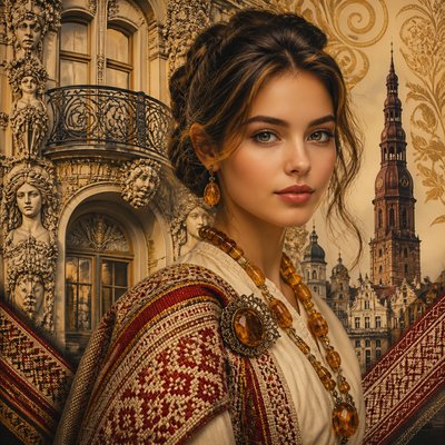
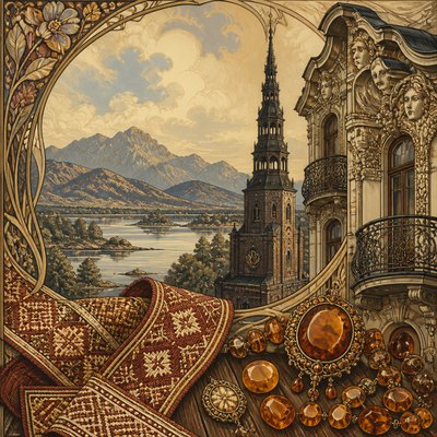
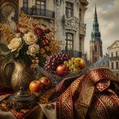
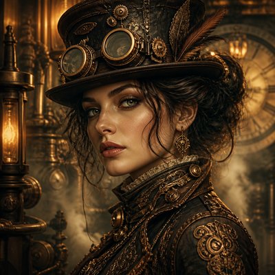
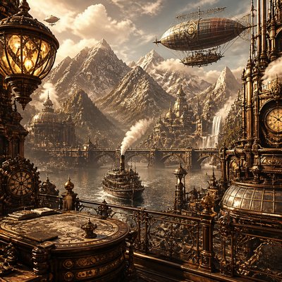
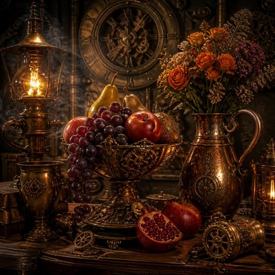
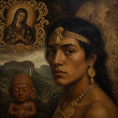
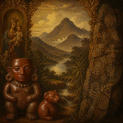
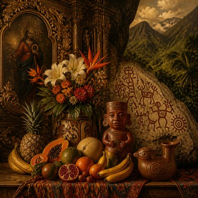
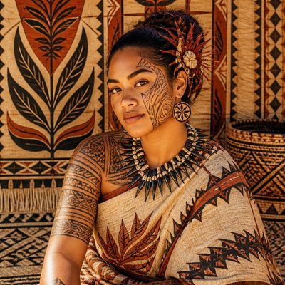
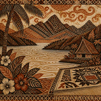
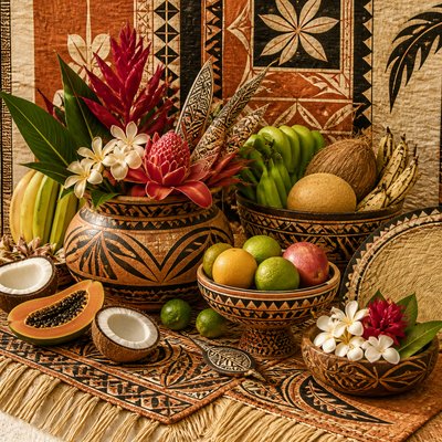
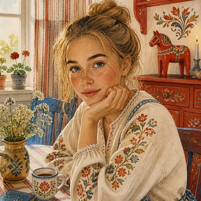
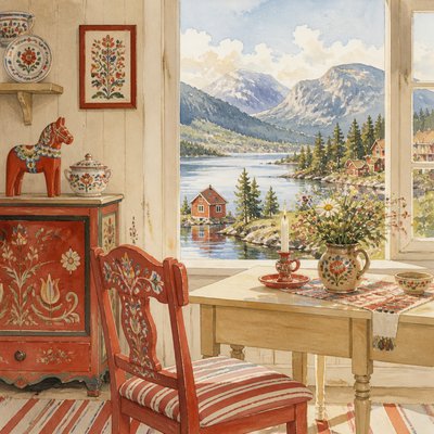
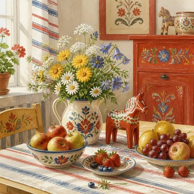
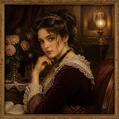
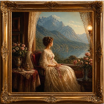
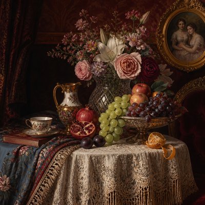
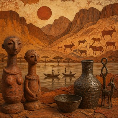
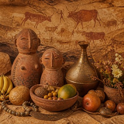
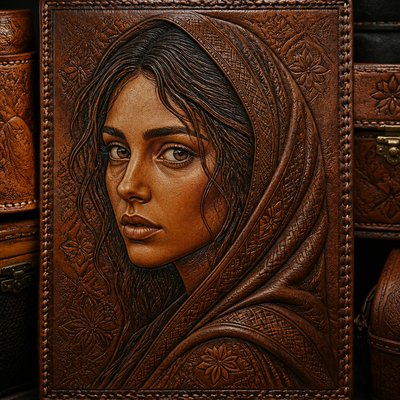
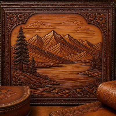
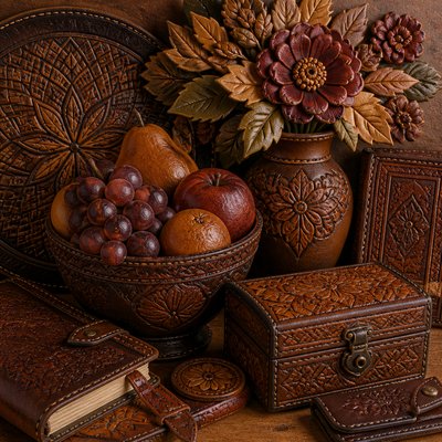
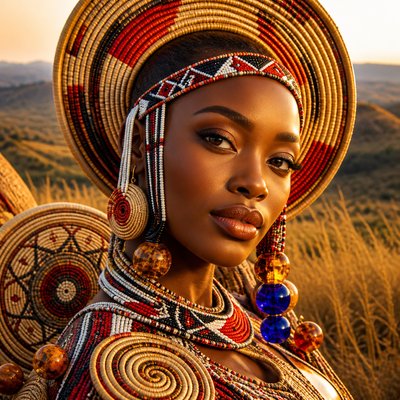
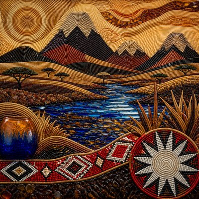
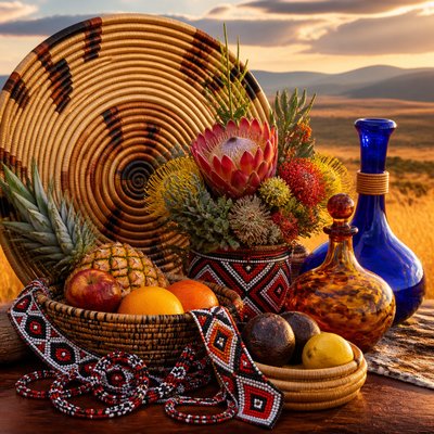
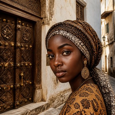
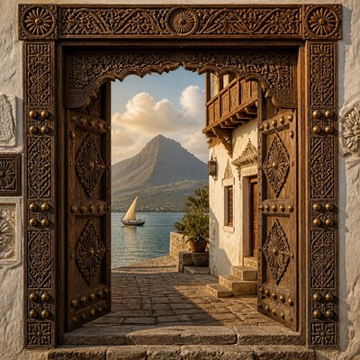
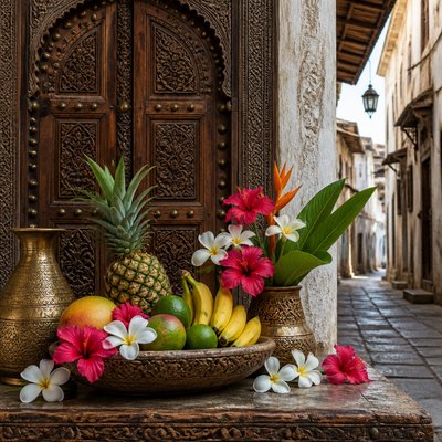
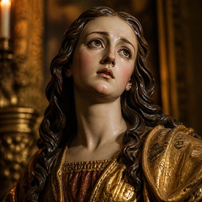
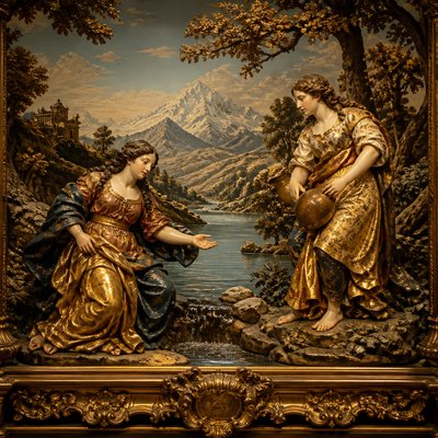
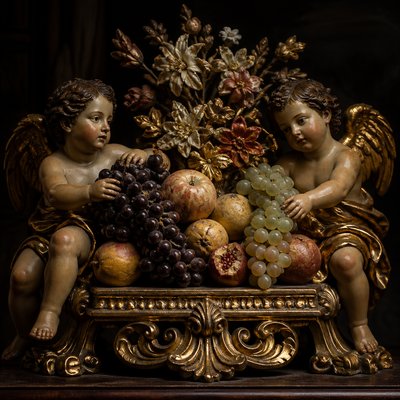
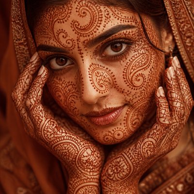
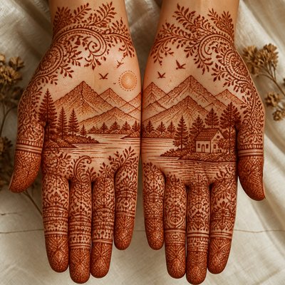
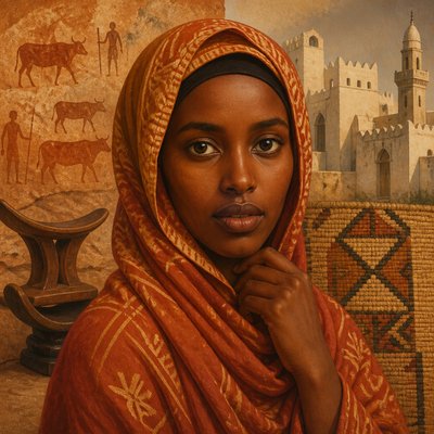
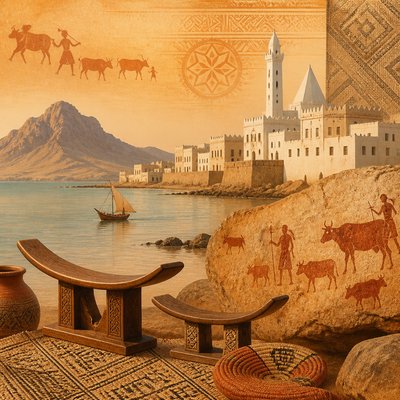
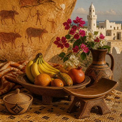
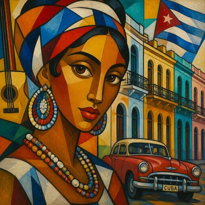
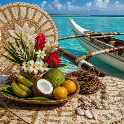
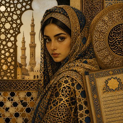
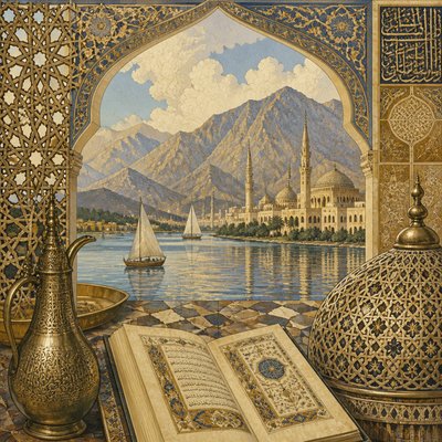
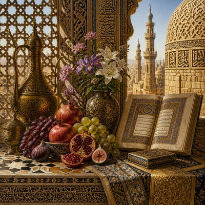
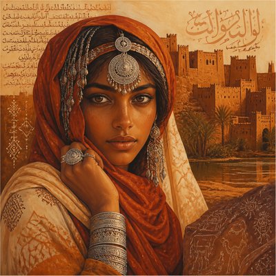
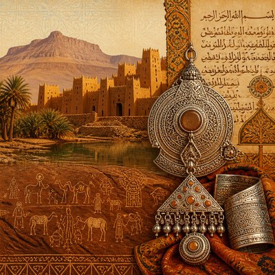
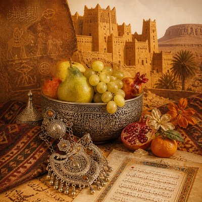
Explore Warm Palette Art: a radiant visual style of reds, ambers, oranges and golds, with firelit shadows and enveloping sunset heat.
Instantly rendered in Warm Palette — or transform a photo
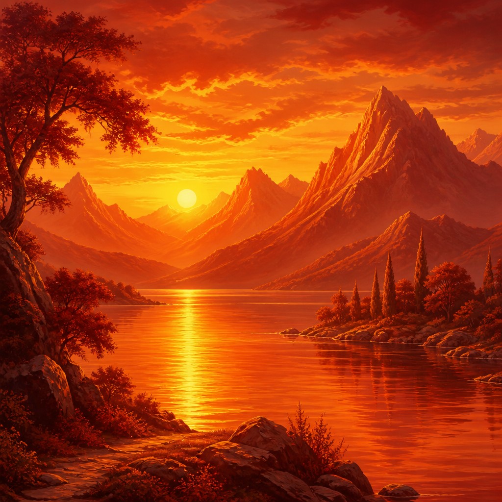
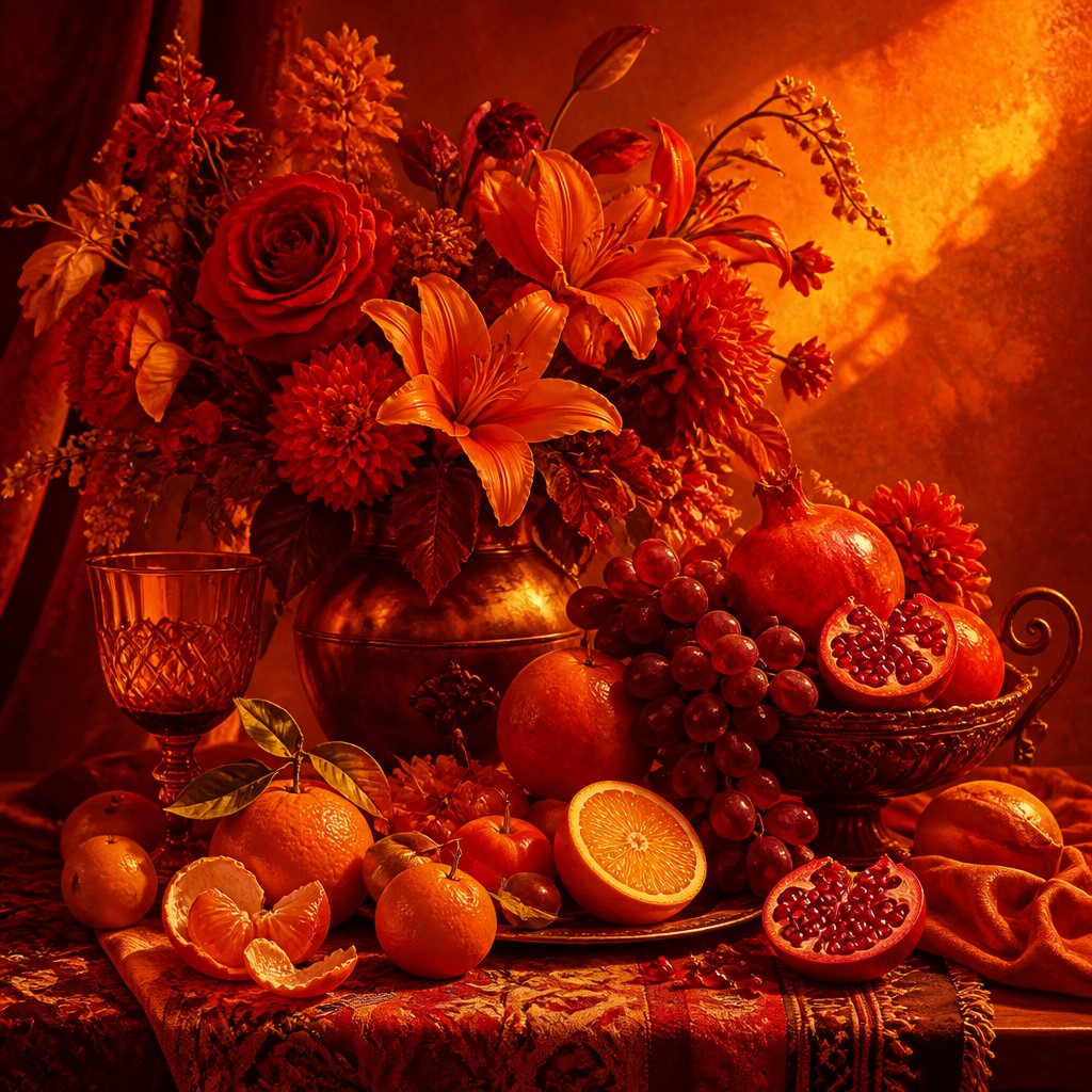
Warm Palette Gallery
Tap any artwork to explore it
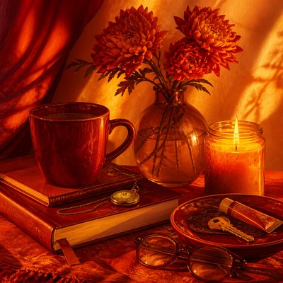
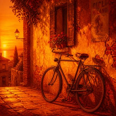
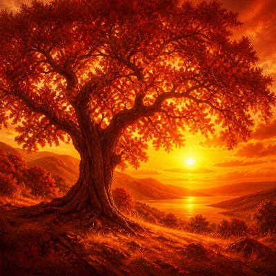
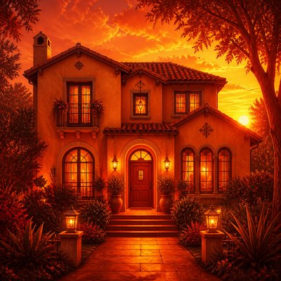
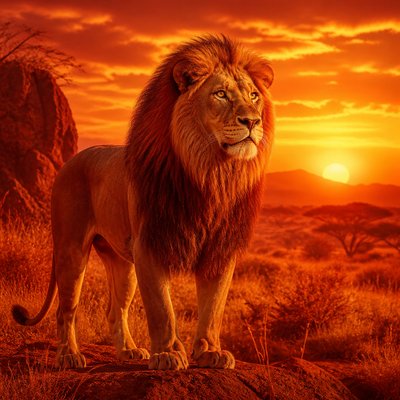
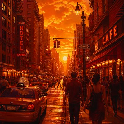
What is Warm Palette Art Style?
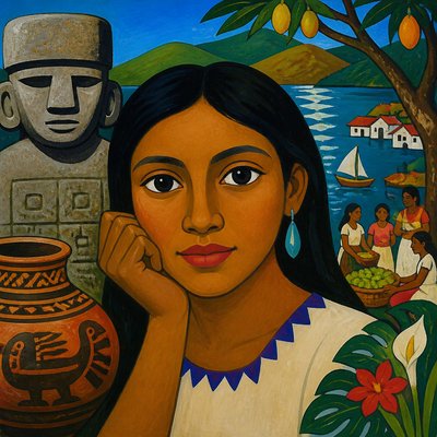
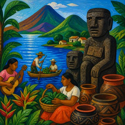
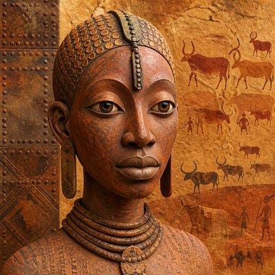
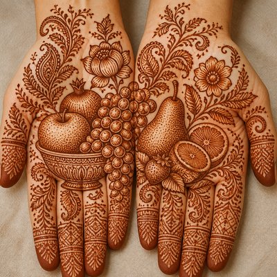
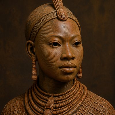
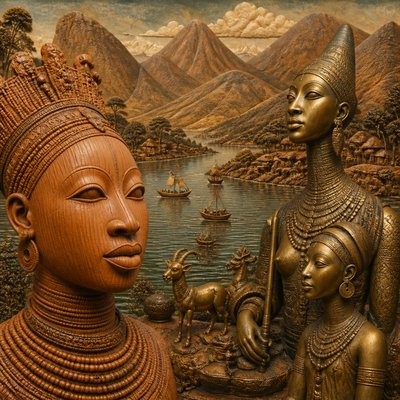
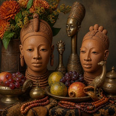
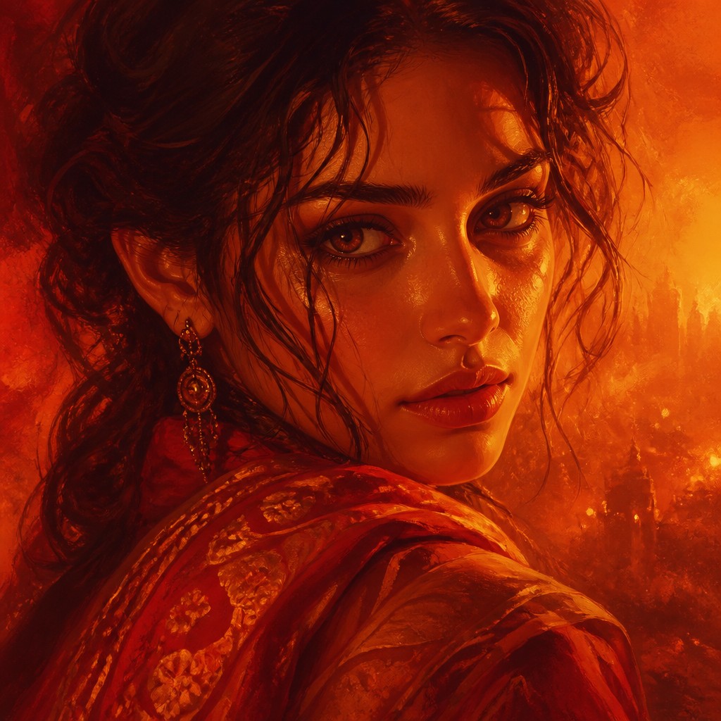
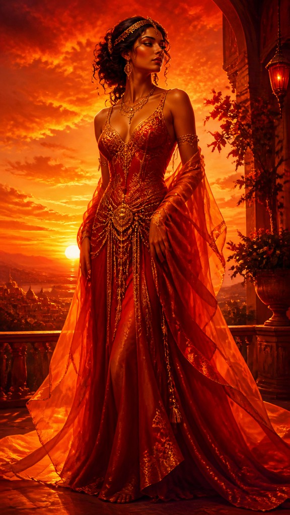
Warm Palette Art is a color-centered visual style defined by an almost exclusive use of reds, oranges, ambers, ochres and golds. Its images appear sunlit, firelit or heat-soaked, with color doing much of the work normally assigned to naturalistic lighting, atmosphere and emotional expression. Shadows remain warm, shifting toward sienna, russet, burgundy or muted plum rather than blue, gray or green.
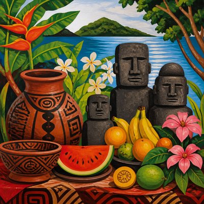
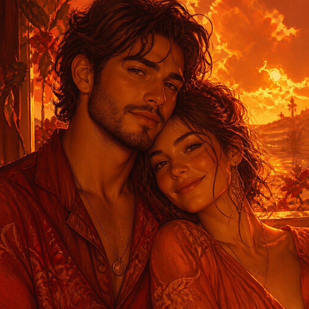
The style can be applied to landscapes, portraits, interiors, architecture, still life and imagined scenes. Its visual identity comes from the controlled restriction of hue: even pale highlights tend toward cream, honey or molten gold, while dark areas retain a reddish temperature. The result may feel intimate and comforting, dramatic and volcanic, nostalgic like a sunset photograph, or intense like a painted flame.
Try It On Your Photos
Upload any photo and convert it into Warm Palette Art Style — drag the sliders to compare before and after.


What Defines Warm Palette Art Style
The signature details, up close
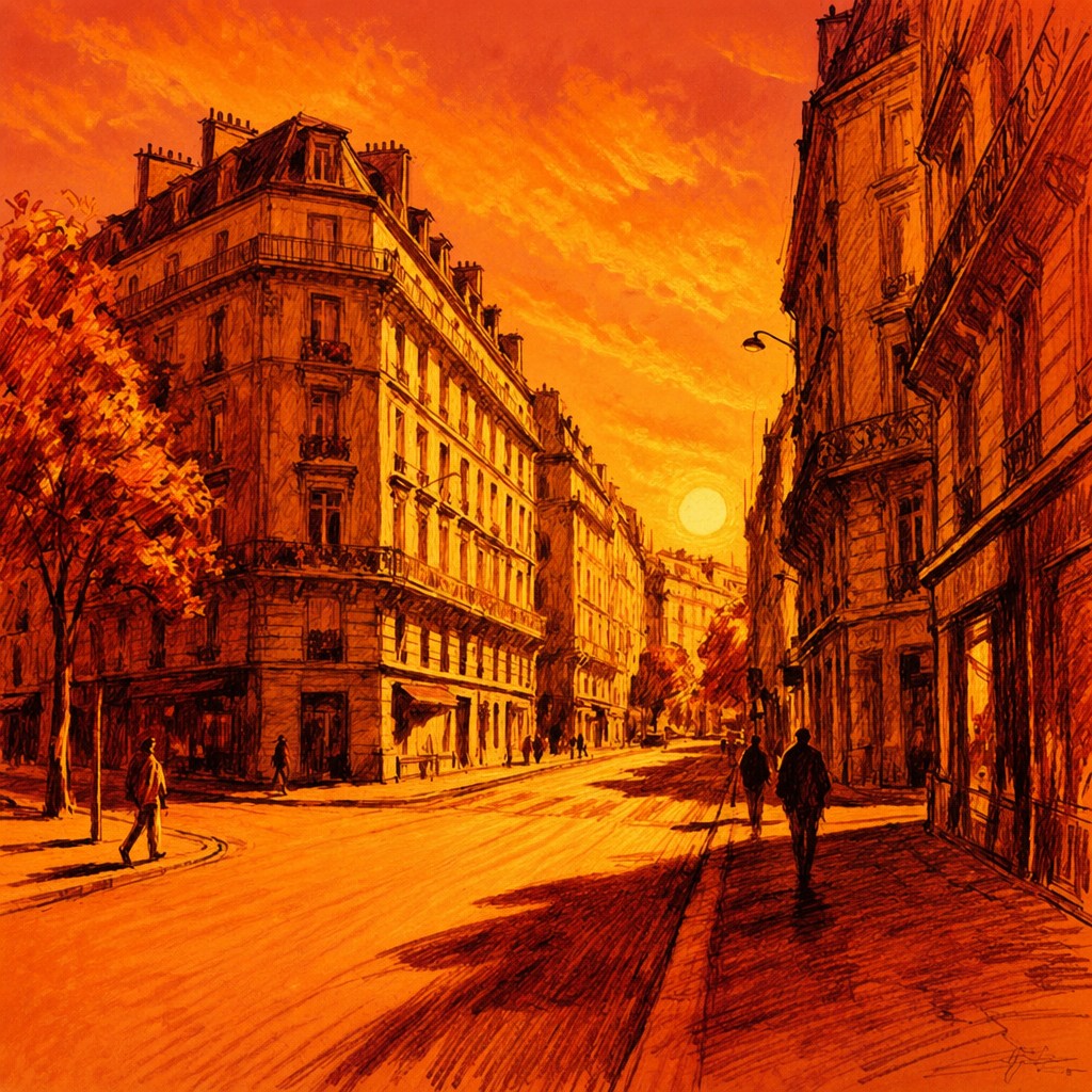
Restricted warm spectrum
The image is built primarily from reds, oranges, ambers, ochres and golds. Cool blues, blue-grays, turquoise and green are omitted or reduced to preserve chromatic unity.
Firelit illumination
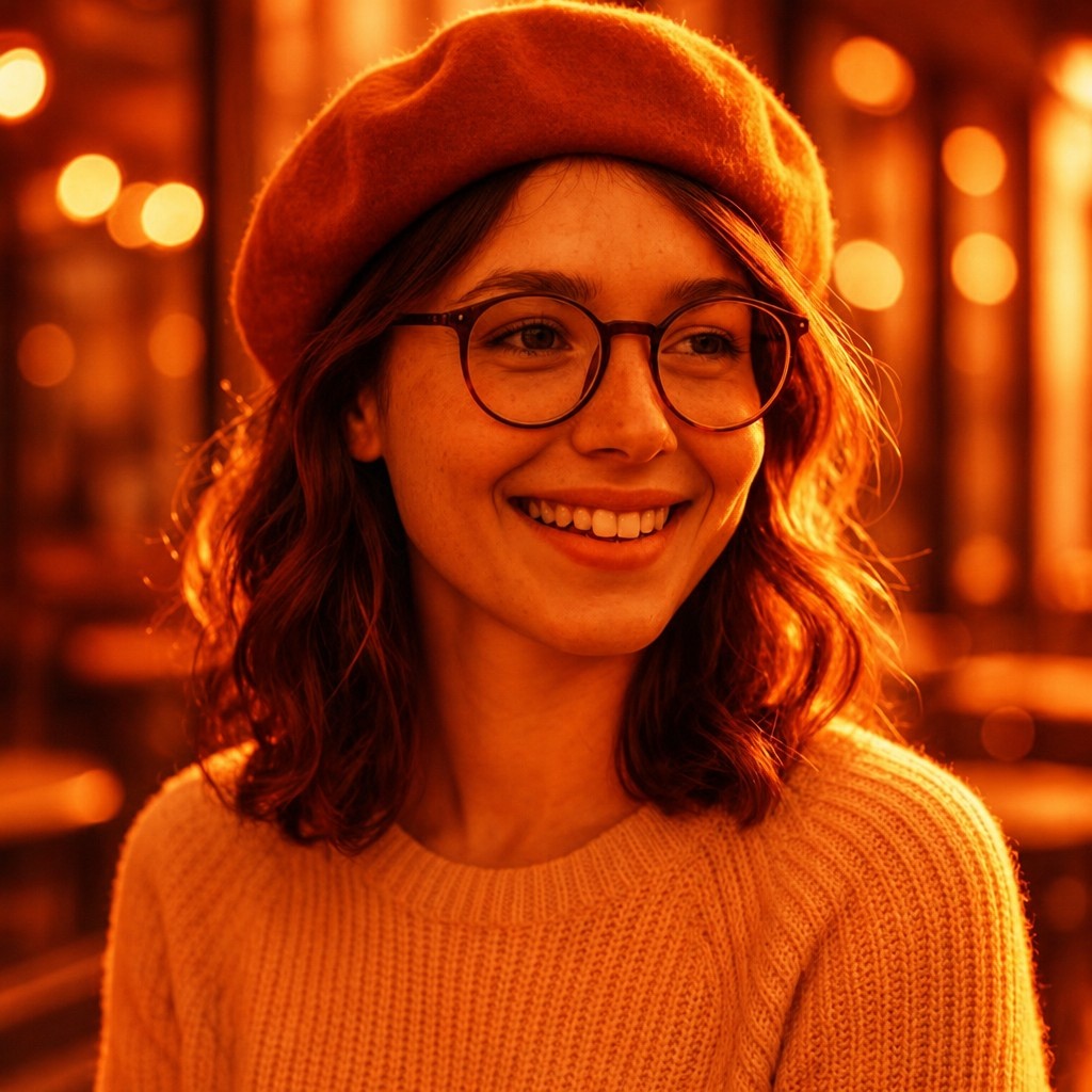
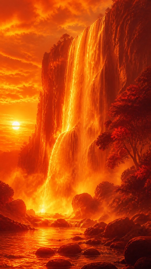
Light often behaves like sunset, candlelight, embers or reflected flame. Highlights glow with honey, copper or molten gold, while surrounding forms appear warmed by the same source.
Warm shadow structure
Dark values use burnt sienna, rust, oxblood, burgundy and warm plum instead of neutral black or cool gray. This keeps the shadows visually integrated with the illuminated areas.
Advancing visual heat
Dense reds and oranges can make surfaces seem closer, heavier and more enveloping. Gradual transitions between related warm hues create a sensation of radiant atmosphere rather than detached local color.
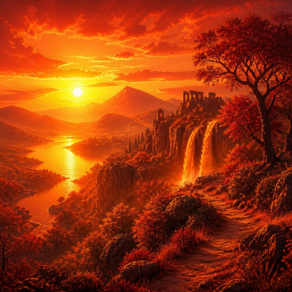
High color cohesion
Objects may retain recognizable differences in value and texture while sharing a common color temperature. This unifies complex scenes and gives them a deliberate, poster-like or painterly coherence.
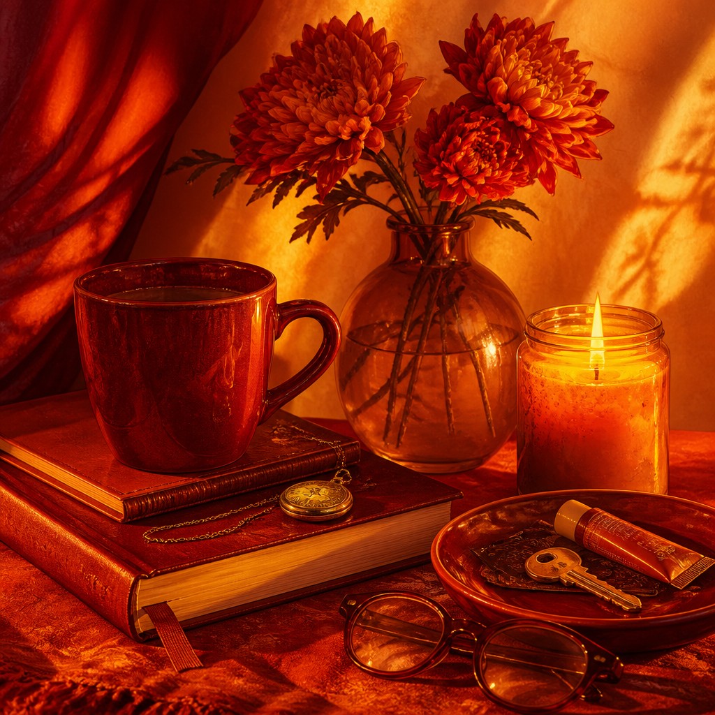
Luminous contrast
The style frequently sets bright golds against deep crimson or sienna to create intensity. Contrast can be sharp around a flame or horizon, or soft and hazy in a heavily diffused sunset.
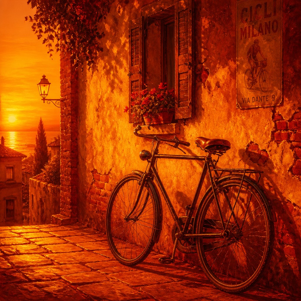
Emotional warmth
The palette tends to suggest intimacy, celebration, danger, nostalgia, energy or climatic heat. Meaning comes partly from the tension between inviting golden light and more threatening scarlet or near-black-red areas.
Try It
Create Videos in Warm Palette Art Style
Styles aren't just for stills — describe a scene or animate an image and get a short video rendered in Warm Palette. Press play to see this pond come to life.
Make a VideoWarm Palette Prompt Ideas
Start from an idea — each one opens the generator with the style ready to go. See all 40 Warm Palette prompts →
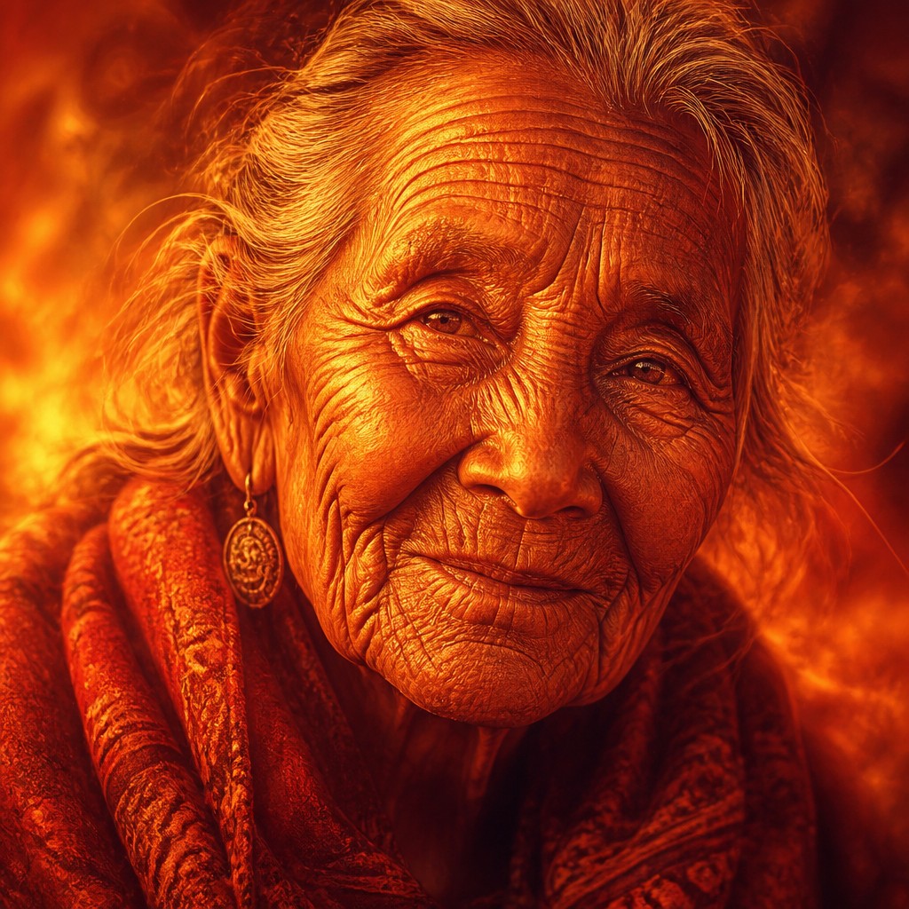
“close-up portrait of an elderly person with expressive weathered features”
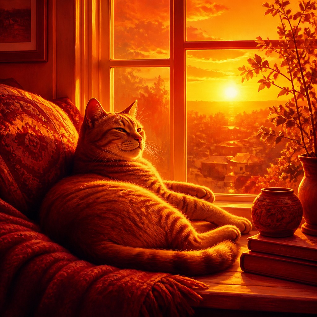
“a cat lounging in a sunlit window”
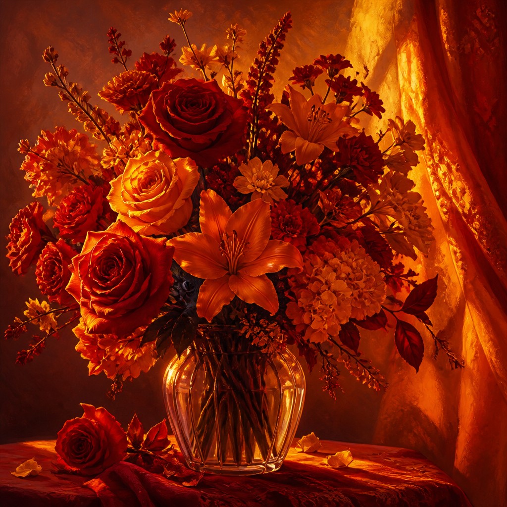
“bouquet of flowers in a glass vase”
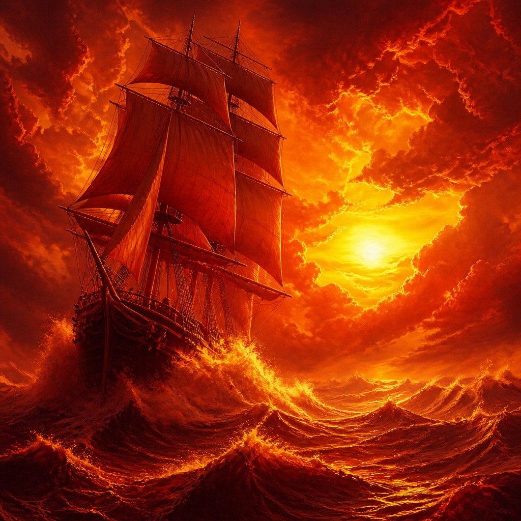
“sailing ship on a stormy sea”
How to Create Warm Palette Art
Master the craft step by step — or skip straight to creating. Read the full guide →
- 1
Build a limited palette
Begin with a small selection such as vermilion, crimson, burnt sienna, ochre, orange, raw umber and warm white. Mix darker values from red-brown and plum rather than relying on black, which can flatten the temperature.
- 2
Establish one warm light source
Choose a clear source such as a low sun, hearth, lantern or abstract glow, then place the brightest golds near it. Repeat the light color in reflected edges and selected surfaces so the scene feels illuminated rather than merely colorized.
- 3
Control value before saturation
A successful warm image still needs a readable range from luminous highlights to deep shadows. Make a grayscale check or temporarily reduce saturation to ensure that forms remain legible beneath the intense color.
- 4
Use layered digital color
In digital work, try a warm gradient map, soft-light layer or selective color adjustment, then repaint shadows and highlights manually. Preserve texture and local contrast instead of applying a uniform orange filter.
- 5
Describe the palette precisely
For prompt-based generation, specify reds, oranges, ambers and golds, firelit or sunset illumination, warm sienna and plum shadows, and the absence of cool tones. Add subject, composition, atmosphere and material details to prevent the palette from overwhelming the scene.
- 6
Balance intensity with neutrals
When every area is equally saturated, the image can become visually flat. Reserve the brightest golds and strongest reds for focal points, using muted ochre, terracotta and umber elsewhere to create hierarchy.
The Story
History & Origins of Warm Palette
Warm Palette Art is a contemporary, descriptive style rather than a formally established historical movement. It has no single founding period or geographic origin; instead, it organizes a longstanding artistic interest in heat, radiance and restricted color around a deliberately warm chromatic system.
Its aesthetic lineage includes the sunset illumination of landscape painting, the ochre and vermilion harmonies of many traditional painting practices, the dramatic chiaroscuro of Baroque art, the saturated color experiments of modern painting, and the amber grading associated with cinema and photography. Digital color tools and text-based image-making have made this palette easy to apply consistently across otherwise unrelated subjects.
Influences: The style relates to sunset landscape painting, firelit chiaroscuro, ochre-based mural and tempera traditions, color-field and expressionist approaches to emotional hue, and the warm tonal grading used in film and photography. It also echoes the restricted palettes of poster art, illuminated manuscripts and selected decorative traditions in which red and gold signify vitality, ceremony or sacred radiance. Unlike a historical movement with a fixed manifesto, it is a flexible contemporary palette system that can borrow techniques from many periods and media.
Frequently Asked Questions
What defines Warm Palette Art?
It is defined by a restricted range of warm hues, especially reds, oranges, ambers and golds. Its shadows also remain warm, using sienna, rust, burgundy or plum rather than cool gray or blue. Lighting usually suggests sunset, flame, candlelight or another enveloping source of heat.
Is Warm Palette Art a historical art movement?
No. The term describes a contemporary aesthetic system rather than a recognized historical movement with a fixed origin or membership. It draws on older traditions of warm color, dramatic illumination and restricted palettes.
How is it different from monochromatic art?
Monochromatic art is generally restricted to variations of one hue, while Warm Palette Art uses several neighboring warm hues. Reds, oranges, yellows, browns and golds can all appear together, provided the overall temperature remains consistently warm.
Can this style be used for portraits and photographs?
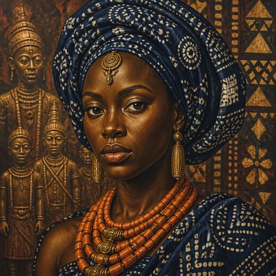
Yes. Warm color can emphasize skin, fabric, reflective surfaces and atmospheric depth in portraits, while careful shadow control prevents faces from looking unnaturally orange. In photography, selective color grading is usually more effective than applying a uniform warm filter.
How can I keep the image from looking flat or overly orange?
Create a clear value range and vary saturation across the composition. Use muted ochres and umbers for secondary areas, reserve brilliant gold and scarlet for focal points, and shape objects with warm darks rather than treating the entire image as one orange wash.
What subjects work especially well with this palette?
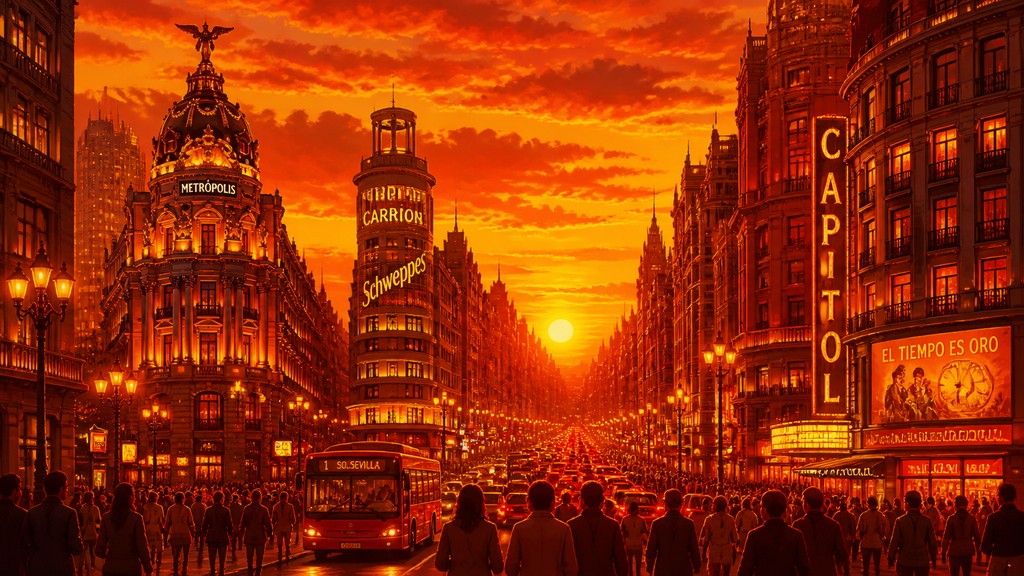
Sunsets, deserts, autumn forests, flames, volcanic terrain, candlelit interiors, theatrical scenes, warm portraits and metallic still lifes are natural choices. The palette can also reinterpret cool or futuristic subjects by replacing their usual blues and greens with crimson, copper and amber.
Create your first Warm Palette artwork
Describe anything — or upload a photo — and see it in Warm Palette Art Style in seconds.
Related Styles
Discover similar art styles