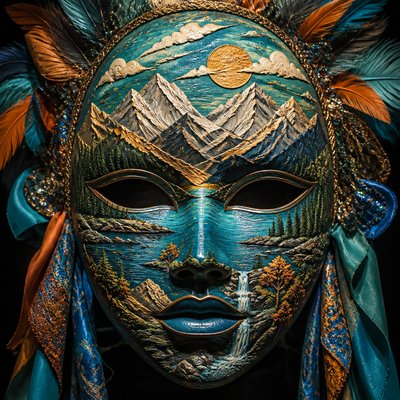
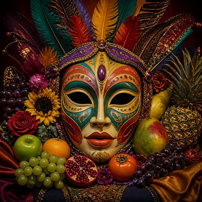
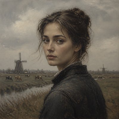
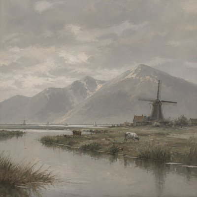
Pastel Art Style
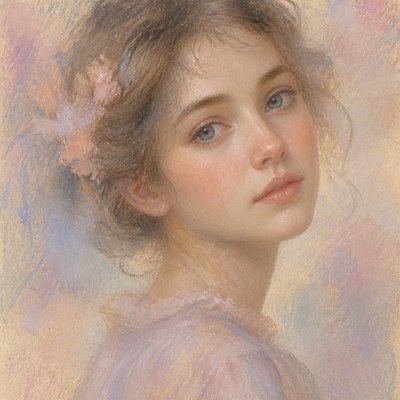
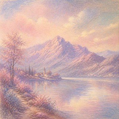
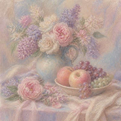
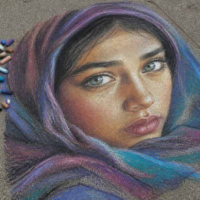
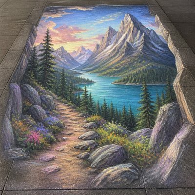
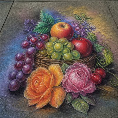
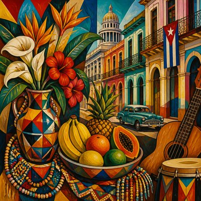
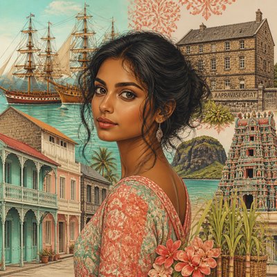
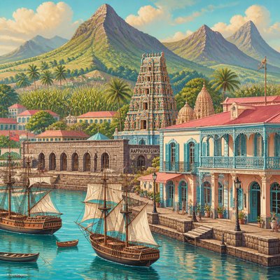
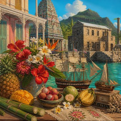
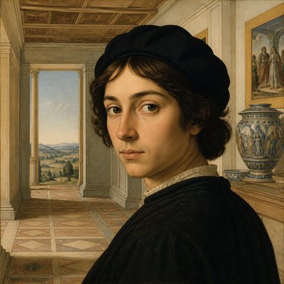
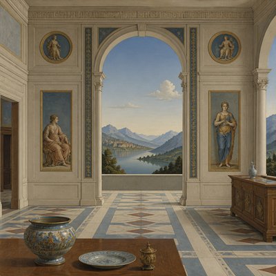
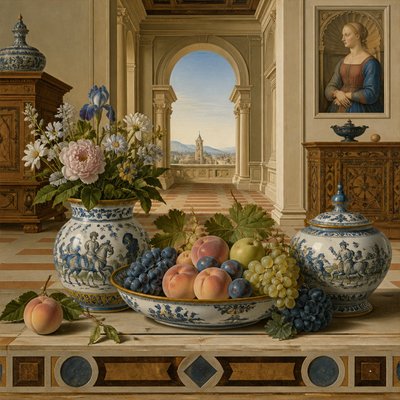
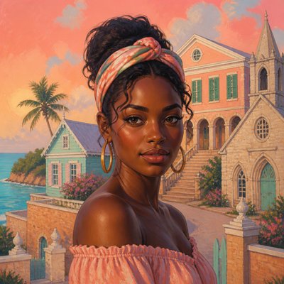
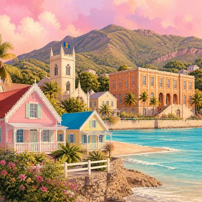
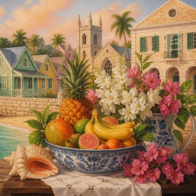
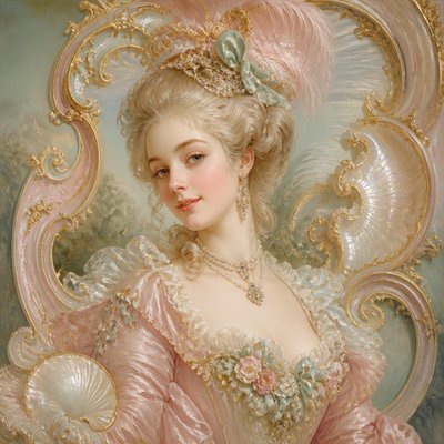
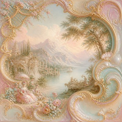
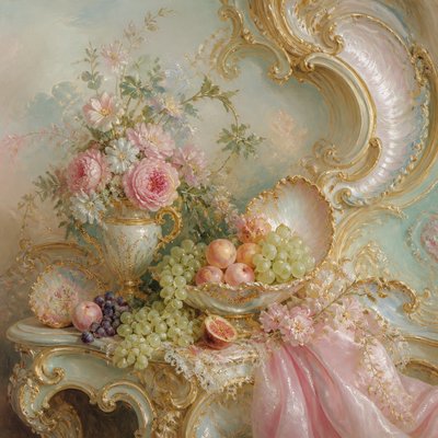
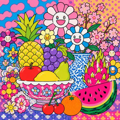
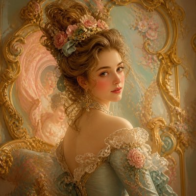
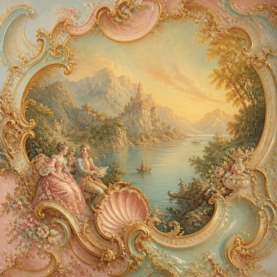
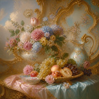
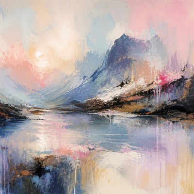
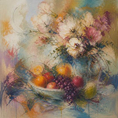
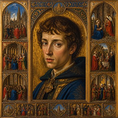
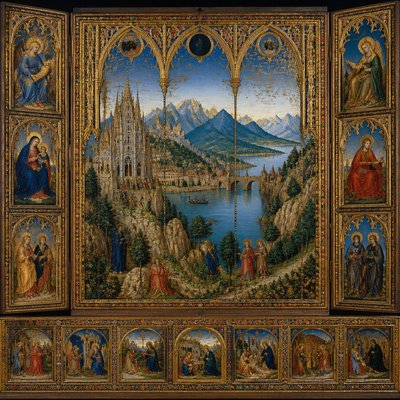
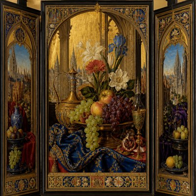
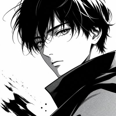
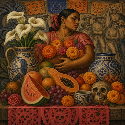
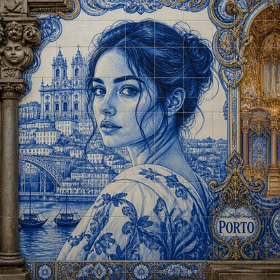
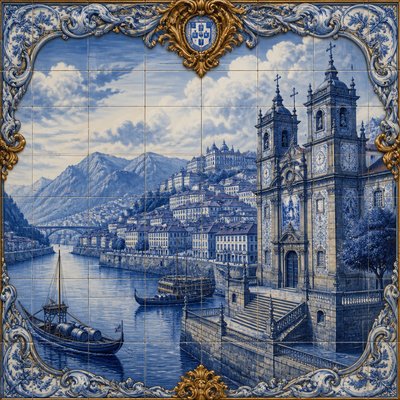
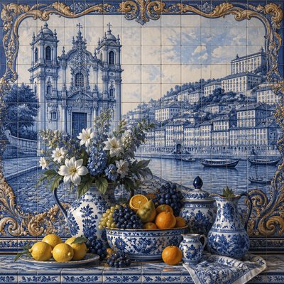
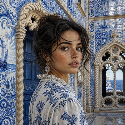
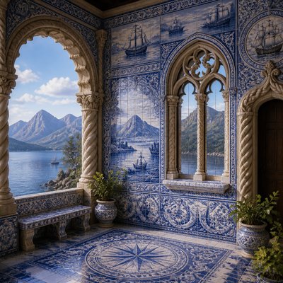
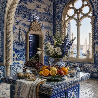
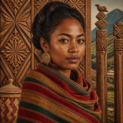
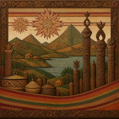
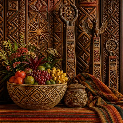
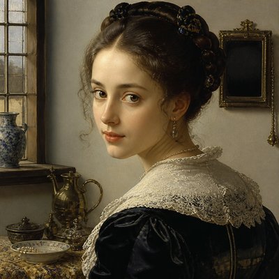
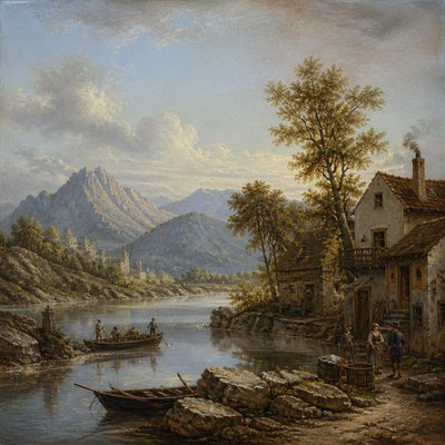
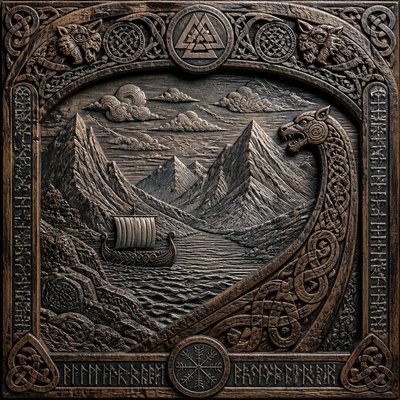
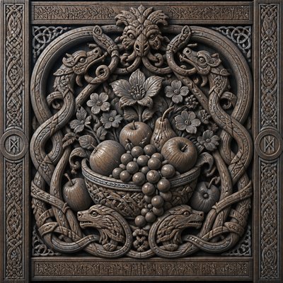
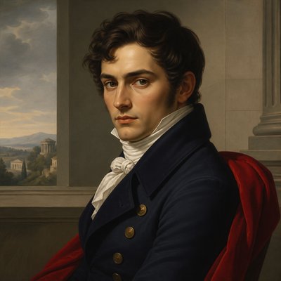
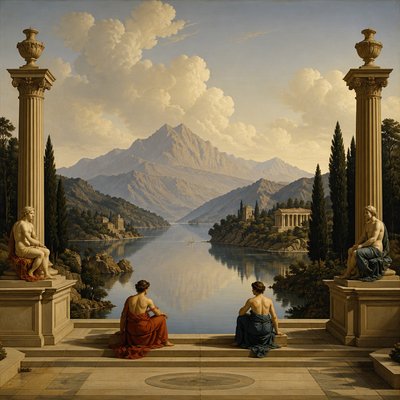
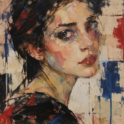
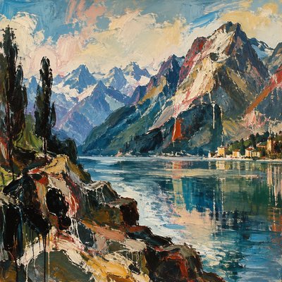
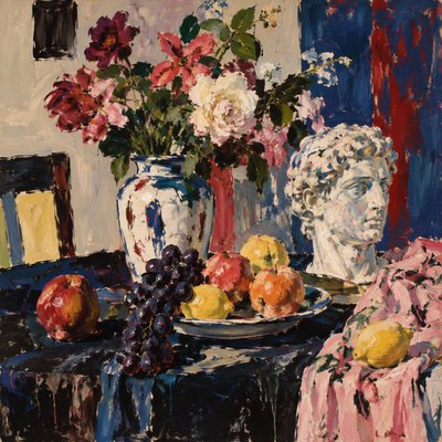
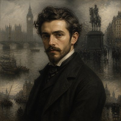
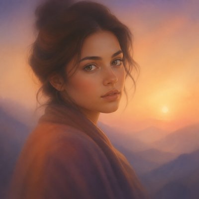
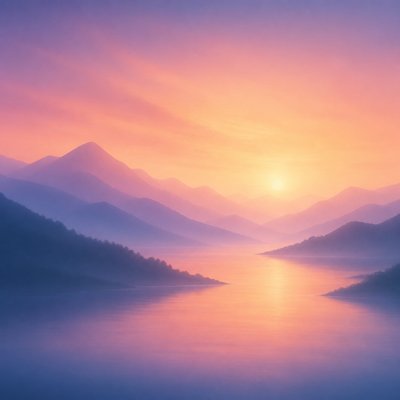
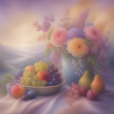
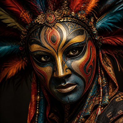
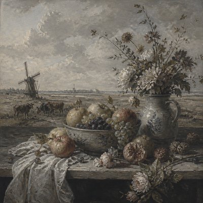
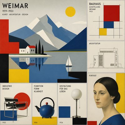
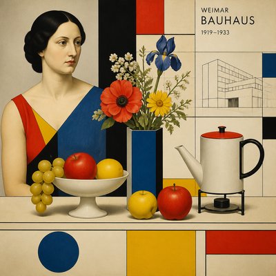
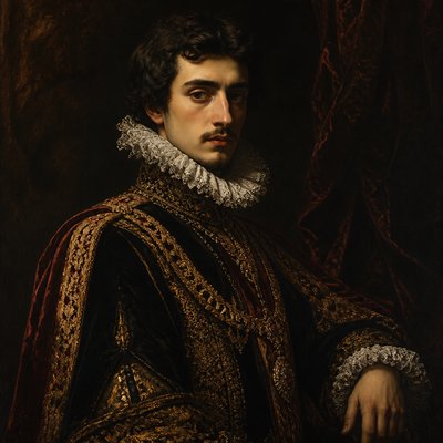
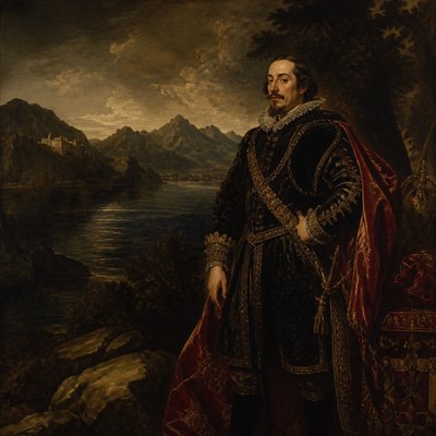
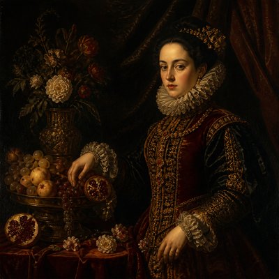
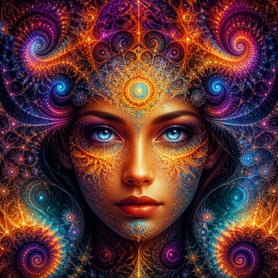
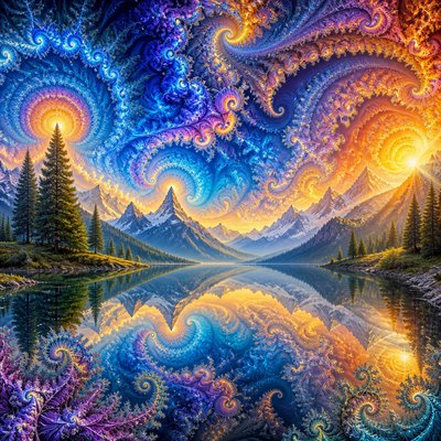
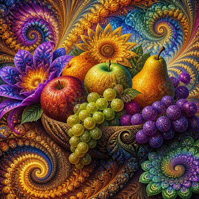
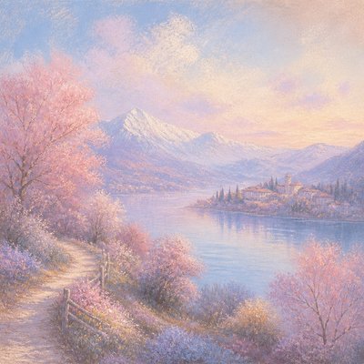
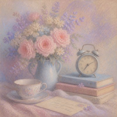
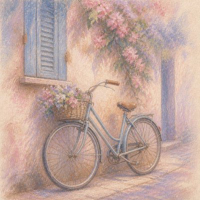
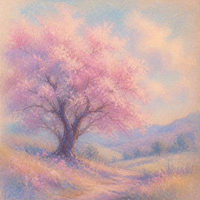
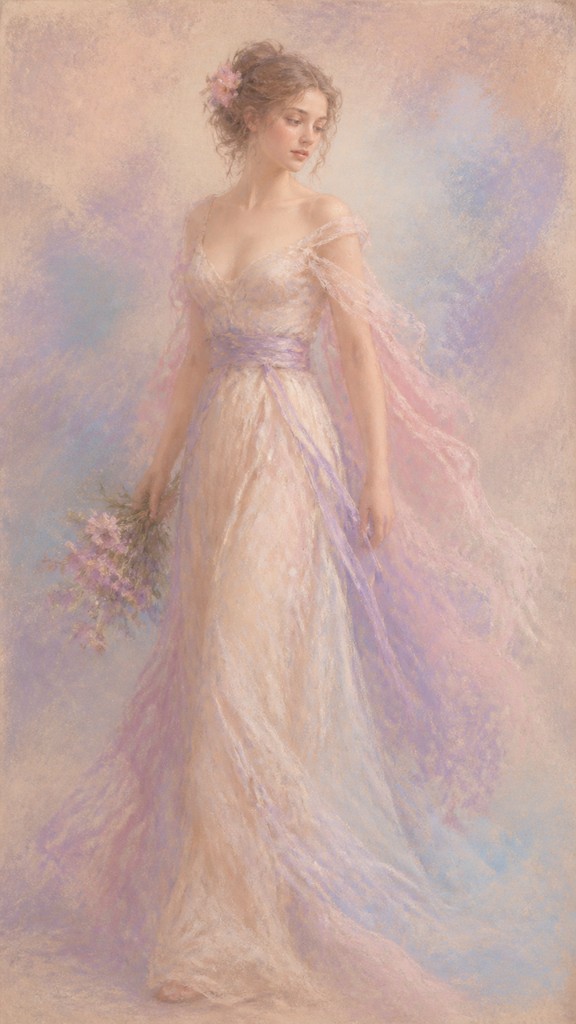
Soft chalk pigments, powdery blending, and luminous textured surfaces define this dreamy, delicate art style.
Instantly rendered in Pastel — or transform a photo
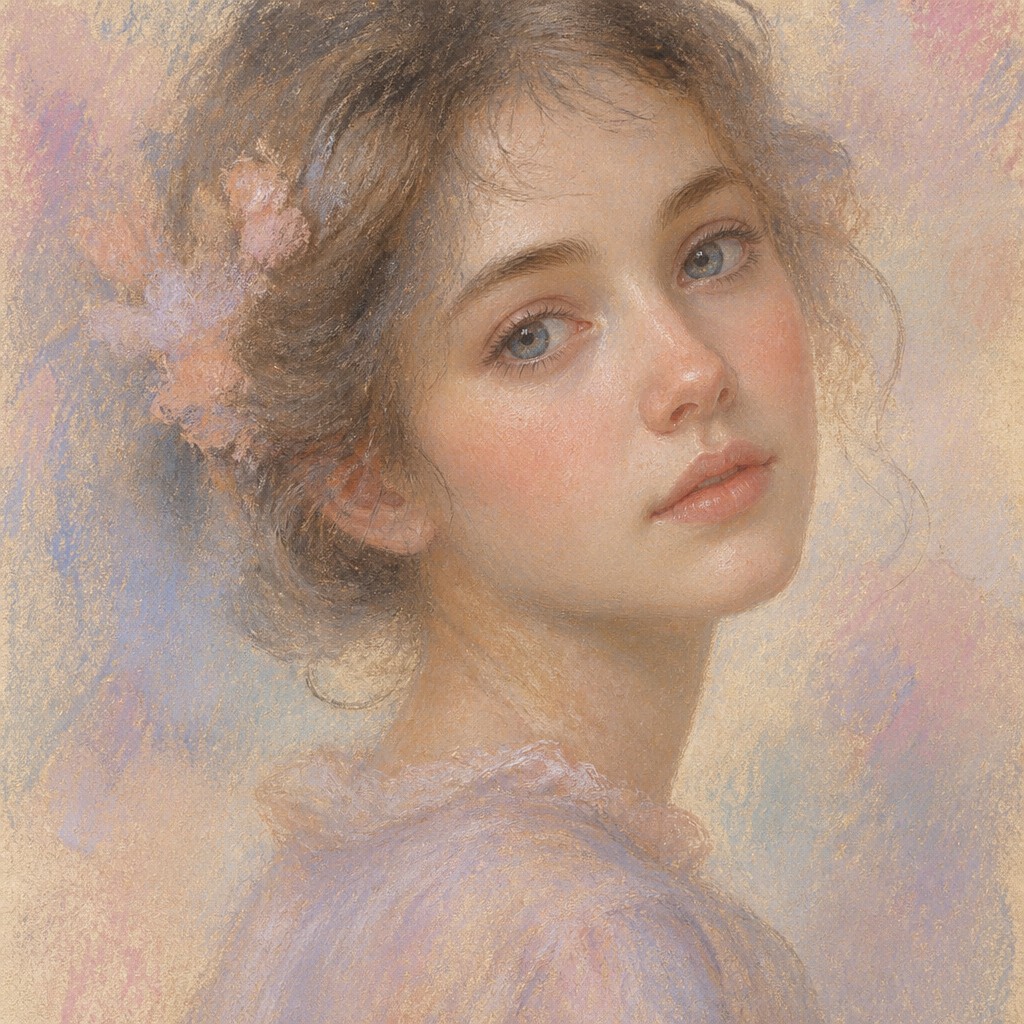
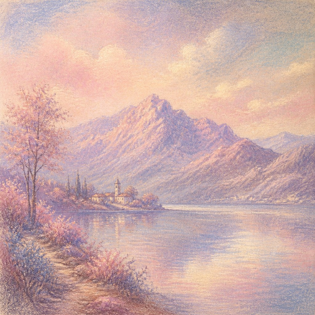
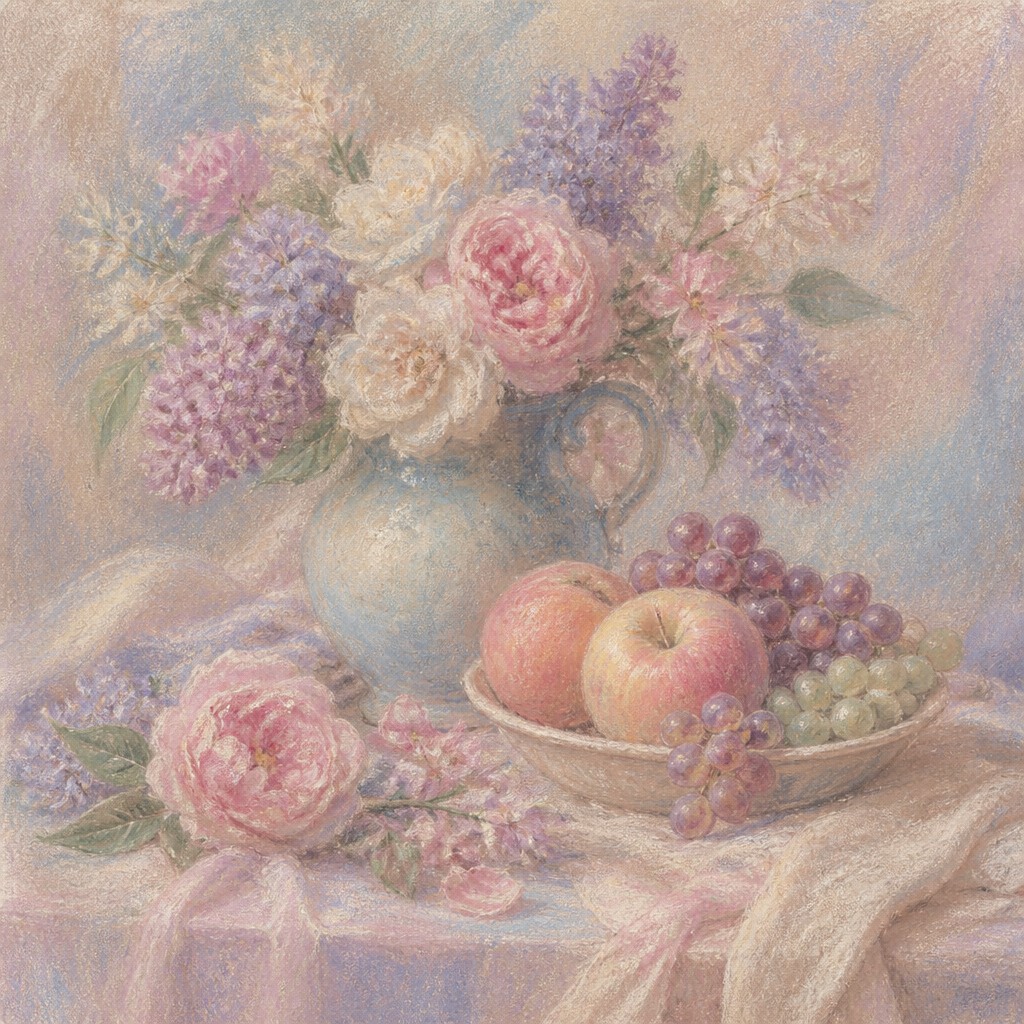
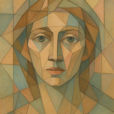
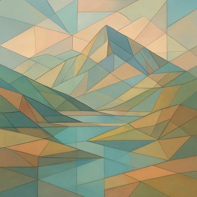
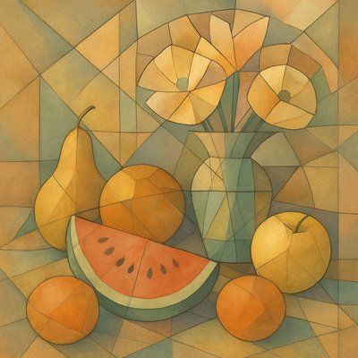
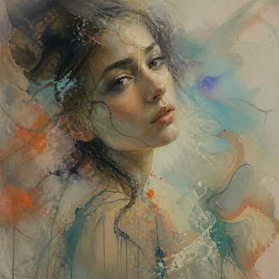
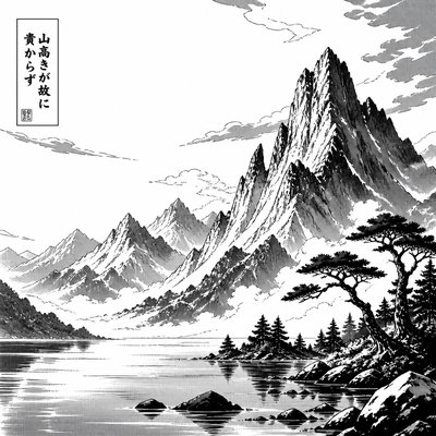
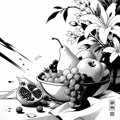
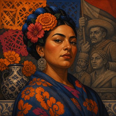
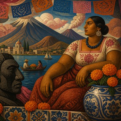
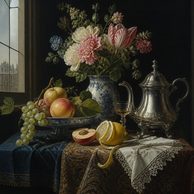
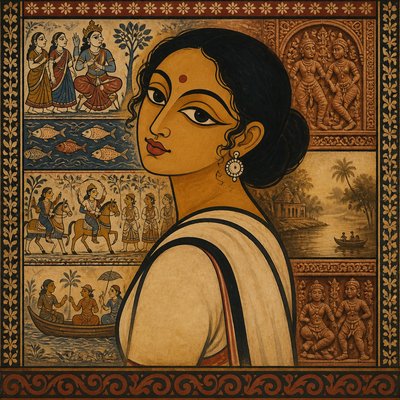
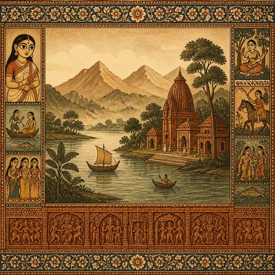
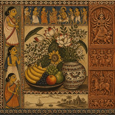
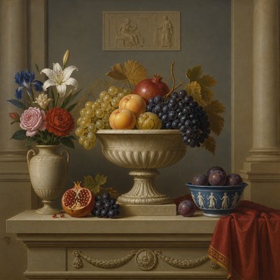
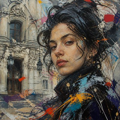
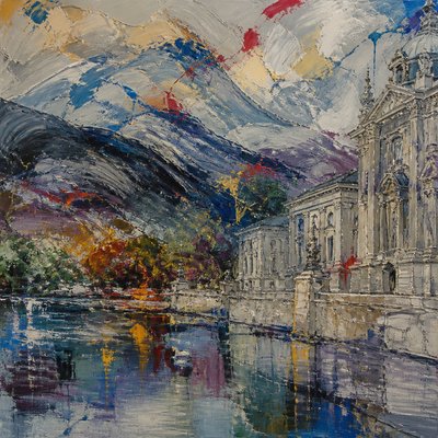
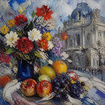
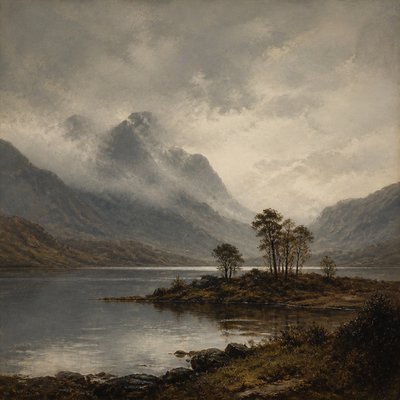
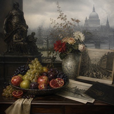
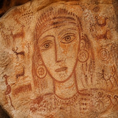
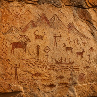
Pastel Gallery
Tap any artwork to explore it
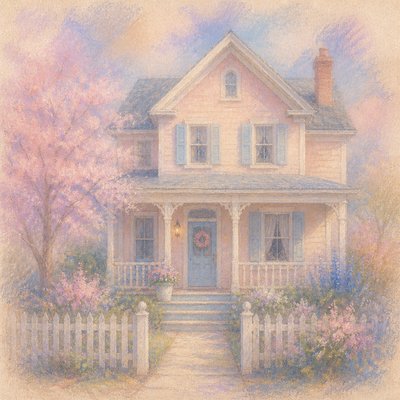
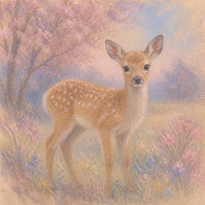
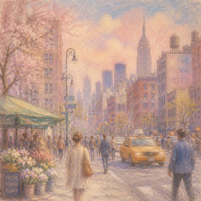
What is Pastel Art Style?
Pastel art style is a drawing and painting approach made with chalk-based pigments that sit on the surface of textured paper rather than soaking into it. Its visual identity is defined by powdery color, velvety transitions, visible paper tooth, and a soft matte glow that gives subjects a gentle, atmospheric presence.
The style often feels dreamy, romantic, and intimate because pastel allows both broad blended passages and crisp, saturated accents in the same image. Soft pinks, pale blues, warm creams, and muted lavenders are especially common, but the medium can also support richer hues when pressed harder. The result is an image with luminous light, feathered edges, and a distinctive delicacy that differs from the flatter look of many paint media or the harder line of ink-based drawing.
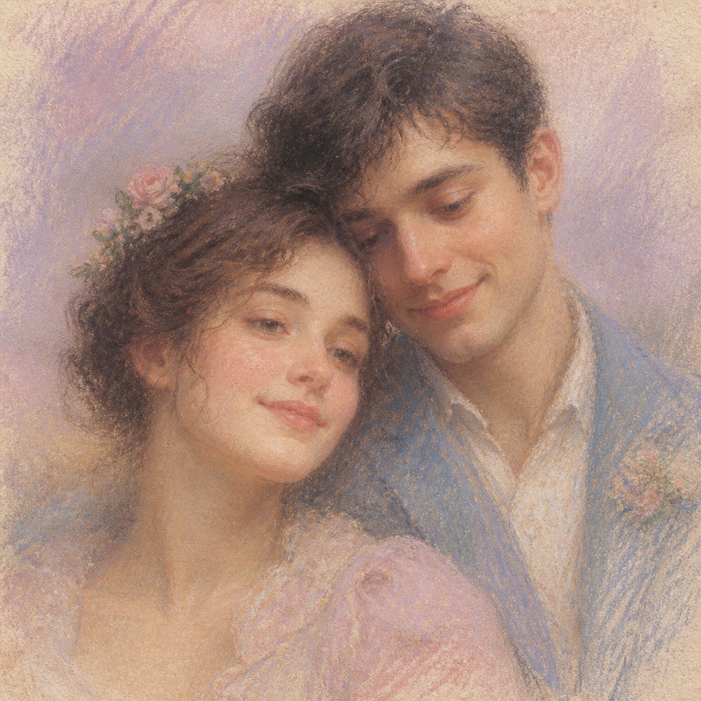
Try It On Your Photos
Upload any photo and convert it into Pastel Art Style — drag the sliders to compare before and after.
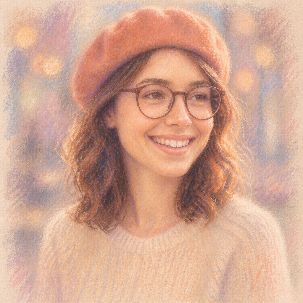

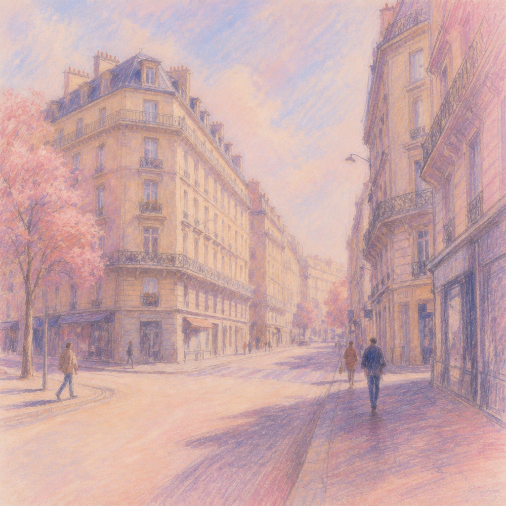

What Defines Pastel Art Style
The signature details, up close
Powdery pigment
Pastel marks look dry, soft, and slightly dusty because the medium uses chalky pigment particles. This creates a velvety surface that reads differently from wet paint or glossy digital shading.
Visible paper tooth
The texture of the paper is part of the image, catching pigment and showing through in unfilled areas. That grain is essential to the medium’s tactile look and helps establish depth.
Soft blending
Color transitions are typically smudged or layered into one another rather than sharply edged. This gives the style its hazy, seamless atmosphere and gentle emotional tone.
Muted luminous palette
Soft pinks, pale blues, creams, lavenders, and other low-contrast hues are common, though stronger accents may appear in focal areas. The overall effect is luminous without becoming glossy or highly saturated.
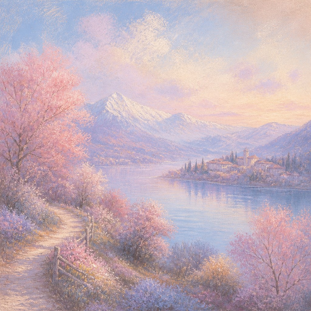
Feathered contours
Outlines are often softened or partially dissolved into the background, especially in portraits, florals, and landscapes. This makes forms feel tender, airy, and slightly dreamlike.
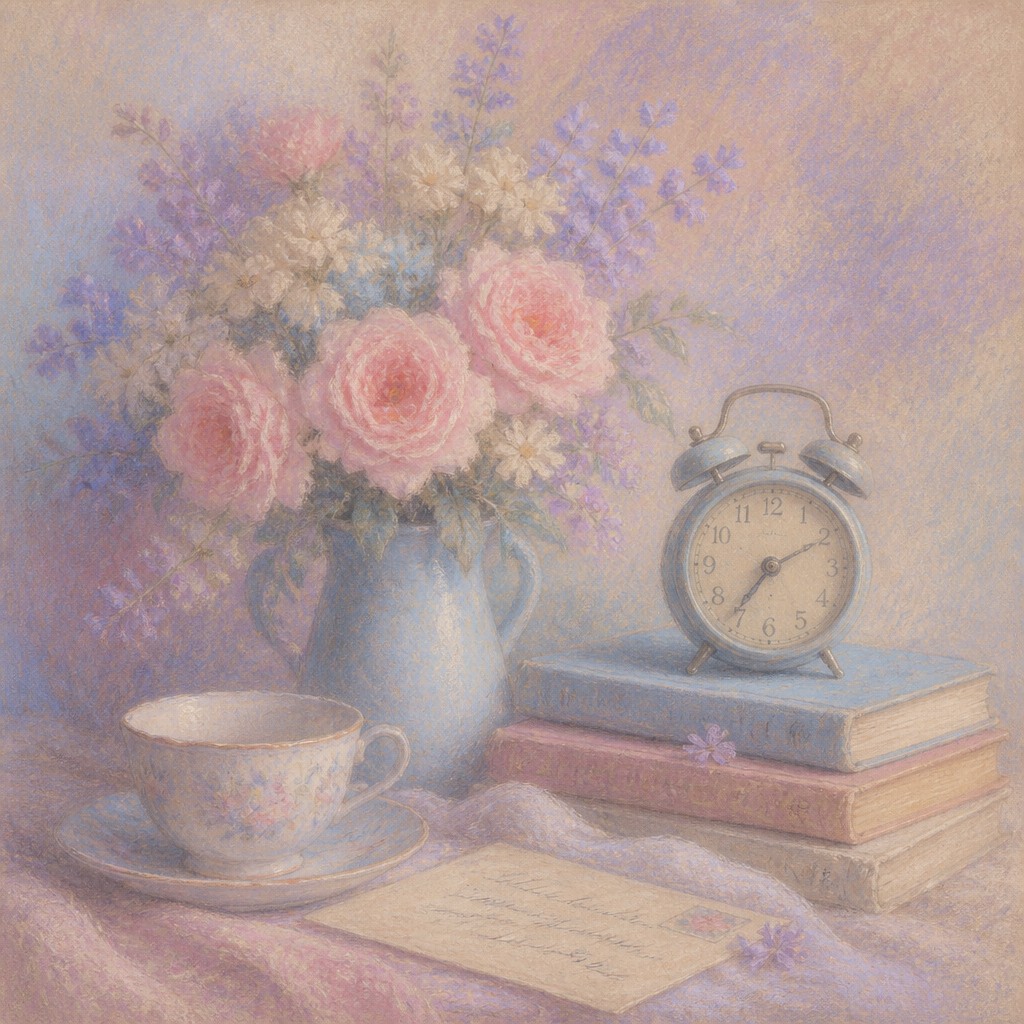
Matte light and low contrast
Pastel images usually avoid hard shadows and harsh specular highlights. Light appears diffused, as if filtered through mist, fabric, or late-afternoon haze.
Try It
Create Videos in Pastel Art Style
Styles aren't just for stills — describe a scene or animate an image and get a short video rendered in Pastel. Press play to see this pond come to life.
Make a VideoPastel Prompt Ideas
Start from an idea — each one opens the generator with the style ready to go. See all 40 Pastel prompts →
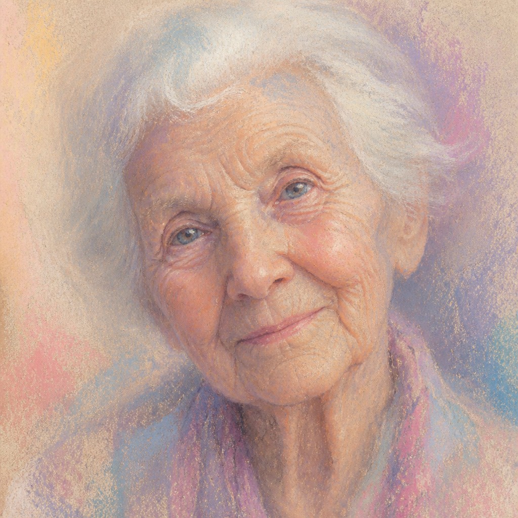
“close-up portrait of an elderly person with expressive weathered features”
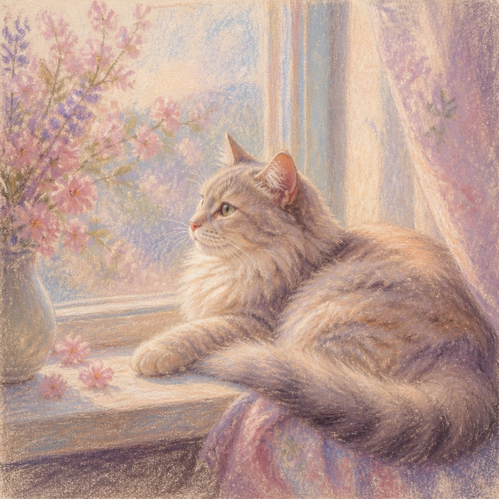
“a cat lounging in a sunlit window”
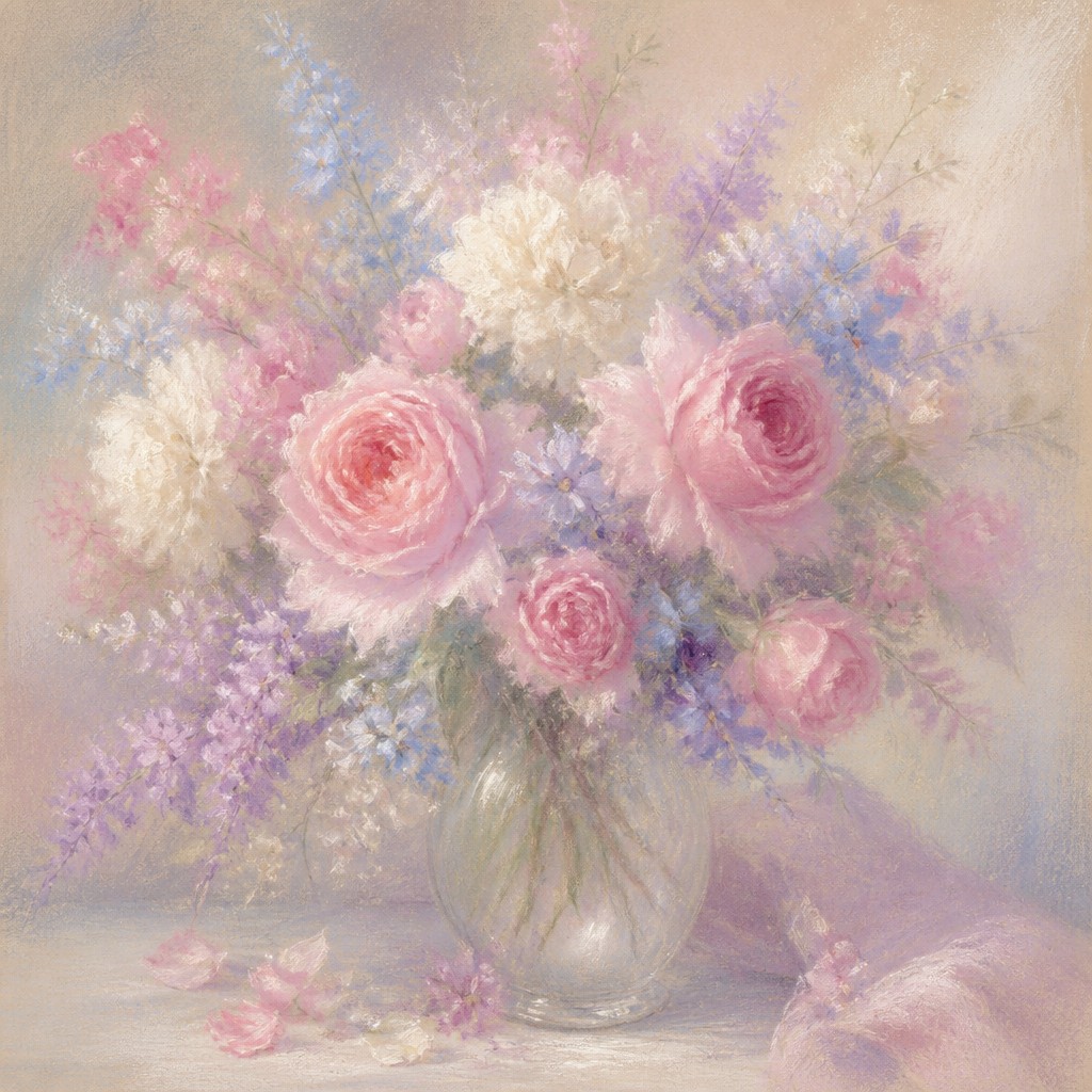
“bouquet of flowers in a glass vase”
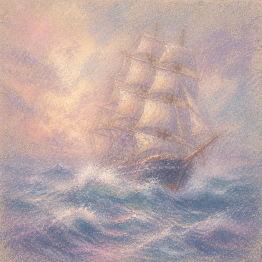
“sailing ship on a stormy sea”
How to Create Pastel Art
Master the craft step by step — or skip straight to creating. Read the full guide →
- 1
Choose a textured surface
On paper, use pastel paper, sanded paper, or a surface with enough tooth to hold multiple layers. The texture matters because it catches pigment and creates the characteristic broken, velvety appearance.
- 2
Layer from light to dark
Build forms gradually with broad strokes first, then deepen shadows and accents. This preserves the airy quality of the medium while still allowing for structure and contrast where needed.
- 3
Blend selectively
Use fingertips, blending stumps, soft brushes, or cloth to soften transitions, but leave some edges unblended. Too much smoothing removes the powdery character that defines the style.
- 4
Preserve matte color relationships
Keep the palette soft and cohesive, using pale tints and restrained contrast for most of the image. Add denser marks only for focal points such as eyes, lips, flowers, or highlights in hair and fabric.
- 5
Simulate material texture digitally
In digital painting, add paper grain, chalk brushes, smudge tools, and subtle edge breakup to mimic pastel dust. Avoid overly clean gradients; slightly uneven blending feels more authentic.
- 6
Use descriptive prompt language
For image generation, specify chalk pastel, textured paper, powdery pigment, gentle blending, feathered edges, and diffused light. Subject, mood, and palette should be named clearly so the soft material qualities can shape the result.
The Story
History & Origins of Pastel
Pastel as a medium has a long history in European art, with notable use in the 18th century for portraits and intimate likenesses. Leading Rococo pastel portraitists, a prominent Venetian pastel portraitist, and a celebrated French genre and still-life painter helped establish pastel’s reputation for capturing flesh tones, fabrics, and soft light with exceptional immediacy. In the 19th century, a major painter of dancers and modern life expanded the medium’s possibilities with energetic layered marks, exploring movement, texture, and modern urban subjects.
The contemporary “pastel art style” seen in illustration and image-making draws from this historical medium as well as from related traditions of romantic illustration, soft-focus portraiture, and atmospheric color design. Its look is shaped by the properties of chalk pigment on textured support: particles cling to the surface, blend easily, and retain a matte, slightly dusty character. Digital and AI-based recreations imitate these material effects by simulating paper grain, smudging, and powdery edges rather than by copying a single historical school.
Influences: This style is closely related to the historical pastel traditions of 18th- and 19th-century portraiture and figure drawing, especially the work of leading Rococo pastel portraitists, a prominent Venetian pastel portraitist, a celebrated French genre and still-life painter, and a major 19th-century painter of dancers and modern life. It also overlaps with romantic illustration, soft-focus editorial imagery, and contemporary color design that favors atmospheric light and gentle tonal transitions. In digital contexts, it often borrows from traditional drawing aesthetics rather than from a single later movement.

Frequently Asked Questions
What defines the pastel art style?
It is defined by chalk-based, powdery color that blends softly on textured paper. The image typically has a matte finish, visible grain, feathered edges, and a delicate, luminous palette.
Is pastel the same as watercolor or colored pencil?
No. Watercolor relies on transparent pigment in liquid form, while colored pencil is harder-edged and more linear. Pastel looks softer and dustier because the pigment sits on the surface and can be smudged into velvety transitions.
Why do pastel images look so soft and dreamy?
The medium naturally diffuses edges and creates low-glare color with little visual harshness. Because the paper texture remains visible and the pigment blends in thin layers, the result feels airy and atmospheric.
What subjects work best in pastel?
Portraits, florals, pets, landscapes, still life, and intimate scenes are especially effective because the medium excels at gentle light and soft transitions. It can also be used for expressive figure work and romantic or nostalgic imagery.
How do I make a digital image look like pastel?
Use chalk-like brushes, paper grain, smudging, and muted color palettes, then avoid crisp outlines and glossy lighting. In prompts, ask for powdery pigment, textured paper, seamless blending, and diffused light.
Where is pastel art used today?
It appears in fine art, illustration, editorial imagery, portrait commissions, children’s book art, and atmospheric concept work. Its softness makes it useful whenever a tender, nostalgic, or elegant mood is desired.

Create your first Pastel artwork
Describe anything — or upload a photo — and see it in Pastel Art Style in seconds.
Make Something with Pastel
Compare Pastel
Related Styles
Discover similar art styles