Pastel vs Watercolor Portrait: What's the Difference?
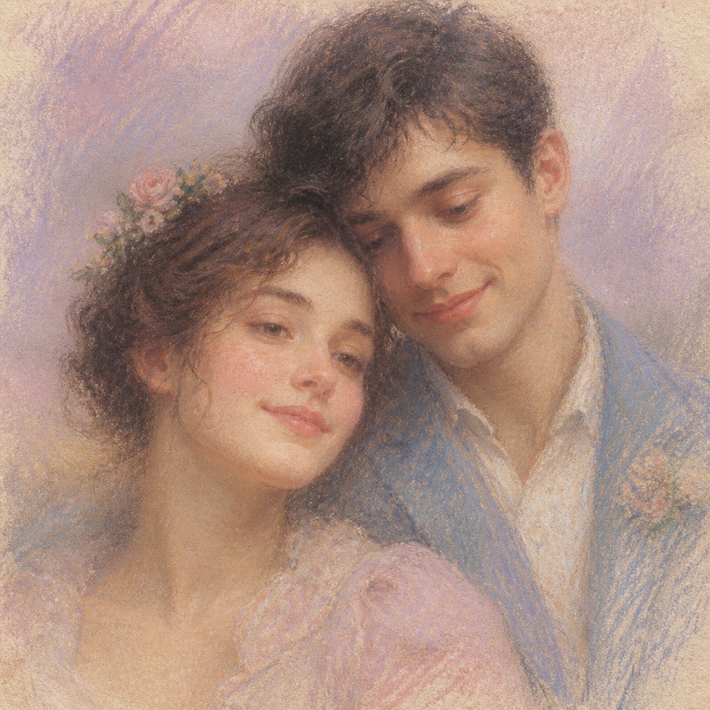
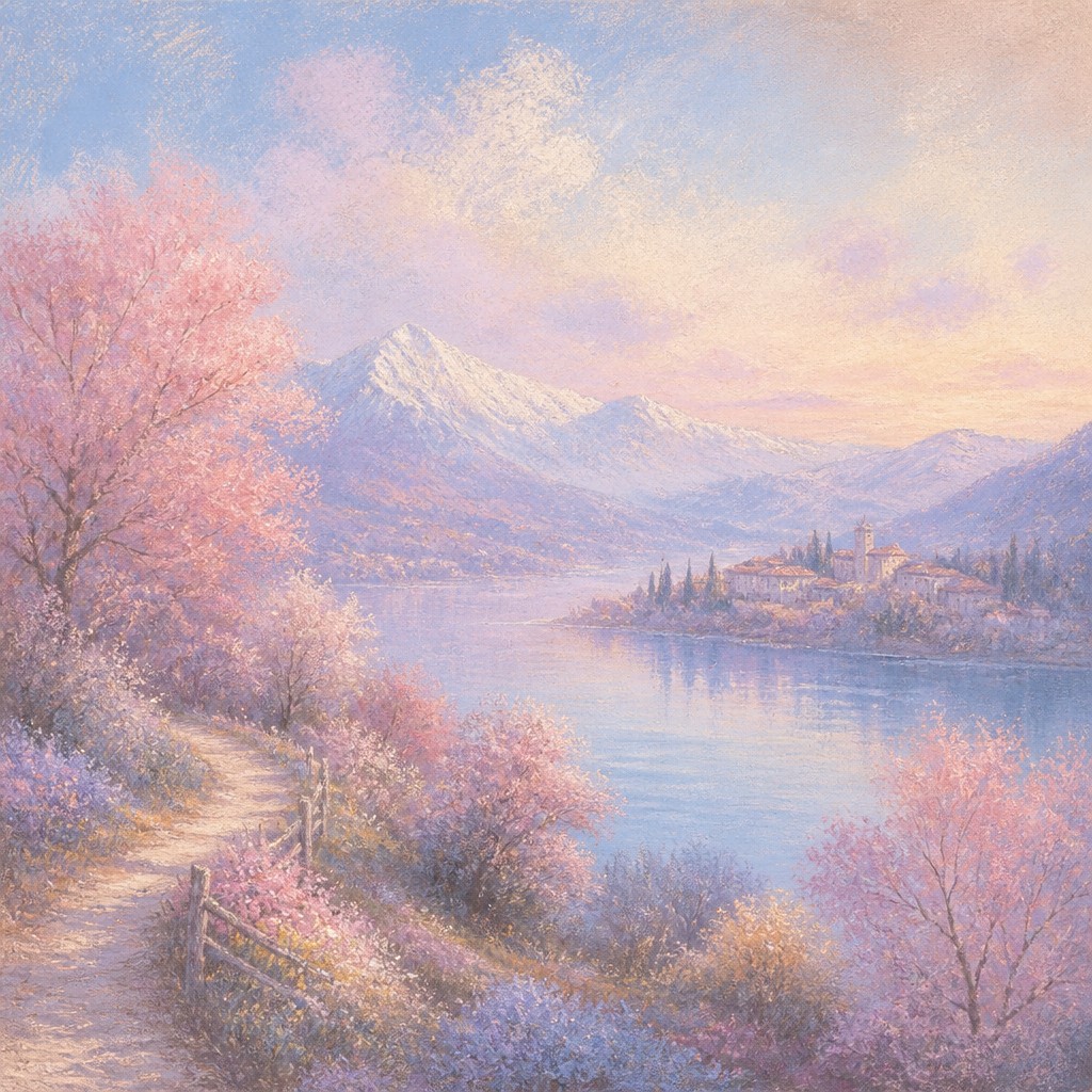
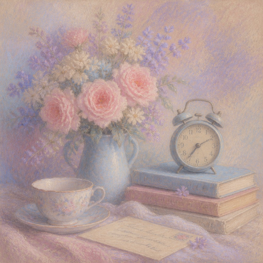
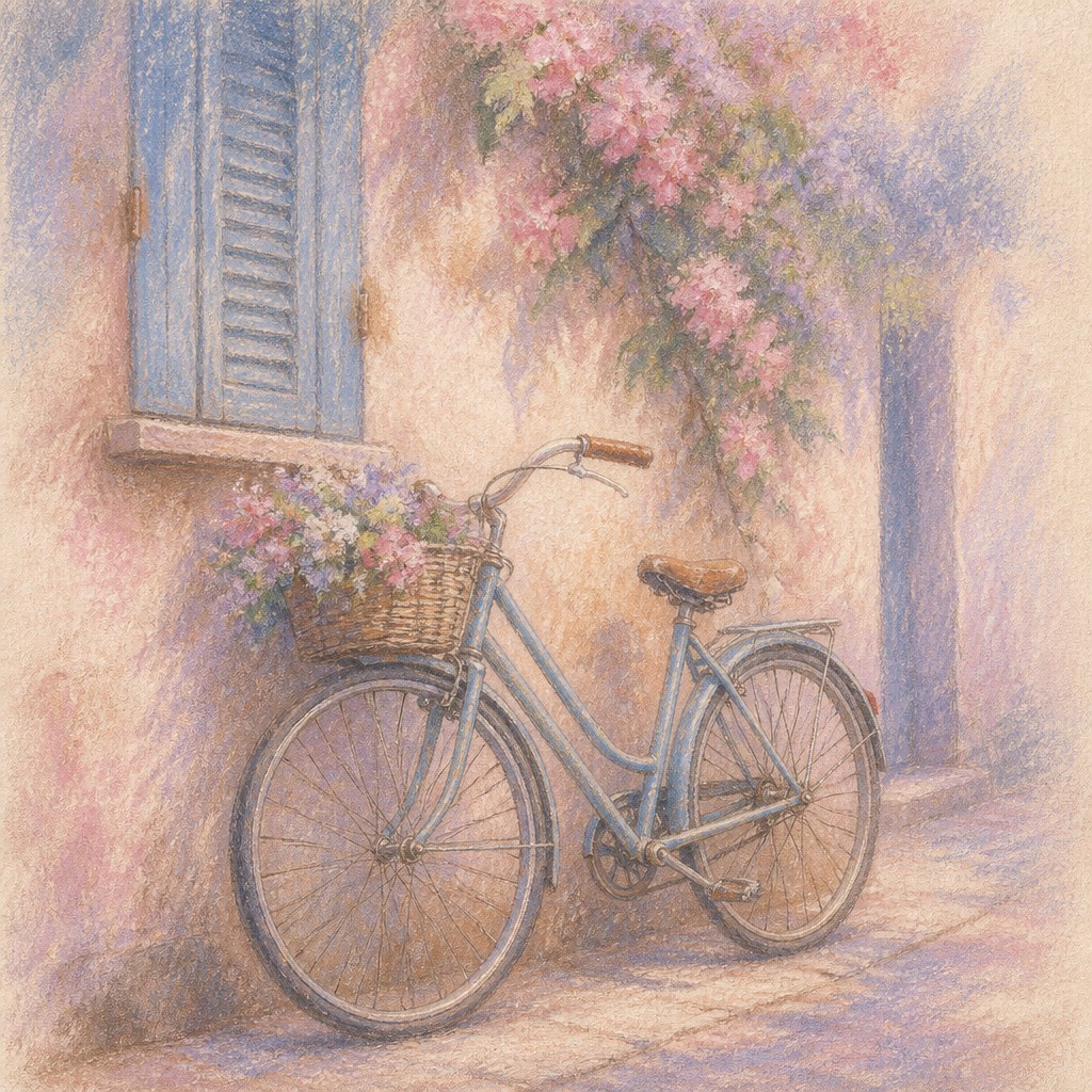
Pastel art style uses soft chalk pigments, powdery blending, and luminous textured surfaces to create a dreamy, delicate look. It often feels velvety and tactile, with colors that sit visibly on the surface and edges that can be gently softened or left expressive.
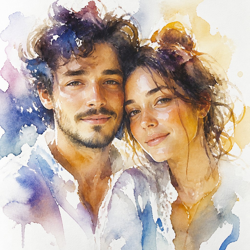
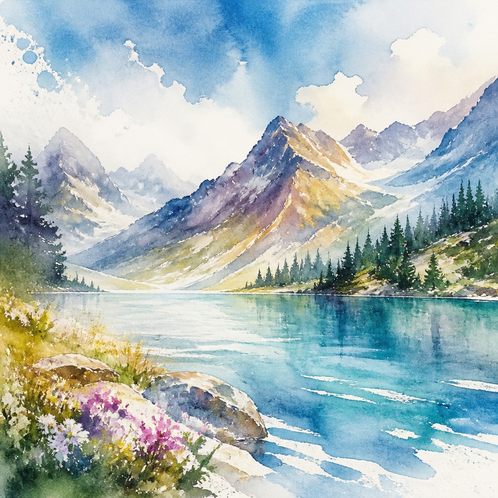
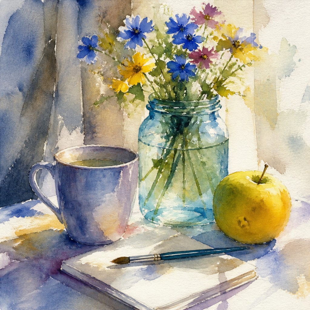
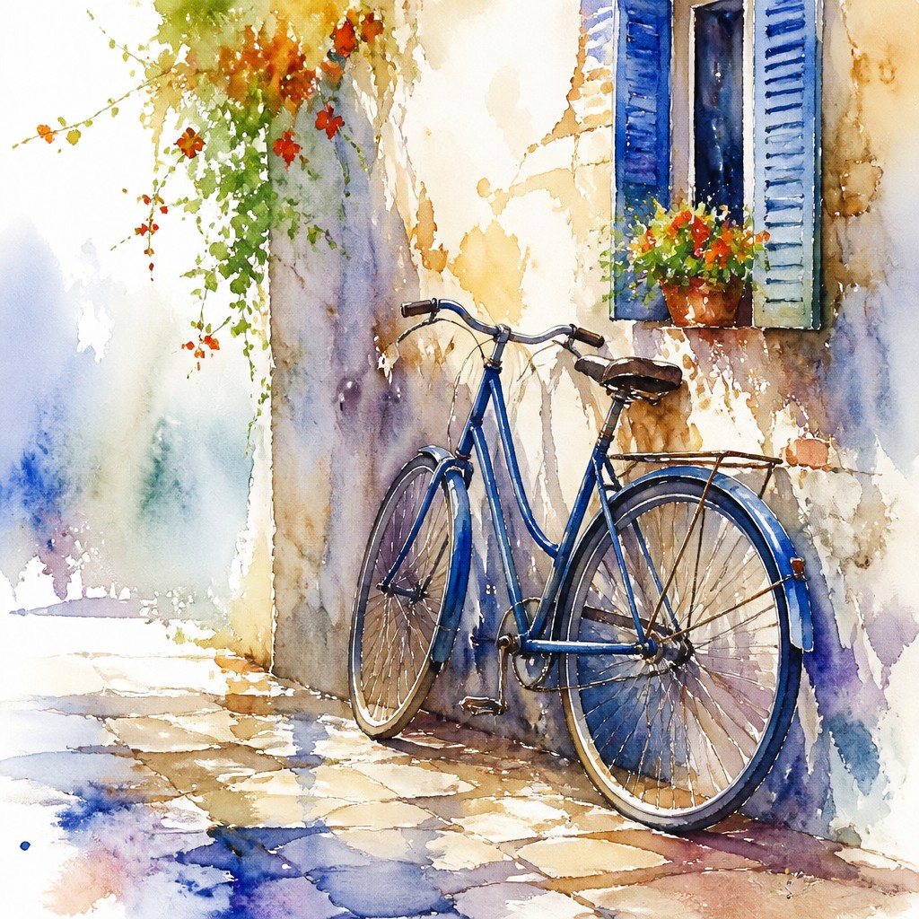
Watercolor portrait art style creates fresh, luminous portraits with transparent washes, wet-into-wet edges, and airy white space. People compare the two because both can feel light, subtle, and atmospheric, yet they achieve that effect in very different ways: pastel builds with dry pigment and texture, while watercolor relies on transparency and flow.
Same Prompt, Both Styles
Each pair below was generated from the identical prompt — only the style changed.
“portrait of two people together”
“wide landscape with natural scenery”
“still life with everyday objects”
“bicyle resting against a wall”
Key Differences
| Pastel | Watercolor Portrait | |
|---|---|---|
| Medium behavior | Dry pigment sits on the surface and can be layered into a velvety finish. | Fluid washes sink into paper and create transparent, flowing color. |
| Texture | Noticeable chalky grain and soft powdery bloom are part of the look. | Texture is quieter, often coming from paper grain and diluted pigment. |
| Edges | Edges can stay crisp or be gently smudged into soft transitions. | Edges often feather naturally through wet-into-wet spreading. |
| Portrait effect | Faces feel soft, sculpted, and richly tactile. | Faces feel fresh, airy, and open, with delicate light passing through. |
| Surface and space | Works often fill the surface with blended color and texture. | Works often preserve white space to enhance brightness and breathability. |
| Mood | dreamy, romantic, gentle, intimate | ethereal, delicate, expressive, luminous |
| Energy | calm | calm |
| Detail level | detailed | moderate |
| Color | soft powdery muted pastels | soft transparent washes, light natural tones |
| Texture | velvety matte with visible tooth | fluid washes, soft blooms, paper grain |
| Origin | 18th-century Europe | 18th-century Europe |
| Best for | portrait art, landscapes, children's books, editorial illustrations, greeting cards, album covers | portrait commissions, editorial illustrations, book covers, greeting cards, fine art prints |
| Difficulty | moderate | advanced |
Which Should You Choose?
Pick pastel art style if you want a richer tactile surface, softer chalky transitions, and a dreamy finish that can feel intimate and luxurious. Pick watercolor portrait art style if you want a lighter, more transparent look with spontaneous edges, glowing skin tones, and visible breathing room from the paper. Choose pastel for stronger surface texture and more control over opaque color; choose watercolor for freshness, translucency, and a sense of lightness.
Frequently Asked Questions
Which style is more textured?
Pastel art style is usually more textured because the dry pigment stays visible on the surface. Watercolor can show paper texture, but it generally looks smoother and more transparent.
Which style looks lighter and airier?
Watercolor portrait art style usually feels lighter because it uses transparent washes and white paper for luminosity. Pastel can be airy too, but it typically reads as softer and more plush than transparent.
Which style is better for realistic portraits?
Both can be realistic, but they emphasize different qualities. Pastel is strong for soft modeling and skin texture, while watercolor is strong for luminous color relationships and expressive edges.
Can these styles be confused with each other?
Yes, because both can appear gentle, colorful, and atmospheric. The key difference is that pastel looks dry and powdery, while watercolor looks fluid and transparent.