Pop Art Still Life Art Style
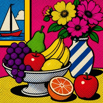
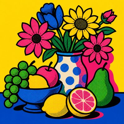
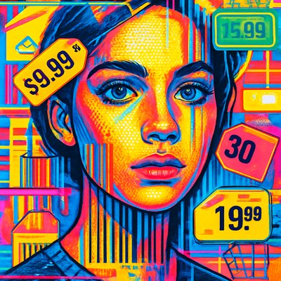
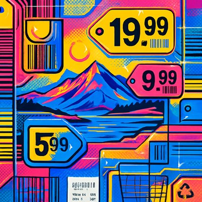
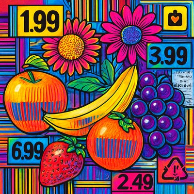
Bold still life imagery with pop colors, halftones, repetition, and graphic simplification inspired by commercial print culture.
Instantly rendered in Pop Art Still Life — or transform a photo
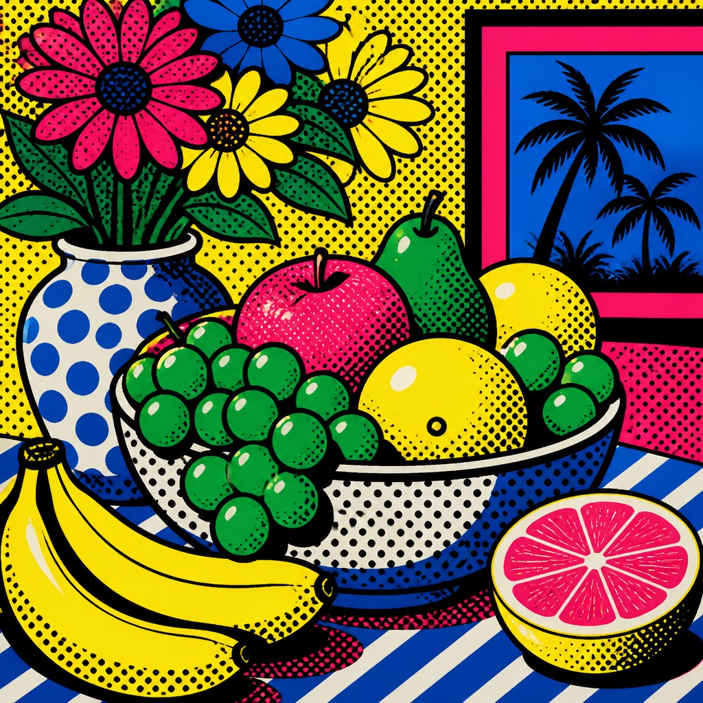
Pop Art Still Life Gallery
Tap any artwork to explore it
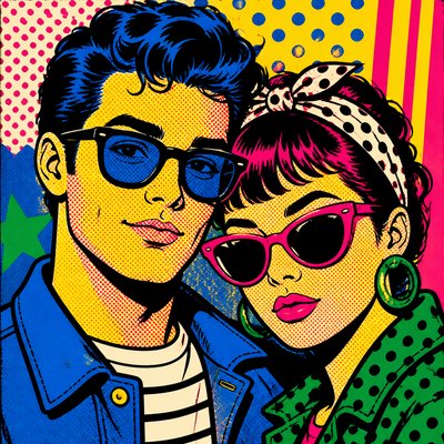
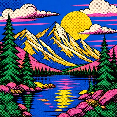
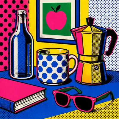
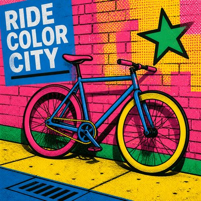
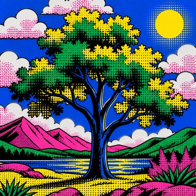
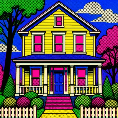
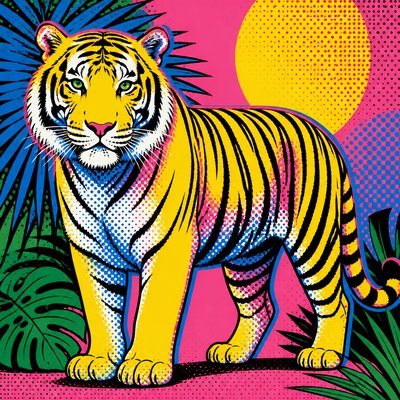
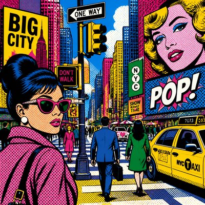
What is Pop Art Still Life Art Style?
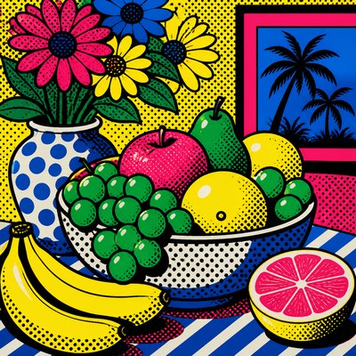
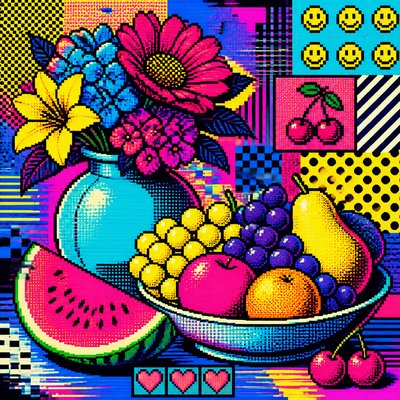
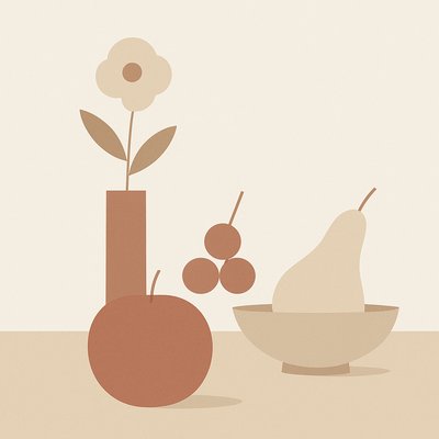
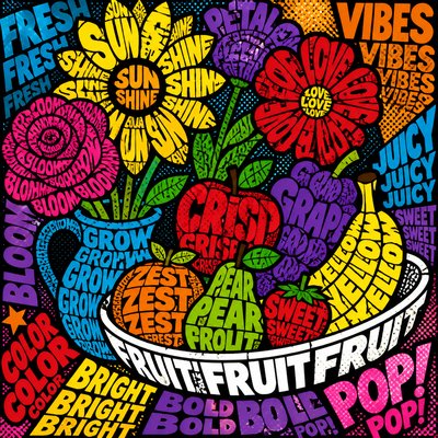
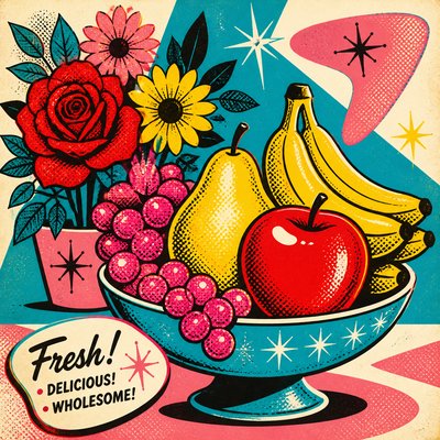
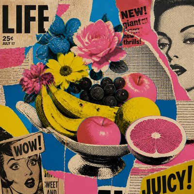
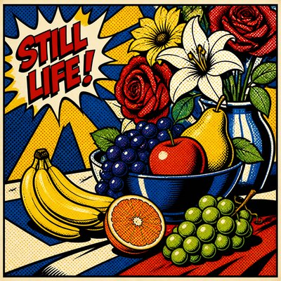
Pop art still life turns ordinary consumer goods into graphic icons. Bottles, cans, boxes, fruit bowls, and packaged foods are simplified into hard-edged shapes, then repeated or rearranged to emphasize pattern, branding, and visual rhythm rather than naturalistic depth. The result is a still life language that feels bright, direct, and unmistakably commercial.
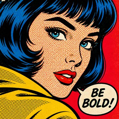
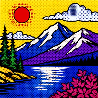
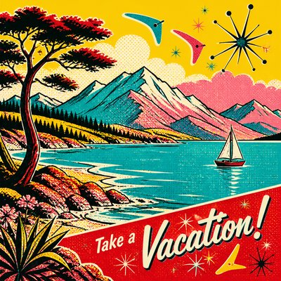
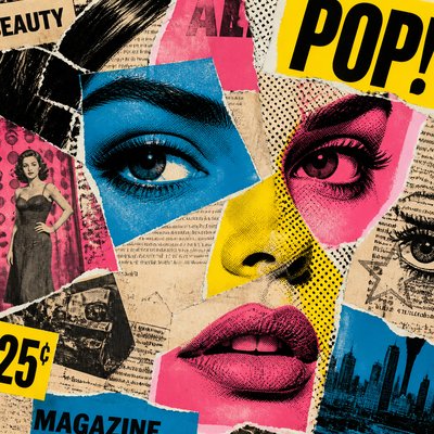
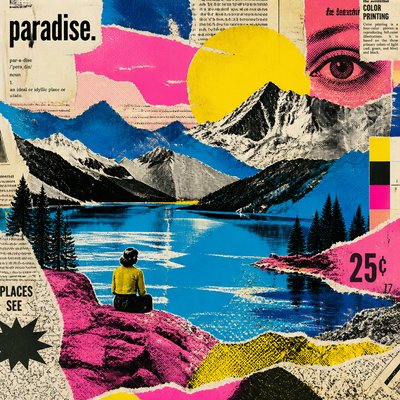
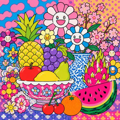
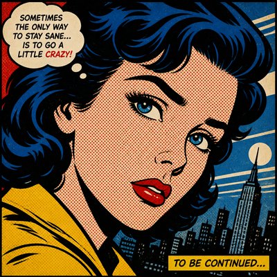
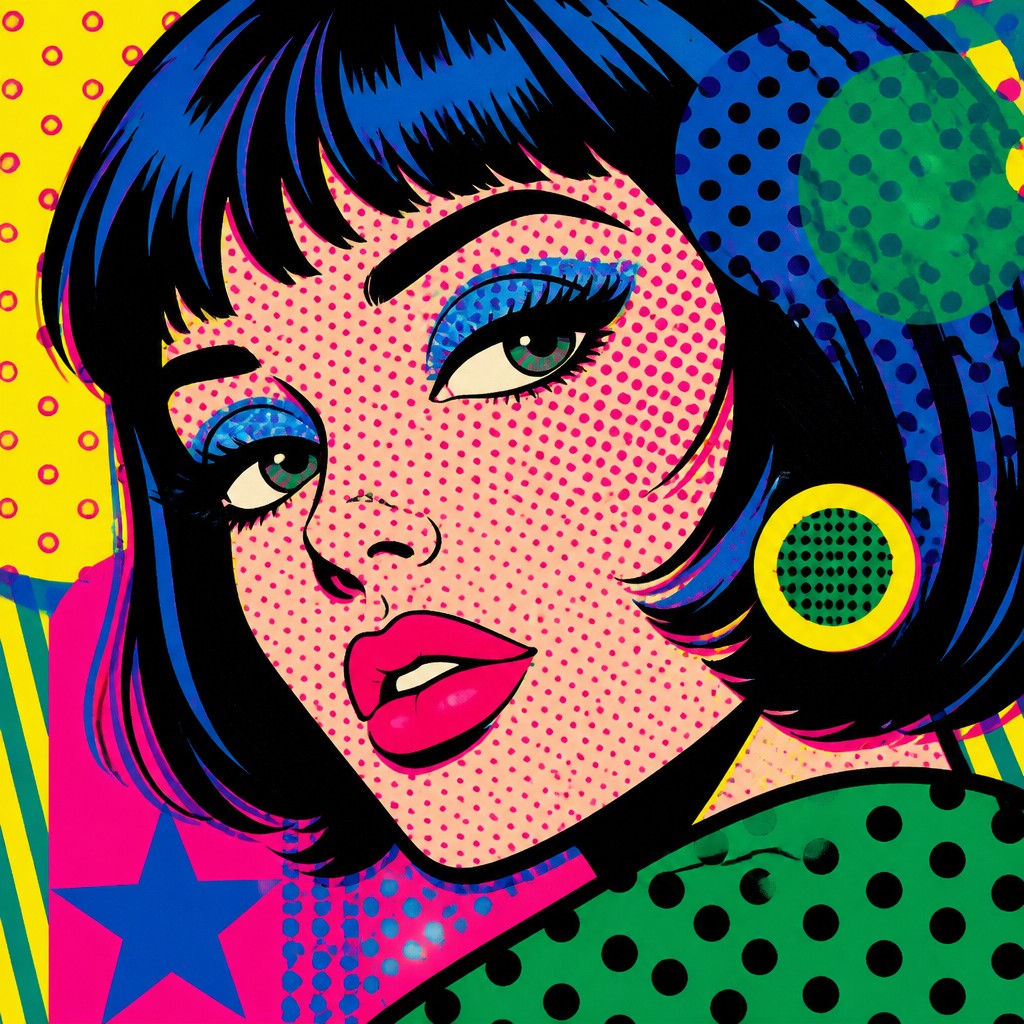
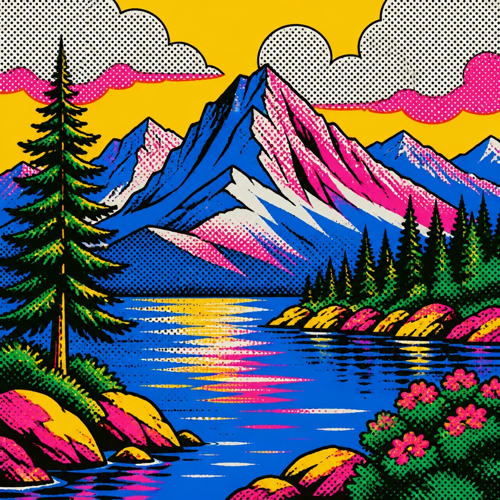
Its look comes from the visual vocabulary of mid-20th-century advertising and print production: saturated color, thick outlines, halftone dots, flat lighting, and slight misregistration that echoes screen printing or poster work. Instead of painterly modeling, objects are reduced to clean silhouettes and bold color blocks, giving everyday products the same visual presence once reserved for high art subjects.
Try It On Your Photos
Upload any photo and convert it into Pop Art Still Life Art Style — drag the sliders to compare before and after.



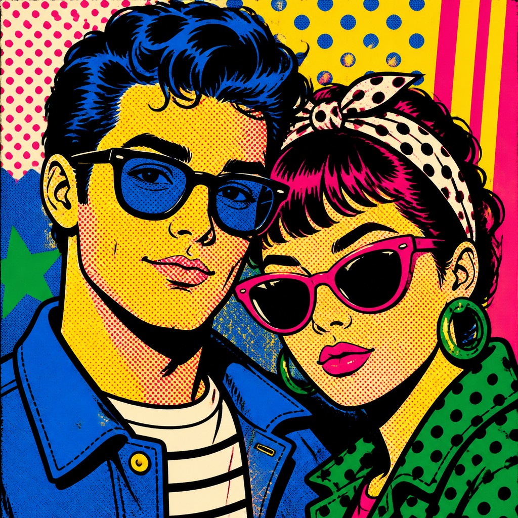
What Defines Pop Art Still Life Art Style
The signature details, up close
Consumer goods as subjects
The style focuses on recognizable products such as soup cans, soda bottles, cereal boxes, cosmetics, and packaged snacks. Everyday items are treated as icons rather than ordinary objects.
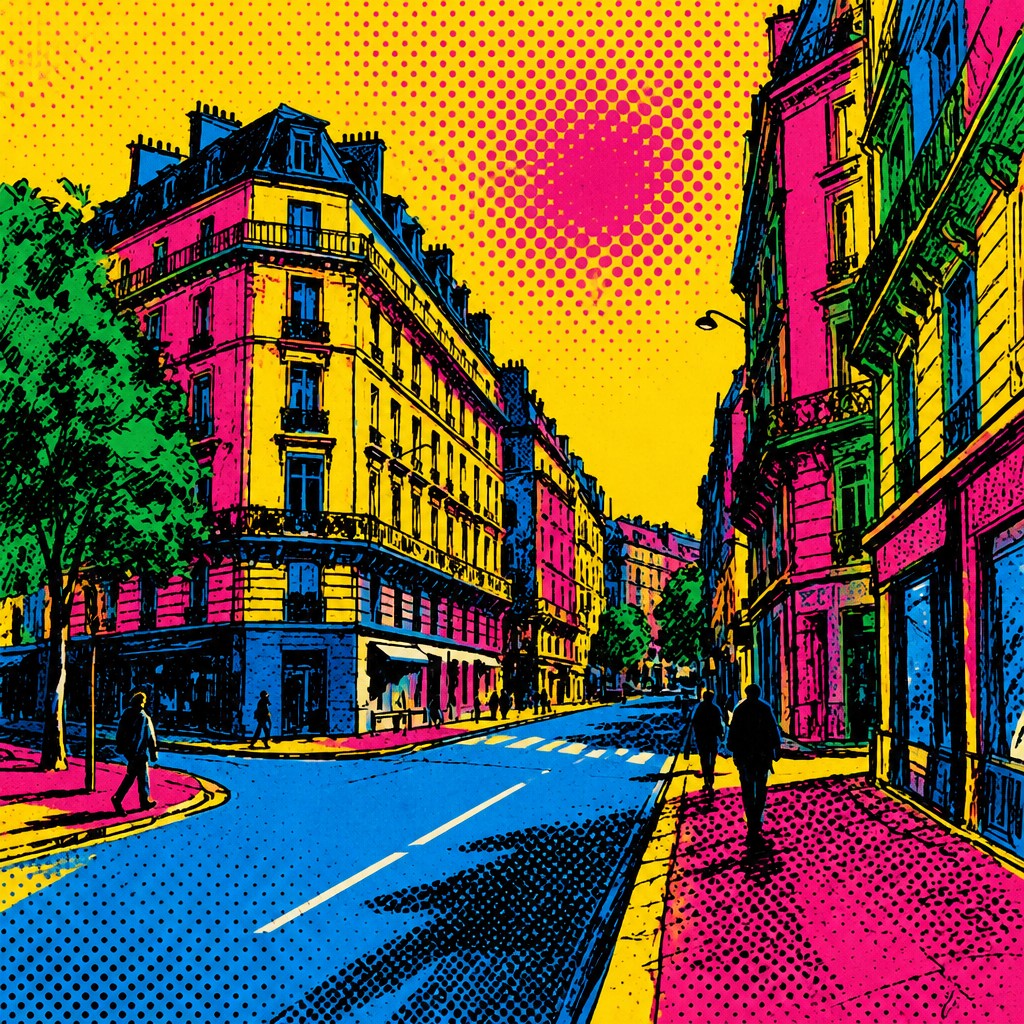
Flat, saturated color
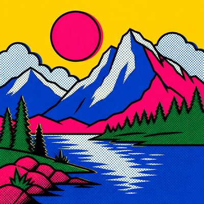
Color is typically bright and artificial, using primaries, secondary colors, and glossy advertising tones. Shadows are minimized or eliminated in favor of simple color fields.
Thick outlines and hard edges
Forms are defined with strong contour lines and sharp boundaries. This keeps the image legible at a glance and gives it a poster-like clarity.
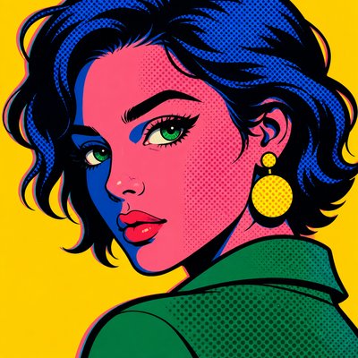
Halftone and Ben Day textures
Printed-dot textures suggest comic books, newspaper reproduction, and commercial screen printing. These marks add visual grain without returning to realistic shading.
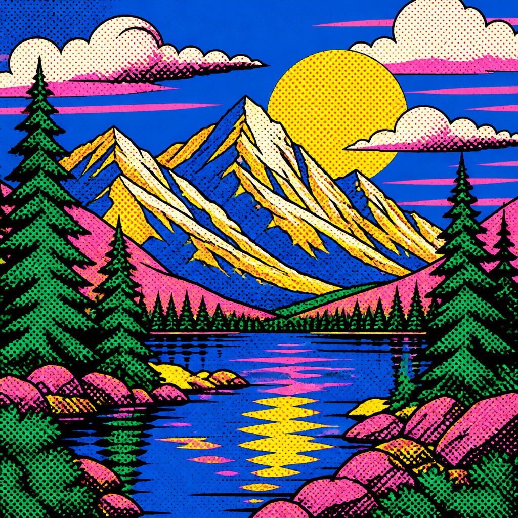
Repetition and seriality
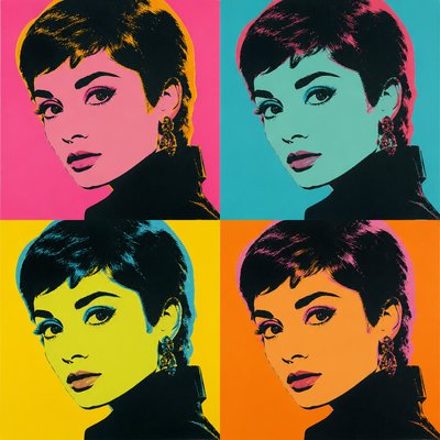
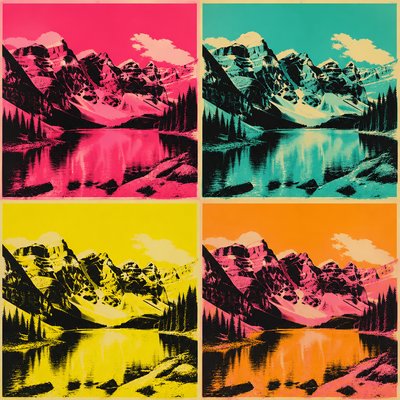
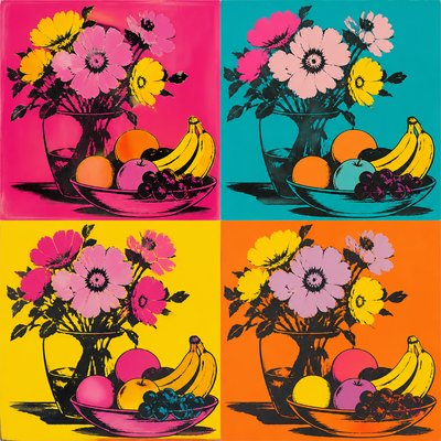
Objects often appear in multiples or in orderly arrays. Repetition creates rhythm and emphasizes the industrial, mass-produced character of the subject.
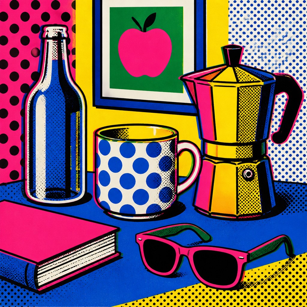
Graphic simplification
Details are reduced to essential symbols, labels, and silhouettes. The goal is not illusionistic realism but a stylized, instantly readable image.
Try It
Create Videos in Pop Art Still Life Art Style
Styles aren't just for stills — describe a scene or animate an image and get a short video rendered in Pop Art Still Life. Press play to see this pond come to life.
Make a VideoPop Art Still Life Prompt Ideas
Start from an idea — each one opens the generator with the style ready to go. See all 40 Pop Art Still Life prompts →
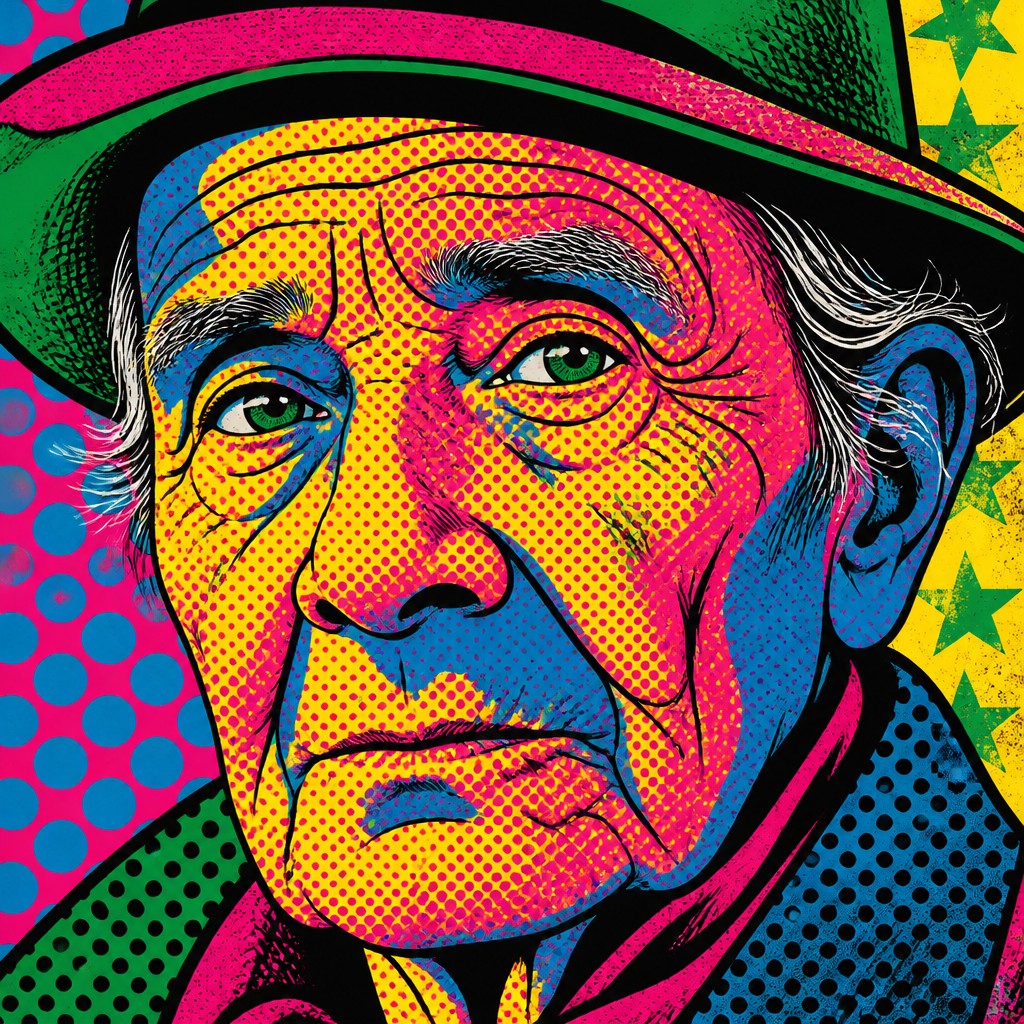
“close-up portrait of an elderly person with expressive weathered features”
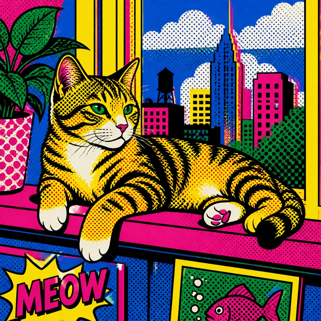
“a cat lounging in a sunlit window”
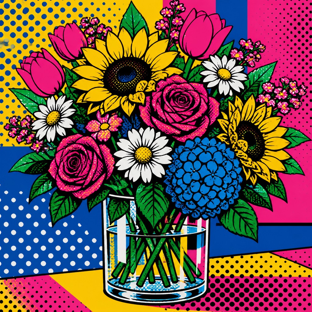
“bouquet of flowers in a glass vase”
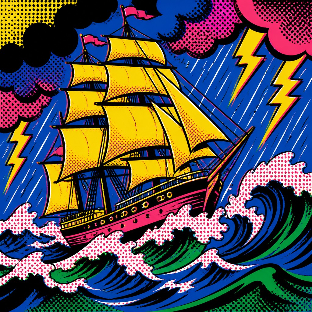
“sailing ship on a stormy sea”
How to Create Pop Art Still Life Art
Master the craft step by step — or skip straight to creating. Read the full guide →
- 1
Choose recognizable commercial objects
Start with products that have strong shapes, labels, or brand-coded colors. Compose them like a classic still life, but group them so their repetition and packaging design become the main visual interest.
- 2
Simplify forms into bold planes
When working traditionally, sketch clear contours and block in flat areas of color before adding texture. In digital work, use shape layers or crisp brushwork to avoid soft modeling and preserve a poster-like finish.
- 3
Use a pop-inspired palette
Build the palette around electric blue, hot pink, chrome yellow, emerald green, and other saturated hues. Keep highlights stylized rather than naturalistic so the objects feel printed and iconic.
- 4
Add halftone and screen-print effects
Introduce dot patterns, slight ink overlap, and subtle registration shifts to simulate print reproduction. These details help the image feel tied to commercial graphics instead of painterly realism.
- 5
Repeat motifs for rhythm
Duplicate cans, bottles, fruit, or labels in rows, grids, or mirrored arrangements. Repetition is one of the clearest ways to evoke the style and can make even simple objects feel conceptually charged.
- 6
Use text prompts that specify print qualities
For generation, describe the subject plus key traits such as flat lighting, thick outlines, halftone dots, screen-printed texture, saturated color, and repeated motifs. Avoid language that suggests realism, soft gradients, or atmospheric depth.
The Story
History & Origins of Pop Art Still Life
Pop art still life draws from the broader Pop Art movement of the 1950s and 1960s, when artists in Britain and the United States used consumer goods, mass media imagery, and advertising language as artistic subject matter. In that context, still life was no longer mainly about flowers, fruit, or tableware in the classical sense; it became a way to examine abundance, repetition, brand identity, and the visual saturation of modern life.
Its aesthetic lineage also includes commercial printing, packaging design, comic art, and poster graphics. The style reflects the look of screen-printed posters, magazine reproduction, and product ads, where flat color, halftone texture, and simplified forms were practical as well as expressive. In fine art, major postwar pop artists helped establish the visual and conceptual foundation for this approach, though the still-life variant is less a single historical school than a contemporary synthesis of those influences.
Influences: This style is closely related to Pop Art, especially the work of major postwar pop artists in Britain and the United States, as well as to comic-book illustration, screen printing, advertising, and package design. It also shares visual traits with poster art and the flat color logic of graphic design, but its defining feature is the transformation of commercial objects into art subjects through repetition, simplification, and print-based texture.
Frequently Asked Questions
What defines pop art still life art style?
It combines still-life composition with the visual language of Pop Art: consumer products, bright flat color, thick outlines, halftone texture, and repeated forms. Rather than painting objects naturally, it turns them into graphic icons. The style often looks like something printed on packaging, a poster, or a comic page.
How is this different from traditional still life painting?
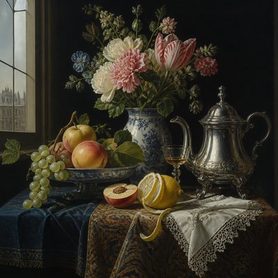
Traditional still life usually emphasizes light, volume, and material realism, often with fruit, flowers, or tableware. Pop art still life replaces that naturalistic approach with commercial subjects and bold graphic treatment. The emphasis shifts from observation to cultural commentary and visual impact.
Is this the same as Pop Art?
Not exactly. Pop Art is the broader historical movement, while pop art still life is a subject-specific application of its visual language. It focuses on arranged objects and consumer goods rather than portraits, celebrities, or general media imagery.
What subjects work best in this style?
Everyday packaged goods work especially well: cans, bottles, snack wrappers, cosmetics, boxes, and household products. Objects with recognizable labels and simple silhouettes are easiest to stylize. Fruit or flowers can also work if they are treated as graphic objects rather than natural forms.
How do I make this style digitally?
Use flat color layers, crisp edges, and a limited set of saturated hues. Add halftone dots, slight misregistration, and repetition to mimic print processes. Avoid gradients, heavy blending, and realistic shadow rendering.
Where is this style commonly used?
It appears in poster design, editorial illustration, album art, fashion graphics, product-inspired artwork, and contemporary decorative prints. It is also popular in image-making that wants a retro-commercial feel without becoming fully nostalgic or literal.
Create your first Pop Art Still Life artwork
Describe anything — or upload a photo — and see it in Pop Art Still Life Art Style in seconds.
Make Something with Pop Art Still Life
Related Styles
Discover similar art styles