Retro Pop Art Style
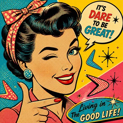
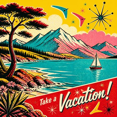
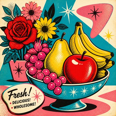
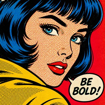
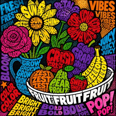
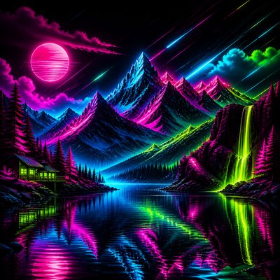
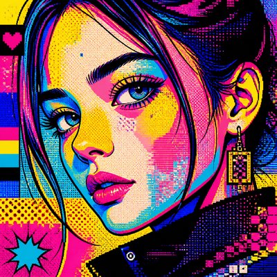
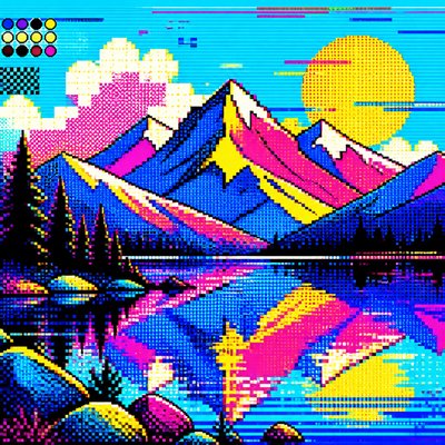
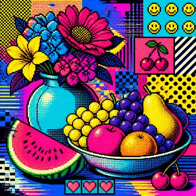
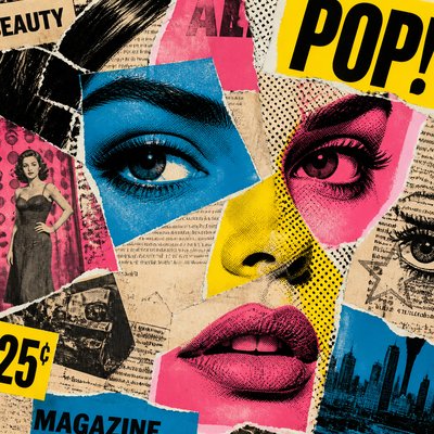
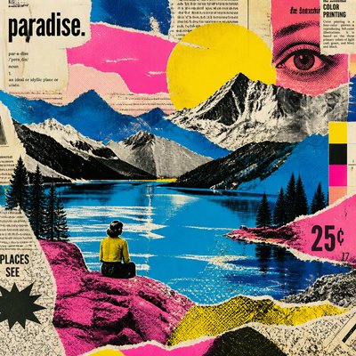
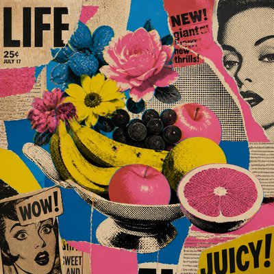
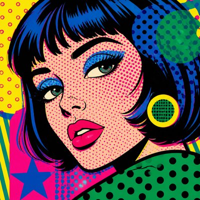
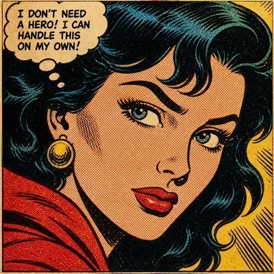
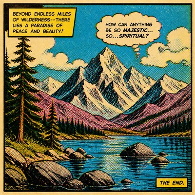
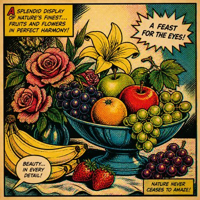
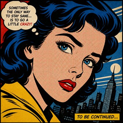
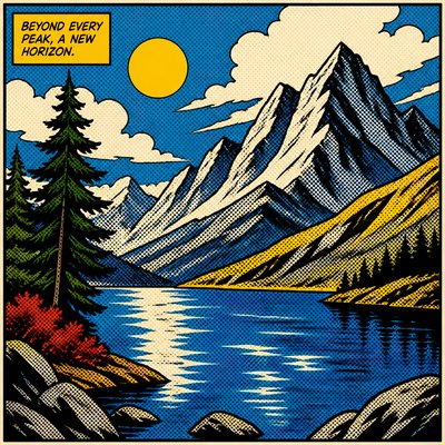
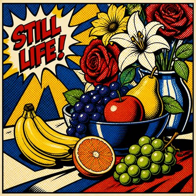
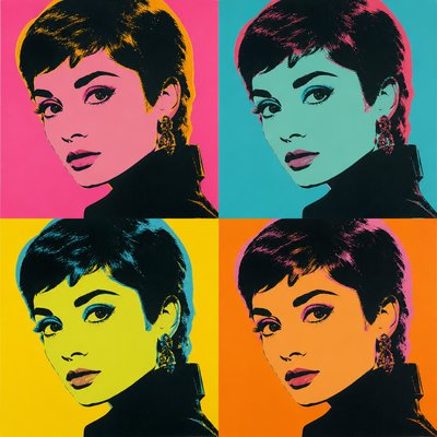
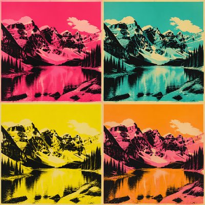
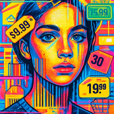
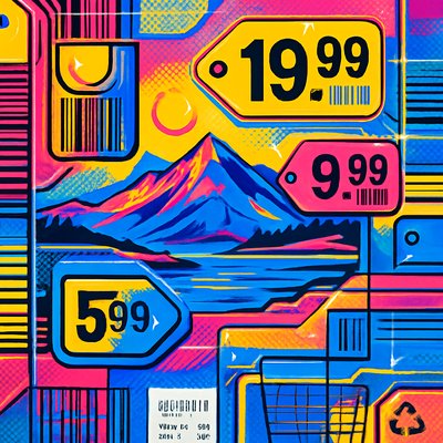
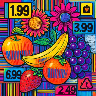
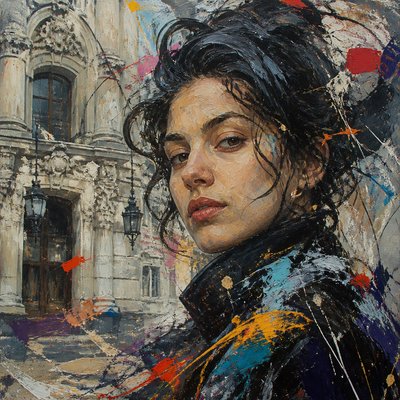
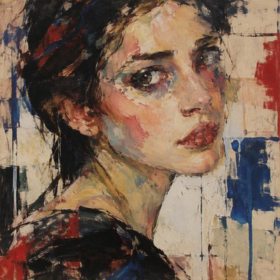
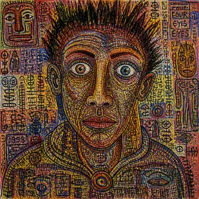
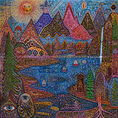
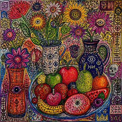
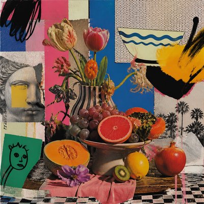
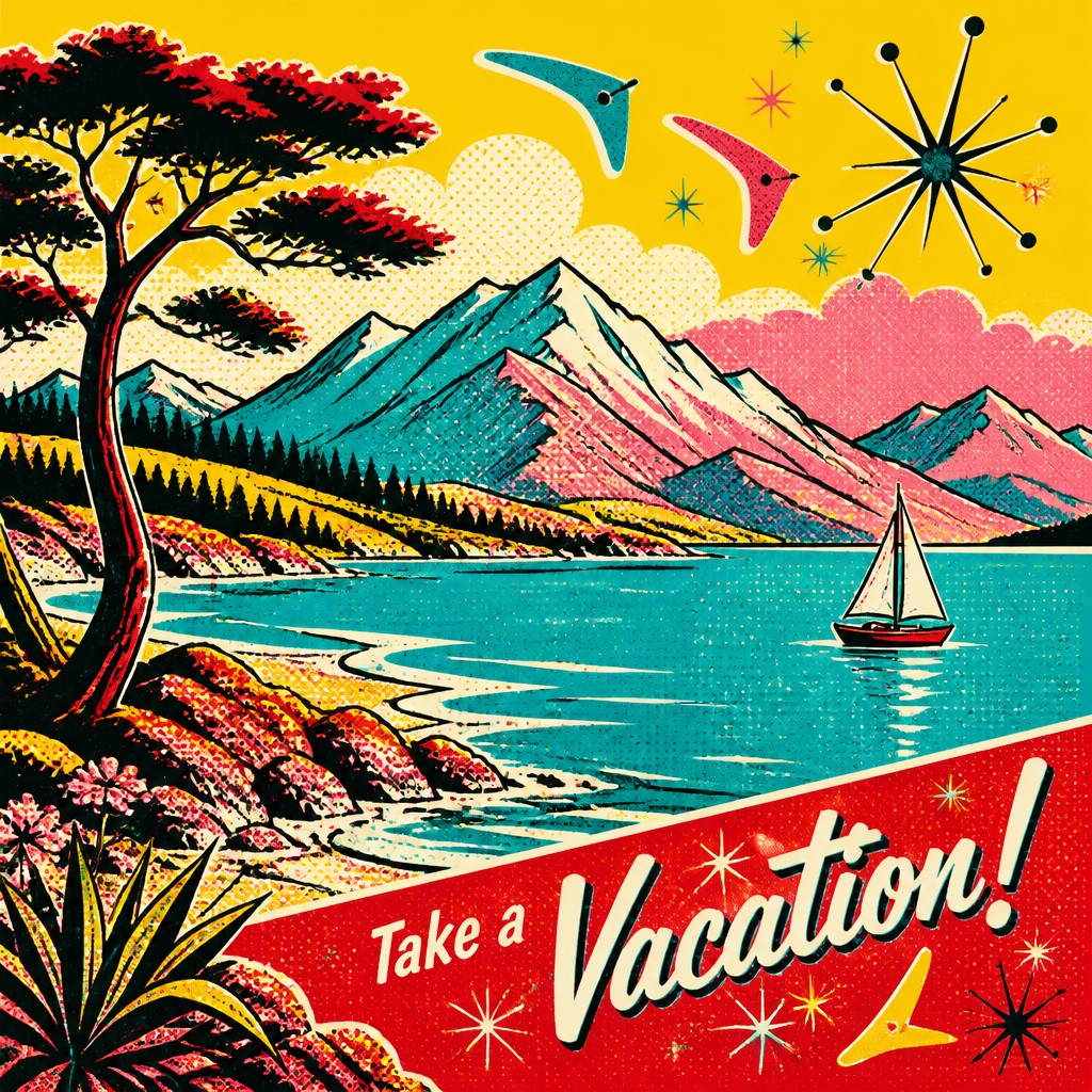
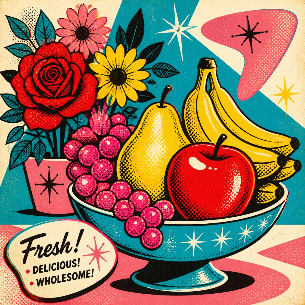
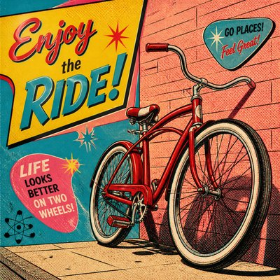
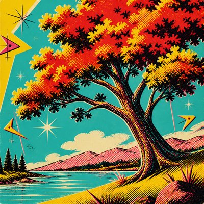
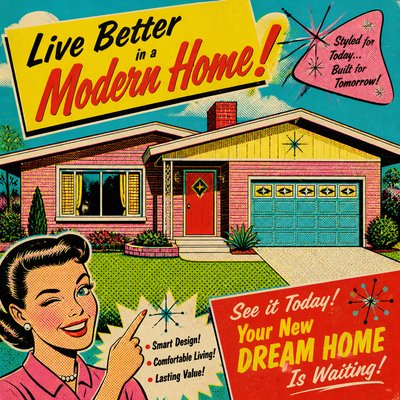
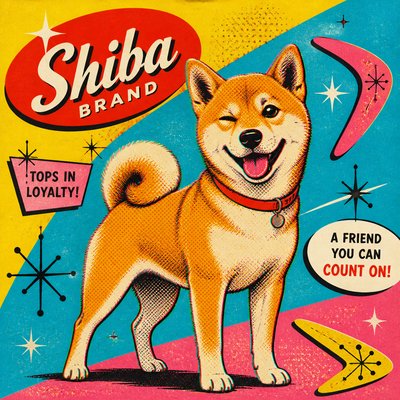
1950s–60s commercial-inspired style with halftone dots, bold outlines, atomic motifs, and saturated vintage advertising colors.
Instantly rendered in Retro Pop — or transform a photo

Retro Pop Gallery
Tap any artwork to explore it

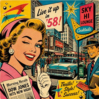
What is Retro Pop Art Style?
Retro Pop Art Style is a nostalgic visual language built from the look of mid-century commercial illustration, advertising, and comic printing. It borrows the flattened forms, loud color contrasts, and mechanically reproduced textures of 1950s and 1960s mass media, then adds a wink of irony that makes the imagery feel both celebratory and self-aware.
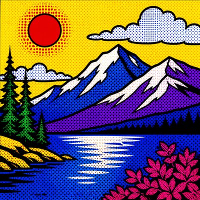
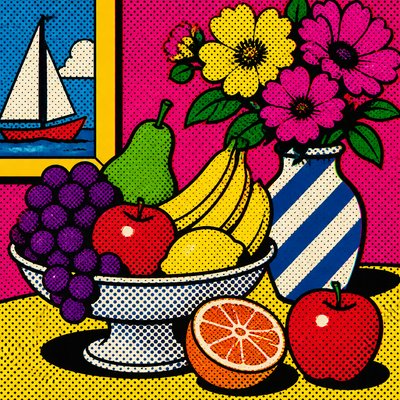
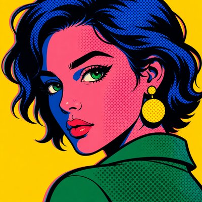
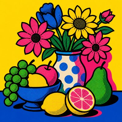
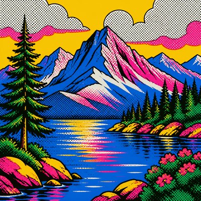
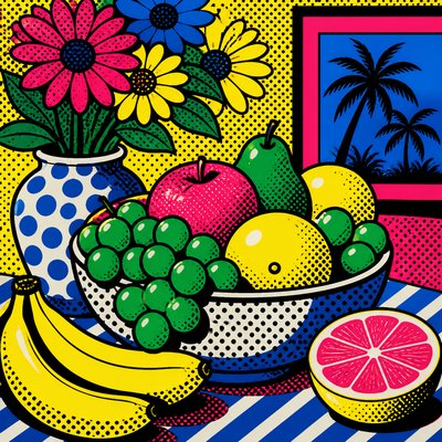
Its identity is defined by thick black outlines, Ben Day halftone dots, screen-printed grain, and a palette drawn from vintage packaging and magazine ads: cherry red, sunshine yellow, turquoise blue, and bubblegum pink. Atomic-age starbursts, boomerangs, and diagonals give the compositions a buoyant, optimistic energy, while deliberate print imperfections such as CMYK misregistration evoke the look of offset reproduction and help the style feel authentically period-specific.

Try It On Your Photos
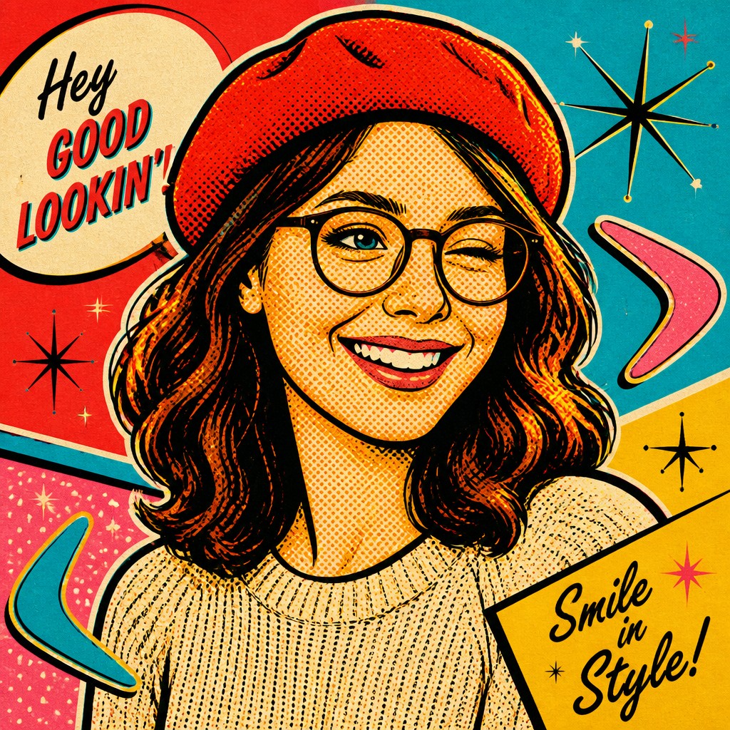
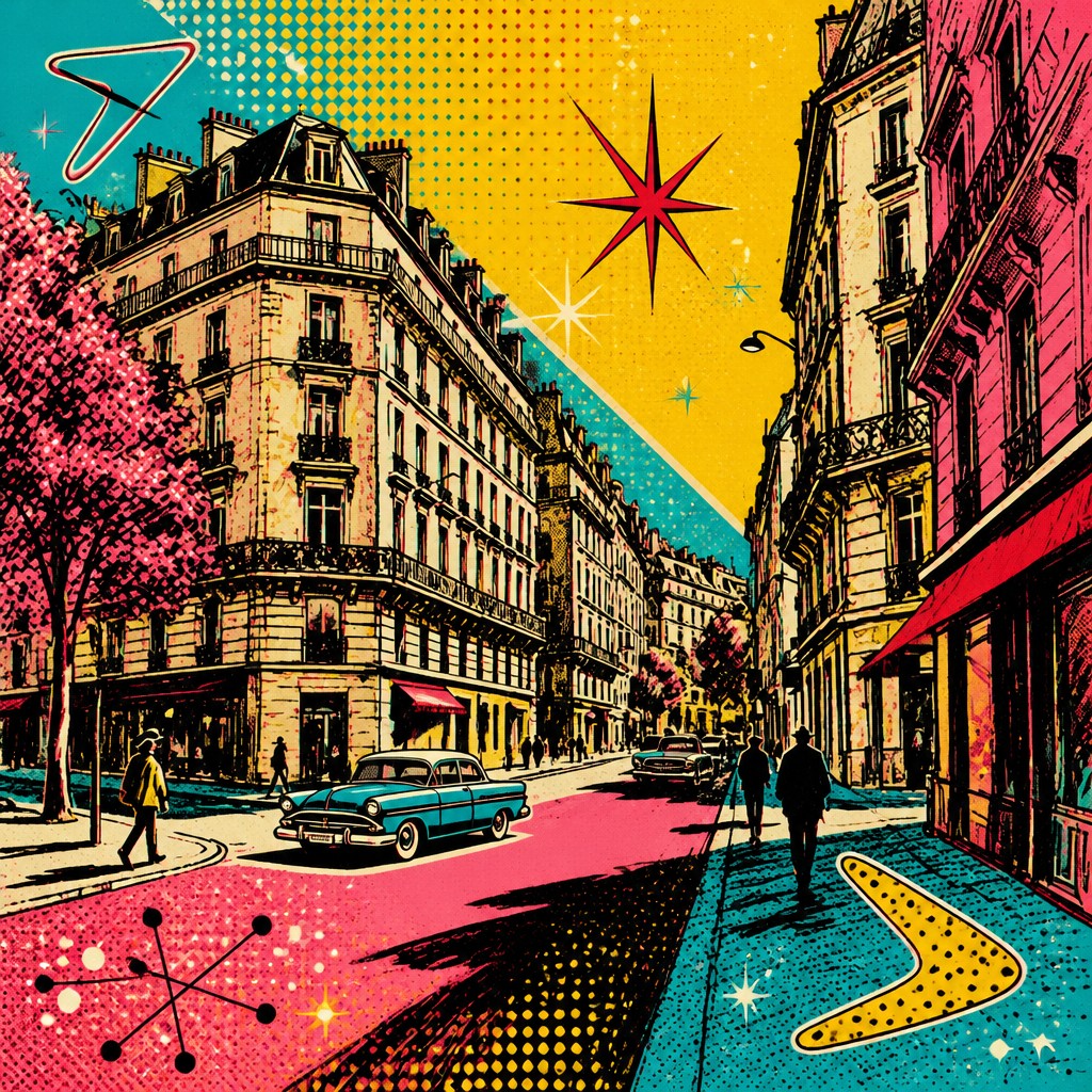
Upload any photo and convert it into Retro Pop Art Style — drag the sliders to compare before and after.


What Defines Retro Pop Art Style
The signature details, up close
Ben Day halftone texture
Small, evenly spaced dots and mechanical screening imitate the look of vintage print reproduction. The texture adds visual noise and immediately places the image in a mid-century mass-media context.
Bold black contour lines
Thick outlines separate shapes clearly and give figures, objects, and lettering strong graphic presence. This linework echoes comic panels, advertising illustrations, and poster design.
Vintage advertising palette
The color scheme relies on saturated, cheerful hues such as red, yellow, teal, and pink, often with limited mixed tones. The result feels printed, economical, and unmistakably period-coded.
CMYK misregistration and print wear
Slight color shifts, rough edges, and screen-printed texture simulate offset printing and mass production. These imperfections make the image feel physical rather than digitally seamless.
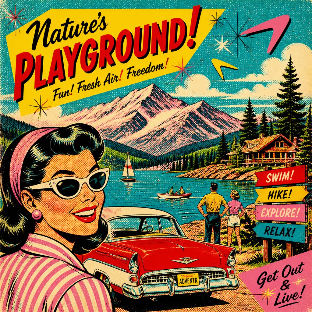
Atomic-age motifs
Starbursts, boomerangs, rays, and burst shapes recall 1950s design optimism and space-age consumer aesthetics. They function as decorative accents and as symbols of modernity.
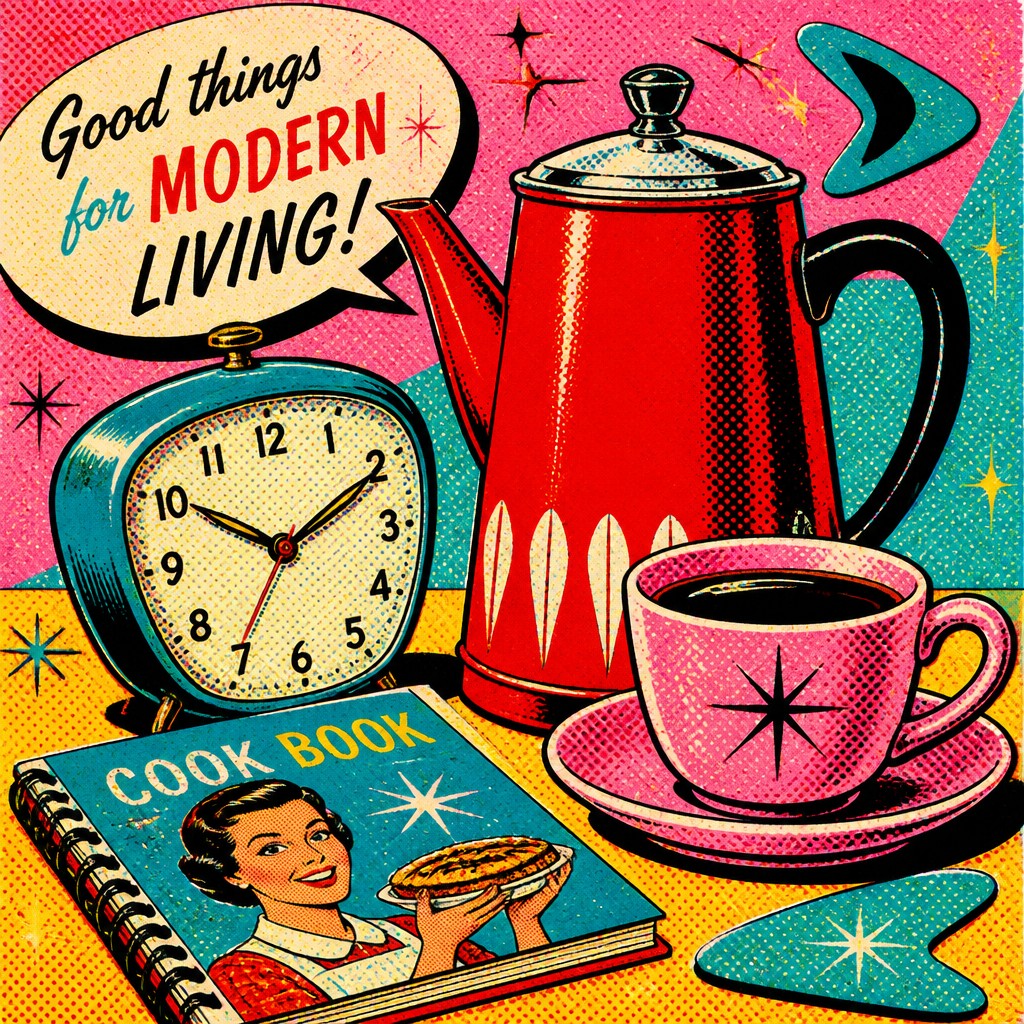
Dynamic diagonal composition
Instead of static framing, the image often uses angled layouts, staggered elements, and energetic asymmetry. This creates the sense of a lively ad, cover, or comic panel captured in motion.
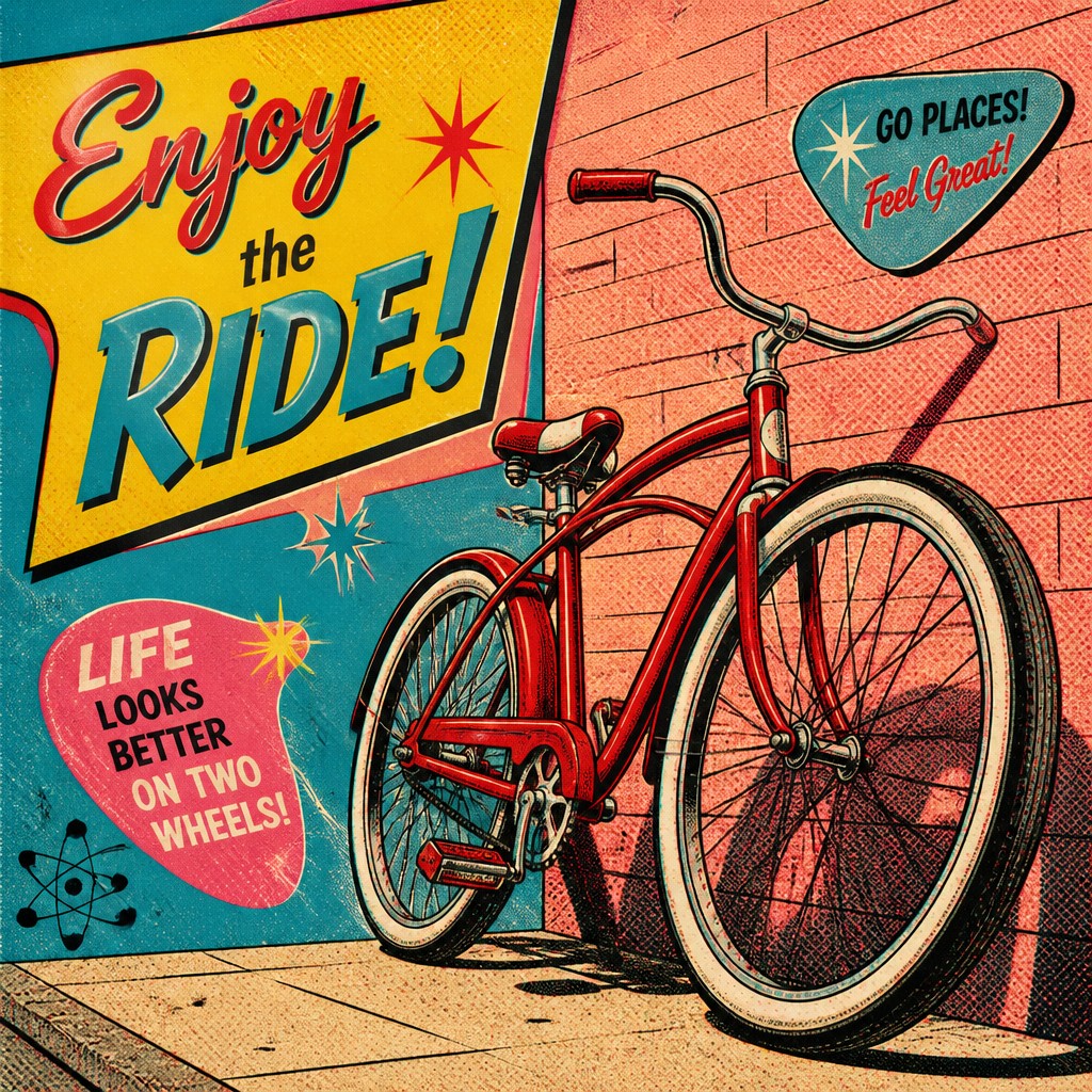
Glossy commercial finish
Surfaces are rendered as if they belong to packaging, magazine illustration, or promotional art. Even when the subject is ordinary, the presentation feels polished and persuasive.
Try It
Create Videos in Retro Pop Art Style
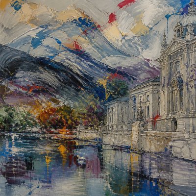
Styles aren't just for stills — describe a scene or animate an image and get a short video rendered in Retro Pop. Press play to see this pond come to life.
Make a VideoRetro Pop Prompt Ideas
Start from an idea — each one opens the generator with the style ready to go. See all 40 Retro Pop prompts →
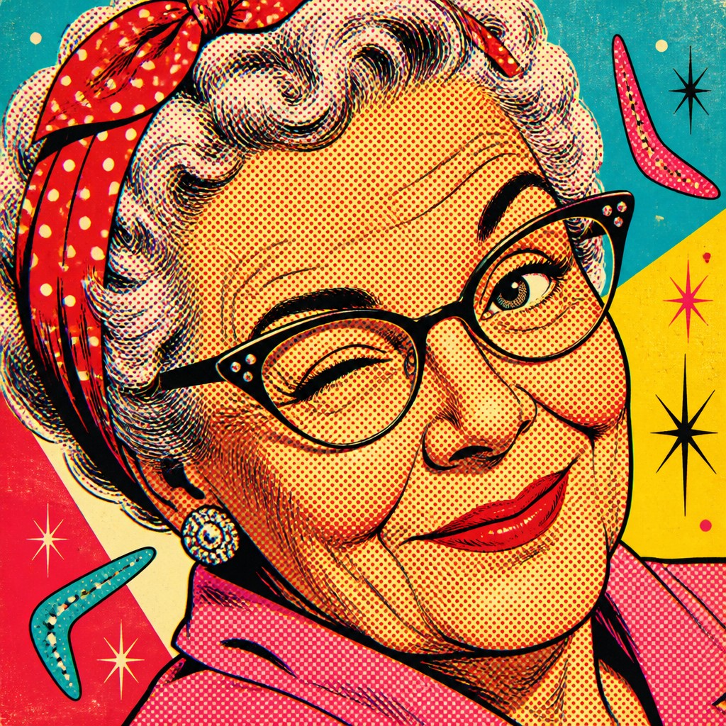
“close-up portrait of an elderly person with expressive weathered features”
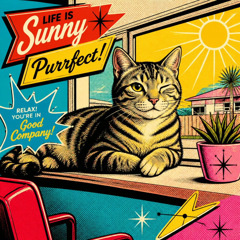
“a cat lounging in a sunlit window”
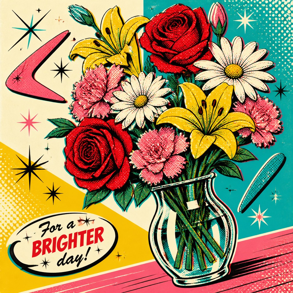
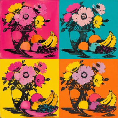
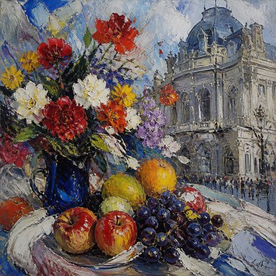
“bouquet of flowers in a glass vase”
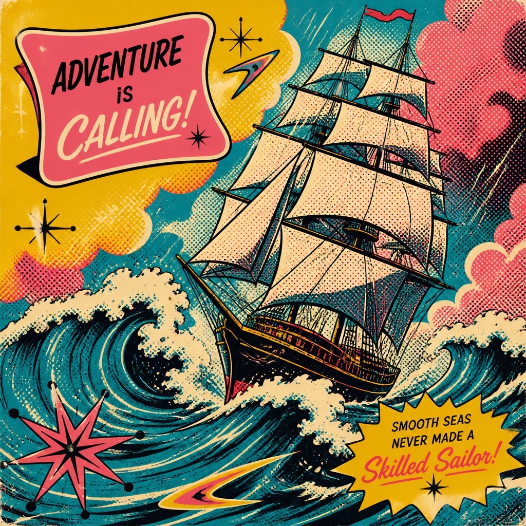
“sailing ship on a stormy sea”
How to Create Retro Pop Art
Master the craft step by step — or skip straight to creating. Read the full guide →
- 1
Simplify forms into bold graphic shapes
Start with clear silhouettes, limited detail, and strong figure-ground separation. In traditional work, use ink or vector-like brushes; in digital work, avoid soft shading and preserve crisp contour edges.
- 2
Restrict the palette to period colors
Choose a small set of saturated colors inspired by 1950s ads and packaging, then balance them with black and white. A limited palette helps the piece feel printed and historically grounded.
- 3
Add halftone and screen-print effects
Overlay Ben Day dots, halftone gradients, or visible print grain to simulate reproduction through magazine or poster printing. Subtle misalignment between color layers can greatly increase authenticity.
- 4
Use mid-century graphic motifs
Incorporate starbursts, swooshes, boomerangs, and atomic symbols to anchor the image in the era. These details work best as secondary shapes that support the main subject rather than overwhelming it.
- 5
Compose like an ad or comic cover
Build the image with diagonals, cropped framing, and strong focal hierarchy so it reads quickly from a distance. For prompt-based generation, specify objects, colors, halftone dots, thick outlines, and intentional print misregistration.
- 6
Balance nostalgia with irony
If you want the classic pop-art tension, present familiar consumer imagery with a slightly exaggerated, self-aware tone. That contrast between sincerity and critique is central to the style’s appeal.

The Story
History & Origins of Retro Pop
This style is not a single historical movement so much as a contemporary aesthetic lineage assembled from mid-century visual culture. Its sources include 1950s and 1960s American advertising, comic books, supermarket packaging, and industrial design, along with the broader Pop Art critique of consumer imagery associated with major postwar pop artists and sculptors. The style’s “retro” character comes from reproducing the design codes of those media rather than from any one canonical school.
Its visual language also reflects the optimism of the atomic age and the rise of postwar consumer culture, when bright graphics were used to sell appliances, food, cars, and domestic ideals. In digital and contemporary illustration, this look persists because it is instantly legible, highly reproducible, and rich in cultural association: it can read as playful nostalgia, media satire, or a polished homage to mid-century commercial art.
Influences: Retro Pop Art Style draws from mid-century American advertising, comic-book printing, package design, and the broader Pop Art tradition. It is especially related to the commercial imagery referenced by major postwar pop artists and sculptors, as well as the graphic optimism of atomic-age design and the simplified shapes of postwar illustration. Its current form also borrows from contemporary vintage revival graphics and screen-print aesthetics.
Frequently Asked Questions
What defines Retro Pop Art Style?
It is defined by the look of 1950s and 1960s commercial art: bold outlines, halftone dots, saturated vintage colors, and print imperfections. The style often includes atomic-age motifs and compositions that resemble advertisements, comic panels, or packaging.
Is this the same as Pop Art?
Not exactly. Pop Art is a historical art movement that emerged in the 1950s and 1960s, while Retro Pop Art Style is a contemporary aesthetic that imitates and reinterprets that era’s visual language. It tends to emphasize nostalgia and reproduction effects more directly than historical Pop Art usually did.
What colors are typical in this style?
Common colors include cherry red, sunshine yellow, turquoise blue, and bubblegum pink, often balanced with black, white, and cream. The palette is usually bright but limited, as if printed with a small number of inks.
How do you make artwork look authentic in this style?
Use flat color fields, thick outlines, halftone texture, and slight color misregistration. Reference the design logic of old advertisements: clear focal points, energetic diagonals, and decorative starbursts or swooshes.
Where is this style commonly used?
It appears in posters, album art, packaging, editorial illustration, apparel graphics, and retro-themed branding. It is also popular in image generation because it produces an immediately recognizable vintage-commercial look.
How does it differ from modern flat illustration?
Modern flat illustration often aims for clean minimalism and digital smoothness, while this style intentionally imitates older print methods and advertising aesthetics. The halftone dots, rough texture, and CMYK imperfections are key to its identity.

Create your first Retro Pop artwork
Describe anything — or upload a photo — and see it in Retro Pop Art Style in seconds.
Make Something with Retro Pop
Compare Retro Pop
Related Styles
Discover similar art styles