Retro Pop vs Pop: What's the Difference?
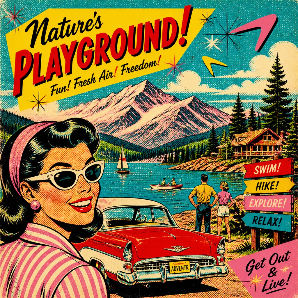
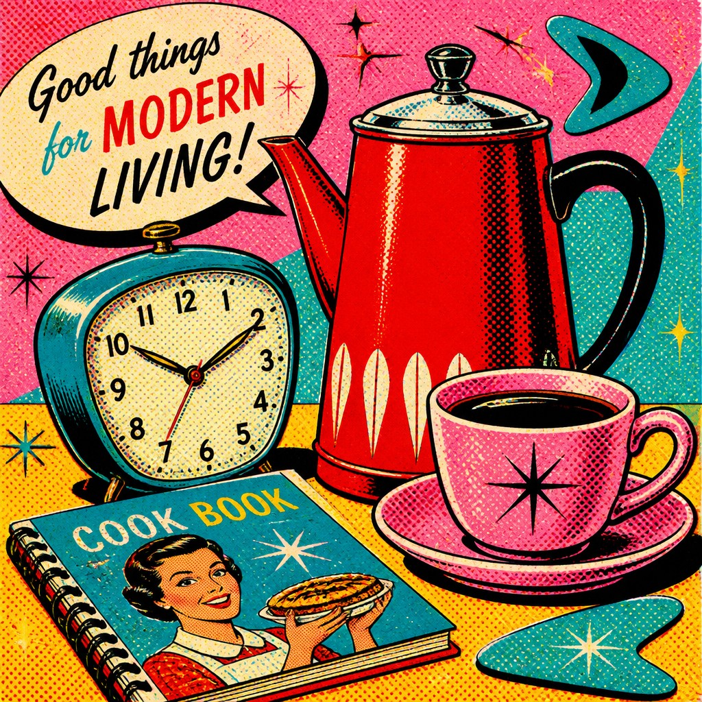
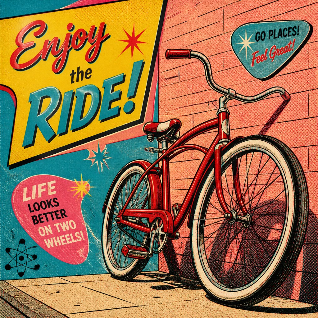
Retro Pop Art Style draws from 1950s–60s commercial illustration, with atomic-era motifs, saturated vintage advertising colors, bold outlines, and halftone texture. It often feels nostalgic and playful, echoing the look of printed ads, comic panels, and consumer packaging from the mid-century era.
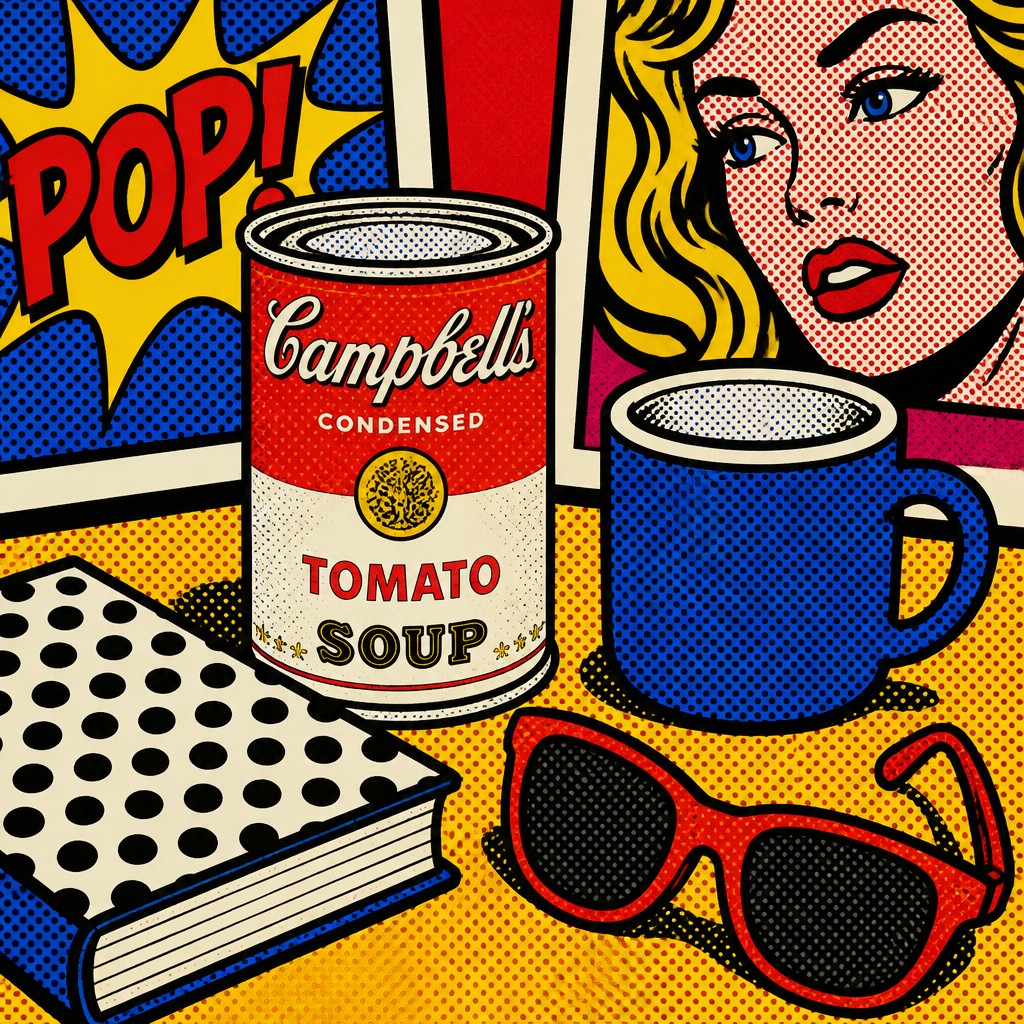
Pop Art Style is broader and more modern in use: it emphasizes bold commercial imagery, flat color, thick outlines, halftone dots, and mass-media energy. People compare them because both borrow from advertising and reproduction techniques, but Retro Pop Art is more specific to a vintage era and palette, while Pop Art can feel more current, general, and adaptable.
Same Prompt, Both Styles
Each pair below was generated from the identical prompt — only the style changed.




Key Differences
| Retro Pop | Pop | |
|---|---|---|
| Historical feel | Rooted in 1950s–60s advertising and mid-century optimism. | Broader, less tied to one decade or nostalgic period. |
| Color palette | Uses saturated vintage hues, often warm, faded, or nostalgic. | Uses bold flat color, often cleaner and more flexible. |
| Motifs | Includes atomic-era shapes, retro gadgets, and old ad imagery. | Uses general consumer icons, products, and media imagery. |
| Surface texture | Halftones feel printed, aged, and period-specific. | Halftones feel graphic, punchy, and contemporary in presentation. |
| Emotional tone | Feels nostalgic, playful, and distinctly mid-century. | Feels energetic, bold, and more universally commercial. |
| Best use cases | Good for retro branding, vintage posters, and period-style art. | Good for modern pop graphics, editorial art, and merch design. |
| Mood | nostalgic, playful, ironical, optimistic, bold | bold, playful, commercial, ironic, vibrant |
| Energy | lively | lively |
| Detail level | moderate | moderate |
| Color | bright primaries, pastel accents, high contrast | bright saturated primaries and contrasts |
| Texture | flat print, halftone, screen-printed grain | flat, printed, dot-patterned surface |
| Origin | 1950s-60s American commercial art | 1960s Britain and United States |
| Best for | posters, album covers, advertising art, editorial illustrations, comic-style graphics, packaging design | posters, album covers, editorial graphics, advertisements, book covers, merchandise design |
| Difficulty | moderate | moderate |
Which Should You Choose?
Choose Retro Pop Art Style if you want a stronger sense of era, nostalgia, and mid-century advertising charm. Choose Pop Art Style if you want bold commercial impact with more flexibility and a less dated look. If the goal is historical atmosphere, pick A; if the goal is broad, high-energy graphic appeal, pick B.
Frequently Asked Questions
Are these two styles the same thing?
Not exactly. Both use commercial imagery, bold outlines, and halftone effects, but Retro Pop Art is a more specific vintage variation. Pop Art Style is the broader category and can be adapted to many contexts.
Which style looks more nostalgic?
Retro Pop Art Style is usually more nostalgic because it references mid-century advertising and design. Its color choices and motifs tend to feel older and more period-accurate.
Which style is easier to use for modern branding?
Pop Art Style is often easier for modern branding because it is more flexible and less tied to a specific decade. It can feel fresh while still borrowing the energy of mass-media graphics.
Do both styles use halftone dots?
Yes, both often use halftone dots because they imitate printed media. The difference is in the overall feel: Retro Pop Art uses them to evoke vintage print, while Pop Art Style uses them for bold graphic impact.