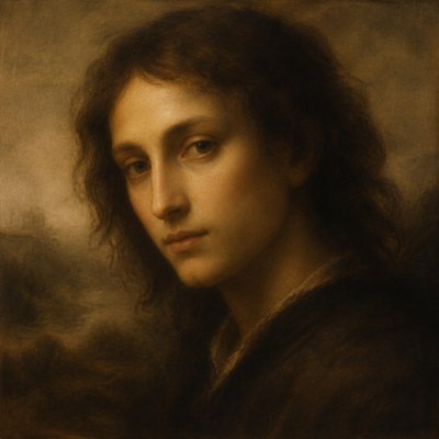
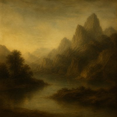
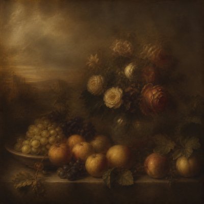
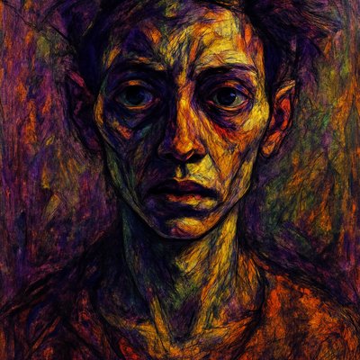
Pop Art Portrait Style
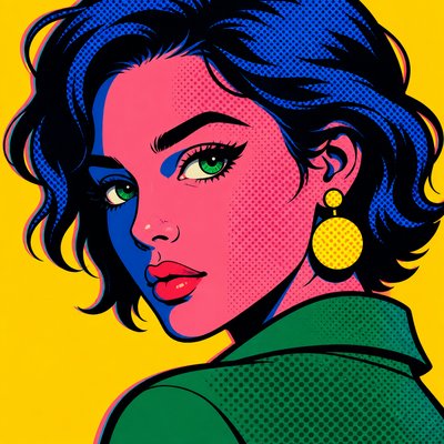
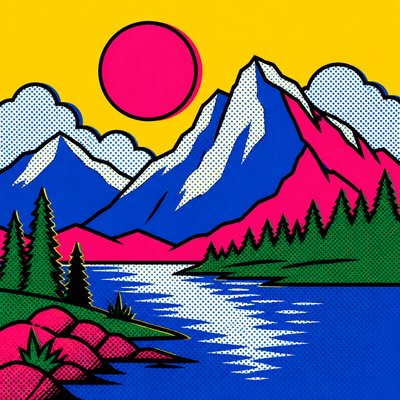
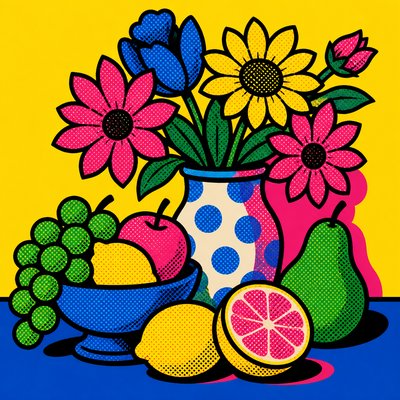
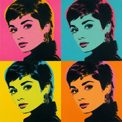
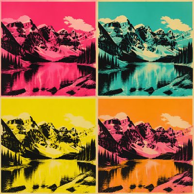
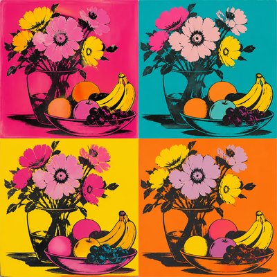
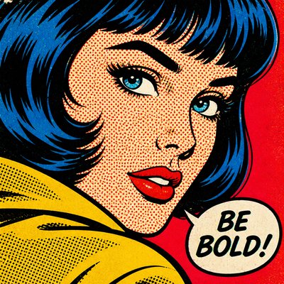
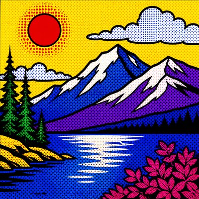
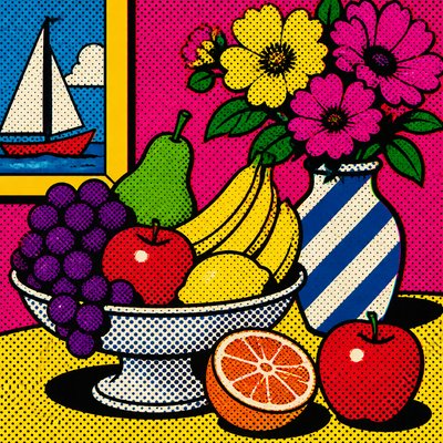
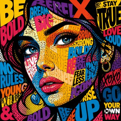
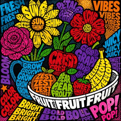
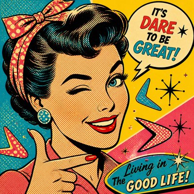
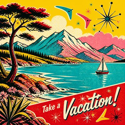
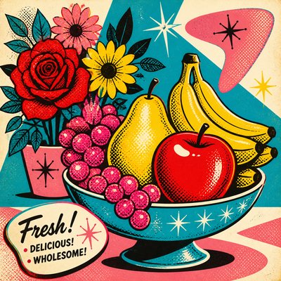
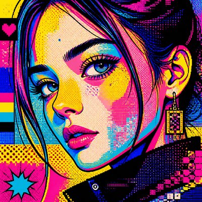
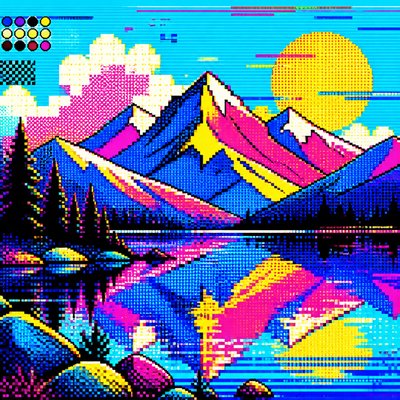
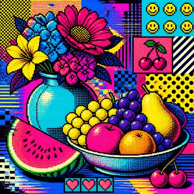
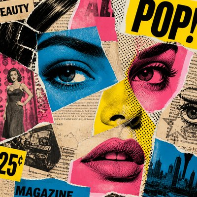
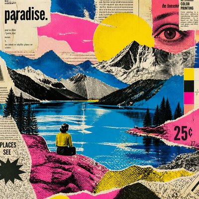
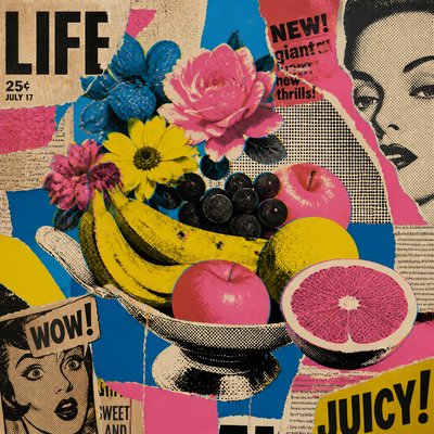
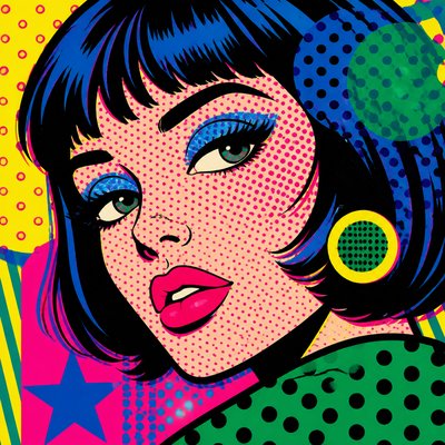
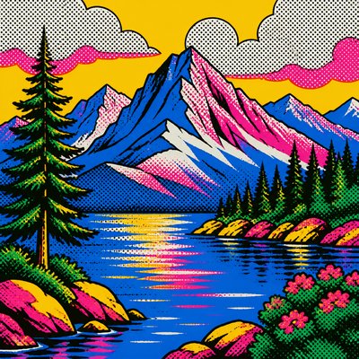
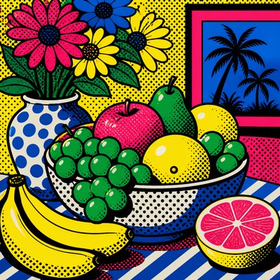
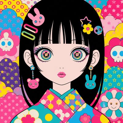
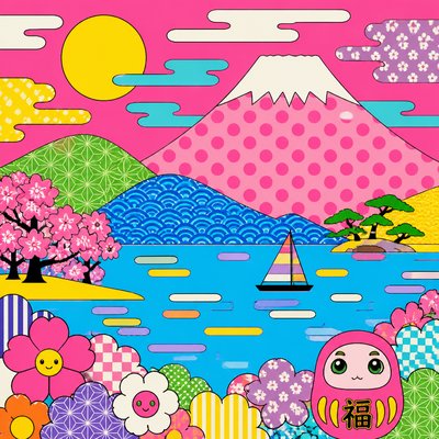
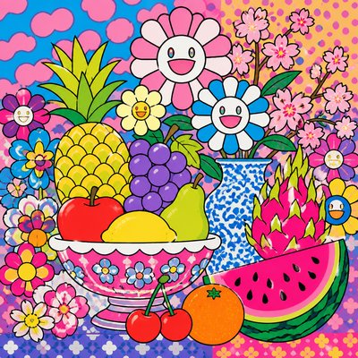
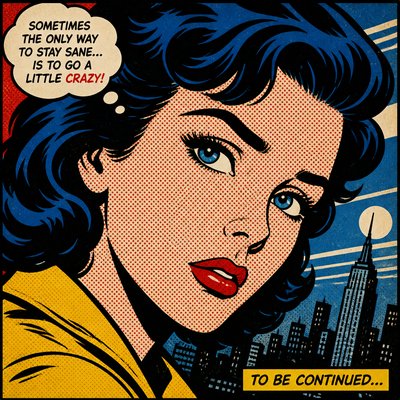
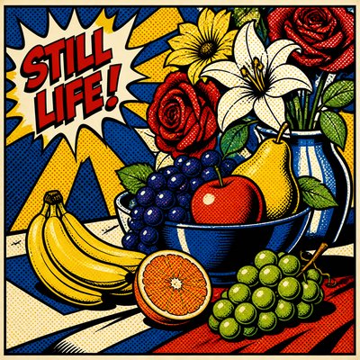
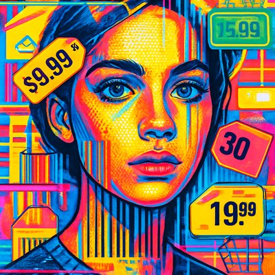
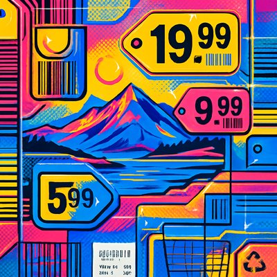
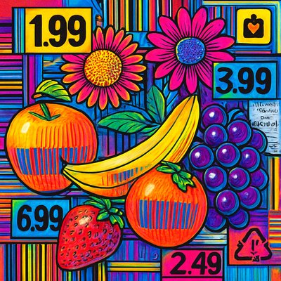
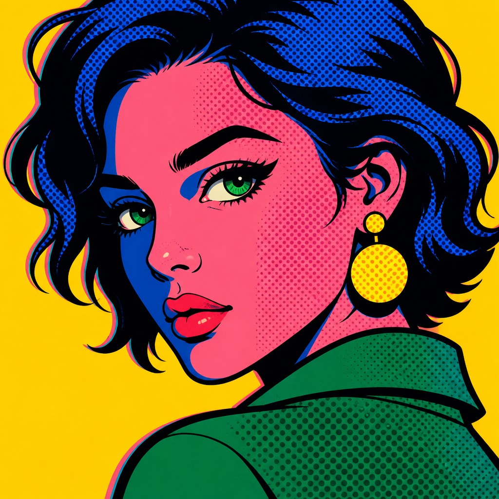
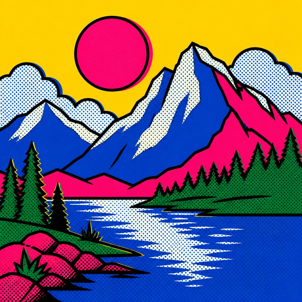
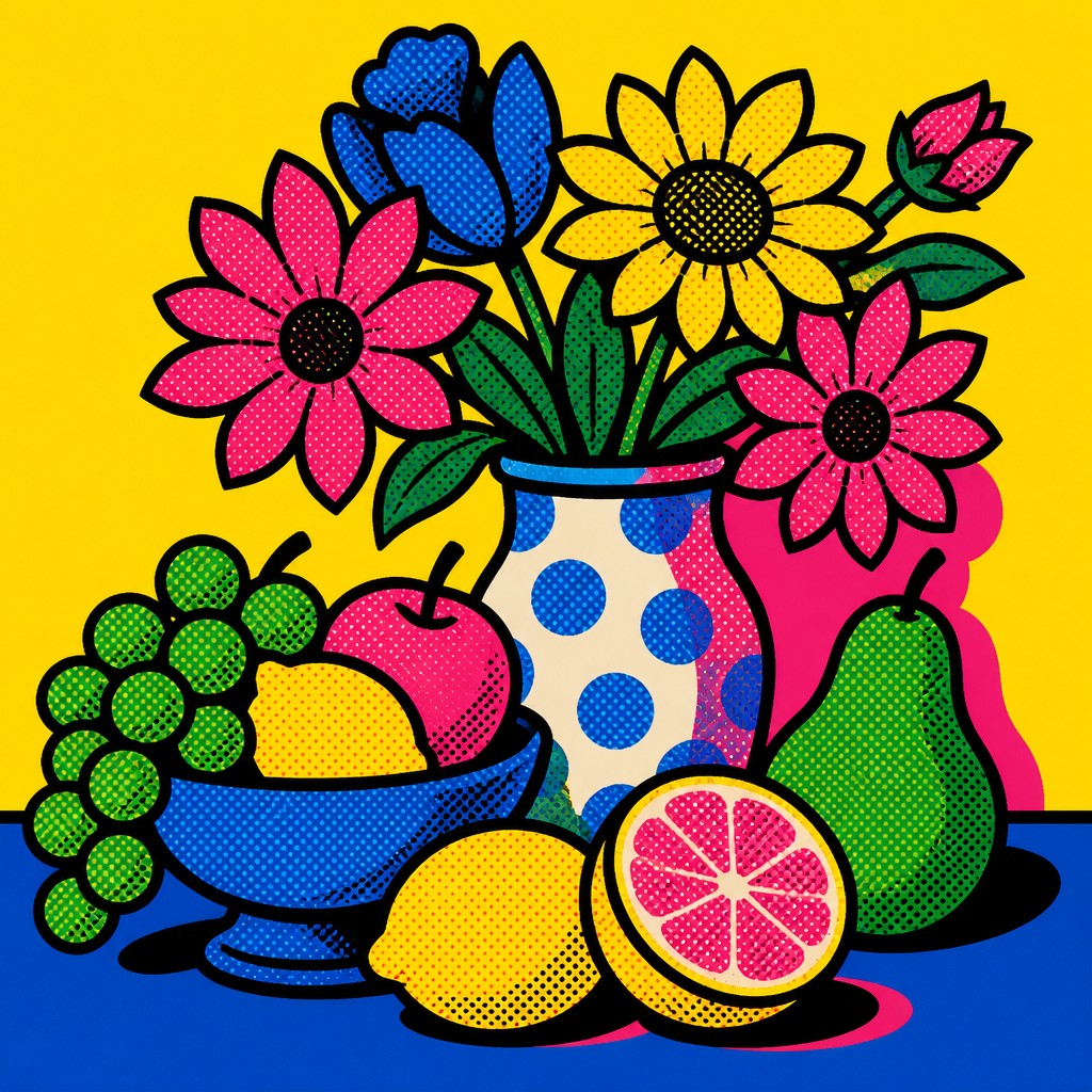
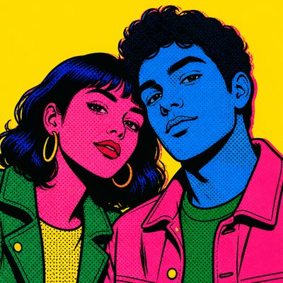
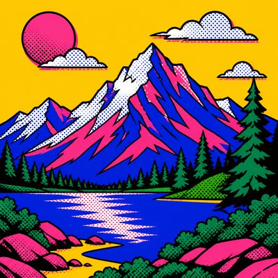
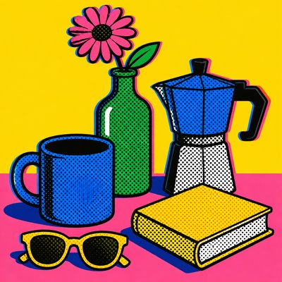
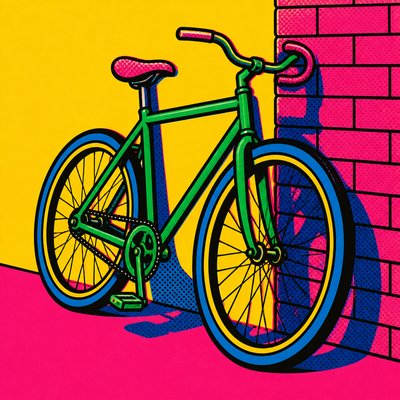
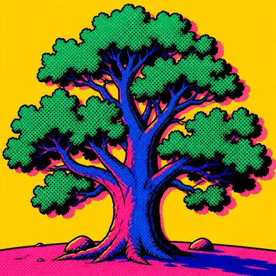
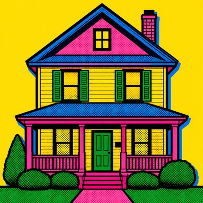
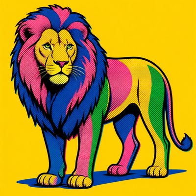
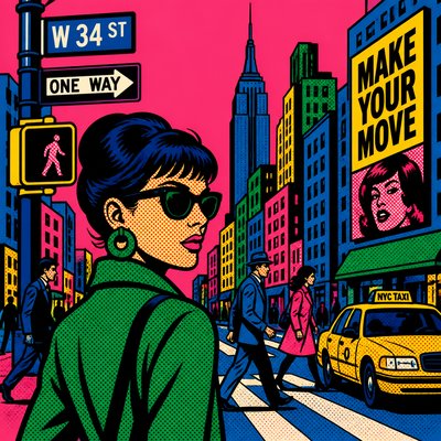
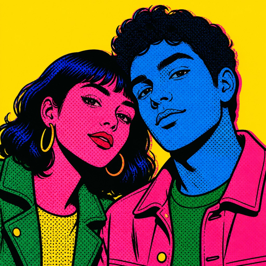
Bold portrait style with flat neon color, thick outlines, Ben Day dots, and screen-printed pop graphics.
Instantly rendered in Pop Art Portrait — or transform a photo
Pop Art Portrait Gallery
Tap any artwork to explore it
What is Pop Art Portrait Style?
Pop art portrait style turns faces into graphic icons. It relies on simplified shapes, thick black outlines, flat saturated color, and dot-based surface texture to give a portrait the feel of a printed poster or comic panel rather than a modeled painting.
The style looks the way it does because it borrows from mid-20th-century mass media: commercial illustration, comic books, advertising, and screen printing. Instead of subtle blending, it uses high-contrast color blocks and repetitive patterns, which flatten the image and make the subject feel immediate, public, and emblematic.
Try It On Your Photos
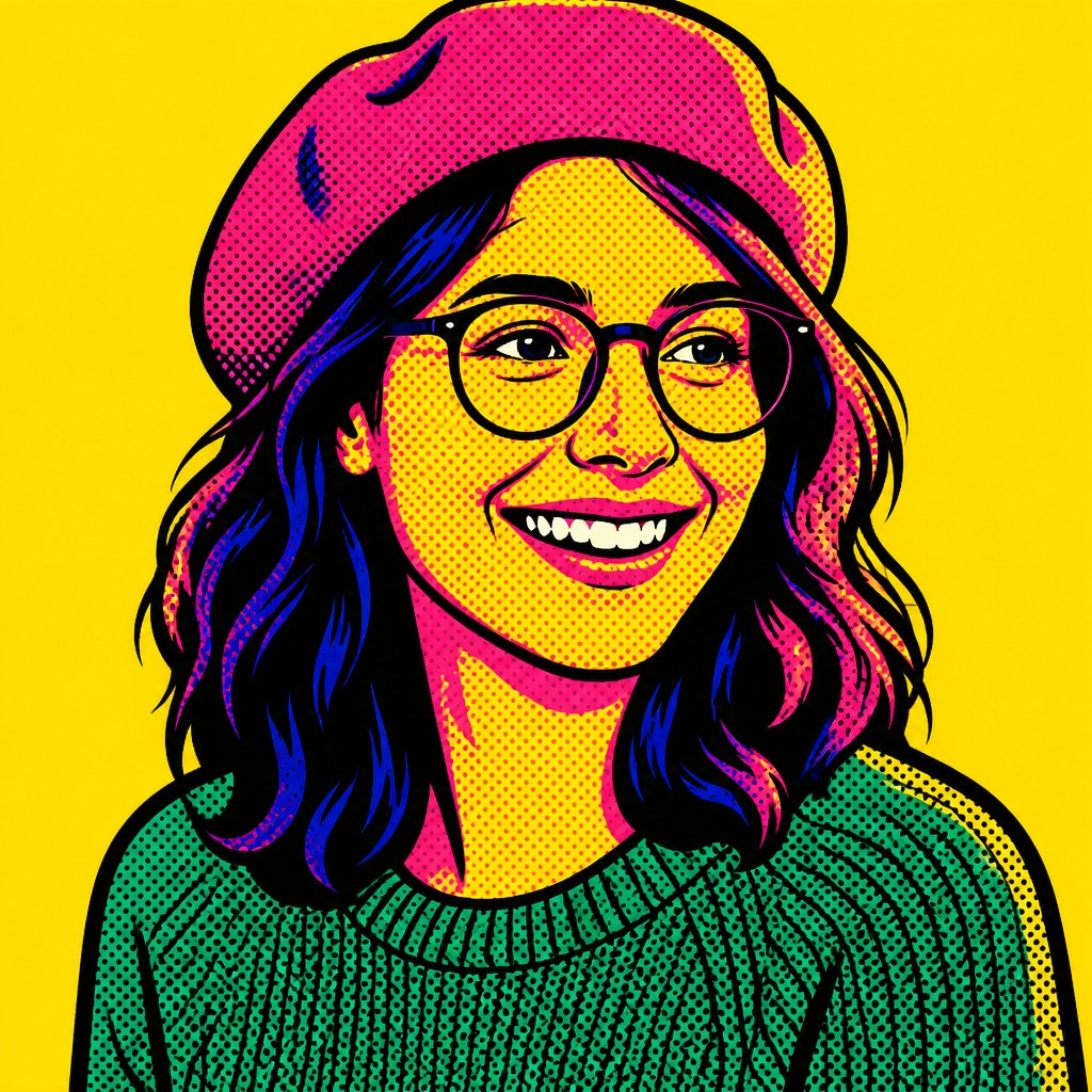
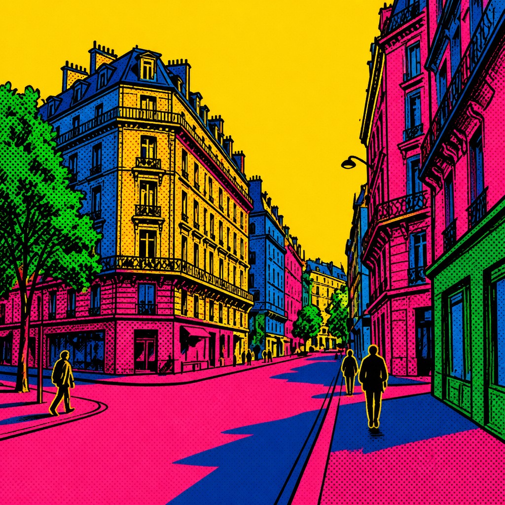
Upload any photo and convert it into Pop Art Portrait Style — drag the sliders to compare before and after.


What Defines Pop Art Portrait Style
The signature details, up close
Simplified facial structure
Features are reduced to essential graphic shapes: eyes, lips, nose, and hair are stated clearly but not modeled in realistic detail. The result reads instantly from a distance, like a printed icon.
Thick black contour lines
Bold outlines separate forms and give the portrait a comic-book clarity. These contours replace delicate drawing and help each shape remain visually distinct against flat color fields.
Flat, saturated color blocks
Color is applied in strong areas rather than blended gradients, often using electric blue, hot pink, yellow, red, and green. The palette feels commercial and poster-like, with high contrast between adjacent shapes.
Ben Day dot texture
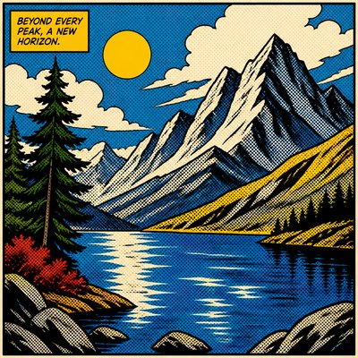
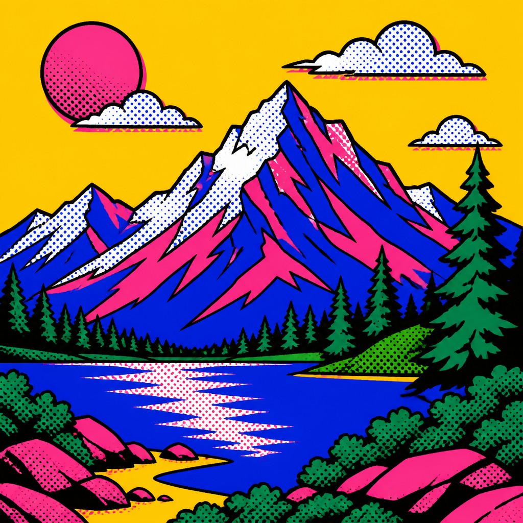
Halftone dots evoke print reproduction and comic-strip shading. They may cover skin, hair, or background areas to suggest tone while preserving the mechanical, manufactured look.
Screen-printed appearance
Slight misregistration, visible edge sharpness, and layer separation imitate silkscreen or offset printing. This gives the image a handcrafted-yet-industrial quality associated with Pop Art editions and posters.
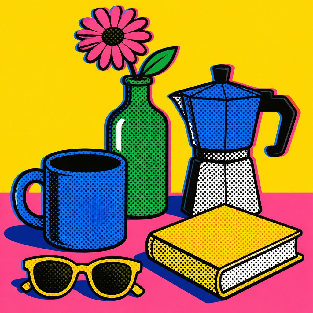
Poster-like composition
The portrait is usually centered, frontal or near-frontal, and designed to read like a public image. Backgrounds are often plain, bold, or minimal so the face functions as the main graphic emblem.
Try It
Create Videos in Pop Art Portrait Style
Styles aren't just for stills — describe a scene or animate an image and get a short video rendered in Pop Art Portrait. Press play to see this pond come to life.
Make a VideoPop Art Portrait Prompt Ideas
Start from an idea — each one opens the generator with the style ready to go. See all 40 Pop Art Portrait prompts →
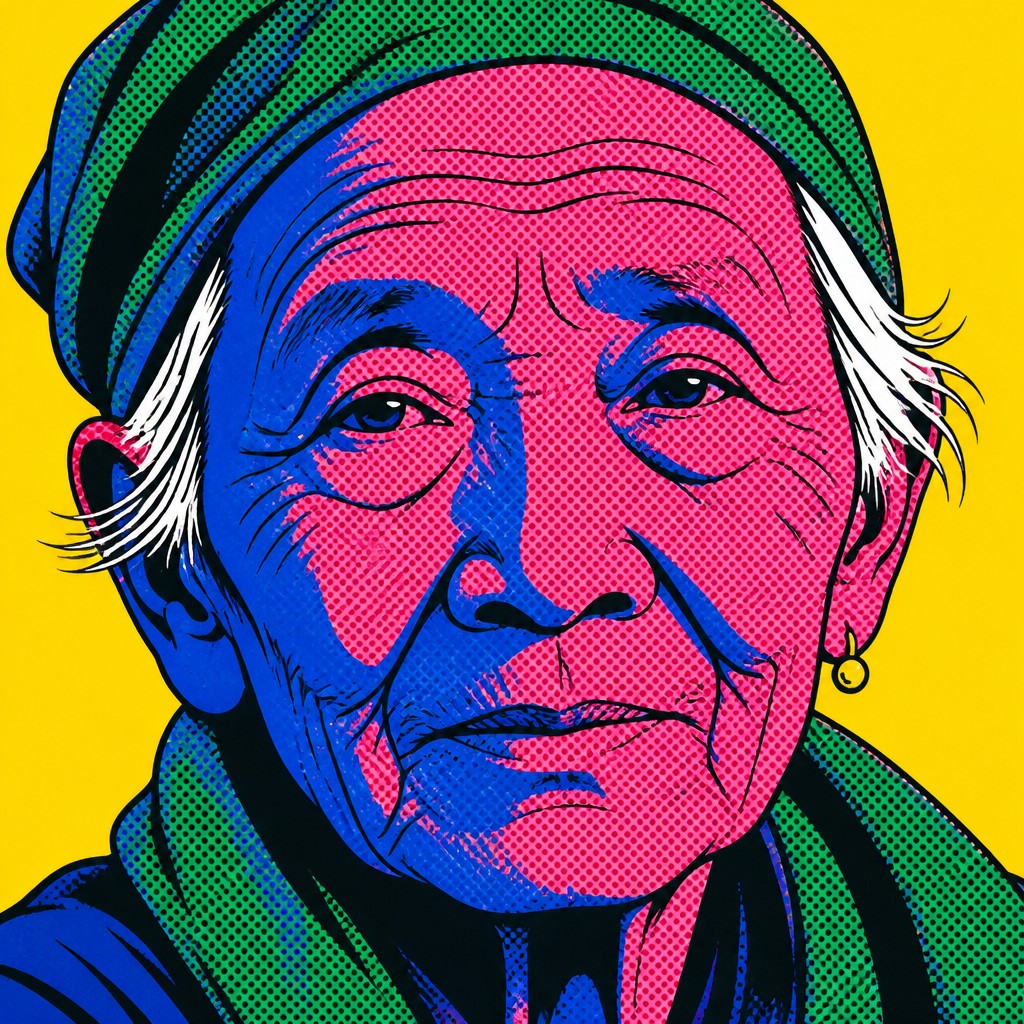
“close-up portrait of an elderly person with expressive weathered features”
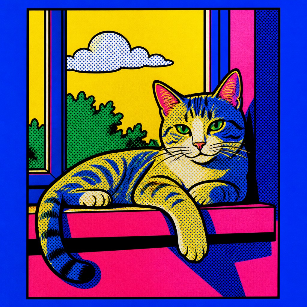
“a cat lounging in a sunlit window”
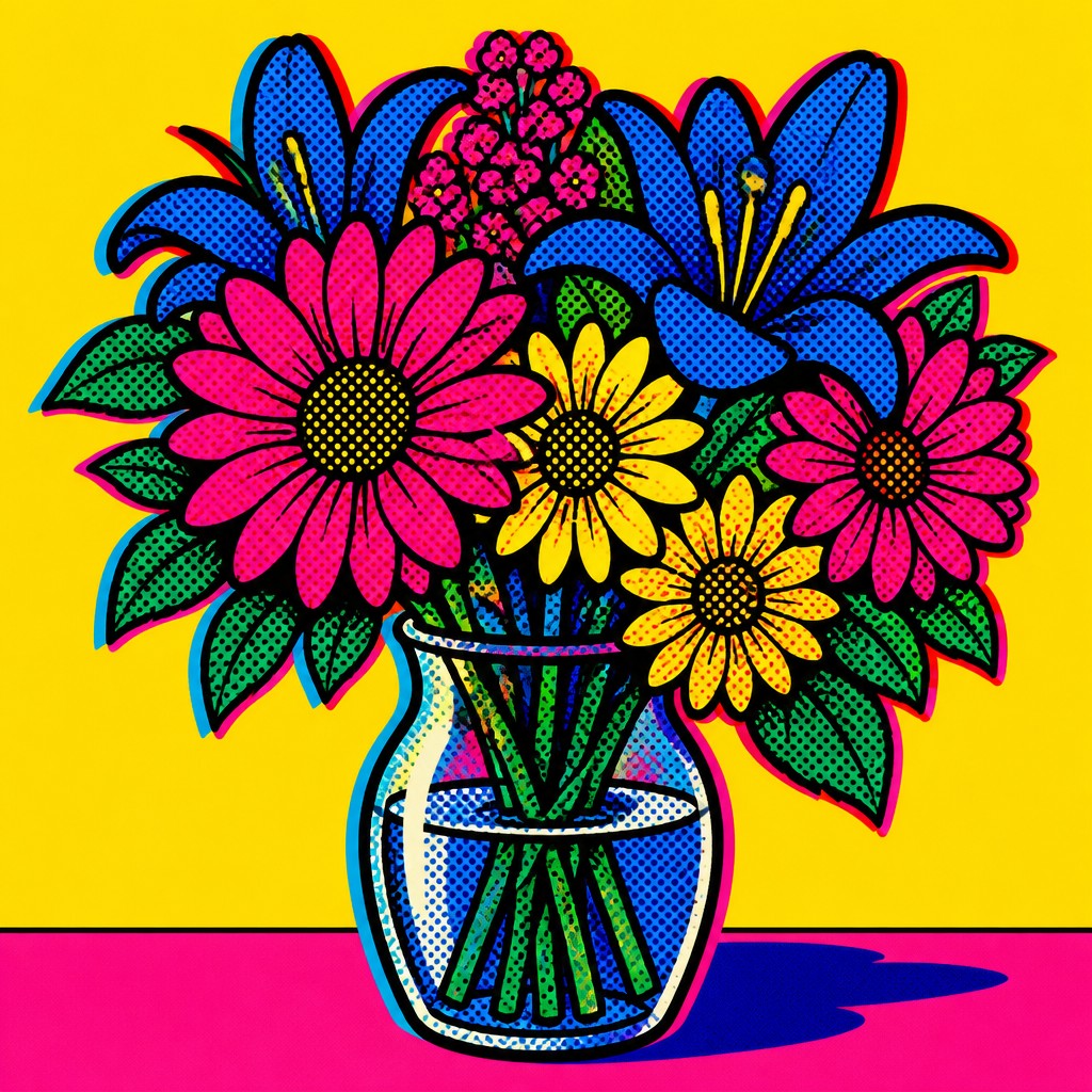
“bouquet of flowers in a glass vase”
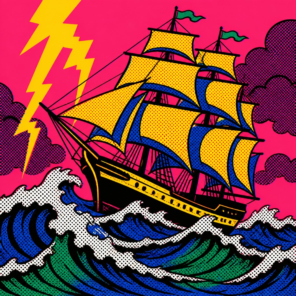
“sailing ship on a stormy sea”
How to Create Pop Art Portrait Art
Master the craft step by step — or skip straight to creating. Read the full guide →
- 1
Start with a clear, frontal portrait
Choose a face with strong landmarks and a readable silhouette, since the style depends on simplified anatomy. In traditional work, begin with a clean contour drawing; in digital work, use a source image with strong lighting and clear facial structure.
- 2
Reduce forms to graphic shapes
Block in hair, eyes, lips, and shadows as separate flat shapes instead of blending them gradually. Think in terms of cut-paper or silkscreen layers, keeping edges crisp and the composition easy to read.
- 3
Use a limited, high-voltage palette
Pick a small set of saturated colors with strong contrast, such as cyan, magenta, yellow, green, and black. Reserve white or a single background color to make the face feel iconic and immediate.
- 4
Add halftone texture and print effects
Use Ben Day dots, halftone shading, and slight color misregistration to simulate commercial reproduction. A subtle offset between layers can make the image feel authentically printed rather than digitally airbrushed.
- 5
Prompt for bold graphic language
When generating an image, specify simplified features, thick outlines, flat saturated colors, halftone dots, and screen-printed poster presentation. If transforming a photo, ask for facial simplification while preserving recognizable likeness and pose.

The Story
History & Origins of Pop Art Portrait
This style descends from Pop Art, the postwar art movement that emerged in the United Kingdom and the United States in the 1950s and 1960s in response to consumer culture, advertising, comics, and mass reproduction. Major postwar pop artists helped define the visual language of repetition, bright commercial color, mechanical edges, and borrowing from printed media.
The portrait format became especially associated with Pop Art through celebrity portraits and comic-derived figures, where faces were reduced to bold contours, dot patterns, and flat tones. Contemporary pop art portrait imagery continues that lineage, often combining the look of screen printing with digital tools that emulate halftone dots, clean vector shapes, and poster-like color separation.
Influences: Pop art portrait style draws from Pop Art, comic-book illustration, advertising graphics, and printmaking, especially silkscreen and halftone reproduction. Its visual logic is closely related to the work of major postwar pop artists, while also borrowing from mid-century magazine illustration and commercial poster design.
Frequently Asked Questions
What defines pop art portrait style?
It is defined by simplified facial forms, thick outlines, flat bright color, and printed texture such as halftone dots. The portrait usually looks like a mass-produced poster or comic image rather than a softly painted likeness.
How is it different from regular pop art?
Pop art is a broader movement that includes objects, advertisements, logos, and celebrity imagery, while pop art portrait style focuses specifically on faces and identity. Portraits in this style emphasize iconic presentation and visual repetition more than narrative or realism.
How is it different from comic art?
Comic art often uses line, sequential storytelling, and varied rendering depending on the genre, while this style isolates the portrait and pushes it toward poster design. It is less about narrative panels and more about a single, emblematic image with print-like surfaces.
What colors work best in this style?
Strong primaries and secondary accents work best, especially combinations like cyan, magenta, yellow, red, black, and white. The palette should feel saturated and graphic, with enough contrast to separate facial features clearly.
Can I use a photo to create this look?
Yes. A portrait photo with clear lighting and a strong expression is ideal, because the style depends on clean shapes and readable features. The image should then be simplified into flat color regions with outlines and halftone texture.
Where is this style commonly used?
It appears in posters, album artwork, fashion graphics, editorial illustration, music promotion, and contemporary wall art. It is popular whenever a portrait needs to feel bold, recognizable, and visually immediate.

Create your first Pop Art Portrait artwork
Describe anything — or upload a photo — and see it in Pop Art Portrait Style in seconds.
Make Something with Pop Art Portrait
Related Styles
Discover similar art styles