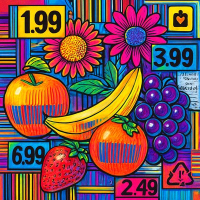
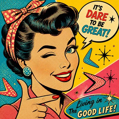
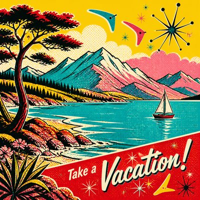
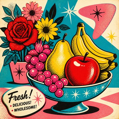
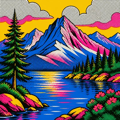
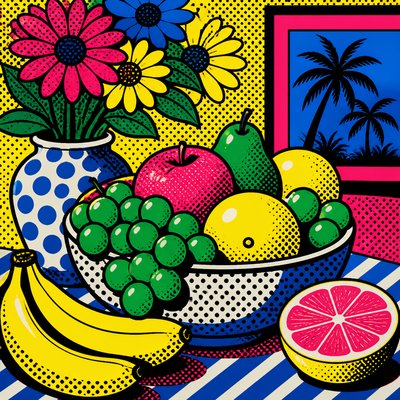
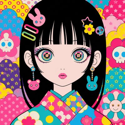
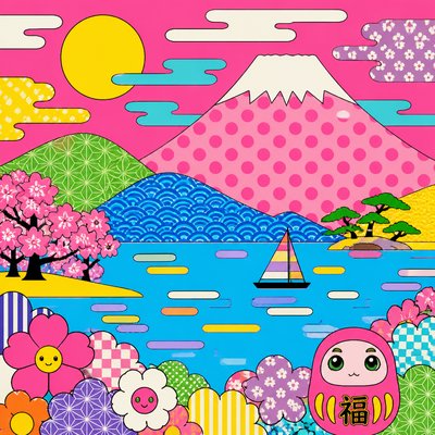
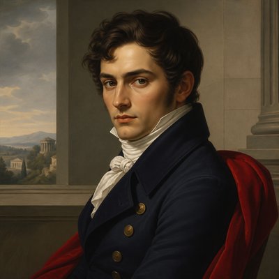
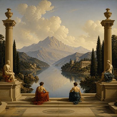
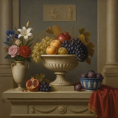
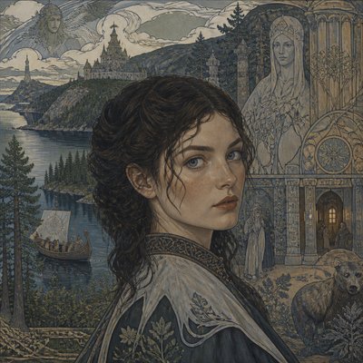
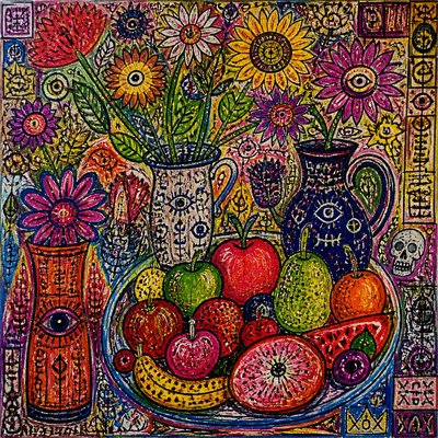
Typography Pop Art Style
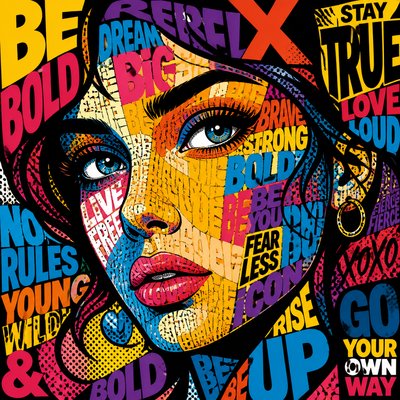
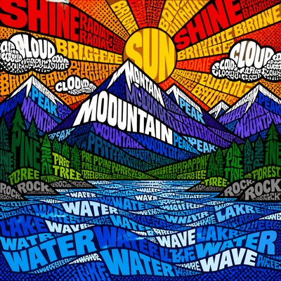
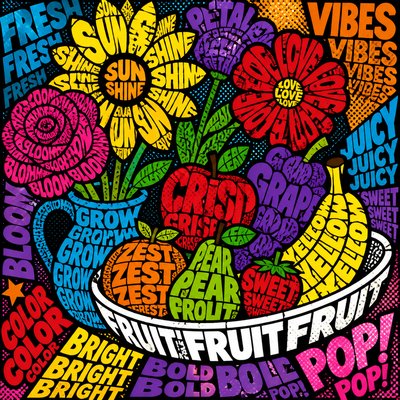
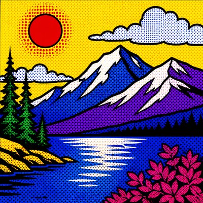
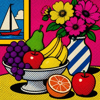
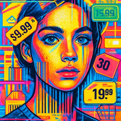
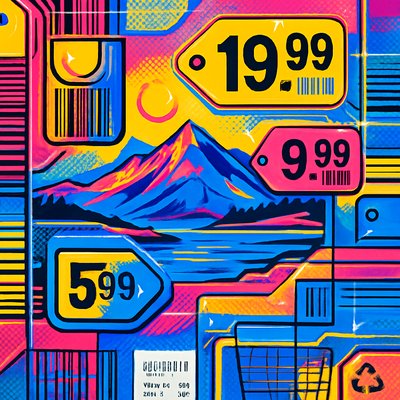
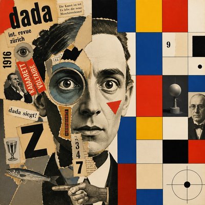
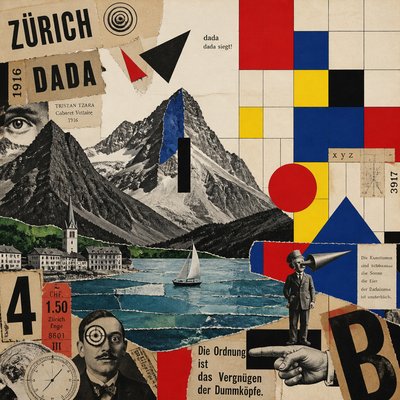
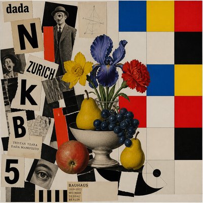
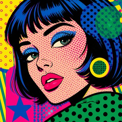
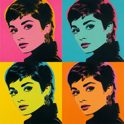
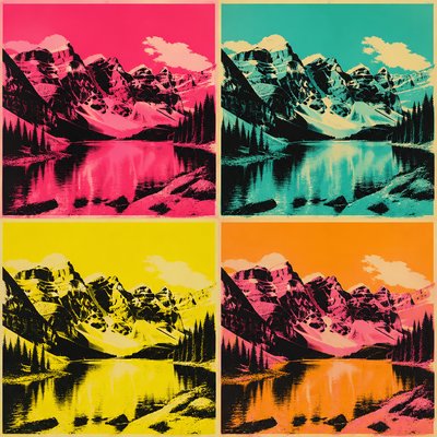
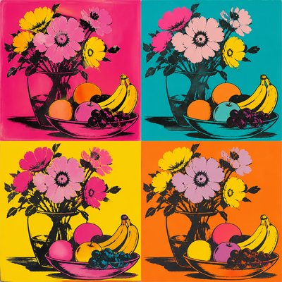
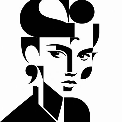
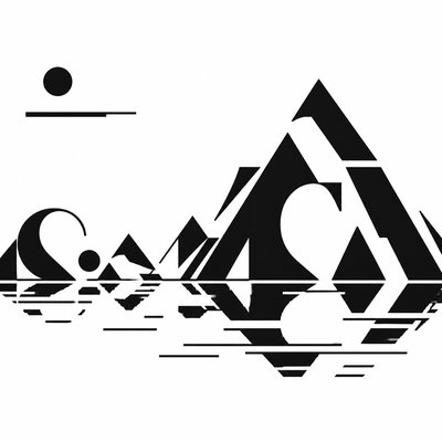
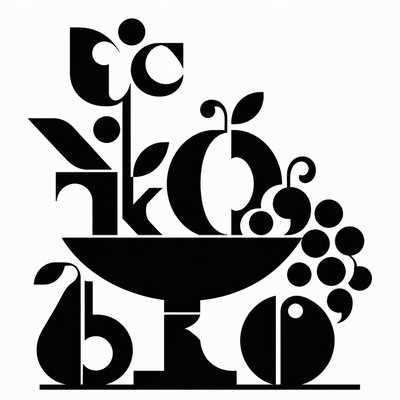
Bold text becomes imagery in a high-contrast pop art style of layered letters, repetition, halftones, and saturated color.
Instantly rendered in Typography Pop — or transform a photo
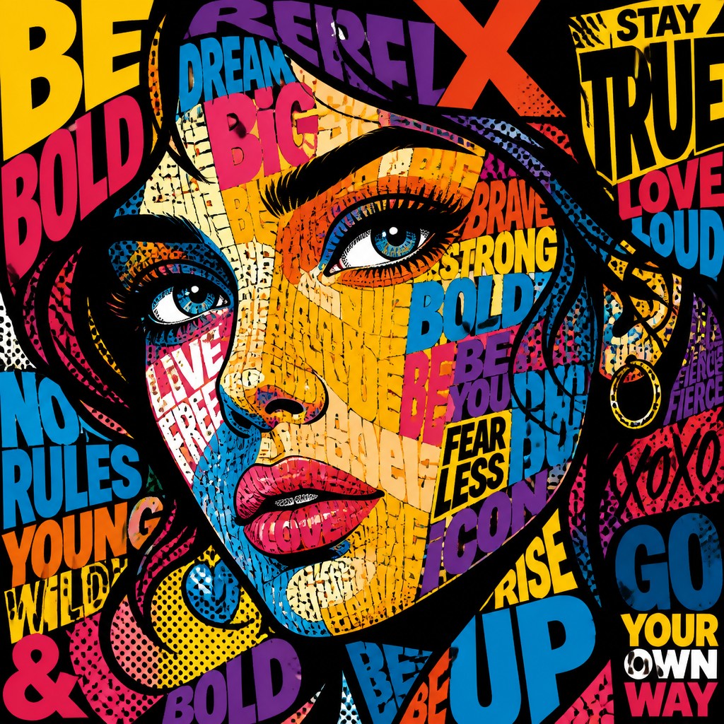
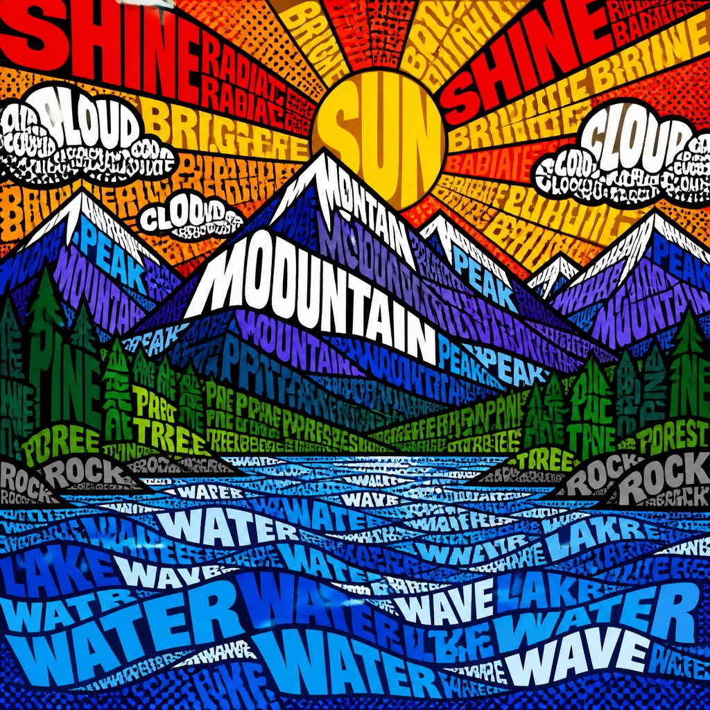
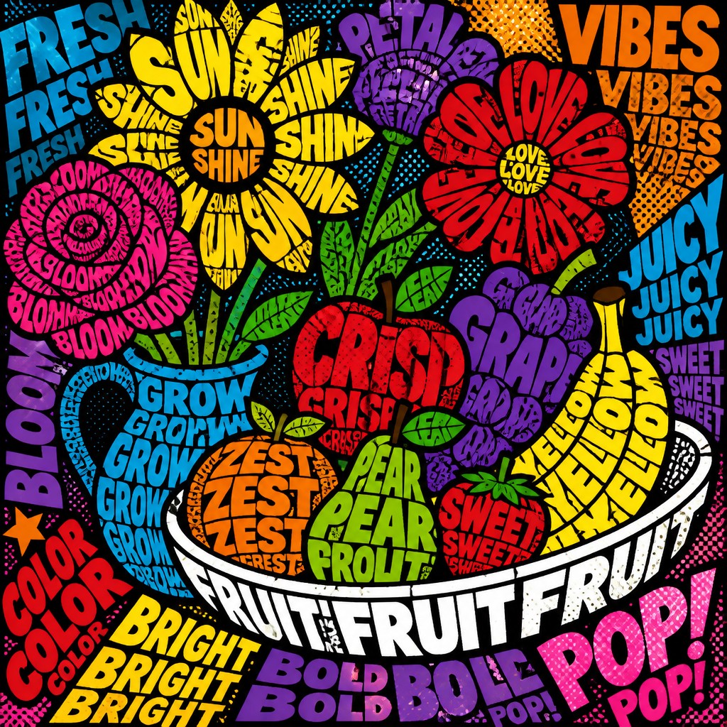
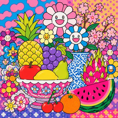
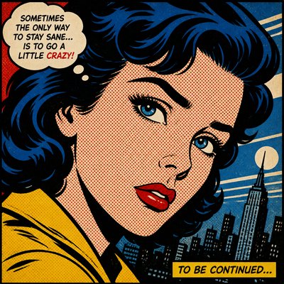
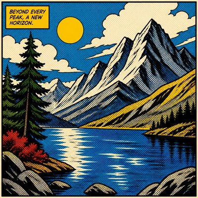
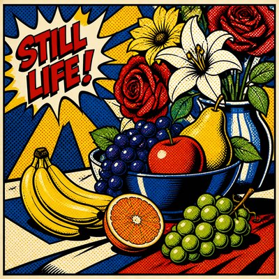
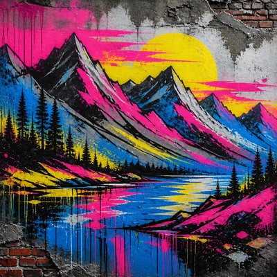
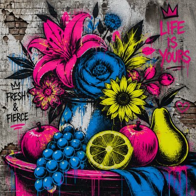
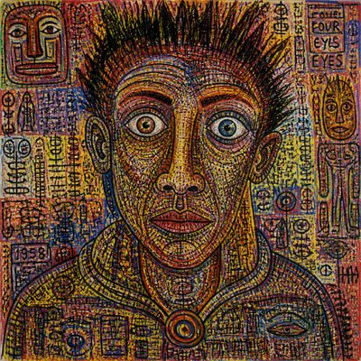
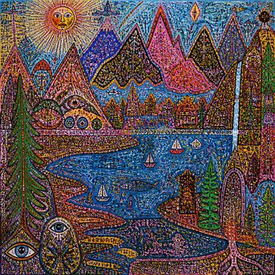
Typography Pop Gallery
Tap any artwork to explore it
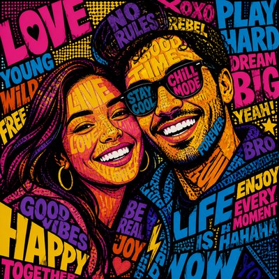
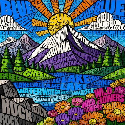
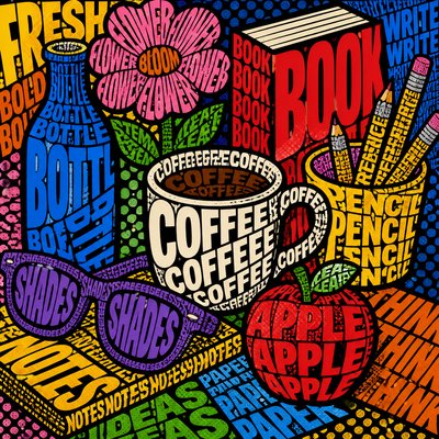
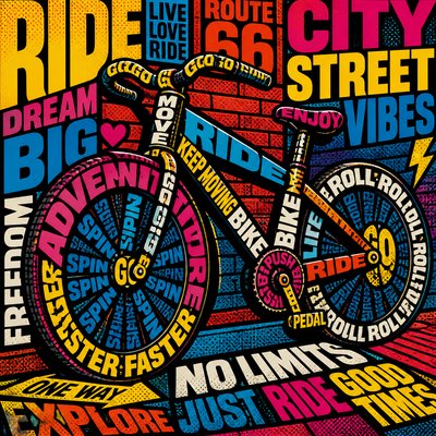
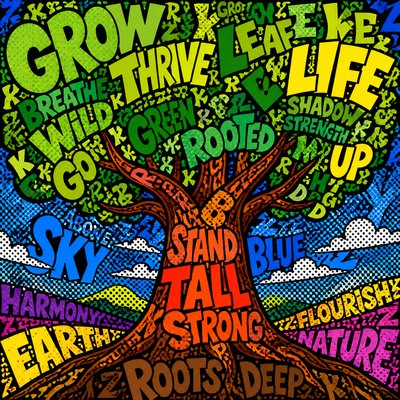
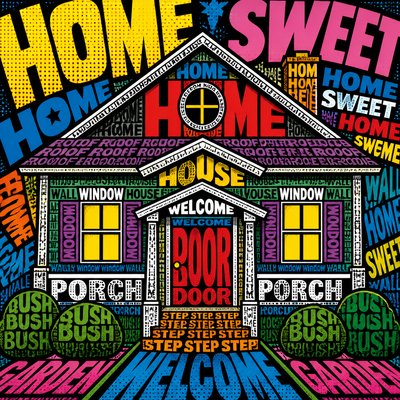
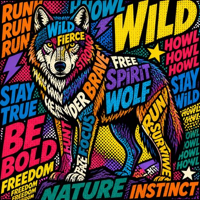
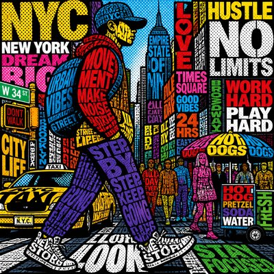
What is Typography Pop Art Style?
Typography pop art is a graphic style in which words, letters, and phrases are treated as both content and image. Instead of using type merely to label or explain, it turns letterforms into the main visual material: stacked, repeated, rotated, and enlarged until text becomes pattern, structure, and subject at once. The result is a page or image that must be read and seen simultaneously.
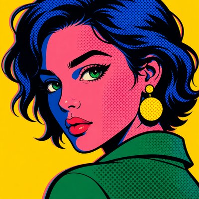
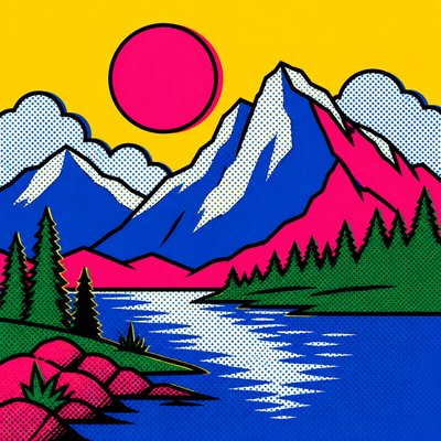
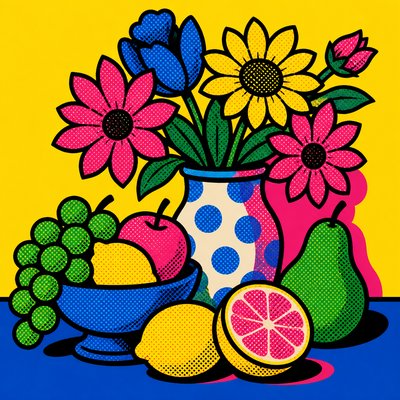
Its visual identity comes from the fusion of advertising graphics, comic-book energy, and modern typographic experimentation. Bold outlines, flat saturated color, halftone dots, and dense compositions make the letters feel loud and physical, while shifts between legibility and abstraction give the work its tension. Meaning emerges through rhythm, emphasis, and visual drama as much as through literal reading.
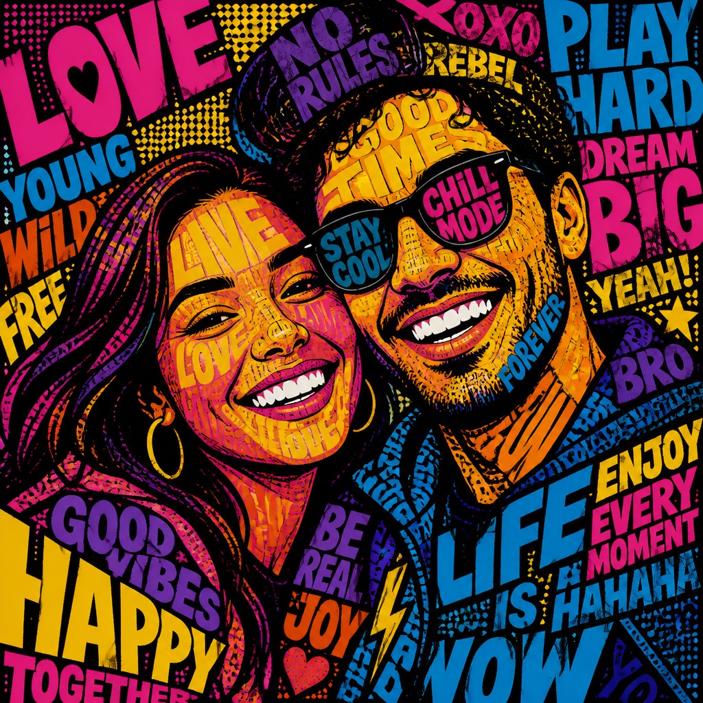
Try It On Your Photos
Upload any photo and convert it into Typography Pop Art Style — drag the sliders to compare before and after.


What Defines Typography Pop Art Style
The signature details, up close
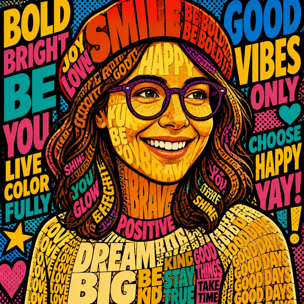
Letterforms as image
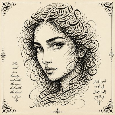
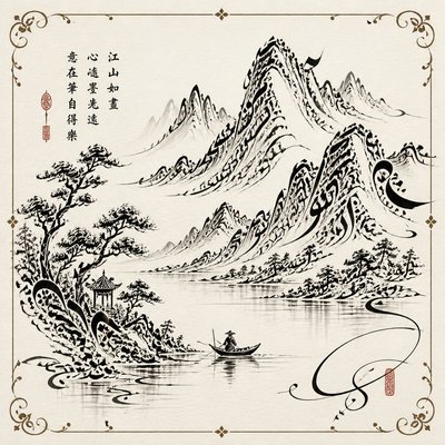
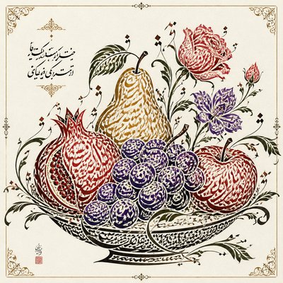
Words are built into the subject itself, so the composition reads like a picture made from text. Letters may remain readable in places and dissolve into abstract shape in others.
Layering and repetition
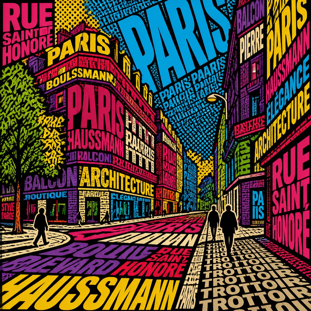
The same word or phrase is often repeated at different sizes and angles to create density and momentum. This repetition gives the work a poster-like or screen-printed punch.
High-contrast pop color
Bright, saturated hues such as magenta, cyan, yellow, red, and electric blue dominate the palette. Colors are usually flat and separated into clear blocks for maximum graphic impact.
Strong black outlines
Thick contour lines clarify the forms and prevent the composition from becoming visually muddy. They also echo comic art and commercial print graphics.
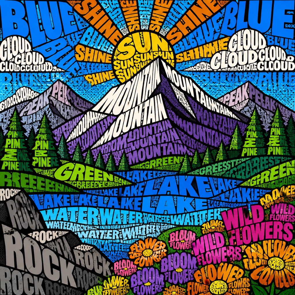
Halftone and print texture
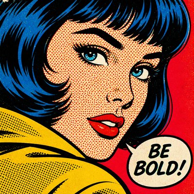
Dot patterns, mechanical screening, and print-like textures add a mass-media feel. These details help connect the style to newspaper comics, posters, and offset printing.
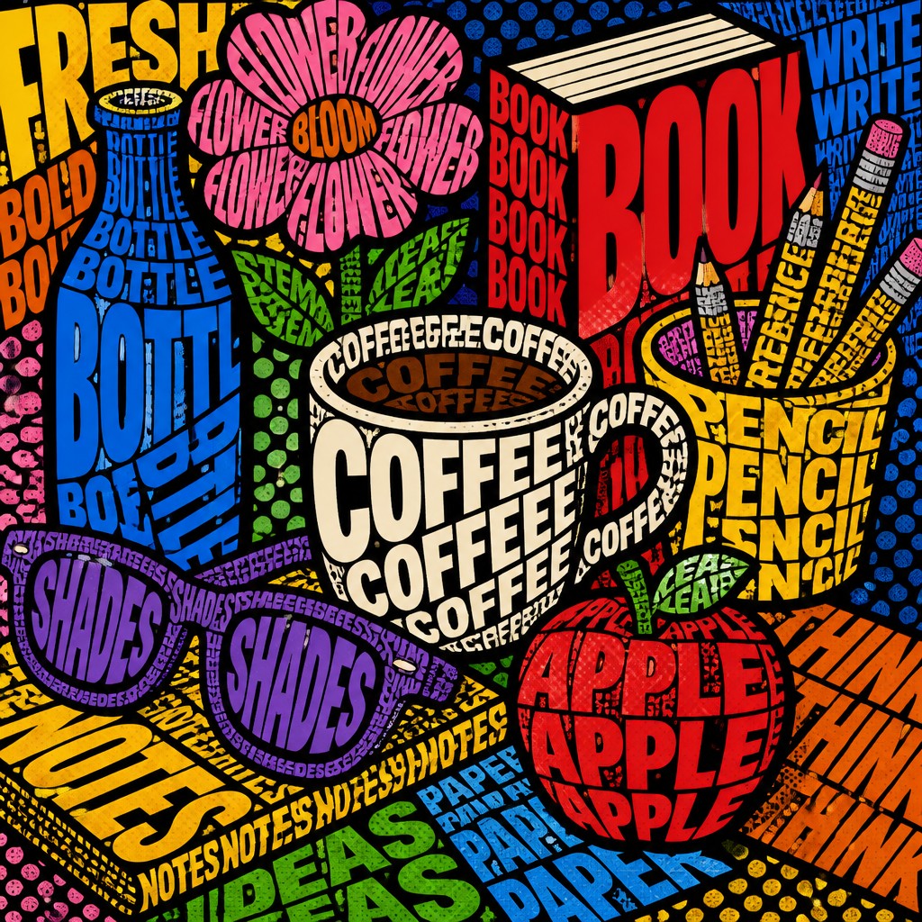
Dynamic full-frame composition
The layout usually fills the frame edge to edge with little empty space. Diagonals, overlaps, and rotating text create a sense of movement and visual noise.
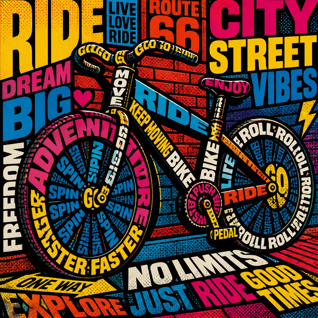
Tension between reading and seeing
Typography pop art works best when language is partly legible but partly graphic. The viewer is pulled between decoding the words and responding to the image as a whole.
Try It
Create Videos in Typography Pop Art Style
Styles aren't just for stills — describe a scene or animate an image and get a short video rendered in Typography Pop. Press play to see this pond come to life.
Make a VideoTypography Pop Prompt Ideas
Start from an idea — each one opens the generator with the style ready to go. See all 40 Typography Pop prompts →
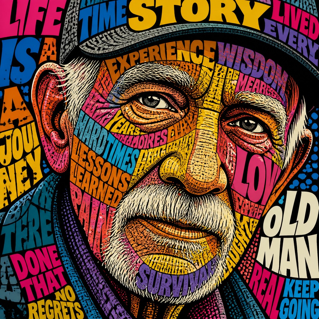
“close-up portrait of an elderly person with expressive weathered features”
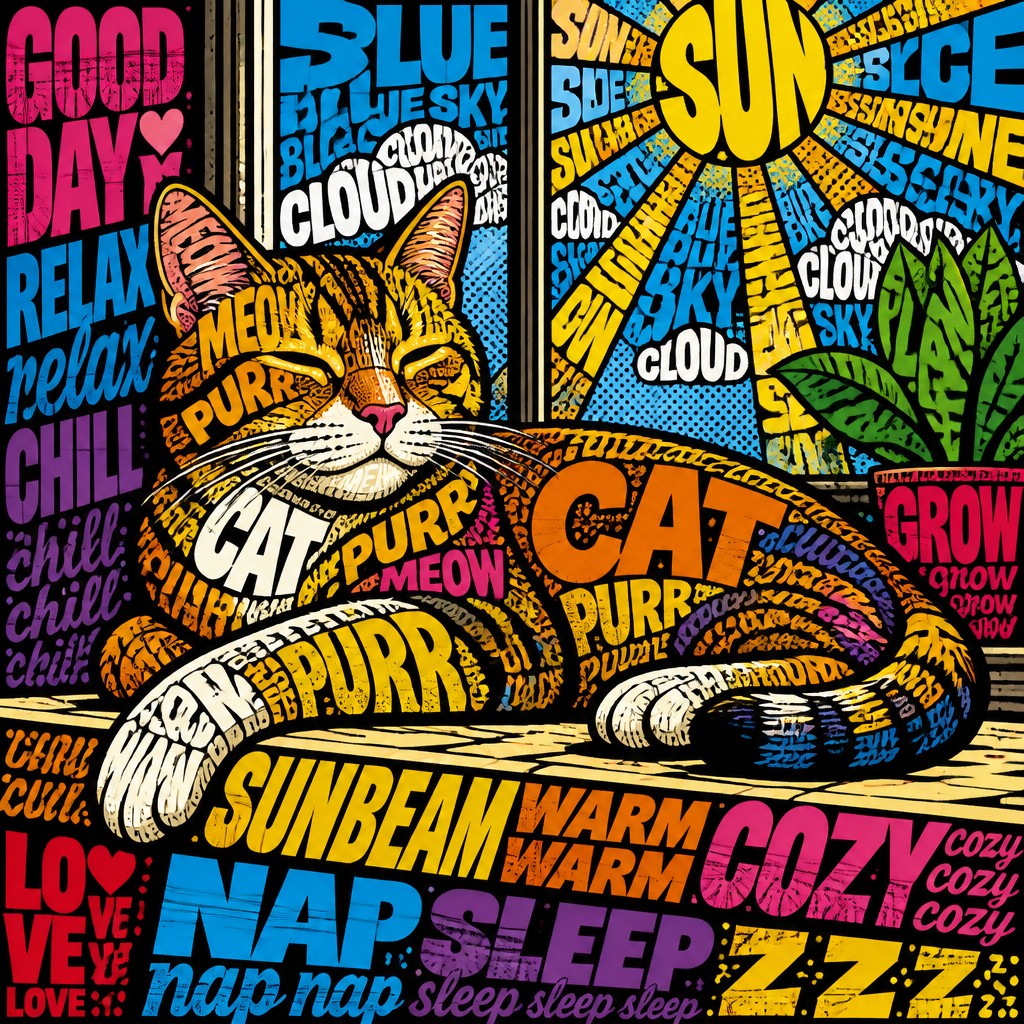
“a cat lounging in a sunlit window”
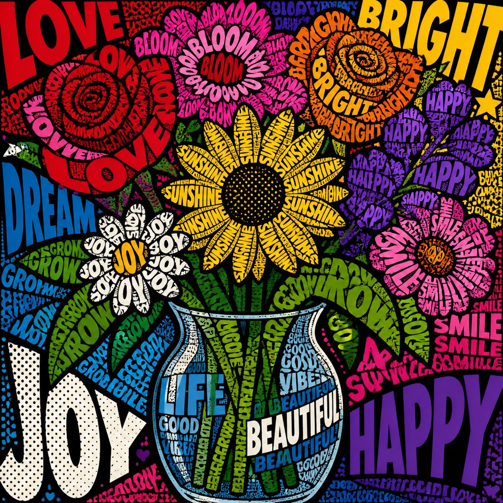
“bouquet of flowers in a glass vase”
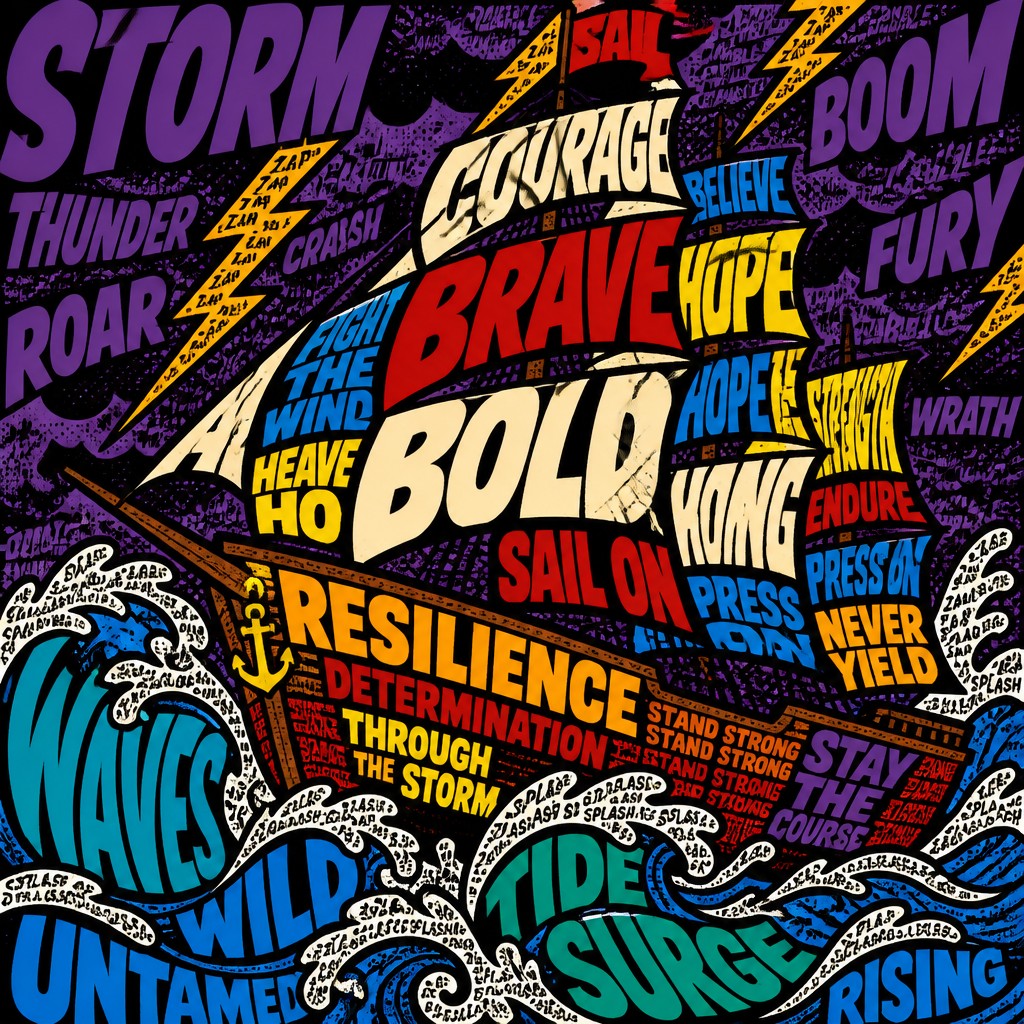
“sailing ship on a stormy sea”
How to Create Typography Pop Art
Master the craft step by step — or skip straight to creating. Read the full guide →
- 1
Start with a short textual subject
Choose a word, phrase, name, or slogan that can be repeated and visually expanded. Shorter text usually works better because it can be layered densely without losing the overall structure.
- 2
Build the image from type, not around it
In traditional work, arrange letters as shapes first and as readable text second. In digital work, use multiple text layers, varied scale, rotation, and tracking to create a composition that feels constructed from language.
- 3
Use flat color and hard edges
Limit shading and avoid soft gradients unless you are intentionally mixing methods. Clear color separations, bold outlines, and high contrast keep the graphic rhythm strong.
- 4
Add print-based effects carefully
Halftone dots, misregistration, and screen-print-like overlaps can make the piece feel more authentic to pop and comic traditions. Keep these effects controlled so the typography remains readable enough to carry meaning.
- 5
Balance legibility with abstraction
If every word is perfectly clear, the work may look like plain lettering; if everything becomes illegible, the typographic idea disappears. Aim for a middle ground where the viewer can still sense language inside the image.
- 6
When generating digitally, describe structure and behavior
A strong prompt should specify layered letterforms, repeated words, bold outlines, saturated pop colors, halftone dots, and dense edge-to-edge composition. Mention the subject you want the type to form, and keep the phrase short enough that the text system can be translated into visual rhythm.
The Story
History & Origins of Typography Pop
Typography pop art does not refer to a single historical movement with a fixed origin; it is a contemporary hybrid aesthetic built from several real traditions. Its roots lie in the graphic force of mid-20th-century advertising, comic-book printing, and Pop Art, as well as in modernist and postmodern experiments that treated type as an image rather than a transparent carrier of information.
The style also draws from poster design, sound-and-fury comic lettering, psychedelic print culture, and later digital typography, where type could be warped, layered, duplicated, and colored with extreme precision. In that lineage, major postwar pop artists, a leading comic-derived visual language, a prominent conceptual artist, and an influential modern graphic designer are relevant reference points for the use of repetition, mass-media language, bold graphics, and text as a visual force, though the style itself is broader than any one artist's practice.
Influences: Typography pop art draws from Pop Art, comic-book illustration, poster design, and the history of typographic experimentation in modern graphic design. Important historical touchstones include major postwar pop artists' repetition and mass-media imagery, a leading comic-derived visual language, a prominent conceptual artist's confrontational use of text, and an influential modern graphic designer's expressive graphic design. It also relates to screen printing, psychedelic posters, and late-20th-century digital typography, where type became increasingly elastic, layered, and image-like.

Frequently Asked Questions
What defines typography pop art?
It is defined by using letters and words as the primary visual building blocks of an image. The text is not just a caption or title; it becomes the subject, structure, and pattern of the artwork. Bold color, repetition, and comic-style graphic clarity are common.
How is this different from regular graphic design typography?
Regular typography usually prioritizes readability and information hierarchy, while typography pop art prioritizes visual impact and expressive composition. In this style, letters can stretch, overlap, rotate, and repeat until they function as imagery as much as language.
Is typography pop art the same as Pop Art?
Not exactly. Pop Art is a broader historical movement focused on mass culture, consumer imagery, and reproduction, while typography pop art is a more specific text-driven aesthetic that borrows from Pop Art's visual energy. It is best understood as a typographic offshoot or descendant of those ideas.
What kinds of subjects work best in this style?
Simple, recognizable subjects work best because they can be translated into bold letter-based forms. Faces, animals, objects, slogans, logos, and urban scenes are especially effective because their silhouettes can be built from repeated text and strong graphic shapes.
Can this style be made by hand?
Yes. It can be created with collage, hand lettering, stencil work, screen printing, marker, ink, or cut-paper composition. The key is to treat letters as visual materials and to build strong contrast through layering and repetition.
Where is typography pop art commonly used?
It is often used in posters, album art, editorial graphics, branding experiments, social media visuals, and expressive digital illustration. Its boldness makes it effective anywhere text needs to carry both message and visual energy.
Create your first Typography Pop artwork
Describe anything — or upload a photo — and see it in Typography Pop Art Style in seconds.
Make Something with Typography Pop
Related Styles
Discover similar art styles