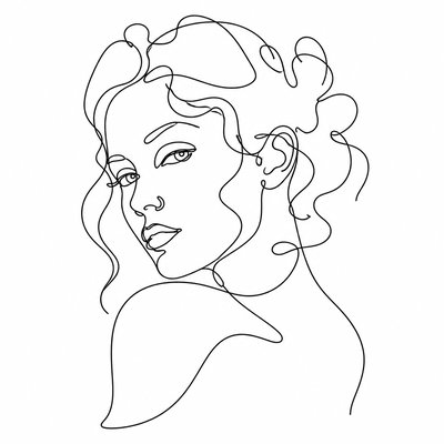
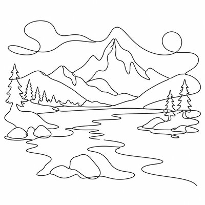
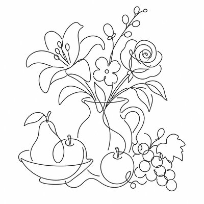
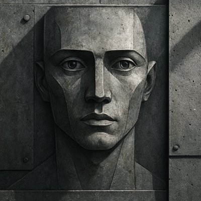
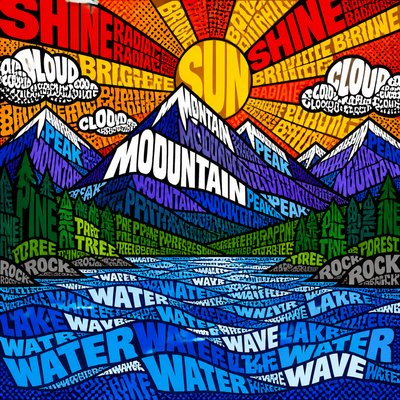
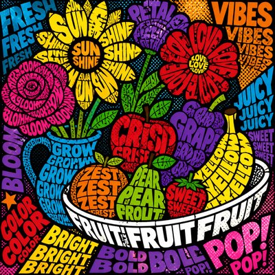
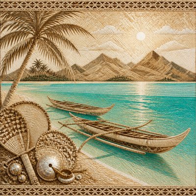
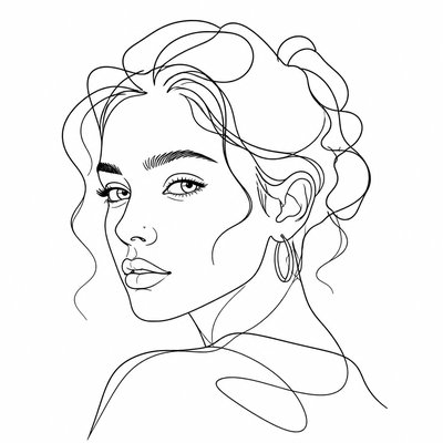
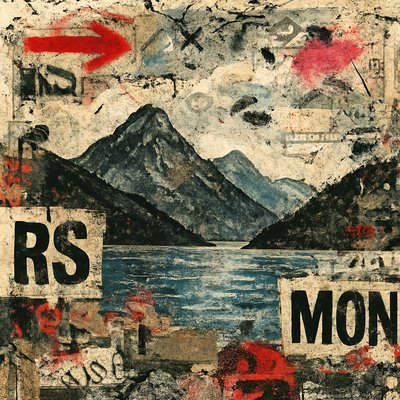
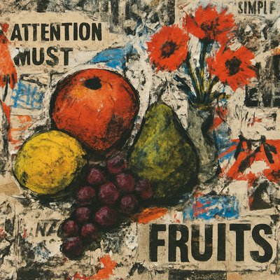
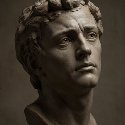
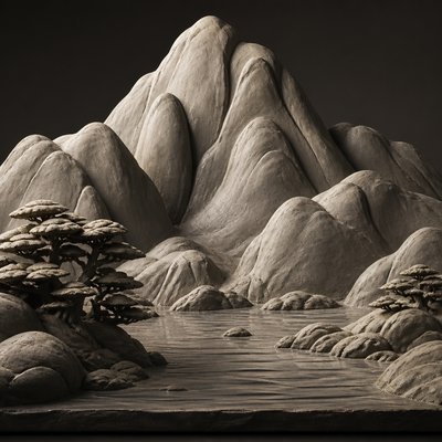
Typographic Minimalism Art Style
Typography reduced to pure form: stark black-and-white compositions built from letters, glyphs, and punctuation.
Instantly rendered in Typographic Minimalism — or transform a photo
Typographic Minimalism Gallery
Tap any artwork to explore it
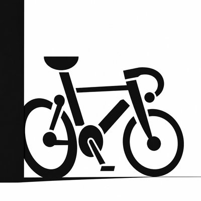
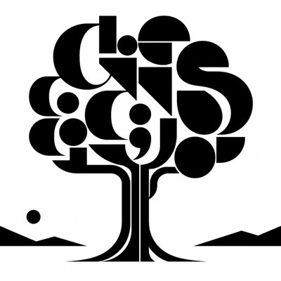
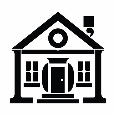
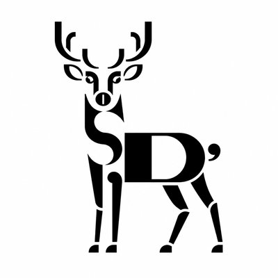
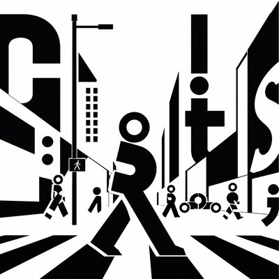
What is Typographic Minimalism Art Style?
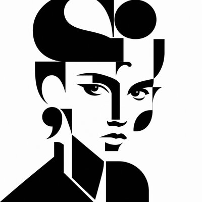
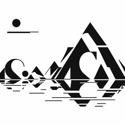
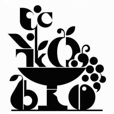
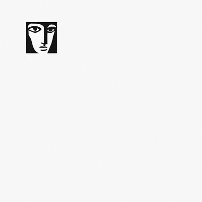
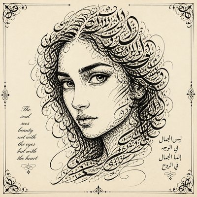
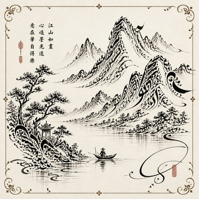
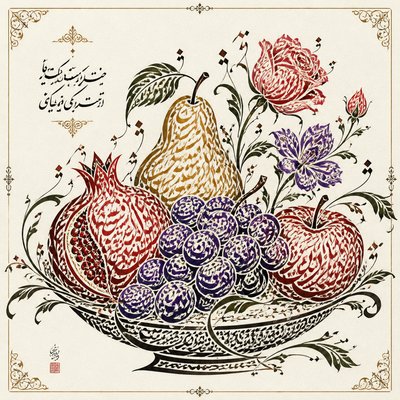
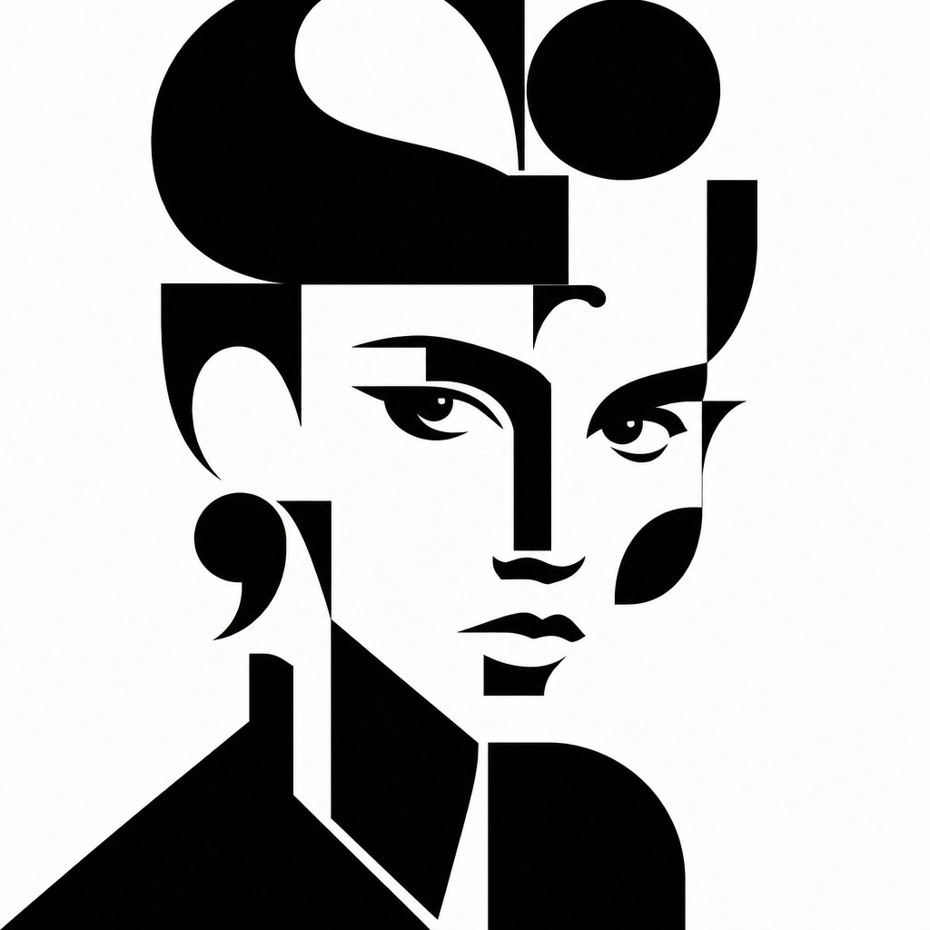
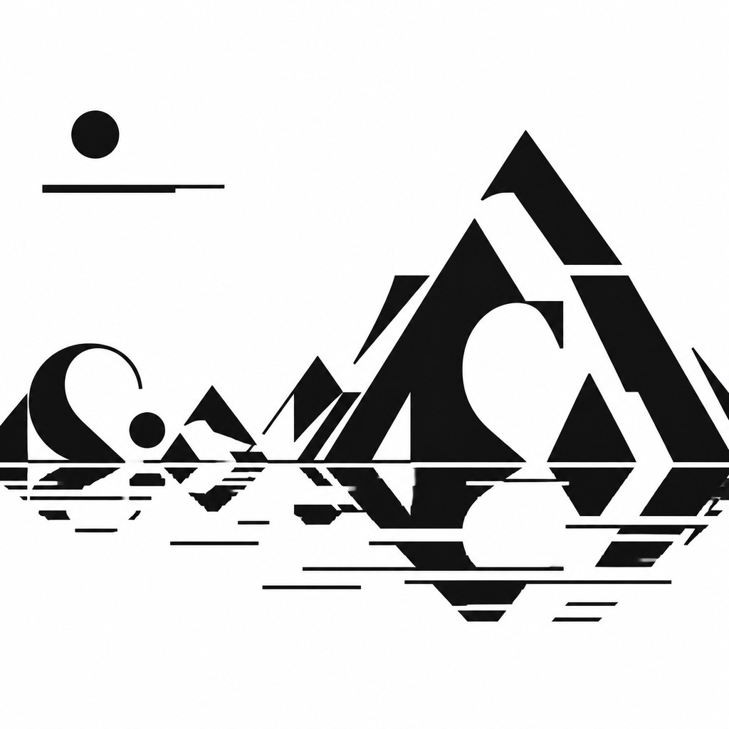
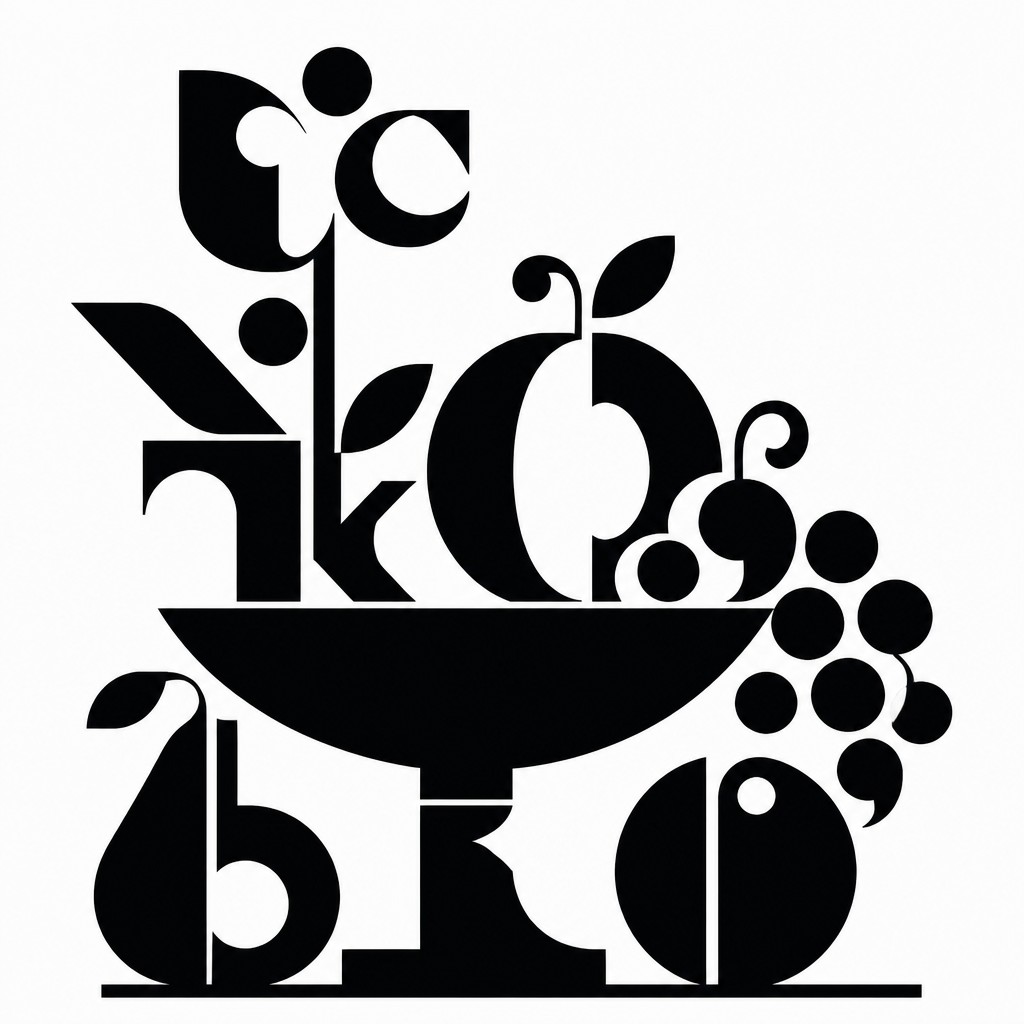
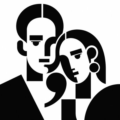
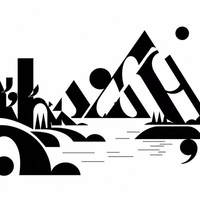
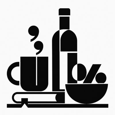
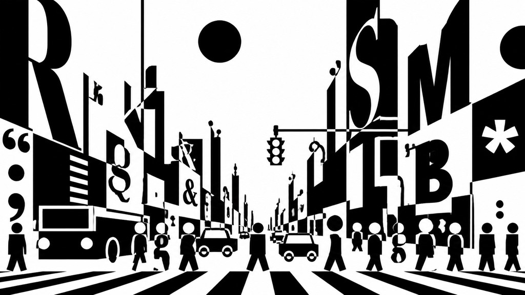
Typographic Minimalism is a visual style that treats letters, words, and punctuation marks less as language than as shape. The subject is reduced to a sparse arrangement of bold glyphs, often enlarged beyond readability so that their curves, stems, counters, and intervals become the primary subject of the image.
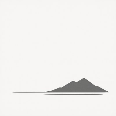
Its visual identity depends on severe reduction: black and white only, crisp vector edges, precise spacing, and large areas of empty space. The effect is architectural and often brutalist, because meaning is stripped back until typography functions as pure geometry, rhythm, and contrast rather than as a carrier of text.
Try It On Your Photos
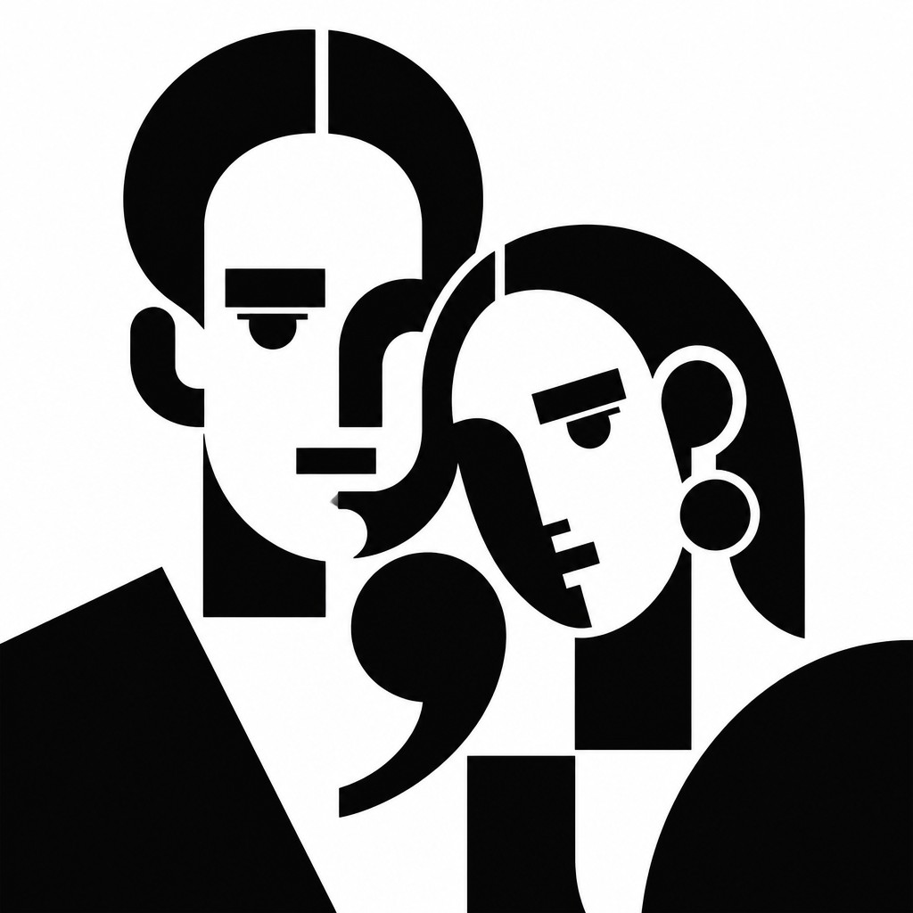
Upload any photo and convert it into Typographic Minimalism Art Style — drag the sliders to compare before and after.


What Defines Typographic Minimalism Art Style
The signature details, up close
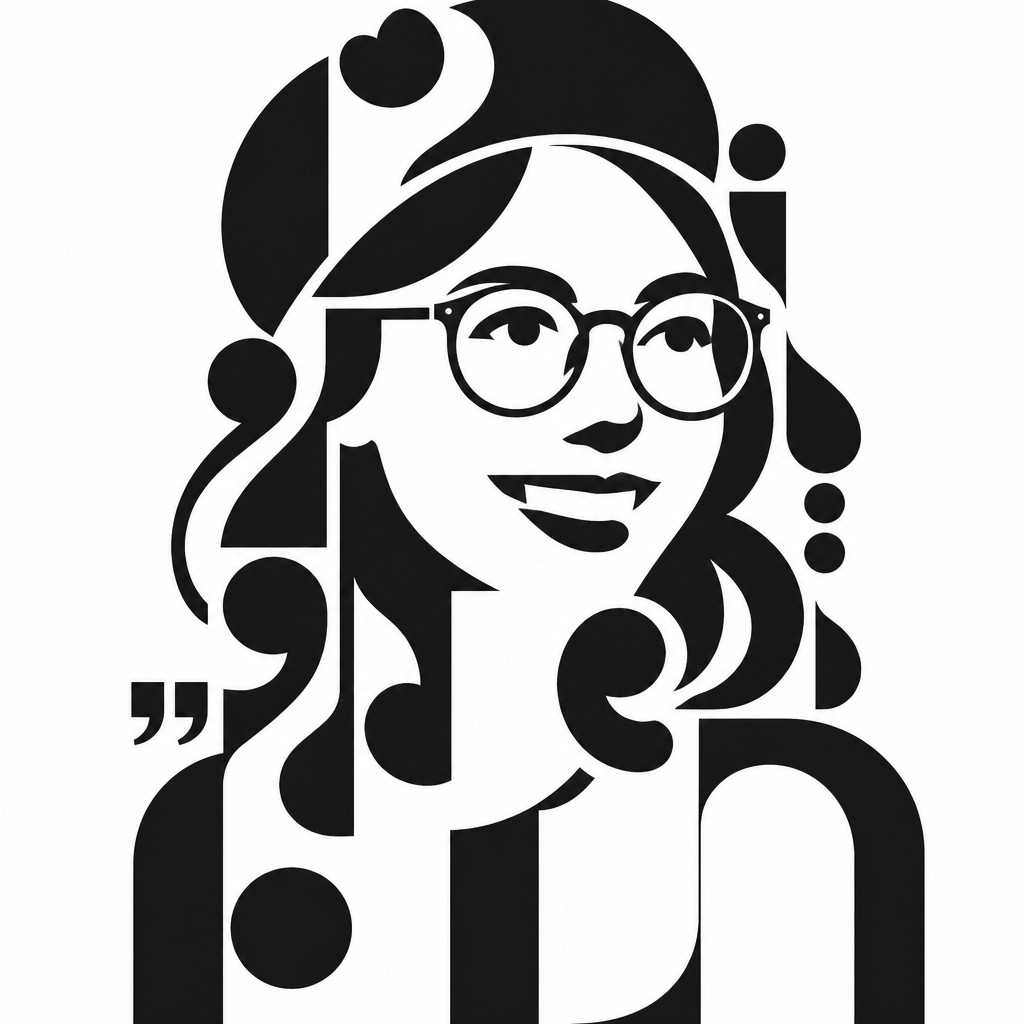
Letters as sculptural forms
Characters are enlarged, cropped, repeated, or isolated until they read as abstract shapes. Their linguistic function is secondary to their silhouette, weight, and spatial presence.
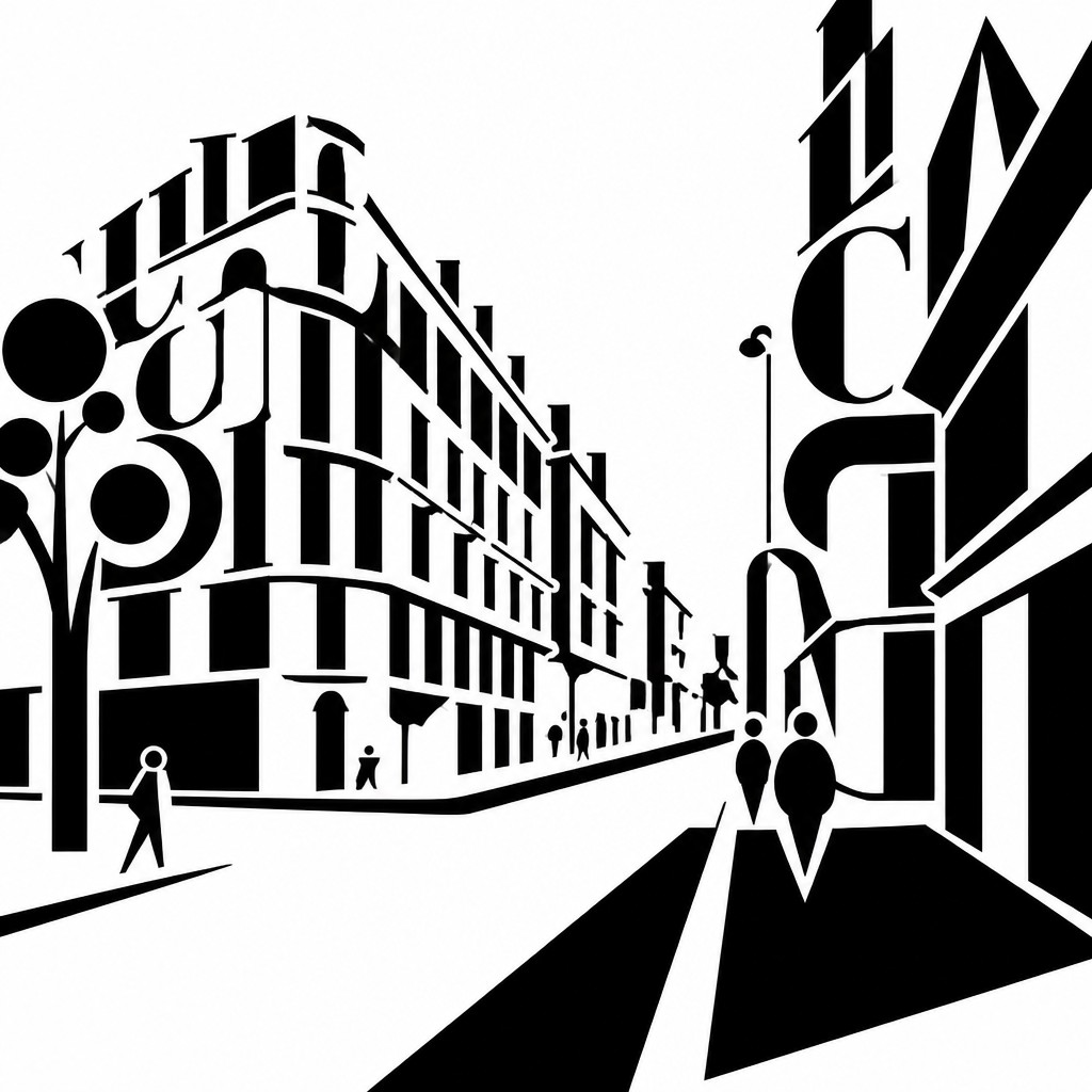
Monochrome palette
The style usually relies on black ink or black vector forms on a white ground, with little or no tonal variation. This restraint heightens contrast and emphasizes edge, proportion, and spacing.
Maximum negative space
Empty space is not incidental; it is a core compositional element. Large voids create tension and allow the typography to feel deliberate, spare, and architectonic.
Precision and alignment
Forms are typically arranged with mathematical clarity, often following grid logic, center alignment, or carefully measured offsets. Even when the composition feels irregular, it is usually controlled rather than expressive.
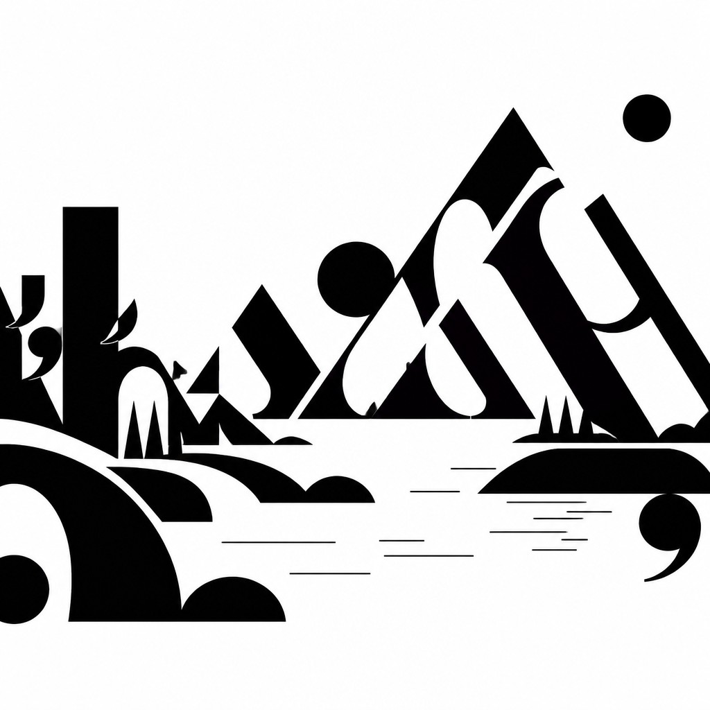
Readability disrupted
The text may be technically legible, but it is often pushed past normal reading scale or fragmented into partial forms. This displacement turns language into visual material.
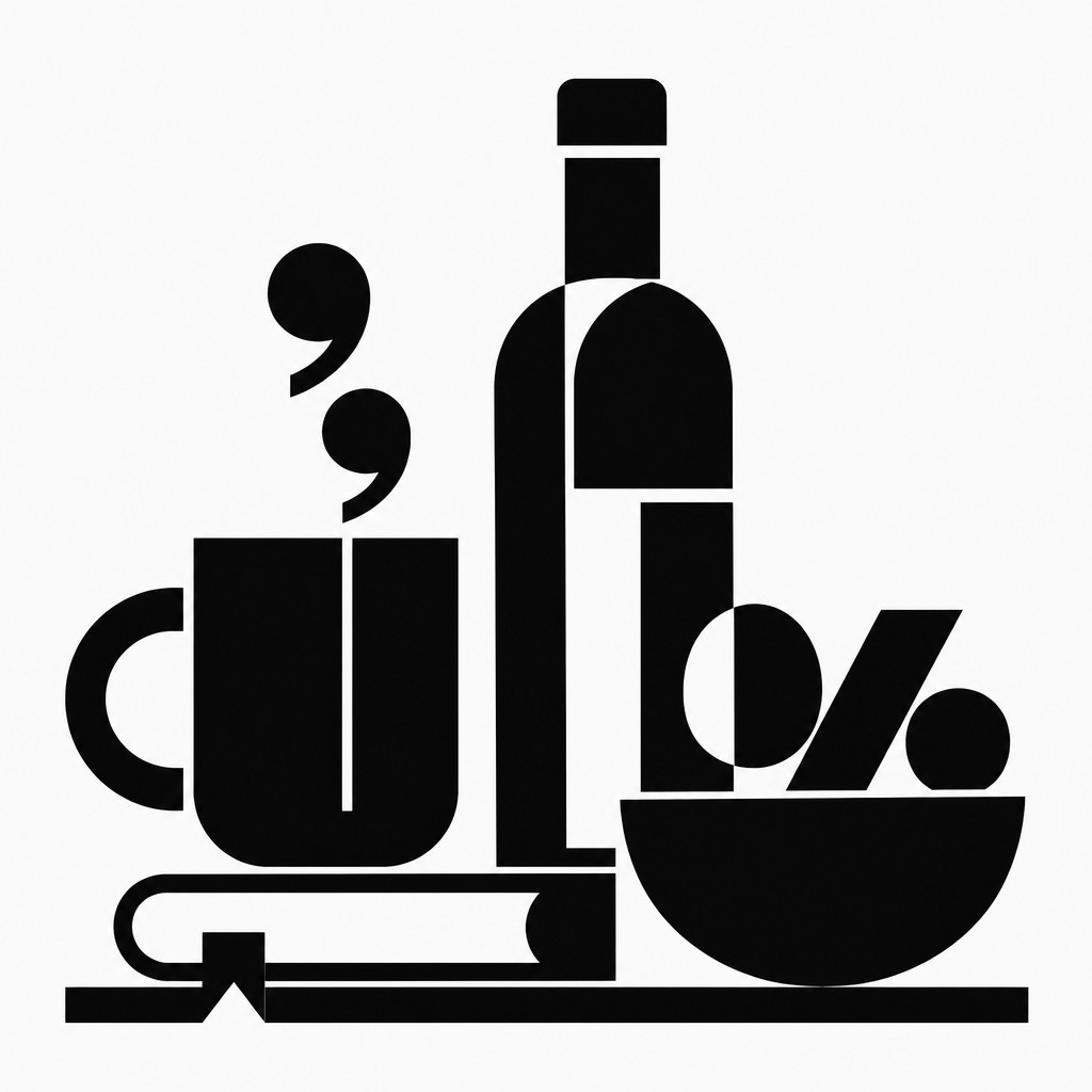
Flat graphic finish
Surfaces are clean and untextured, with no painterly brushwork, grain, or simulated lighting. The result is crisp, poster-like, and unmistakably designed.
Try It
Create Videos in Typographic Minimalism Art Style
Styles aren't just for stills — describe a scene or animate an image and get a short video rendered in Typographic Minimalism. Press play to see this pond come to life.
Make a VideoTypographic Minimalism Prompt Ideas
Start from an idea — each one opens the generator with the style ready to go. See all 40 Typographic Minimalism prompts →
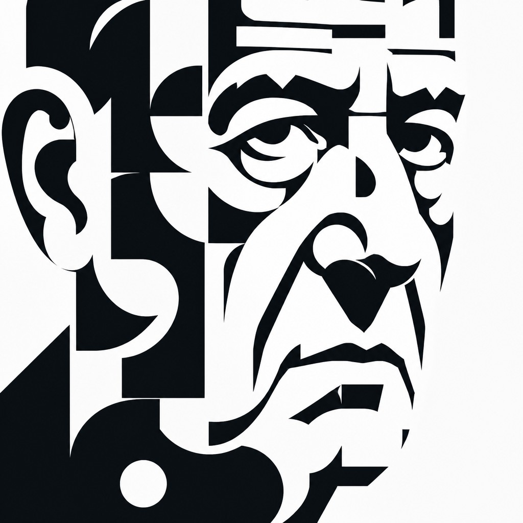
“close-up portrait of an elderly person with expressive weathered features”
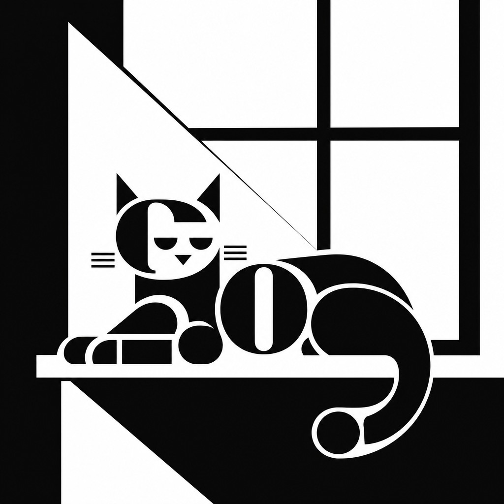
“a cat lounging in a sunlit window”
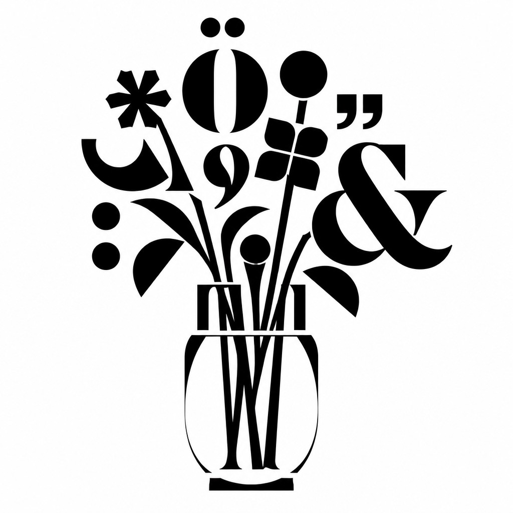
“bouquet of flowers in a glass vase”
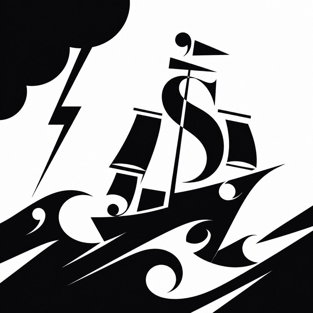
“sailing ship on a stormy sea”
How to Create Typographic Minimalism Art
Master the craft step by step — or skip straight to creating. Read the full guide →
- 1
Start from a reduced typographic system
Choose one typeface family or a narrow set of glyph forms, then reduce the composition to a few repeated characters. Limit the palette to black and white so the structure of the letterforms does the expressive work.
- 2
Think in terms of layout, not illustration
Build the image as if it were a poster or editorial spread: establish a grid, place forms with intention, and let empty space create hierarchy. The goal is to make the page feel designed, not decorated.
- 3
Push scale until meaning gives way to shape
Enlarge letters, punctuation, or fragments of words beyond normal readability. Cropping and overlapping can help transform language into monumental abstract geometry.
- 4
Use high-contrast vector treatment
In digital work, keep edges sharp and flat, with no gradients or texture. In traditional work, use solid ink, stencil methods, cut paper, or precise black marker forms to preserve the same hard-edged clarity.
- 5
Balance clarity with intentional ambiguity
If you are using prompt-based generation, specify that the subject should be rendered from letters, glyphs, and punctuation, with maximum negative space and no texture or shading. For image-to-image work, emphasize monochrome contrast, strict alignment, and the loss of literal readability.
The Story
History & Origins of Typographic Minimalism
Typographic Minimalism is best understood as an aesthetic lineage rather than a single historical movement. It draws from 20th-century modernist typography, especially the ideas of the Bauhaus, De Stijl, Swiss/International Style graphic design, and later conceptual and concrete poetry, all of which explored the formal properties of language and the page.
Its closest precedents also include experimental typographic work by leading early- and mid-20th-century designers and constructivist graphic innovators, who used letters as abstract visual elements within disciplined grids and reductionist layouts. In contemporary visual culture, the style reappears in poster design, editorial graphics, motion graphics, and digitally generated image-making where text is treated as structure, not readable content.
Influences: This style is related to modernist graphic design, especially the disciplined typography of the Bauhaus, De Stijl, and the Swiss/International Style associated with leading early- and mid-20th-century typographic designers and layout specialists. It also echoes the conceptual use of language in concrete poetry and the abstraction of letterforms in the work of pioneering Constructivist and Bauhaus-associated graphic artists, where typography becomes image, structure, and idea at once.
Frequently Asked Questions
What defines Typographic Minimalism?
It is defined by the reduction of imagery into letterforms, glyphs, and punctuation treated as abstract shapes. The style depends on monochrome contrast, generous negative space, and controlled alignment.
Is this style meant to be readable?
Usually only partially. The text may begin as language, but the style intentionally pushes it toward abstraction so that form matters more than readability. Some compositions remain legible, while others become almost entirely visual.
How is it different from standard typography?
Standard typography is designed primarily to communicate text clearly, while Typographic Minimalism uses text as visual material. It borrows the tools of graphic design but prioritizes composition, scale, and geometry over direct legibility.
What kinds of subjects work well in this style?
Simple, iconic, or strongly silhouetted subjects work especially well because they can be translated into reduced typographic structure. Faces, objects, architecture, animals, and single figures are common choices.
Where is this style commonly used?
It appears in poster design, editorial graphics, album art, identity systems, exhibition graphics, and conceptual image-making. It is also popular in contemporary digital art because it translates cleanly into vector-based workflows.
How do I make it look minimal rather than cluttered?
Restrict the palette, limit the number of characters, and leave more empty space than you think you need. Clutter usually comes from trying to preserve too much literal detail, so simplify the subject into a few strong typographic masses.
Create your first Typographic Minimalism artwork
Describe anything — or upload a photo — and see it in Typographic Minimalism Art Style in seconds.
Make Something with Typographic Minimalism
Compare Typographic Minimalism
Related Styles
Discover similar art styles