Typographic Minimalism vs Minimalist Poster Design: What's the Difference?
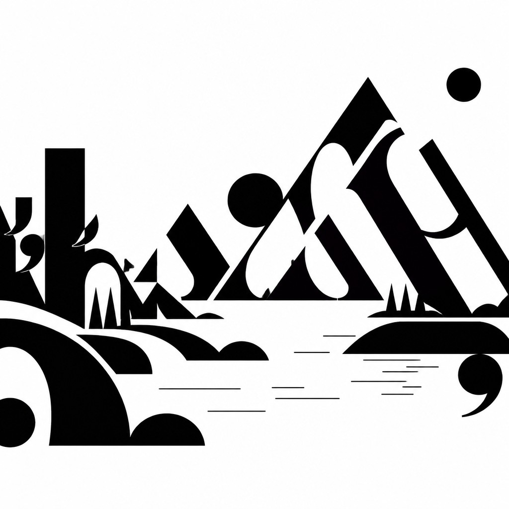
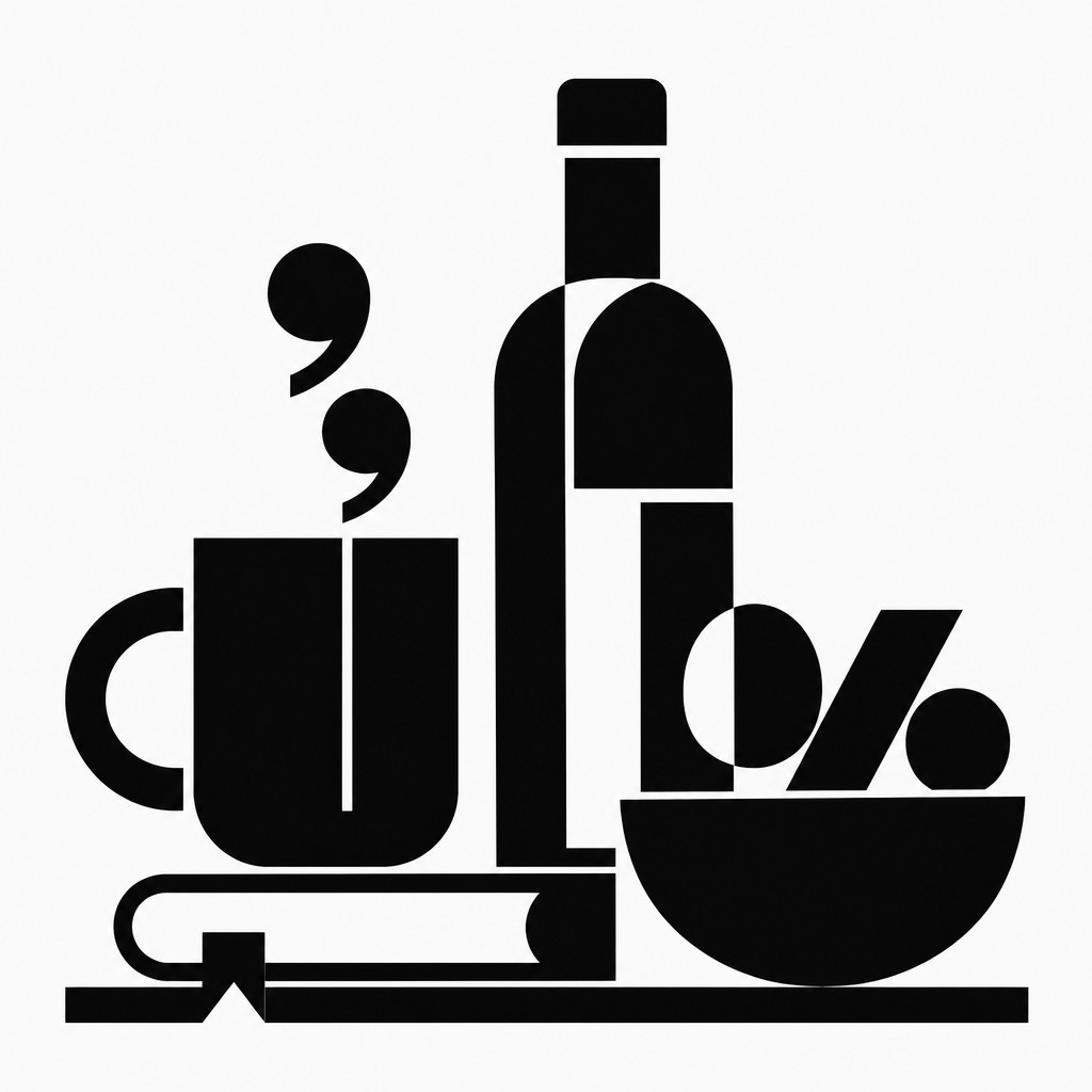
Typographic Minimalism Art Style treats letters, glyphs, and punctuation as the main visual material. It strips typography down to stark black-and-white form, focusing on spacing, rhythm, contrast, and the abstract beauty of language shapes rather than on readability or message.
Minimalist Poster Design uses a small number of colors, simple shapes, and generous negative space to communicate quickly and clearly. People compare the two because both rely on restraint, strong composition, and visual economy, yet one is more language-driven and abstract while the other is more message-driven and functional.
Same Prompt, Both Styles
Each pair below was generated from the identical prompt — only the style changed.
“portrait of two people together”
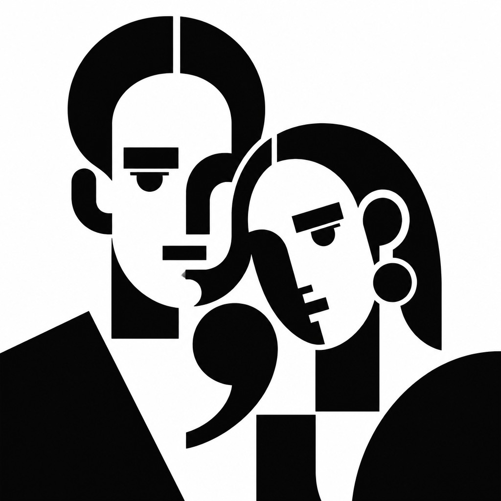
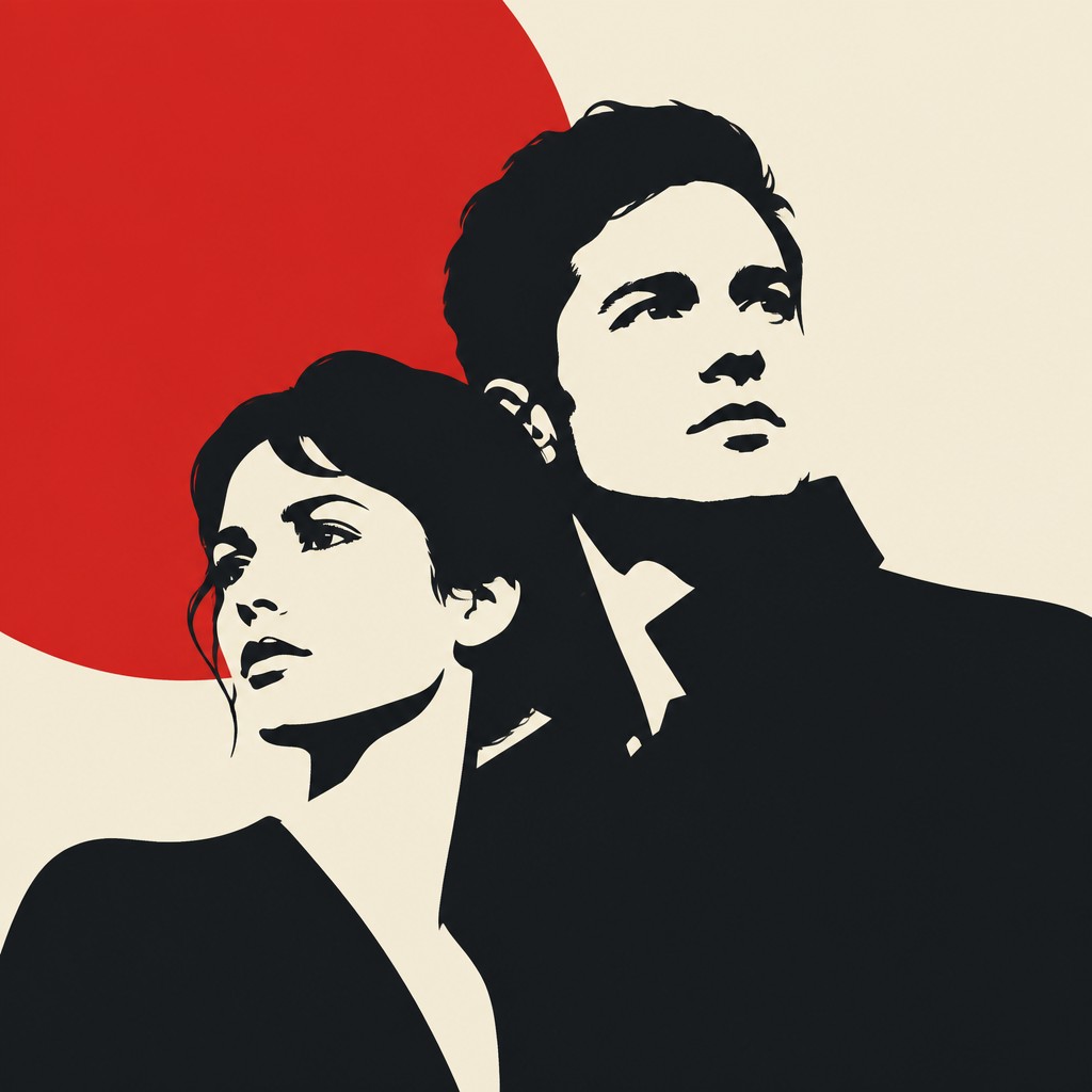
“wide landscape with natural scenery”

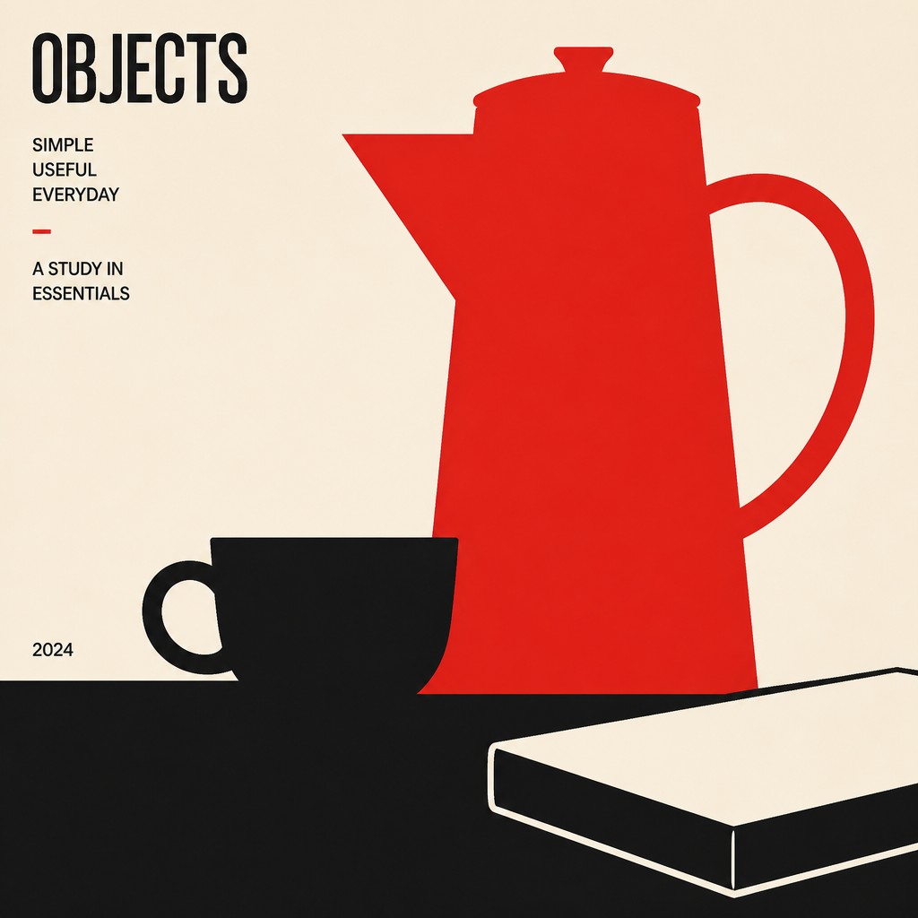
“still life with everyday objects”
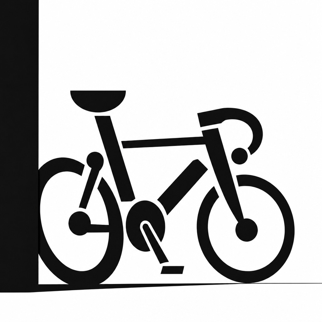
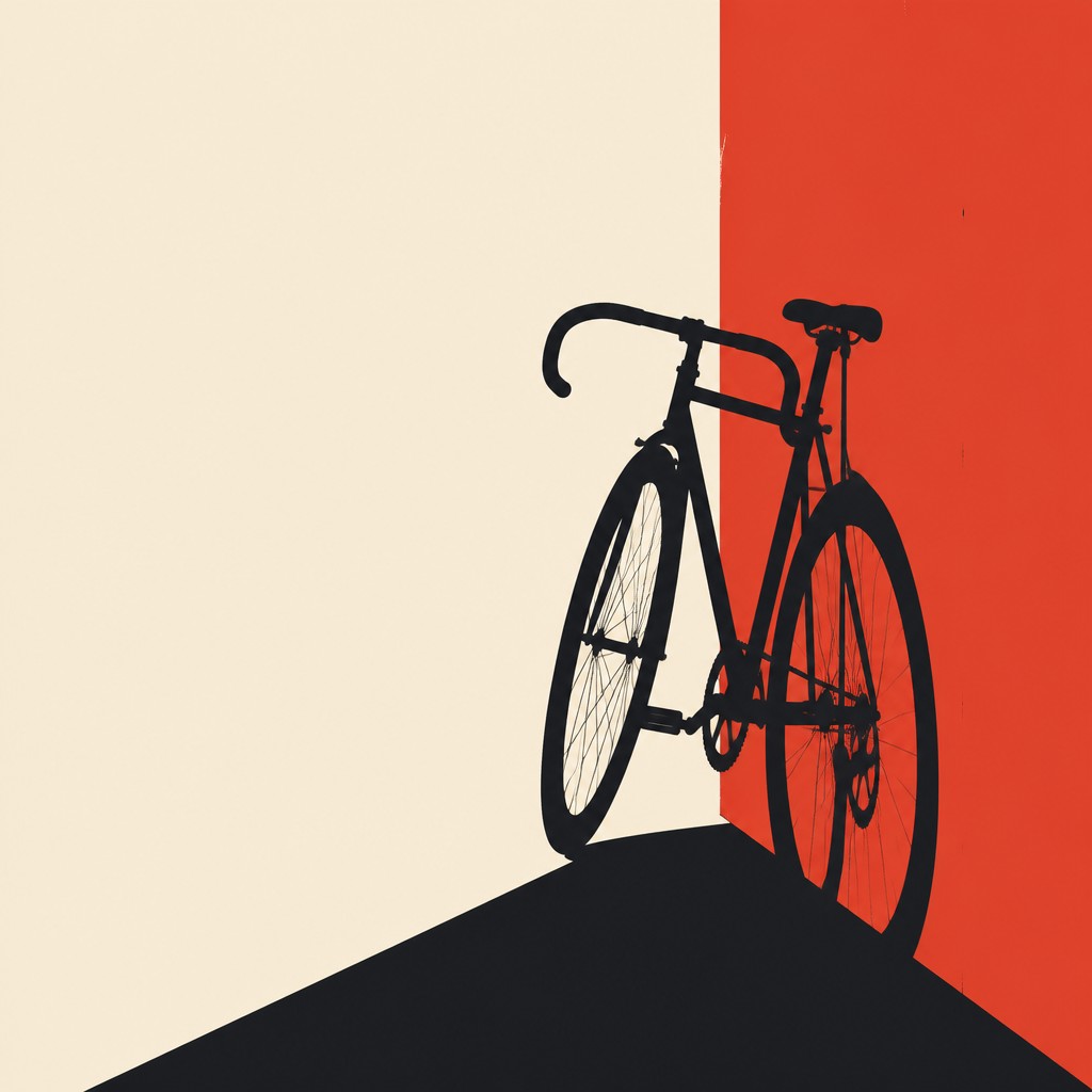
“bicyle resting against a wall”
Key Differences
| Typographic Minimalism | Minimalist Poster Design | |
|---|---|---|
| Core material | Letters and punctuation are the primary visual elements. | Shapes, text, and layout work together as communication tools. |
| Purpose | Often explores typography as abstract art or visual texture. | Designed to deliver a clear message at a glance. |
| Color use | Usually stark black-and-white with high contrast. | Limited palette, often one to three colors for emphasis. |
| Readability | Legibility may be secondary to form and composition. | Readability is usually preserved for fast understanding. |
| Composition | Dense, experimental arrangements of typographic forms. | Open layouts with strong hierarchy and negative space. |
| Visual tone | Conceptual, editorial, and sometimes cryptic. | Clean, direct, and often promotional or informational. |
| Mood | austere, contemplative, sparse, graphic | clean, focused, bold, restrained, sophisticated |
| Energy | calm | calm |
| Detail level | minimal | minimal |
| Color | black-and-white, high contrast, monochrome | limited palette, high contrast, neutral accents |
| Texture | flat, crisp, clean vector surfaces | flat, smooth, crisp edges |
| Origin | late 20th-century graphic design, digital-native aesthetic | 20th-century international graphic design |
| Best for | posters, album covers, editorial spreads, branding, book covers, gallery prints | posters, editorial graphics, brand campaigns, album covers, public signage, event promotion |
| Difficulty | moderate | moderate |
Which Should You Choose?
Choose Typographic Minimalism if the goal is to make language itself feel like art, especially for posters, editorials, or identity systems that can tolerate abstraction and reduced readability. Choose Minimalist Poster Design if the goal is to communicate a message clearly, guide attention fast, or create a polished poster with immediate visual impact. In short, pick A for expressive typography-first work and B for clear, shape-led communication.
Frequently Asked Questions
Is typographic minimalism a type of minimalist poster design?
It can appear in posters, but it is not the same thing. Typographic minimalism is defined by turning text into the main visual subject, while minimalist poster design is defined by clear communication using sparse composition.
Which style is easier to read?
Minimalist poster design is usually easier to read because it keeps hierarchy and legibility intact. Typographic minimalism may intentionally reduce readability to emphasize form, texture, or concept.
Can both styles use the same fonts?
Yes, they can use similar font families, but the treatment differs. Typographic minimalism often pushes letters into abstract arrangements, while minimalist poster design uses type more conventionally to support clarity.
Which style is better for branding?
It depends on the brand goal. Typographic minimalism works well for brands seeking a conceptual, design-forward identity, while minimalist poster design is stronger when quick recognition and message clarity matter most.