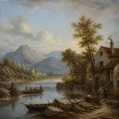
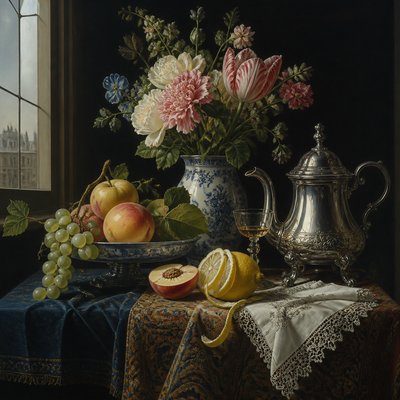
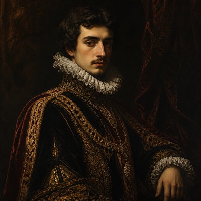
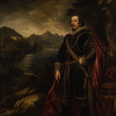
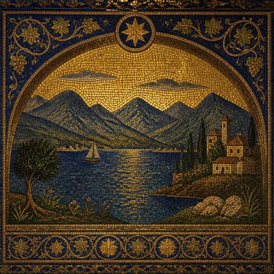
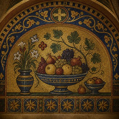
Saturation Art Style
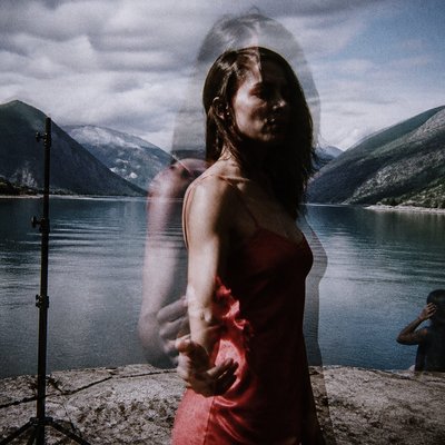
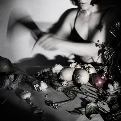
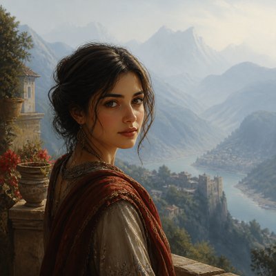
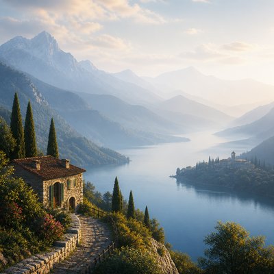
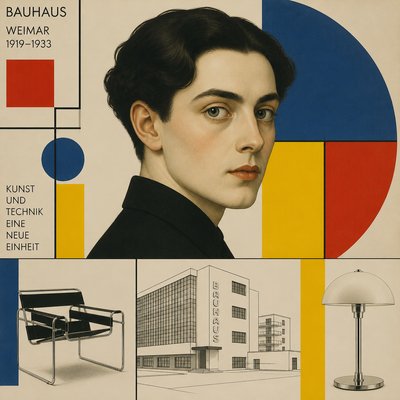
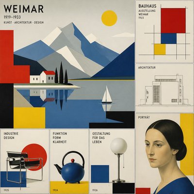
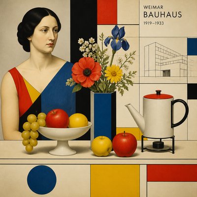
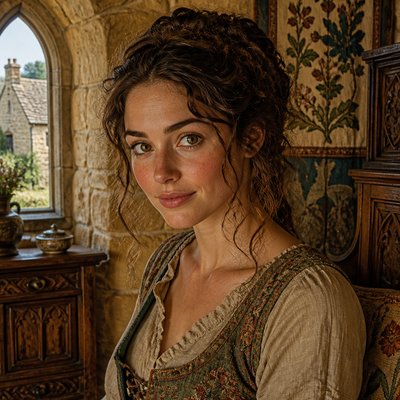
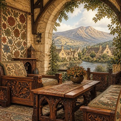
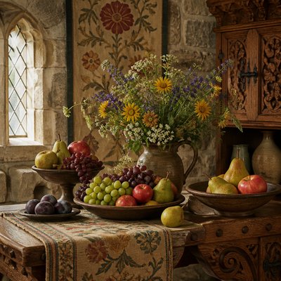
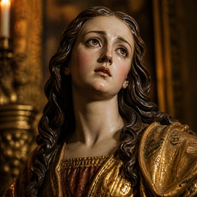
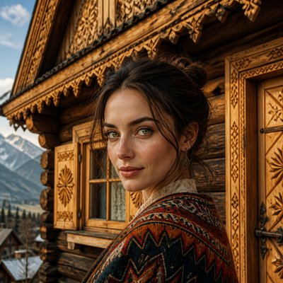
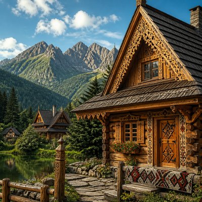
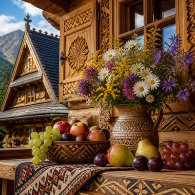
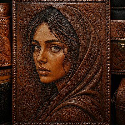
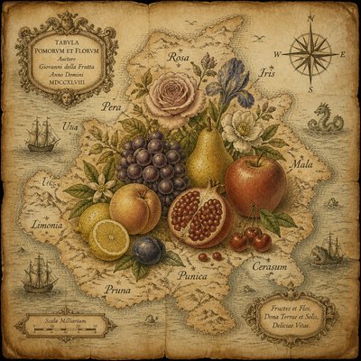
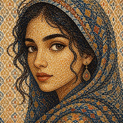
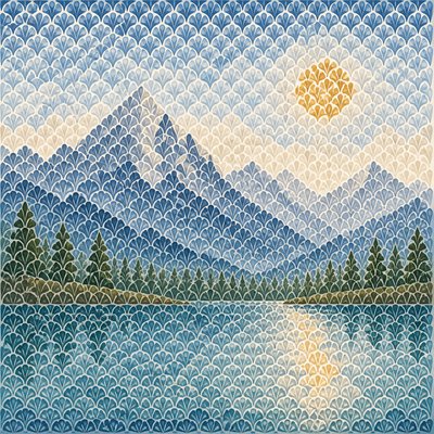
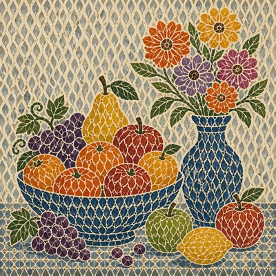
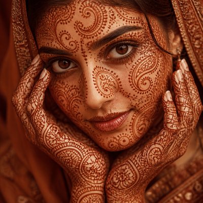
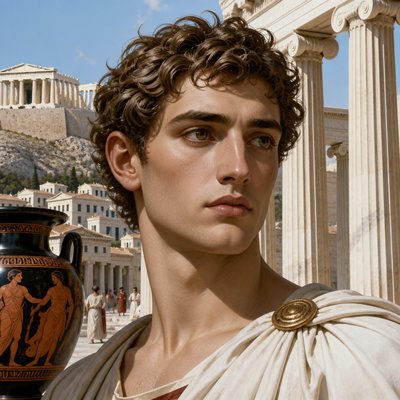
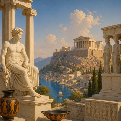
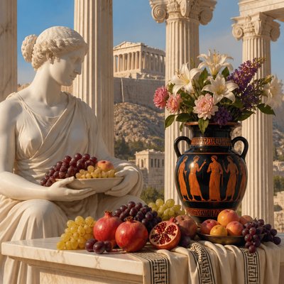
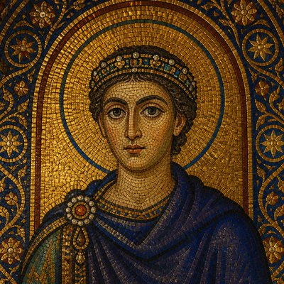
Explore Saturation Art Style: electric pure hues, high-chroma color fields, and bold undiluted contrasts for vivid visual impact.
Instantly rendered in Saturation — or transform a photo
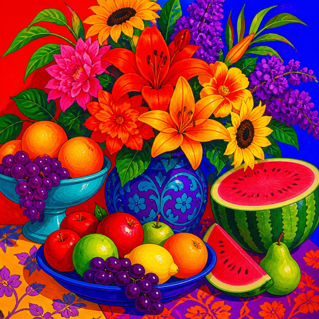
Saturation Gallery
Tap any artwork to explore it
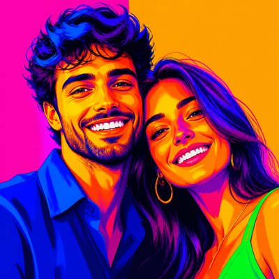
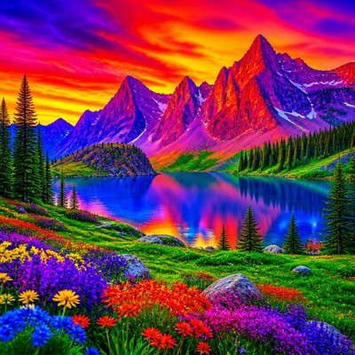
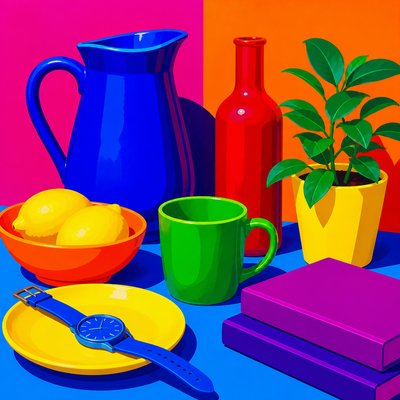
What is Saturation Art Style?
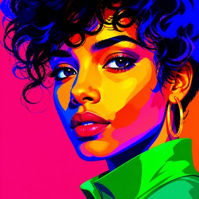
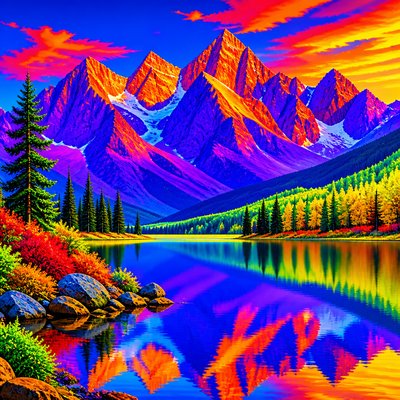
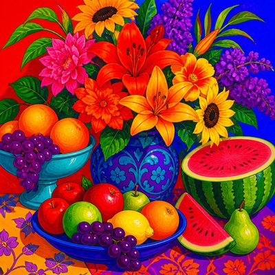
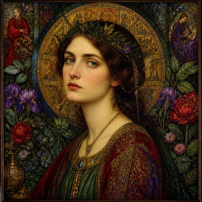
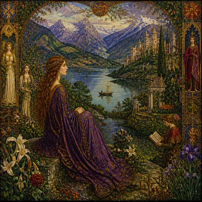
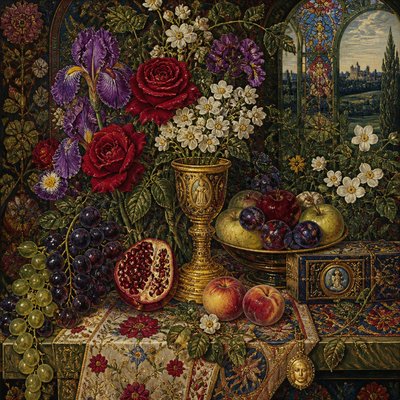
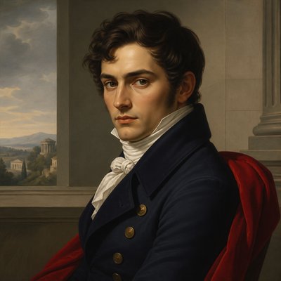
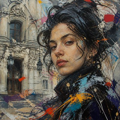
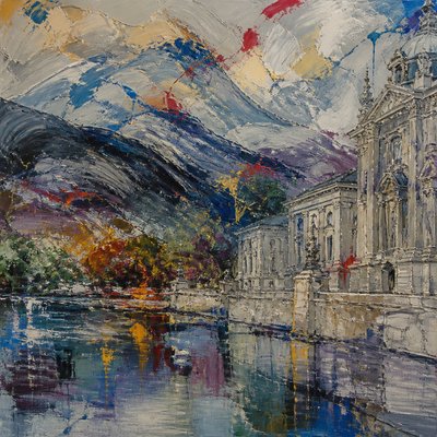
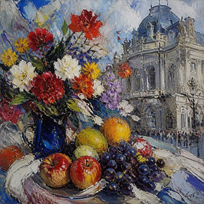
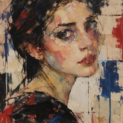
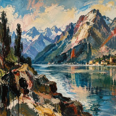
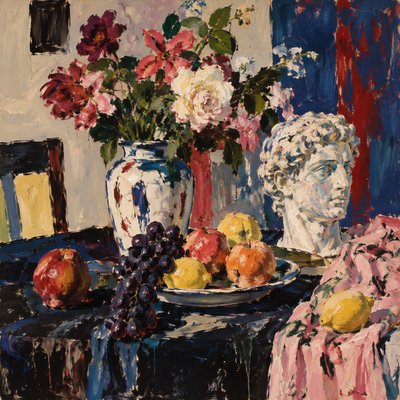
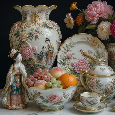
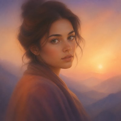
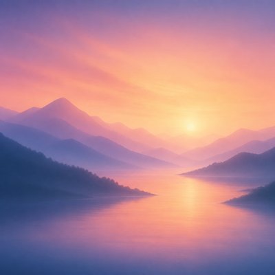
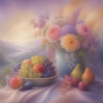
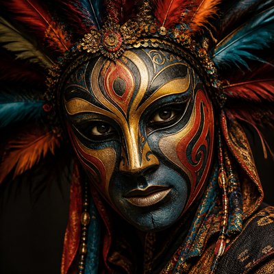
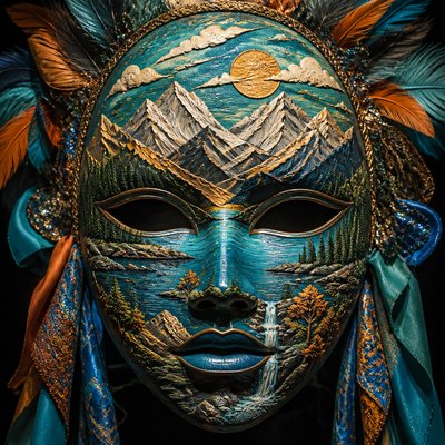
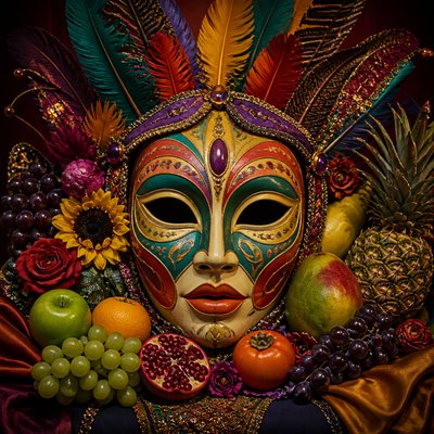
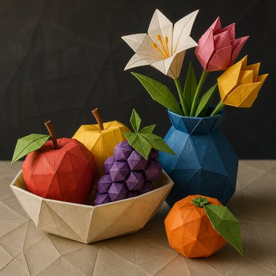
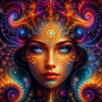
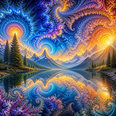
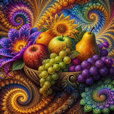
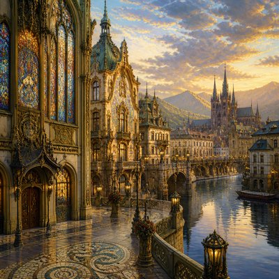
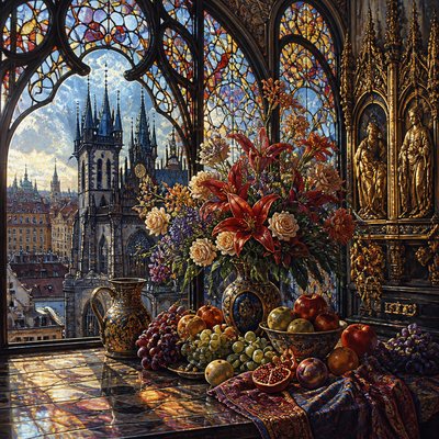
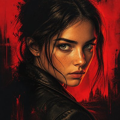
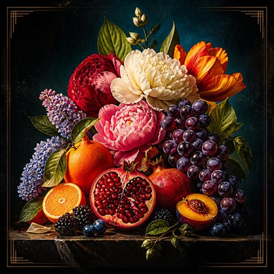
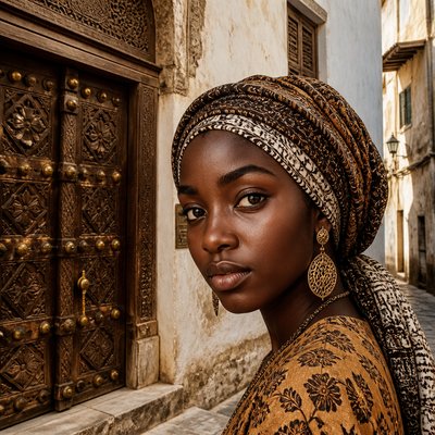
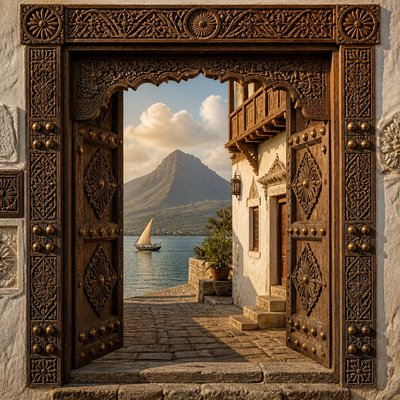
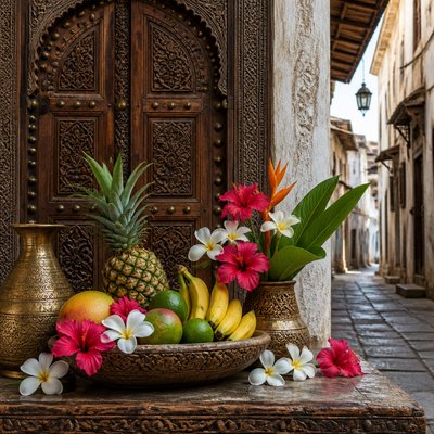
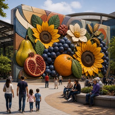
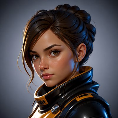
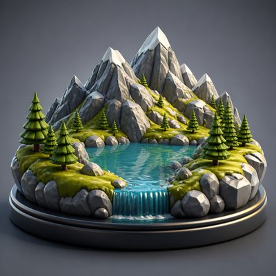
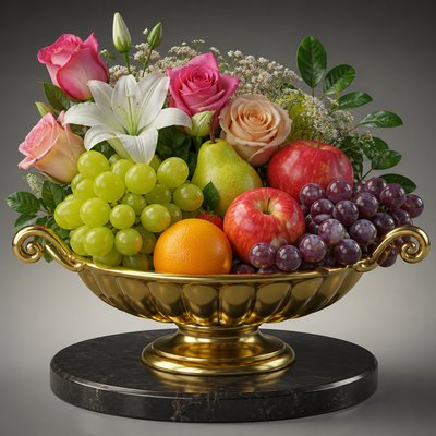
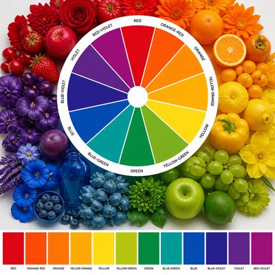
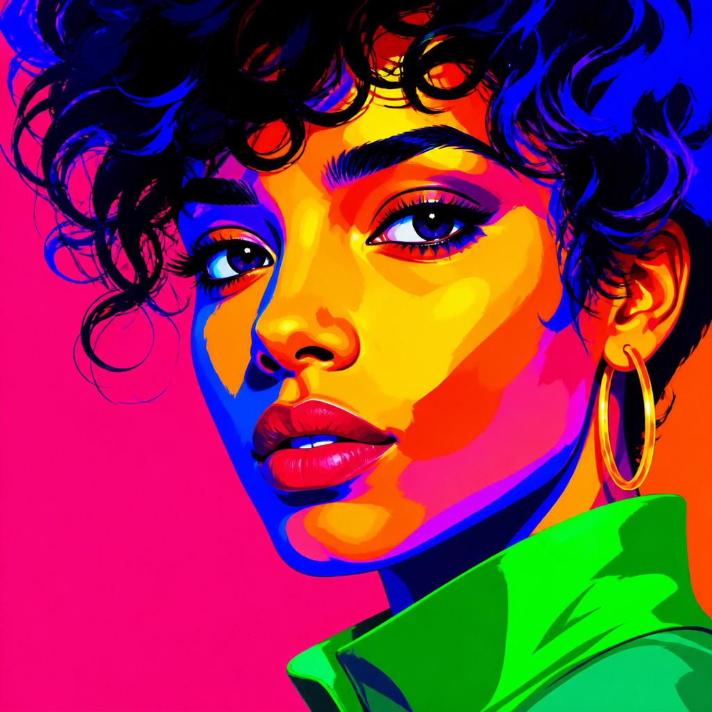
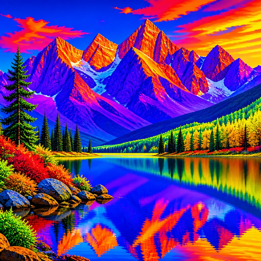
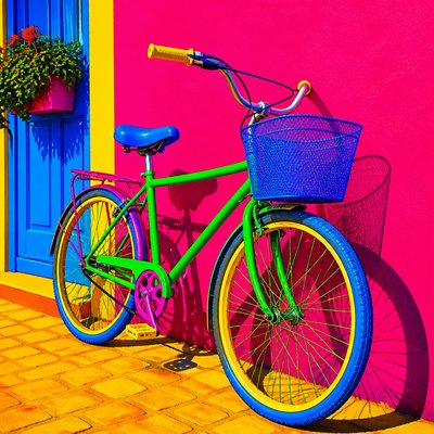
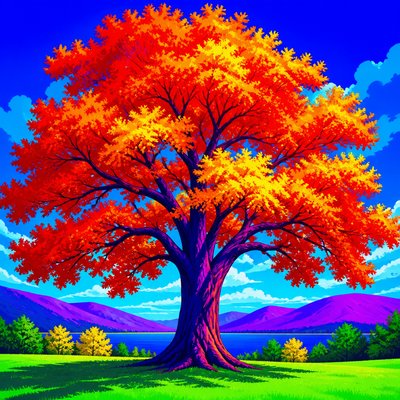
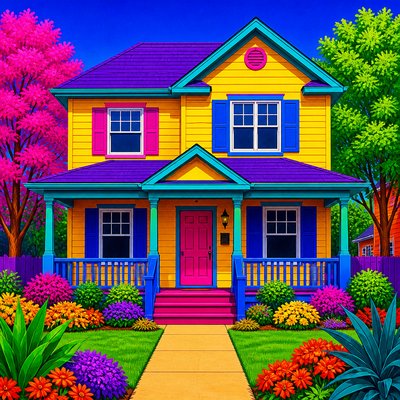
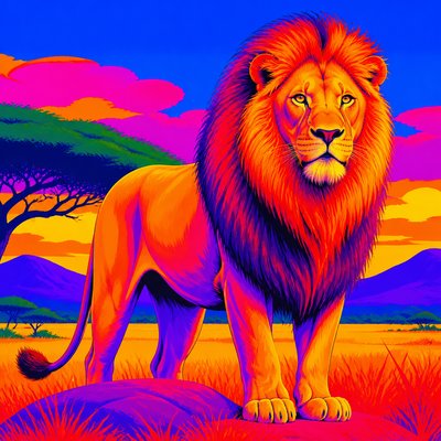
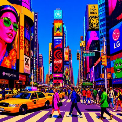
Saturation Art Style is a contemporary, descriptive approach centered on color intensity rather than a particular subject, medium, or historical movement. It uses highly vivid, high-chroma hues—such as electric red, ultraviolet violet, cyan, acid green, and brilliant orange—as the dominant structural elements of an image.
Its visual identity comes from minimizing gray, brown, pastel, and muted mixtures while allowing pure colors to occupy large, assertive areas. Forms may be realistic, graphic, abstract, or fantastical, but the color treatment remains emphatic: surfaces appear energized, contrasts feel immediate, and the composition is designed to produce strong chromatic impact at first glance.
Try It On Your Photos
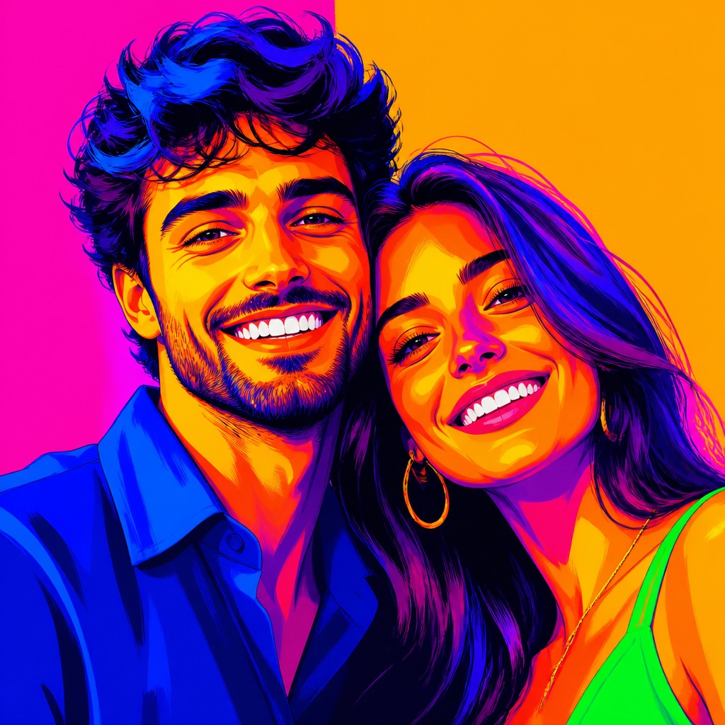
Upload any photo and convert it into Saturation Art Style — drag the sliders to compare before and after.


What Defines Saturation Art Style
The signature details, up close
Maximum chroma
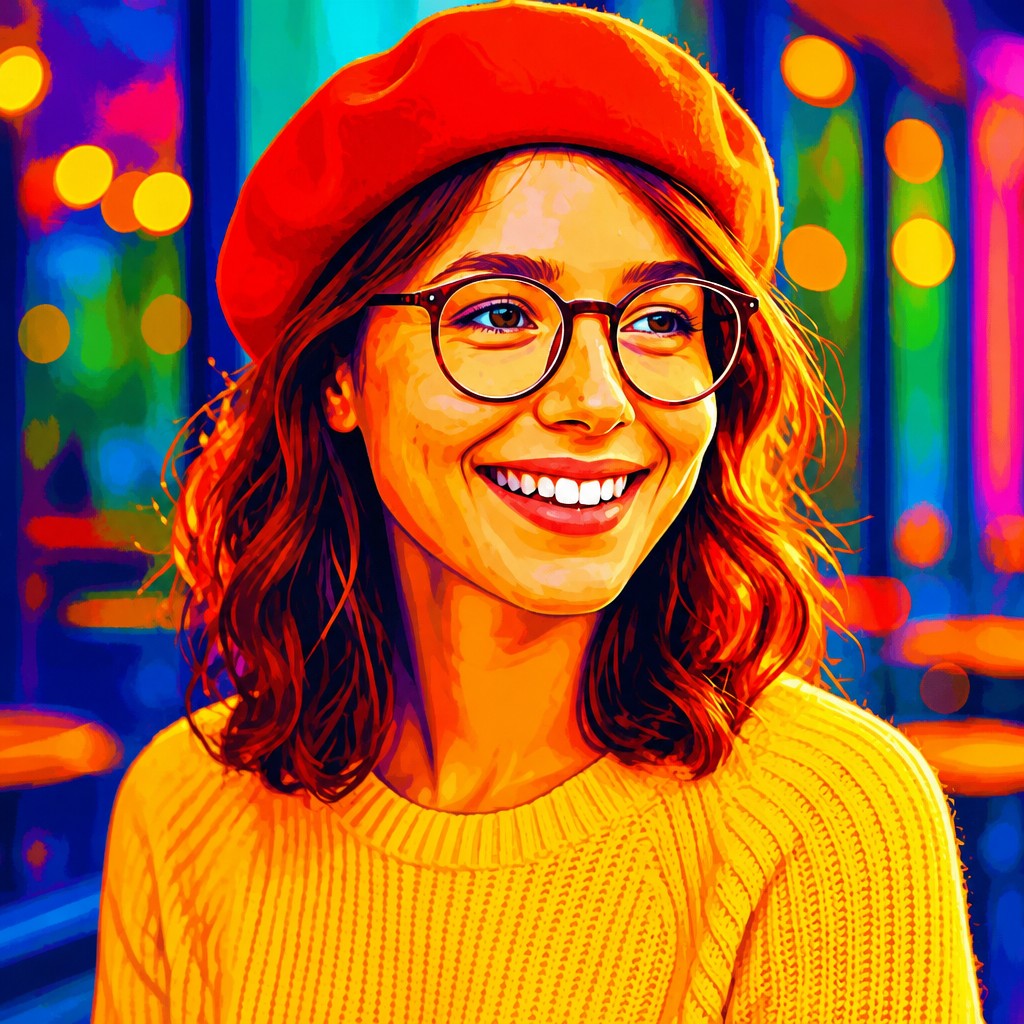
Colors are selected for intensity and purity, with minimal gray or complementary neutralization. The palette favors hues that remain visually forceful even when used across broad areas.
Electric hue relationships
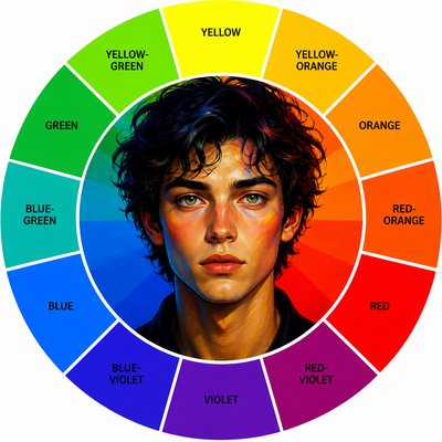
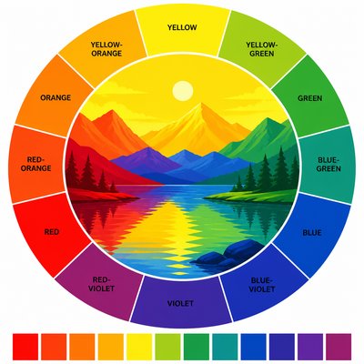
Strongly contrasting colors—such as cyan against red or violet against yellow—create immediate visual tension. Adjacent high-chroma hues may also be placed together for a vibrating, energized effect.
Bold color blocks
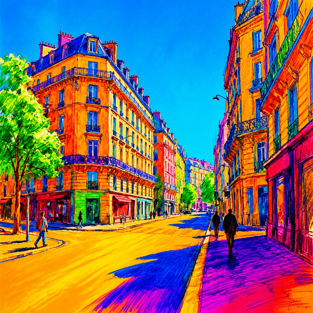
Large, clearly legible areas of color organize the image and often replace delicate tonal modeling. Edges may be crisp and graphic, though painterly surfaces can retain the same chromatic intensity.
Limited neutral modulation
Black, white, gray, and muddy mixtures are used sparingly so they do not dilute the central color experience. When shadows are present, they are often expressed through deep chromatic hues rather than neutral black.
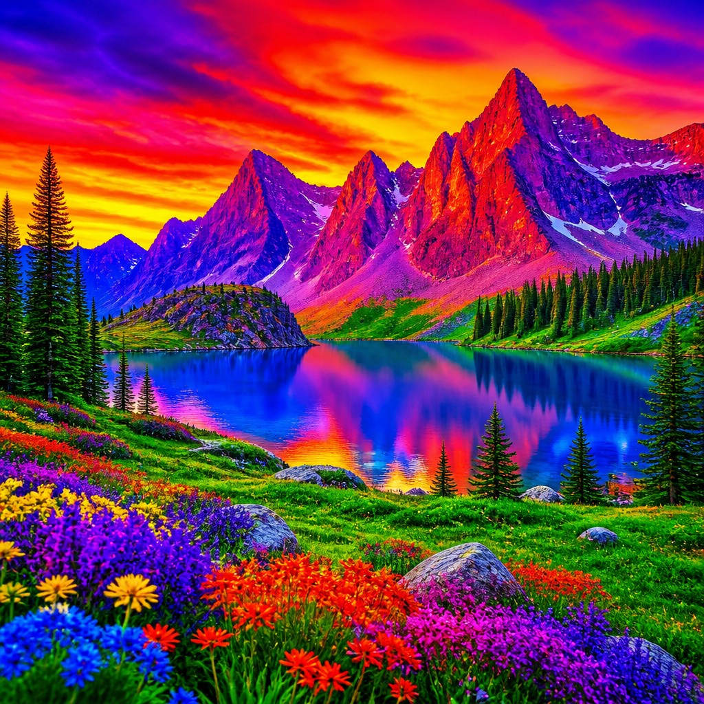
Compressed tonal range
The style commonly reduces subtle midtone transitions in favor of decisive light-dark and hue-to-hue changes. This makes silhouettes, patterns, and focal forms read quickly.
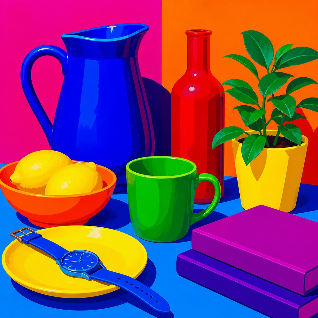
Color-led composition
Hue distribution can be as important as subject matter or perspective. Repeated color accents, saturated focal zones, and deliberate warm-cool balances guide the viewer through the image.
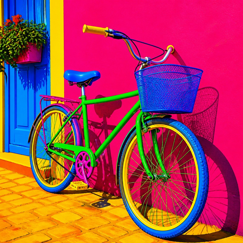
Sensory visual intensity
The combined effect is energetic, artificial, luminous, or feverishly expressive rather than restrained or naturalistic. The style can suggest digital light even when applied to traditional media.
Saturation Prompt Ideas
Start from an idea — each one opens the generator with the style ready to go. See all 40 Saturation prompts →
How to Create Saturation Art
Master the craft step by step — or skip straight to creating. Read the full guide →
- 1
Build a restricted high-chroma palette
Choose a small group of vivid primary, secondary, and fluorescent-leaning colors before beginning. Test them together and remove mixtures that become gray, dusty, or unintentionally pastel.
- 2
Separate hues instead of muddying them
In paint, layer clean colors and wash brushes thoroughly between applications; use opaque blocks or deliberate glazing rather than uncontrolled mixing. In digital software, keep saturated colors on separate layers and monitor them in a wide-gamut workflow when possible.
- 3
Use chromatic shadows
Model depth with dark violet, ultramarine, crimson, teal, or another colored shadow instead of relying only on neutral black. Reserve the darkest values for structural accents so the overall image stays vivid.
- 4
Control contrast and visual hierarchy
Place the most intense complementary contrast near the focal subject and allow secondary areas to repeat or echo those hues. Too many unrelated colors at equal strength can flatten the composition.
- 5
Translate the intent into a prompt
Describe the subject first, then request intensely vivid pure hues, maximum chroma, bold undiluted color blocks, minimal gray, and strong complementary contrast. Add medium cues such as screen print, painted canvas, poster design, or luminous digital illustration to control the surface.
- 6
Refine saturation after generation
If an image looks muddy, increase vibrance selectively, replace neutral shadows with colored ones, and simplify competing details. If it appears harsh or clipped, lower saturation in background areas while preserving the focal color relationships.
The Story
History & Origins of Saturation
Saturation Art Style is best understood as a contemporary and AI-native aesthetic label rather than a documented historical movement with a fixed period or founding school. Its lineage draws on several established traditions that treated color as an independent expressive force, including modernist color abstraction, Fauvist and Expressionist approaches to non-naturalistic hue, Pop Art's flat commercial color, psychedelic graphics, and later digital color practices.
The style has become especially practical in digital image-making, where wide-gamut displays, direct color controls, gradient mapping, and prompt-based systems make extreme chroma easy to specify. Unlike a historical movement, it does not require a shared manifesto or geographic center; its consistency comes from the deliberate pursuit of pure, visually forceful color.
Influences: The style relates to Fauvist and Expressionist color, where hue can depart from natural observation to convey sensation; modernist and Color Field abstraction, where broad areas of color organize the picture; Pop Art and screen-print traditions, which favor flat, reproducible color; psychedelic poster design, known for vibrating complementary combinations; and contemporary digital illustration, which makes precise control of chroma and luminous color widely accessible.
Frequently Asked Questions
What defines Saturation Art Style?
It is defined by an intentional emphasis on color saturation, purity, and visual intensity. Images typically use high-chroma hues, limited neutral mixing, bold color areas, and strong chromatic contrasts.
Is Saturation Art Style a historical art movement?
No. It is a contemporary descriptive aesthetic rather than a historically bounded movement with a recognized founding date or unified manifesto. Its visual language combines ideas from several color-focused art and design traditions.
How is it different from neon or vaporwave aesthetics?
Neon aesthetics often focus on artificial glow, nightlife, or luminous signage, while vaporwave commonly draws on retro-digital imagery and nostalgic late-20th-century design. Saturation Art Style is broader: it can depict any subject and does not require glow, nostalgia, or a specific cultural palette.
Can this style be used for realistic images?
Yes. A realistic scene can retain recognizable anatomy, perspective, and texture while using unusually pure hues and chromatic shadows. The result is colorically heightened rather than strictly naturalistic.
How can I avoid making the image look muddy?
Use clean pigments or separate digital layers, avoid overmixing complementary colors, and keep neutral grays out of large areas. Establish a limited palette and assign the strongest saturation to the main subject or focal region.
Where is this aesthetic commonly used?
It suits posters, editorial illustration, album and event artwork, packaging, fashion imagery, game environments, murals, social media graphics, and experimental photography. Its strong color separation also helps images remain legible at a distance or in small formats.
Create your first Saturation artwork
Describe anything — or upload a photo — and see it in Saturation Art Style in seconds.
Related Styles
Discover similar art styles