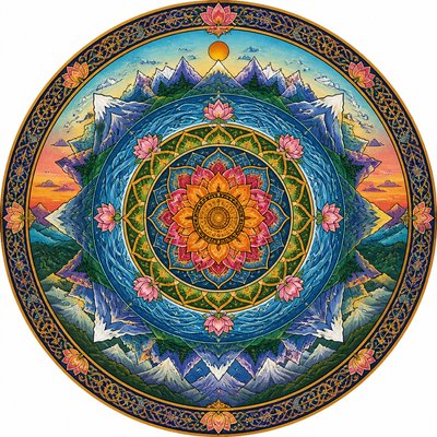
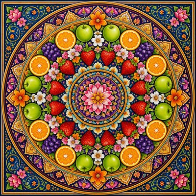
Gradation Art Style
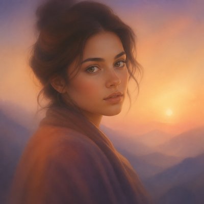
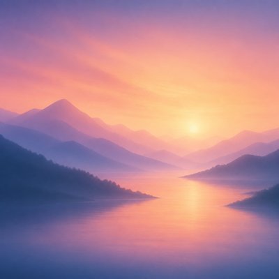
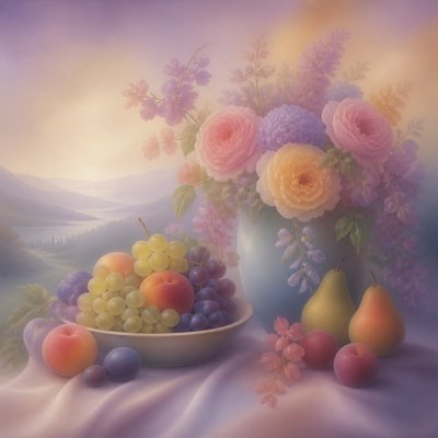
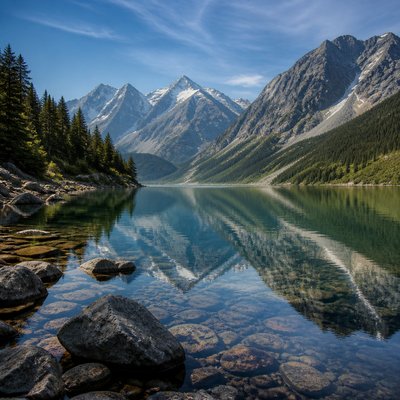
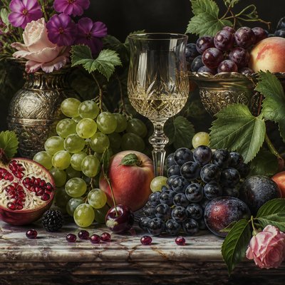
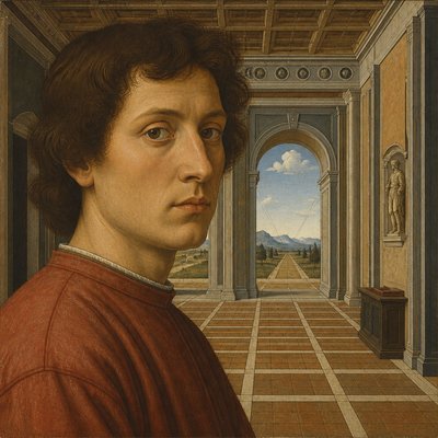
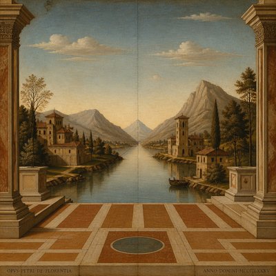
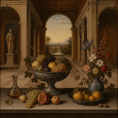
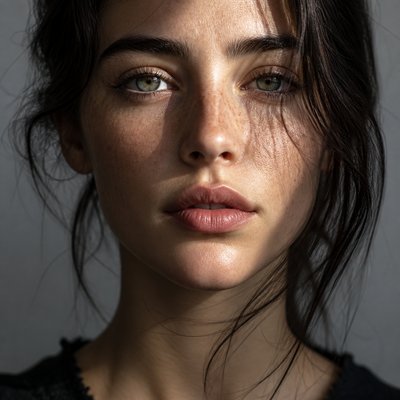
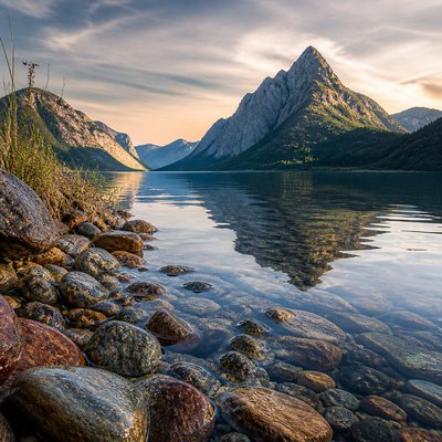
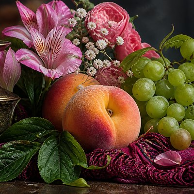
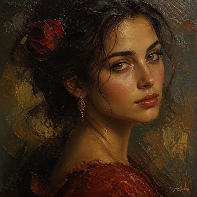
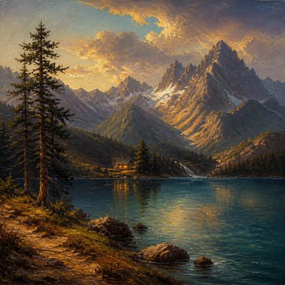
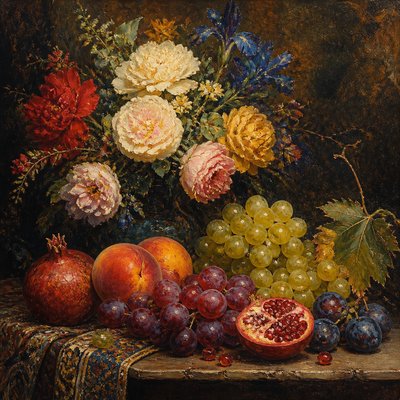
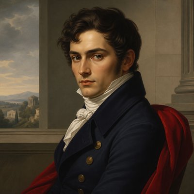
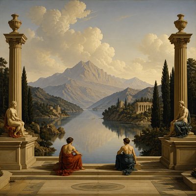
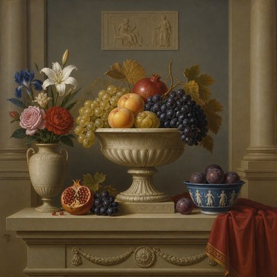
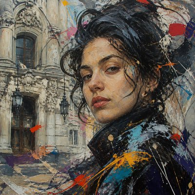
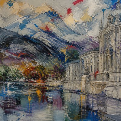
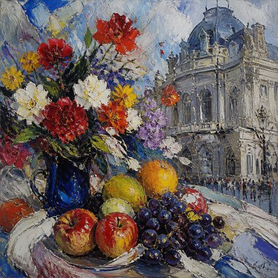
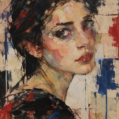
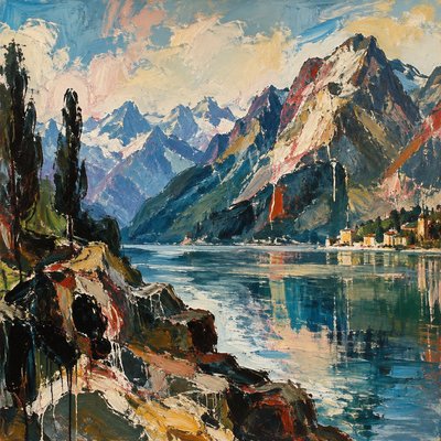
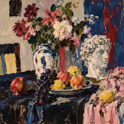
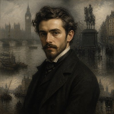
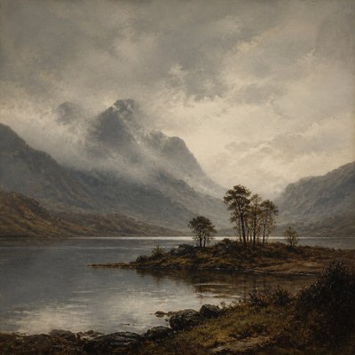
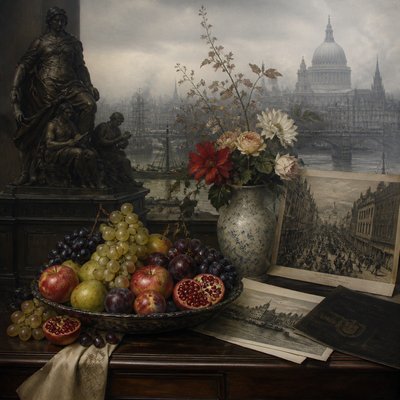
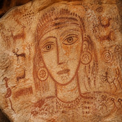
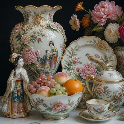
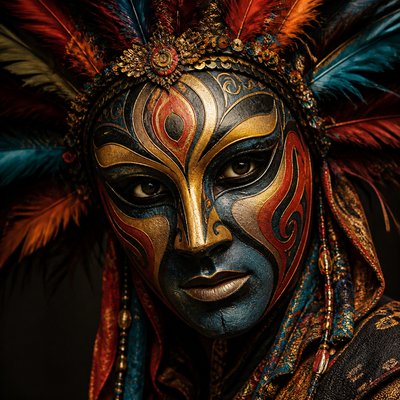
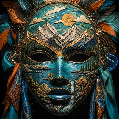
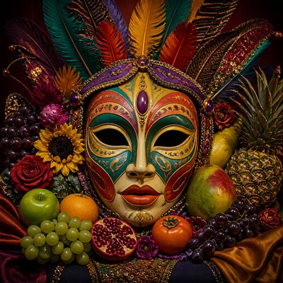
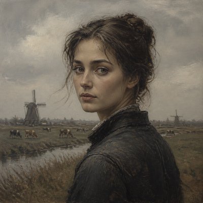
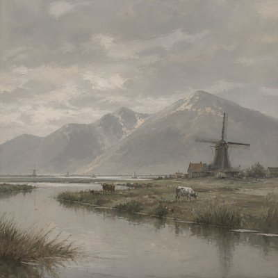
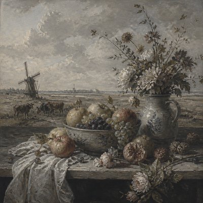
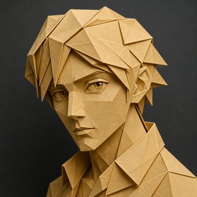
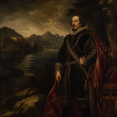
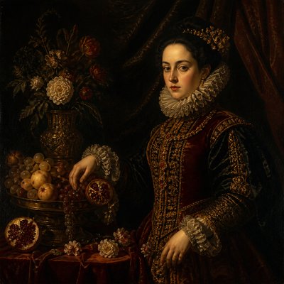
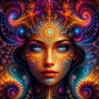
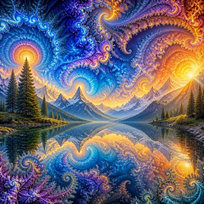
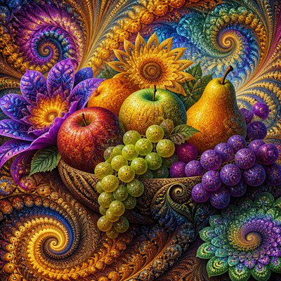
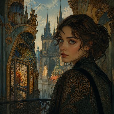
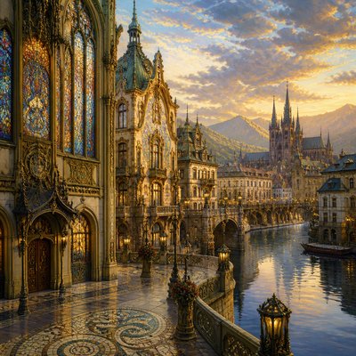
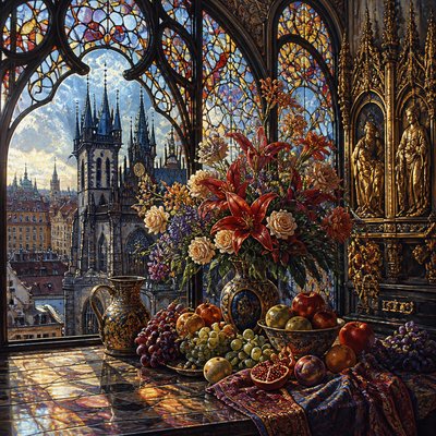
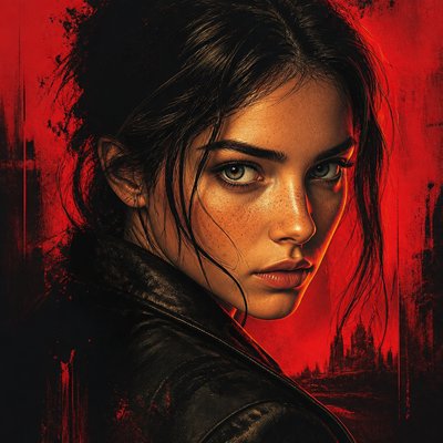
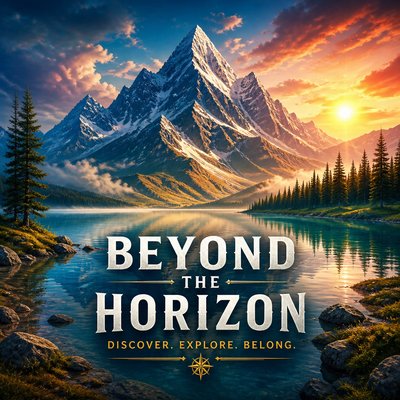
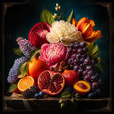
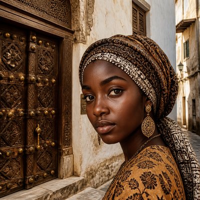
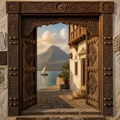
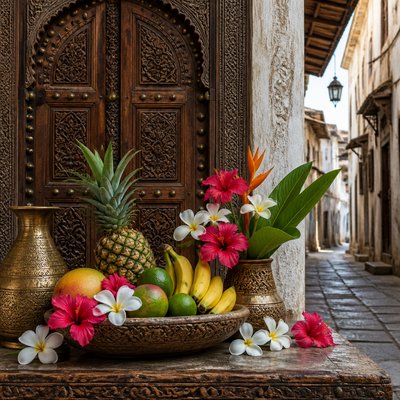
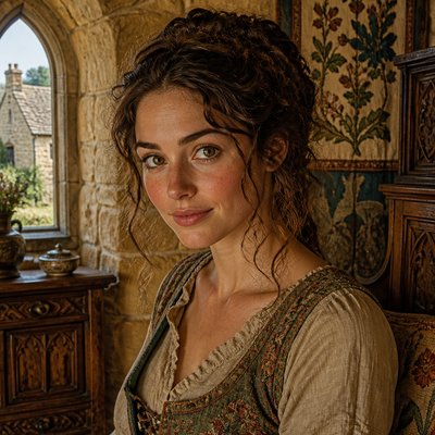
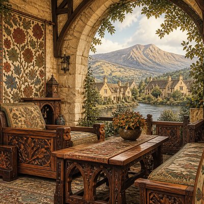
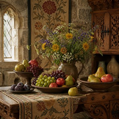
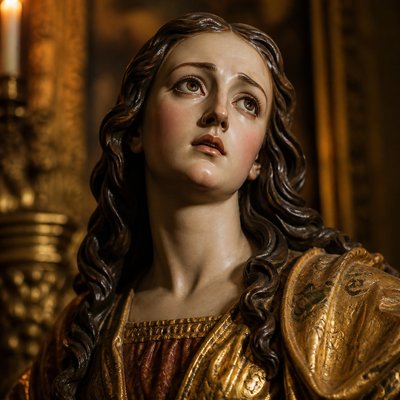
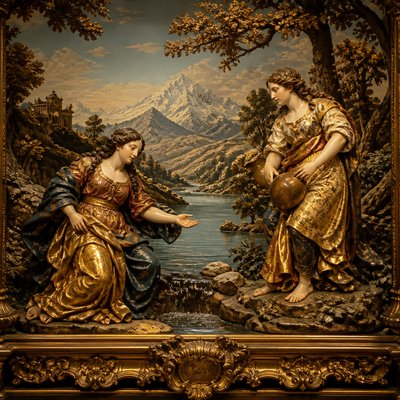
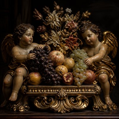
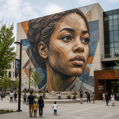
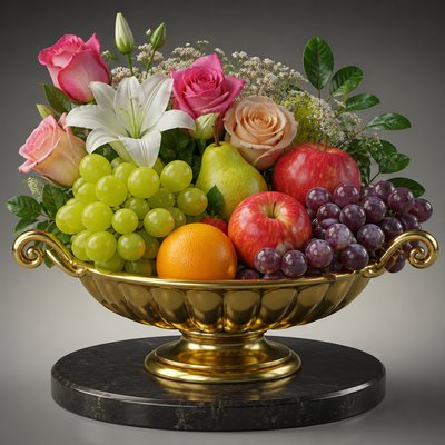
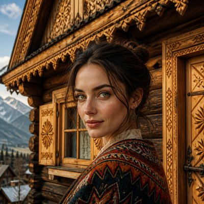
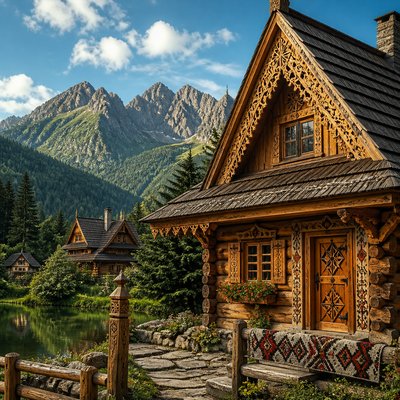
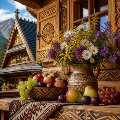
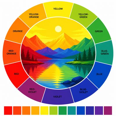
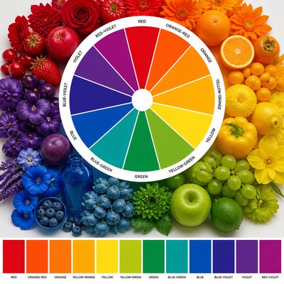
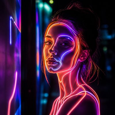
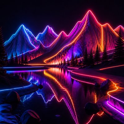
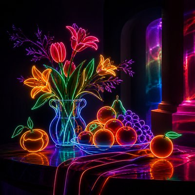
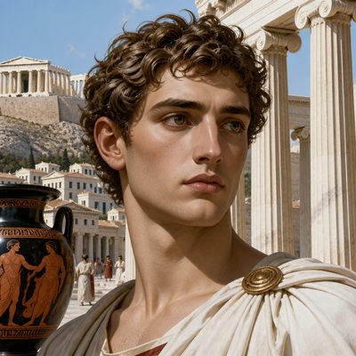
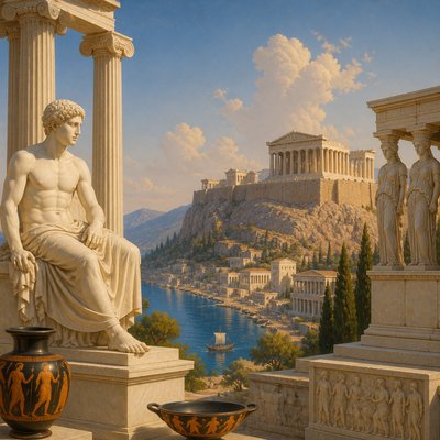
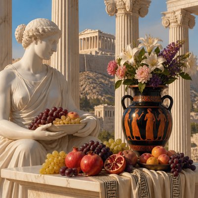
Explore Gradation Art: seamless color, light, and atmospheric transitions create soft, depth-rich images without hard edges.
Instantly rendered in Gradation — or transform a photo
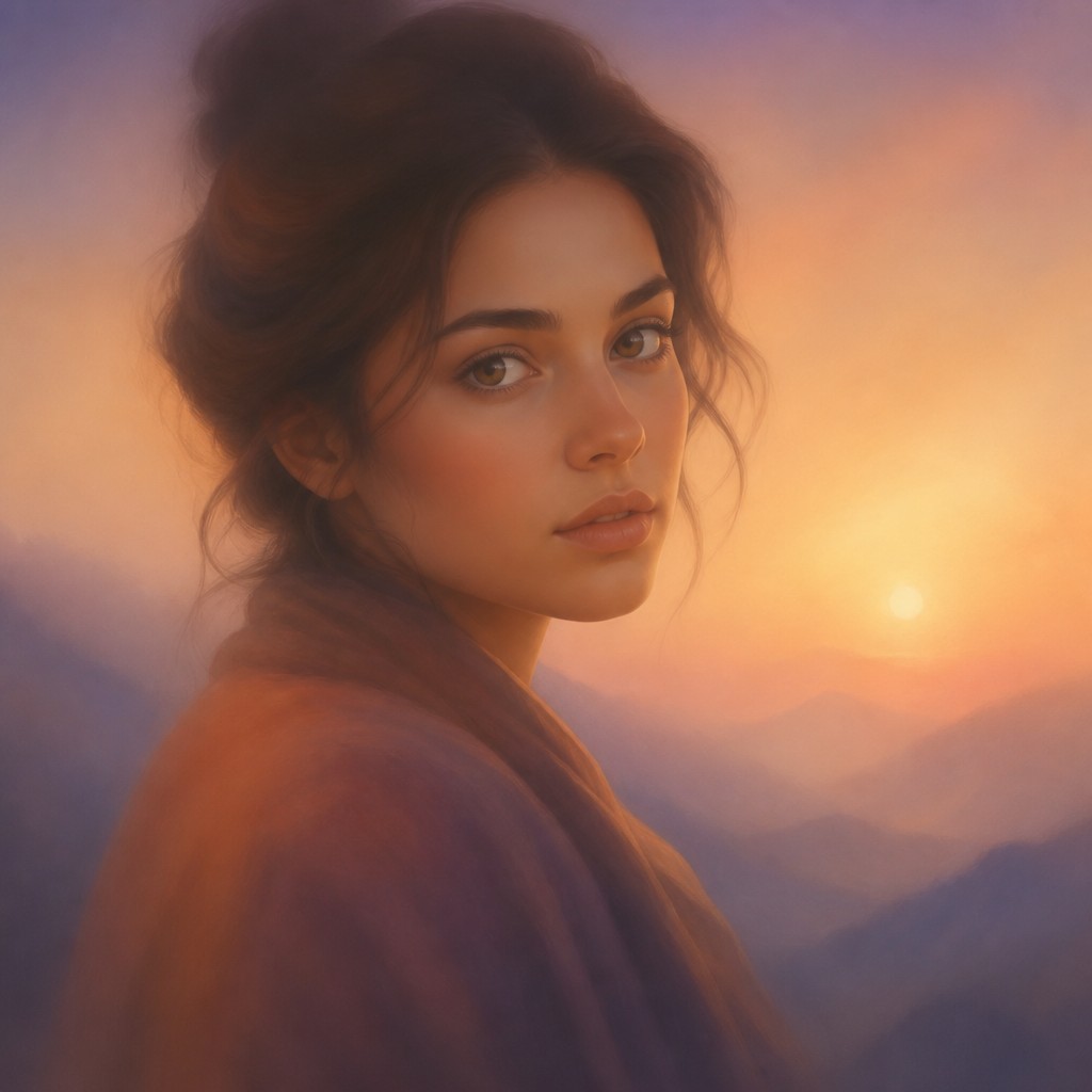
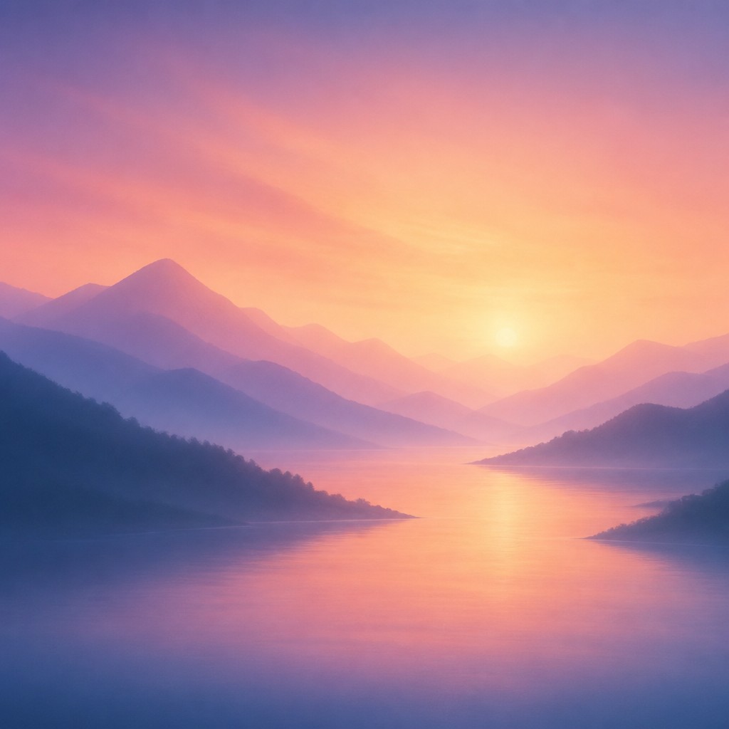
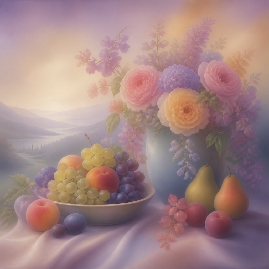
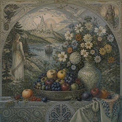
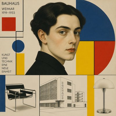
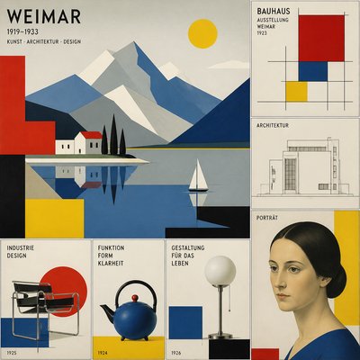
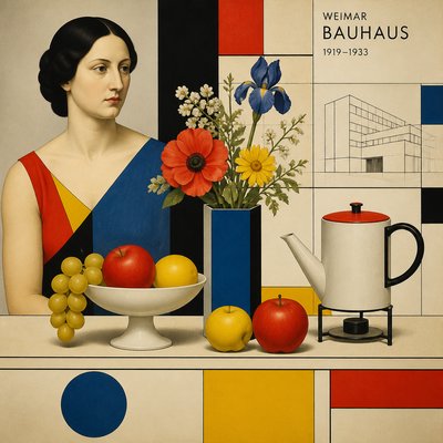
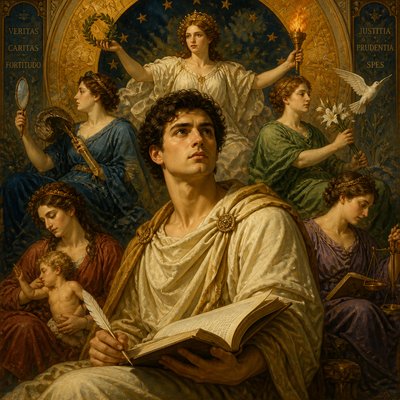
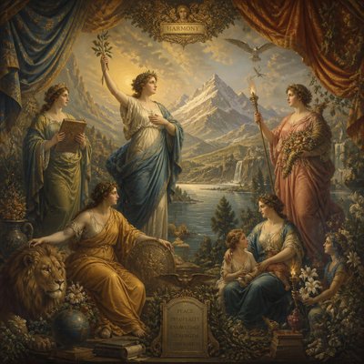
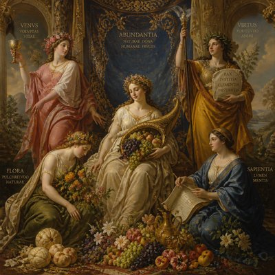
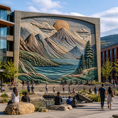
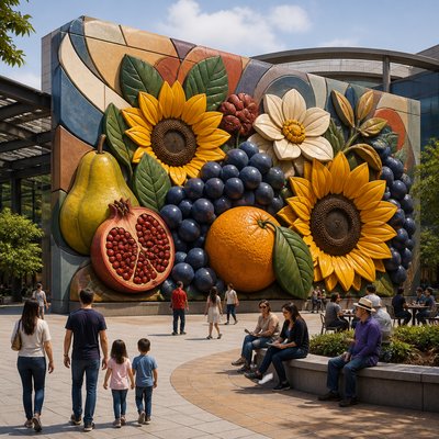
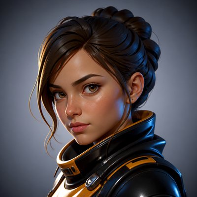
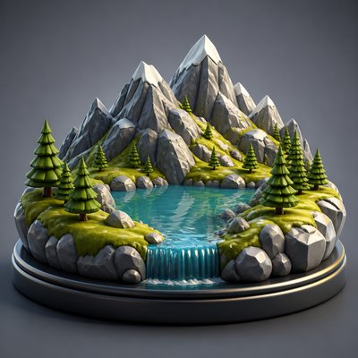
Gradation Gallery
Tap any artwork to explore it
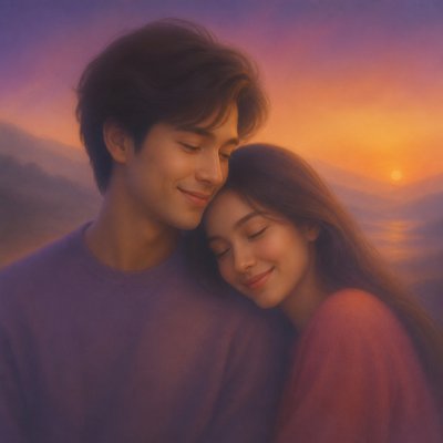
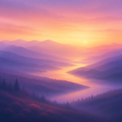
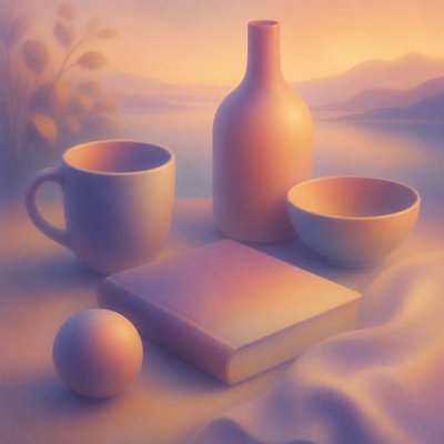
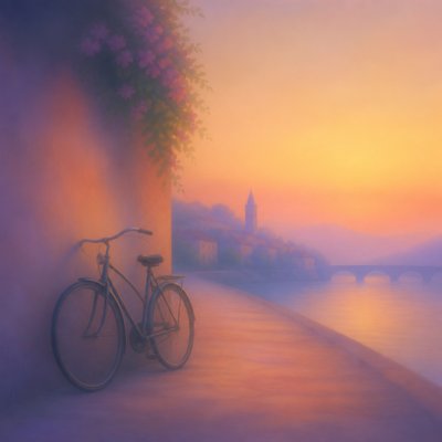
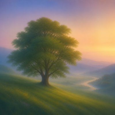
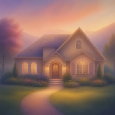
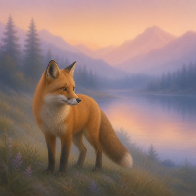
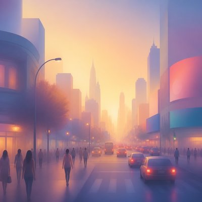
What is Gradation Art Style?
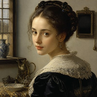
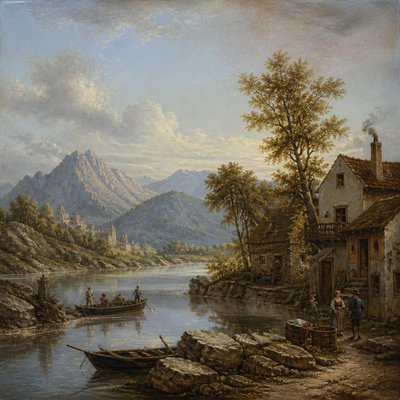
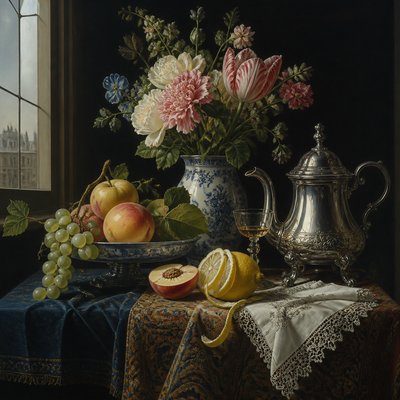
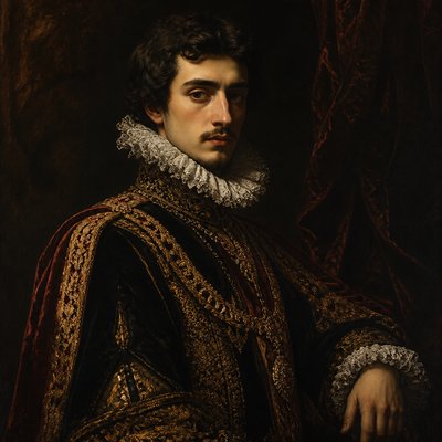
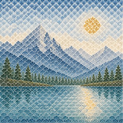
Gradation Art is a visual style built from continuous transitions rather than outlines, abrupt contrasts, or sharply bounded forms. Color melts gradually from one hue into another, while light shifts softly across surfaces and atmospheric tones fade toward distant space. Objects remain recognizable through broad changes in value, saturation, scale, and transparency instead of hard contours.
The style produces a calm, unified image in which one area flows into the next. Its sense of depth comes from diminishing detail, softened contrast, and progressive fading, while its mood depends heavily on the chosen color sequence: cool gradients can feel spacious and meditative, warm transitions intimate or luminous, and dark-to-light progressions dramatic without becoming sharply graphic.
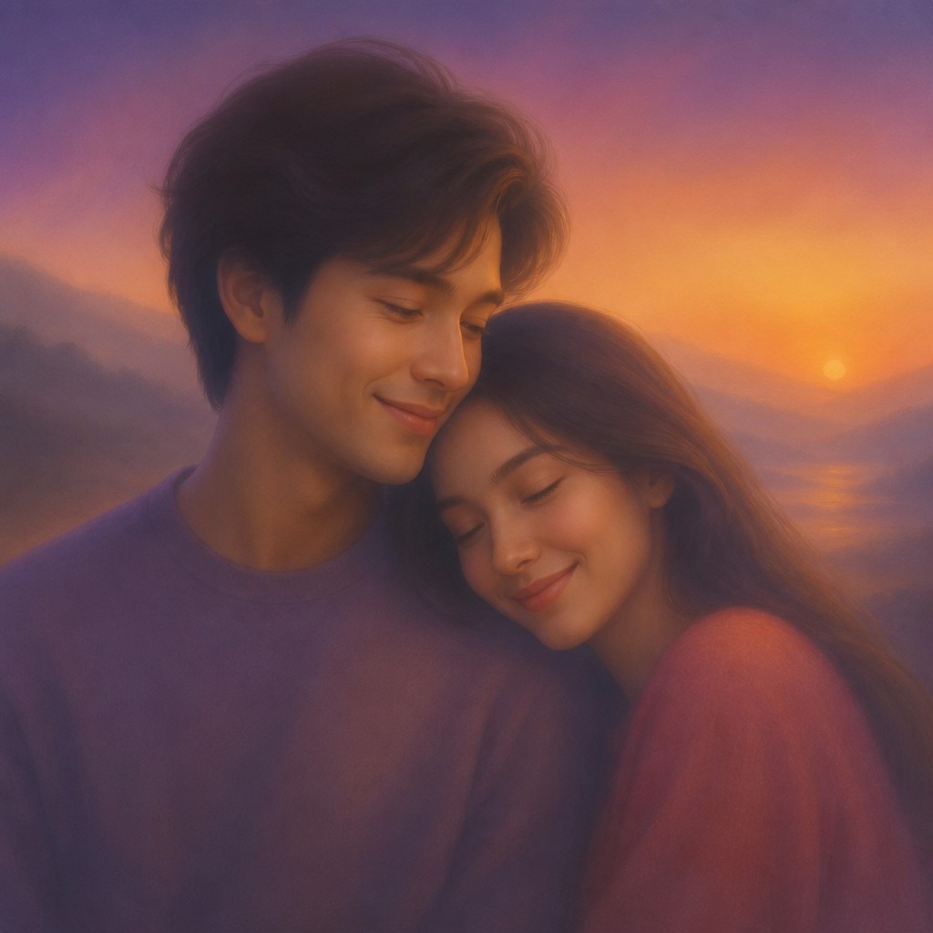
Try It On Your Photos
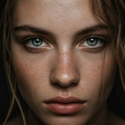
Upload any photo and convert it into Gradation Art Style — drag the sliders to compare before and after.
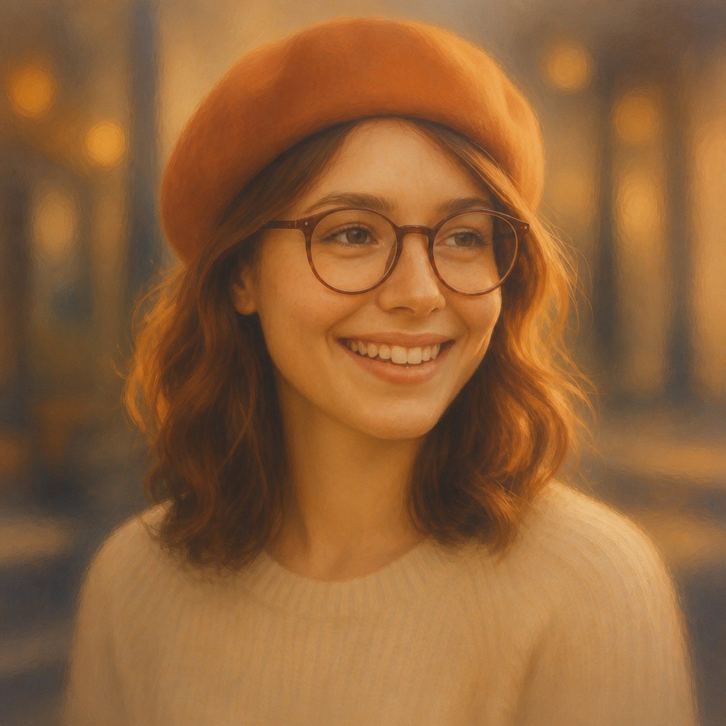

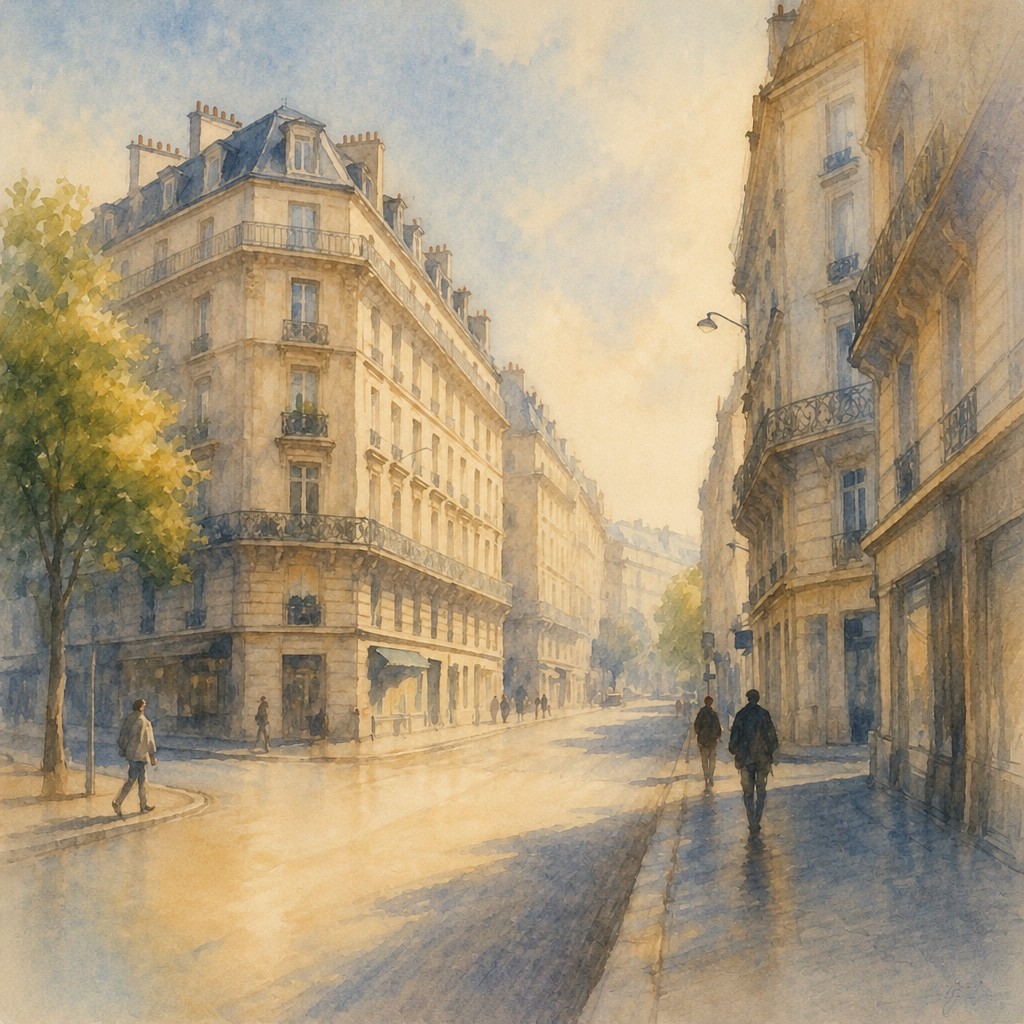

What Defines Gradation Art Style
The signature details, up close
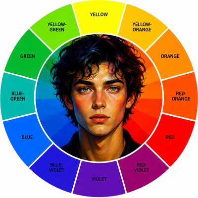
Seamless hue transitions
Adjacent colors blend progressively, often moving through intermediate hues rather than meeting at a visible boundary. Multicolor transitions remain continuous and restrained.
Soft value modeling
Forms are described by gradual movement from shadow to illumination instead of linework or sharply cast tonal divisions. Highlights dissolve gently into surrounding color.
Atmospheric fading
Distant objects lose contrast, saturation, and detail as they approach the horizon or background. This creates depth through suspension and haze rather than crisp perspective lines.
Suppressed contours
Edges are blurred, feathered, or merged with neighboring tones so that silhouettes appear to emerge from the surrounding field. Readability depends on broad tonal relationships.
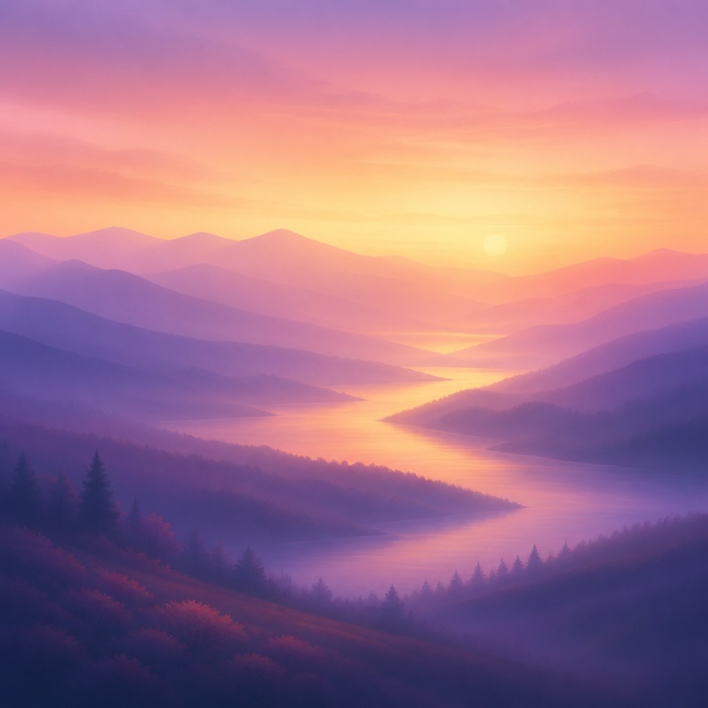
Progressive scale and detail
Repeated forms become smaller, simpler, and less distinct with distance. This gradual diminution reinforces spatial recession and gives the composition a continuous visual rhythm.
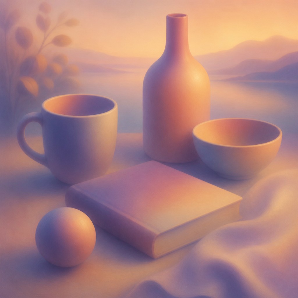
Unified luminosity
The image often feels illuminated from within by a coherent glow or broad light direction. Reflections, shadows, and background colors share related transitions rather than isolated effects.
Gradation Prompt Ideas
Start from an idea — each one opens the generator with the style ready to go. See all 40 Gradation prompts →
How to Create Gradation Art
Master the craft step by step — or skip straight to creating. Read the full guide →
- 1
Plan a limited color journey
Choose a dominant palette and map where it will shift from one hue or value to another. Keep intermediate colors available so transitions do not become abrupt or muddy.
- 2
Build forms with broad tonal passes
In paint, use thin, semi-transparent layers and soft brushes, blending while the paint is workable. In digital software, use low-opacity brushes, gradient tools, feathered masks, and gently layered adjustment passes.
- 3
Create depth by reducing information
Make distant areas lighter or hazier, lower their saturation and contrast, and simplify their textures. Let scale and detail diminish gradually instead of switching suddenly between foreground and background.
- 4
Protect the edge language
Inspect every contour for accidental outlines, sharp cast shadows, or isolated high-contrast marks. Soften or merge edges where necessary while preserving enough value difference for the subject to remain legible.
- 5
Use precise generation instructions
For prompt-based creation, specify seamless hue blending, gradual dark-to-light modeling, atmospheric fading, reduced distant detail, and soft or absent contours. Add the subject, composition, lighting direction, and palette, then exclude hard outlines, abrupt color bands, and harsh edges.
The Story
History & Origins of Gradation
Gradation Art is a contemporary, descriptive style rather than a historically established movement with a single origin or chronology. Its aesthetic lineage includes the soft modeling of Renaissance sfumato, atmospheric perspective in landscape painting, tonal transitions in airbrush illustration, color-field painting, gradient-based graphic design, and digitally generated light effects.
Digital imaging expanded the vocabulary of seamless blending through layered opacity, feathered masks, blur, interpolation, and high-resolution color fields. Contemporary image-making applies these methods to landscapes, portraits, architecture, abstract compositions, and photographic transformations, often combining painterly atmosphere with precise digital control.
Influences: The style relates to sfumato and atmospheric perspective, which use softened transitions to model form and distance; color-field painting, which emphasizes expansive areas of interacting color; airbrush and aerograph illustration, known for vaporous tonal blending; gradient-based poster and interface design; and cinematic matte imagery that uses haze, bloom, and controlled contrast to establish space. It also shares principles with minimalist and abstract practices that reduce visual information to relationships of color, light, and scale.
Frequently Asked Questions
What defines Gradation Art?
Its defining feature is continuous visual transition: hues, values, light, edges, scale, and detail change gradually across the image. Subjects may be figurative or abstract, but they are integrated through blending rather than hard outlines.
Is Gradation Art an established historical art movement?
No. The term describes a contemporary aesthetic approach rather than a formally documented movement with a fixed period or founding school. It draws on older traditions such as sfumato and atmospheric perspective while using modern digital and image-processing methods.
How is it different from a simple color gradient?
A simple gradient usually describes a smooth change between colors across a flat area. Gradation Art applies that principle to the whole image, including modeled surfaces, atmospheric depth, lighting, texture, scale, and the gradual disappearance of edges.
Can Gradation Art depict realistic subjects?
Yes. Landscapes, portraits, interiors, plants, and architecture can remain recognizable through carefully controlled value and color relationships. The result is often atmospheric or dreamlike because detail and contour are deliberately softened.
How can I avoid muddy colors when blending?
Use a planned palette, preserve clear value structure, and introduce intermediate hues rather than mixing every color together indiscriminately. Working in transparent layers or with low-opacity digital brushes helps maintain luminosity.
Where is this style commonly used?
It is suited to atmospheric illustration, digital painting, abstract compositions, editorial imagery, album and poster art, backgrounds, visual effects, and photographic treatments. It is especially effective when a tranquil, luminous, spacious, or dreamlike mood is desired.
Create your first Gradation artwork
Describe anything — or upload a photo — and see it in Gradation Art Style in seconds.
Related Styles
Discover similar art styles