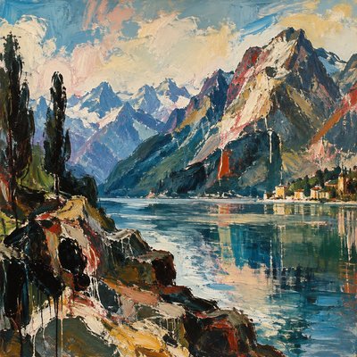
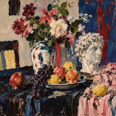
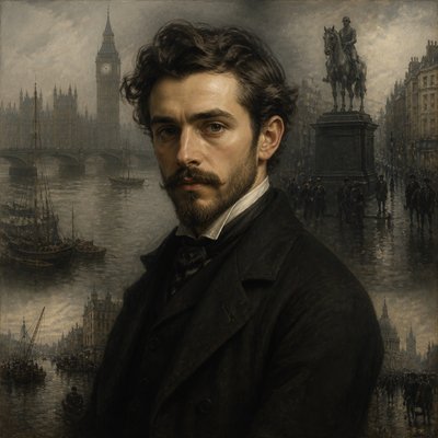
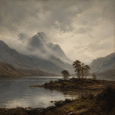
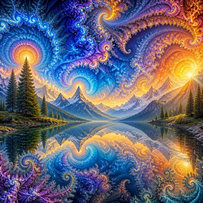
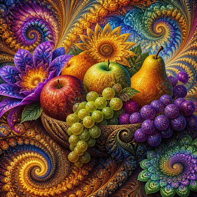
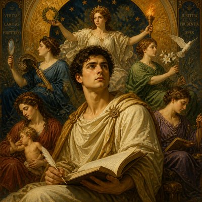
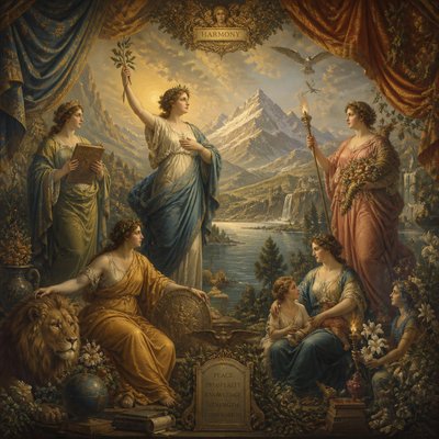
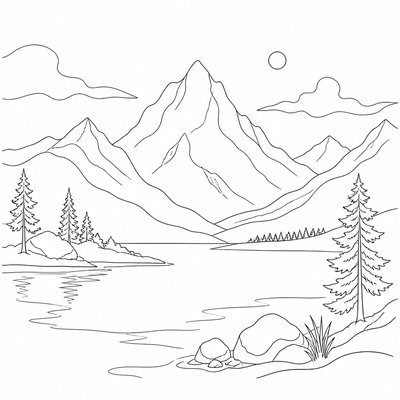
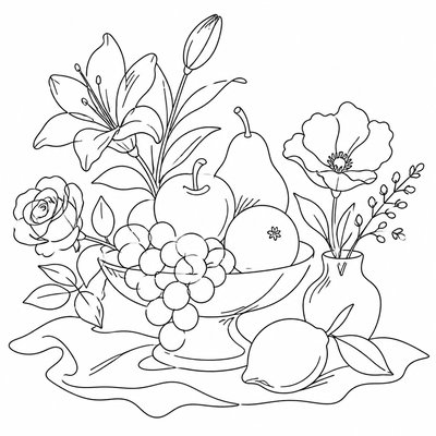
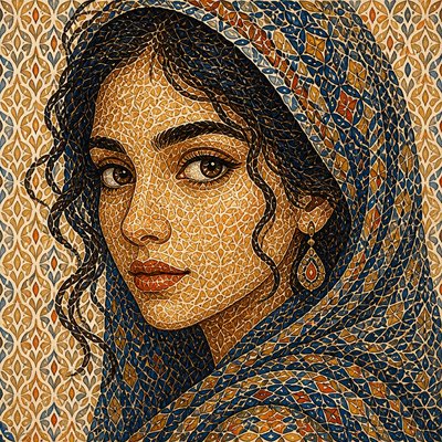
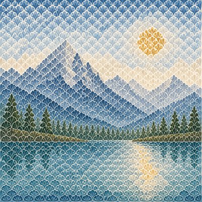
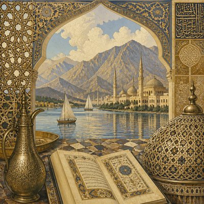
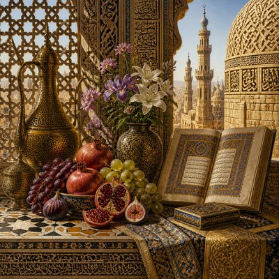
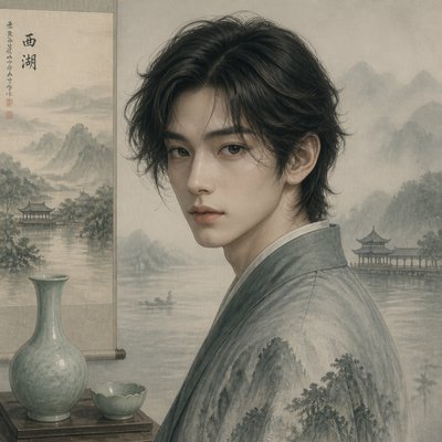
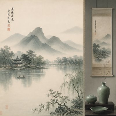
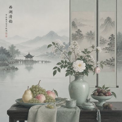
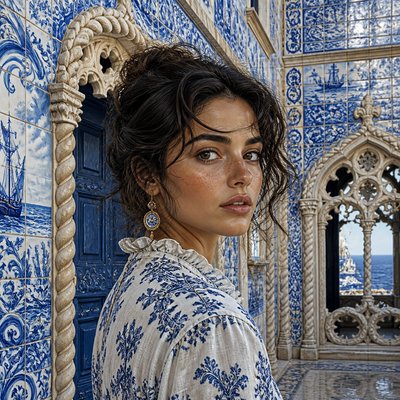
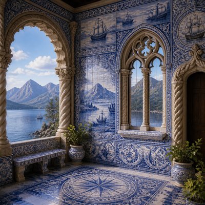
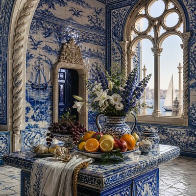
Cover Art Style
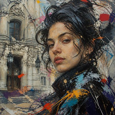
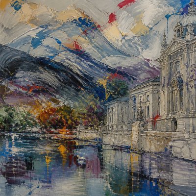
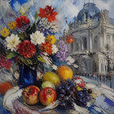
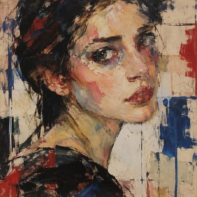
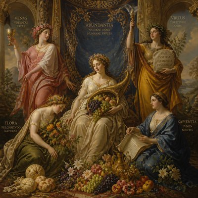
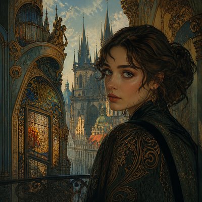
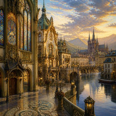
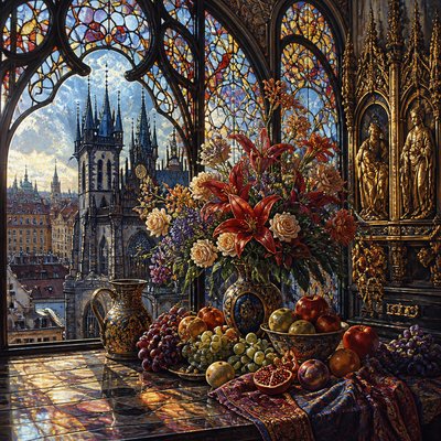
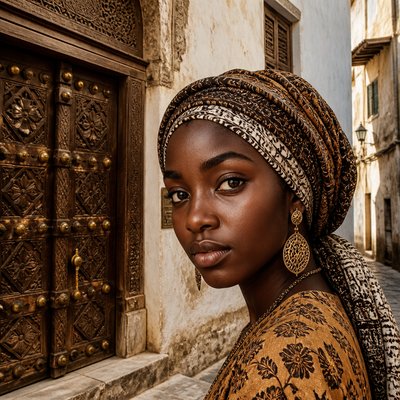
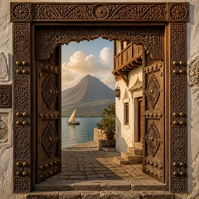
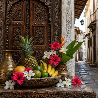
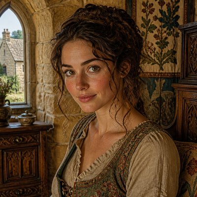
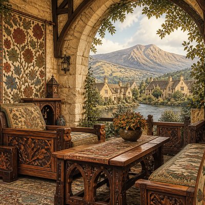
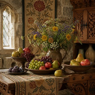
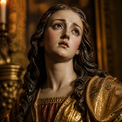
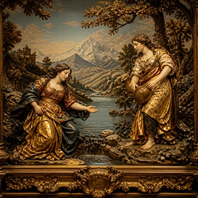
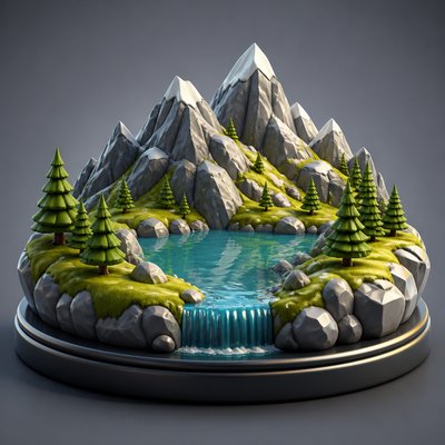
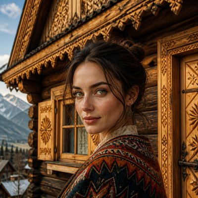
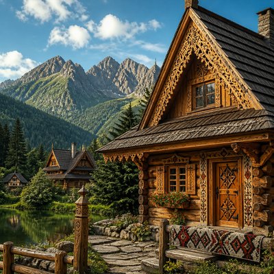
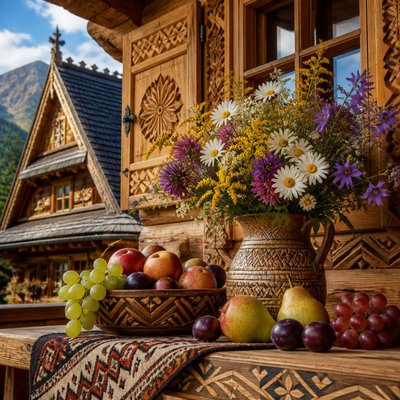
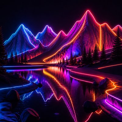
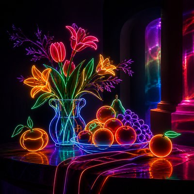
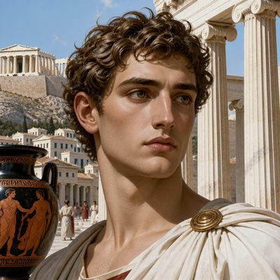
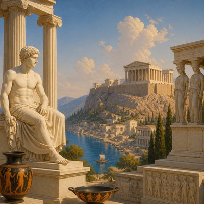
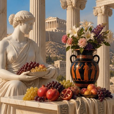
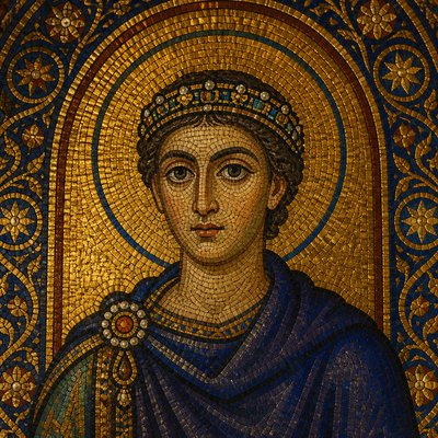
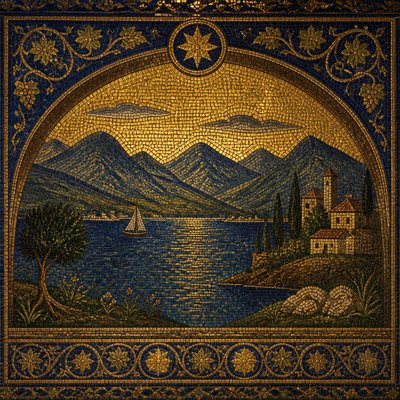
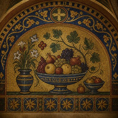
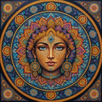
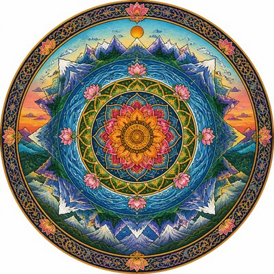
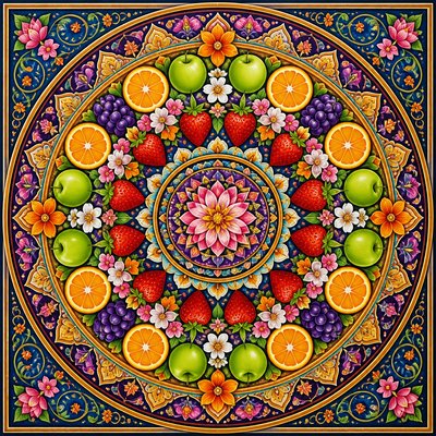
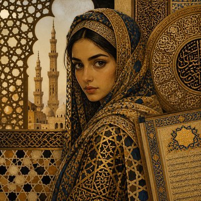
Explore cover art style: bold focal imagery, dramatic color, integrated typography, and polished compositions designed to sell a story at a glance.
Instantly rendered in Cover — or transform a photo
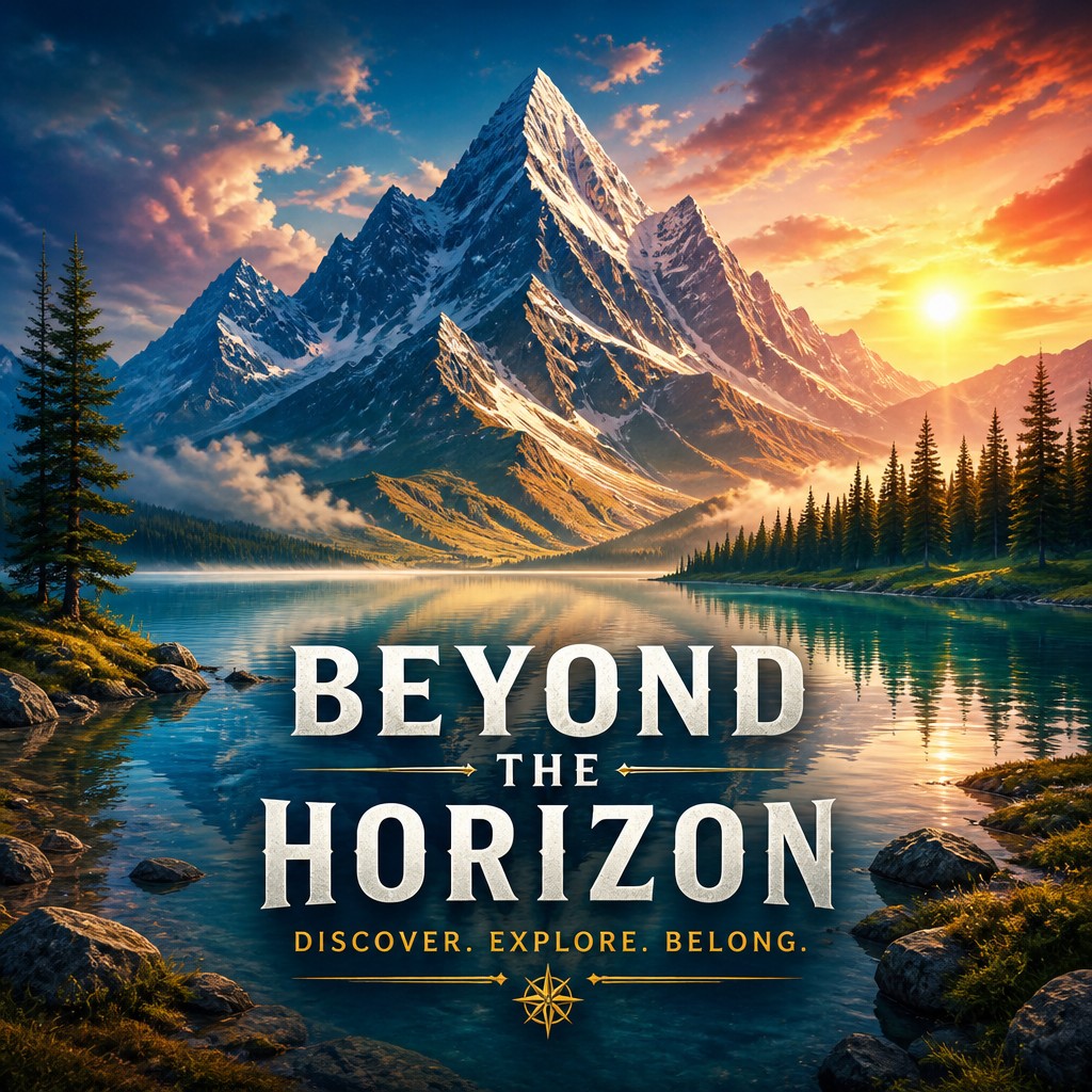
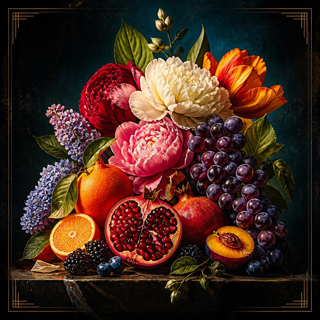
Cover Gallery
Tap any artwork to explore it

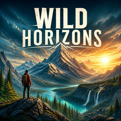
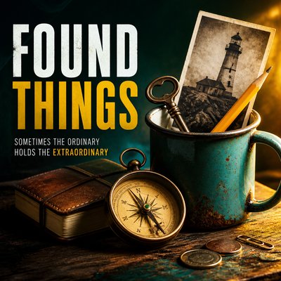
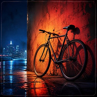
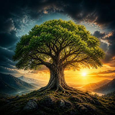

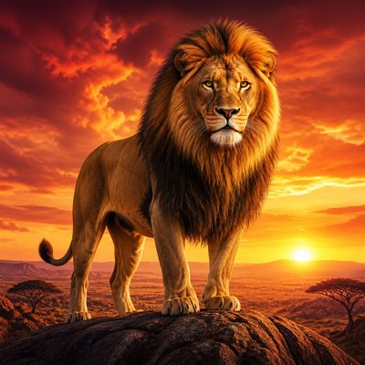
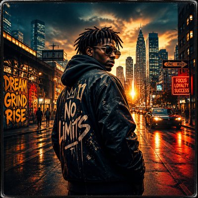
What is Cover Art Style?
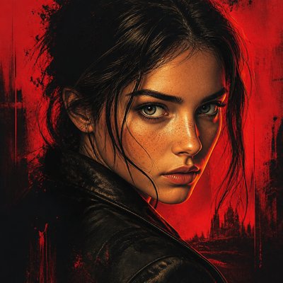
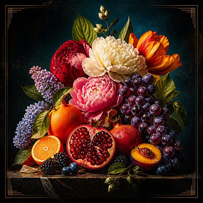
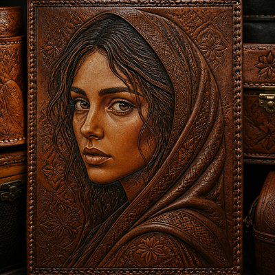
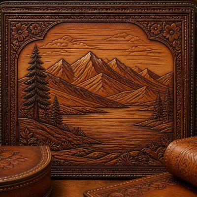
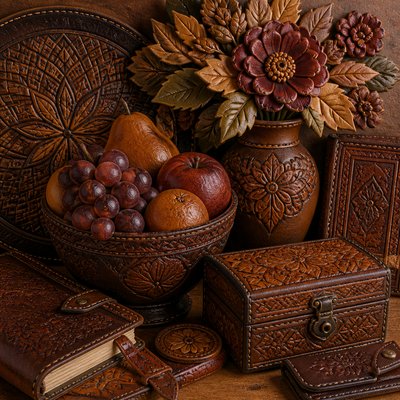
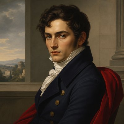
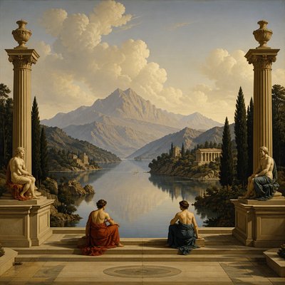
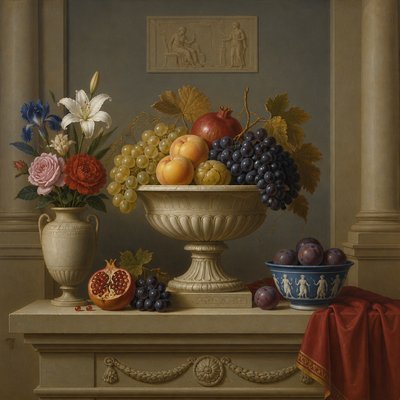
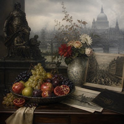
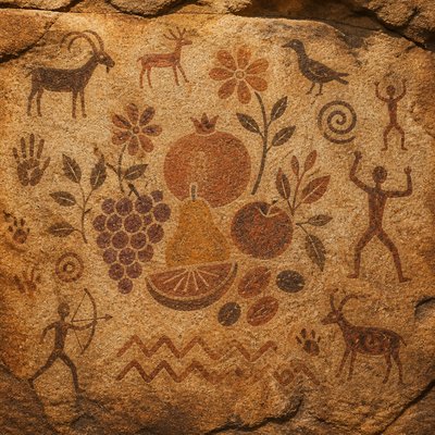
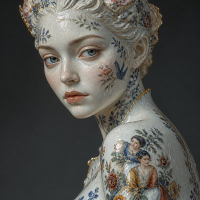
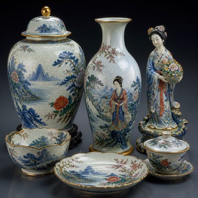
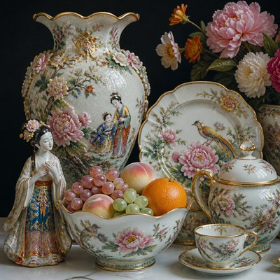
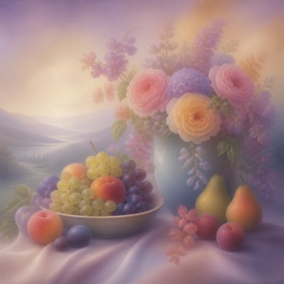
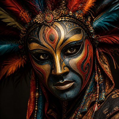
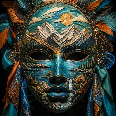
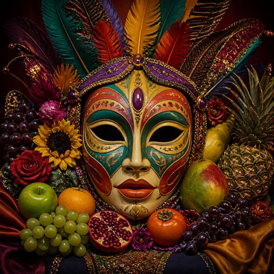
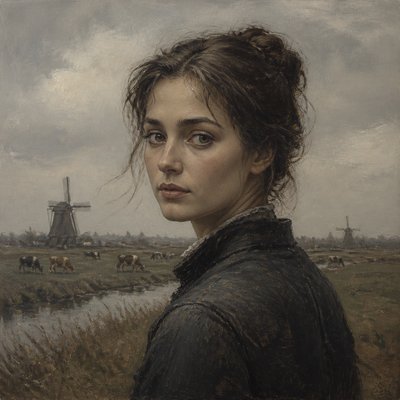
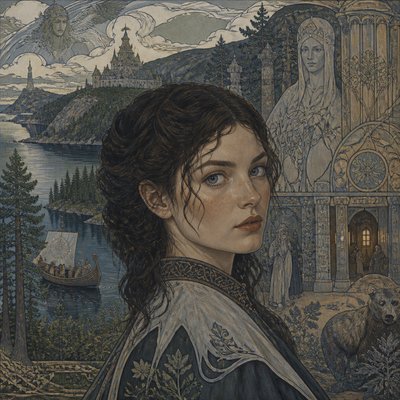
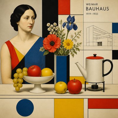
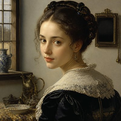
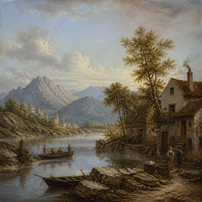
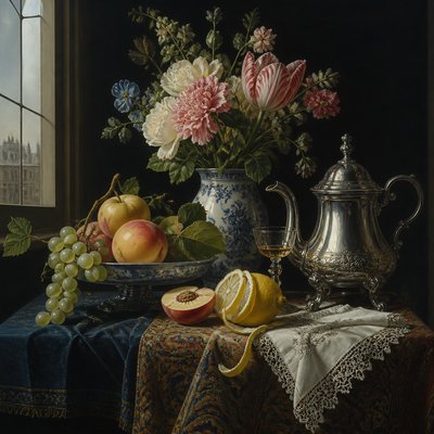
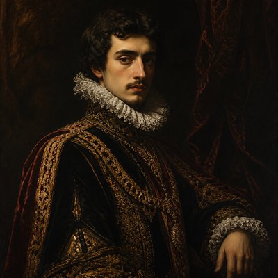
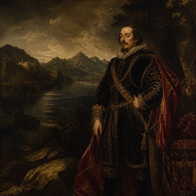
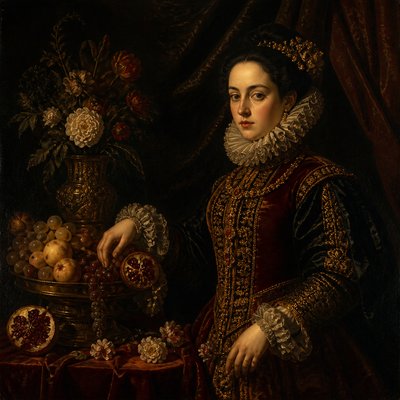
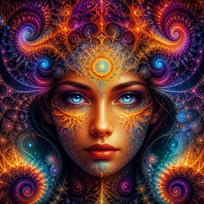
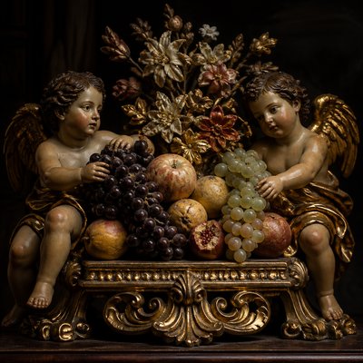
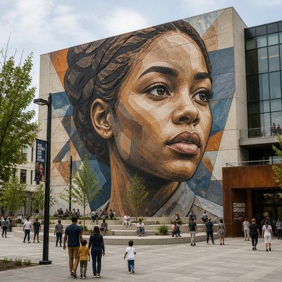
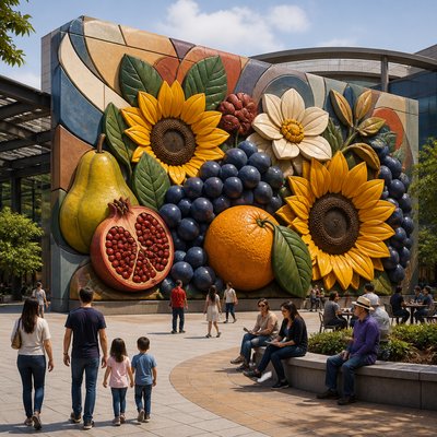
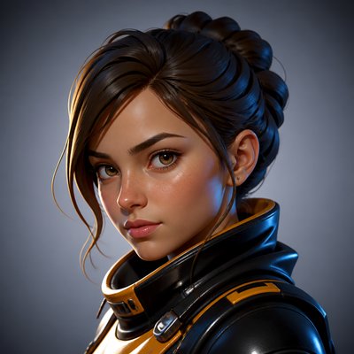
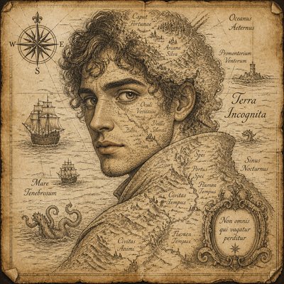
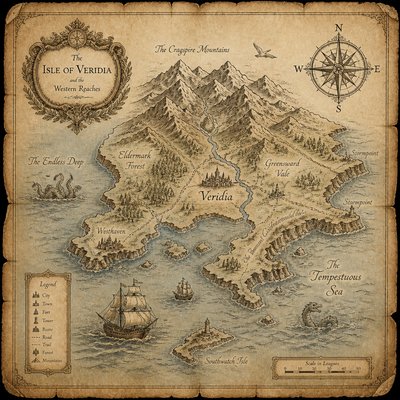
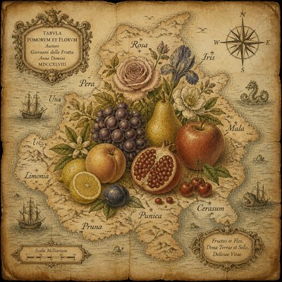
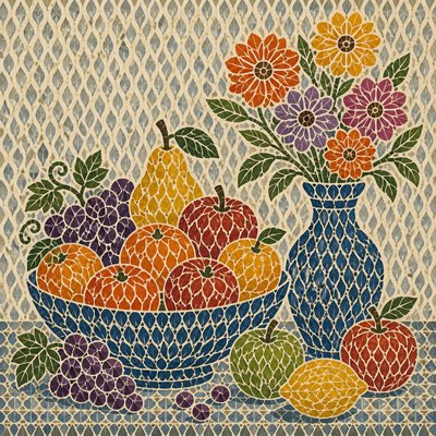
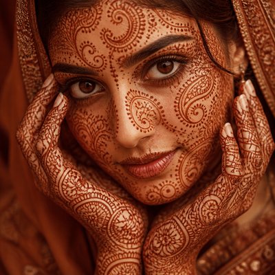
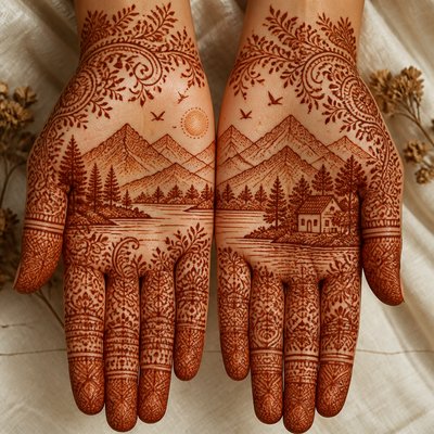
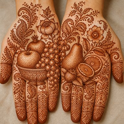
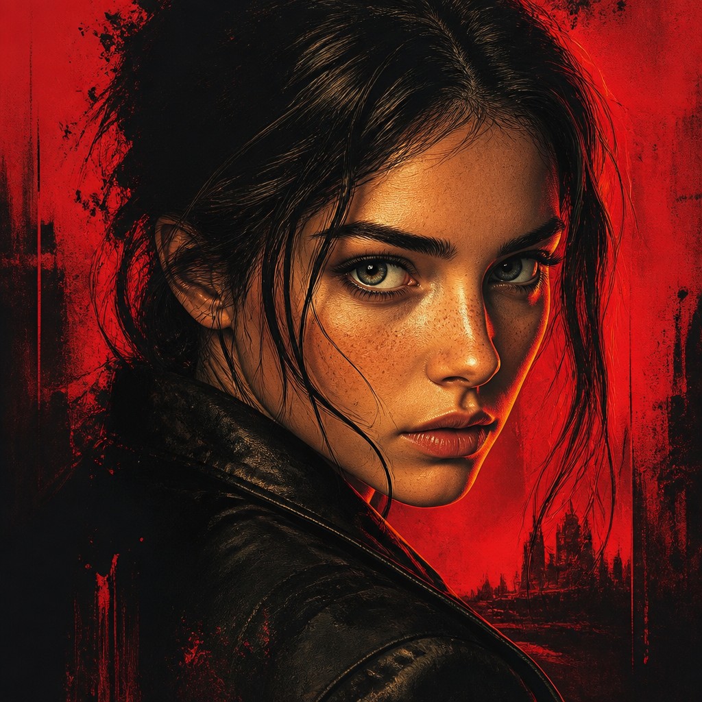
Cover Art Style is a visual approach designed to communicate a story, subject, or mood immediately, often within the limited space of a book, magazine, album, game, or film cover. It typically centers on one memorable image, uses dramatic lighting and saturated color, and leaves deliberate areas for a title, subtitle, author name, logo, or other identifying text.
The style prioritizes instant recognition and small-scale legibility over quiet observation or unrestricted detail. A strong hierarchy guides the eye from the main subject to the title and supporting information, while polished illustration, photographic realism, or a hybrid finish gives the image a commercially resolved appearance. Framed edges, controlled negative space, and high contrast help the design remain readable as both a physical cover and a thumbnail.

Try It On Your Photos
Upload any photo and convert it into Cover Art Style — drag the sliders to compare before and after.


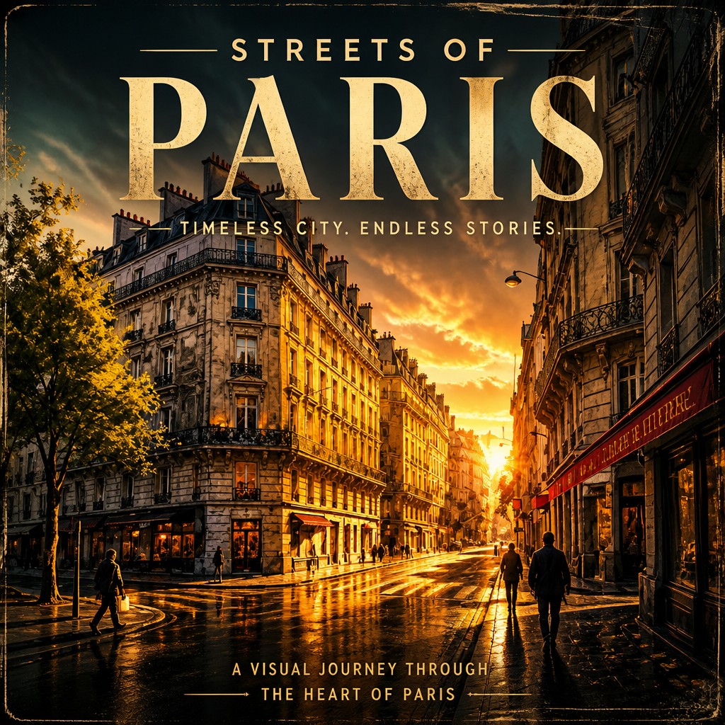

What Defines Cover Art Style
The signature details, up close
Dominant focal image
A single subject, character, object, or symbolic scene usually carries the main narrative burden. Its scale, placement, and silhouette are optimized for immediate recognition.
Dramatic lighting
Rim light, directional beams, glowing highlights, deep shadows, and atmospheric haze create mood and separate the focal subject from its surroundings.
Saturated, high-contrast color
Strong value separation and concentrated color accents make the image visible at a distance. Palettes may be ominous, luminous, nostalgic, heroic, or genre-specific.
Integrated typography
The title is treated as part of the composition rather than as an afterthought. Open zones, visual pauses, and directional shapes are reserved for readable type placement.
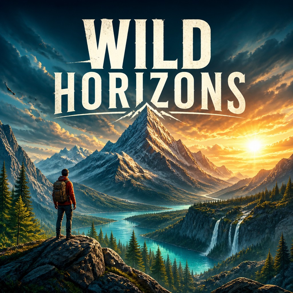
Narrative compression
A cover suggests a larger plot, world, or emotional conflict through one decisive moment, visual metaphor, or carefully selected object.
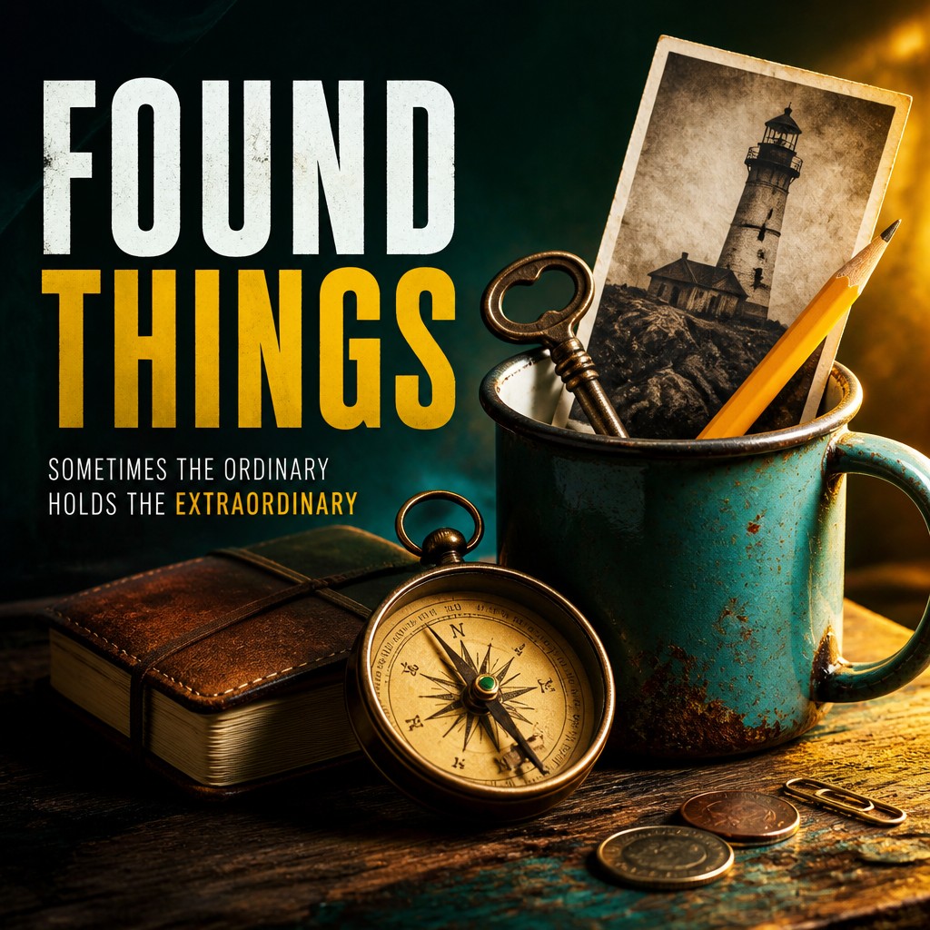
Polished illustrative finish
Surfaces are usually refined and intentional, ranging from painted brushwork and graphic flatness to cinematic photography and digitally composited realism.
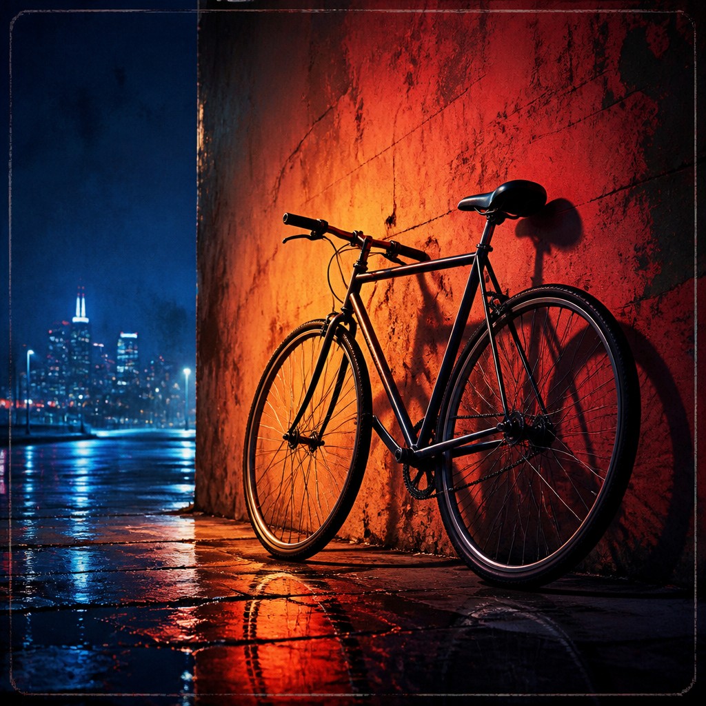
Thumbnail clarity
The composition remains understandable when reduced in size. Strong silhouettes, limited clutter, and a clear hierarchy prevent secondary details from competing with the main message.
Cover Prompt Ideas
Start from an idea — each one opens the generator with the style ready to go. See all 40 Cover prompts →
How to Create Cover Art
Master the craft step by step — or skip straight to creating. Read the full guide →
- 1
Establish the hierarchy first
Decide what must be noticed first, second, and third, then build the composition around those priorities. Use scale, contrast, sharpness, and placement to direct attention.
- 2
Reserve space for type
Block out a calm area for the title before rendering details. Keep important faces, hands, symbols, and silhouettes away from likely text zones unless intentional overlap is part of the design.
- 3
Build lighting around the subject
Choose one dominant light direction and add selective rim light or atmospheric glow to separate the focal image. Avoid evenly lighting every element, which can flatten the hierarchy.
- 4
Use a controlled palette
Begin with a small family of dominant colors and one or two accents. Test the image in grayscale to confirm that value contrast still makes the subject and title area readable.
- 5
Refine traditionally or digitally
Thumbnail sketches, painted studies, collage, photography, vector shapes, and digital compositing can all produce the look. Finish by simplifying backgrounds, sharpening key edges, and checking the design at actual cover or thumbnail size.
- 6
Write generation prompts by hierarchy
Specify the subject, pose, setting, lighting, palette, composition, and intended text area in that order. For reliable lettering, generate the artwork with a clean title zone and add the final typography separately in a layout or design application.
The Story
History & Origins of Cover
Cover Art Style is not a single historical movement but a practical visual lineage formed by mass-print publishing, poster design, illustrated advertising, comic books, pulp fiction, album packaging, and cinema promotion. Its foundations developed alongside late nineteenth- and early twentieth-century printing, when publishers needed compelling images that could attract attention in crowded shops and newsstands.
Over time, cover design absorbed techniques from editorial illustration, modern graphic design, commercial photography, fantasy and science-fiction illustration, and digital compositing. Contemporary examples often combine cinematic lighting, photographic texture, painterly rendering, symbolic imagery, and carefully planned typography, making the style especially adaptable to both physical publishing and screen-based discovery.
Influences: The style draws on poster art, editorial illustration, pulp and paperback publishing, comic-book covers, cinematic key art, album packaging, advertising photography, fantasy and science-fiction illustration, and modern graphic design. It also shares principles with collage, photomontage, visual semiotics, and information hierarchy: an image must be attractive, legible, emotionally specific, and capable of identifying a larger work through limited visual information.
Frequently Asked Questions
What defines Cover Art Style?
It is defined by a strong focal image, dramatic lighting, high-contrast color, narrative suggestion, and planned integration of typography. The composition is designed to communicate genre and mood quickly, often at thumbnail size.
Is Cover Art Style a historical art movement?
No. It is a broad applied aesthetic rather than a single organized movement with a fixed period or manifesto. Its visual language developed from several commercial and illustrative traditions, including posters, publishing, comics, photography, and graphic design.
How is it different from a poster?
Cover art and poster design overlap in their use of hierarchy, bold imagery, and typography. A cover usually identifies and packages a specific work while implying its contents, whereas a poster more often promotes an event, product, or public message at a larger viewing distance.
Can a cover use photography instead of illustration?
Yes. Photographic, painterly, vector-based, collage, and hybrid treatments are all compatible with the style. What matters most is the clarity of the focal subject, the lighting and color hierarchy, and the relationship between image and text.
How do I make the title readable?
Plan the title area before final rendering and preserve sufficient contrast behind it. Use a simple background zone, avoid placing type over busy facial or architectural details, and add the final lettering separately when precise wording is important.
Where is Cover Art Style commonly used?
It appears on books, magazines, albums, films, games, comics, podcasts, promotional campaigns, and digital storefront thumbnails. The same principles can also be applied to posters, product launches, editorial features, and serialized online fiction.
Create your first Cover artwork
Describe anything — or upload a photo — and see it in Cover Art Style in seconds.
Related Styles
Discover similar art styles