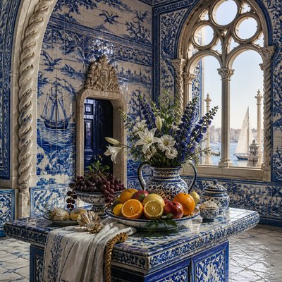
Porto Art Style
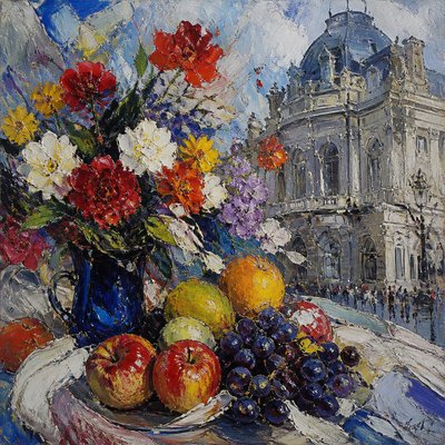
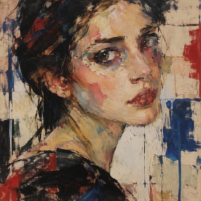
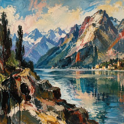
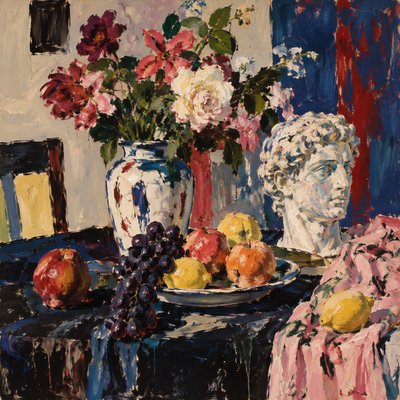
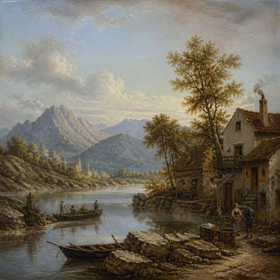
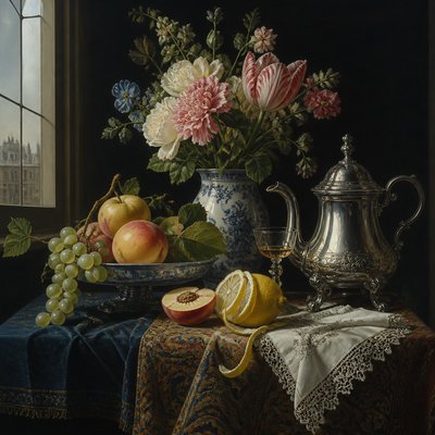
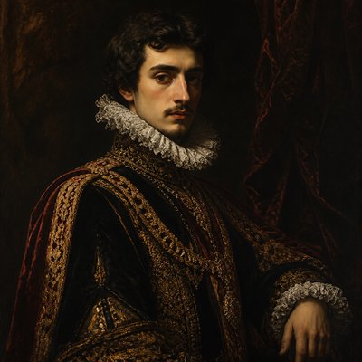
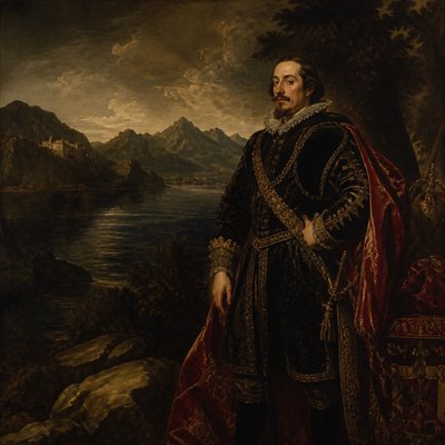
Explore Porto Art Style: riverside Baroque architecture, blue-and-white azulejo storytelling, glazed ceramics, misty streets, and warm gilded interiors.
Instantly rendered in Porto — or transform a photo
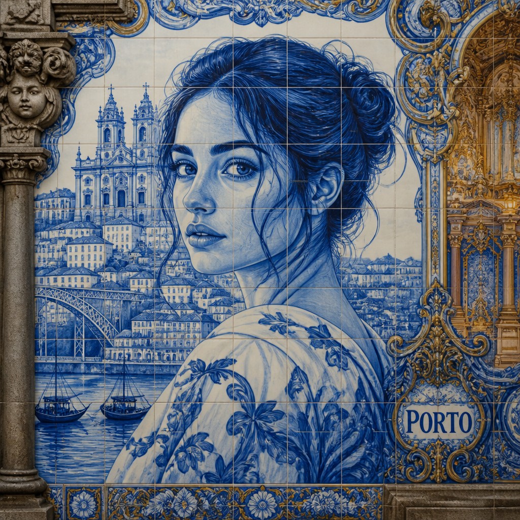
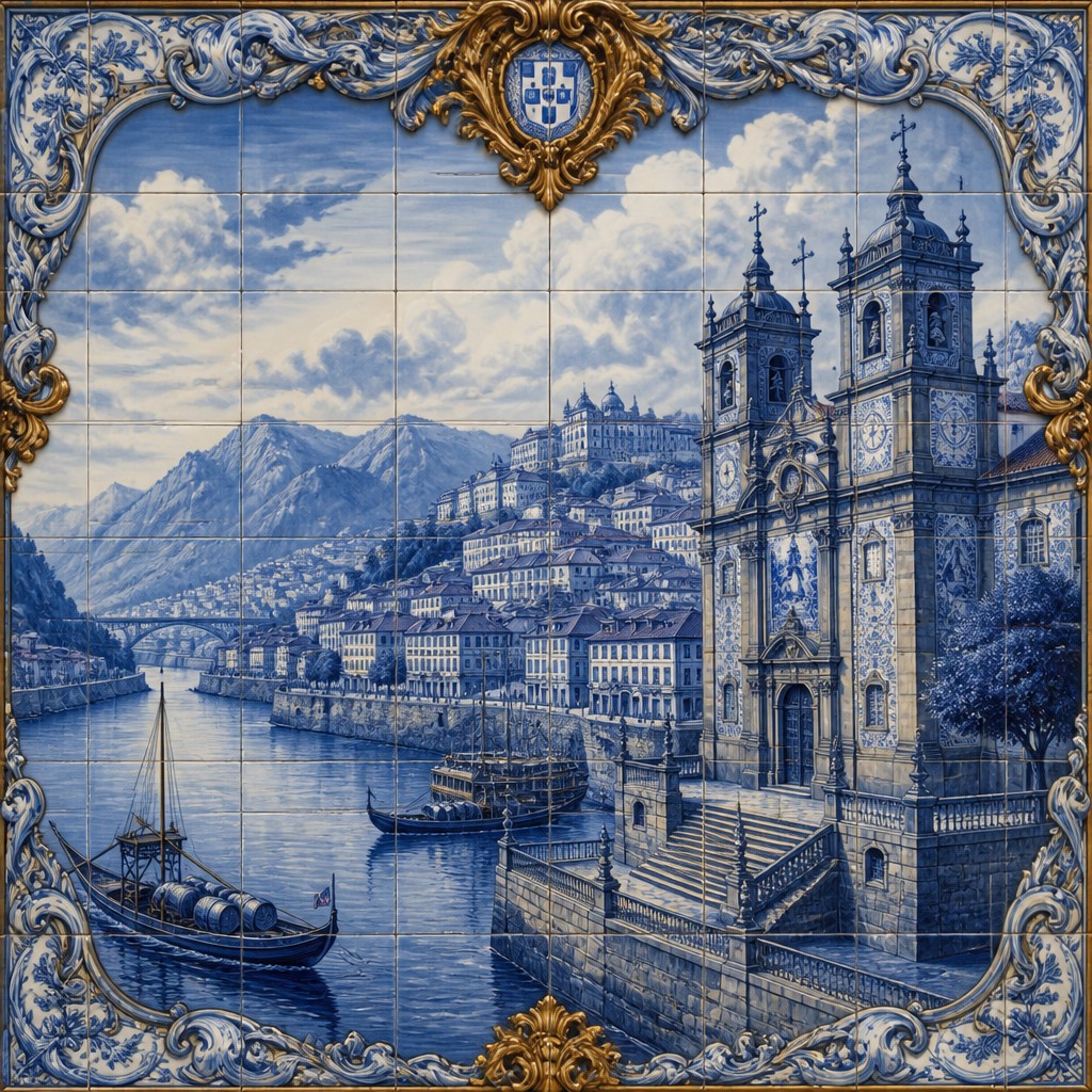
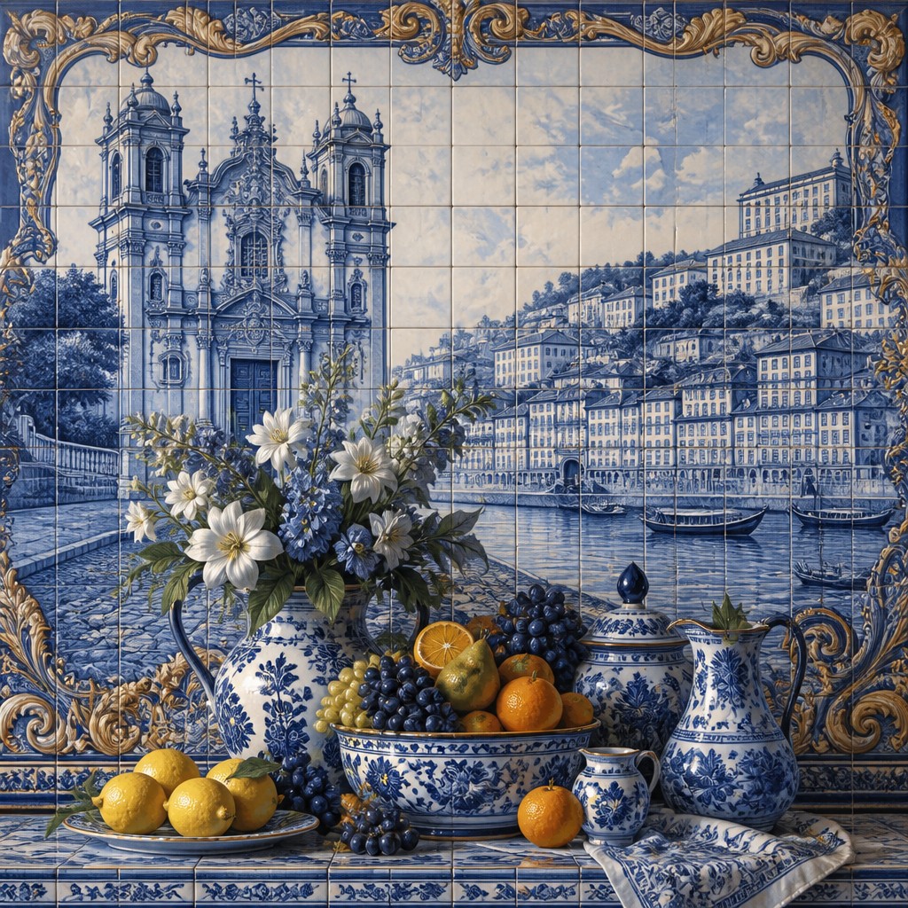
Porto Gallery
Tap any artwork to explore it
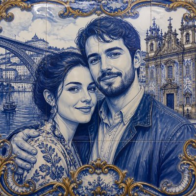
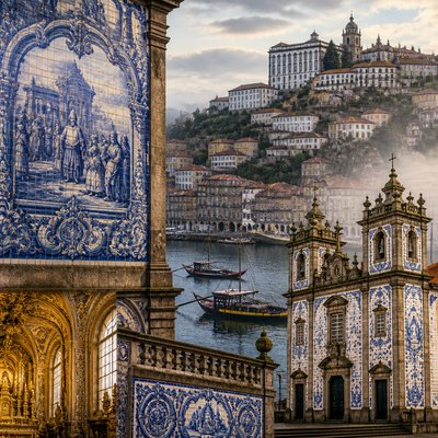
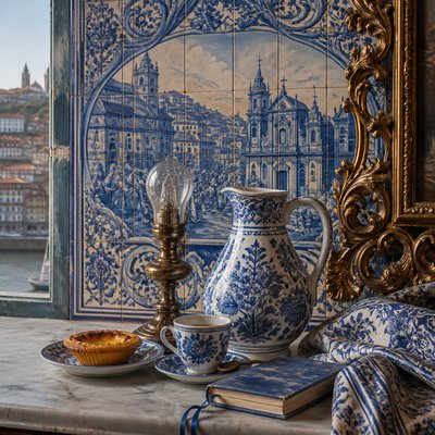
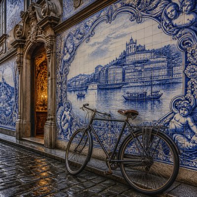
What is Porto Art Style?
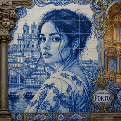
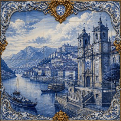
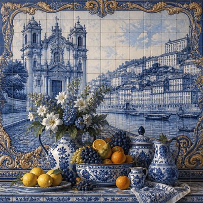
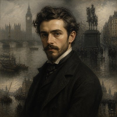
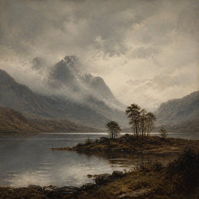
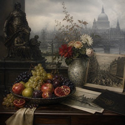
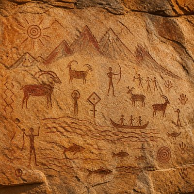
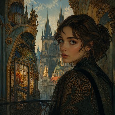
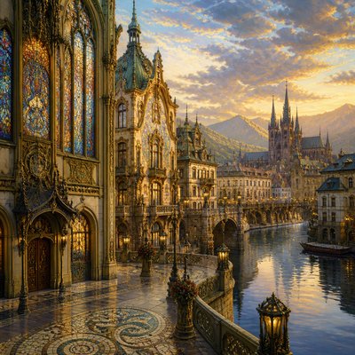
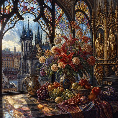
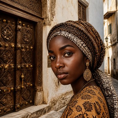
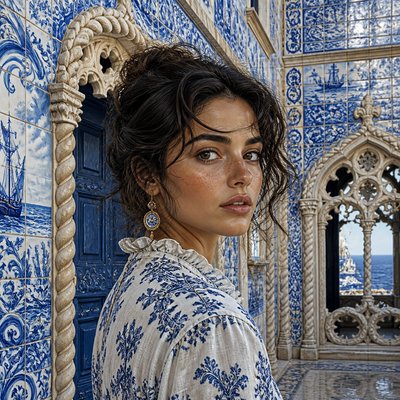
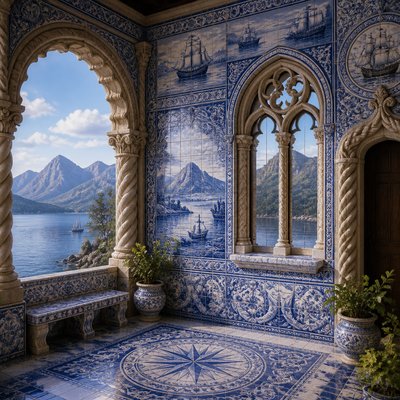
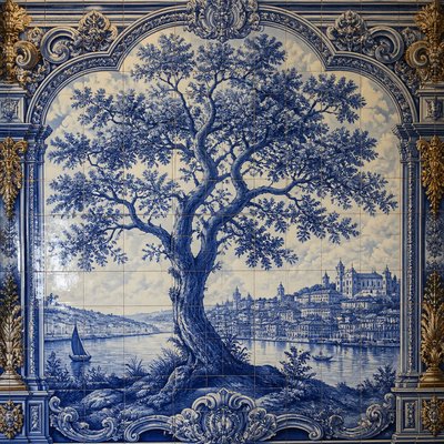
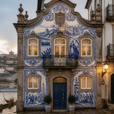
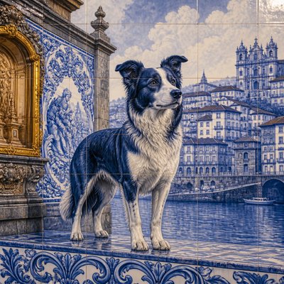
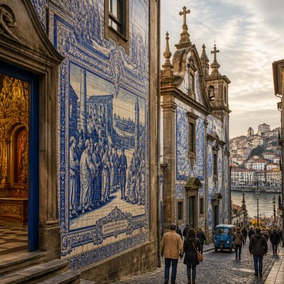
Porto Art Style is a contemporary, place-inspired visual language built around the meeting of Portuguese azulejo tilework, riverside Baroque architecture, and narrative illustration. Its signature imagery uses large blue-and-white ceramic panels to depict scenes, buildings, landscapes, and stories, often set among steep urban slopes shaped by river mist.
The style derives its distinctive atmosphere from contrast: cool glazed tiles and weathered granite are balanced by warm gilding, candlelit interiors, and occasional terracotta or ochre accents. Fine grout lines, repetitive mosaic structure, reflective ceramic surfaces, and densely described façades make the image feel both architectural and handcrafted.
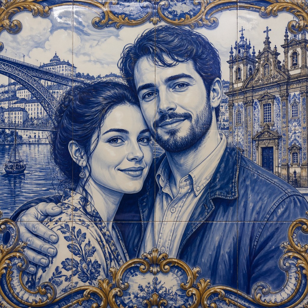
Try It On Your Photos
Upload any photo and convert it into Porto Art Style — drag the sliders to compare before and after.
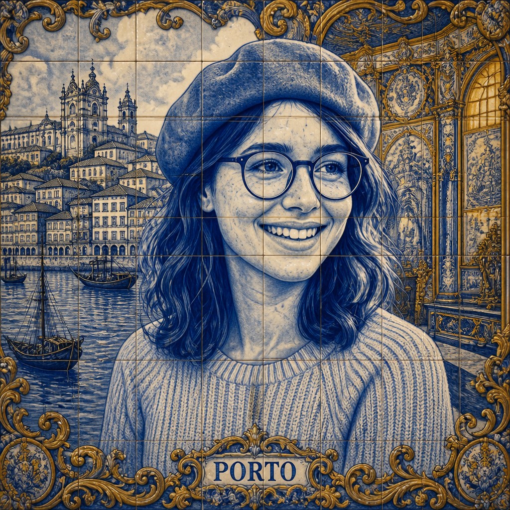

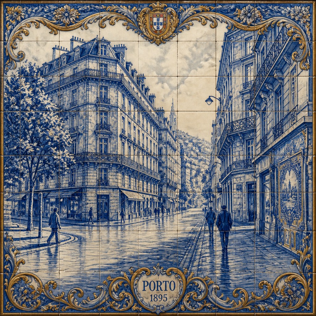

What Defines Porto Art Style
The signature details, up close
Narrative blue-and-white azulejos
Scenes are organized as large ceramic panels, with cobalt or indigo linework describing figures, buildings, landscapes, and historical episodes against a pale ground. Borders, cartouches, repeated motifs, and decorative framing often reinforce the storytelling structure.
Weathered granite architecture
Baroque church façades, arcades, stairways, balconies, and retaining walls appear in cool gray granite marked by age, dampness, lichen, and river mist. Dense masonry detail gives the style a solid, tactile sense of place.
Steep riverside townscapes
Hillside streets, layered rooftops, narrow passages, bridges, and waterfront buildings create compressed vertical compositions. Sloping perspective and stacked architecture are central to the style's sense of movement and depth.
Glossy glazed surfaces
Tiles are rendered with subtle reflections, uneven highlights, hairline cracks, and variations in glaze. Light should visibly skim across ceramic surfaces rather than treating them as flat blue-and-white graphics.
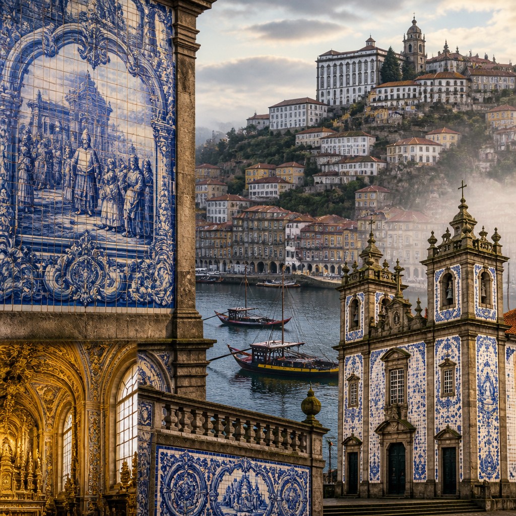
Gilded Baroque warmth
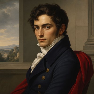
Interiors may introduce carved scrollwork, gilded ornament, dark timber, candlelight, and warm ochre illumination. This warmer register offsets the cool exterior palette and creates a dramatic transition between street and sanctuary.
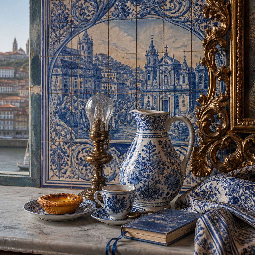
Decorative framing and fine linework
Cartouches, floral borders, ornamental flourishes, and carefully controlled contour lines make the composition resemble an assembled architectural panel. Repetition is used as a structural device, not merely as surface decoration.
Porto Prompt Ideas
Start from an idea — each one opens the generator with the style ready to go. See all 40 Porto prompts →
How to Create Porto Art
Master the craft step by step — or skip straight to creating. Read the full guide →
- 1
Plan the panel structure
Begin with a clear subject and divide the image into a central narrative field, architectural borders, and supporting decorative motifs. For traditional work, sketch the composition on tiles or a tile-sized grid before applying cobalt pigment and glaze.
- 2
Control the limited palette
Use porcelain white, cobalt or indigo blue, granite gray, muted terracotta, and restrained gold or amber light. In digital work, preserve this hierarchy so warm accents remain focal points rather than overwhelming the ceramic character.
- 3
Build ceramic material convincingly
Add grout seams, slight tile irregularity, translucent glaze, reflected highlights, and small signs of wear. Avoid perfectly uniform digital blue fills, which can make the result resemble flat vector art instead of fired ceramic.
- 4
Layer architecture and atmosphere
Combine sharply described façades and tile motifs with softened distance, damp stone, low cloud, and river haze. Use steep diagonals, overlapping roofs, and stairways to establish the vertical geography of a riverside city.
- 5
Use image-to-image or digital painting selectively
When transforming a photograph, preserve the major perspective and silhouette while replacing surfaces with azulejo panels, granite texture, and ornamental borders. In a digital painting workflow, work from large architectural masses to tile linework, then add glaze and light as final layers.
- 6
Write prompts with material and composition cues
For text-to-image creation, specify the subject first, then request narrative blue-and-white tile panels, weathered granite, glazed reflections, steep riverside perspective, and warm gilded details. Mention desired structure and lighting rather than relying on a style label alone.
The Story
History & Origins of Porto
Porto Art Style is an invented contemporary style rather than a documented historical movement. Its aesthetic lineage comes primarily from Portuguese azulejo traditions, especially the large figurative and devotional tile panels that became prominent in Portugal during the Baroque period and continued into later architectural decoration.
It also draws on the granite churches, steep townscapes, ornamental interiors, and maritime atmosphere associated with northern Portuguese cities. Blue-and-white ceramic painting connects it to wider Iberian tile traditions and to European blue-and-white porcelain and pottery, while its narrative compositions borrow from mural painting, architectural illustration, and heritage documentation.
Influences: The style relates to Portuguese and Iberian azulejo, European Baroque architecture, mural painting, decorative arts, ceramic illustration, and architectural heritage imagery. It also shares qualities with blue-and-white porcelain traditions, Gothic and Baroque revival ornament, illuminated storytelling, and contemporary digital matte painting. Its combination of documentary architecture and embellished narrative distinguishes it from purely historical tile reproduction.
Frequently Asked Questions
Is Porto Art Style a historical art movement?
No. Porto Art Style is a contemporary, invented visual category rather than a documented historical movement. It synthesizes established Portuguese azulejo traditions, Baroque architecture, ceramic craft, and the atmospheric character of northern riverside cities.
What defines Porto Art Style?
Its core features are narrative blue-and-white tile panels, glossy ceramic surfaces, weathered granite architecture, steep riverside townscapes, and warm gilded Baroque interiors. The strongest examples balance cool cobalt structure with mist, candlelight, and restrained ornamental color.
How is it different from traditional Portuguese azulejo?
Traditional azulejo is a broad historical medium and cultural practice with many periods, subjects, colors, and techniques. Porto Art Style expands that lineage into a unified contemporary image language, often combining tile storytelling with dramatic cityscapes, cinematic atmosphere, and digitally constructed viewpoints.
Can this style be used for subjects other than architecture?
Yes. Portraits, animals, historical events, myths, botanical studies, and landscapes can all be organized as ceramic narratives. The subject should be designed to work within panel borders, repeated motifs, cobalt linework, and a decorative architectural setting.
How can I make a convincing image in this style?
Describe the subject together with blue-and-white azulejo panels, visible grout, glossy glaze, granite texture, steep perspective, and warm Baroque ornament. For a photograph, retain recognizable forms while transforming walls, streets, and clothing into patterned ceramic surfaces and adding controlled atmospheric mist.
Where is Porto Art Style most effective?
It works especially well for city scenes, travel imagery, architectural studies, heritage subjects, maps, legends, and storybook illustrations. It is less suited to extremely minimal compositions because its identity depends on layered detail, ornament, and material contrast.
Create your first Porto artwork
Describe anything — or upload a photo — and see it in Porto Art Style in seconds.
Related Styles
Discover similar art styles