Lettering Art Style
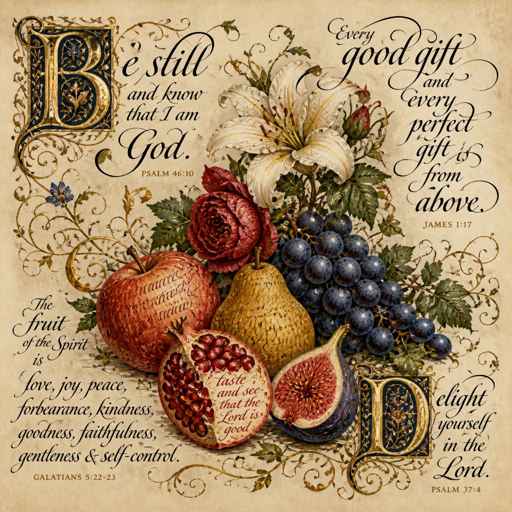
Explore Lettering Art: gilded capitals, expressive ink weight, vine flourishes, and parchment textures that turn words into ornamental images.
Instantly rendered in Lettering — or transform a photo
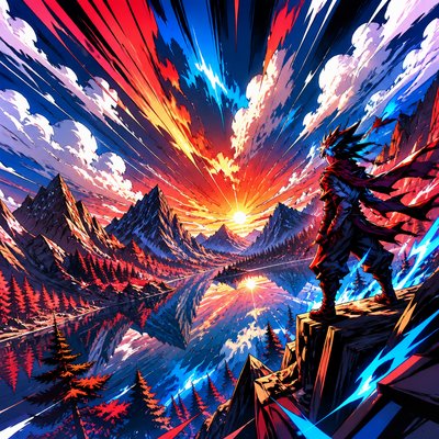
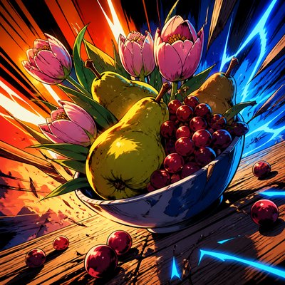
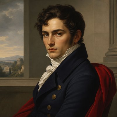
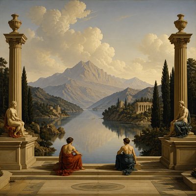
Lettering Gallery
Tap any artwork to explore it
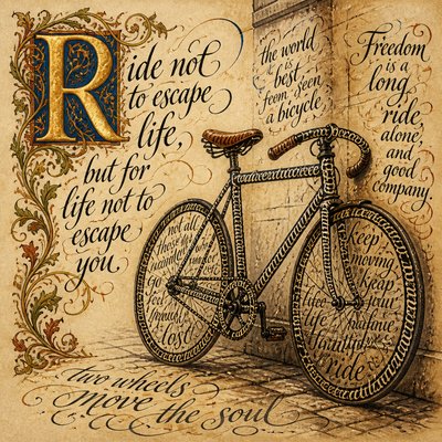
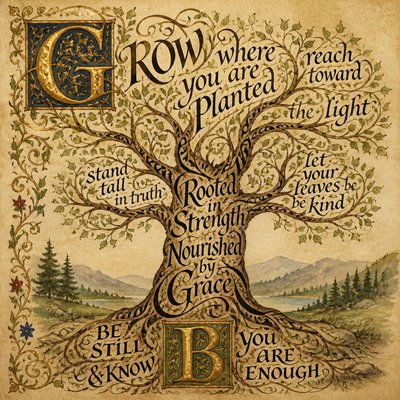
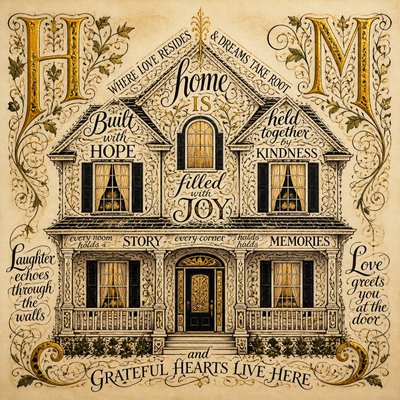
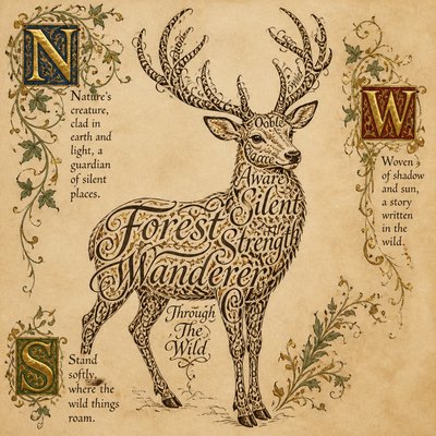
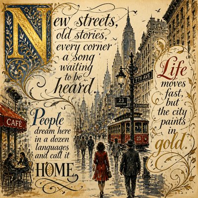
What is Lettering Art Style?
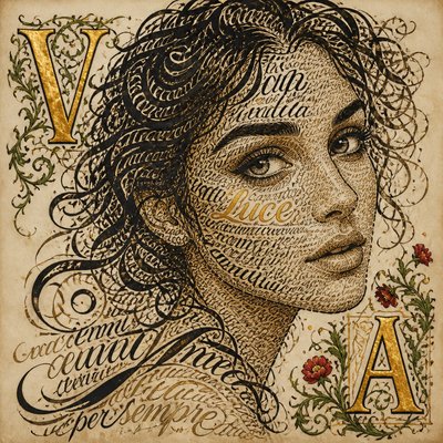
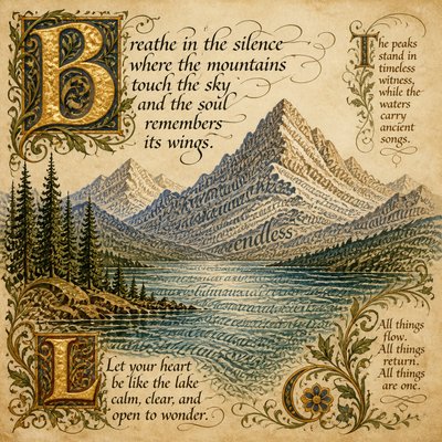
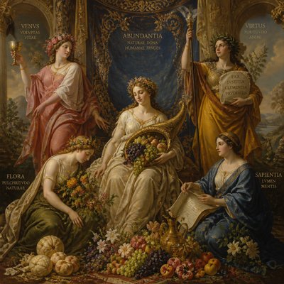
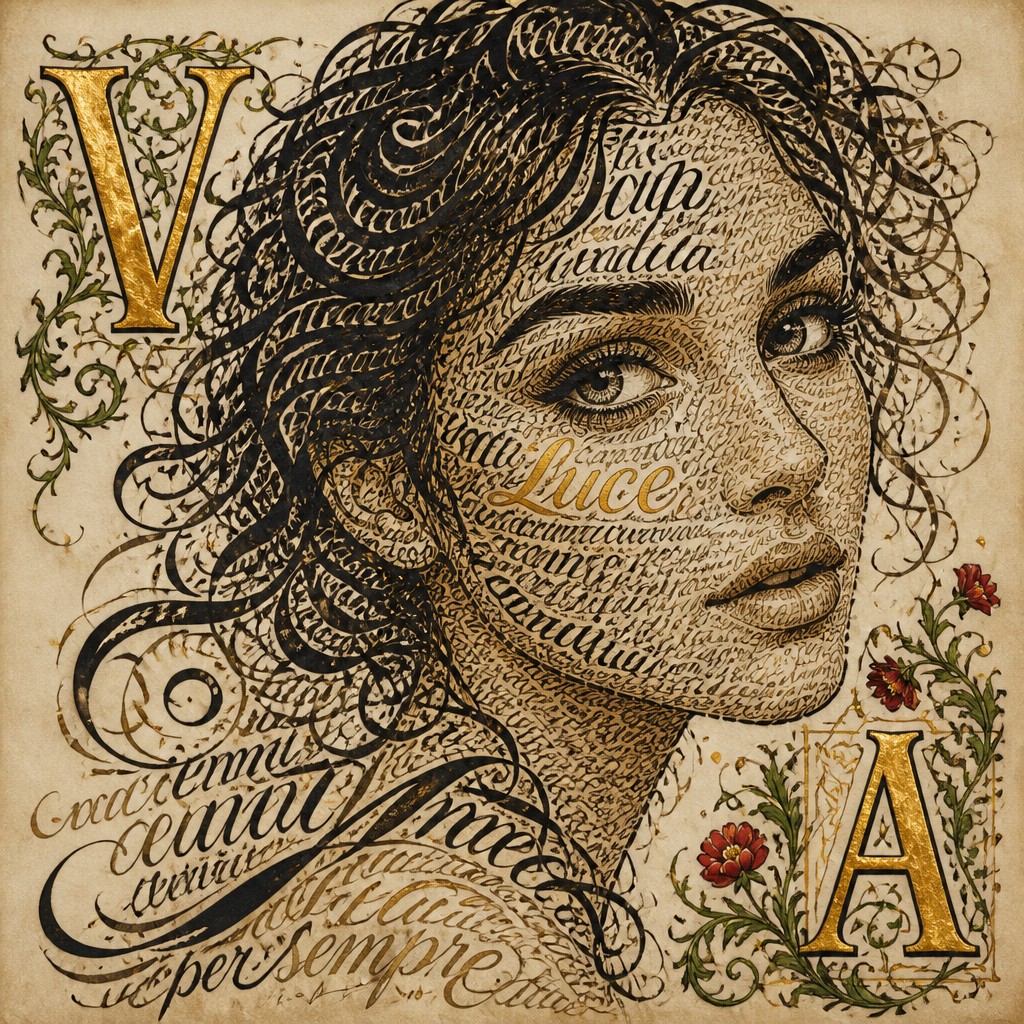
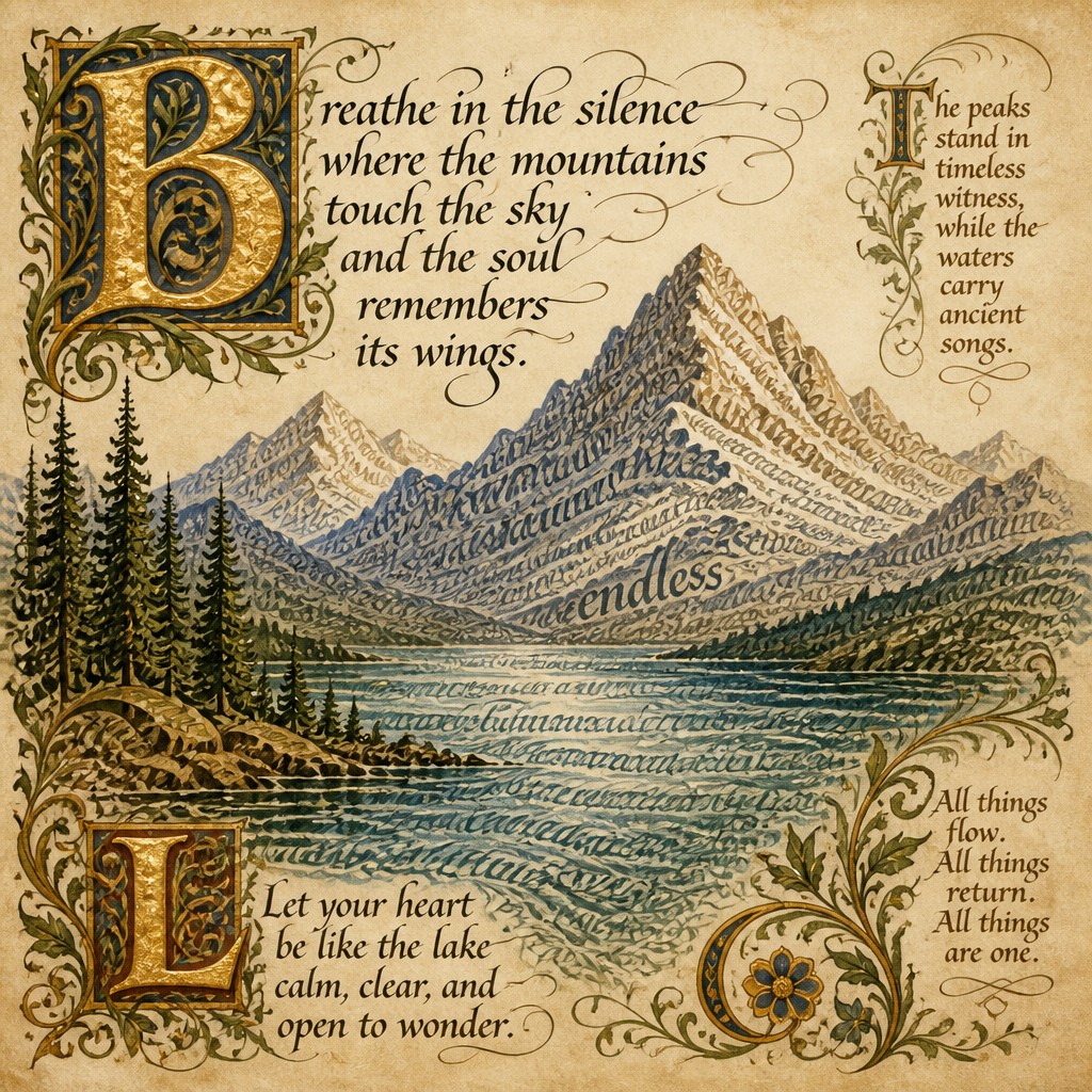
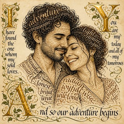
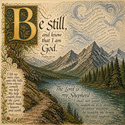
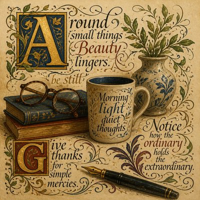
Lettering Art is an ornamental visual style in which written characters become the primary subject and structure of the image. Swirling hand-inked forms, dramatic thick-and-thin strokes, illuminated capitals, curling serifs, and botanical flourishes transform words into richly composed pictures rather than merely conveying text.
Its visual identity comes from the tension between disciplined letter construction and expressive decoration. Warm parchment grain, saturated pigment, and touches of gold suggest an object made by hand, while the controlled rhythm of repeated curves and counterforms keeps the composition legible. Letters may interlock, blossom into vines, or frame a central emblem, allowing typography, illustration, and decorative pattern to function as one design.
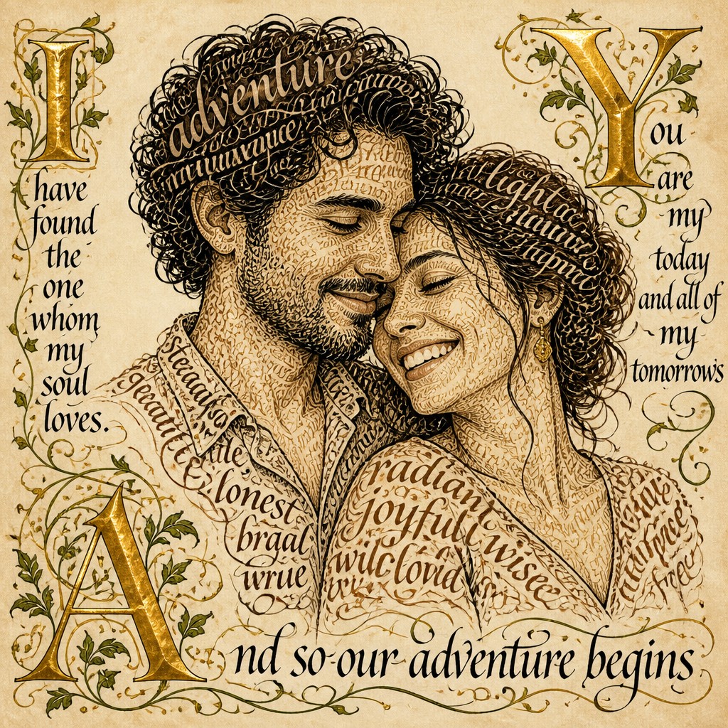
Try It On Your Photos
Upload any photo and convert it into Lettering Art Style — drag the sliders to compare before and after.
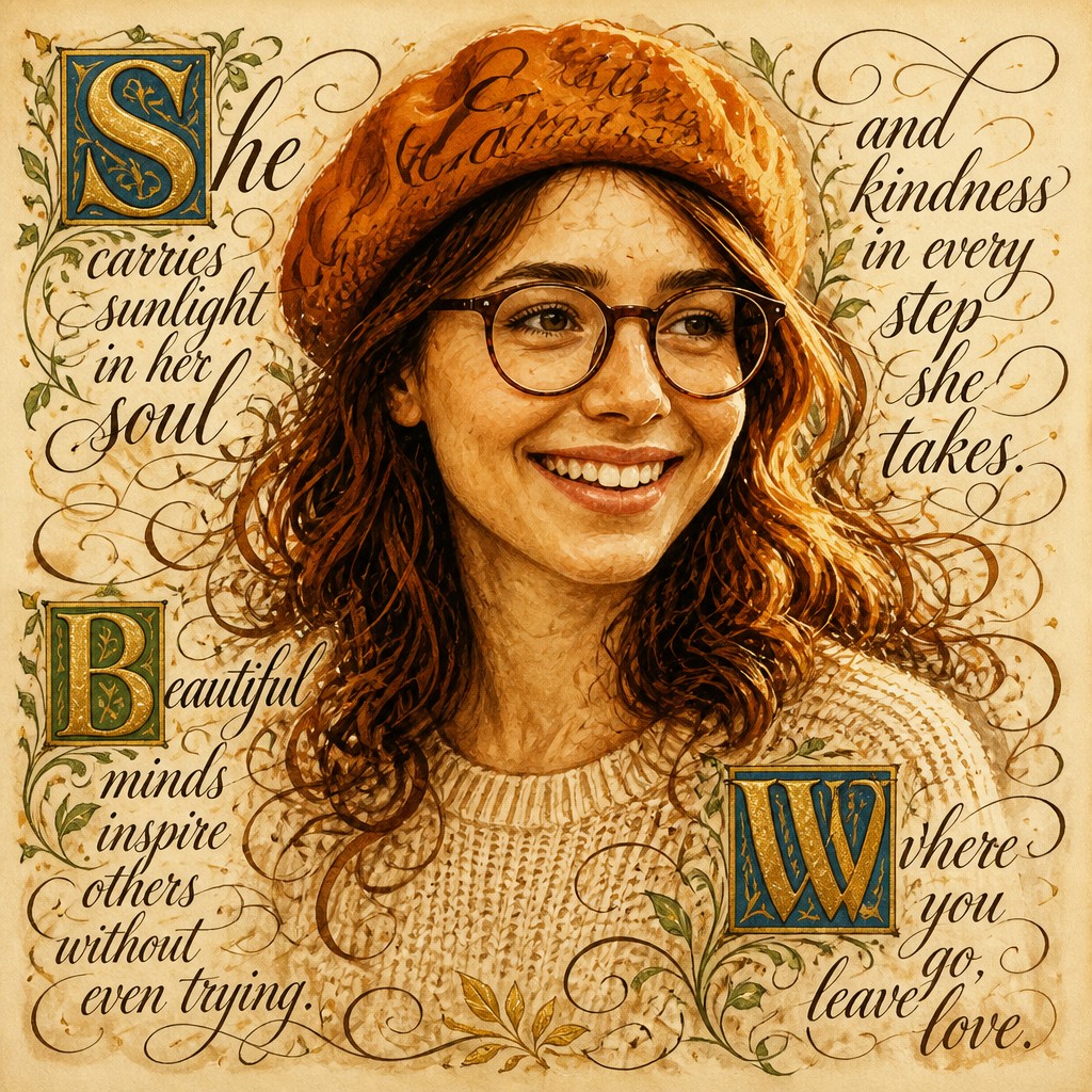

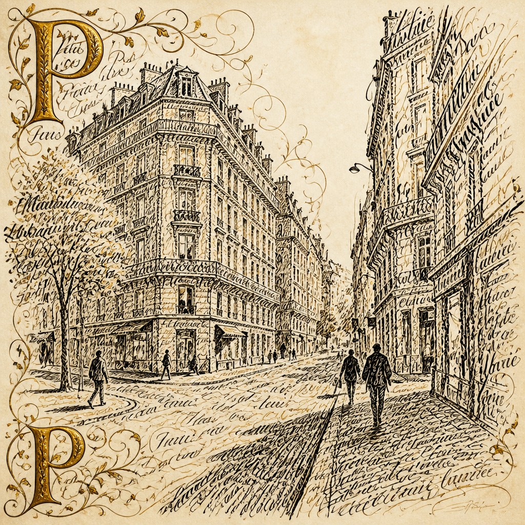

What Defines Lettering Art Style
The signature details, up close
Illuminated capitals
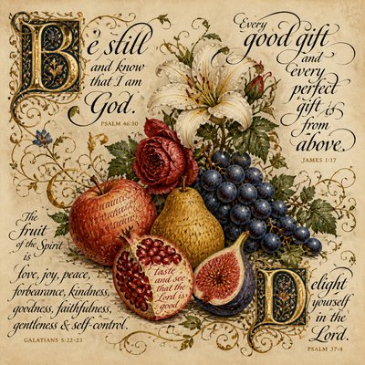
Large initial letters act as compositional anchors, often filled with gold, jewel-like pigment, or painted botanical details. Their scale gives the text the presence of an emblem or icon.
Expressive stroke contrast
Hairline accents sit beside confident, heavily inked downstrokes. This varied weight creates rhythm, hierarchy, and the tactile impression of a flexible nib or loaded brush.
Vine and floral ornament
Leaves, tendrils, petals, and curling stems grow from letters or occupy the surrounding negative space. Ornament is usually integrated into the letter structure rather than placed as a separate border.
Flourished serif forms
Serifs extend into loops, hooks, and sweeping terminals that guide the eye through the composition. These flourishes may be highly symmetrical or deliberately irregular, depending on the intended mood.
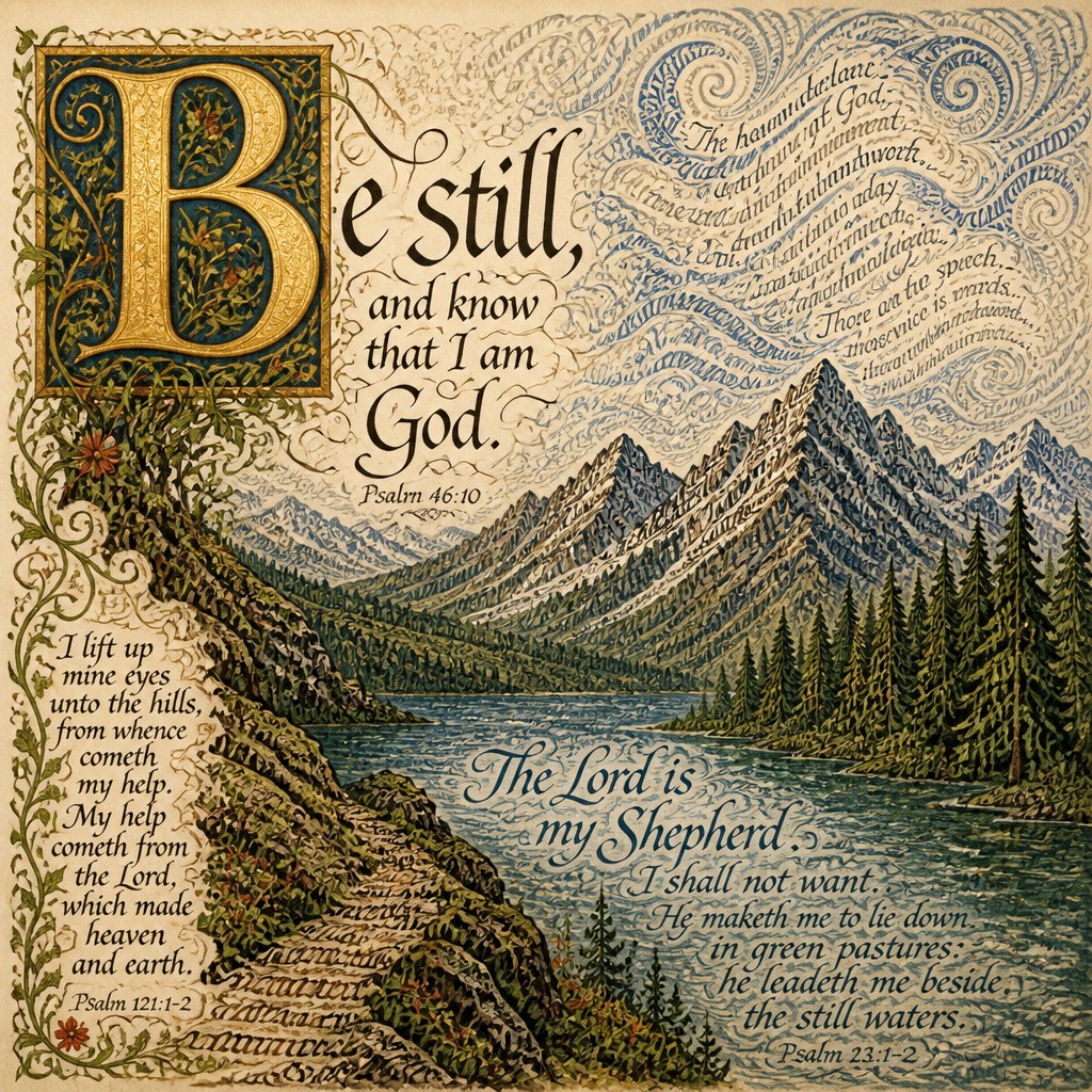
Gilded and pigmented surfaces
Gold-leaf effects introduce reflective highlights and visual hierarchy, while deep reds, blues, greens, and umbers suggest richly painted manuscript decoration. Metallic areas are often contrasted with matte ink and pigment.
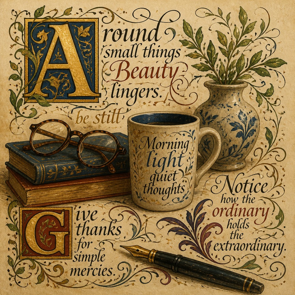
Parchment materiality
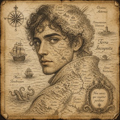
Visible paper grain, softened edges, stains, and subtle tonal variation make the image feel like a crafted page or archival object. The texture also prevents large letterforms from appearing mechanically flat.
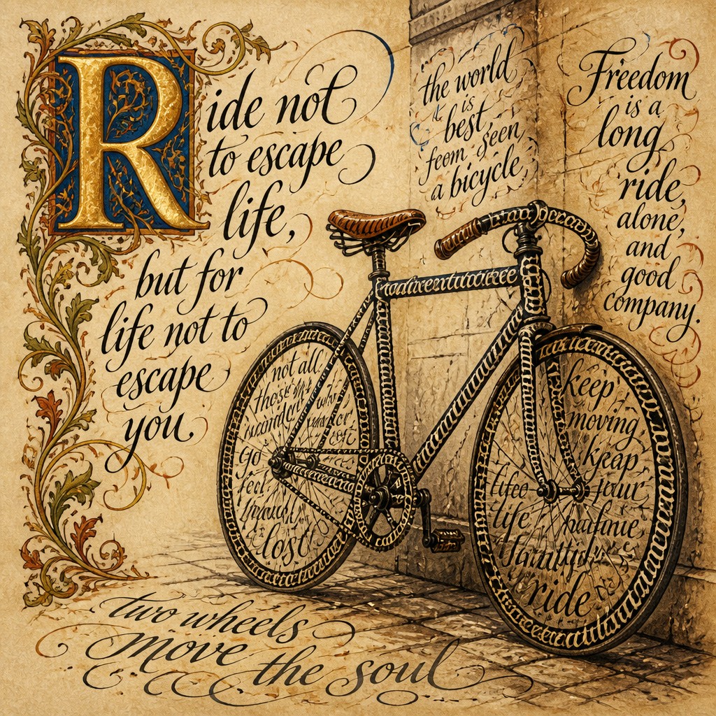
Legibility within ornament
Although decoration can be elaborate, the main word or phrase generally remains readable through clear spacing, deliberate alignment, and a recognizable letter skeleton. The best compositions balance verbal meaning with visual intricacy.
Lettering Prompt Ideas
Start from an idea — each one opens the generator with the style ready to go. See all 40 Lettering prompts →
How to Create Lettering Art
Master the craft step by step — or skip straight to creating. Read the full guide →
- 1
Plan the letter architecture
Choose a short word or phrase and establish its baseline, center axis, and dominant capital before adding decoration. Keep counters and word spacing open enough that ornament does not destroy legibility.
- 2
Build strokes in layers
Sketch the letter skeleton first, then reinforce downstrokes, add hairlines, and finish with terminals and flourishes. In digital software, separate these layers so the ink, gold, pigment, and texture can be adjusted independently.
- 3
Use ornament as structure
Let vines emerge from terminals, counters, or joins instead of scattering unrelated flowers around the page. Repeat leaf shapes and curve directions to create a coherent decorative rhythm.
- 4
Simulate authentic materials
For traditional work, combine waterproof ink, opaque watercolor or gouache, and metallic leaf or metallic pigment on a toned paper. Digitally, use paper-grain overlays, irregular pigment masks, restrained edge wear, and directional highlights to suggest handmade surfaces.
- 5
Control the composition
Reserve the strongest contrast for the main capital or keyword, and use quieter flourishes toward the edges. A limited palette of parchment, dark ink, one or two rich pigments, and gold usually produces greater unity than many unrelated colors.
- 6
Write precise generation instructions
For prompt-based creation, specify the exact text, lettering arrangement, stroke contrast, gold treatment, botanical motifs, paper surface, and desired level of readability. Request accurate spelling and minimal extra text, then correct or typeset the lettering afterward if necessary.
The Story
History & Origins of Lettering
Lettering Art is best understood as a contemporary hybrid aesthetic rather than a single historical movement. It draws on the illuminated manuscript traditions of medieval Europe, in which decorated initials combined painted pigment, metallic leaf, vegetal ornament, and carefully structured writing. It also recalls later calligraphic display traditions, hand-painted sign lettering, ornamental certificates, and decorative book arts.
Modern versions combine these historical references with the visual language of poster design, editorial illustration, and digital compositing. The style often heightens the contrast between handmade irregularity and polished symmetry, using parchment effects, simulated gold leaf, and layered flourishes to evoke historical craft without belonging to one particular period or region.
Influences: The style is related to medieval European manuscript illumination, decorated initials, blackletter and formal calligraphy, hand-painted sign lettering, Victorian and Art Nouveau ornament, book arts, heraldic display, and contemporary lettering illustration. It also shares techniques with gouache painting, ink drawing, gold-leaf decoration, and ornamental graphic design, while its digital versions borrow from texture compositing and layered poster production.
Frequently Asked Questions
What defines Lettering Art?
It treats letters as illustrated forms rather than neutral carriers of text. Gilded capitals, variable ink weight, botanical flourishes, expressive serifs, and parchment-like surfaces are its most recognizable features.
Is Lettering Art a historical art movement?
No. The term describes a contemporary hybrid aesthetic, not a formally bounded historical movement. It synthesizes elements from illuminated manuscripts, calligraphy, sign painting, decorative book arts, and modern graphic design.
How is it different from ordinary calligraphy?
Calligraphy primarily emphasizes the disciplined execution of writing strokes, while Lettering Art expands the letters into an illustrated composition. It may alter letter proportions, incorporate pictorial motifs, and use gold, painted ornament, or narrative imagery.
Does the text need to remain readable?
Usually, yes, especially when the work functions as a title, poster, cover, or emblem. Highly decorative versions may sacrifice some readability for visual impact, but a clear underlying letter structure helps the design retain meaning.
What materials are used to make it traditionally?
Common materials include broad or pointed nibs, brushes, ink, watercolor or gouache, toned paper, and metallic pigment or gold leaf. A light pencil construction is often used first to preserve proportion and alignment.
Where is Lettering Art commonly used?
It suits book covers, certificates, wedding stationery, menus, posters, packaging, editorial illustrations, logos, tattoos, and decorative wall art. Its ornate character is especially effective when a short phrase or single word needs to feel ceremonial or handcrafted.
Create your first Lettering artwork
Describe anything — or upload a photo — and see it in Lettering Art Style in seconds.
Related Styles
Discover similar art styles