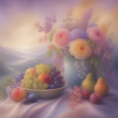
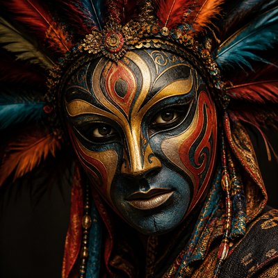
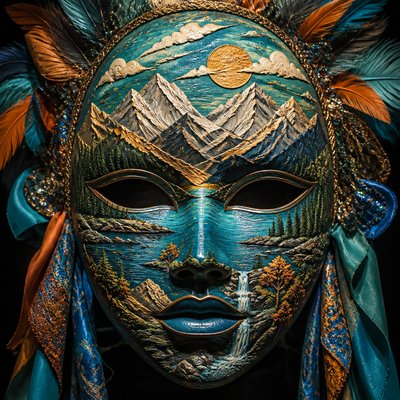
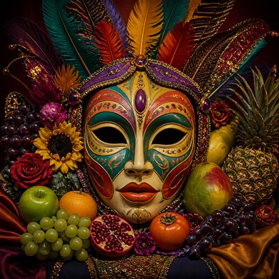
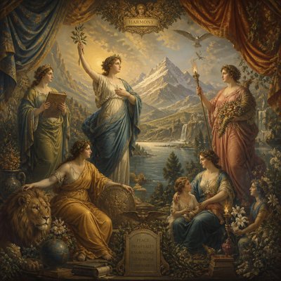
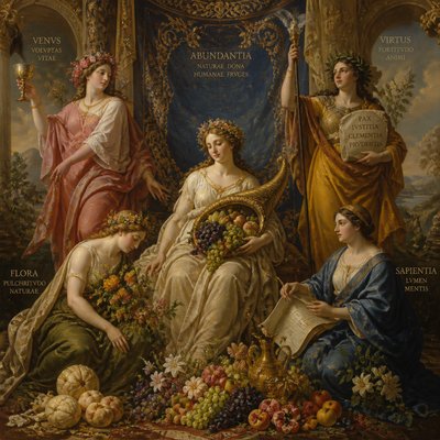
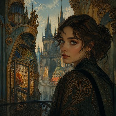
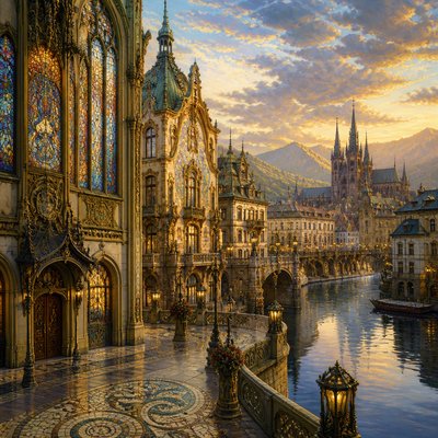
Poster Art Style
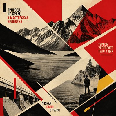
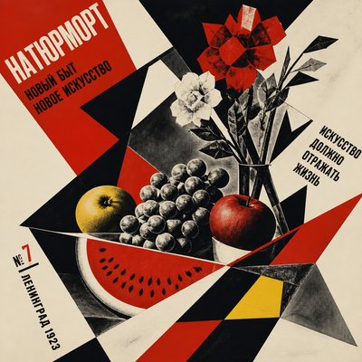
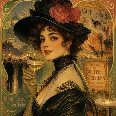
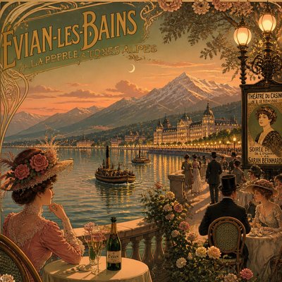
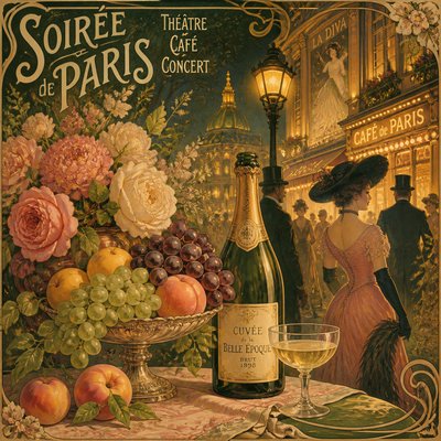
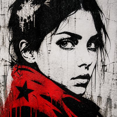
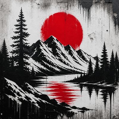
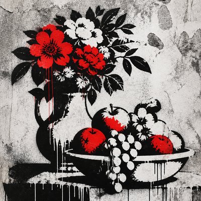
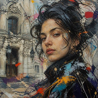
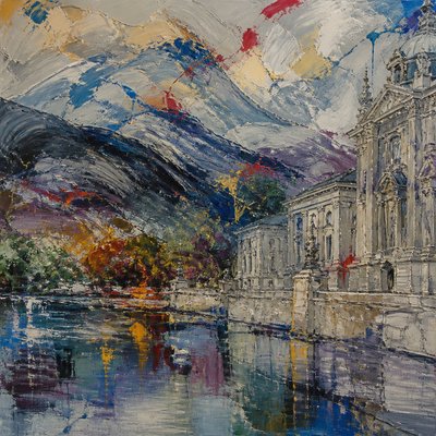
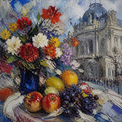
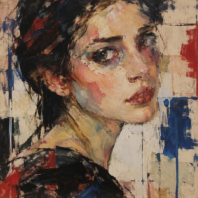
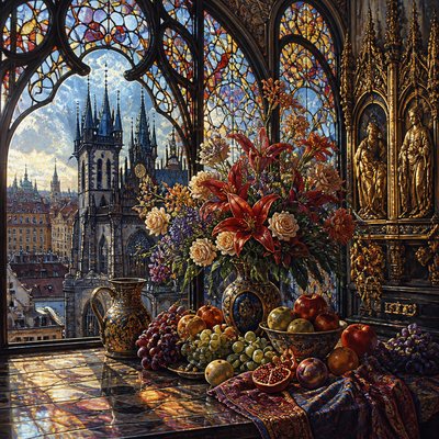
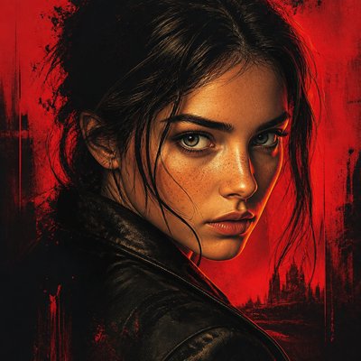
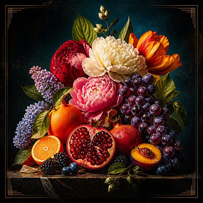
Explore Poster Art Style: bold color blocks, crisp shapes, vintage print texture, integrated lettering, and compositions made for instant impact.
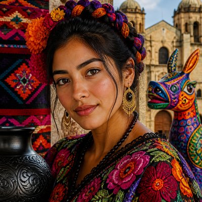
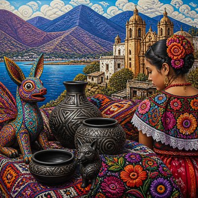
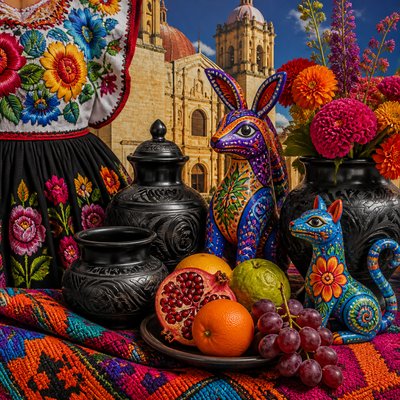
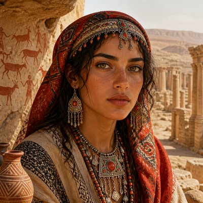
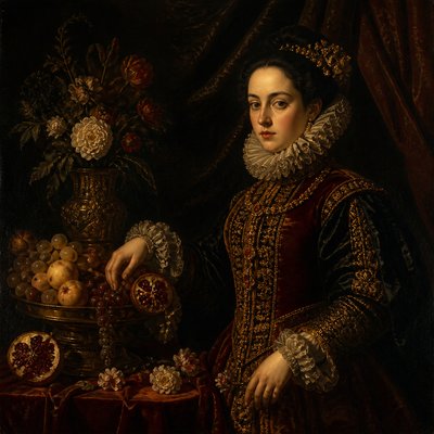
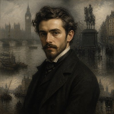
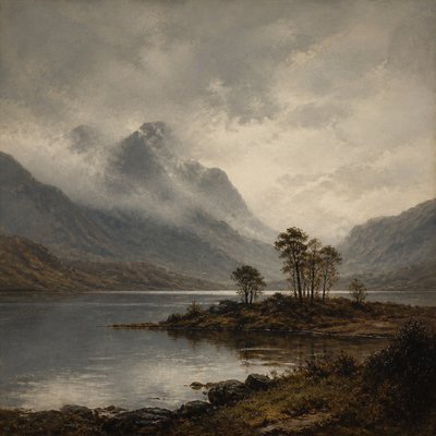
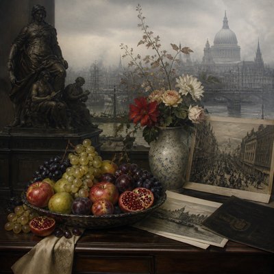
Instantly rendered in Poster — or transform a photo
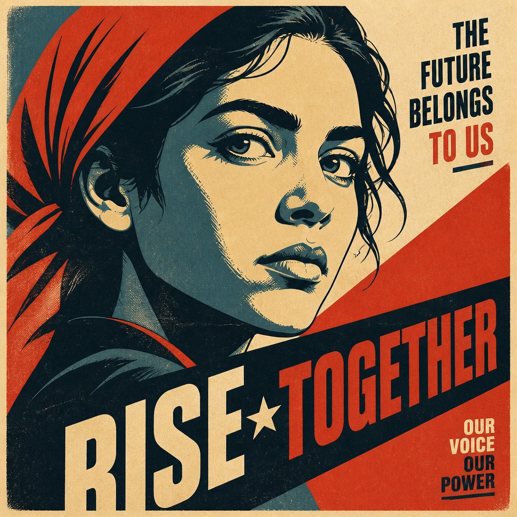
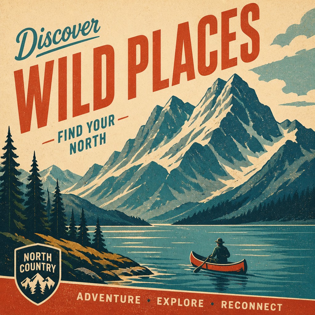
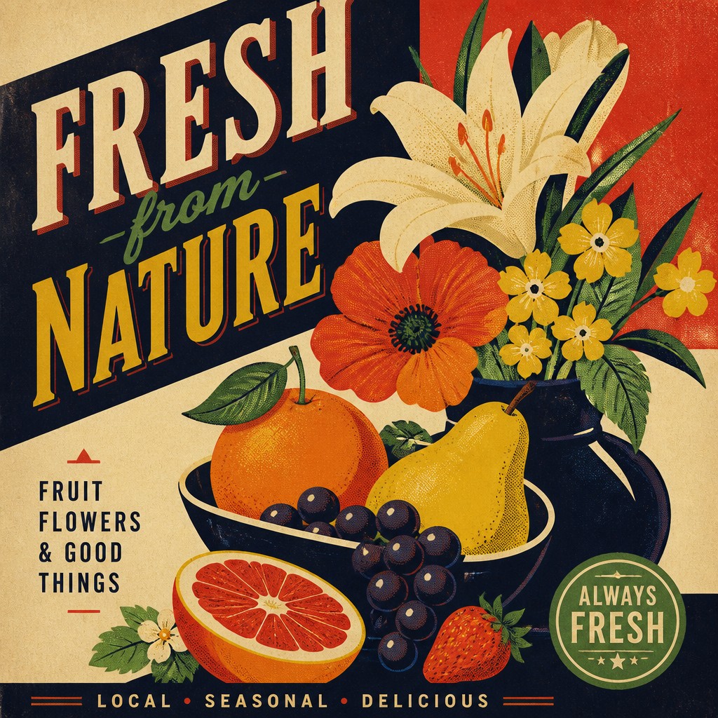
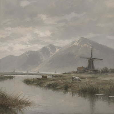
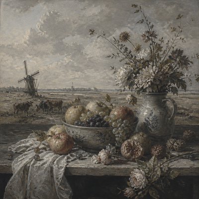
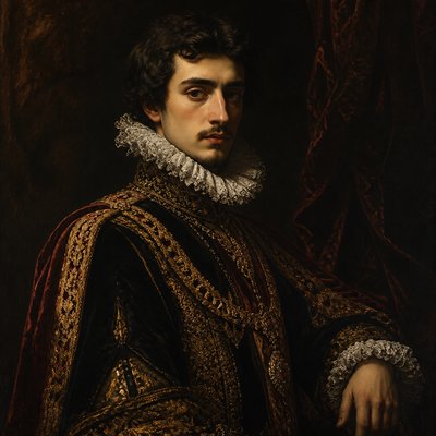
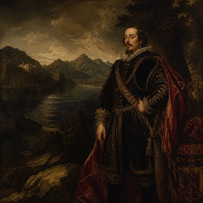
Poster Gallery
Tap any artwork to explore it
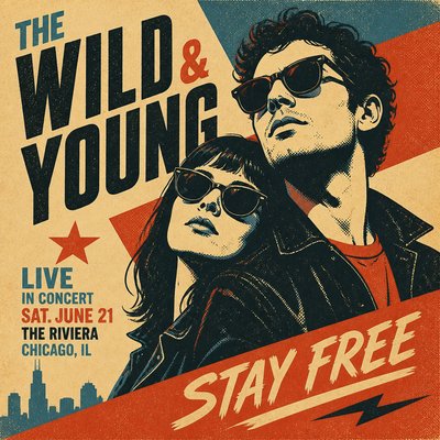

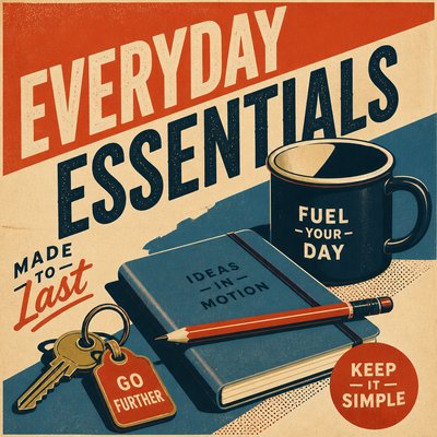
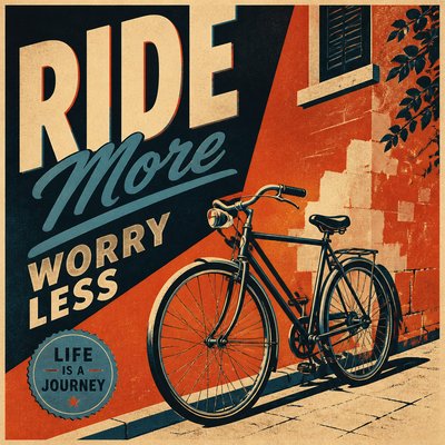
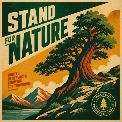
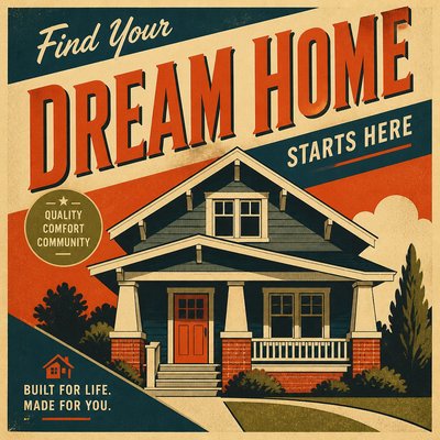
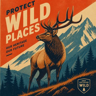
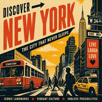
What is Poster Art Style?
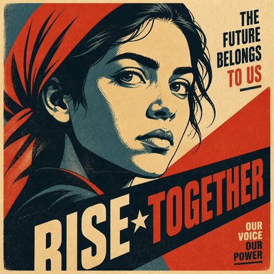
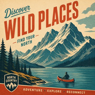
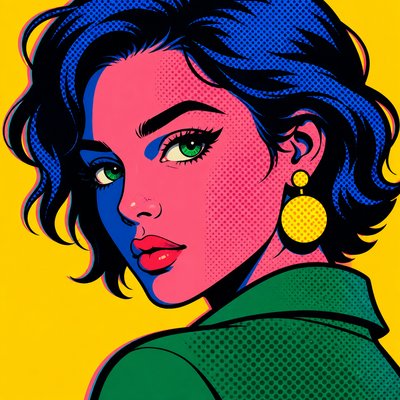
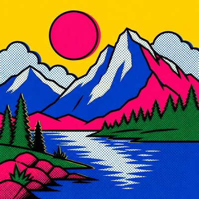
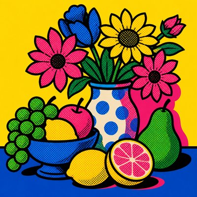
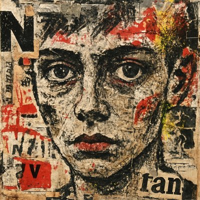
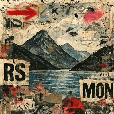
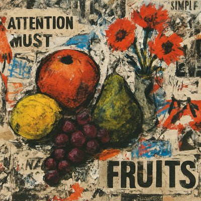
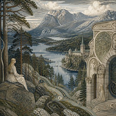
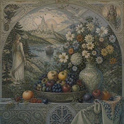
Poster Art Style is a graphic approach designed to communicate an image or message quickly at a distance. It uses simplified forms, flat areas of saturated color, strong silhouettes, crisp edges, and carefully controlled typography rather than painterly modeling or subtle tonal transitions. The result is an image that reads immediately, often with a memorable central symbol, figure, product, slogan, or directional composition.
Its visual identity depends on reduction and hierarchy: unnecessary detail is removed so that the subject, lettering, and main color contrasts remain clear. Diagonal structures, limited palettes, halftone dots, paper grain, and slight ink misregistration can add energy and physical character, recalling printed lithographs and screen prints. Contemporary versions may apply the same logic to editorial graphics, album artwork, event promotion, portraits, travel imagery, and digital illustrations.
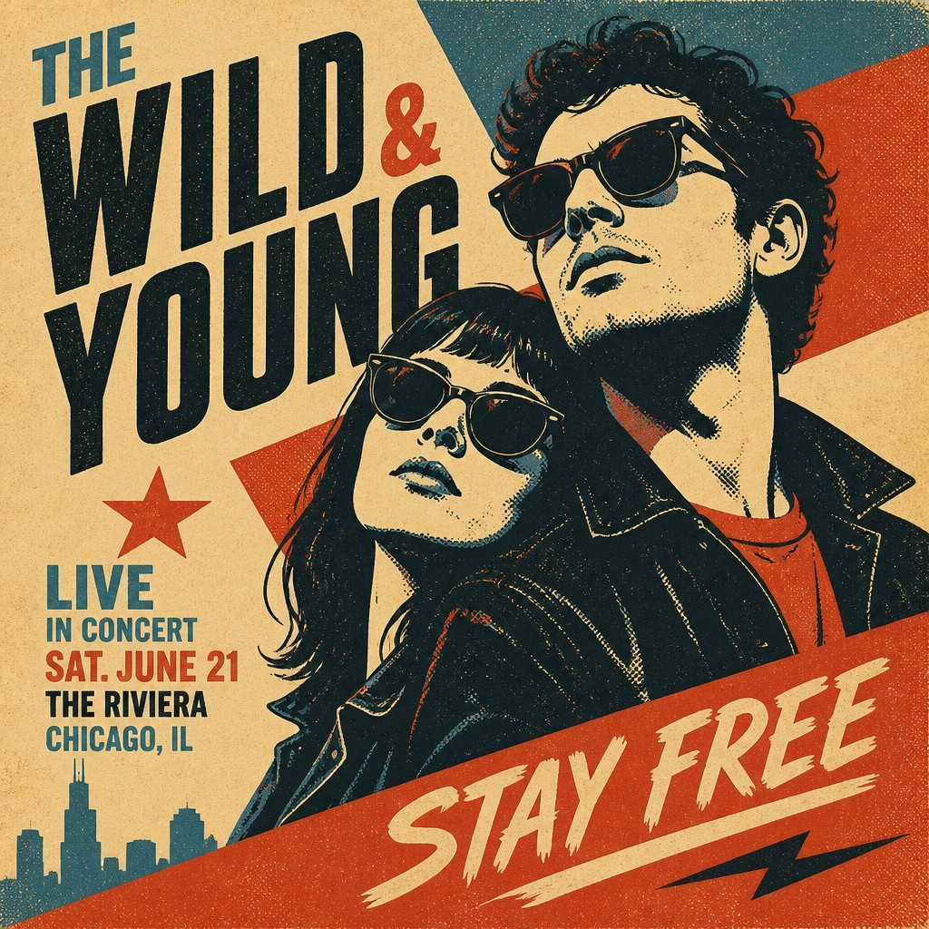
Try It On Your Photos
Upload any photo and convert it into Poster Art Style — drag the sliders to compare before and after.
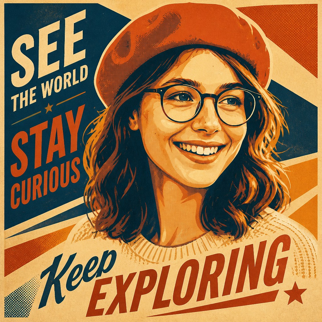


What Defines Poster Art Style
The signature details, up close
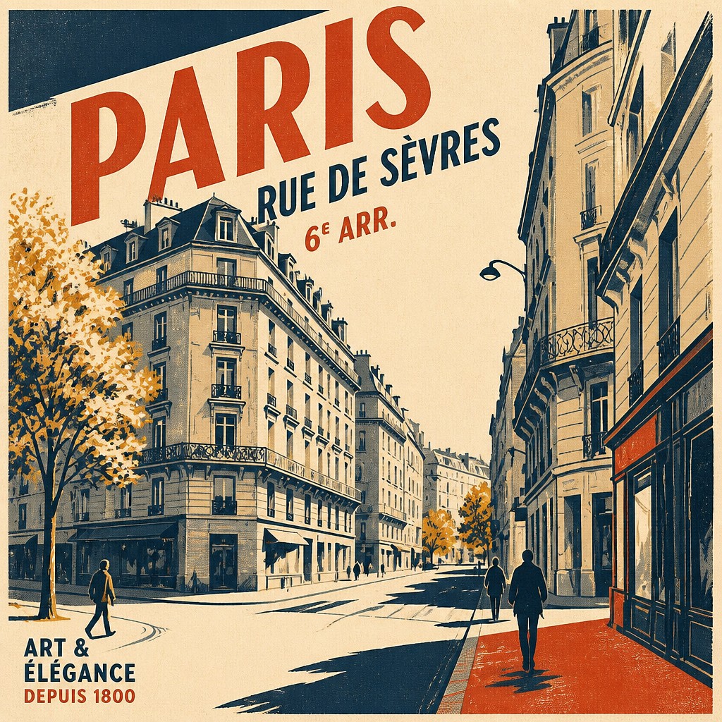
Flat color blocks
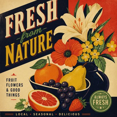
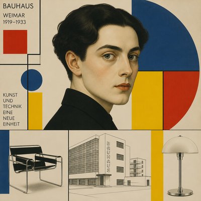
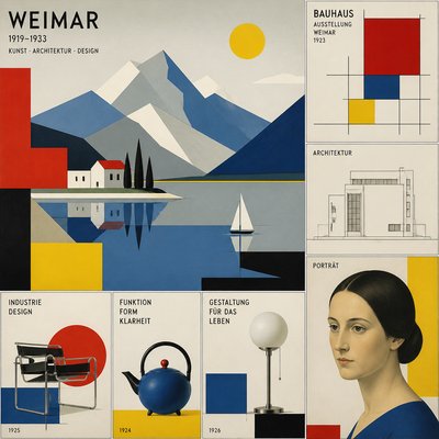
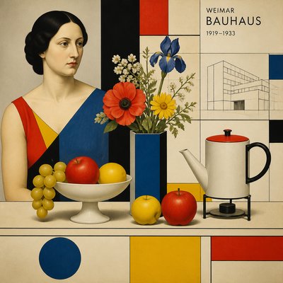
Large, unmodulated areas of color establish the subject and structure of the image. Shading is usually simplified into a few graphic planes rather than rendered as continuous realism.
Crisp silhouettes and contours
Strong outlines, clean edges, and recognizable silhouettes make the composition readable from a distance. Forms are often selectively exaggerated for clarity and impact.
Limited high-contrast palette
A small number of carefully selected colors creates visual unity and immediate emphasis. Complementary contrasts, dark grounds, and vivid accent colors are common.
Integrated typography
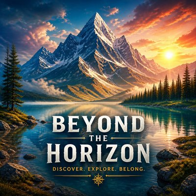
Words, numerals, slogans, or labels function as part of the image rather than as an afterthought. Lettering may be condensed, geometric, hand-drawn, arched, or arranged along the composition's directional axis.
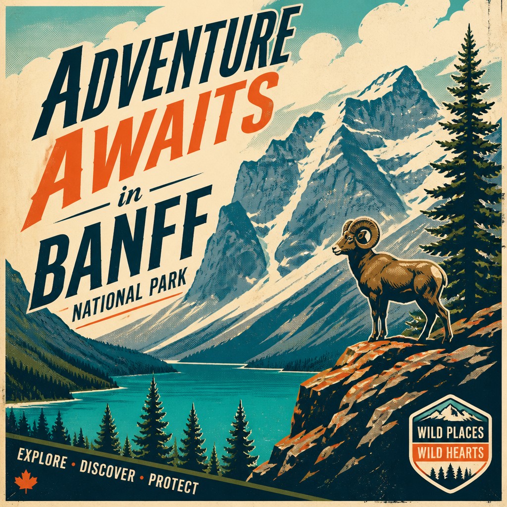
Dynamic composition
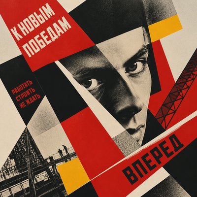
Diagonal lines, cropped figures, radiating shapes, and asymmetrical balance create movement and urgency. The layout generally establishes one dominant focal point before supporting details.
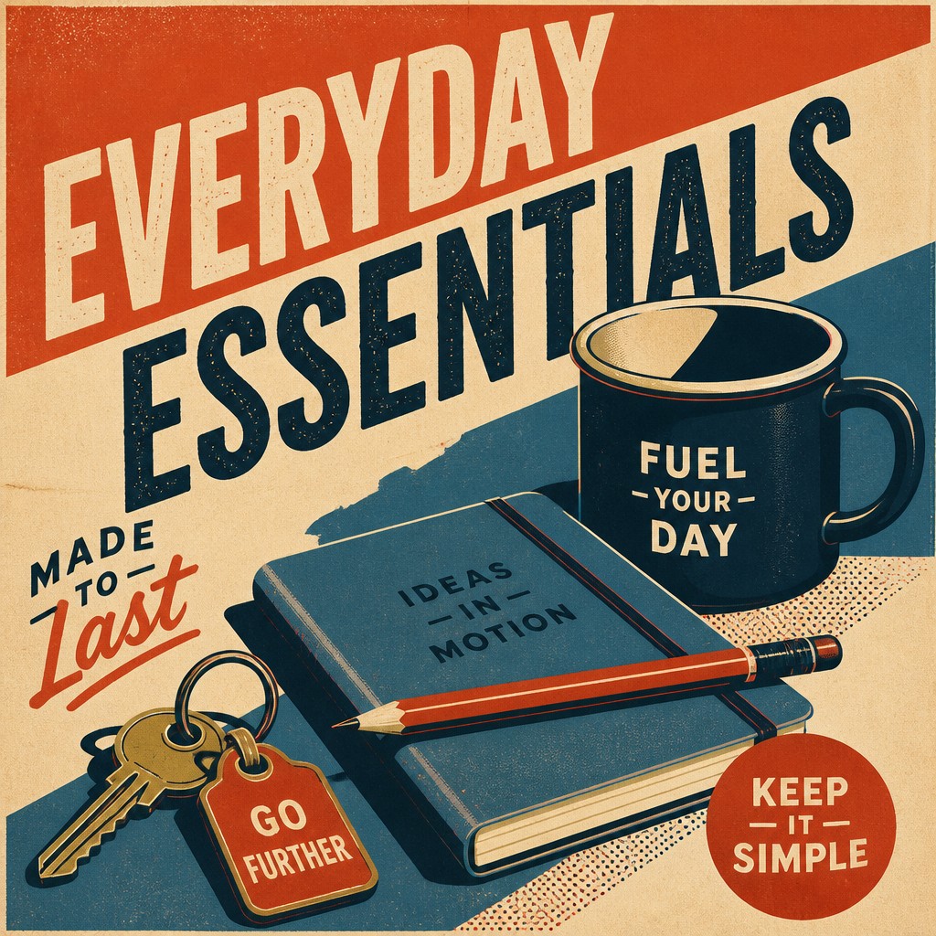
Print-based texture
Halftone dots, lithographic grain, faded ink, paper fibers, and slight registration offsets suggest a tactile reproduction process. Texture is typically subordinate to legibility rather than used for realistic surface description.
Poster Prompt Ideas
Start from an idea — each one opens the generator with the style ready to go. See all 40 Poster prompts →
How to Create Poster Art
Master the craft step by step — or skip straight to creating. Read the full guide →
- 1
Reduce the subject to essential shapes
Begin with a clear silhouette and identify the few planes that communicate volume, pose, or action. Remove small details that will disappear when the image is viewed at poster distance.
- 2
Build a restricted palette
Choose two to five dominant colors plus a background and an accent. Test the design in grayscale to ensure that value contrast, not color alone, separates the focal subject from its surroundings.
- 3
Design the hierarchy before decorating
Place the main subject, headline, and supporting information in a deliberate reading order. Vector tools, cut paper, screen printing, or layered digital shapes all work well because they preserve clean graphic relationships.
- 4
Use typography as an image element
Select lettering with a strong silhouette and adjust its scale, spacing, rotation, and placement to reinforce the composition. Keep wording brief and check that it remains legible at a reduced size.
- 5
Add controlled print character
Apply halftone patterns, paper grain, restrained distressing, and a subtle registration shift after the main design is resolved. Avoid heavy texture that obscures silhouettes or small lettering.
- 6
Guide prompt-based generation precisely
Describe the subject, focal layout, palette, lettering placement, print process, and degree of texture in that order. For reliable results, specify readable or minimal typography separately, then refine composition and color through image editing or layered compositing.
The Story
History & Origins of Poster
Poster Art Style has an aesthetic lineage in the commercial lithographic posters that expanded in Europe and North America during the late 19th century, when advances in color printing made large illustrated advertisements widely available. Art Nouveau contributed flowing silhouettes and integrated lettering, while early modernist graphic design introduced sharper geometry, simplified forms, and more systematic visual organization.
During the 20th century, poster design developed through political and public-information graphics, constructivist geometry, Art Deco styling, wartime prints, film advertising, tourism posters, and screen-print traditions. Mid-century modernism and later digital design further emphasized limited palettes, bold sans-serif typography, modular layouts, and instant legibility. The contemporary style combines these historical printing conventions with digital compositing, vector illustration, and generative image-making.
Influences: The style draws from color lithography, commercial advertising posters, Art Nouveau, Art Deco, constructivist and Bauhaus-era graphic design, modernist grid systems, political and public-information posters, screen printing, comic-book color separation, and mid-century travel graphics. It also shares methods with contemporary vector illustration, editorial design, album covers, stencil art, and street-art wheatpastes, particularly their emphasis on simplified form, reproducible color, and rapid visual communication.
Frequently Asked Questions
What defines Poster Art Style?
It is defined by simplified graphic forms, flat or minimally shaded color, strong contrast, integrated lettering, and a composition organized for immediate readability. Print-like texture and dramatic cropping or diagonals often reinforce its physical poster character.
Is Poster Art Style a single historical art movement?
No. Poster art is a broad design tradition rather than one uniform movement. The style described here synthesizes methods from lithographic advertising, modernist graphic design, public-information posters, screen printing, and digital illustration.
How does it differ from a realistic advertisement or painting?
Poster art prioritizes communication and visual hierarchy over continuous modeling, naturalistic detail, or atmospheric depth. Subjects are reduced into bold shapes, while text, color, and silhouette are designed to work together as one concise message.
Can Poster Art Style include portraits and landscapes?
Yes. Portraits, landscapes, products, architecture, events, and fictional scenes can all be adapted to this approach. The subject should be simplified into a strong focal shape and supported by a clear palette and directional layout.
How can I make a poster look authentically printed?
Use a limited number of ink colors, visible halftone or grain, slightly imperfect edges, and a restrained registration offset. Paper tone, ink density, and minor wear can suggest lithography or screen printing without overwhelming the underlying design.
Is typography required in Poster Art Style?
No, but typography is historically important because posters are designed to communicate at a glance. A text-free image can still qualify when it uses poster-like hierarchy, simplified forms, bold contrast, and a composition intended for public display.
Create your first Poster artwork
Describe anything — or upload a photo — and see it in Poster Art Style in seconds.
Related Styles
Discover similar art styles