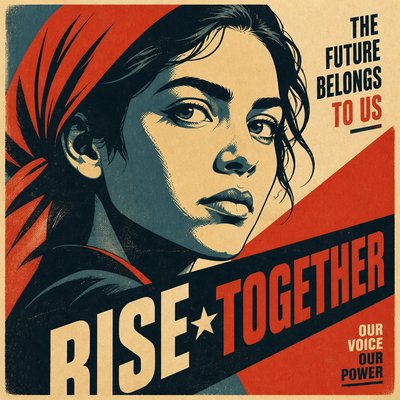
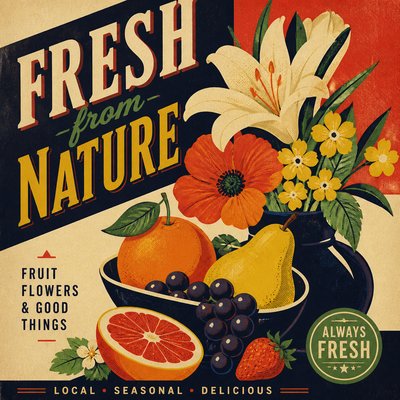
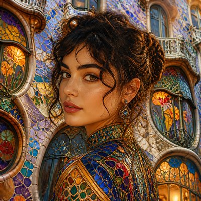
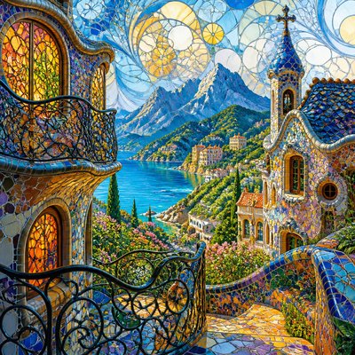
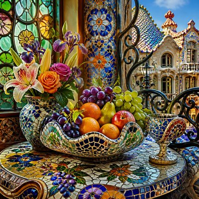
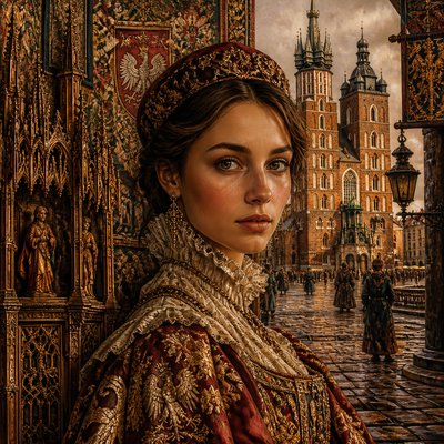
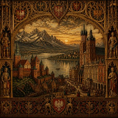
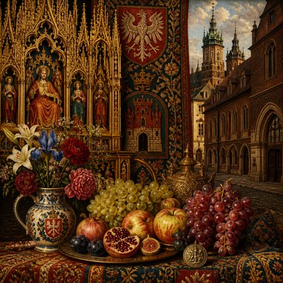
Color Harmony Art Style
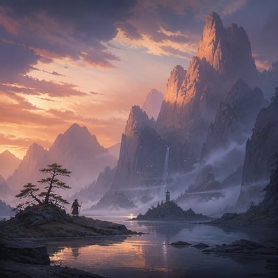
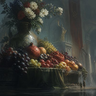
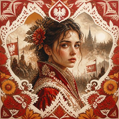
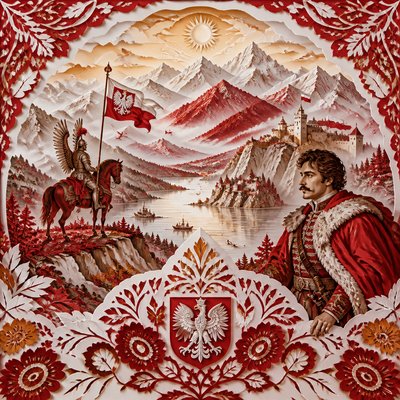
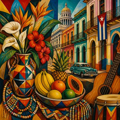
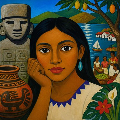
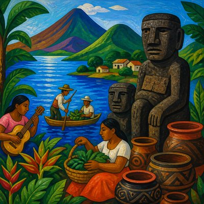
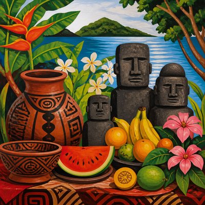
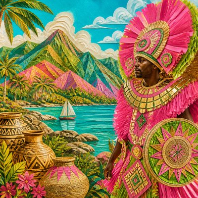
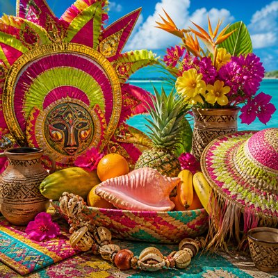
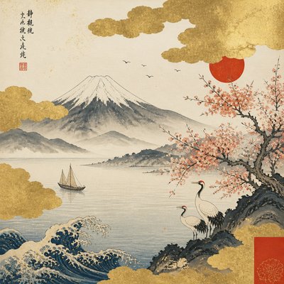
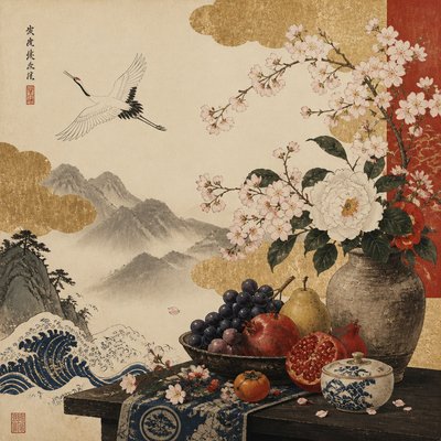
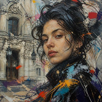
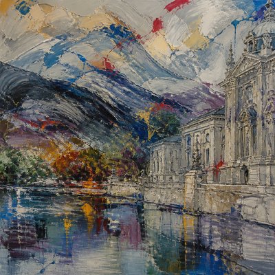
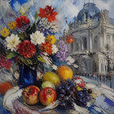
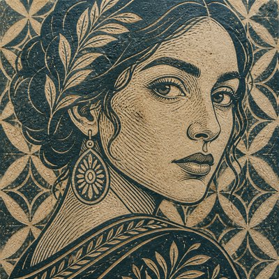
Explore Color Harmony Art Style: serene analogous palettes, soft transitions, and unified warm or cool hues for balanced visual compositions.
Instantly rendered in Color Harmony — or transform a photo
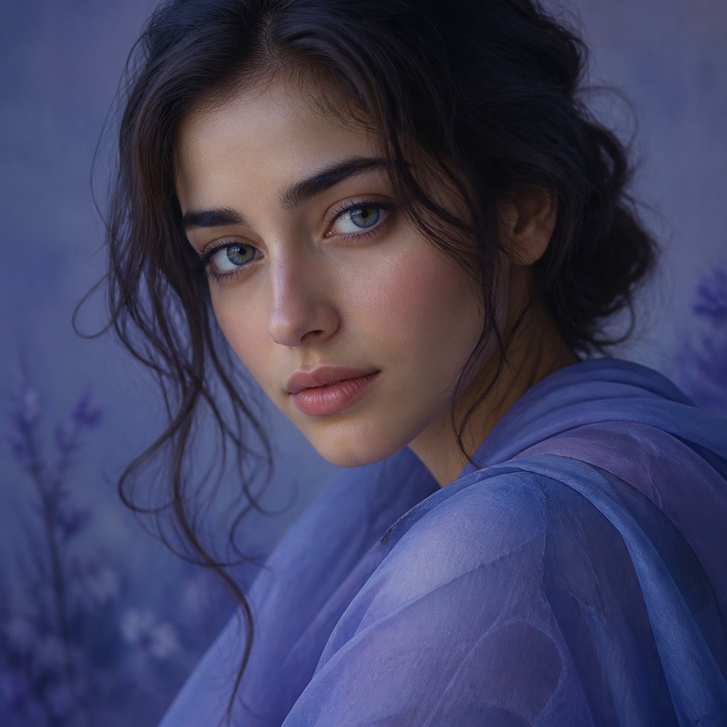
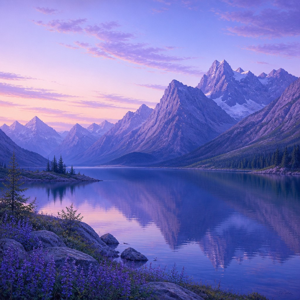
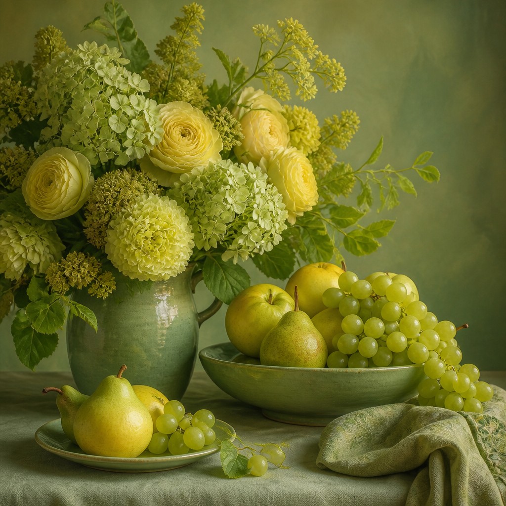
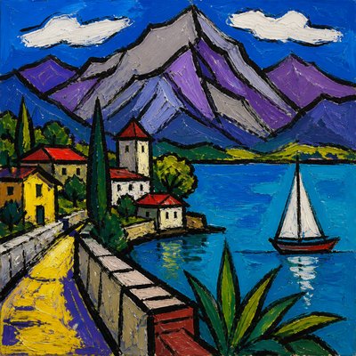
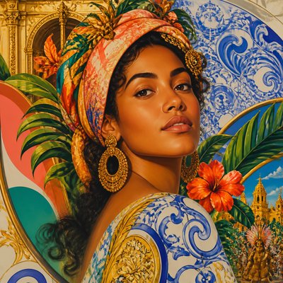
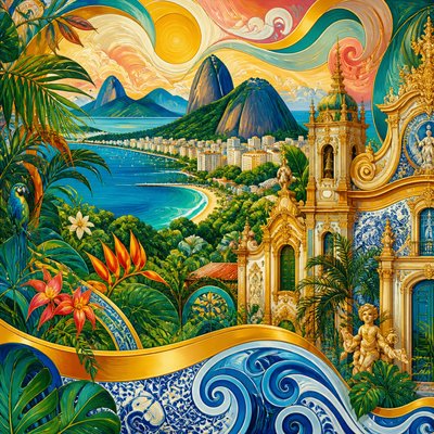
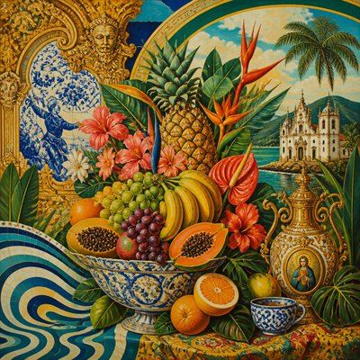
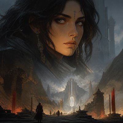
Color Harmony Gallery
Tap any artwork to explore it
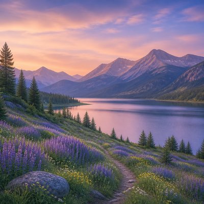
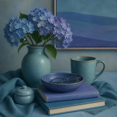
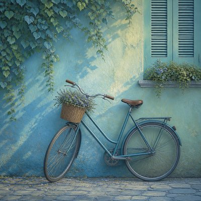
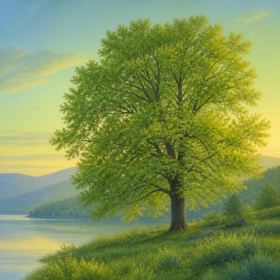
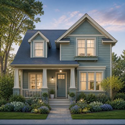
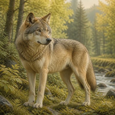
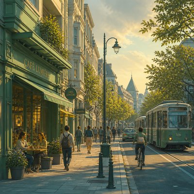
What is Color Harmony Art Style?
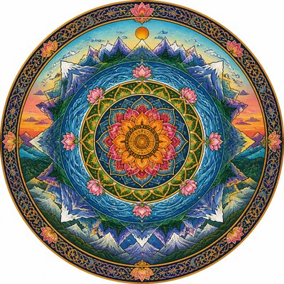
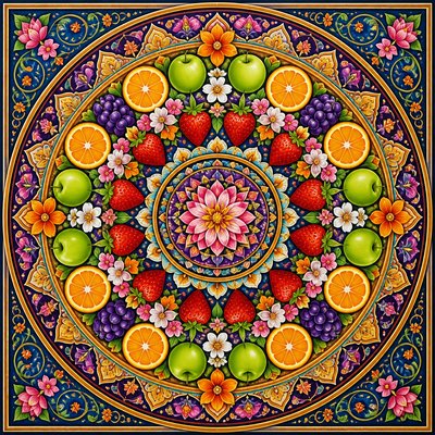
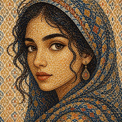
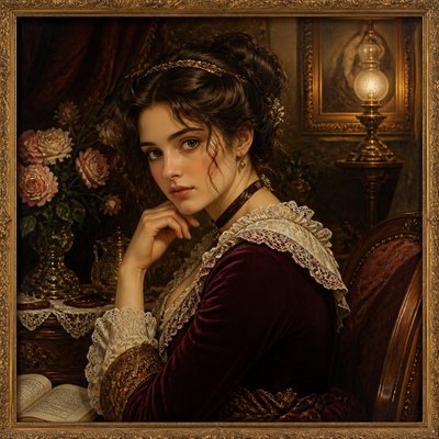
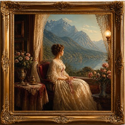
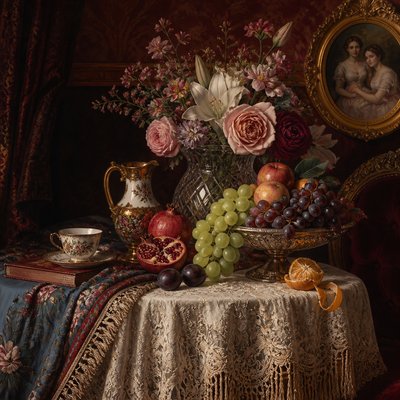
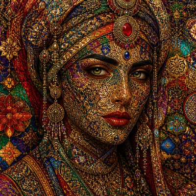
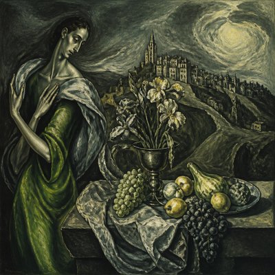
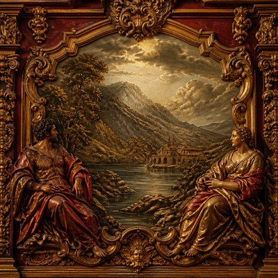
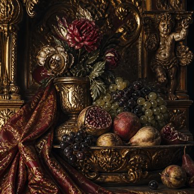
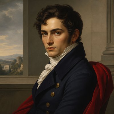
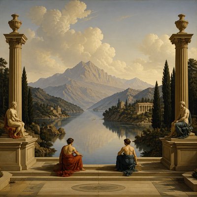
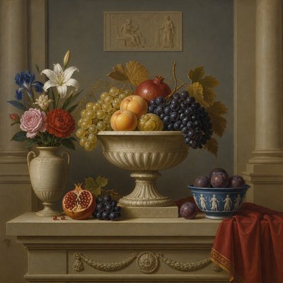
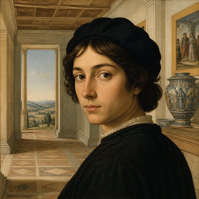
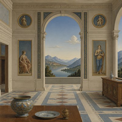
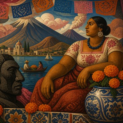
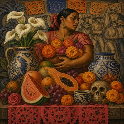
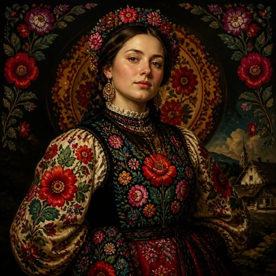
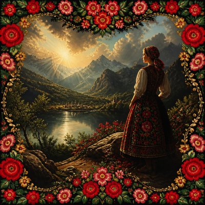
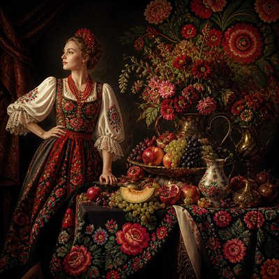
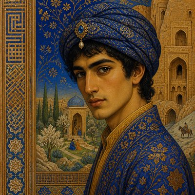
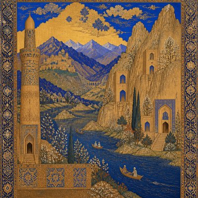
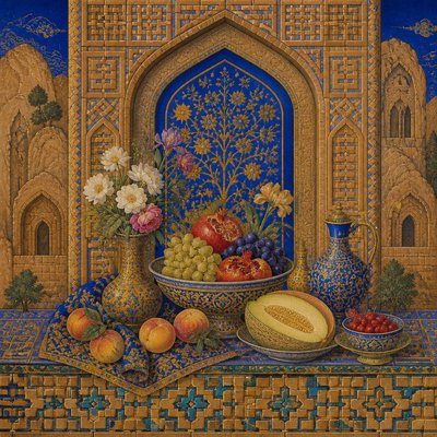
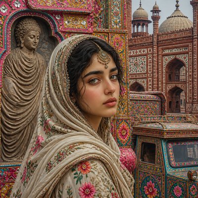
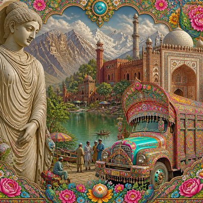
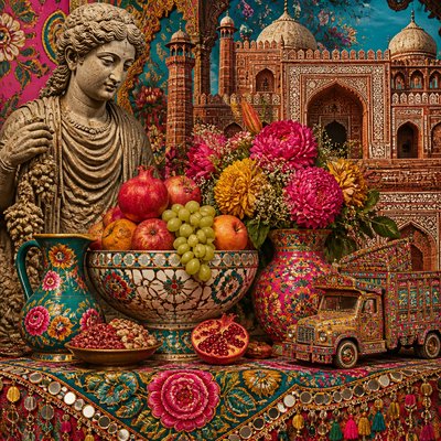
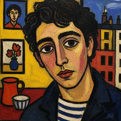
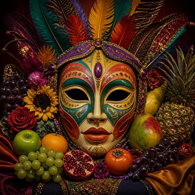
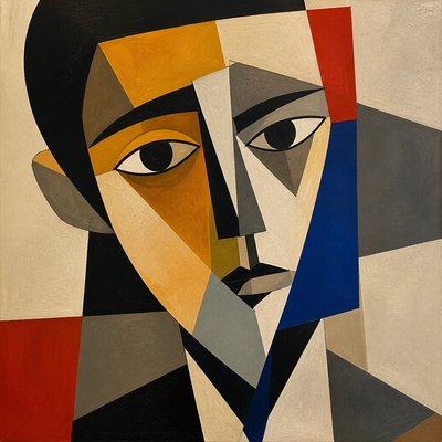
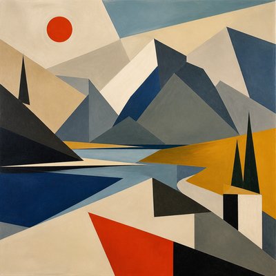
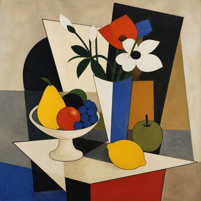
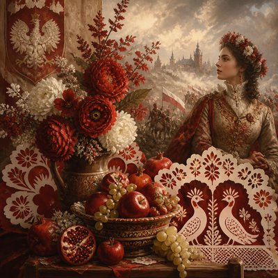
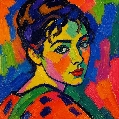
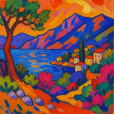
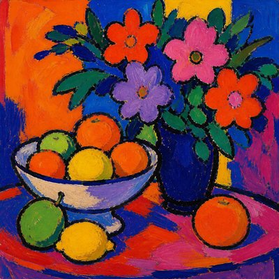
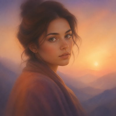
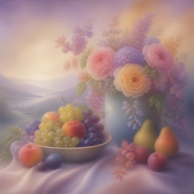
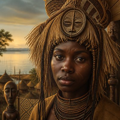
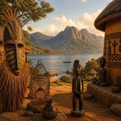
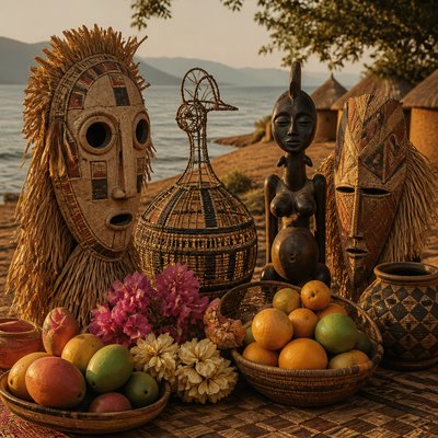
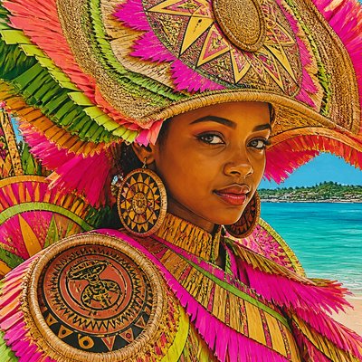
Color Harmony Art Style is a contemporary descriptive style built around neighboring hues arranged in calm, closely related palettes. Instead of relying on strong complementary contrasts or isolated bright accents, it lets colors sit near one another on the color wheel, producing a unified impression of warmth, coolness, or atmospheric quiet.
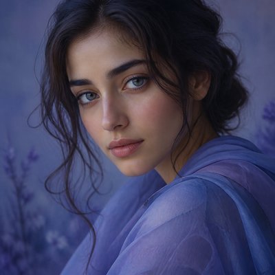
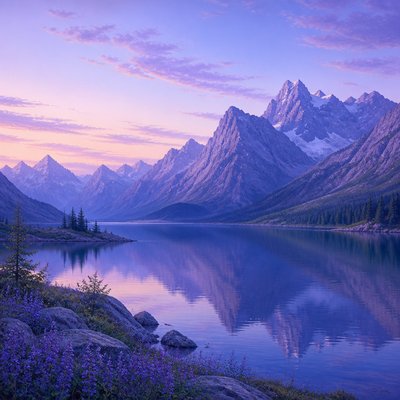
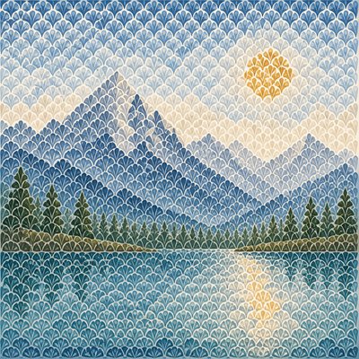
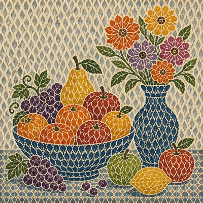
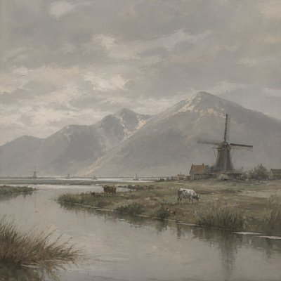
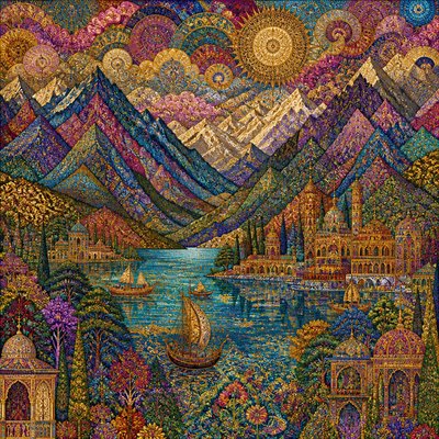
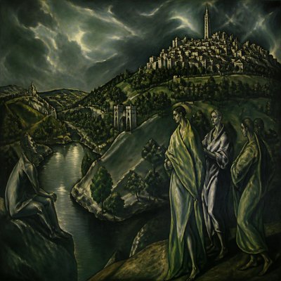
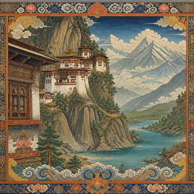
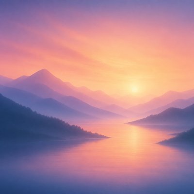
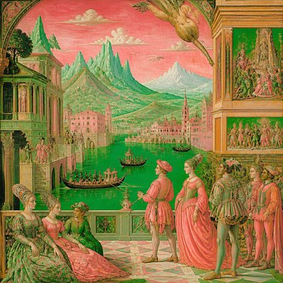
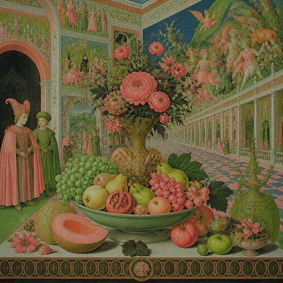
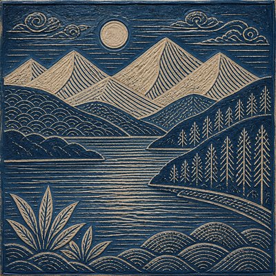
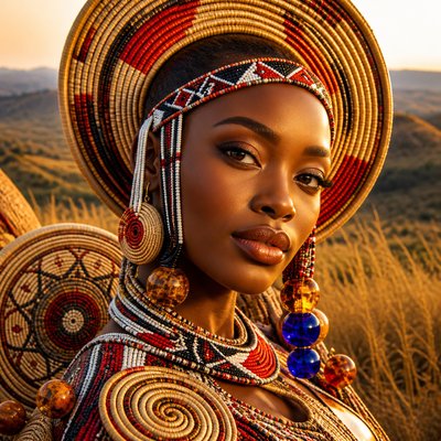
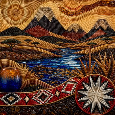
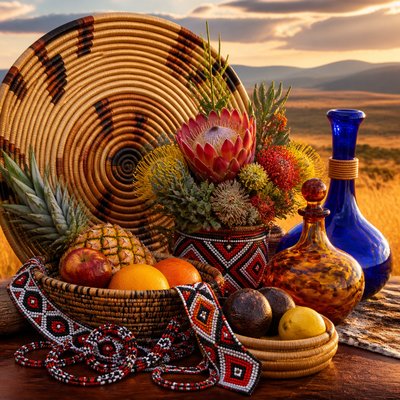
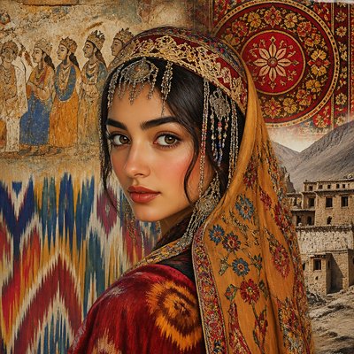
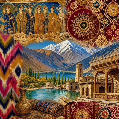
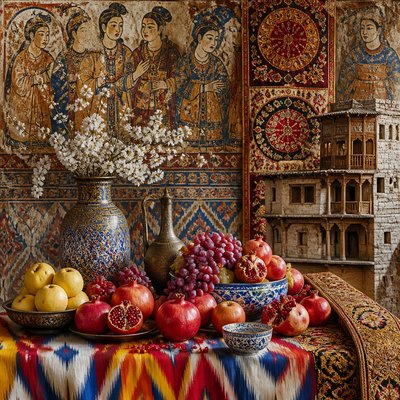
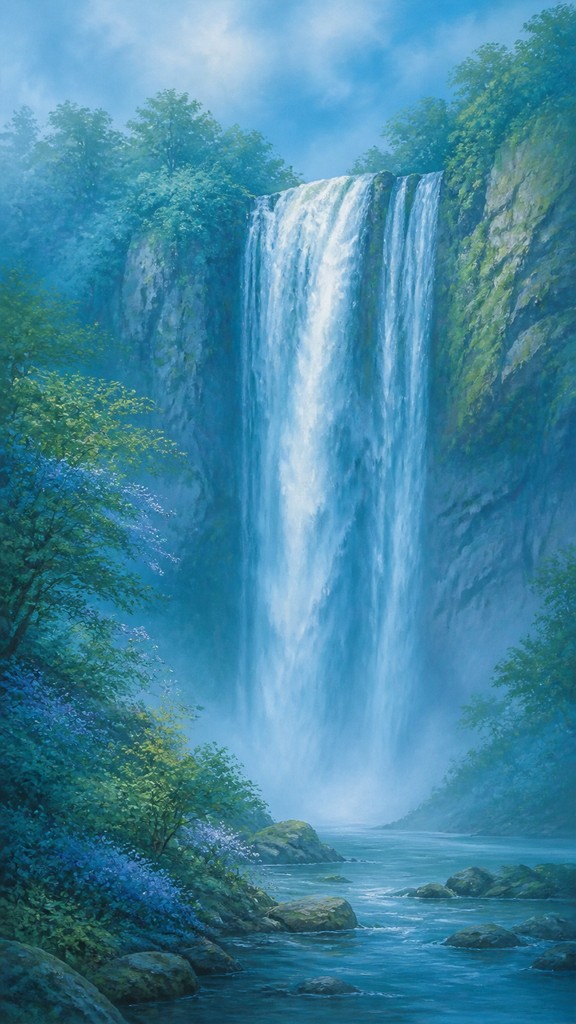
Its visual identity comes from analogous color relationships, softly graded transitions, restrained saturation, and carefully controlled tonal variation. A blue, blue-green, and green landscape, for example, may feel continuous and enveloping, while a composition of ochre, orange, and red can create gentle warmth without becoming visually aggressive. The approach can be applied to representational scenes, abstraction, illustration, photography, interiors, and digital compositions.
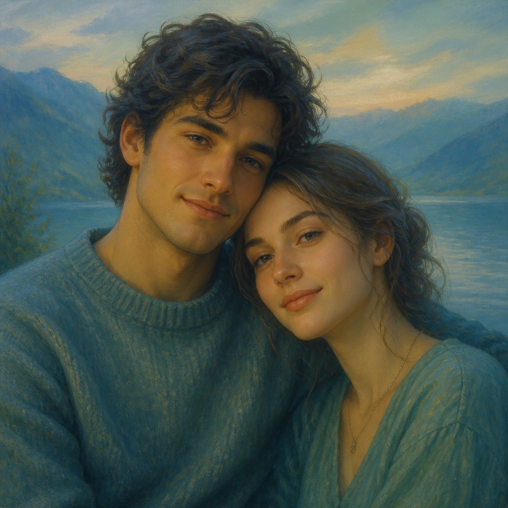
Try It On Your Photos
Upload any photo and convert it into Color Harmony Art Style — drag the sliders to compare before and after.
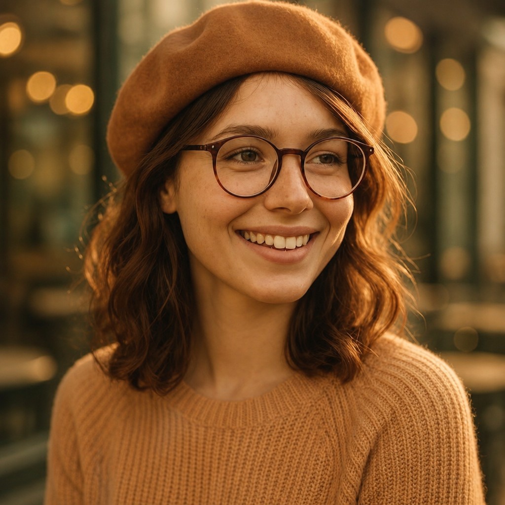

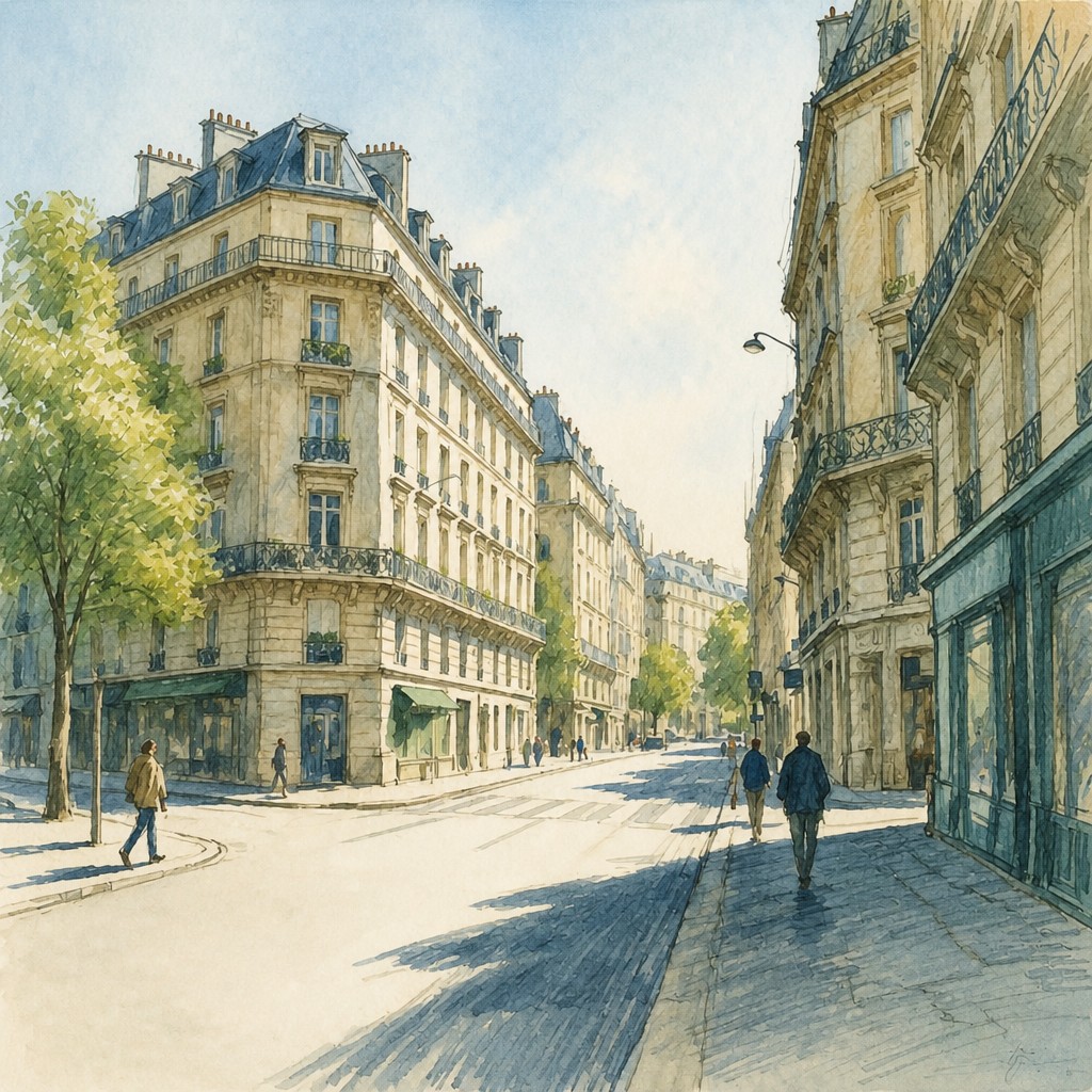

What Defines Color Harmony Art Style
The signature details, up close
Analogous palettes
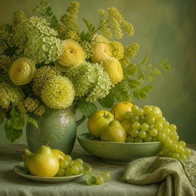
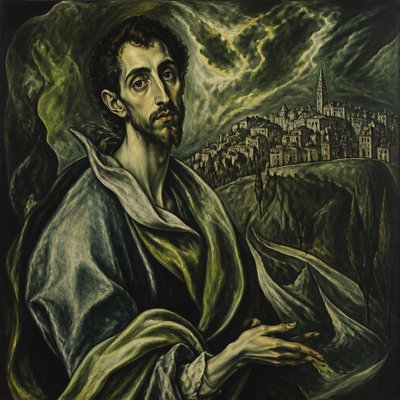
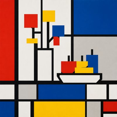
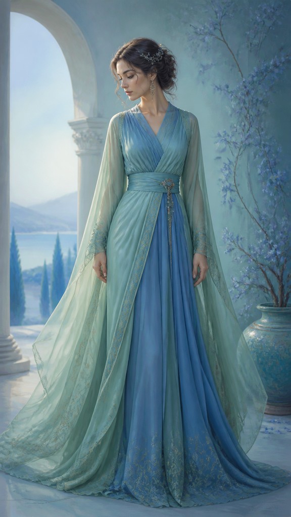
The dominant colors occupy neighboring positions on the color wheel, such as blue-green-green or yellow-orange-red. This reduces visual friction and gives the composition a coherent chromatic identity.
Unified color temperature
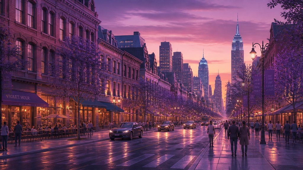
The image generally leans warm or cool rather than alternating unpredictably between both. A consistent temperature helps foreground, background, lighting, and shadow feel as though they belong to the same atmosphere.
Soft transitions
Hues blend gradually through glazing, tonal modeling, atmospheric perspective, gradients, or digital color transitions. Hard edges may still define forms, but the color relationships remain gentle.
Restrained contrast
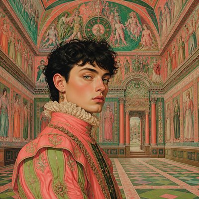
Contrast is usually carried by value, texture, scale, or composition rather than by clashing hues. Saturation is controlled so that no small accent overwhelms the visual balance.
Serene chromatic mood
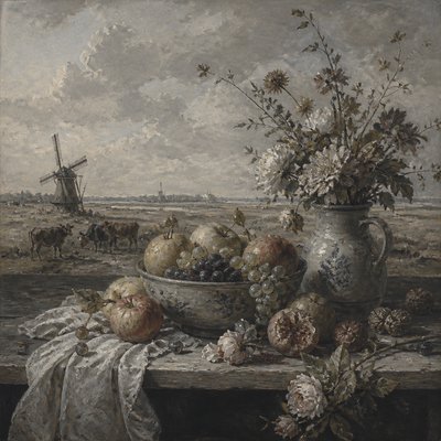
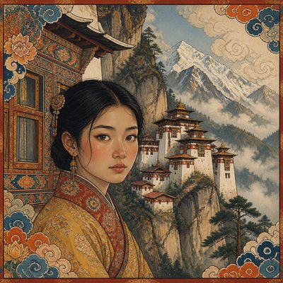
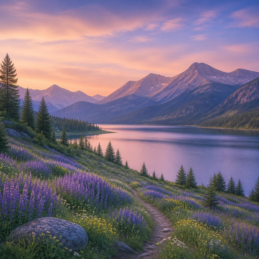
The close relationship between hues tends to evoke calm, contemplation, intimacy, or visual stillness. Mood varies with the chosen family: cool greens and blues can feel restorative, while ochres and reds can feel intimate and sunlit.
Integrated focal points
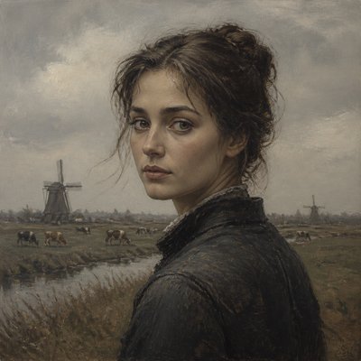
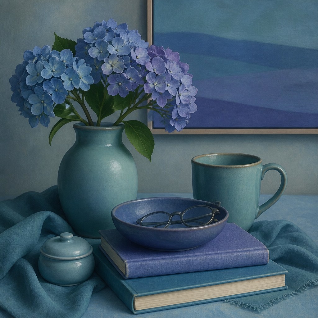
Important subjects are emphasized through placement, value, sharpness, or slight saturation shifts instead of unrelated accent colors. The focal area remains part of the overall palette.
Try It
Create Videos in Color Harmony Art Style
Styles aren't just for stills — describe a scene or animate an image and get a short video rendered in Color Harmony. Press play to see this pond come to life.
Make a VideoColor Harmony Prompt Ideas
Start from an idea — each one opens the generator with the style ready to go. See all 40 Color Harmony prompts →
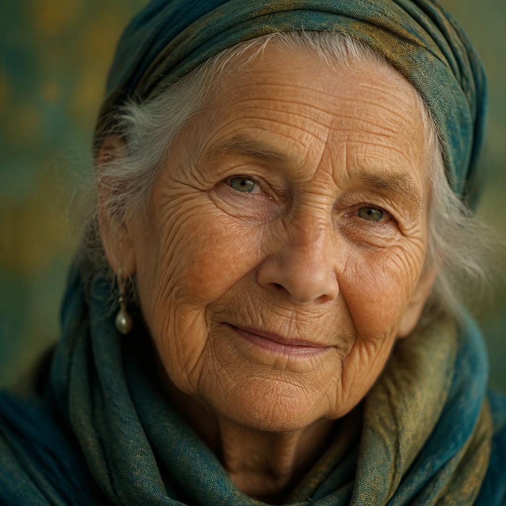
“close-up portrait of an elderly person with expressive weathered features”
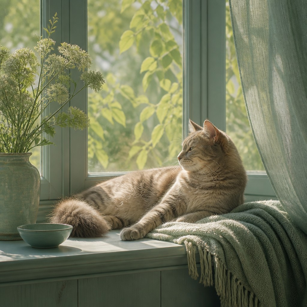
“a cat lounging in a sunlit window”
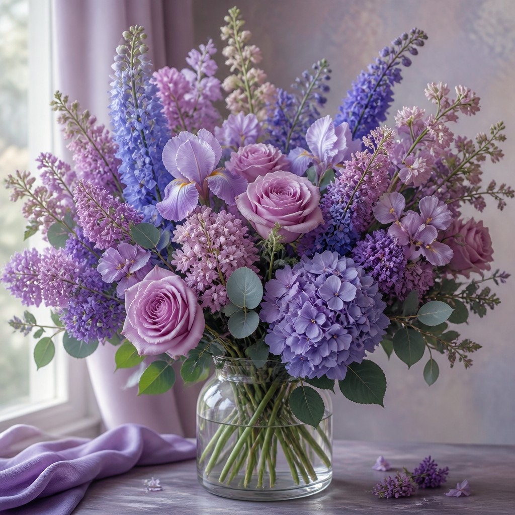
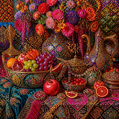
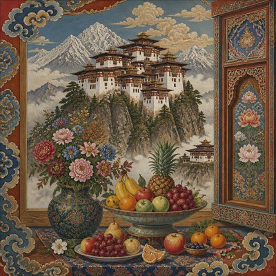
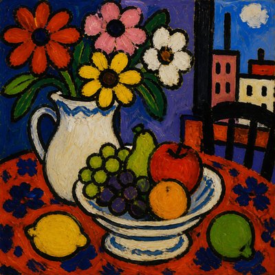
“bouquet of flowers in a glass vase”
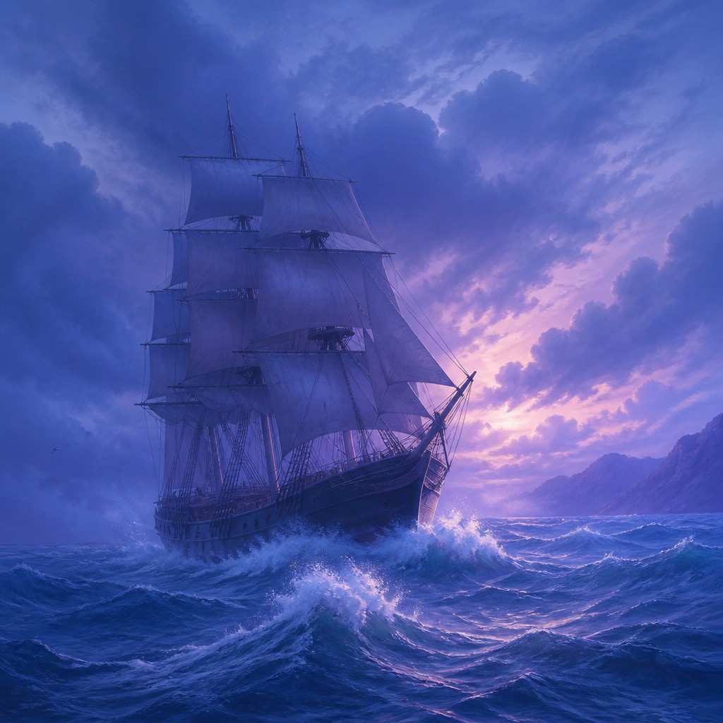
“sailing ship on a stormy sea”
How to Create Color Harmony Art
Master the craft step by step — or skip straight to creating. Read the full guide →
- 1
Choose a narrow hue family
Select two or three neighboring hues before beginning, then establish lighter, darker, duller, and more saturated versions of them. Decide whether the work will be predominantly warm or cool.
- 2
Build value before saturation
Plan the light, middle, and dark values first so the image remains legible without relying on color contrast. Add saturation selectively, keeping most passages within the same chromatic range.
- 3
Blend with controlled transitions
In paint, use thin layers, glazing, softened edges, or adjacent wet mixtures; in digital tools, use low-opacity brushes, gradient maps, and subtle color grading. Preserve enough edge variation to prevent the result from becoming flat.
- 4
Unify the lighting
Give the entire scene a shared light source and atmospheric color. Tint shadows, reflected light, and distant forms toward the same neighboring hue family rather than introducing arbitrary neutrals.
- 5
Use texture as secondary structure
When hue contrast is quiet, surface texture, brushwork, grain, pattern, and value changes can provide visual interest. Vary texture by focal importance instead of adding bright color accents.
- 6
Write precise generation prompts
For digital or AI creation, specify the subject, a narrow analogous palette, warm or cool temperature, soft chromatic transitions, restrained saturation, and the desired lighting. Add exclusions such as harsh complementary accents or neon highlights when a quieter result is needed.
The Story
History & Origins of Color Harmony
Color Harmony Art Style is not a historical movement with a fixed founding date or canonical membership. It is a modern stylistic formulation based on long-established principles of color theory, especially analogous palettes, limited-color composition, atmospheric color, and the use of a dominant temperature to unify an image.
Its aesthetic lineage includes tonal painting traditions, atmospheric landscape painting, color-field abstraction, muted editorial illustration, cinematic color grading, and contemporary digital art. Advances in digital palettes and image-processing tools have made it especially easy to build images around controlled hue families and smooth chromatic transitions.
Influences: The style relates to analogous color schemes in traditional color theory, tonalism, atmospheric landscape painting, color-field abstraction, limited-palette illustration, monochromatic and duotone design, cinematic color grading, and softly processed photography. It also shares the emphasis on restraint found in minimalist-modern aesthetics, while differing from strict monochrome work by allowing several neighboring hues to remain distinctly visible.
Frequently Asked Questions
What defines Color Harmony Art Style?
It is defined by a palette of neighboring hues, gentle transitions, controlled saturation, and a unified warm or cool atmosphere. The composition aims for chromatic agreement rather than dramatic color conflict.
Is Color Harmony Art Style a historical art movement?
No. It is a contemporary descriptive style rather than a formal historical movement with a founding period or fixed membership. Its principles draw from established color theory and several painting, illustration, photography, and digital-art traditions.
How is it different from monochromatic art?
Monochromatic art usually develops one hue through changes in value and saturation. Color Harmony Art Style permits multiple neighboring hues, such as blue, teal, and green, while maintaining a closely related overall palette.
Can this style include strong outlines or detailed subjects?
Yes. Line, texture, and precise detail are compatible with the style as long as the color relationships remain cohesive. A detailed subject can be made harmonious through shared lighting, related shadows, and restrained accents.
How can I make a photograph look like this style?
Begin with a color grade that favors a narrow hue range, then reduce competing saturation and apply a consistent warm or cool cast. Preserve important value differences and skin or material detail so the image does not become uniformly tinted.
Where is Color Harmony Art Style commonly used?
It suits editorial illustration, calming interiors, landscape imagery, portraiture, book and album artwork, branding systems, concept art, photography, and digital environments. It is particularly effective when atmosphere and emotional continuity matter more than visual shock.
Create your first Color Harmony artwork
Describe anything — or upload a photo — and see it in Color Harmony Art Style in seconds.
Related Styles
Discover similar art styles