Japanese Art Style
Explore Japanese art style: gold-leaf clouds, ink-wash landscapes, woodblock color, wabi-sabi restraint, and graceful traditional motifs.
Instantly rendered in Japanese — or transform a photo
Japanese Gallery
Tap any artwork to explore it
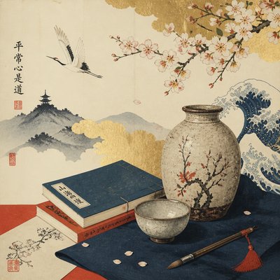
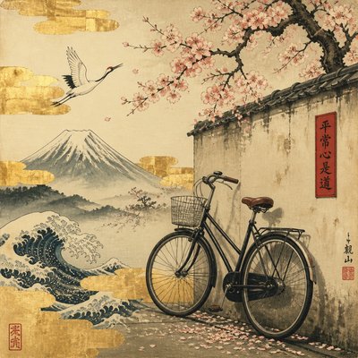
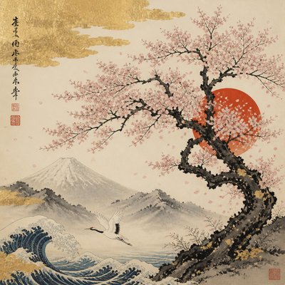
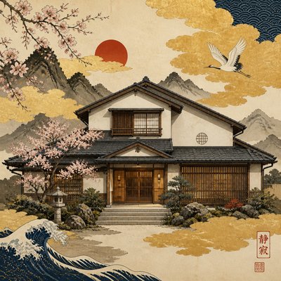
What is Japanese Art Style?
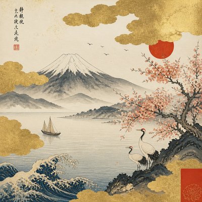
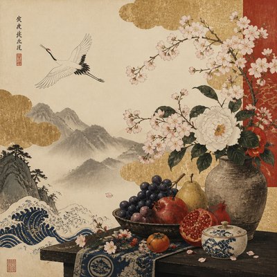
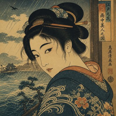
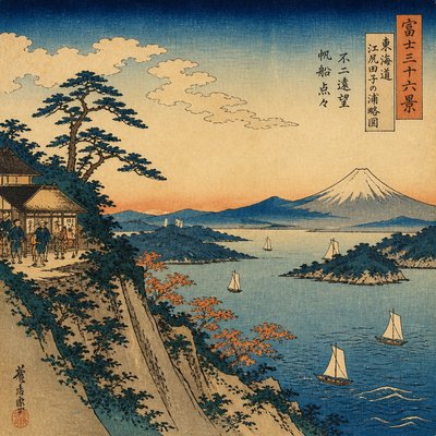
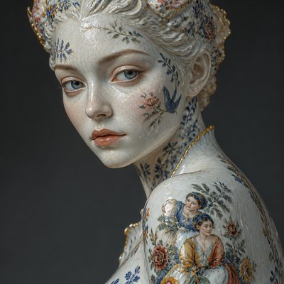
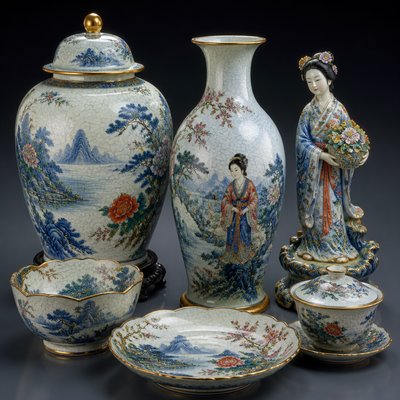
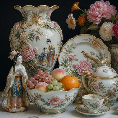
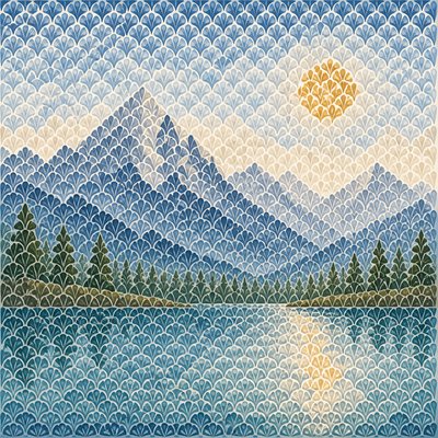
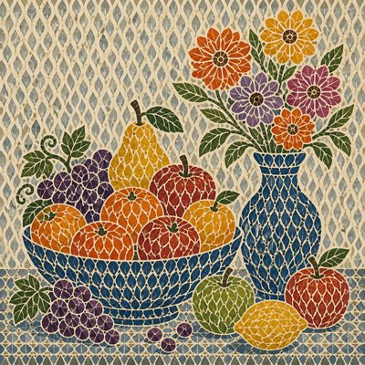
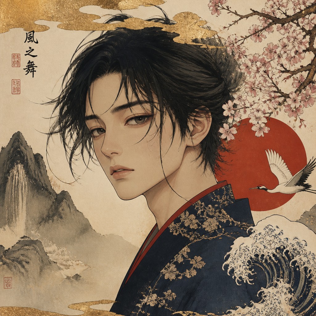
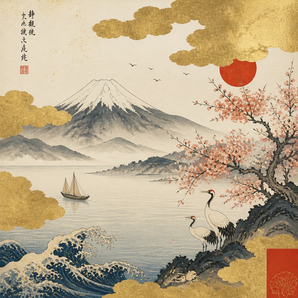
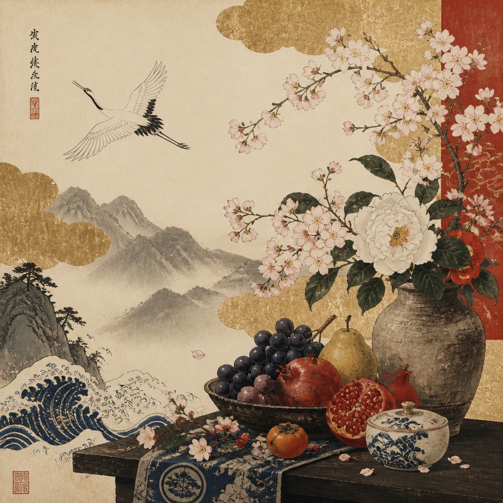
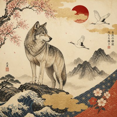
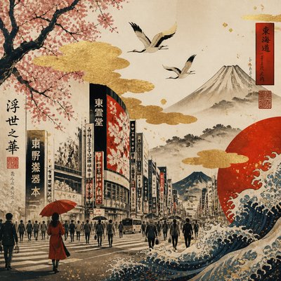
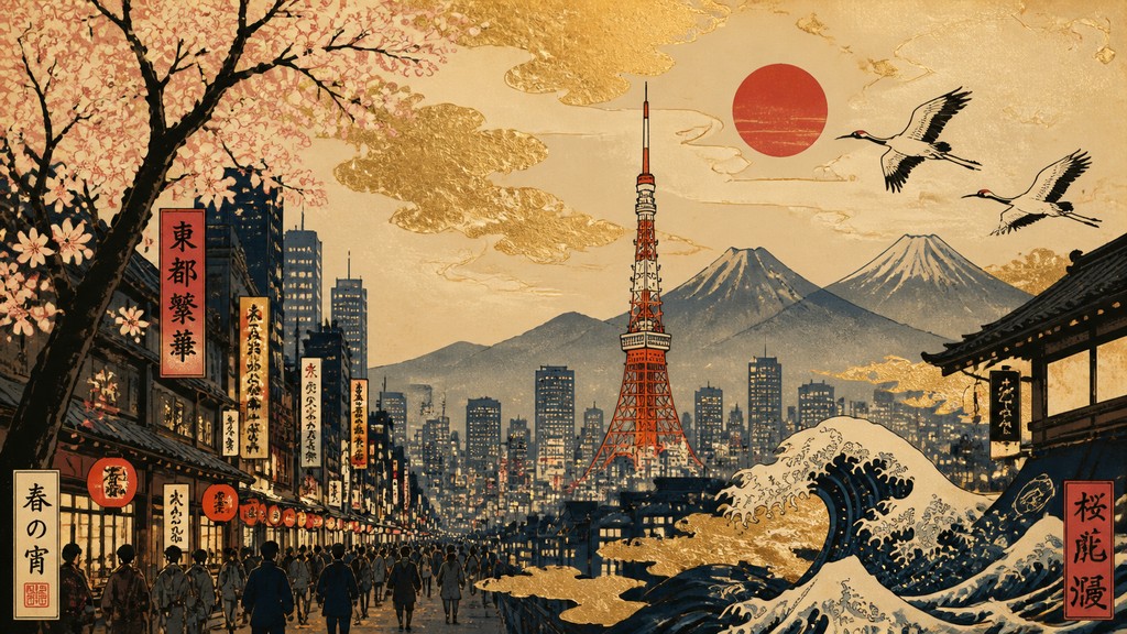
Japanese art style is a broad visual synthesis rather than a single historical movement. This interpretation combines the quiet asymmetry of screen painting, the expressive economy of ink wash, the flat color and strong contours of woodblock prints, and the refined irregularity associated with wabi-sabi. Gold clouds, cherry blossoms, waves, cranes, mountains, and architectural or seasonal details create a distinctly Japanese visual vocabulary.
Its characteristic appearance comes from balancing ornament with restraint. Expansive unpainted areas, simplified silhouettes, mineral or woodblock-like color fields, and carefully placed motifs produce compositions that feel spacious and rhythmic rather than densely modeled. Vermilion, indigo, muted green, charcoal ink, cream, and metallic gold provide contrast while preserving an atmosphere of calm, ceremony, and transience.
Try It On Your Photos
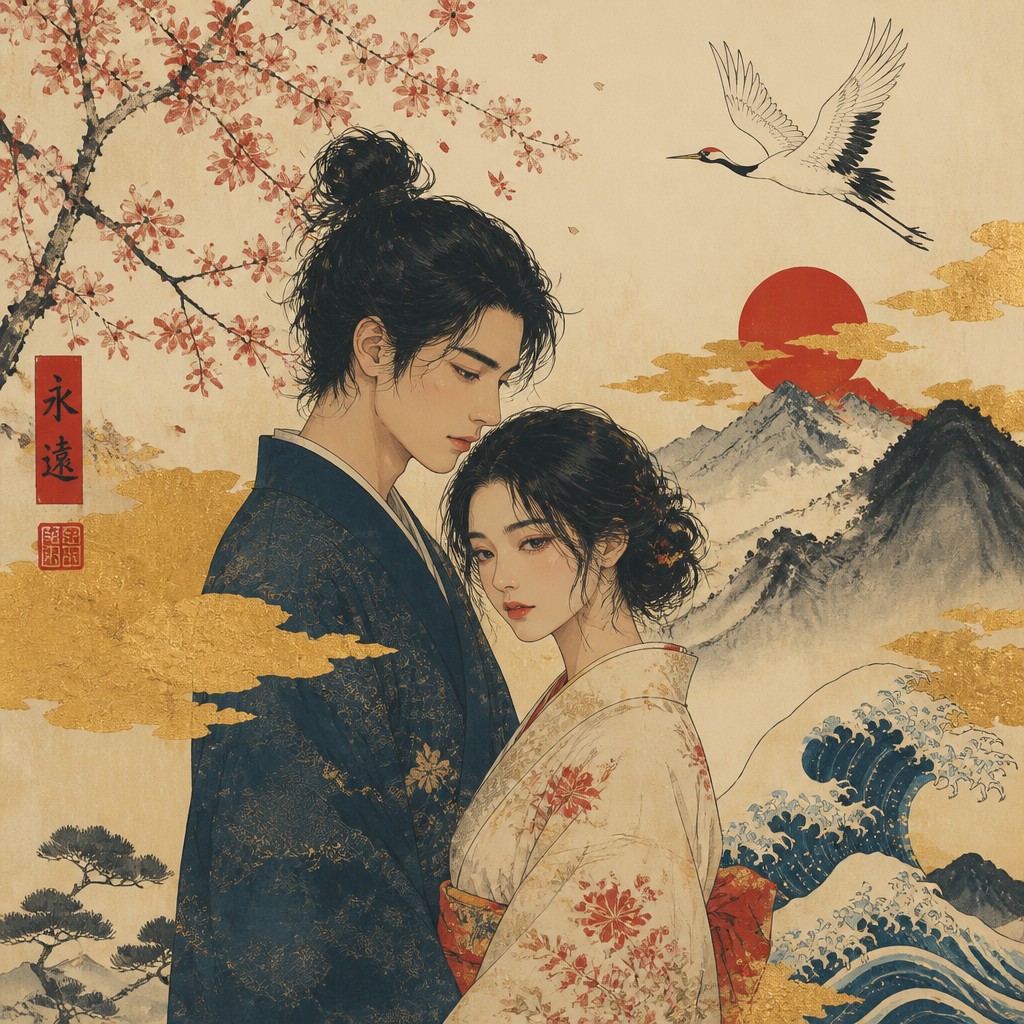
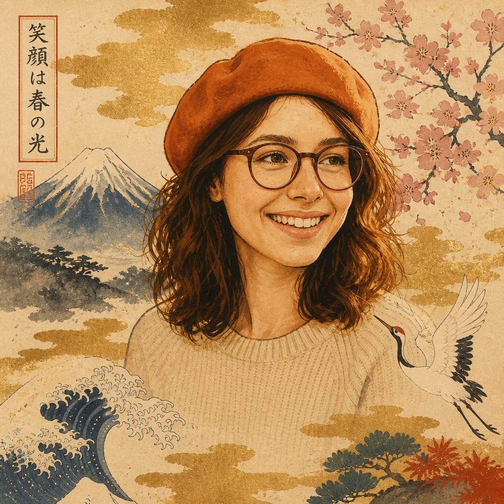
Upload any photo and convert it into Japanese Art Style — drag the sliders to compare before and after.

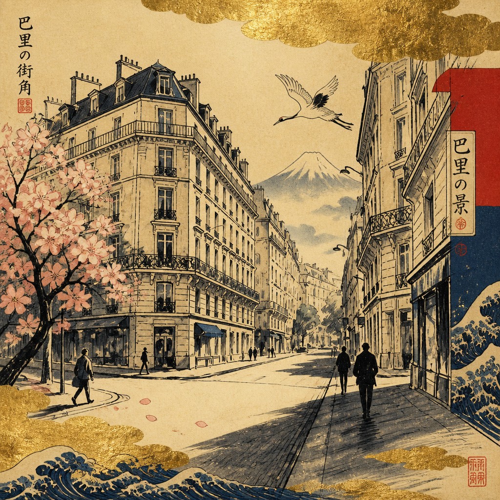

What Defines Japanese Art Style
The signature details, up close
Asymmetric composition
Subjects are often offset within the frame, with deliberate empty space and visual movement across the surface. This creates balance without relying on central symmetry or deep Western-style perspective.
Gold-leaf atmosphere
Gold clouds, screens, halos, or atmospheric passages suggest luminosity and ceremony. A digital approximation can use softly mottled metallic textures rather than a uniform yellow fill.
Ink-wash restraint
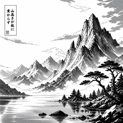
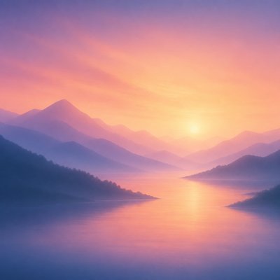
Mountains, branches, mist, and distant scenery are reduced to economical brush marks with varied density. Tonal transitions may remain visible, preserving the expressive character of the brush.
Flat woodblock color
Large areas of cream, indigo, vermilion, muted green, and charcoal are separated by crisp contours. Modeling is limited, so pattern, silhouette, and line carry much of the descriptive work.
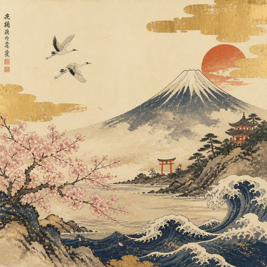
Seasonal and natural motifs
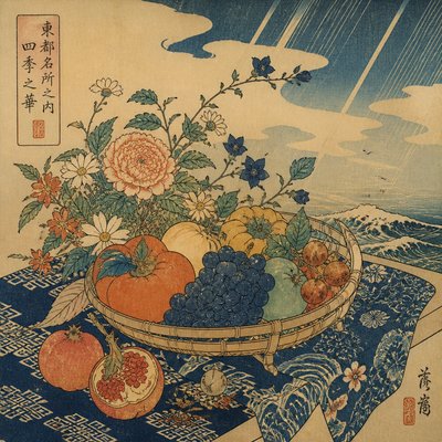
Cherry blossoms, autumn leaves, cranes, carp, bamboo, waves, mist, and the moon connect the image to seasonality and impermanence. These motifs often function symbolically as well as decoratively.
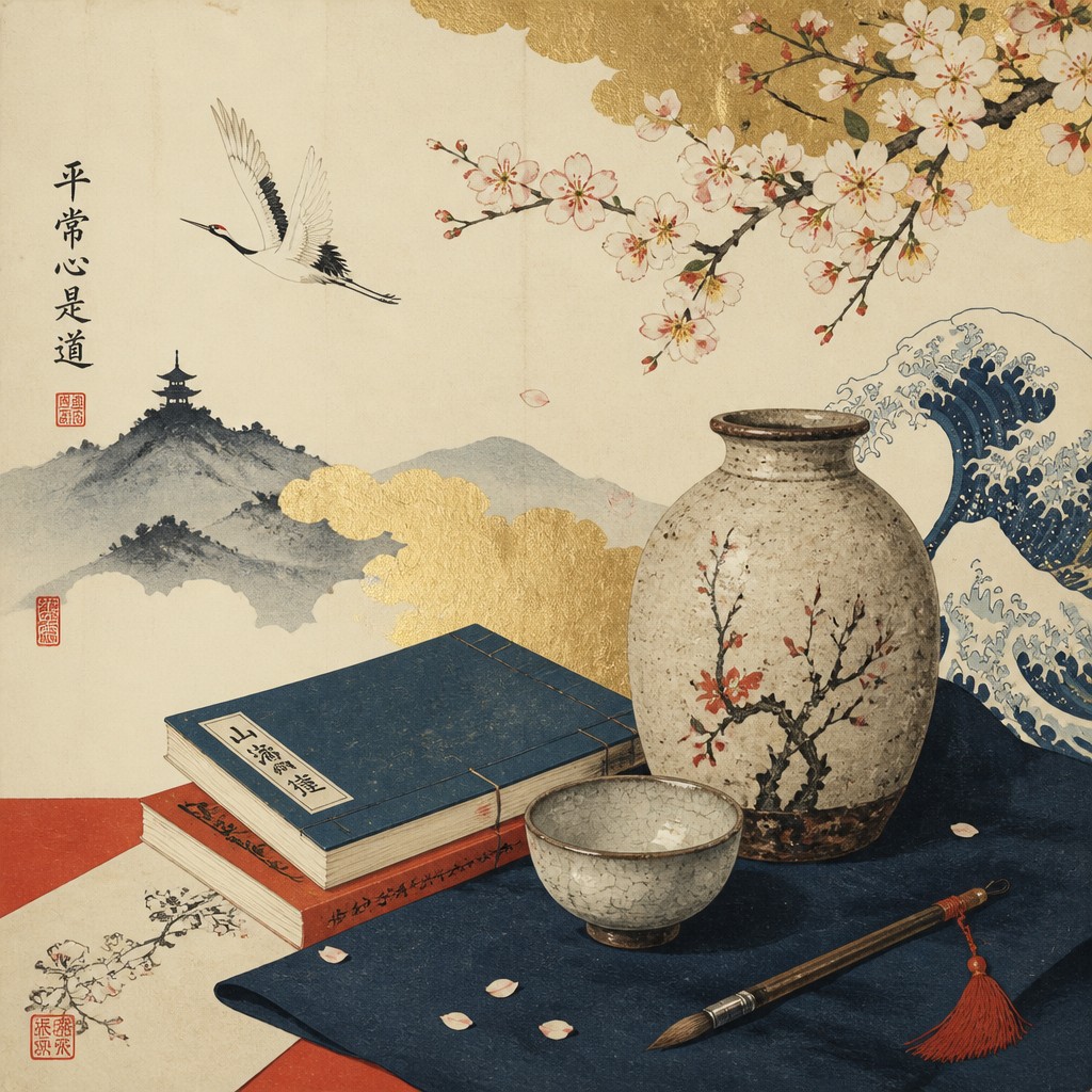
Wabi-sabi irregularity
Subtle asymmetry, weathered texture, uneven edges, and restrained decoration introduce a sense of age and imperfection. The effect should feel considered and tactile, not simply distressed.
Try It
Create Videos in Japanese Art Style
Styles aren't just for stills — describe a scene or animate an image and get a short video rendered in Japanese. Press play to see this pond come to life.
Make a VideoJapanese Prompt Ideas
Start from an idea — each one opens the generator with the style ready to go. See all 40 Japanese prompts →
How to Create Japanese Art
Master the craft step by step — or skip straight to creating. Read the full guide →
- 1
Build the composition in layers
Begin with a few large shapes: a cream ground, a distant mountain or architectural silhouette, a gold cloud band, and one clear foreground subject. Reserve open space before adding secondary motifs.
- 2
Use controlled materials
For traditional work, combine diluted sumi-style ink, opaque mineral or gouache-like pigments, and imitation gold leaf on paper or board. In digital painting, separate ink lines, flat color, paper grain, and metallic texture into distinct layers.
- 3
Favor line and silhouette
Define figures, cranes, plants, and waves with confident contour lines, then fill them with restrained color fields. Avoid excessive gradients and photorealistic shading, which can weaken the graphic structure.
- 4
Suggest texture selectively
Add handmade paper fibers, broken ink edges, subtle registration shifts, or softly mottled gold in small amounts. Texture should support material character without obscuring the main subject.
- 5
Choose symbolic details carefully
Match motifs to the subject and season: blossoms for spring, maple leaves for autumn, cranes for longevity, or waves for movement and endurance. A few well-placed symbols are more effective than a crowded collection.
- 6
Write a precise generation prompt
Specify the subject, asymmetric layout, gold cloud placement, ink-wash background, flat woodblock colors, limited palette, paper texture, and desired motifs. For image-to-image work, preserve the source subject's pose while reducing photographic detail and adding clear linework and layered surfaces.

The Story
History & Origins of Japanese
The style draws on several centuries of Japanese visual culture rather than originating at one identifiable moment. Gold-ground screen and decorative painting traditions developed prominently from the late medieval period onward, while ink painting absorbed techniques and philosophies connected with East Asian literati traditions. During the Edo period, ukiyo-e woodblock printing popularized flattened perspective, bold outlines, cropped compositions, and affordable images of landscapes, actors, courtesans, and everyday life.
Modern interpretations often merge these historical languages with contemporary illustration, editorial design, digital painting, and photography. The result is an aesthetic lineage rather than a strict period style: traditional motifs and materials are retained, while composition, subject matter, and production methods may be adapted for posters, interiors, packaging, animation, fashion imagery, and digital art.
Influences: Related traditions include ukiyo-e, Rinpa decorative painting, Japanese ink wash, yamato-e narrative painting, gold-ground screen art, emakimono handscrolls, and the restrained material sensibility associated with tea culture and wabi-sabi. It also overlaps with contemporary Japanese illustration, manga-related line economy, textile pattern, ceramics, and modern graphic design. Its simplified forms and asymmetrical layouts have influenced international poster design, Art Nouveau, modernism, and later digital visual culture.
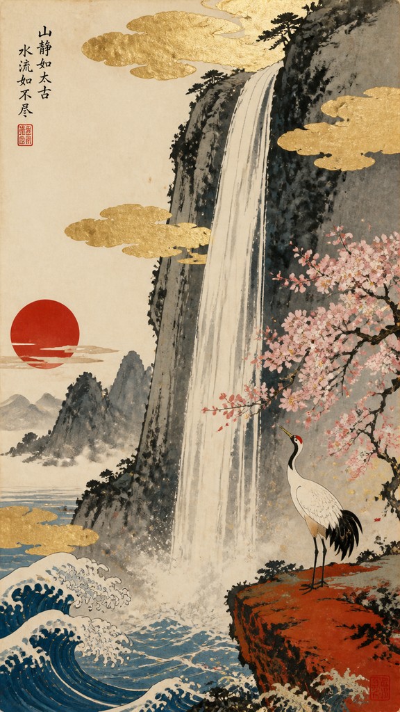
Frequently Asked Questions
What defines the Japanese art style?
It is defined by asymmetrical composition, controlled linework, flat or lightly modeled color, ink-wash atmosphere, seasonal motifs, and a balance between ornament and empty space. Gold, indigo, vermilion, cream, waves, blossoms, cranes, and mountains are common visual signals, but no single motif is mandatory.
Is Japanese art style the same as ukiyo-e?
No. Ukiyo-e is a specific historical tradition of painting and especially commercial woodblock printing that flourished from the Edo period into the nineteenth century. The broader style described here may borrow ukiyo-e contours and flat color while also drawing from screen painting, ink wash, decorative arts, and contemporary illustration.
How can I make an image look less generic and more authentic?
Use a restrained palette, deliberate asymmetry, visible material texture, and a small number of culturally coherent motifs. Avoid combining every recognizable symbol at once, and distinguish between woodblock-like flat shapes, ink-wash passages, and metallic decorative surfaces.
What colors are commonly used?
Cream, charcoal, ink gray, indigo, muted green, vermilion, coral, ochre, and metallic gold are especially useful. Historical palettes varied by medium and period, so a convincing result can also use subdued natural colors rather than relying on bright red and gold alone.
Can photographs be transformed into this style?
Yes. Portraits, landscapes, buildings, and animals can be adapted by simplifying tonal detail, emphasizing contour, flattening selected color regions, and adding paper or screen-painting textures. Preserve the photograph's main silhouette while introducing asymmetry and a limited decorative palette.
Where is this style commonly used?
It appears in editorial illustration, posters, book covers, packaging, textiles, stationery, interior panels, animation backgrounds, games, tattoos, and digital artwork. Its combination of recognizable motifs and controlled geometry also suits logos, menus, and decorative prints when cultural references are used thoughtfully.
Create your first Japanese artwork
Describe anything — or upload a photo — and see it in Japanese Art Style in seconds.
Related Styles
Discover similar art styles