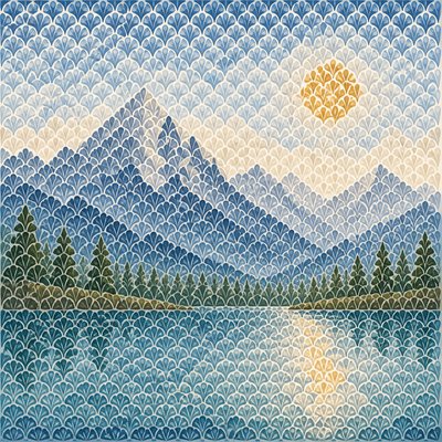
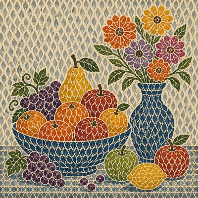
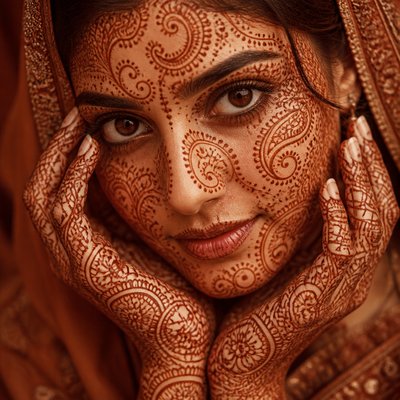
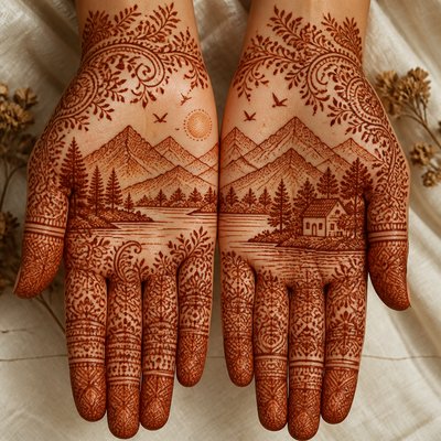
Calligraphy Art Style
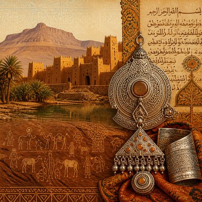
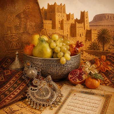
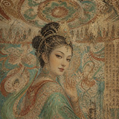
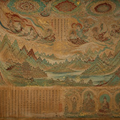
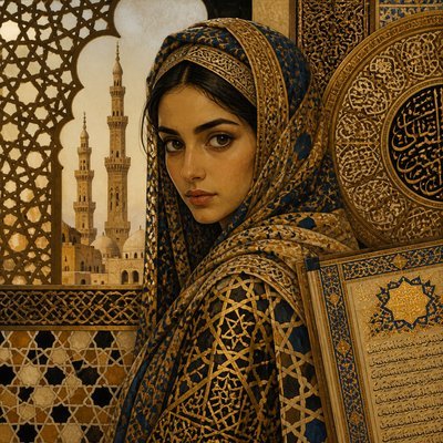
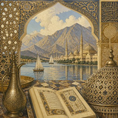
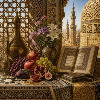
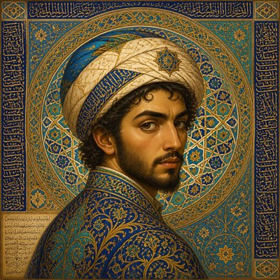
Explore calligraphy art: expressive letterforms, rhythmic strokes, elegant flourishes, ink textures, and ornamental compositions.
Instantly rendered in Calligraphy — or transform a photo

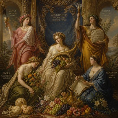
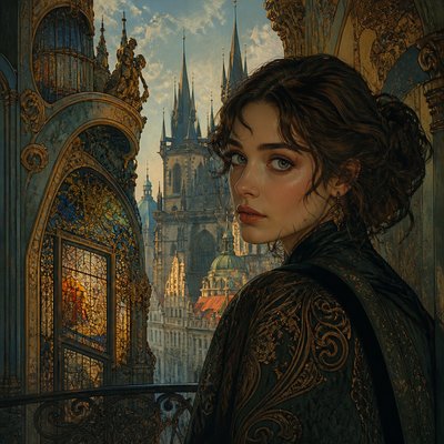
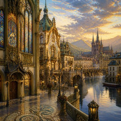
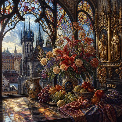
Calligraphy Gallery
Tap any artwork to explore it
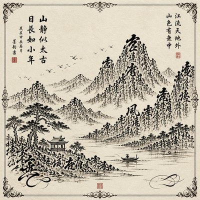
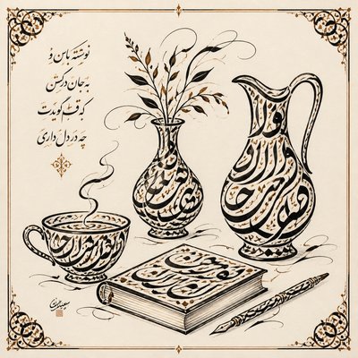
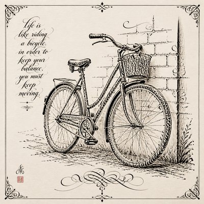
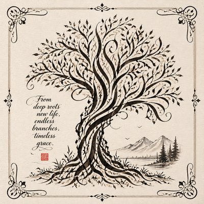
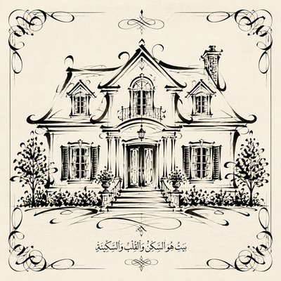
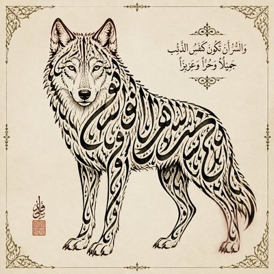
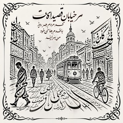
What is Calligraphy Art Style?
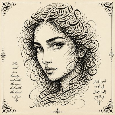
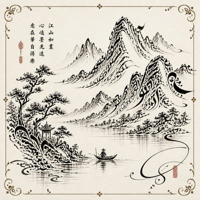
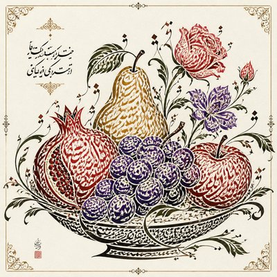
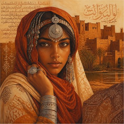
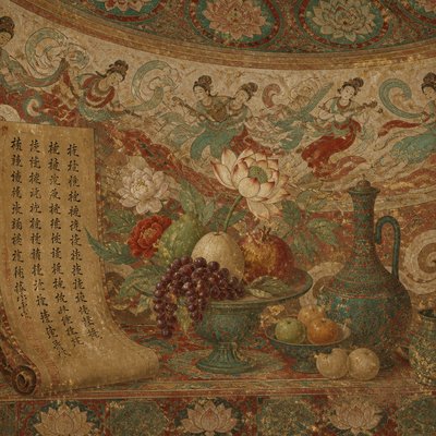
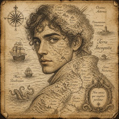
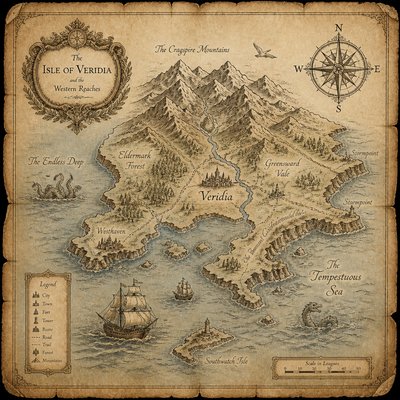
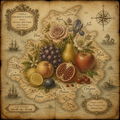
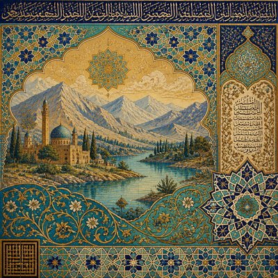
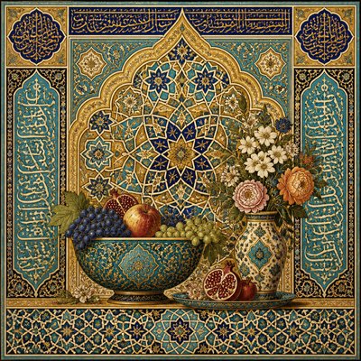
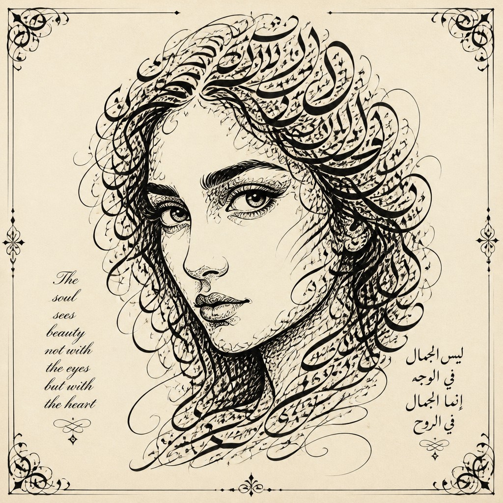
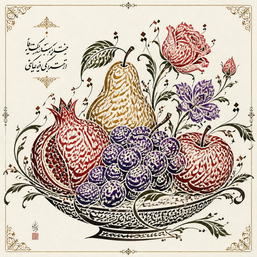
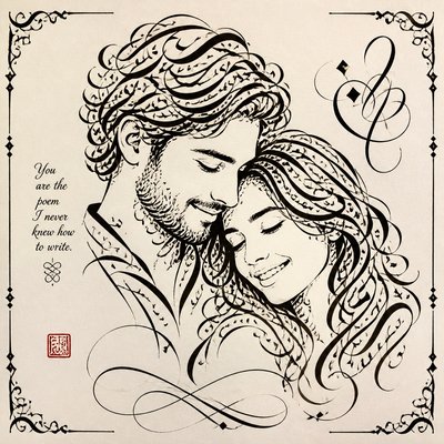
Calligraphy art treats writing as a visual and expressive medium. Rather than serving only to communicate words, its letterforms become lines, shapes, rhythms, and compositional structures. Thick-and-thin strokes, controlled spacing, flourishes, swashes, and carefully balanced empty areas create images that can be read, contemplated, or simply appreciated as abstract marks.
The style may use recognizable scripts, invented lettering, or a combination of text and ornament. Its visual identity is shaped by the relationship between tool, ink, surface, and gesture: a broad nib produces contrasting weights, a brush creates swelling and tapering strokes, and absorbent paper gives edges a soft, organic character. Contemporary calligraphy art often combines traditional discipline with illustration, graphic design, abstraction, and digital layering.
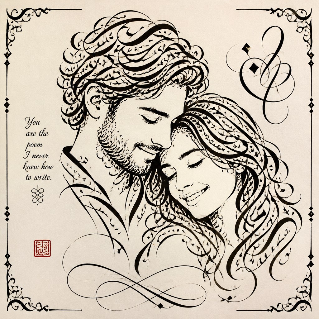
Try It On Your Photos
Upload any photo and convert it into Calligraphy Art Style — drag the sliders to compare before and after.
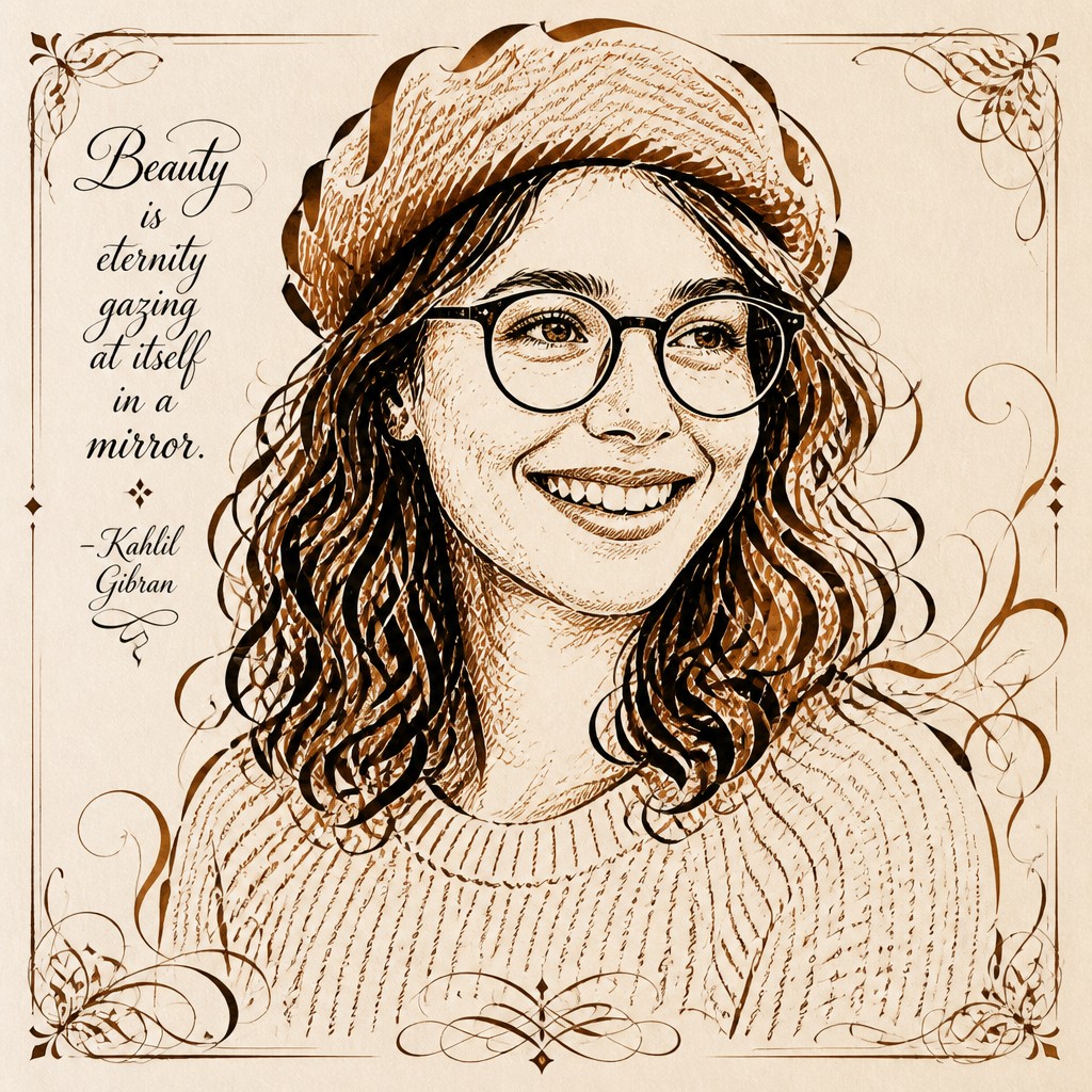

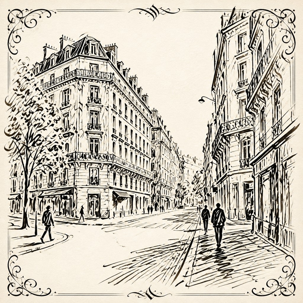

What Defines Calligraphy Art Style
The signature details, up close
Rhythmic thick-and-thin strokes
Line weight changes according to nib angle, brush pressure, speed, and direction. These variations give the lettering a pulse and make each stroke feel intentional.
Elegant flourishes and swashes
Extended entry strokes, exit strokes, loops, and ornamental curves add movement beyond the basic letterforms. Effective flourishes support the composition rather than obscuring legibility.
Balanced negative space
Empty areas between letters, words, strokes, and ornaments are treated as active compositional elements. Careful spacing prevents dense marks from becoming visually confused.
Expressive line quality
Edges may be crisp and geometric, softly feathered, or visibly textured depending on the tool and surface. Variations in pressure and speed preserve the sense of a physical hand movement.
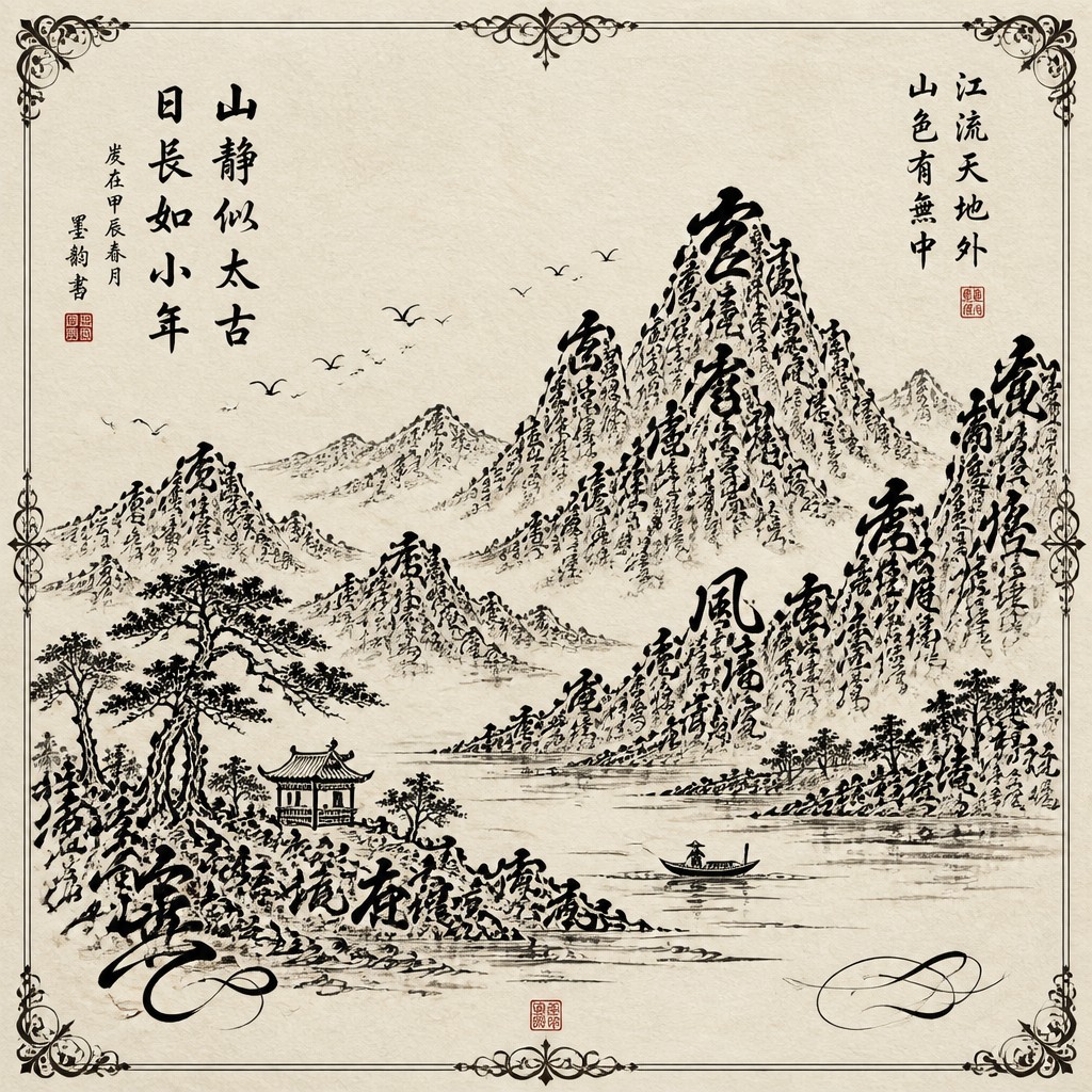
Ink and paper materiality
Dark ink, subtle pooling, dry-brush breaks, paper grain, and imperfect edges give the work a tactile presence. Fine cotton, parchment-like, handmade, or lightly toned papers are common visual references.
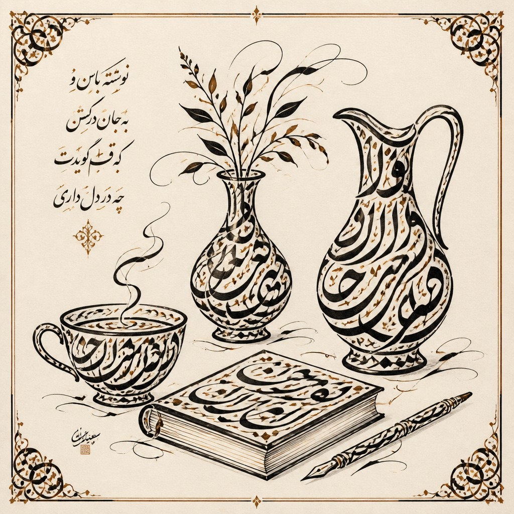
Ornamental framing
Borders, corner motifs, botanical details, geometric rules, and decorative separators often organize the lettering. These elements may draw from manuscript illumination, heraldic design, or regional decorative traditions.
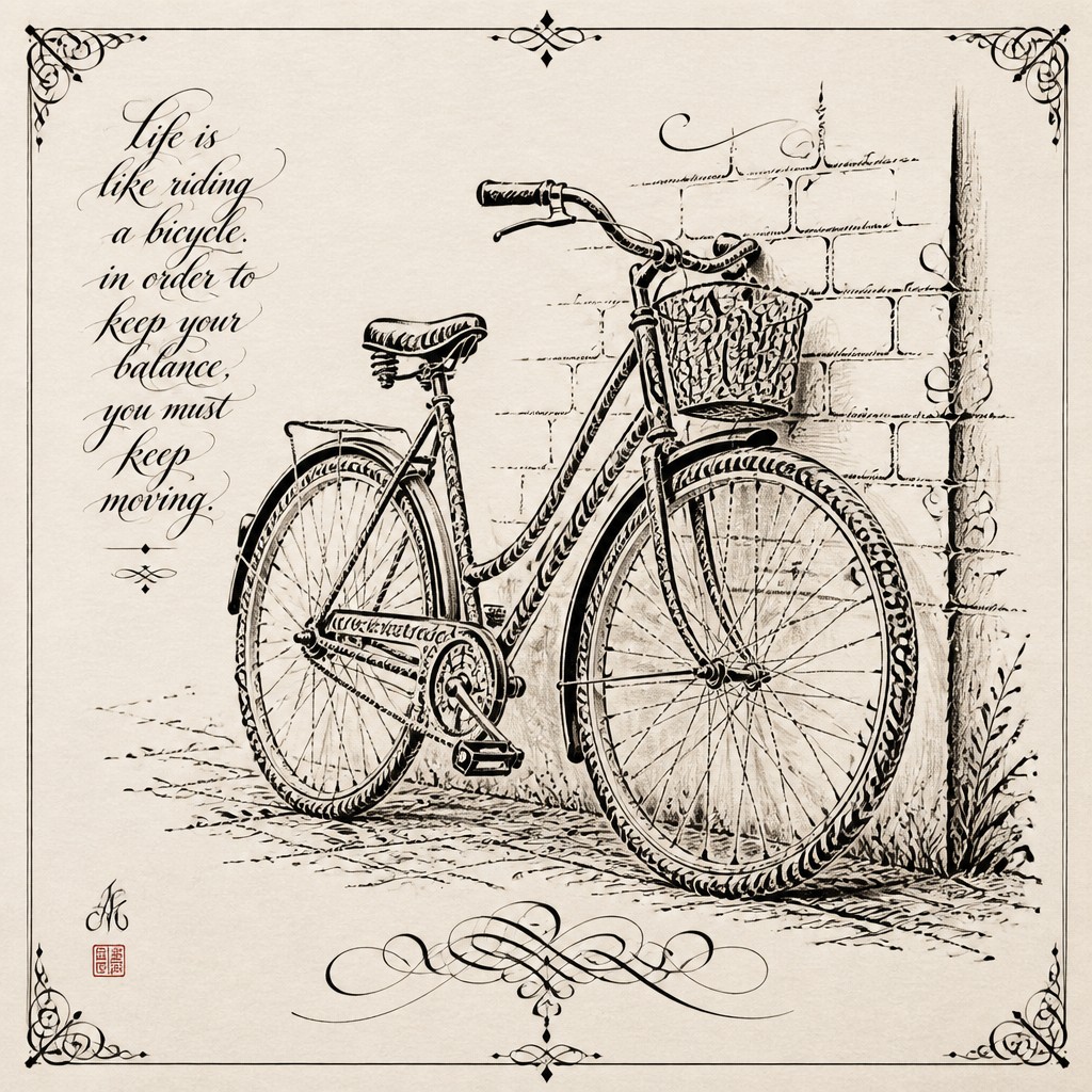
Legible or abstracted language
Some works emphasize readable words and historically accurate scripts, while others use asemic marks that evoke writing without a fixed linguistic meaning. Both approaches depend on visual rhythm and the authority of the stroke.
Try It
Create Videos in Calligraphy Art Style
Styles aren't just for stills — describe a scene or animate an image and get a short video rendered in Calligraphy. Press play to see this pond come to life.
Make a VideoCalligraphy Prompt Ideas
Start from an idea — each one opens the generator with the style ready to go. See all 40 Calligraphy prompts →
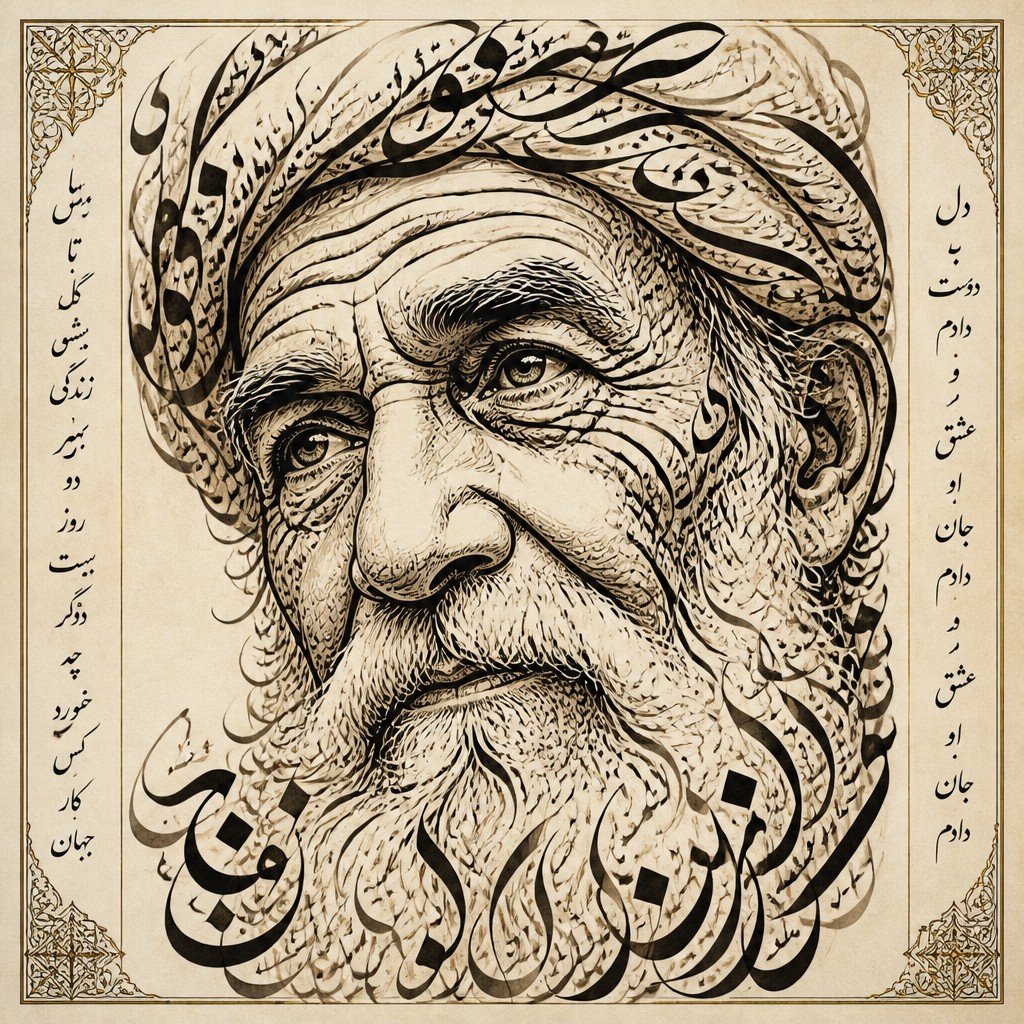
“close-up portrait of an elderly person with expressive weathered features”
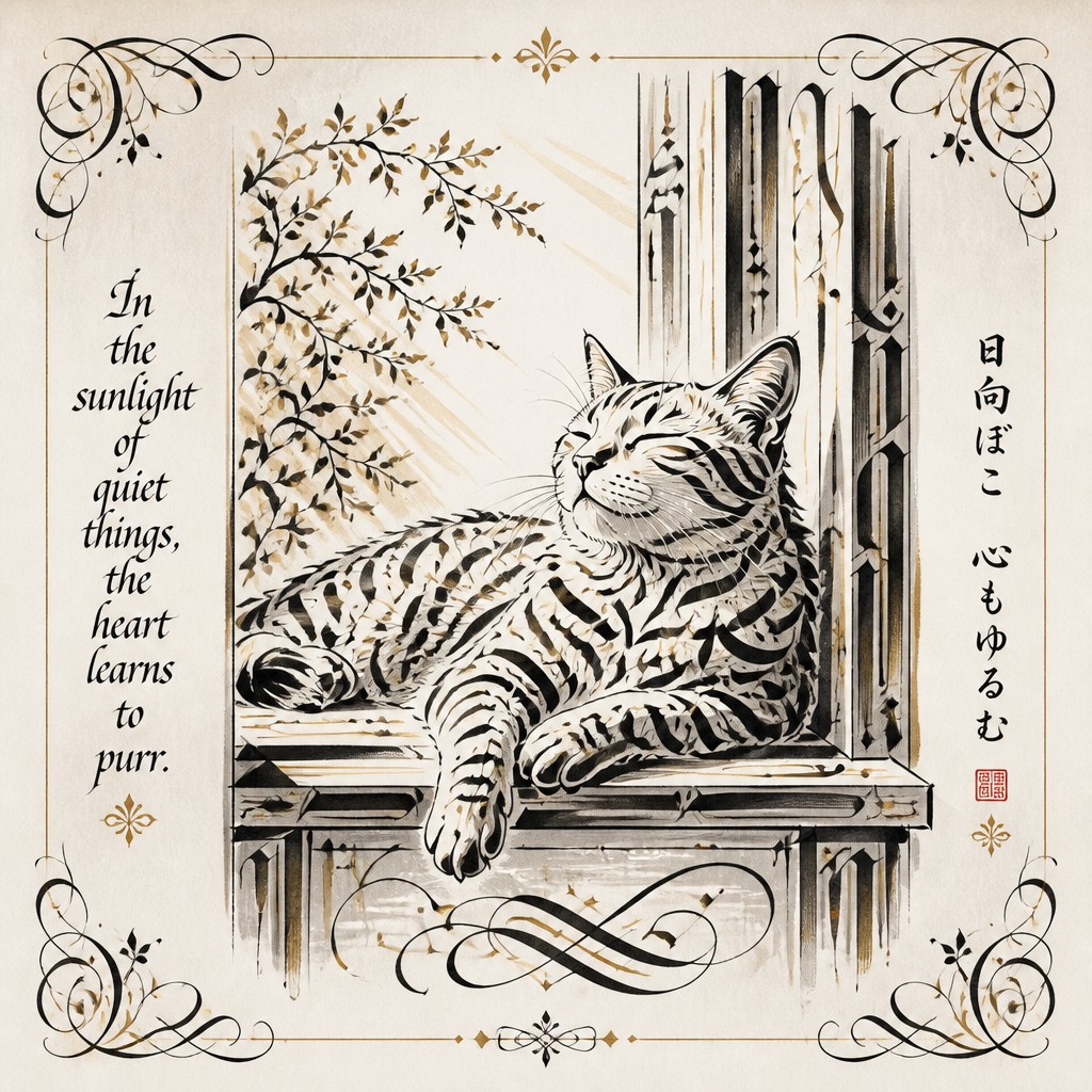
“a cat lounging in a sunlit window”
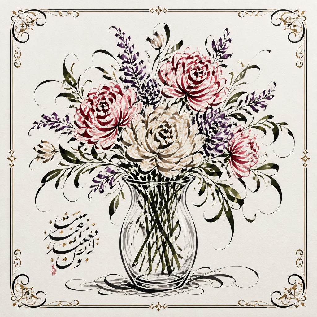
“bouquet of flowers in a glass vase”
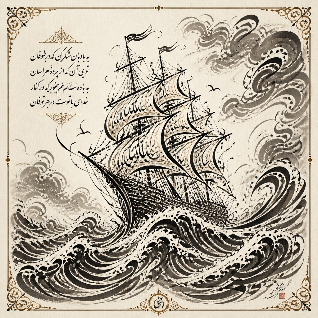
“sailing ship on a stormy sea”
How to Create Calligraphy Art
Master the craft step by step — or skip straight to creating. Read the full guide →
- 1
Choose a script and writing tool
Begin with a specific tradition such as broad-edge Latin lettering, pointed-pen script, brush lettering, Arabic-inspired geometry, or East Asian brushwork. Match the tool to the desired stroke behavior instead of mixing incompatible forms accidentally.
- 2
Practice ductus and pressure
Study the order, direction, angle, and speed of each stroke, then repeat basic forms before composing words. Use consistent pressure for structure and deliberate pressure changes for expressive swelling and tapering.
- 3
Plan the composition
Establish a baseline, margins, hierarchy, and areas of rest before adding flourishes. Sketch the overall silhouette lightly so the lettering, border, and negative space work together.
- 4
Build material texture
Traditionally, vary ink dilution, nib loading, brush pressure, and paper absorbency to create pools, dry marks, and softened edges. Digitally, layer paper grain, ink bleed, pressure-sensitive brushes, and restrained opacity changes.
- 5
Refine digitally
Scan or photograph lettering at high resolution, then clean unwanted artifacts while preserving natural irregularities. Vector paths are useful for precise display lettering, whereas raster brushes better retain handmade texture.
- 6
Guide prompt-based generation precisely
Specify the subject, script character, stroke contrast, paper type, ink behavior, ornament, composition, and legibility level. For reliable results, request short or invented text when exact wording is less important than the visual impression.
The Story
History & Origins of Calligraphy
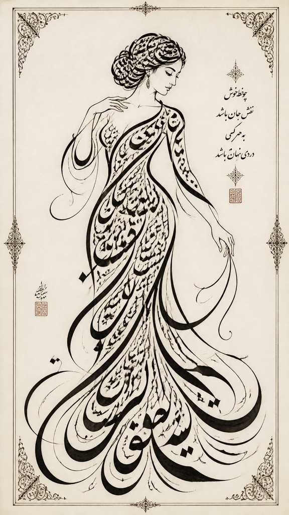
Calligraphy developed independently across many writing cultures, including East Asian brush traditions, Arabic and Persian manuscript arts, South Asian script practices, and European book-hand and illuminated-manuscript traditions. Although each has distinct rules, materials, and formal ideals, these practices share an emphasis on proportion, repetition, stroke order or ductus, spacing, and the disciplined movement of the hand. Religious texts, administrative documents, poetry, inscriptions, and ceremonial objects all helped establish calligraphy as both communication and cultural art.
The modern art form grew through the revival, reinterpretation, and commercialization of historical scripts, especially from the nineteenth century onward. Contemporary practitioners may preserve traditional alphabets, create expressive display lettering, or use marks that resemble writing without forming readable language. Digital tools have expanded the style through vector lettering, textured brushes, animation, projection, and image-based composition, while the central principles of rhythm, contrast, and deliberate gesture remain rooted in manual practice.
Influences: Calligraphy art draws on illuminated manuscripts, East Asian brush painting, Arabic and Persian manuscript decoration, South Asian lettering traditions, Western sign painting, engraving, modernist typography, Art Nouveau ornament, and contemporary hand-lettering. It also shares methods with abstract drawing, gestural painting, minimalism, and graphic identity design, particularly in its use of repetition, modular forms, contrast, and controlled negative space.
Frequently Asked Questions
What defines calligraphy art?
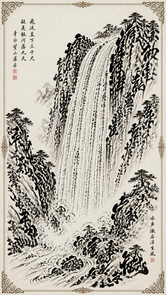
It is defined by the artistic treatment of written or writing-like marks, with attention to stroke rhythm, proportion, spacing, contrast, and gesture. The text may be fully legible, highly decorative, or abstracted into asemic forms.
How is calligraphy art different from ordinary handwriting?
Ordinary handwriting prioritizes speed and practical communication, while calligraphy art prioritizes deliberate construction and visual harmony. Tool angle, stroke sequence, spacing, composition, and ornament are consciously controlled.
Is calligraphy art the same as typography or lettering?
They overlap but are not identical. Calligraphy is usually made through direct, gestural writing; lettering draws or constructs specific letterforms; typography arranges a reusable type system for consistent text composition.
Can calligraphy art be abstract or unreadable?
Yes. Asemic calligraphy uses marks that resemble script without conveying a fixed language. It retains the visual qualities of writing—rhythm, repetition, directional flow, and clustered forms—while treating language as an image.
What materials are commonly used?
Traditional materials include pointed and broad-edge nibs, brushes, ink, watercolor, gouache, and absorbent paper or parchment-like surfaces. Digital artists commonly use pressure-sensitive tablets, textured raster brushes, vector paths, scanned marks, and layered paper textures.
Where is calligraphy art used?
It appears in manuscripts, inscriptions, religious and ceremonial objects, wedding stationery, logos, packaging, posters, book covers, editorial illustration, murals, tattoos, and gallery-based works. Its degree of legibility usually depends on whether communication, ornament, or expressive gesture is the primary goal.
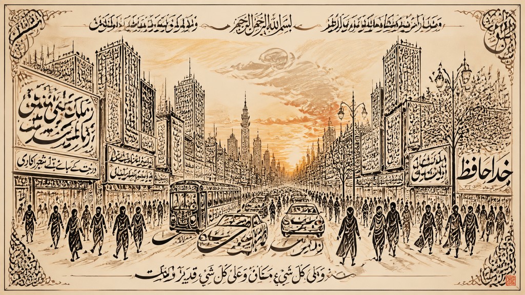
Create your first Calligraphy artwork
Describe anything — or upload a photo — and see it in Calligraphy Art Style in seconds.
Related Styles
Discover similar art styles