Tone Art Style
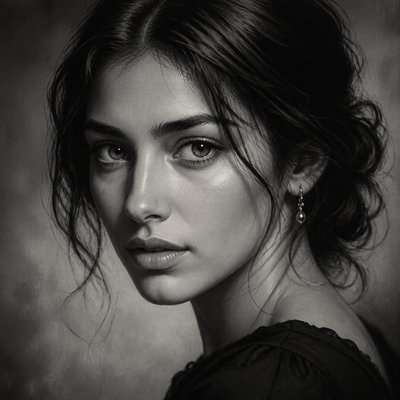
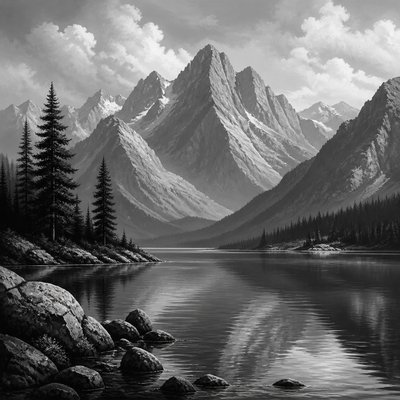
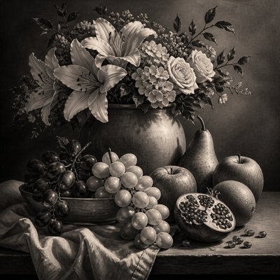
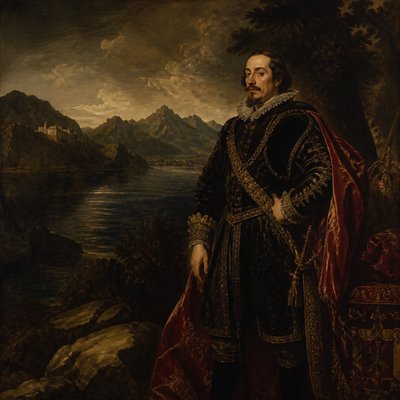
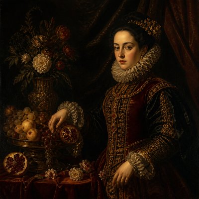
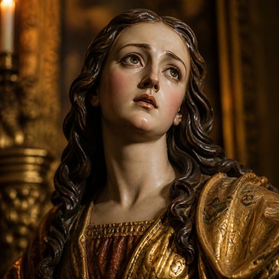
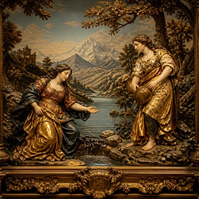
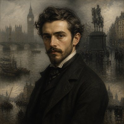
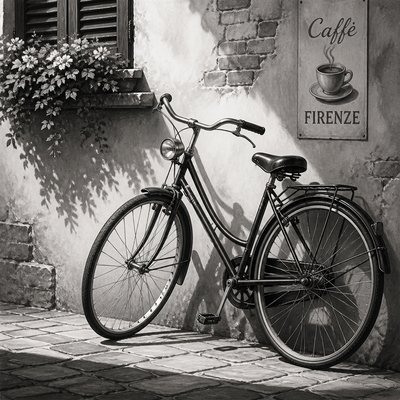
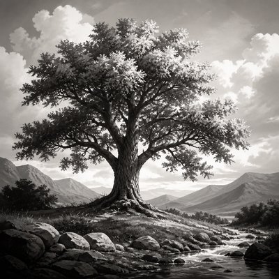
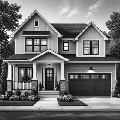
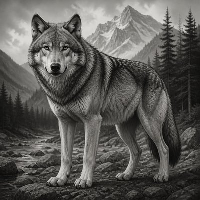
Explore Tone Art Style: monochrome images shaped by a complete value range, crisp edges, smooth midtones, deep shadows, and luminous highlights.
Instantly rendered in Tone — or transform a photo
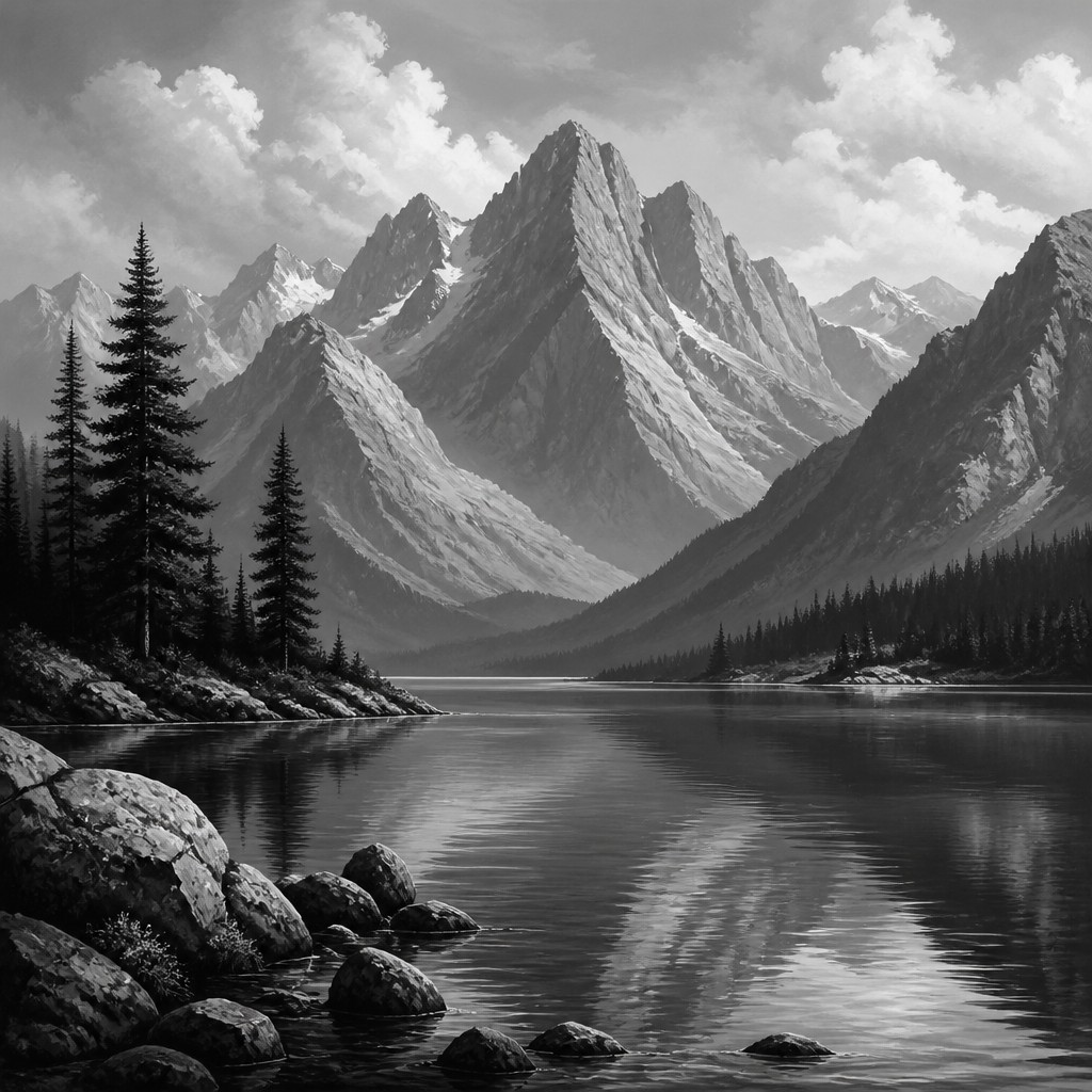
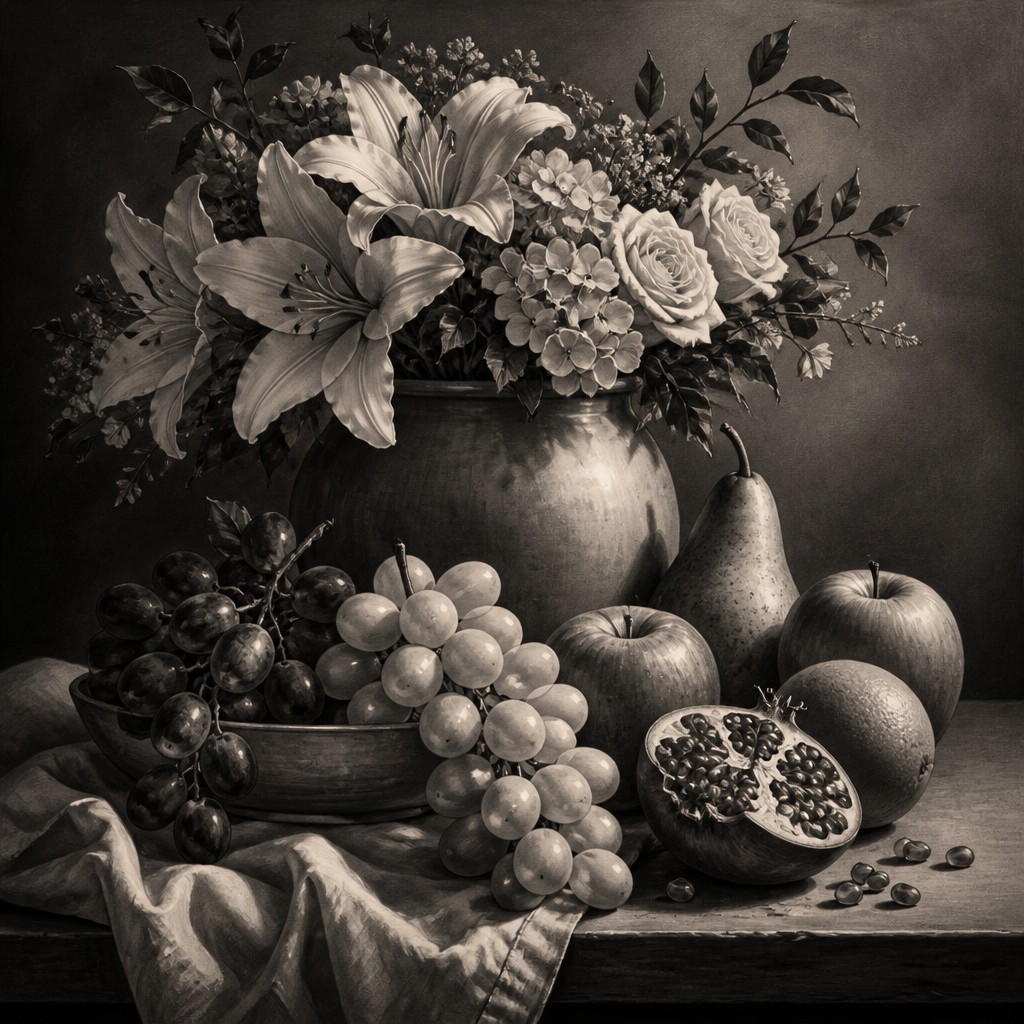
Tone Gallery
Tap any artwork to explore it

What is Tone Art Style?
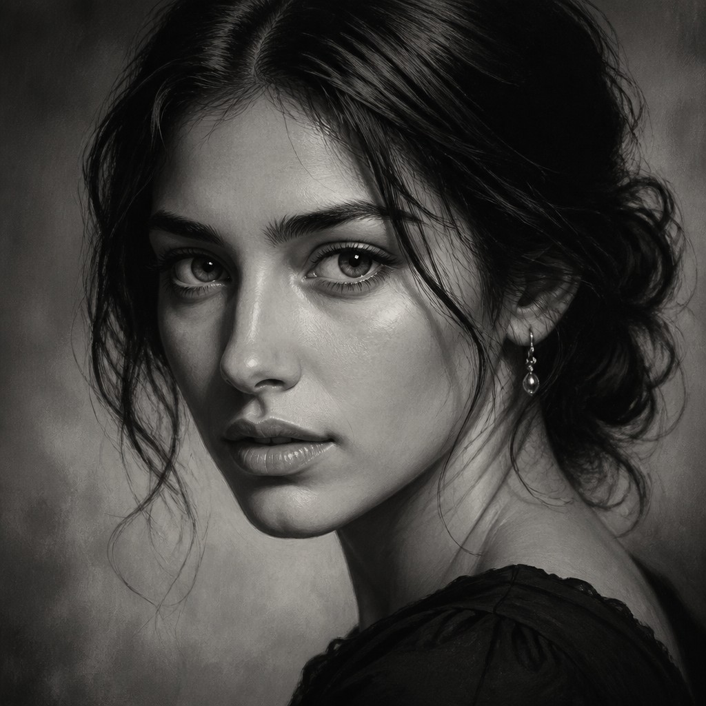
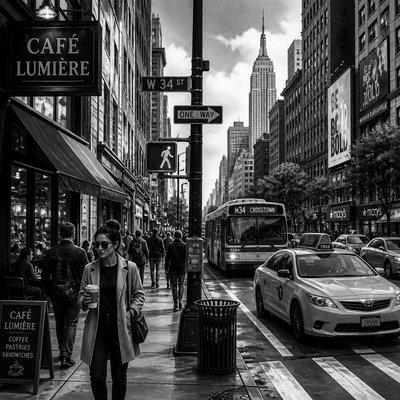
Tone Art Style is a value-centered approach in which form, space, texture, and atmosphere are communicated primarily through the movement from inky black to bright white. Color is absent or highly restrained, allowing tonal relationships to carry the image’s emotional and descriptive weight.
Its visual identity depends on a complete value scale: dark masses provide structure, middle values describe rounded surfaces and planes, and selective highlights establish light direction and three-dimensional depth. Edges may be sharply defined where forms meet, while gradual transitions model skin, stone, metal, fabric, clouds, and other volumetric subjects.
Try It On Your Photos
Upload any photo and convert it into Tone Art Style — drag the sliders to compare before and after.



Or use the free Tone photo filter
What Defines Tone Art Style
The signature details, up close
Complete value range
The image typically spans near-black shadows through a broad field of middle grays to bright white highlights. This expanded range gives the composition both visual authority and readable depth.
Monochrome or restrained palette
Black, white, and neutral grays dominate, sometimes with a faint cool or warm bias. Any color is subordinate to the underlying light-dark structure.
Crisp structural edges
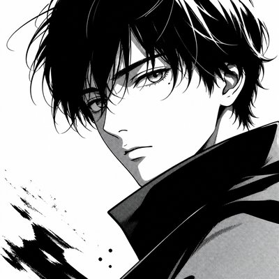
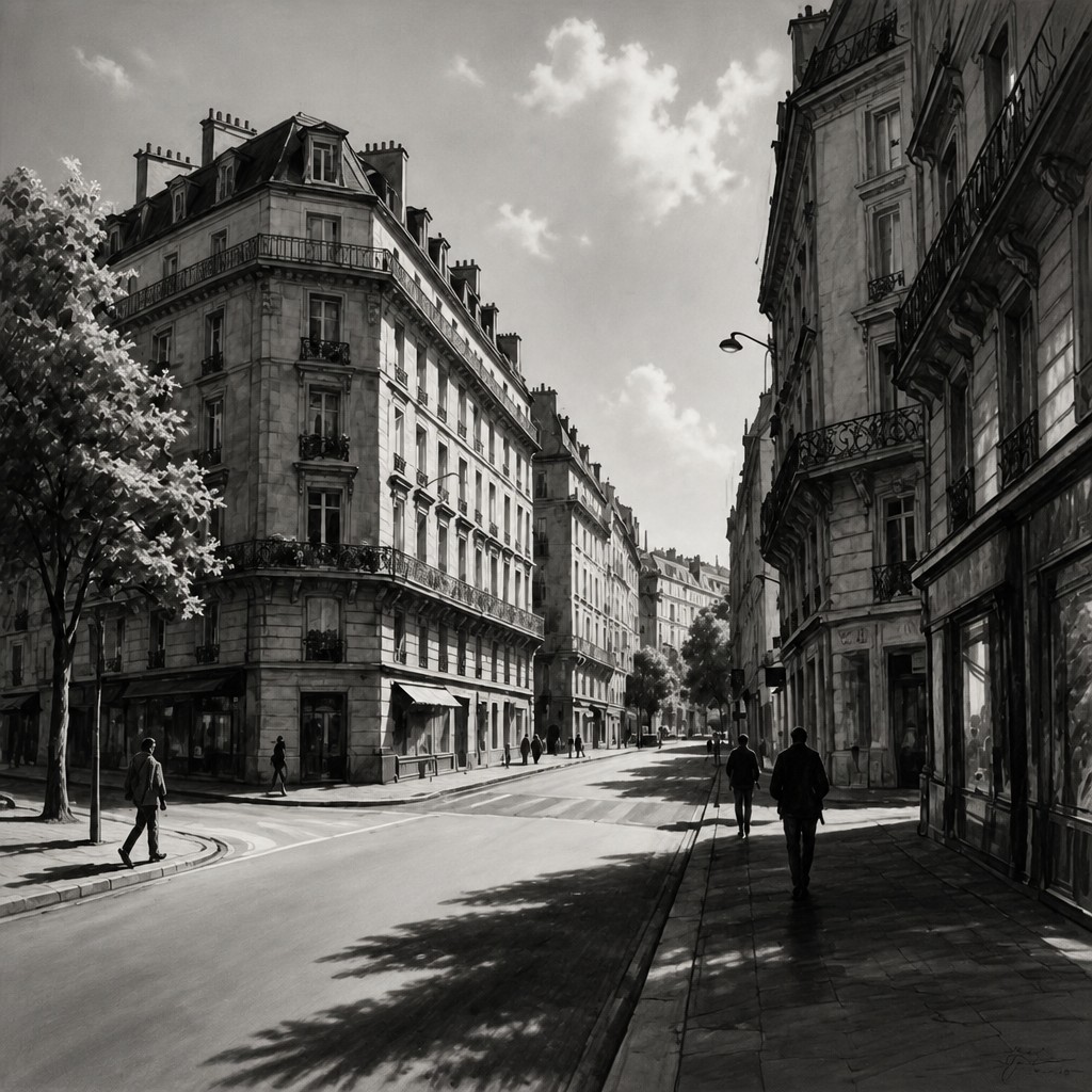
High-contrast boundaries clarify silhouettes, planes, and focal details. Hard edges are especially useful for architecture, graphic forms, reflective objects, and dramatic portraits.
Smooth modeled midtones
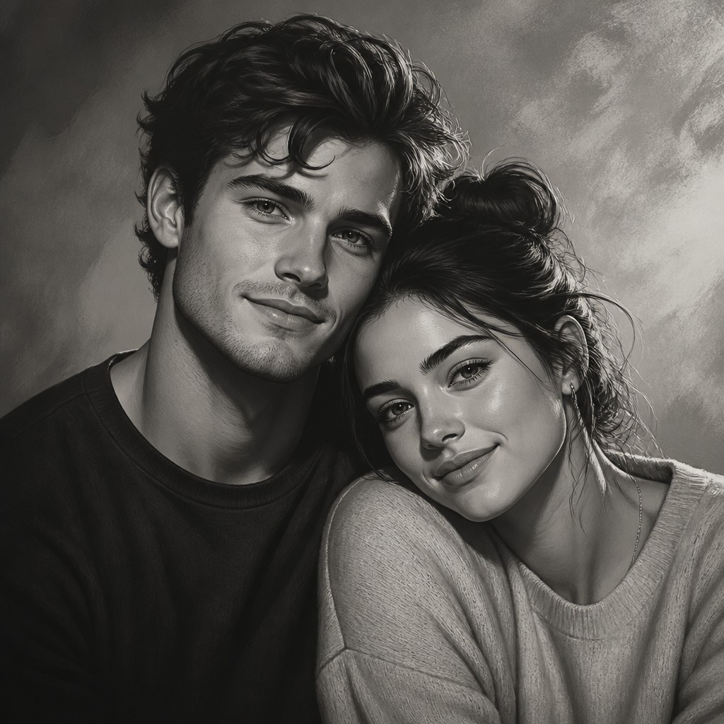
Gradual transitions across rounded surfaces make faces, bodies, clouds, ceramic, and polished materials appear solid. Midtones prevent the image from becoming a simple flat black-and-white graphic.
Deep anchoring shadows
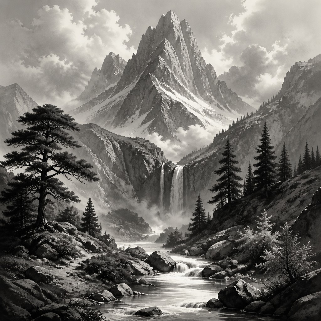
Dense dark values establish weight, recesses, cast shadows, and compositional stability. They often gather beneath forms or around the edges of the frame.
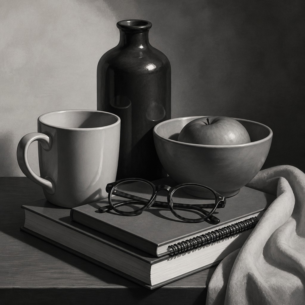
Luminous highlights
Small or carefully placed white areas indicate the direction and intensity of illumination. Highlights can describe reflective surfaces, atmospheric openings, wet materials, or the focal point.
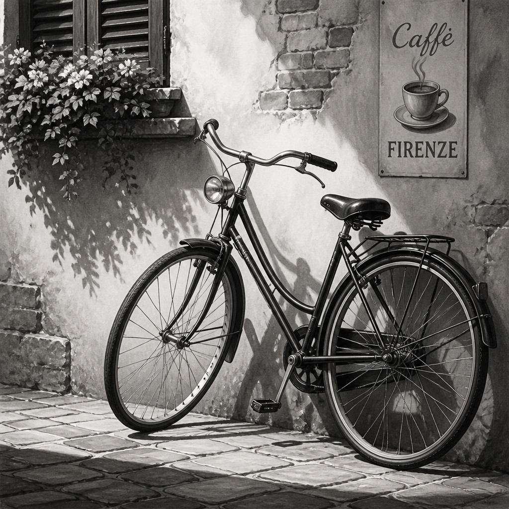
Light-led composition
The arrangement of illumination is as important as the subject itself. Strong backlighting, side lighting, or a concentrated spotlight can organize the entire image through tonal hierarchy.
Tone Prompt Ideas
Start from an idea — each one opens the generator with the style ready to go. See all 40 Tone prompts →
How to Create Tone Art
Master the craft step by step — or skip straight to creating. Read the full guide →
- 1
Begin with a value map
Reduce the subject to three to five broad tones before adding detail: light, middle, dark, and optionally near-black and white. Check the image in grayscale so color cannot conceal weak structure.
- 2
Control the light source
Choose one dominant direction and decide where the deepest shadow and brightest highlight will fall. Use side light for volume, backlight for silhouettes, and frontal light for flatter graphic clarity.
- 3
Build forms gradually
In charcoal, graphite, ink wash, or paint, establish large masses first, then blend or hatch the middle values across curved surfaces. Reserve the darkest marks and sharpest accents for important structural points.
- 4
Use edge variation
Keep focal contours crisp while allowing secondary edges to soften into surrounding tones. This creates depth and avoids making every object appear equally outlined.
- 5
Work digitally in grayscale
Use a grayscale document, tonal adjustment layers, soft brushes for modeling, and hard brushes for accents. A histogram or value-checking layer can reveal clipped shadows, weak highlights, or an overly narrow range.
- 6
Describe values in a prompt
Specify monochrome or near-monochrome rendering, a full graduated value range, deep anchoring shadows, smooth midtone transitions, crisp form-defining edges, and bright dimensional highlights alongside the subject and lighting.
The Story
History & Origins of Tone
Tone Art Style is a descriptive, contemporary style rather than a formally recognized historical art movement. Its aesthetic lineage combines monochrome drawing, academic value studies, chiaroscuro, charcoal and graphite rendering, black-and-white photography, printmaking, tonal painting, and the controlled grayscale workflows of digital illustration.
The approach developed from long-standing practices of reducing an image to lights and darks before adding detail. Digital tools and image-generation systems have extended this tradition by making it easy to specify grayscale palettes, preserve broad tonal separations, and test alternate lighting schemes without relying on color.
Influences: The style is related to chiaroscuro and tenebrism, academic tonal studies, charcoal and graphite drawing, silver-based black-and-white photography, ink wash, mezzotint and other value-rich printmaking processes, grayscale comics, tonal painting, and contemporary digital concept art. It also shares the restrained visual logic of minimalist and high-contrast graphic design, while its modeling techniques connect to realistic figure drawing and observational study.
Frequently Asked Questions
What defines Tone Art Style?
It is defined by the use of a broad grayscale or near-grayscale value range to describe the subject. Deep shadows, substantial midtones, crisp structural edges, and bright highlights work together to create form and depth without relying on saturated color.
Is Tone Art Style the same as black-and-white art?
Not exactly. Black-and-white art may use only stark positive and negative shapes, while Tone Art Style usually emphasizes a continuous scale of grays and carefully modeled transitions. It can be graphic, but its central concern is dimensional value structure.
How does it differ from chiaroscuro?
Chiaroscuro is a lighting and modeling principle used across many historical media, often emphasizing the contrast between illumination and shadow. Tone Art Style adopts that principle but treats the full value scale, including subtle middle tones and controlled highlights, as the primary visual language.
Can Tone Art Style include a small amount of color?
Yes. A faint warm or cool bias can add atmosphere while preserving the dominance of value. Strong hues should remain limited, because color saturation can distract from the light-dark relationships that define the style.
What subjects work well with this style?
Portraits, architecture, still life, landscapes, animals, machinery, and atmospheric scenes all work well. Subjects with clear lighting, varied surfaces, or strong silhouettes are particularly effective because they provide opportunities for distinct shadows, midtones, and highlights.
How can I make an image look more convincingly tonal?
Use a deliberate light source, preserve a wide range from near-black to near-white, and model rounded surfaces with gradual transitions. Avoid filling every area with the same gray; contrast should be strongest at the focal point and where forms need separation.
Create your first Tone artwork
Describe anything — or upload a photo — and see it in Tone Art Style in seconds.
Related Styles
Discover similar art styles