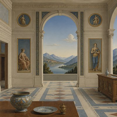
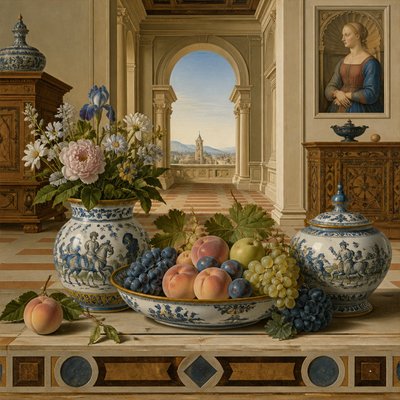
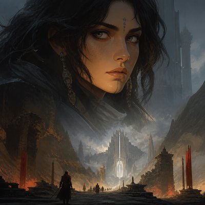
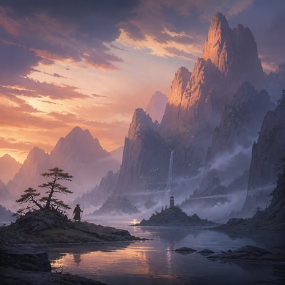
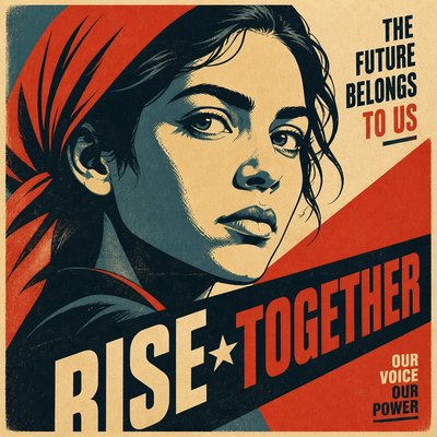
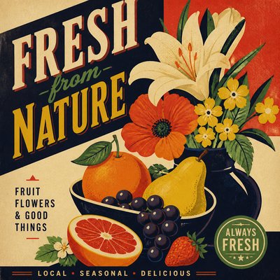
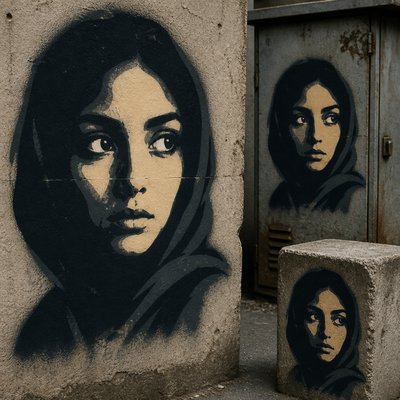
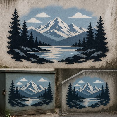
Tint and Shade Art Style
Explore Tint and Shade Art: a single-hue visual language of pale tints, deep shades, smooth gradients, and precise tonal structure.
Instantly rendered in Tint and Shade — or transform a photo
Tint and Shade Gallery
Tap any artwork to explore it
What is Tint and Shade Art Style?
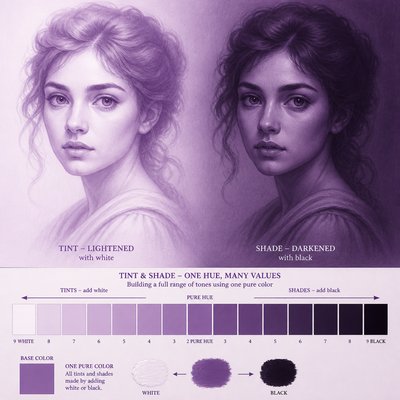
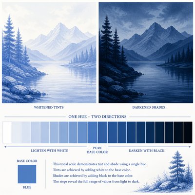
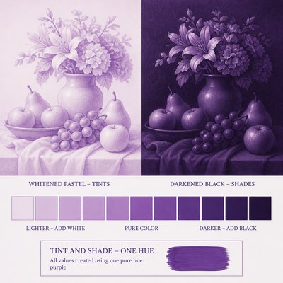
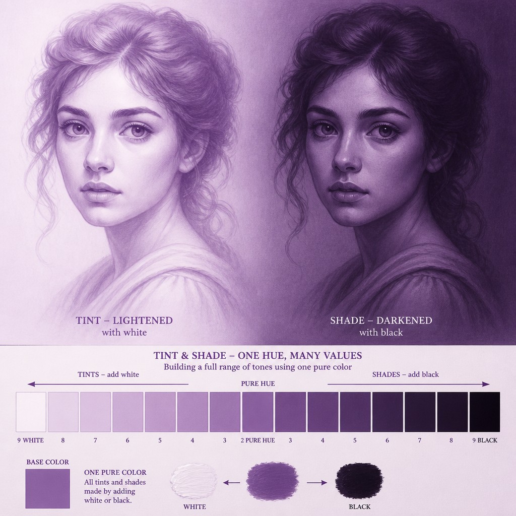
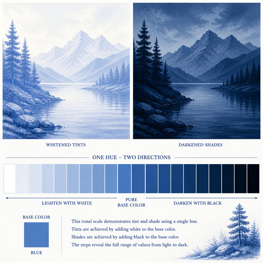
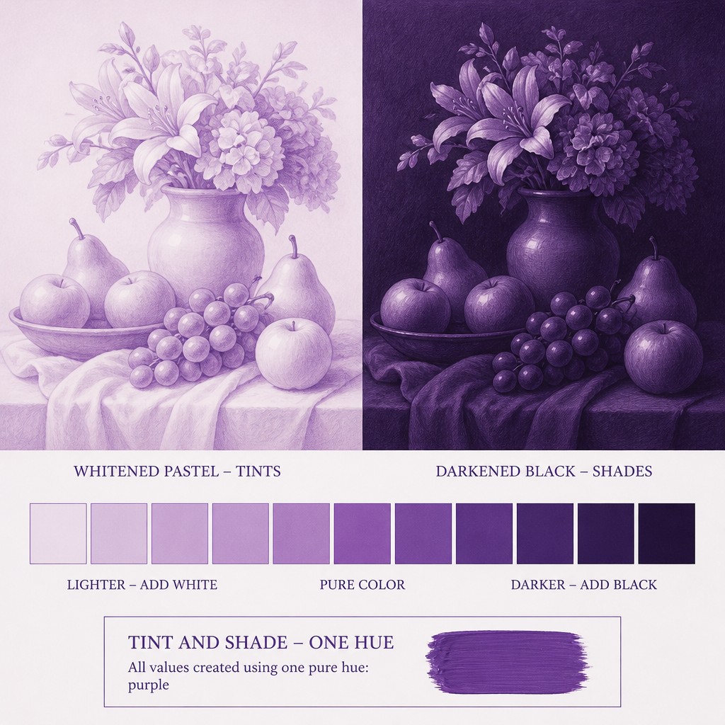
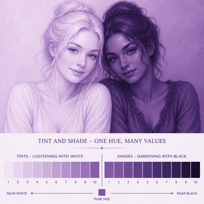
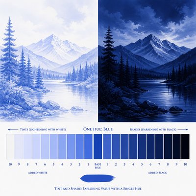
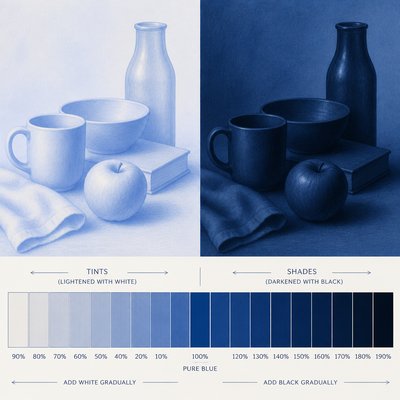
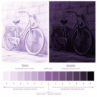
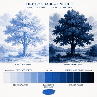
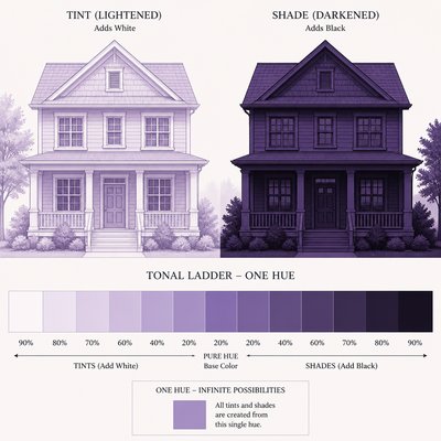
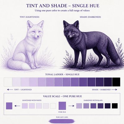
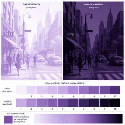
Tint and Shade Art is a monochromatic visual approach built from one base hue modified across a controlled value range. White is added to create pale tints, while black or reduced luminosity produces progressively deeper shades, forming a continuous ladder from near-white to near-black. The result may resemble a color study, tonal diagram, abstract composition, or simplified representation of a subject.
Its visual identity depends on restraint, clarity, and gradual transition rather than on a broad palette or highly textured surface. Smooth gradients, adjacent tonal bands, and repeated light-to-dark structures make the relationship between hue and value immediately legible. The style can feel both educational and contemplative because it presents color theory as the primary subject while using minimal means.
Try It On Your Photos
Upload any photo and convert it into Tint and Shade Art Style — drag the sliders to compare before and after.


What Defines Tint and Shade Art Style
The signature details, up close
Single-hue foundation
The composition is organized around one pure base color rather than a multicolor palette. Hue may remain stable while brightness, darkness, saturation, or opacity changes.
Tint-to-shade progression
Lightened versions of the hue move toward white, while darkened versions move toward black or a near-black equivalent. The sequence is usually intentional and visibly ordered.
Smooth tonal gradients
Blending between values is clean and controlled, with minimal grain, abrupt banding, or accidental color shifts. Gradients may model a subject or function as abstract fields.
Clear tonal ladder
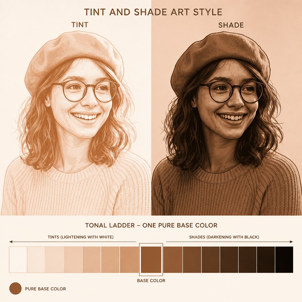
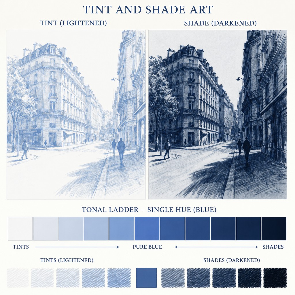
Swatches, stripes, steps, or bands often arrange values from pale to deep in a readable progression. This diagrammatic structure makes the color system part of the subject.
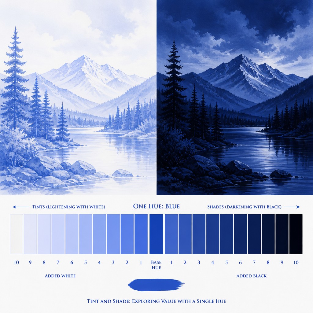
Whitened and blackened counterparts
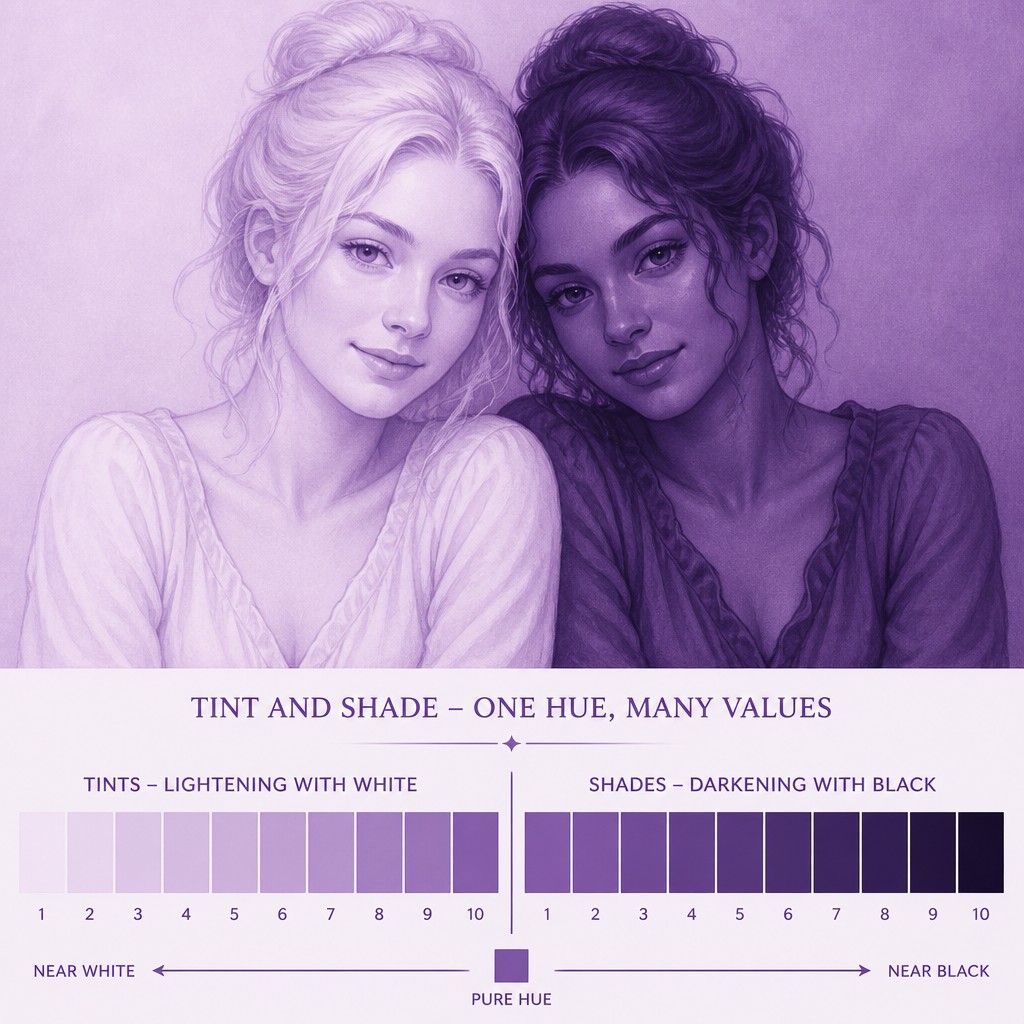
A light tint and a dark shade may appear side by side to emphasize how the same base hue changes under opposing modifications. This contrast is central to the style's explanatory character.
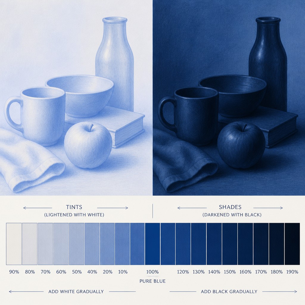
Minimal visual clutter
Forms are simplified and surfaces are generally free of complex texture, decorative detail, and competing hues. Empty space and orderly spacing help the tonal relationships remain prominent.
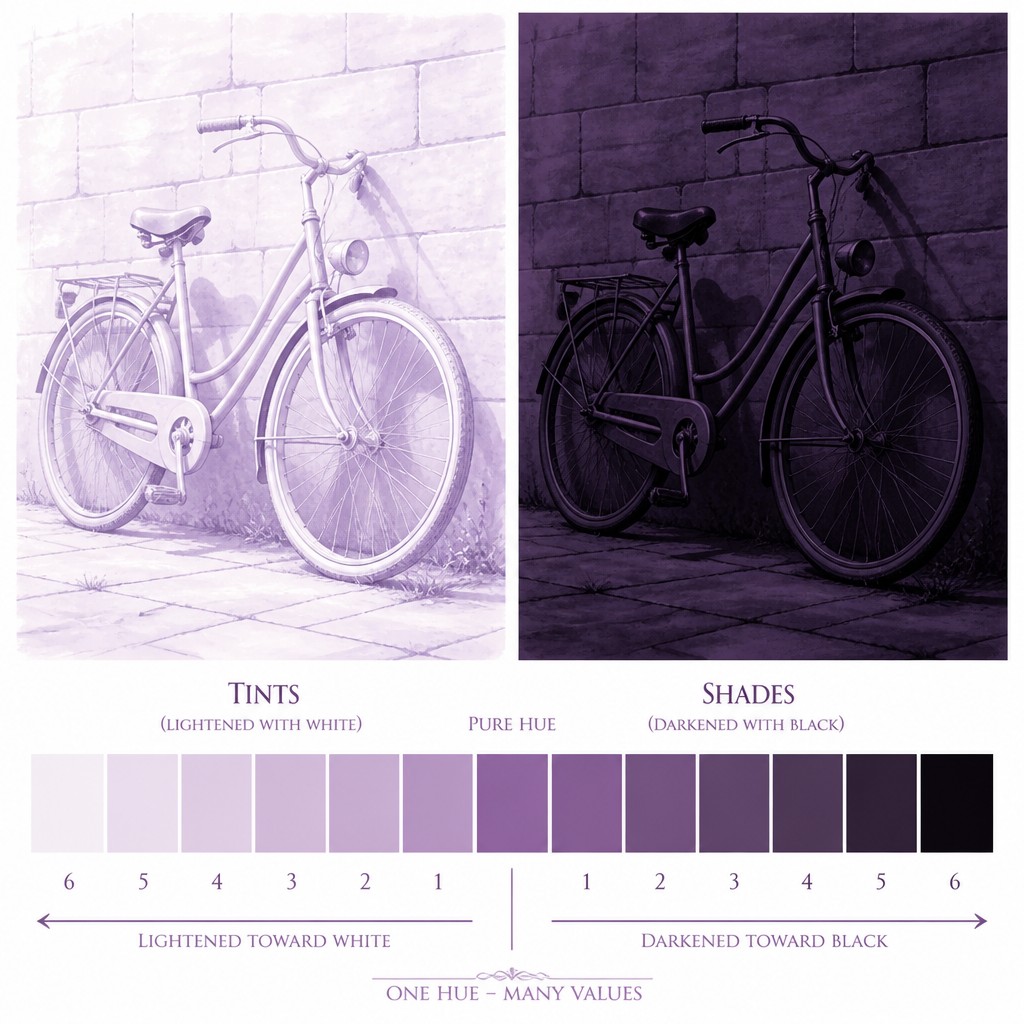
Value-led representation
Objects, figures, or environments are described primarily through light and dark structure. Recognizability comes from silhouette, gradient placement, and tonal separation rather than realistic color.
Tint and Shade Prompt Ideas
Start from an idea — each one opens the generator with the style ready to go. See all 40 Tint and Shade prompts →
How to Create Tint and Shade Art
Master the craft step by step — or skip straight to creating. Read the full guide →
- 1
Choose one base hue
Select a single pure or strongly identifiable color, then build a palette by mixing it with white for tints and black, a dark neutral, or reduced luminosity for shades. Keep hue drift low so the progression remains coherent.
- 2
Build a measured value scale
Prepare five to twelve steps from near-white to near-black before composing the image. Check that each step is visibly distinct while maintaining smooth relationships between neighboring values.
- 3
Use controlled gradients
In painting, apply thin, even layers or carefully blended washes; in digital work, use gradient tools, hard-edged swatches, and consistent opacity. Avoid uncontrolled texture unless it deliberately supports the tonal structure.
- 4
Simplify the subject
Reduce a photograph or drawing to its main silhouettes, planes, and value zones. Reserve the darkest shades for focal anchors and use pale tints to establish light, atmosphere, or negative space.
- 5
Arrange a tonal diagram
For a more graphic result, place swatches or bands in a clear ladder from light to dark, optionally pairing each tint with its corresponding shade. Align spacing and edges precisely.
- 6
Write a precise generation prompt
Specify the subject, one base hue, a pale-to-deep value range, smooth gradients, minimal texture, and an orderly tonal scale. For image-to-image work, request strong preservation of the original silhouette while replacing its palette with the single-hue system.
The Story
History & Origins of Tint and Shade
Tint and Shade Art is a niche, descriptive style rather than a documented historical movement with a fixed period or founding school. Its aesthetic lineage comes from traditional color-theory exercises, monochromatic painting, value studies, tonal scales, scientific diagrams, and modern graphic design systems that reduce visual information to carefully organized variations of one color.
Contemporary digital tools have expanded the approach by allowing extremely smooth transitions, precise color sampling, and repeatable tonal systems. It is now used as an independent abstract language as well as a method for simplifying portraits, landscapes, objects, interfaces, educational charts, and conceptual imagery.
Influences: The style relates to monochromatic painting, grisaille and other single-color studies, color-theory teaching charts, tonal drawing, Bauhaus-associated foundational exercises, Swiss-influenced graphic clarity, minimalist modernism, and contemporary data visualization. It also draws from screen-based gradient design and photographic value reduction, combining the discipline of an instructional diagram with the quiet abstraction of a limited-palette artwork.
Frequently Asked Questions
What defines Tint and Shade Art?
It is defined by a single base hue developed through gradual lightening and darkening. Pale tints, deep shades, smooth gradients, and an orderly value scale are more important than subject matter.
Is Tint and Shade Art the same as monochrome art?
It is a specific form of monochromatic art, but not every monochromatic image follows this style. Tint and Shade Art emphasizes an explicit, structured progression between lightened and darkened versions of one hue, often in a diagrammatic arrangement.
Does the style use only white and black?
No. White and black are reference extremes used to create tints and shades, while the image remains anchored to a chosen hue. A dark neutral, lowered brightness, or reduced saturation may be used to achieve the deepest values.
Can recognizable subjects be made in this style?
Yes. Portraits, landscapes, architecture, still lifes, animals, and abstract forms can all be translated into a single-hue value system. Simplifying the subject into clear silhouettes and major light-dark planes usually produces the strongest result.
How can I create it with traditional materials?
Use one paint color with white and a darkening mixture, or work with a single colored pencil, ink, or watercolor wash at different strengths. Test the full scale first, then apply the values consistently and prevent unintended colors from entering the palette.
Where is this style commonly used?
It suits color-theory studies, posters, editorial graphics, educational diagrams, interface illustrations, album or publication artwork, conceptual images, and minimalist wall art. Its clear value structure also makes it useful for demonstrating how lightness and darkness alter a single hue.
Create your first Tint and Shade artwork
Describe anything — or upload a photo — and see it in Tint and Shade Art Style in seconds.
Related Styles
Discover similar art styles