Color Temperature Art Style
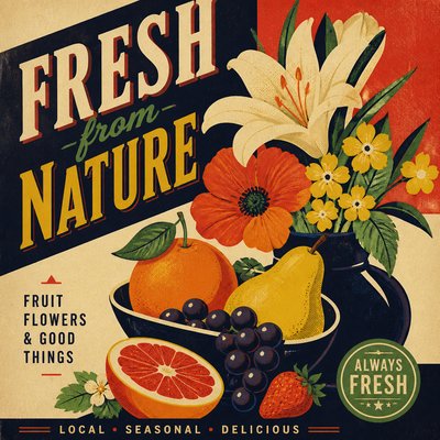
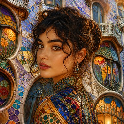
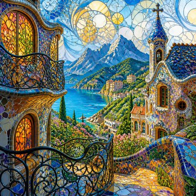
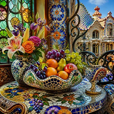
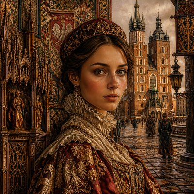
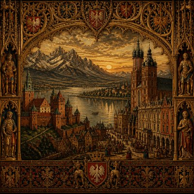
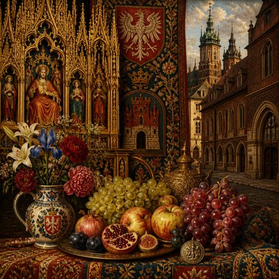
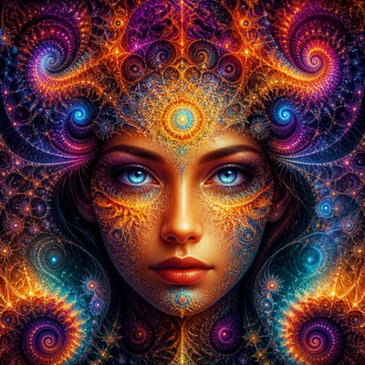
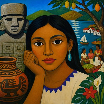
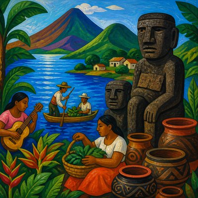
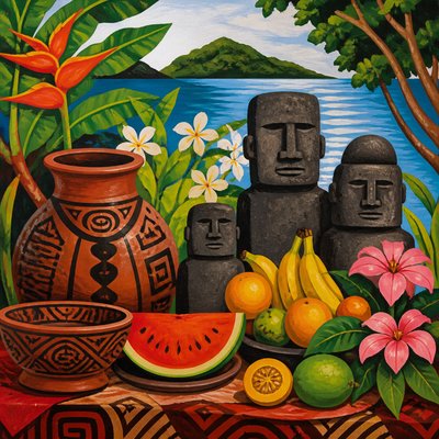
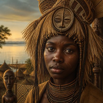
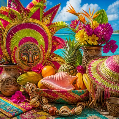
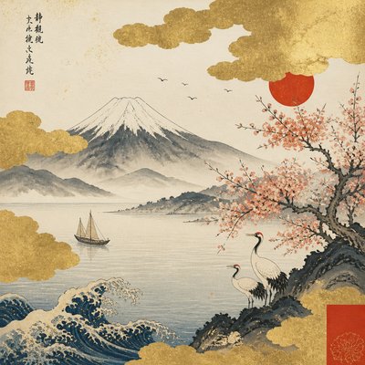
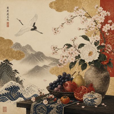
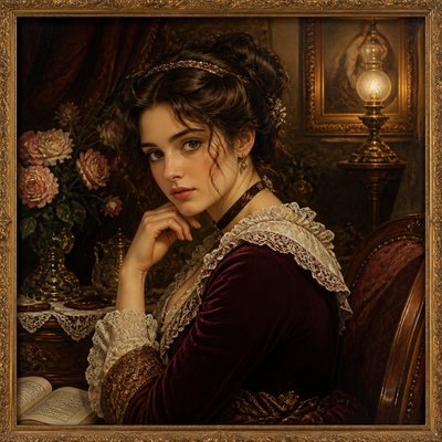
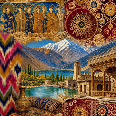
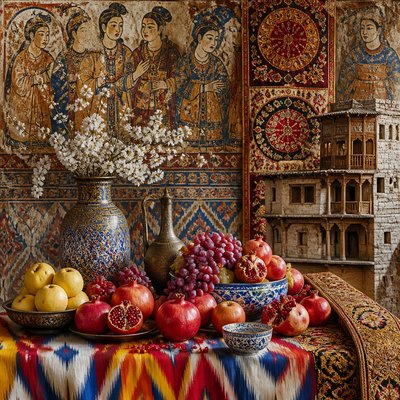
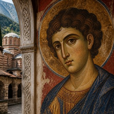
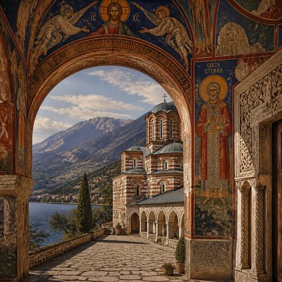
Explore Color Temperature Art: a dramatic visual language of warm foreground light, cool receding shadows, and vivid thermal contrast.
Instantly rendered in Color Temperature — or transform a photo
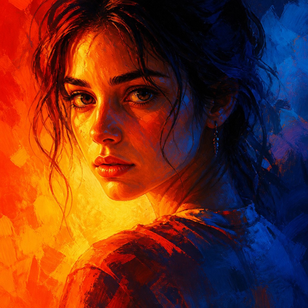
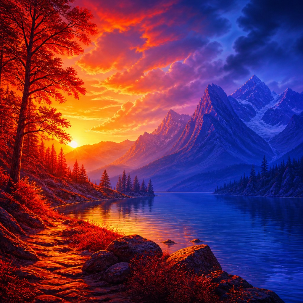
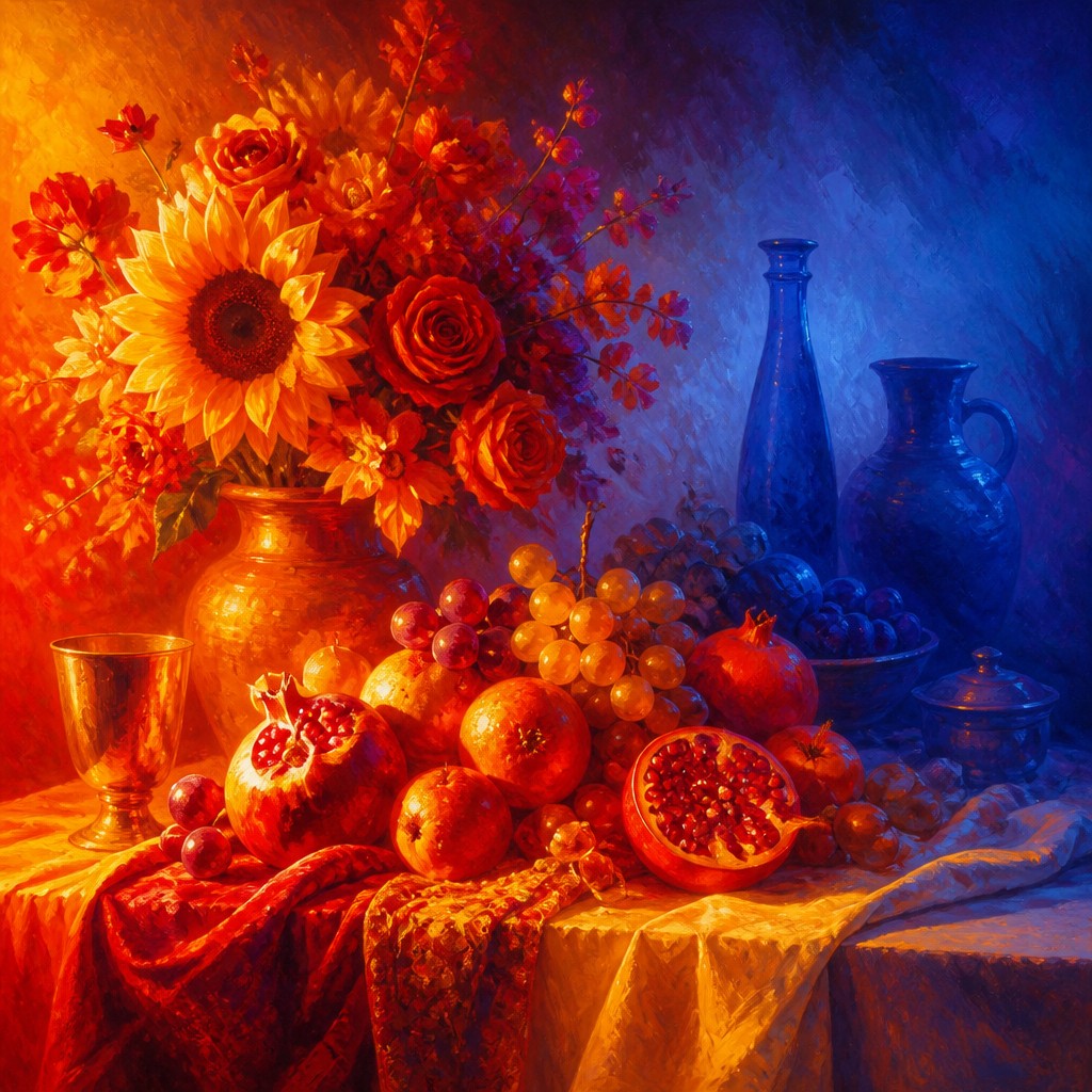
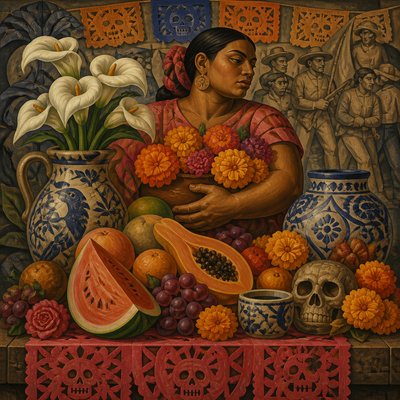
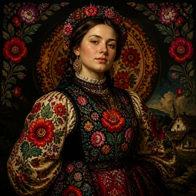
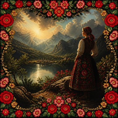
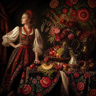
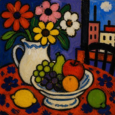
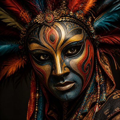
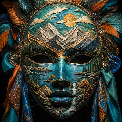
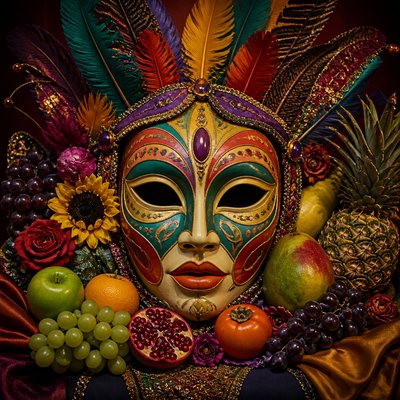
Color Temperature Gallery
Tap any artwork to explore it
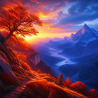
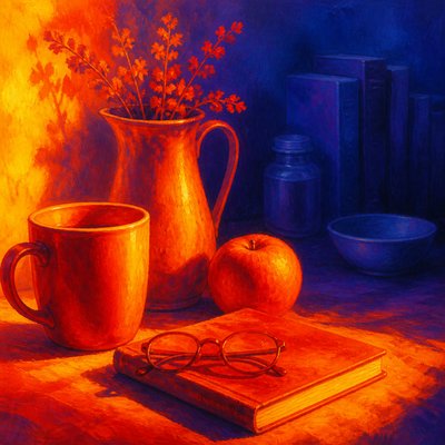
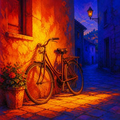
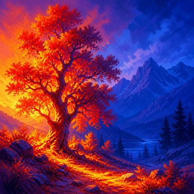
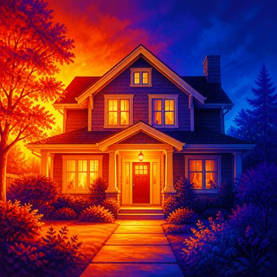
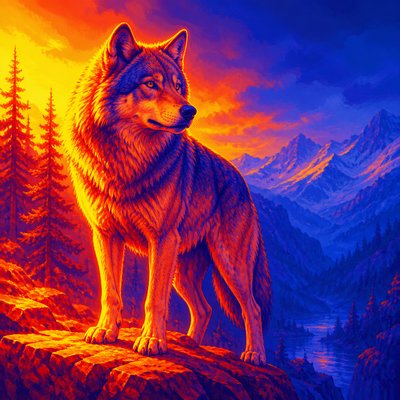
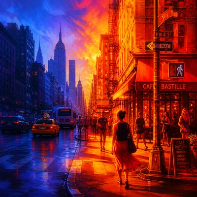
What is Color Temperature Art Style?
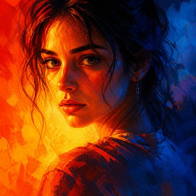
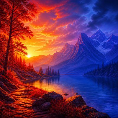
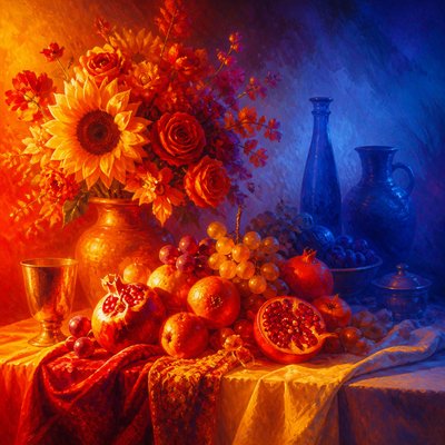
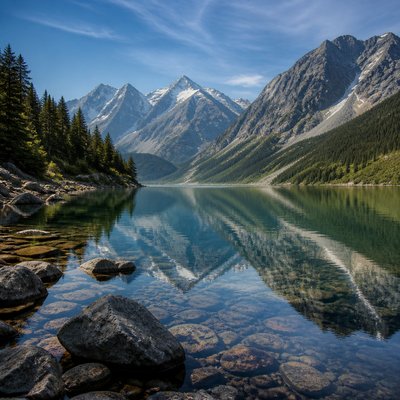
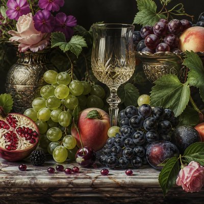
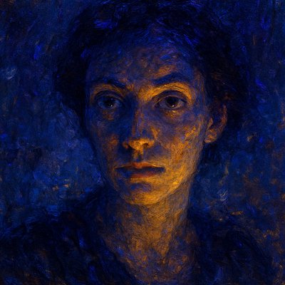
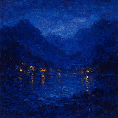
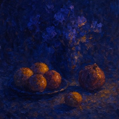
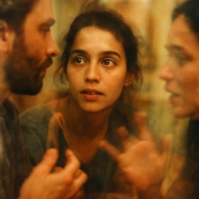
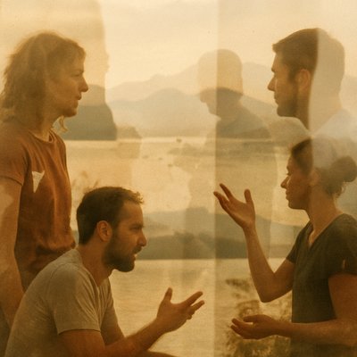
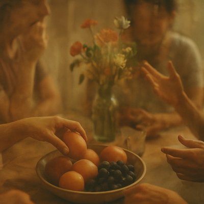
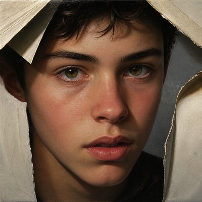
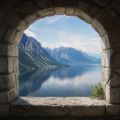
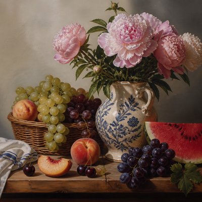
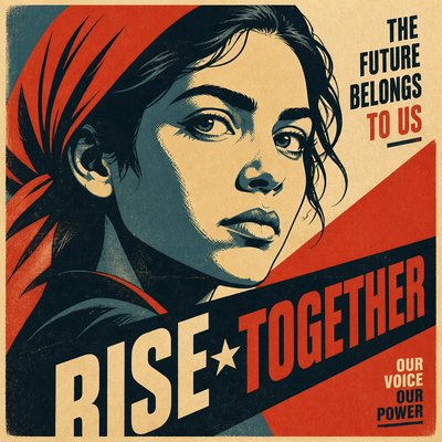
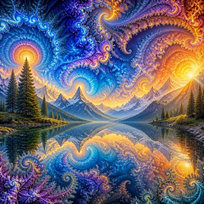
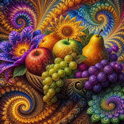
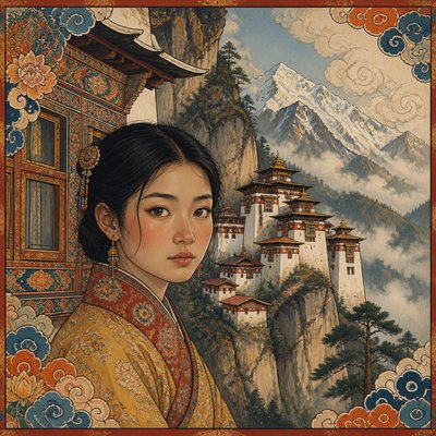
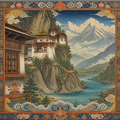
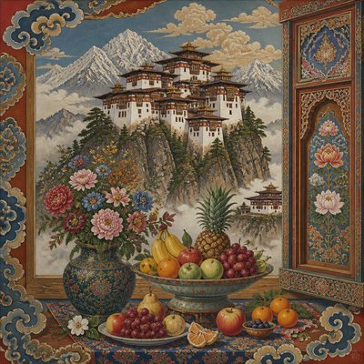
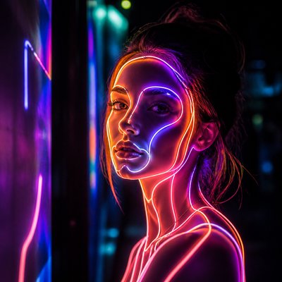
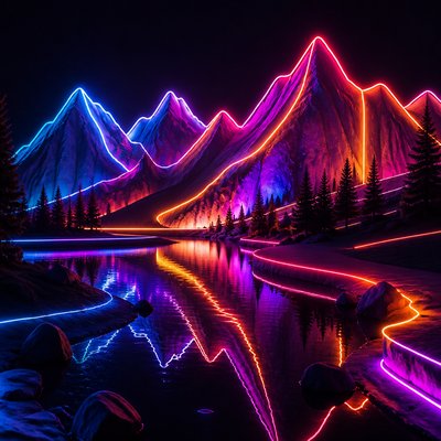
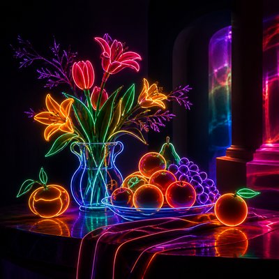
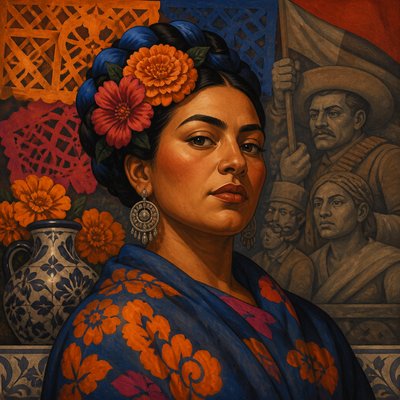
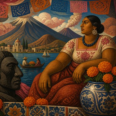
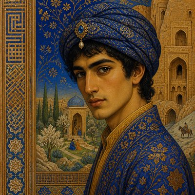
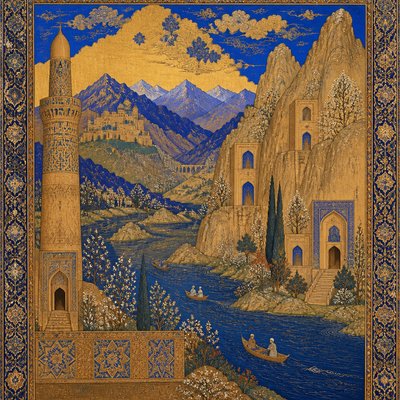
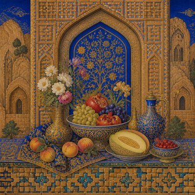
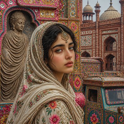
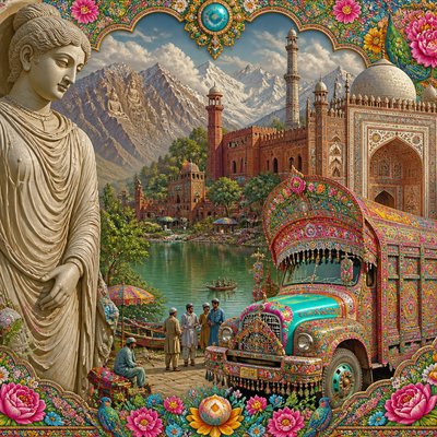
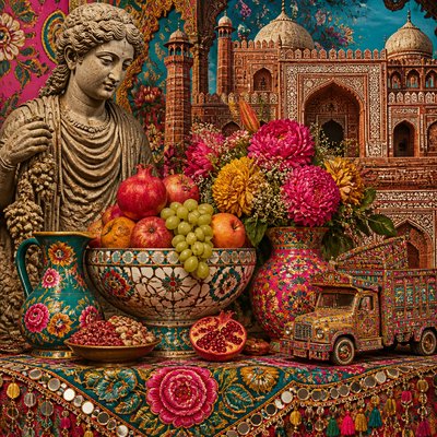
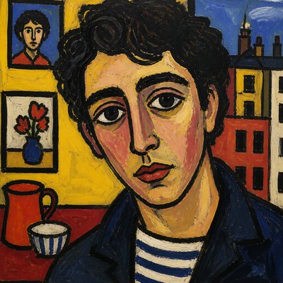
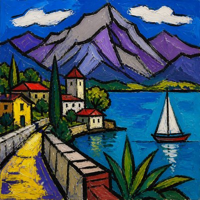
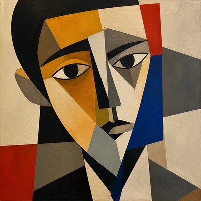
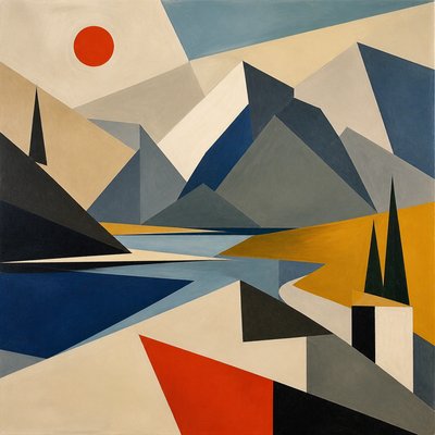
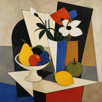
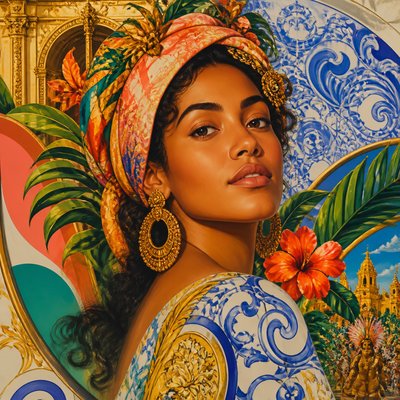
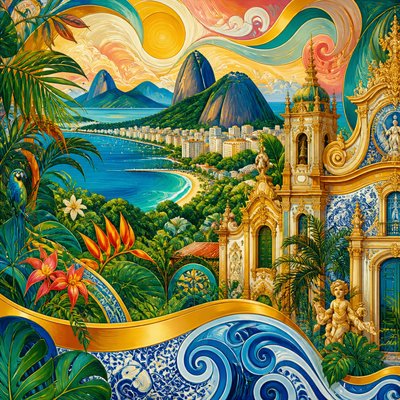
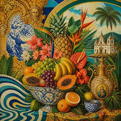
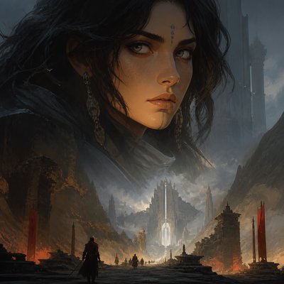
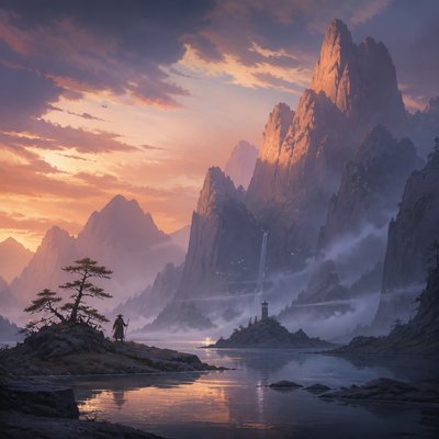
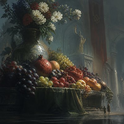
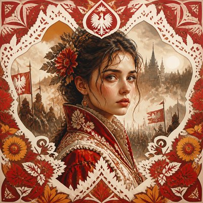
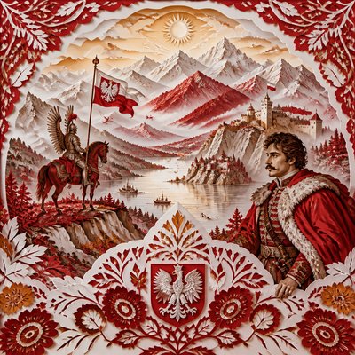
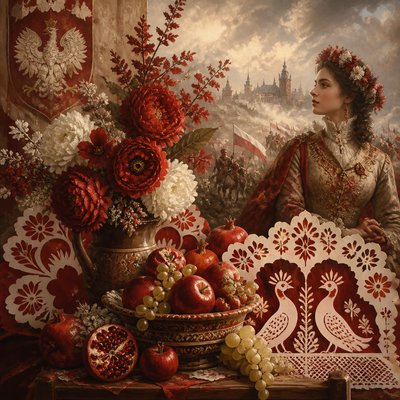
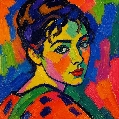
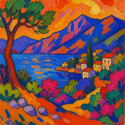
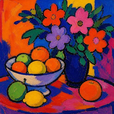
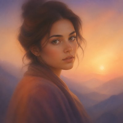
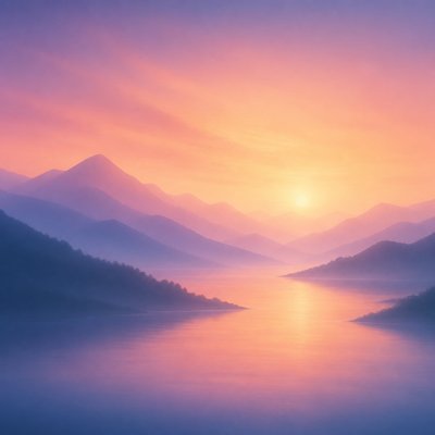
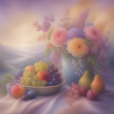
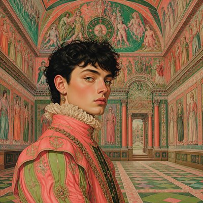
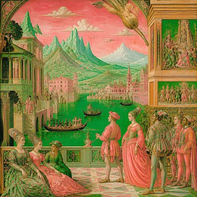
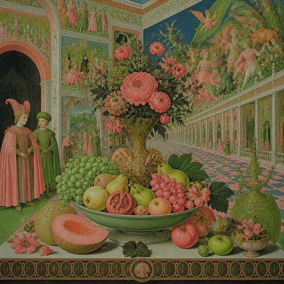
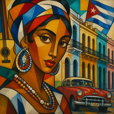
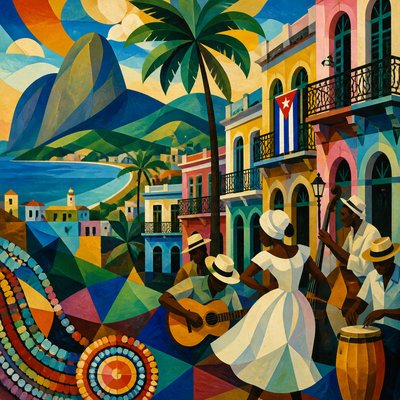
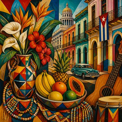
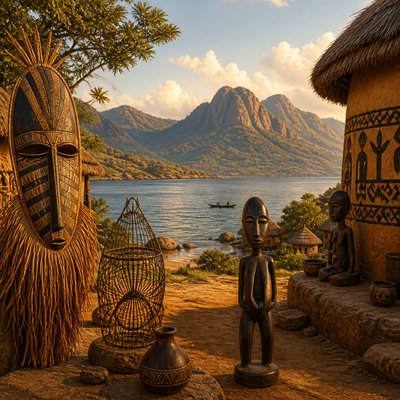
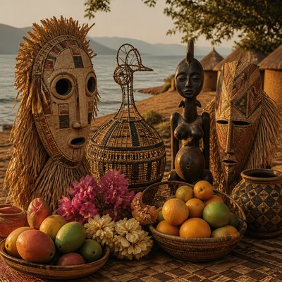
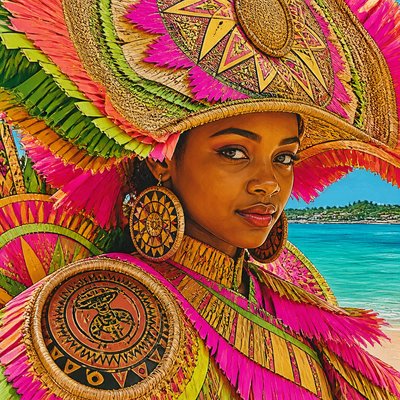
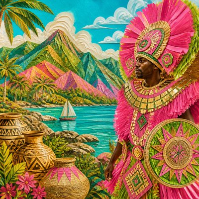
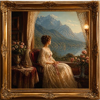
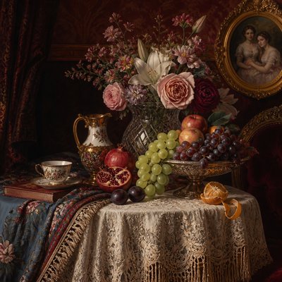
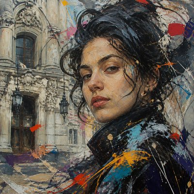
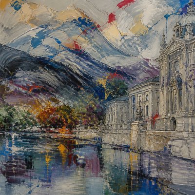
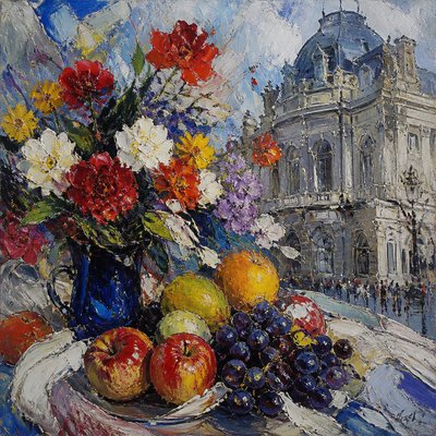
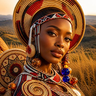
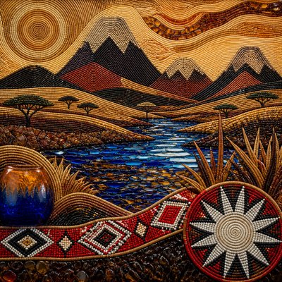
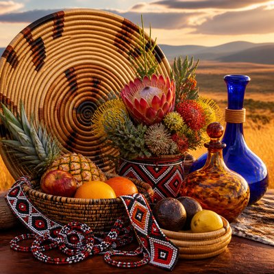
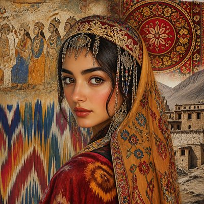
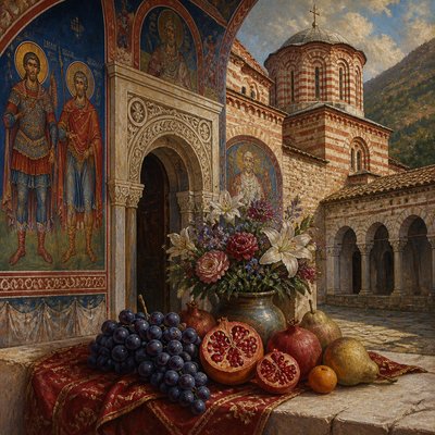
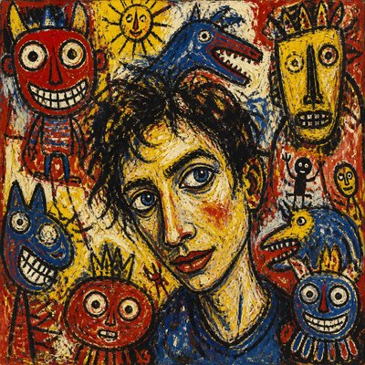
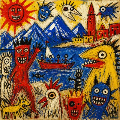
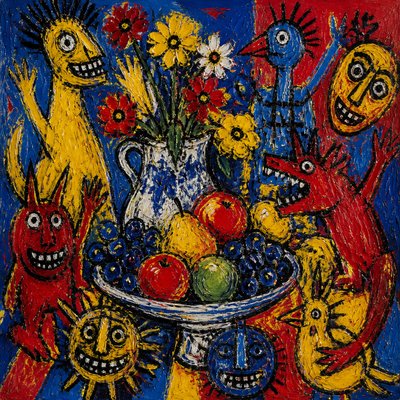
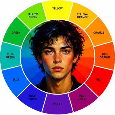
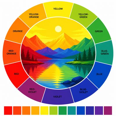
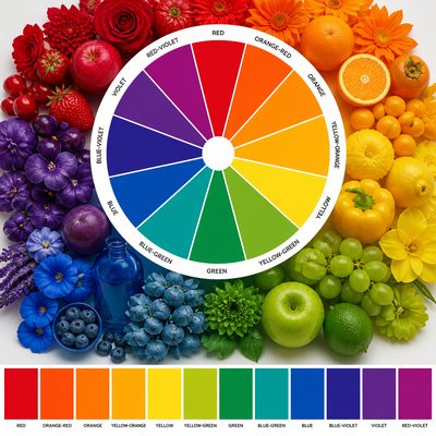
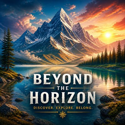
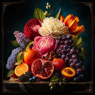
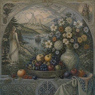
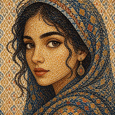
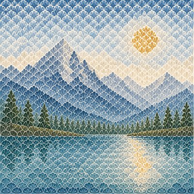
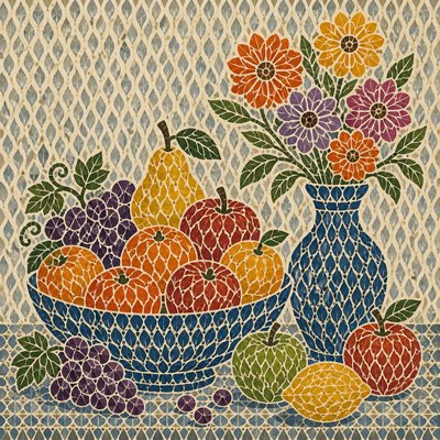
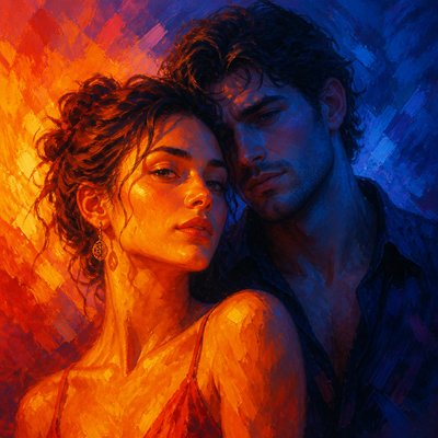
Color Temperature Art is a contemporary visual approach organized around the psychological and spatial contrast between warm and cool colors. Fiery reds, oranges, and yellows are concentrated in illuminated forms or the foreground, while blues, violets, and blue-greens occupy shadow, distance, or atmospheric recession. The result is an image in which warmth appears to advance and coolness appears to withdraw.
The style is defined less by a fixed subject or medium than by a disciplined color relationship. Warm hues can suggest energy, proximity, sunlight, heat, or emotional intensity; cool hues can imply depth, stillness, night, distance, or detachment. Strong temperature separation creates immediate focus and gives the composition a palpable sense of depth, even when forms are simplified or abstracted.
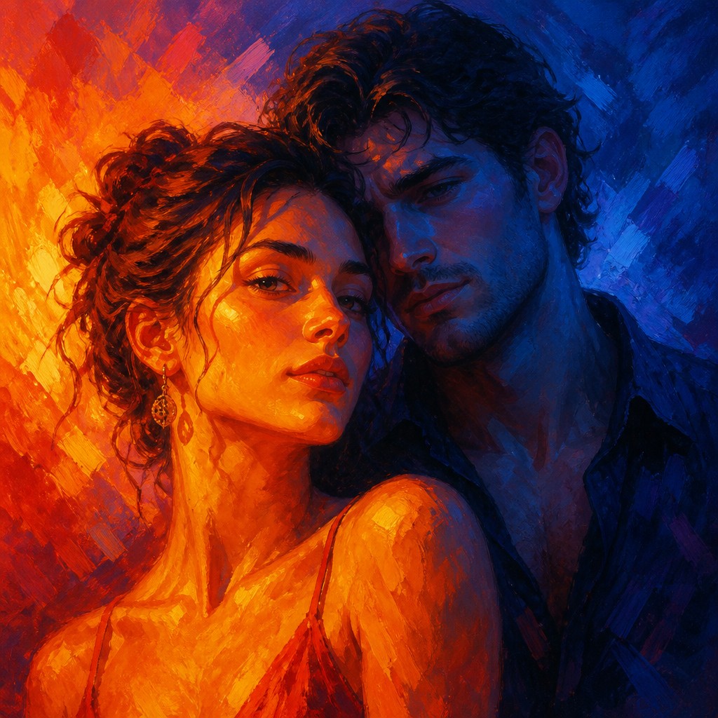
Try It On Your Photos
Upload any photo and convert it into Color Temperature Art Style — drag the sliders to compare before and after.
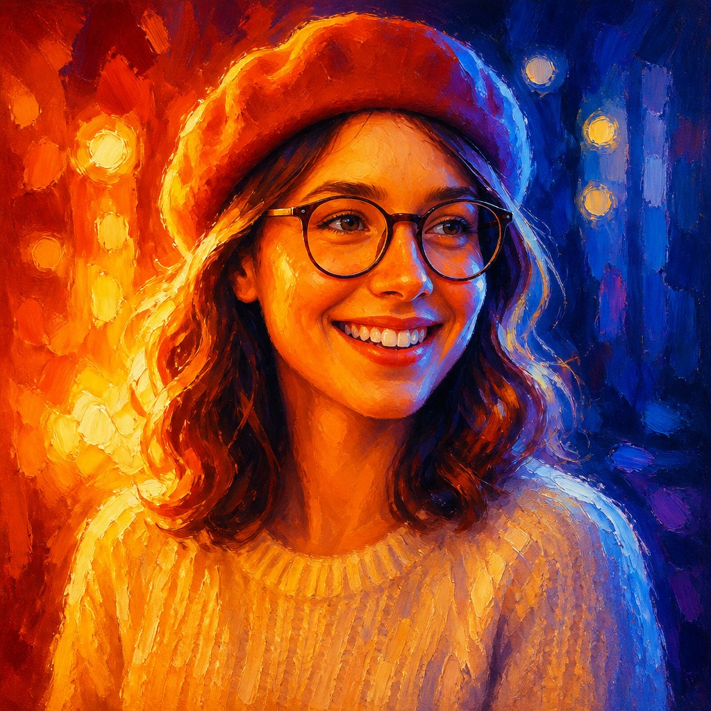

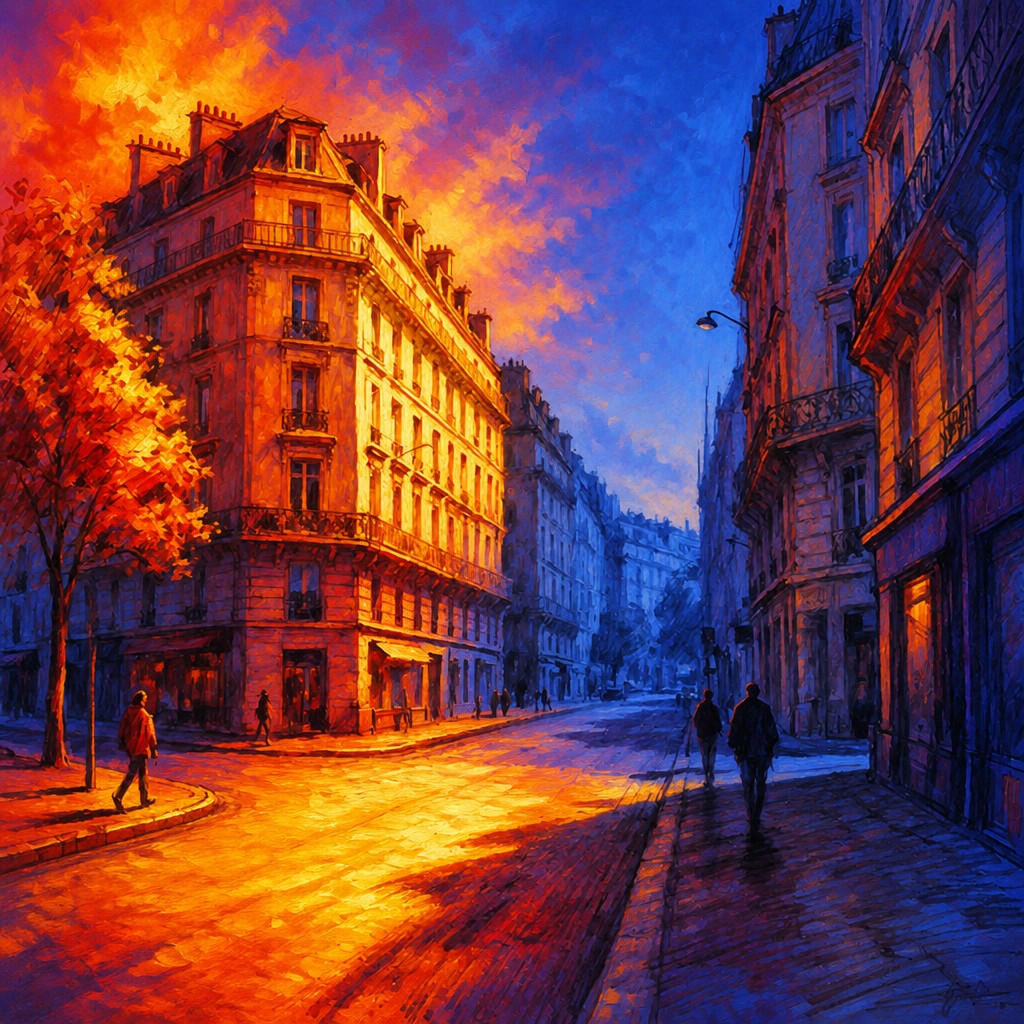

What Defines Color Temperature Art Style
The signature details, up close
Warm foreground emphasis
Reds, oranges, ambers, and golden yellows are concentrated in the nearest or most important forms. Their brightness and saturation make them appear to move toward the viewer.
Cool atmospheric recession
Blues, violets, indigos, and blue-greens occupy distant planes, cast shadows, or surrounding atmosphere. Reduced contrast and cooler color mixtures reinforce spatial withdrawal.
Thermal push-pull
The image is structured by an active tension between advancing warmth and retreating coolness. This contrast can guide the eye more strongly than outlines or traditional linear perspective.
Sharp light-shadow division
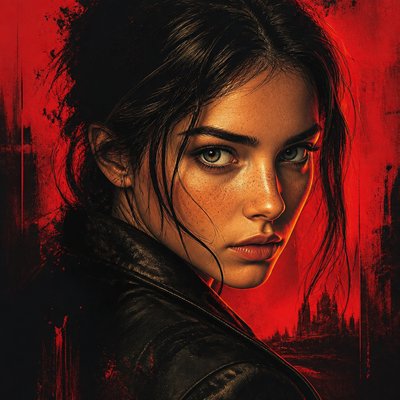
Illumination often falls decisively across the subject, separating a glowing warm side from a chilled, darker side. Edges may be crisp where the temperature change is dramatic and softer within atmospheric zones.
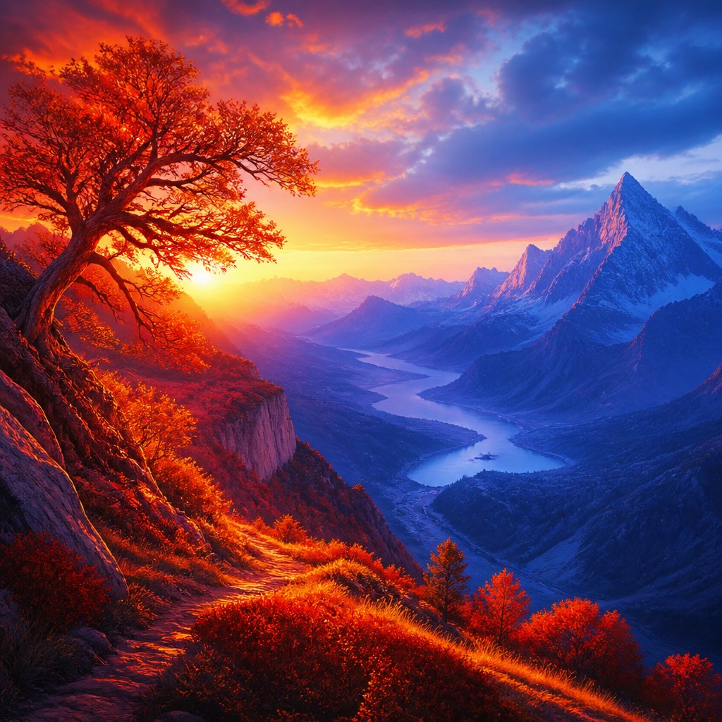
Vivid chromatic contrast
Colors are generally clear, saturated, and intentionally separated rather than uniformly blended into neutral mixtures. Small neutral passages may be used to make adjacent warm and cool areas feel even more intense.
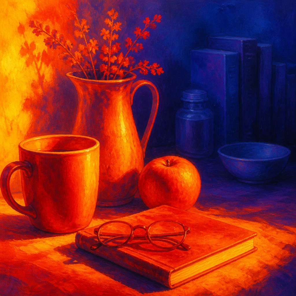
Depth through temperature
Spatial hierarchy is created by shifting hue temperature, saturation, value, and atmospheric clarity. Warm, high-contrast forms tend to dominate, while cooler, lower-contrast areas establish distance.
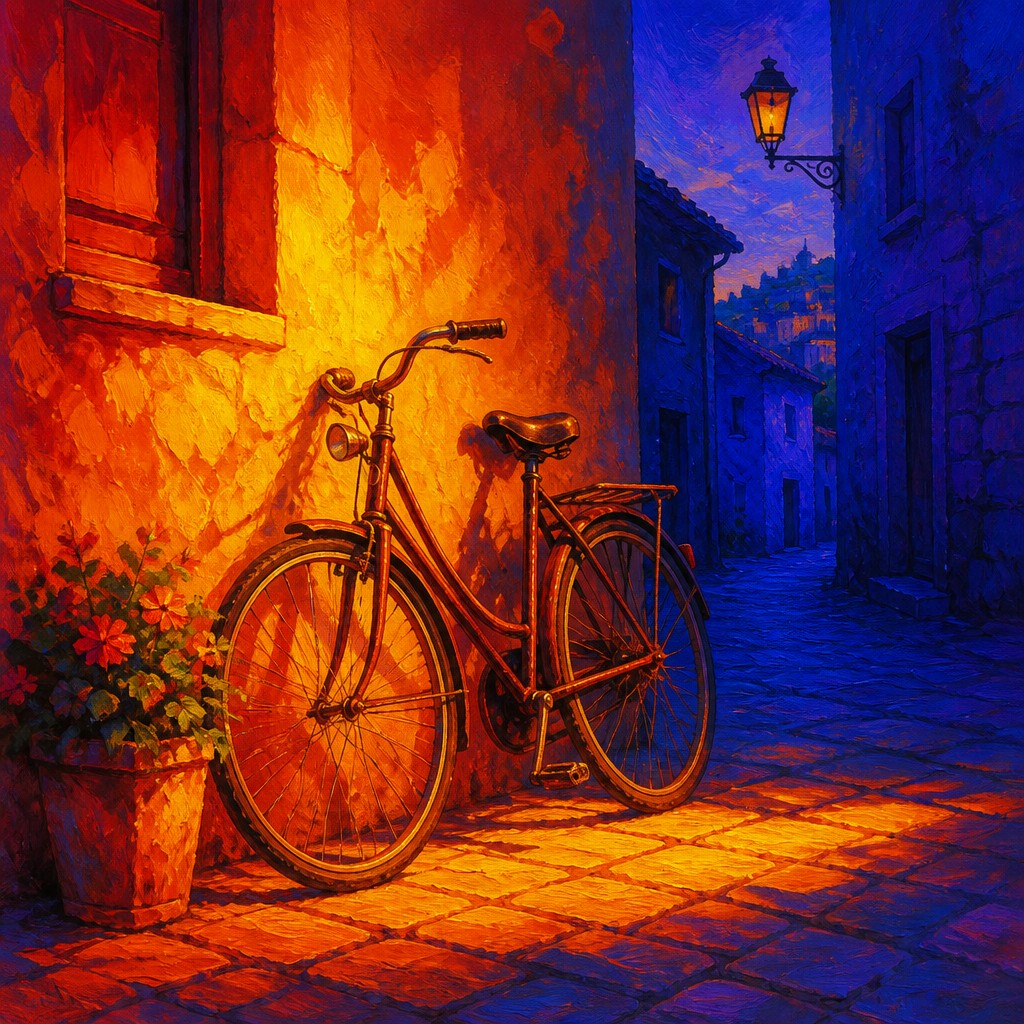
Emotional illumination
Color temperature carries mood as well as structure: warmth may communicate vitality, danger, comfort, or revelation, while coolness may suggest calm, isolation, mystery, or withdrawal.
Color Temperature Prompt Ideas
Start from an idea — each one opens the generator with the style ready to go. See all 40 Color Temperature prompts →
How to Create Color Temperature Art
Master the craft step by step — or skip straight to creating. Read the full guide →
- 1
Plan a temperature map
Before adding detail, decide which side or region will carry the warmest colors and which planes will recede into cool hues. Keep the main temperature relationship consistent so the composition does not become visually muddy.
- 2
Build value before saturation
Establish a clear light-dark structure first, then intensify the warm and cool colors within it. A bright orange light will lose its force if the surrounding values are equally bright and contrast is not controlled.
- 3
Use traditional color mixing carefully
In paint, reserve pure warm and cool accents for focal areas and mix shadows with blues, violets, or complementary colors rather than using black alone. Layering transparent glazes can create luminous heat and deep atmospheric chill.
- 4
Control digital color zones
Use separate layers, gradient maps, selective color adjustments, or localized lighting to keep warm illumination distinct from cool shadow. Lower saturation and contrast in distant cool areas to strengthen the illusion of depth.
- 5
Write prompts around spatial contrast
For prompt-based image creation, specify the subject, the warm-lit side, the cool receding background, the lighting direction, and the desired contrast. Mention atmospheric depth and a limited warm-cool palette rather than relying on color adjectives alone.
The Story
History & Origins of Color Temperature
Color Temperature Art is not a formally established historical movement with a fixed founding date. It is better understood as a contemporary, cross-media aesthetic built from longstanding ideas in color theory, atmospheric perspective, chiaroscuro, and expressive painting. Its central principle—that warm colors often appear to advance while cool colors recede—has been used in landscape painting, theatrical lighting, illustration, photography, and screen-based image making.
The approach developed through the combination of traditional paint practice and modern color workflows. Digital compositing, cinematic grading, LED lighting, and generative image tools have made it especially easy to construct scenes around a deliberate warm-cool axis, while retaining links to landscape traditions, nocturnal painting, expressive abstraction, and color-field composition.
Influences: The aesthetic draws on complementary color theory, atmospheric perspective in landscape painting, chiaroscuro, nocturnal and sunset scenes, expressive abstraction, cinematic color grading, theatrical lighting, and contemporary digital compositing. It also relates to color-field painting and fauvist approaches to non-naturalistic color, although it is distinguished by making warm-cool recession the primary organizing principle rather than treating color as purely decorative or independently expressive.
Frequently Asked Questions
What defines Color Temperature Art?
Its defining feature is a deliberate spatial and emotional contrast between advancing warm colors and receding cool colors. Warm reds, oranges, and yellows usually dominate illuminated foreground forms, while blues and violets structure shadow and distance.
Is Color Temperature Art a historical art movement?
No. The term describes a contemporary aesthetic approach rather than a recognized historical movement with a formal membership or fixed period. It combines established ideas from color theory, atmospheric perspective, expressive painting, lighting design, and digital image making.
How is it different from chiaroscuro?
Chiaroscuro primarily organizes an image through the contrast between light and dark. Color Temperature Art includes value contrast but makes the warm-versus-cool relationship equally important, so a light area may be distinguished from shadow by hue temperature as well as brightness.
Does the style require realistic subjects?
No. It can be applied to portraits, landscapes, architecture, still life, illustration, photography, or abstraction. The essential requirement is that temperature contrast controls emphasis, depth, or mood.
How can I make the warm colors look closer?
Use greater brightness, saturation, edge sharpness, and detail in the warm areas, while reducing contrast and saturation in cool background zones. Atmospheric haze and cooler mixtures can further separate distant forms from the foreground.
Where is this visual approach commonly used?
It appears in painting, concept art, editorial illustration, photography, film and game lighting, poster design, and digital environments. It is particularly effective for sunsets, firelit scenes, nocturnal cityscapes, dramatic portraits, and speculative landscapes.
Create your first Color Temperature artwork
Describe anything — or upload a photo — and see it in Color Temperature Art Style in seconds.
Related Styles
Discover similar art styles