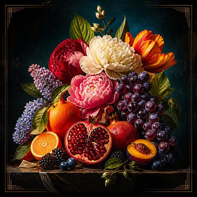
Complementary Color Art Style
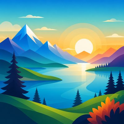
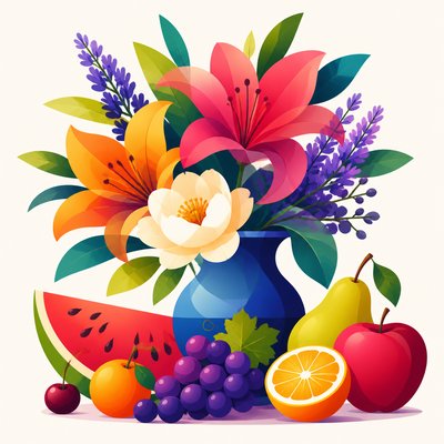
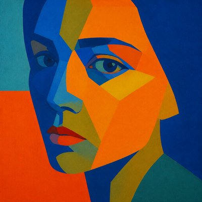
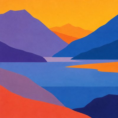
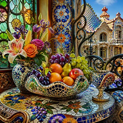
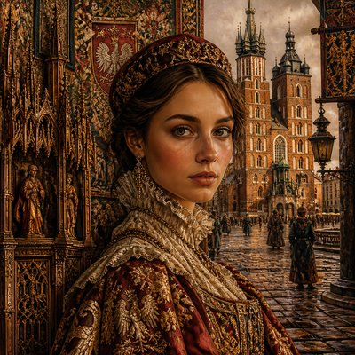
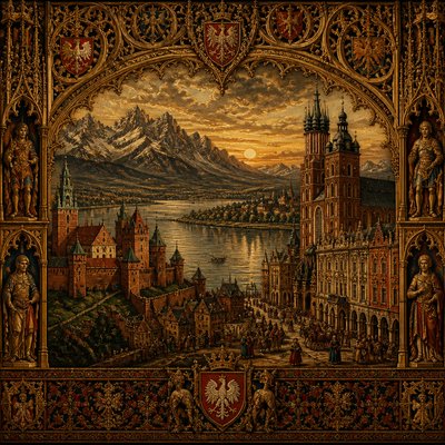
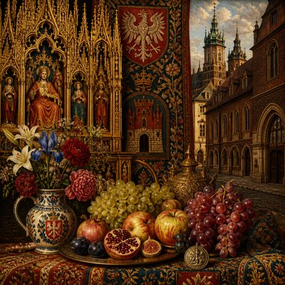
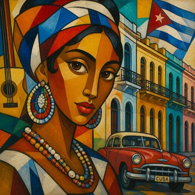
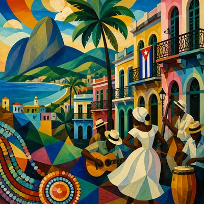
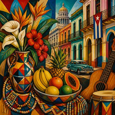
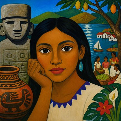
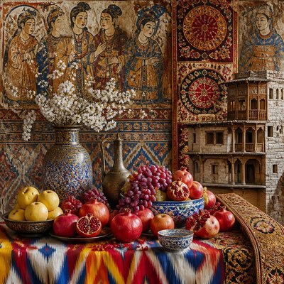
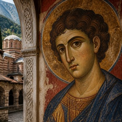
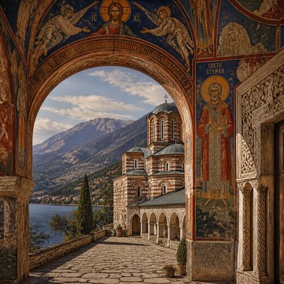
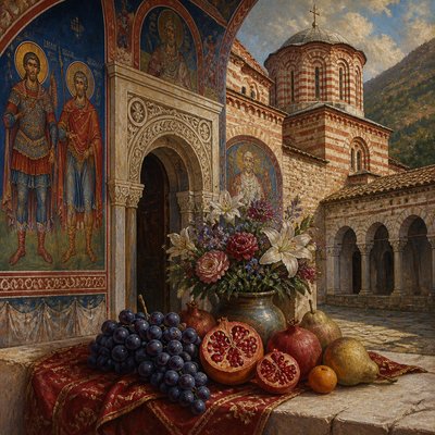
Explore Complementary Color Art: saturated opposites, simultaneous contrast, and vibrating orange-blue or red-green compositions.
Instantly rendered in Complementary Color — or transform a photo
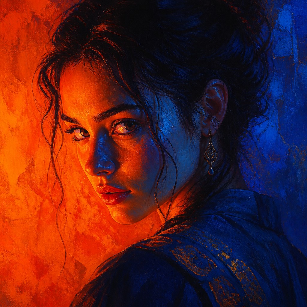
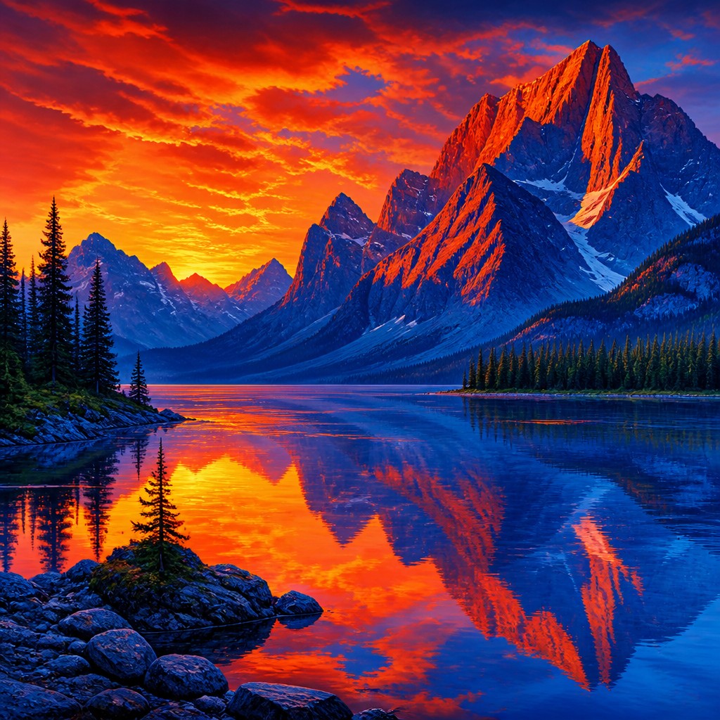
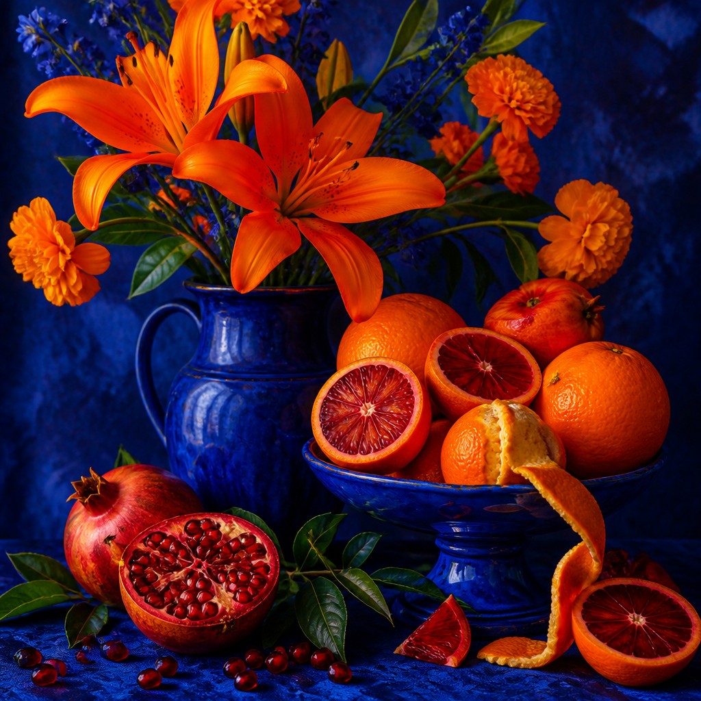
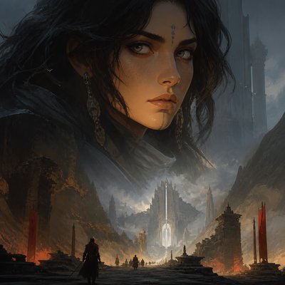
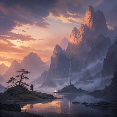
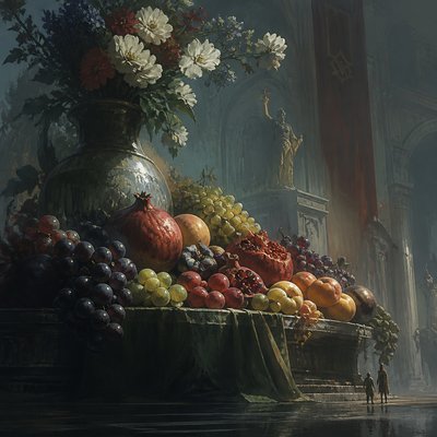
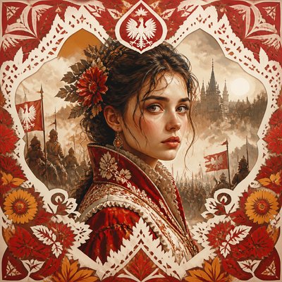
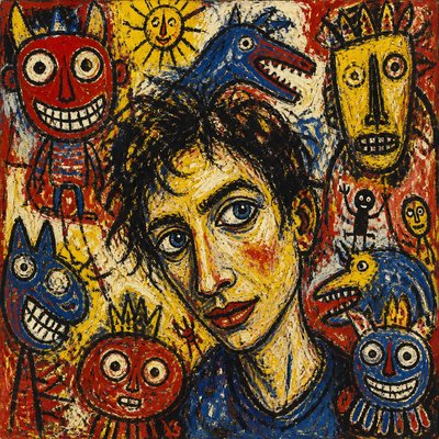
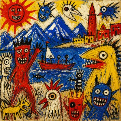
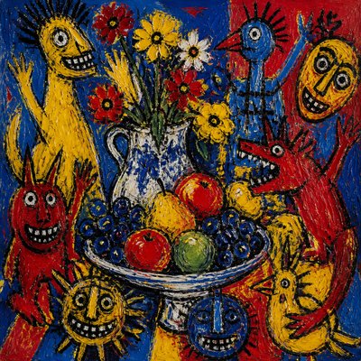
Complementary Color Gallery
Tap any artwork to explore it
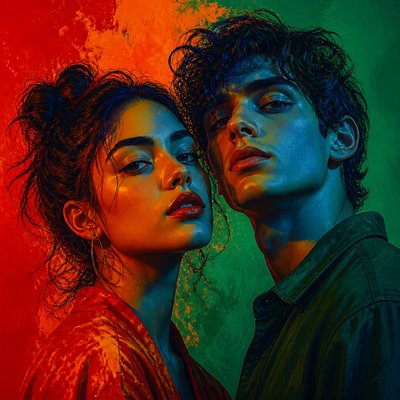
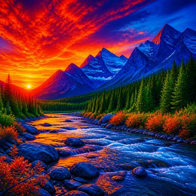
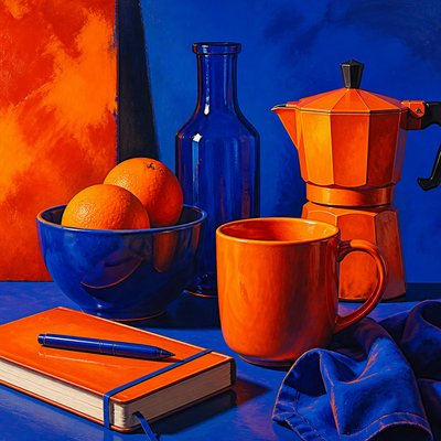
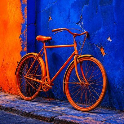
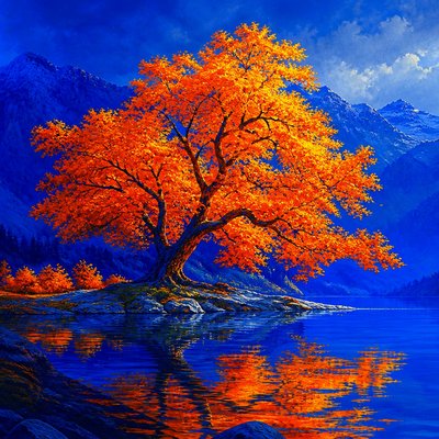
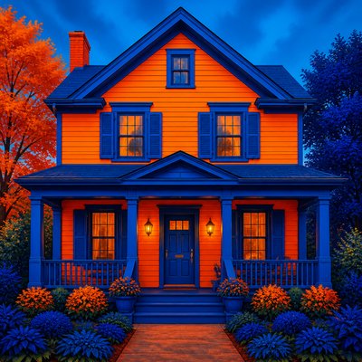
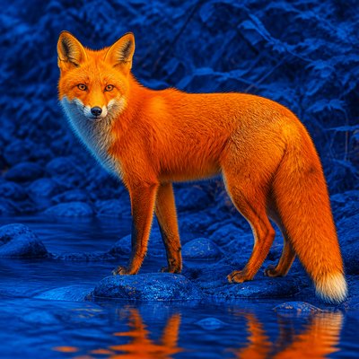
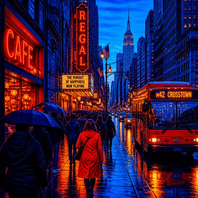
What is Complementary Color Art Style?
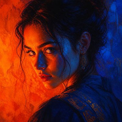
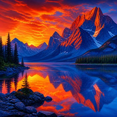
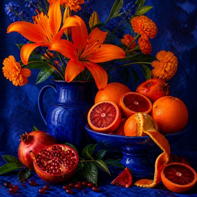
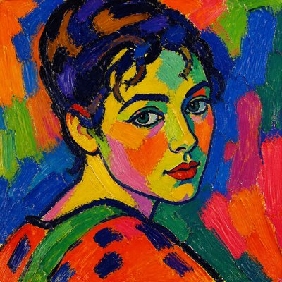
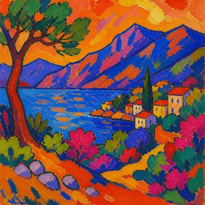
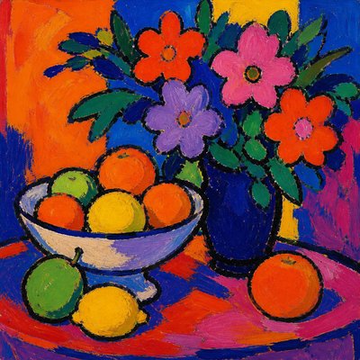
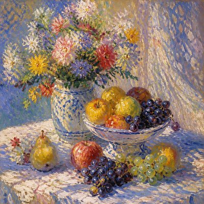
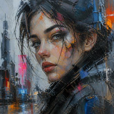
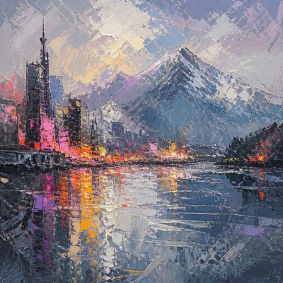
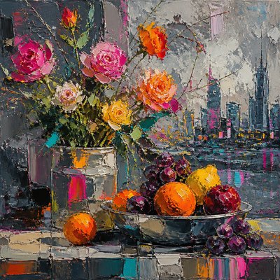
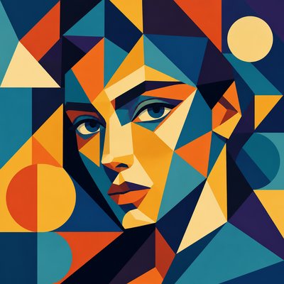
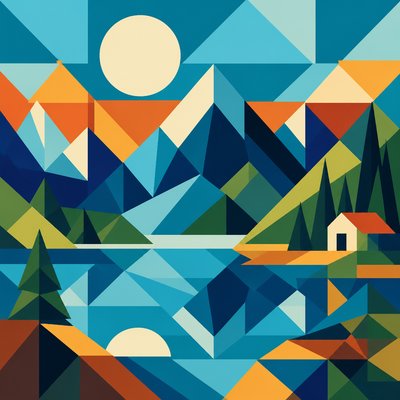
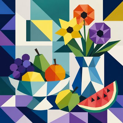
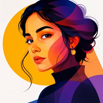
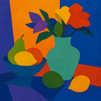
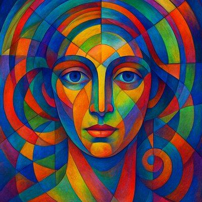
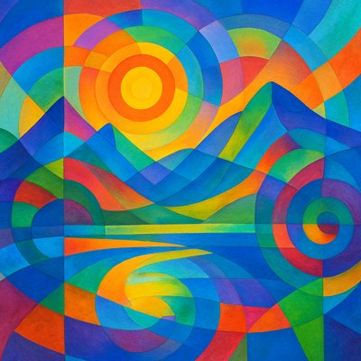
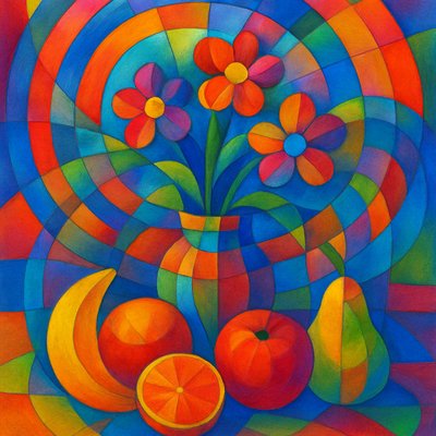
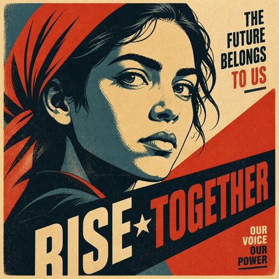
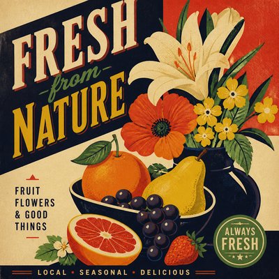
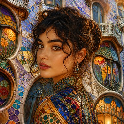
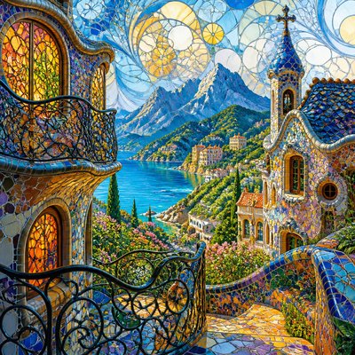
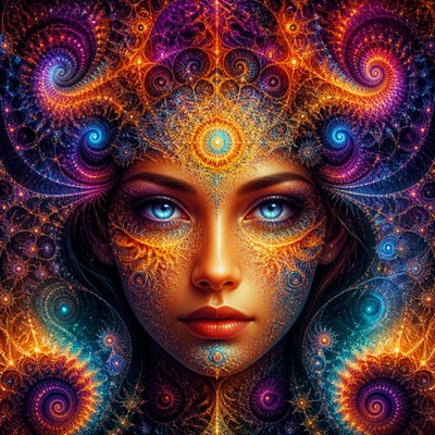
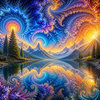
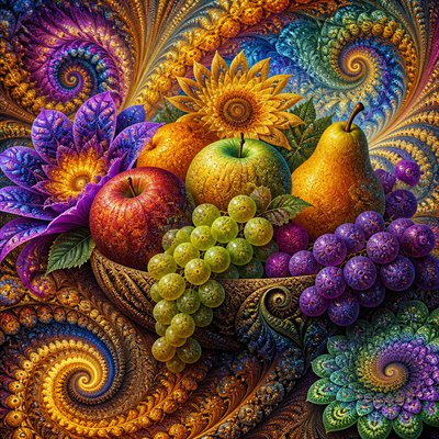
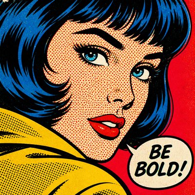
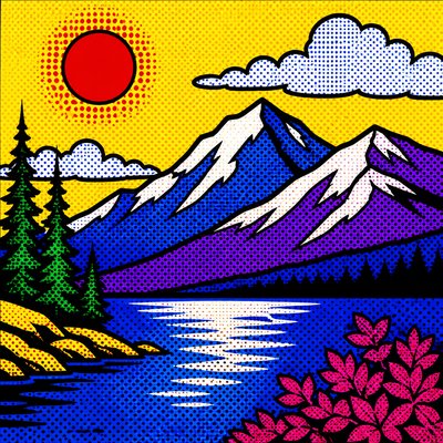
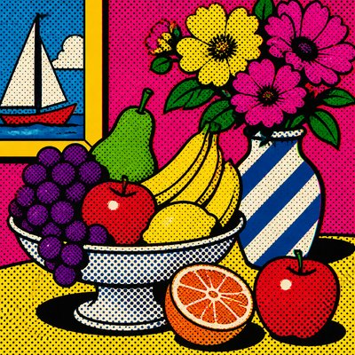
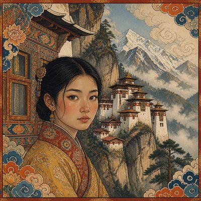
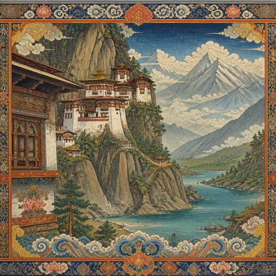
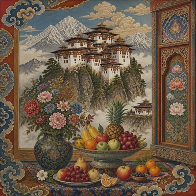
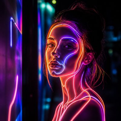
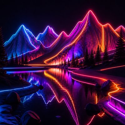
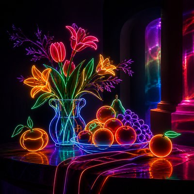
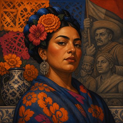
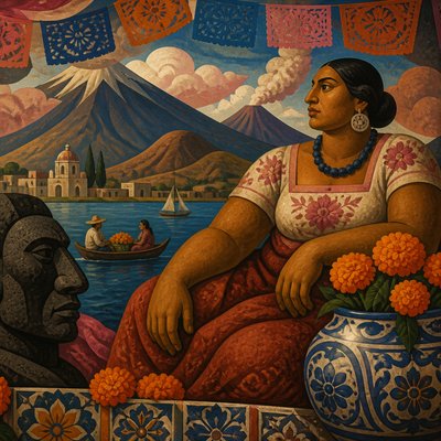
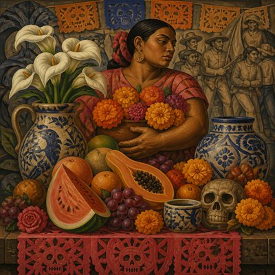
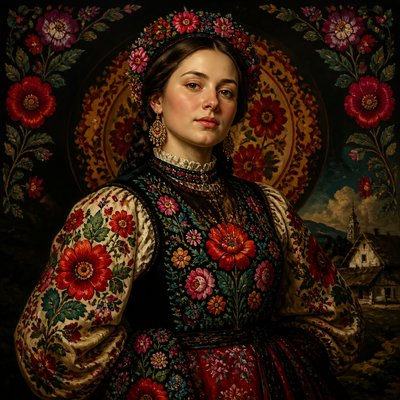
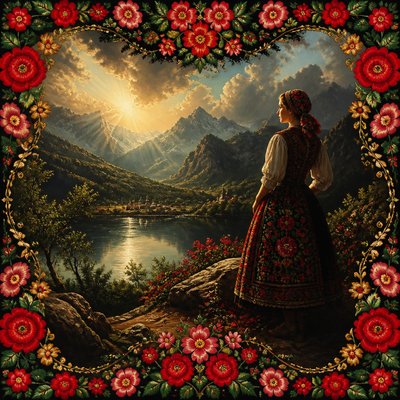
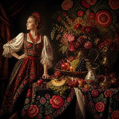
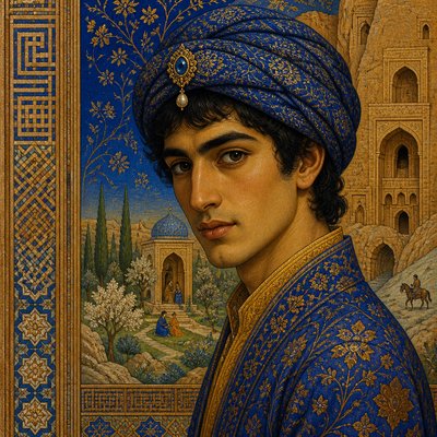
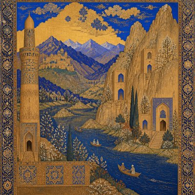
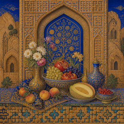
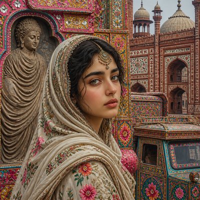
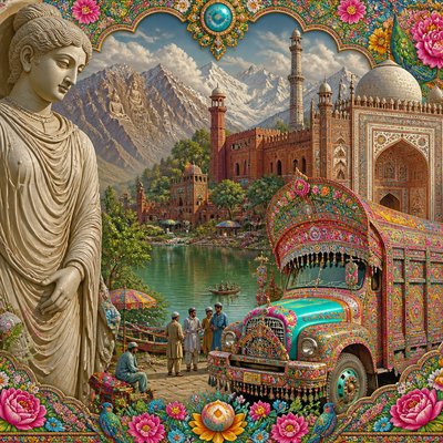
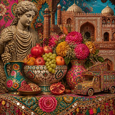
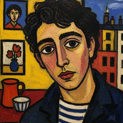
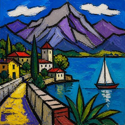
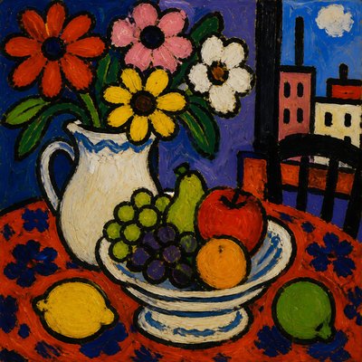
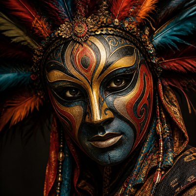
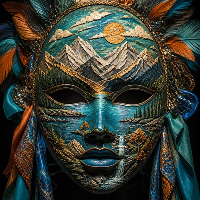
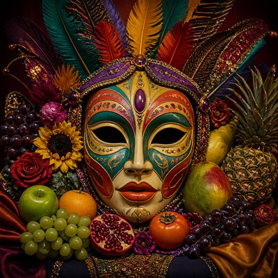
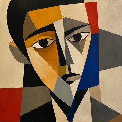
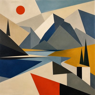
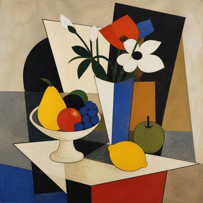
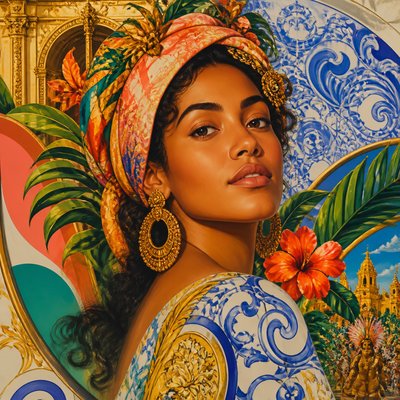
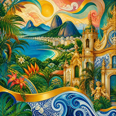
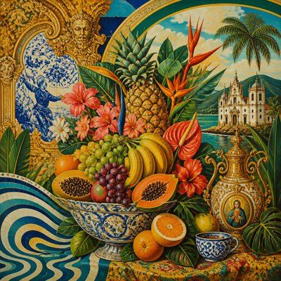
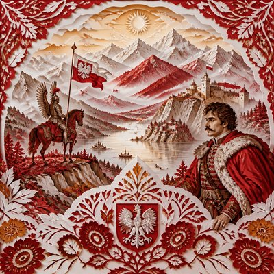
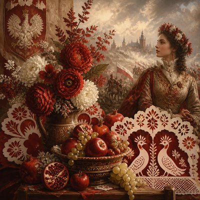
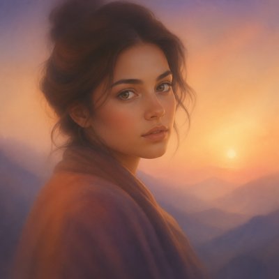
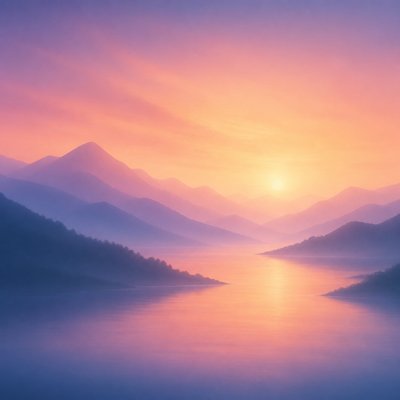
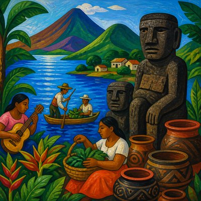
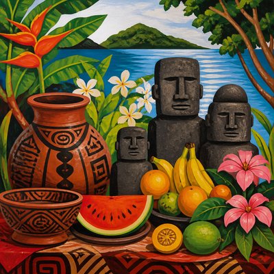
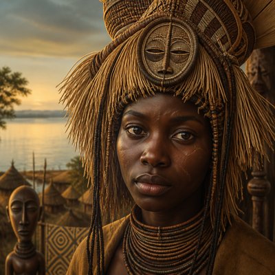
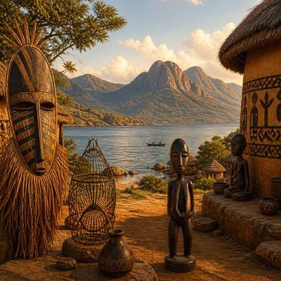
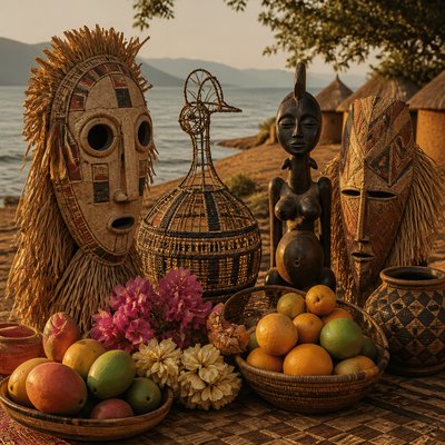
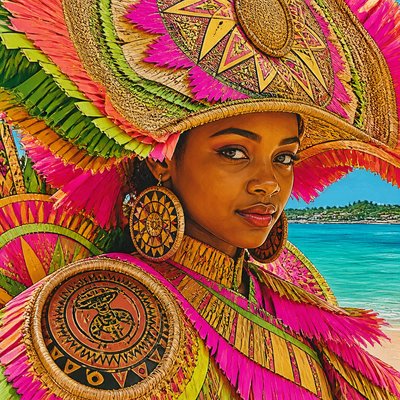
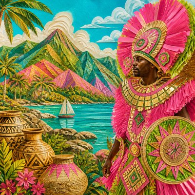
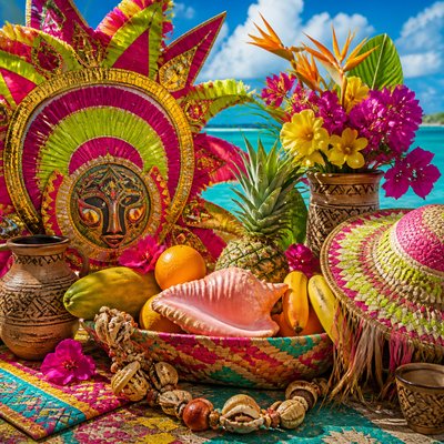
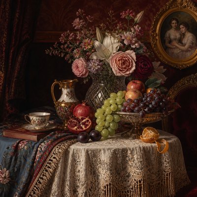
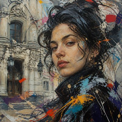
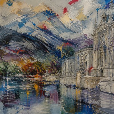
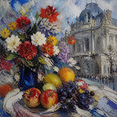
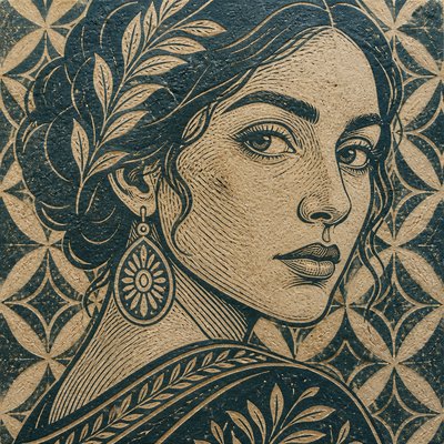
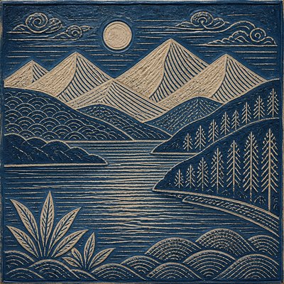
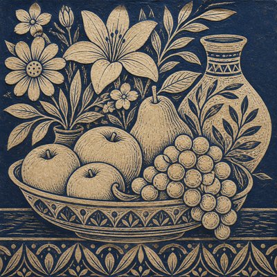
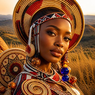
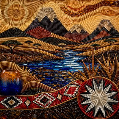
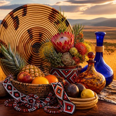
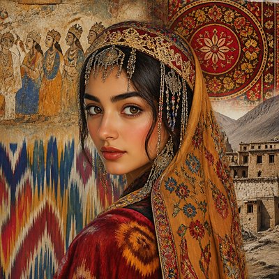
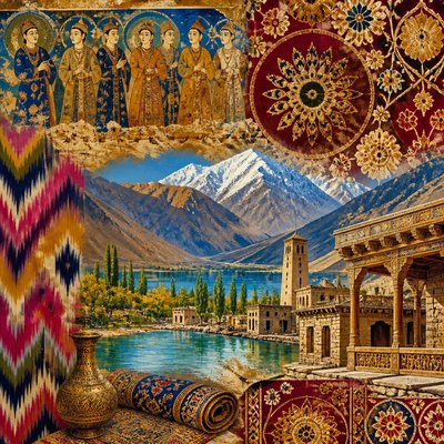
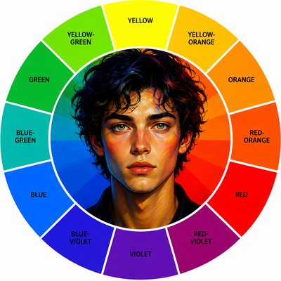
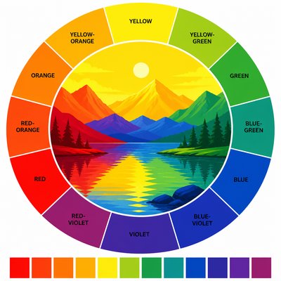
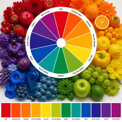
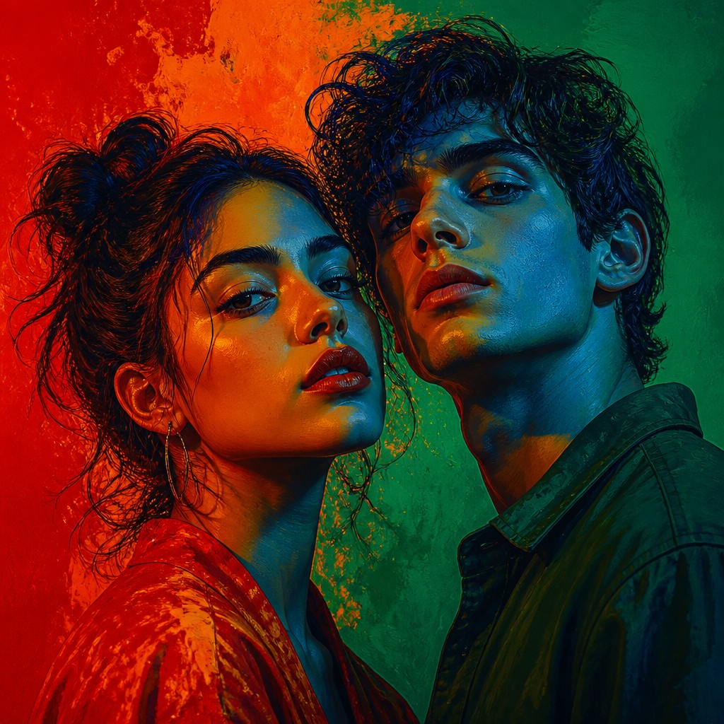
Complementary Color Art is an approach organized around opposing hues on the color wheel: orange and blue, red and green, or yellow and violet. Rather than treating color as a secondary layer, it makes the relationship between opposites the primary subject, using intense pairings to create visual energy, depth, and optical vibration.
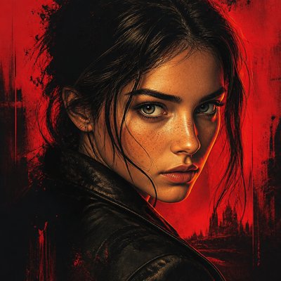
Its characteristic look comes from simultaneous contrast: a saturated color can make the complementary color beside it appear more vivid and active. Hard boundaries, glowing color fields, sharply divided forms, and selective areas of neutral shadow heighten this effect. The result may be representational, abstract, graphic, painterly, or digitally constructed, but it consistently relies on chromatic tension and deliberate color balance.
Try It On Your Photos
Upload any photo and convert it into Complementary Color Art Style — drag the sliders to compare before and after.


What Defines Complementary Color Art Style
The signature details, up close
Opposing hue pairs
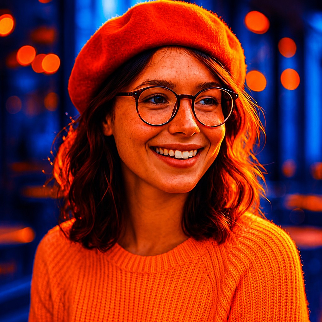
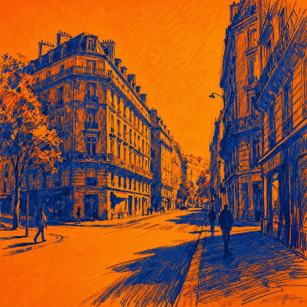
The composition is built around color-wheel opposites such as orange and blue, red and green, or yellow and violet. These pairings create immediate contrast without relying solely on changes in lightness.
High saturation
Colors are often pushed toward vivid, pigment-rich or digitally luminous extremes. Small areas of muted color may be retained to make the surrounding saturated hues feel even stronger.
Simultaneous-contrast shimmer
Adjacent complementary colors appear to intensify one another, producing vibrating edges and a sense of optical activity. Thin borders, closely placed marks, or abrupt transitions can exaggerate the effect.
Chromatic structure
Color relationships organize the image as strongly as line, perspective, or subject matter. A blue background may be deliberately balanced by orange forms, while red and green may divide the focal area into competing zones.
Graphic separation
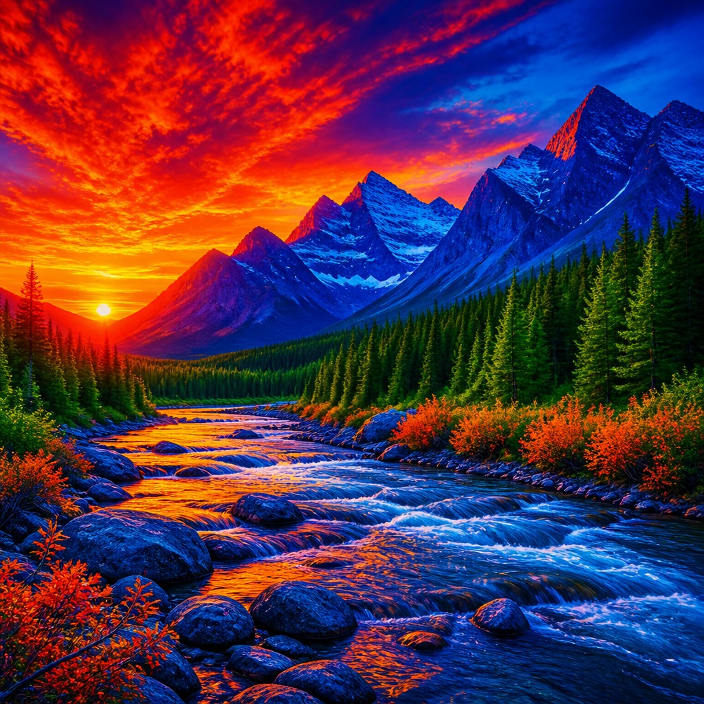
Clear silhouettes, hard-edged shapes, flat planes, and poster-like blocks are common. Softer transitions can also appear, but they usually remain subordinate to the central opposition of hues.
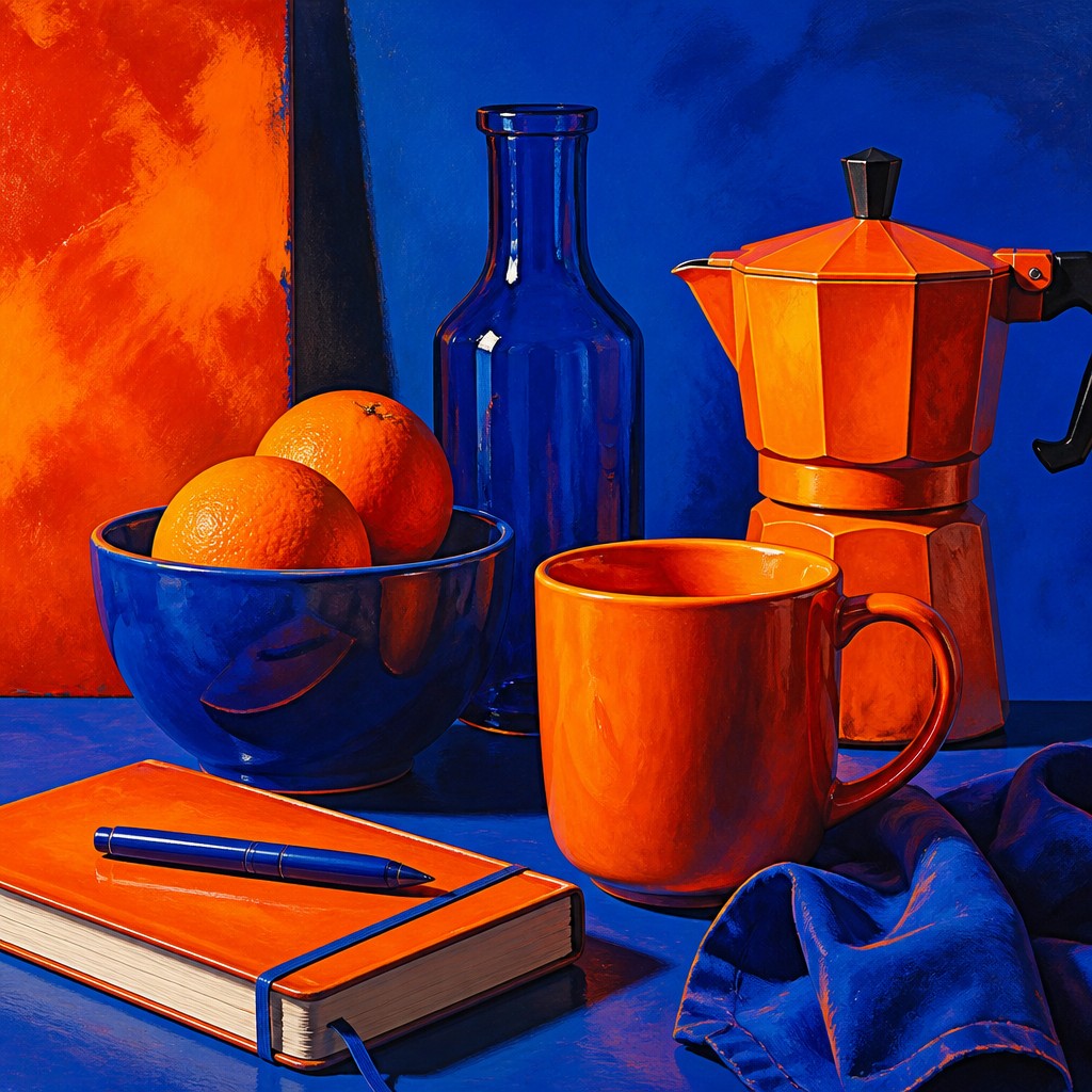
Expressive rather than naturalistic color
Objects do not need to retain their observed colors; skin, architecture, foliage, and shadows may all be reassigned to strengthen the palette. Color communicates mood, emphasis, and energy as much as physical appearance.
Try It
Create Videos in Complementary Color Art Style
Styles aren't just for stills — describe a scene or animate an image and get a short video rendered in Complementary Color. Press play to see this pond come to life.
Make a VideoComplementary Color Prompt Ideas
Start from an idea — each one opens the generator with the style ready to go. See all 40 Complementary Color prompts →
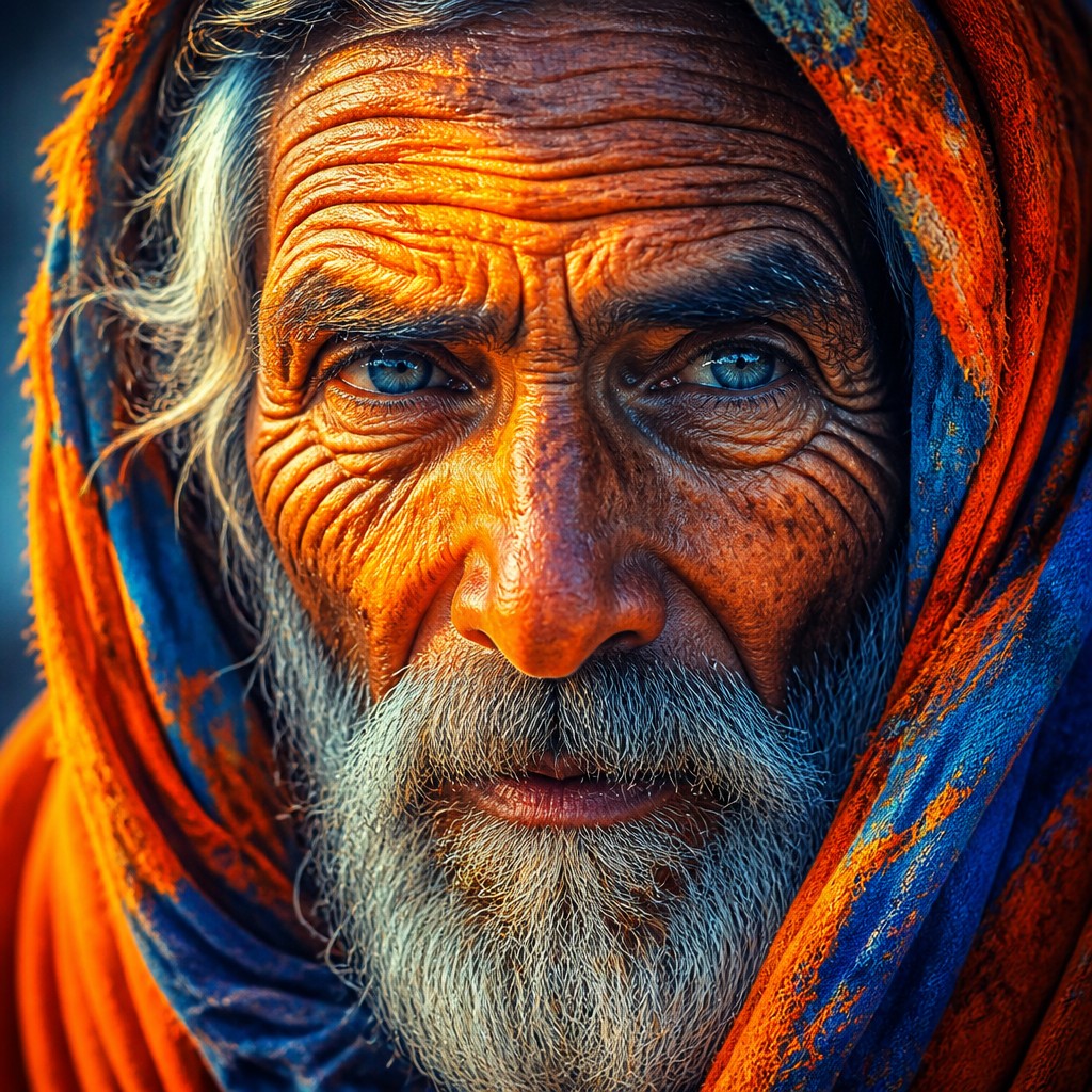
“close-up portrait of an elderly person with expressive weathered features”
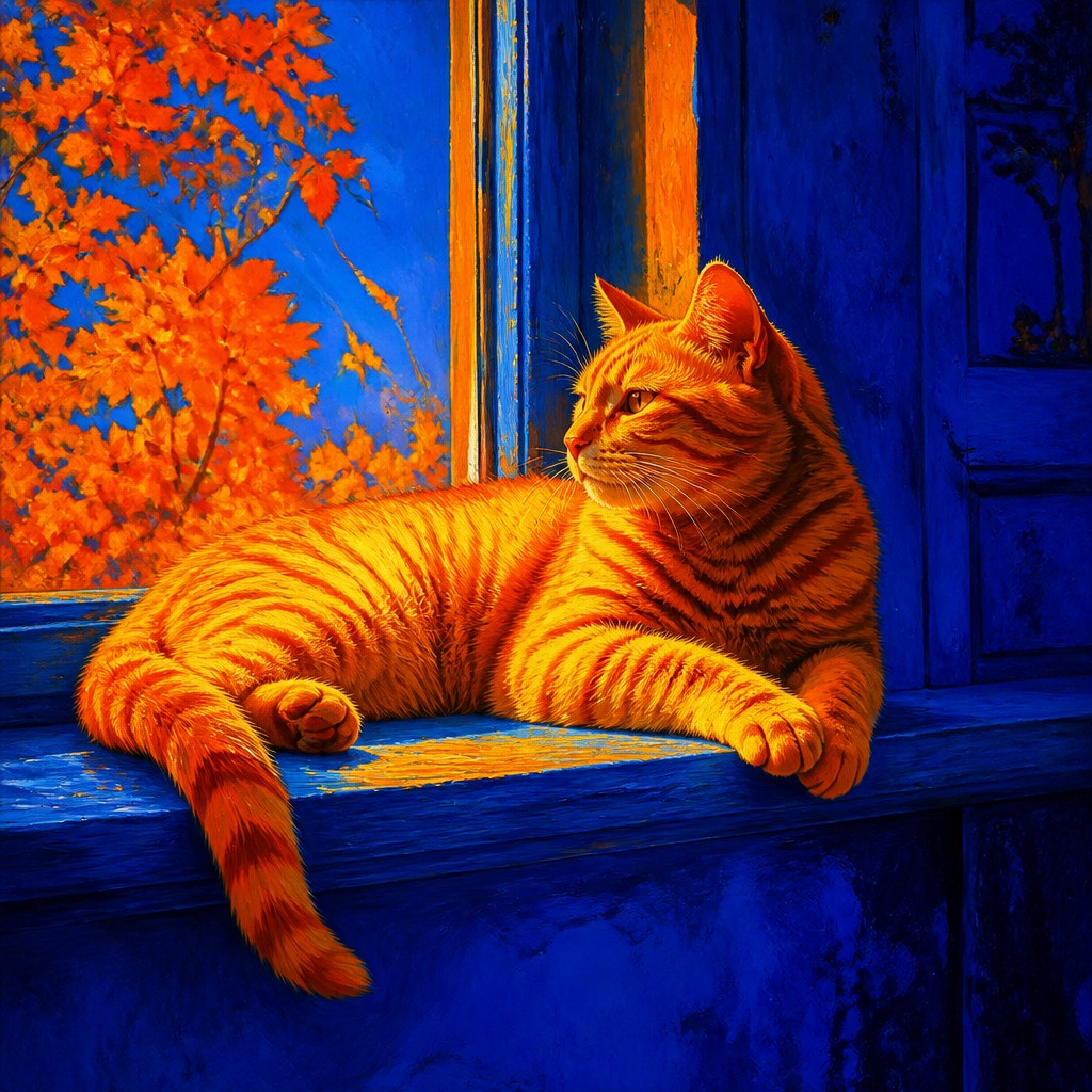
“a cat lounging in a sunlit window”
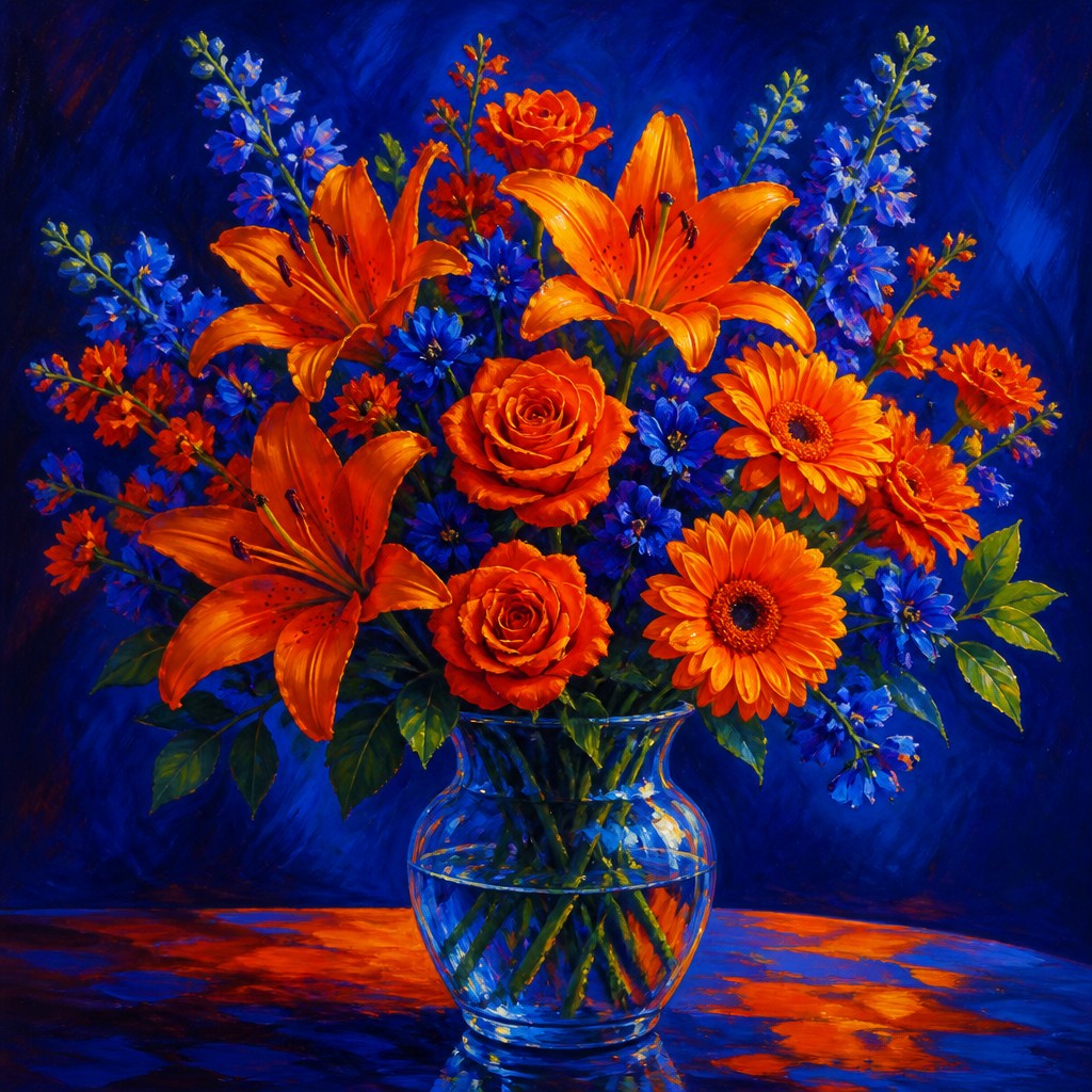
“bouquet of flowers in a glass vase”
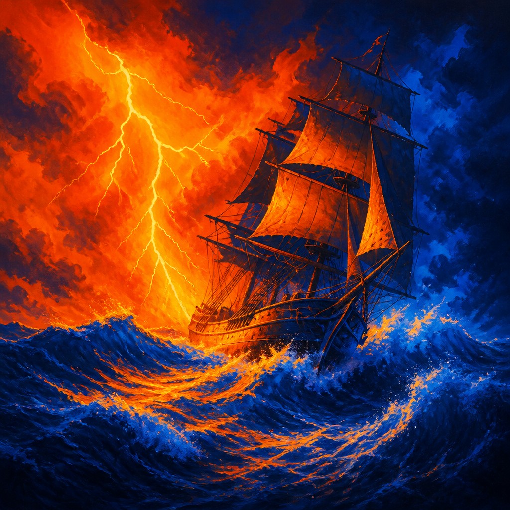
“sailing ship on a stormy sea”
How to Create Complementary Color Art
Master the craft step by step — or skip straight to creating. Read the full guide →
- 1
Choose one dominant complementary pair
Begin with a primary opposition such as blue-orange or red-green, then decide which hue will occupy most of the image. Use the second hue for the focal subject, highlights, shadows, or directional accents rather than distributing both equally everywhere.
- 2
Control value as well as hue
Complementary colors can lose clarity when both have identical brightness or when every area is equally intense. Establish a clear light-dark structure and reserve the highest saturation for focal points.
- 3
Build hard and soft edges deliberately
Use crisp boundaries for graphic impact and controlled blending for atmospheric depth. In paint, juxtapose unmixed strokes or glaze one hue over a carefully dried underlayer; digitally, use masks, blend modes, and selective edge sharpening.
- 4
Use neutral passages as breathing room
Grays, earth colors, white, or near-black areas can prevent complementary contrast from becoming visually exhausting. A restrained neutral passage also makes nearby saturated colors appear more luminous.
- 5
Adapt the method to photography or collage
Look for naturally opposing colors in clothing, architecture, signage, or landscape, then reinforce them through lighting, selective color adjustment, or compositing. Keep skin tones and important details readable if the image is intended to remain representational.
- 6
Write precise generation prompts
Specify the subject, the exact complementary pair, saturation, lighting, edge quality, and composition, such as “rain-soaked market at night, blazing orange umbrellas against deep blue streets, crisp silhouettes, luminous reflections.” Add constraints like limited palette, strong value structure, and no muddy intermediate colors when needed.
The Story
History & Origins of Complementary Color
Complementary Color Art is not a single historical movement with a fixed period or founding school. It is a contemporary descriptive style based on long-established color theory, including the color wheel, complementary contrast, and the study of how neighboring hues alter one another perceptually. These principles became increasingly important in modern European painting, particularly among late nineteenth- and early twentieth-century artists interested in optical color, divided brushwork, and the expressive independence of color.
The approach also draws from poster design, comic-book coloring, screen printing, pop imagery, theatrical lighting, and digital display systems. Contemporary artists and image-makers use it across painting, illustration, photography, motion graphics, and generative image-making, often intensifying traditional complementary relationships beyond naturalistic color.
Influences: The style is closely related to modern color theory, late nineteenth-century optical color experiments, Fauvist and Expressionist color, Pointillist and Divisionist mark-making, poster art, screen printing, pop art, comic-book palettes, theatrical lighting, and contemporary digital illustration. It also shares with abstract art an interest in color as an independent structural force, while its emphasis on opposing hues connects it to graphic design and visual perception studies.
Frequently Asked Questions
What defines Complementary Color Art?
It is defined by the deliberate use of color-wheel opposites as the main organizing principle of an image. High saturation, strong separation, and simultaneous contrast are common, though the style can be representational or abstract.
Which complementary colors are most commonly used?
Popular pairings include blue and orange, red and green, and yellow and violet. Near-complementary variations, such as cyan with warm red-orange or magenta with green, can create a similar effect while offering more control over mood and readability.
Is this the same as complementary color theory?
No. Complementary color theory describes a set of relationships within color perception and color systems, while Complementary Color Art is an aesthetic approach that uses those relationships as a prominent visual language. A work can use complementary colors without belonging entirely to this style.
How can I prevent the colors from looking muddy?
Avoid mixing complements equally in large areas, since they can neutralize one another. Keep opposing hues clean and adjacent where you want vibration, separate them with value or neutral space when necessary, and limit the number of competing accents.
Can photographs be made in this style?
Yes. Photographers can stage subjects with opposing color schemes, use colored gels or lighting, and apply selective color grading afterward. A controlled palette usually works better than increasing saturation across the entire image.
Where is this style commonly used?
It appears in painting, editorial illustration, posters, album and event graphics, fashion imagery, animation, comics, photography, murals, and digital compositions. Its immediate contrast makes it useful where an image must read quickly from a distance.
Create your first Complementary Color artwork
Describe anything — or upload a photo — and see it in Complementary Color Art Style in seconds.
Related Styles
Discover similar art styles