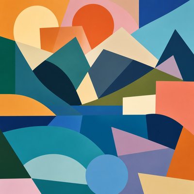
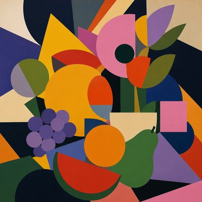
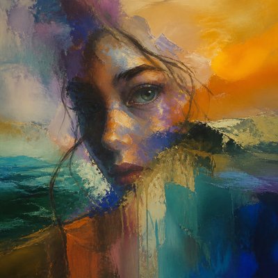
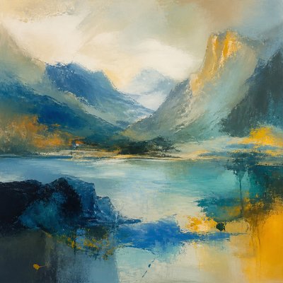
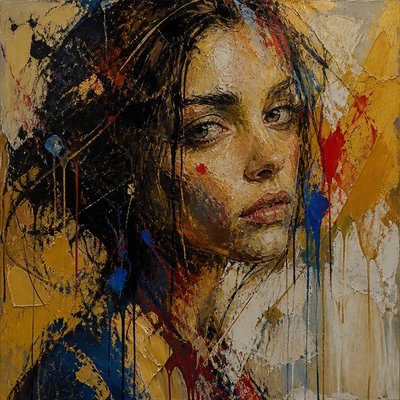
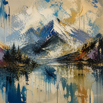
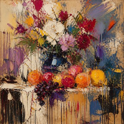
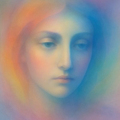
Color Field Abstract Art Style
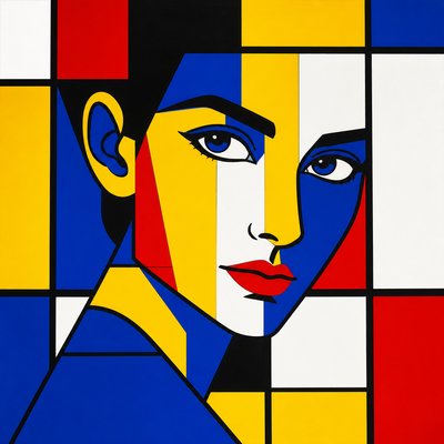
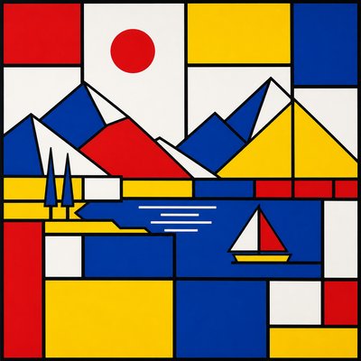
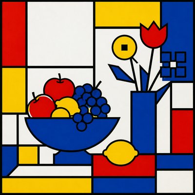
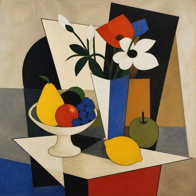
Abstract art of large flat color fields, meditative depth, and emotional impact through pure chromatic relationships.
Instantly rendered in Color Field Abstract — or transform a photo
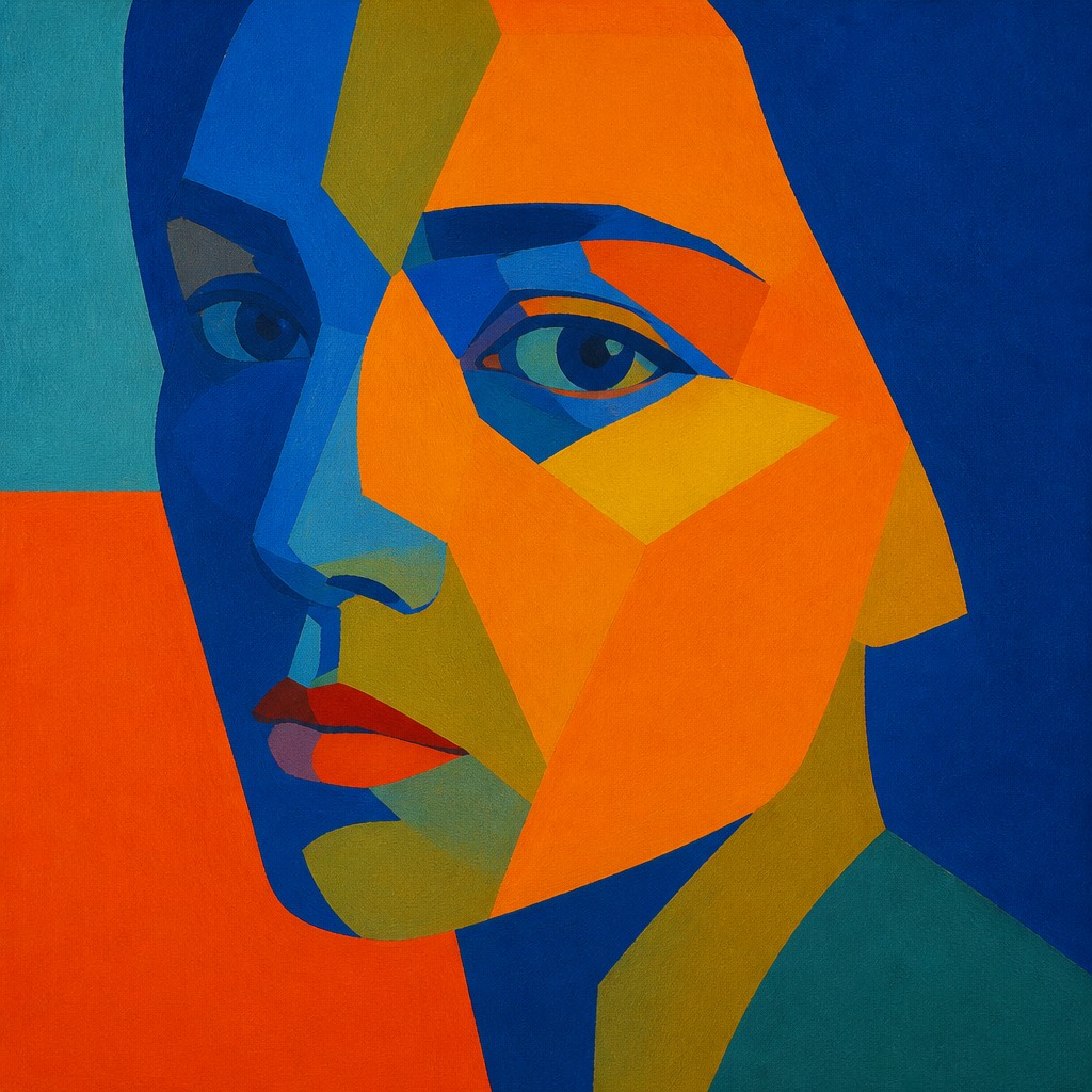
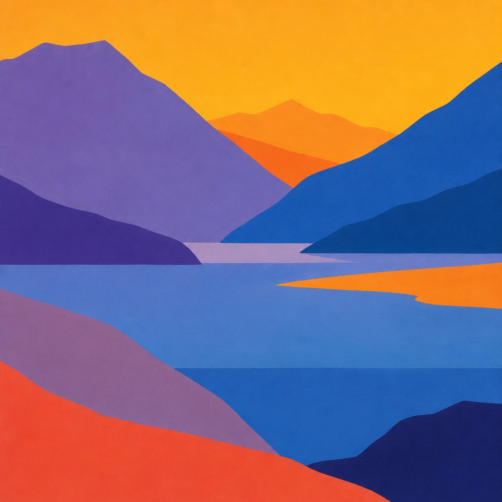
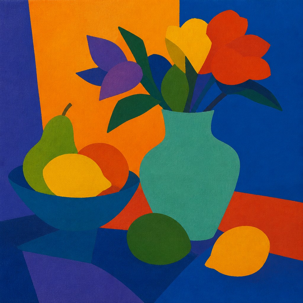
Color Field Abstract Gallery
Tap any artwork to explore it
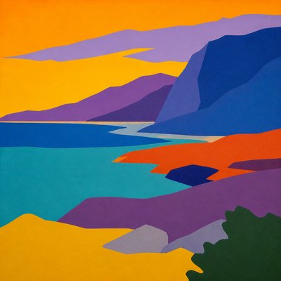
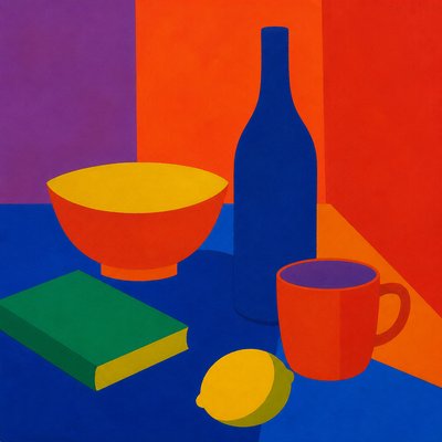
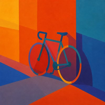

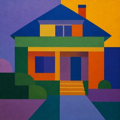
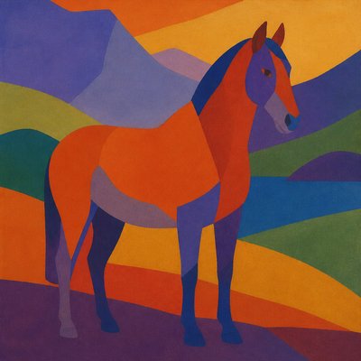
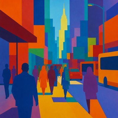
What is Color Field Abstract Art Style?
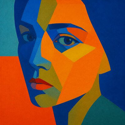
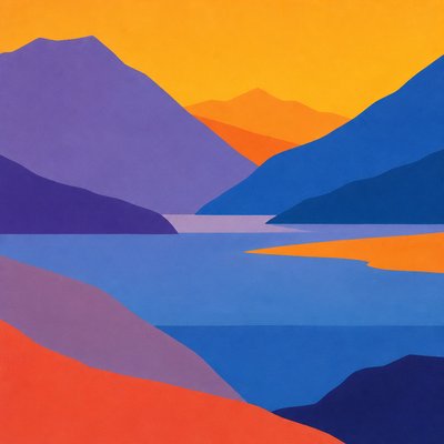
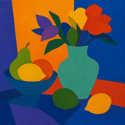
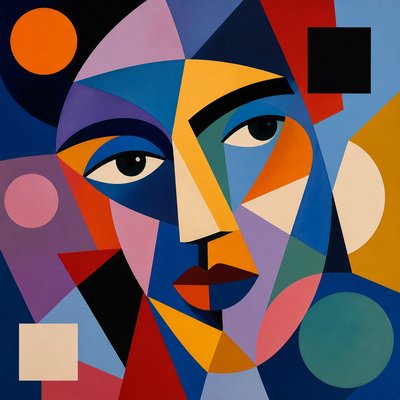
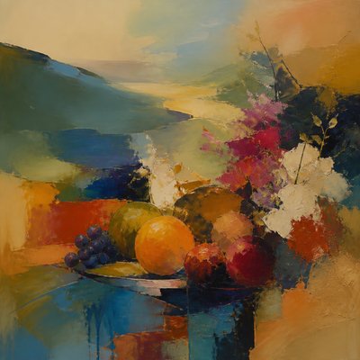
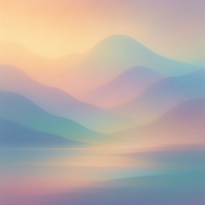
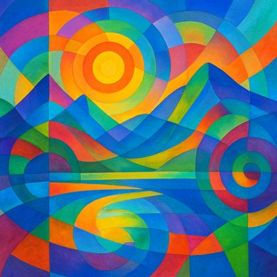
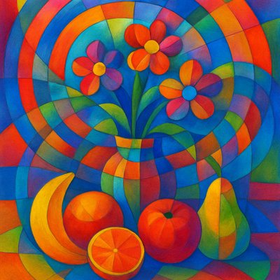
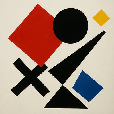
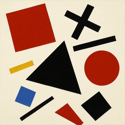
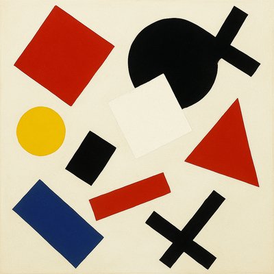
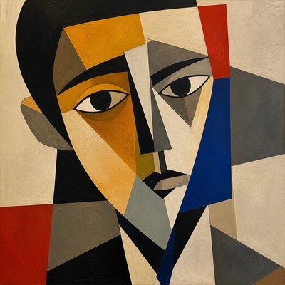
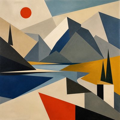
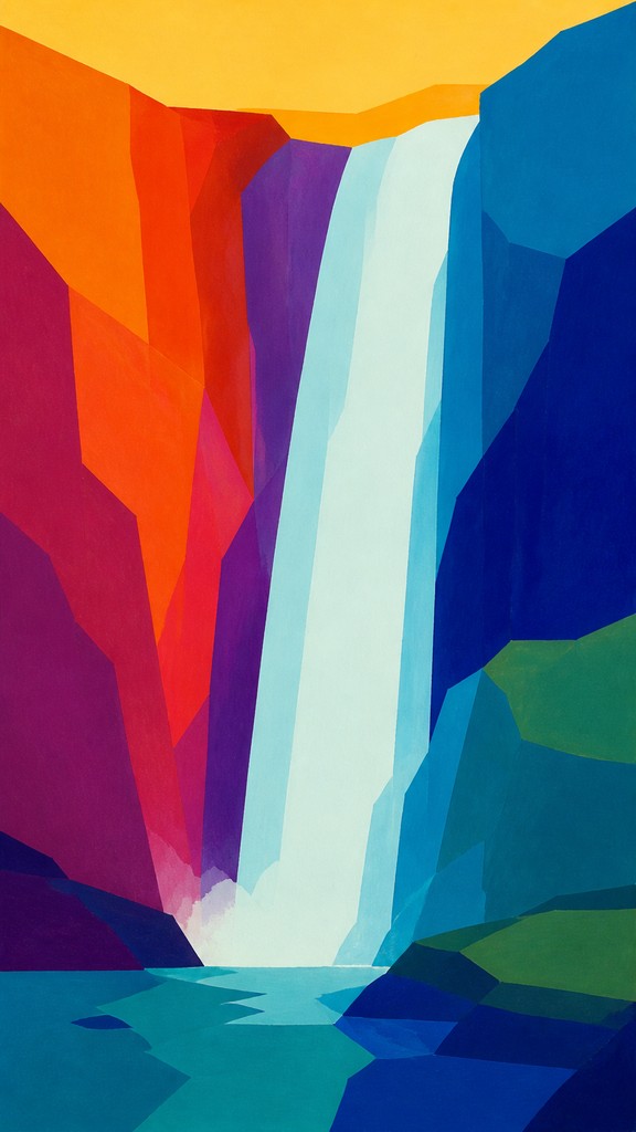
Color field abstract art is a non-representational style defined by broad, unmodulated areas of color arranged to produce atmosphere, tension, and emotional resonance. Rather than depicting objects, landscapes, or figures, it treats color as the primary subject, letting scale, saturation, and edge relationships create the composition’s meaning.
Its visual identity is usually spare and expansive: large rectangles, soft-edged stains, or hard-edged color zones that seem to hover, advance, or recede across the surface. The effect depends on optical interaction between hues, especially warm and cool contrasts, complementary pairings, and subtle shifts in value. Because the forms are simplified to color masses, the viewer often experiences the work as immersive and contemplative, with feeling emerging from chromatic balance rather than narrative.
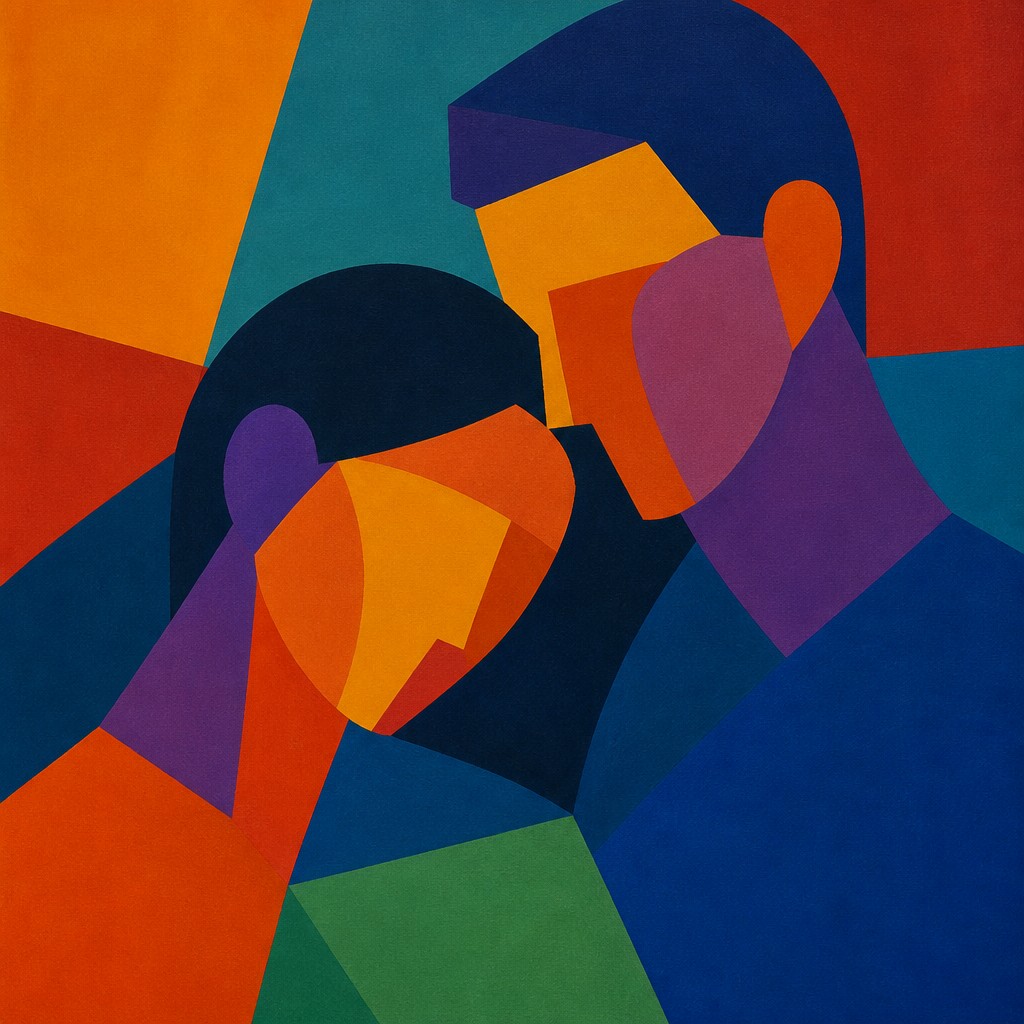
Try It On Your Photos
Upload any photo and convert it into Color Field Abstract Art Style — drag the sliders to compare before and after.
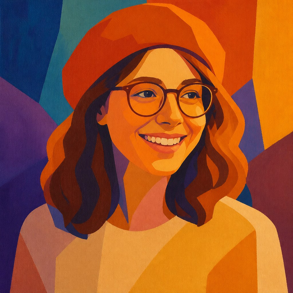

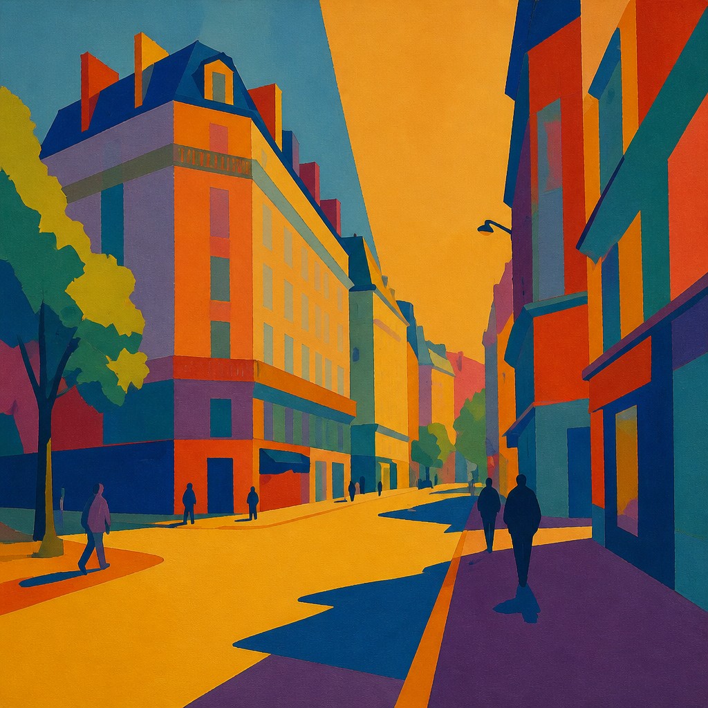

What Defines Color Field Abstract Art Style
The signature details, up close
Large uninterrupted color areas
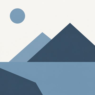
The composition is built from expansive zones of flat or nearly flat color. These fields dominate the image and minimize the presence of line, texture, or figure.
Chromatic depth instead of illusionistic space
Depth is created by color temperature, saturation, and adjacency rather than by traditional perspective. Warm hues may advance while cool hues recede, producing a subtle spatial pulse.
Hard or softened boundaries
Edges may be sharply defined or gently feathered, but they usually remain simple and legible. The boundary between zones becomes a key structural element.
Limited formal vocabulary
Shapes are often reduced to rectangles, bands, verticals, or floating blocks. The restraint allows the viewer to focus on proportion and color interaction.
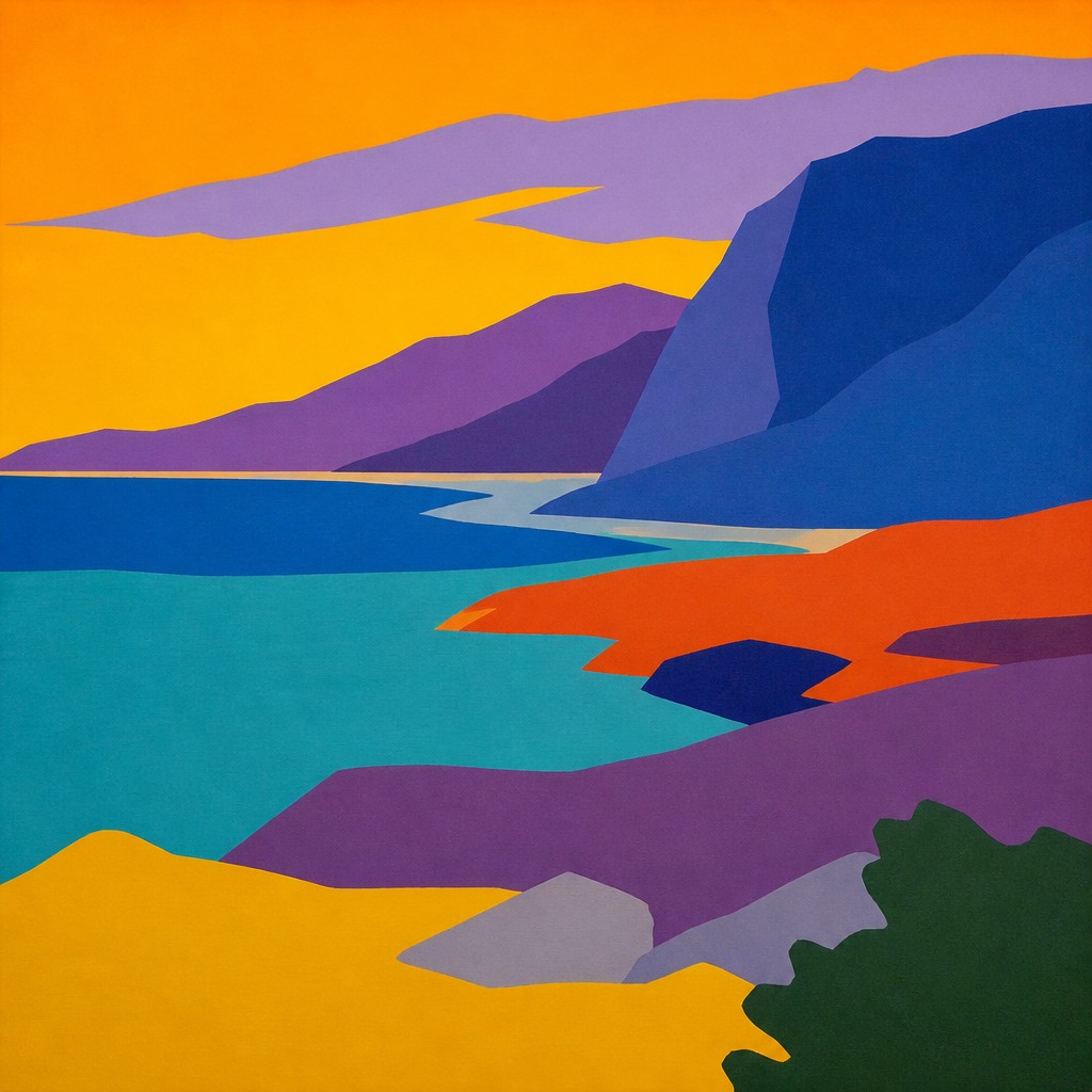
Meditative emotional tone
The style often feels quiet, solemn, luminous, or contemplative. The emotional content comes from the behavior of color and scale rather than from narrative imagery.
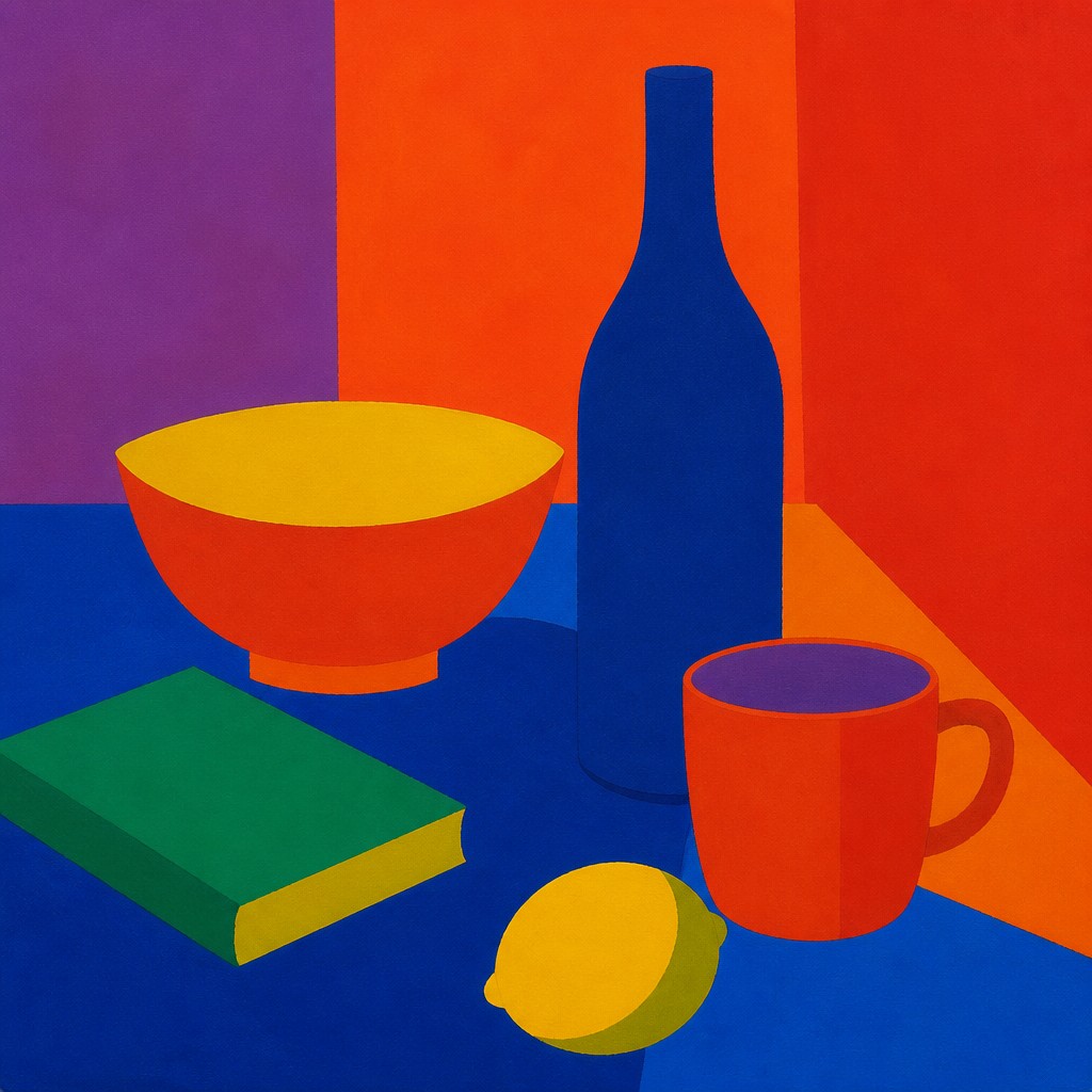
Matte surface and canvas presence
Many works preserve a visible sense of the support beneath the paint, including subtle grain, staining, or brush residue. This keeps the surface tactile even when the composition is highly simplified.
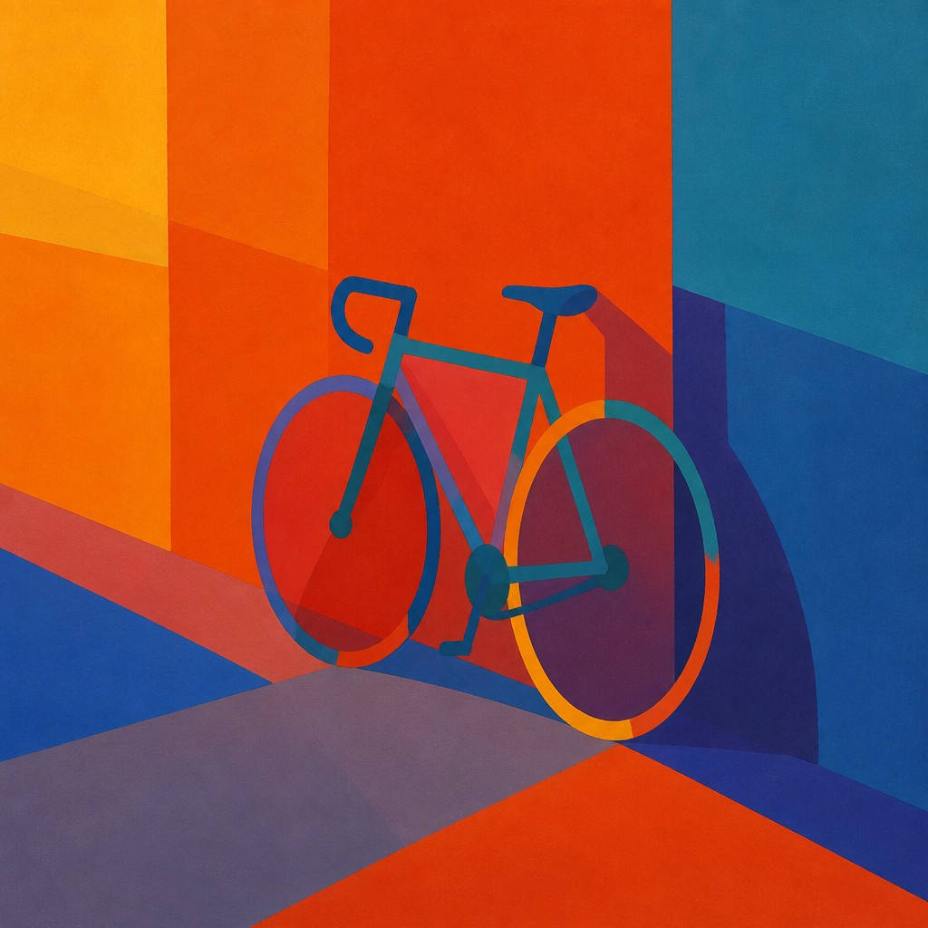
Balance through color relationships
Complementary and analogous harmonies are used to stabilize the composition. Visual weight is distributed through hue, value, and saturation rather than through detailed forms.
Try It
Create Videos in Color Field Abstract Art Style
Styles aren't just for stills — describe a scene or animate an image and get a short video rendered in Color Field Abstract. Press play to see this pond come to life.
Make a VideoColor Field Abstract Prompt Ideas
Start from an idea — each one opens the generator with the style ready to go. See all 40 Color Field Abstract prompts →
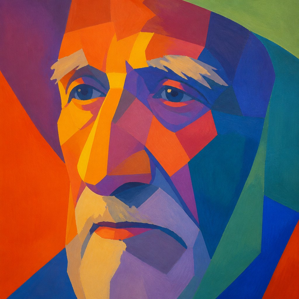
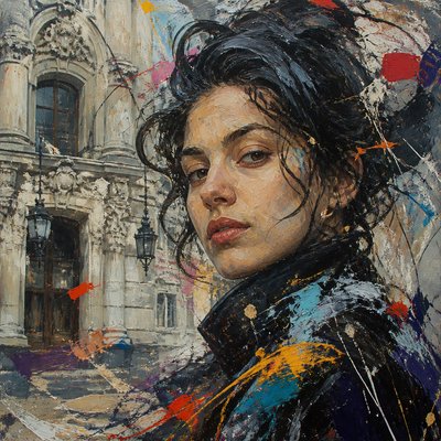
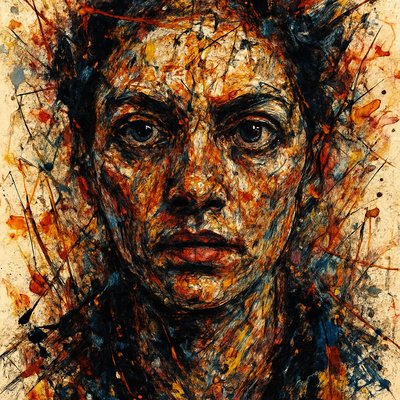
“close-up portrait of an elderly person with expressive weathered features”
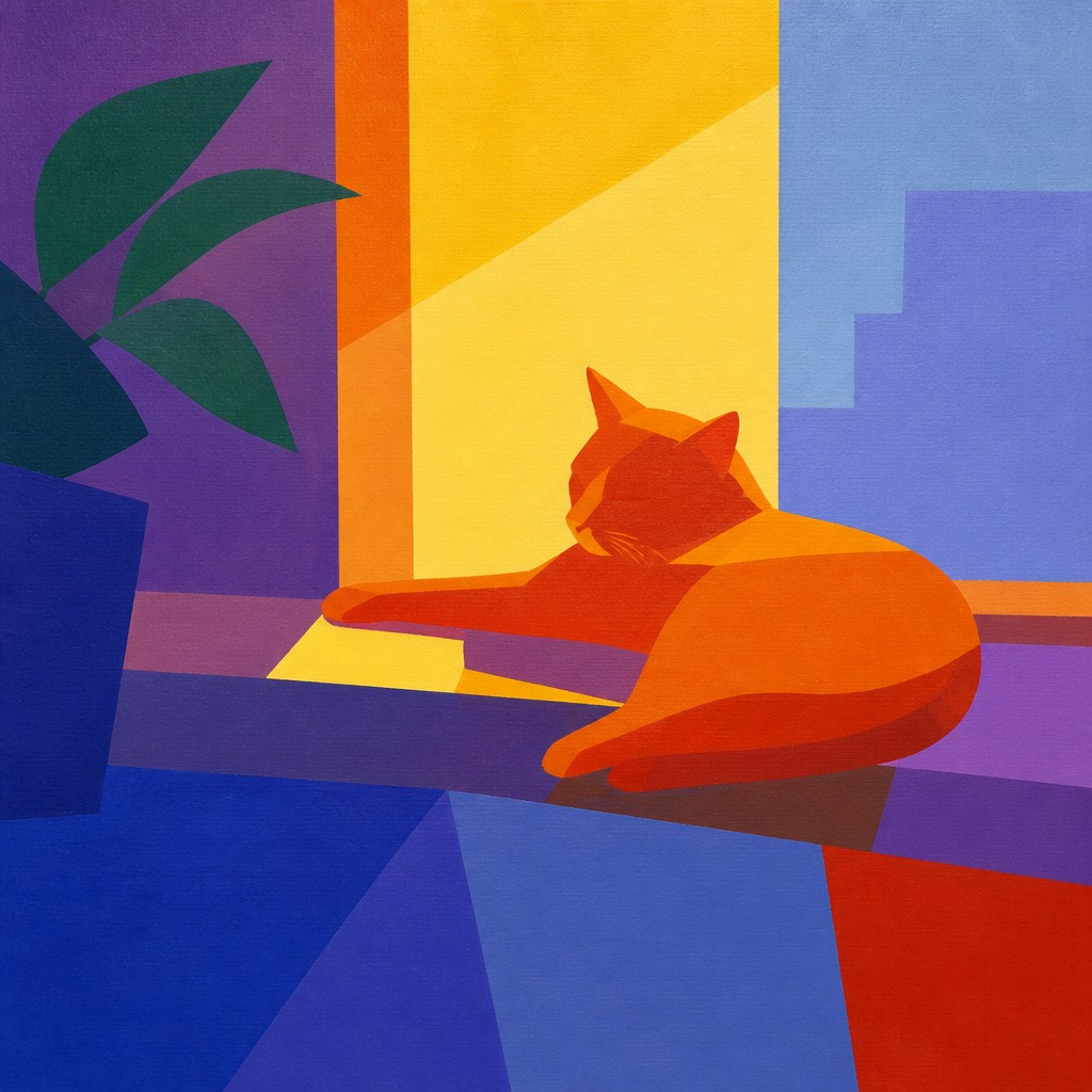
“a cat lounging in a sunlit window”
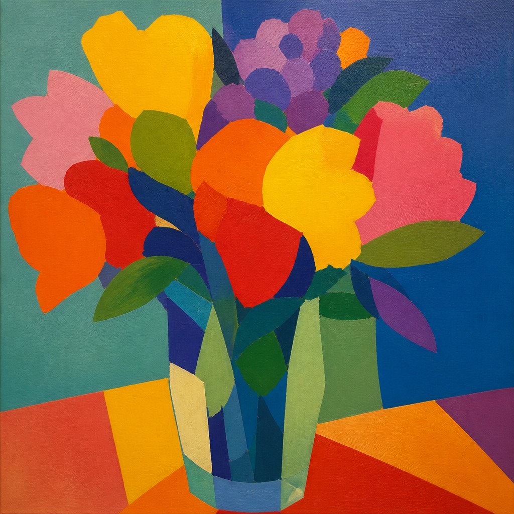
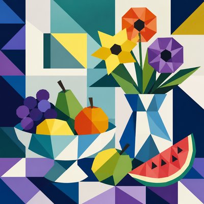
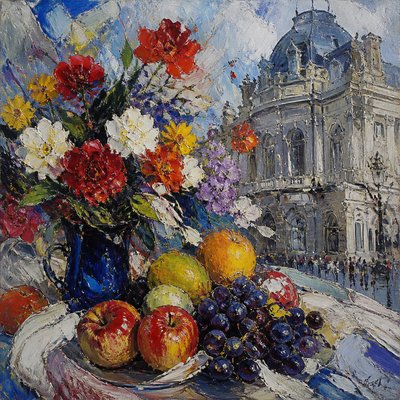
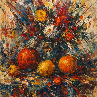
“bouquet of flowers in a glass vase”
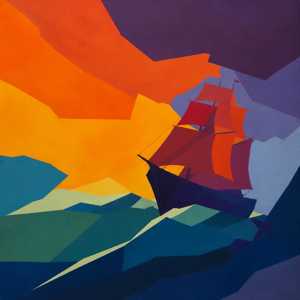
“sailing ship on a stormy sea”
How to Create Color Field Abstract Art
Master the craft step by step — or skip straight to creating. Read the full guide →
- 1
Start with one dominant color structure
Begin by blocking in 2–5 large areas of color and resist adding objects or detail. Think in terms of proportion and visual weight, since the composition must carry the image without representational anchors.
- 2
Use controlled edges and flat application
In traditional painting, apply paint evenly with rollers, broad brushes, staining, or masking to keep surfaces uniform. In digital work, use crisp selection tools or large flat fills, then soften only where a transition is intentionally needed.
- 3
Design with temperature and saturation
Plan the image around warm-cool contrasts, complementary pairings, and subtle value shifts. Small changes in chroma can create the sensation of motion, recession, or emotional tension even when the forms remain static.
- 4
Keep texture minimal but intentional
A slight canvas grain, paper tooth, or matte finish can add physical presence without distracting from the color fields. Avoid heavy patterning or noisy detail unless the goal is to soften the abstraction’s austerity.
- 5
For prompt-based generation, specify the color logic
Describe the subject only if you want a source of inspiration, then add instructions for large flat planes, hard-edged color zones, and a restrained, luminous abstraction. Mention palette relationships such as complementary harmony, warm-cool contrast, or saturated monochrome to steer the result.

The Story
History & Origins of Color Field Abstract
Color field painting emerged in the mid-20th century within American abstract art, especially after the Second World War, as artists moved away from gestural expressionism and toward large-scale fields of saturated color. It is closely associated with Abstract Expressionism, though it developed its own identity through leading mid-20th-century color field painters and other influential postwar abstract artists. Their work varied in technique, but all shared an emphasis on color as the main vehicle for structure and emotion.
Its lineage also reaches back to earlier modernist experiments in abstraction and the reduction of form, including the color innovations of major modernist painters known for bold color use, the spatial flatness of modernist painting, and the influence of stained, poured, or soaked surfaces. Later developments in minimalist and post-painterly abstraction extended its formal concerns, while contemporary digital and graphic practices have adapted its language of large chromatic planes for posters, interfaces, and image generation.
Influences: Color field painting is closely related to Abstract Expressionism and post-painterly abstraction, with major canonical figures including leading mid-20th-century color field painters and other influential postwar abstract artists. It also draws from modernist color theory, the flattening of pictorial space in early 20th-century painting, and later minimalist approaches that favored reduction, clarity, and large-scale visual impact.
Frequently Asked Questions
What defines color field abstract art?
It is defined by large areas of color that function as the main subject of the work. Instead of depicting recognizable objects, it uses hue, saturation, scale, and edge relationships to generate depth and emotion.
How is it different from abstract expressionism?
Color field art is often associated with Abstract Expressionism, but it is less gestural and less visibly dramatic than action painting. Where action painting emphasizes energetic brushwork and spontaneity, color field work emphasizes broad, unified chromatic zones and a quieter visual rhythm.
How is it different from minimalism?
Both styles can use simple forms, but minimalism tends to emphasize objecthood, serial structure, and reduced physical presence. Color field art is usually more atmospheric and emotional, using color interaction to create a sense of immersion rather than strict formal detachment.
Can this style include shapes or figures?
Yes, but they are usually heavily simplified and subordinated to the color structure. If figures appear, they often read as silhouettes, fragments, or color masses rather than descriptive imagery.
What makes this style feel so meditative?
The meditative effect comes from the lack of narrative distraction and the slow optical experience of looking at large color areas. Viewers tend to notice subtle shifts in temperature, edge, and balance over time, which encourages sustained attention.
Where is this style commonly used today?
It appears in gallery painting, large-scale prints, album art, editorial design, interiors, and digital imagery that wants an elegant abstract atmosphere. Its language also translates well to contemporary image-making because it remains legible even when reduced to simple color relationships.

Create your first Color Field Abstract artwork
Describe anything — or upload a photo — and see it in Color Field Abstract Art Style in seconds.
Make Something with Color Field Abstract
Compare Color Field Abstract
Related Styles
Discover similar art styles