Color Field Abstract vs Color Field Minimalism: What's the Difference?
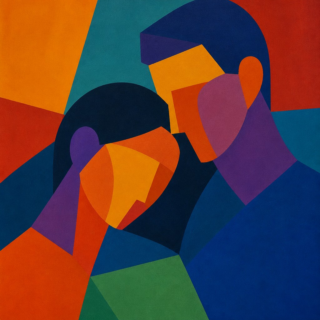
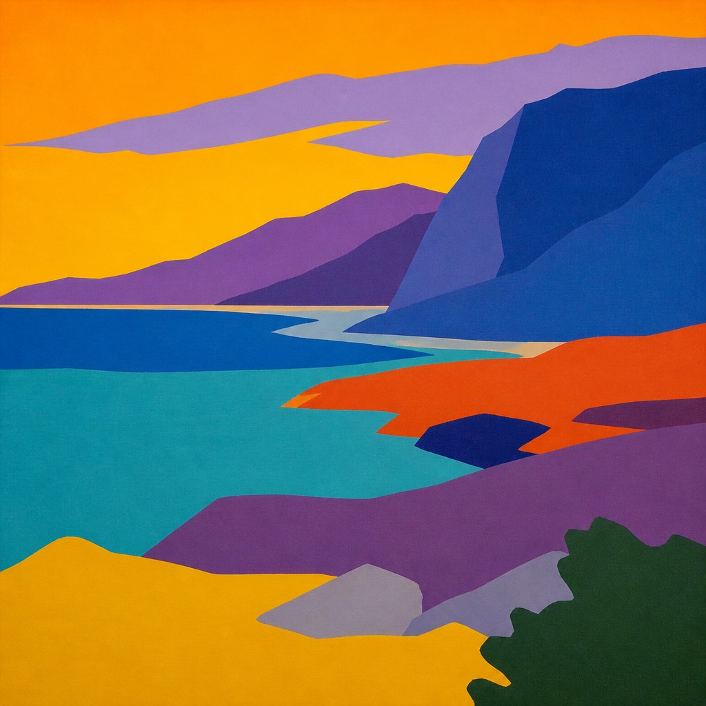
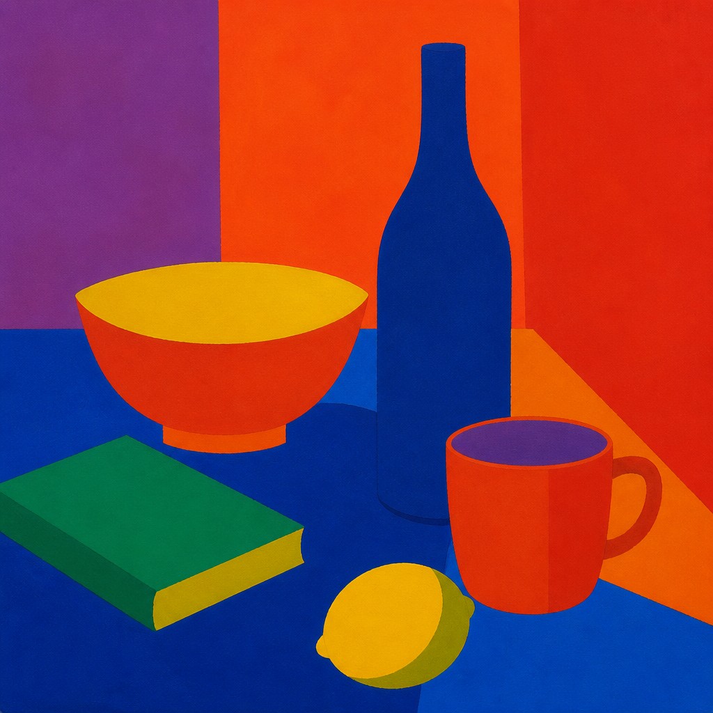
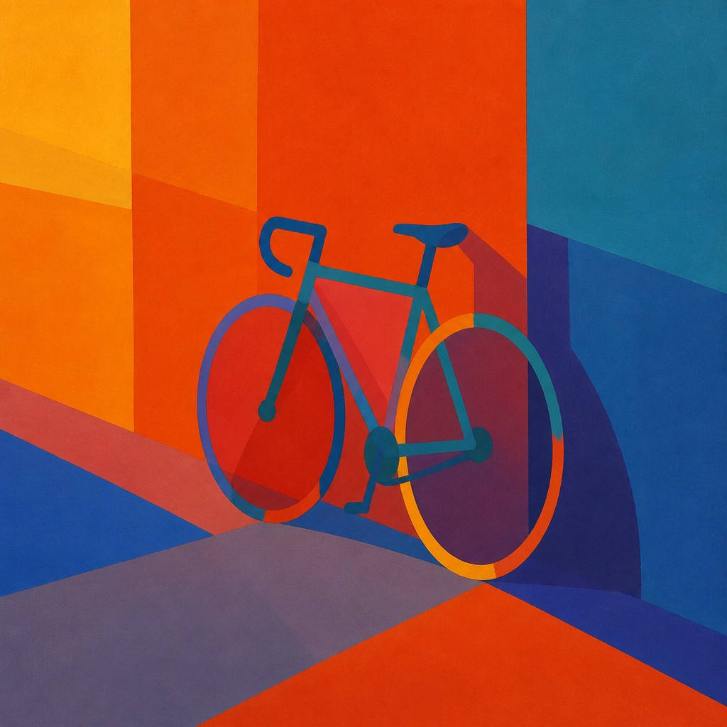
Color Field Abstract Art Style uses expansive areas of color to create a quiet, immersive experience. Its compositions often feel atmospheric and meditative, with soft edges or subtle transitions that let hue, scale, and proportion carry the emotional weight.
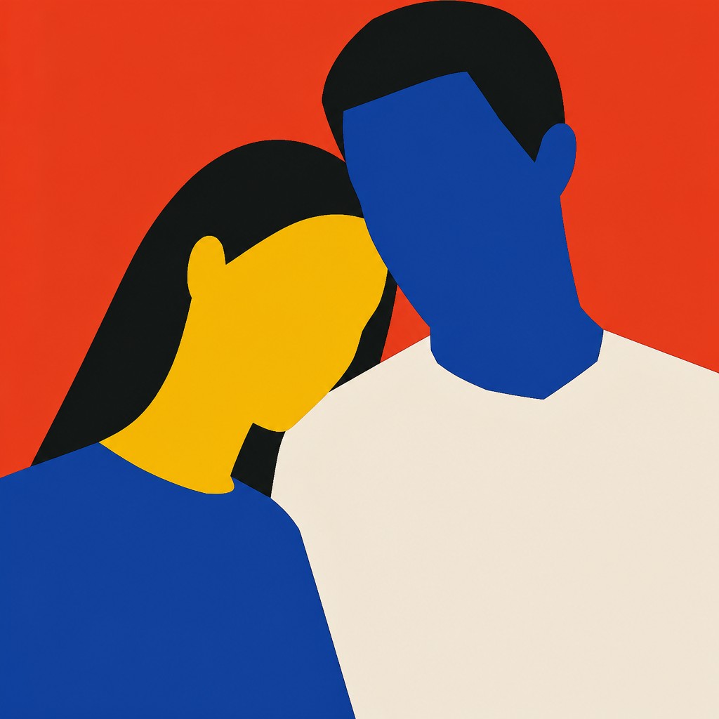
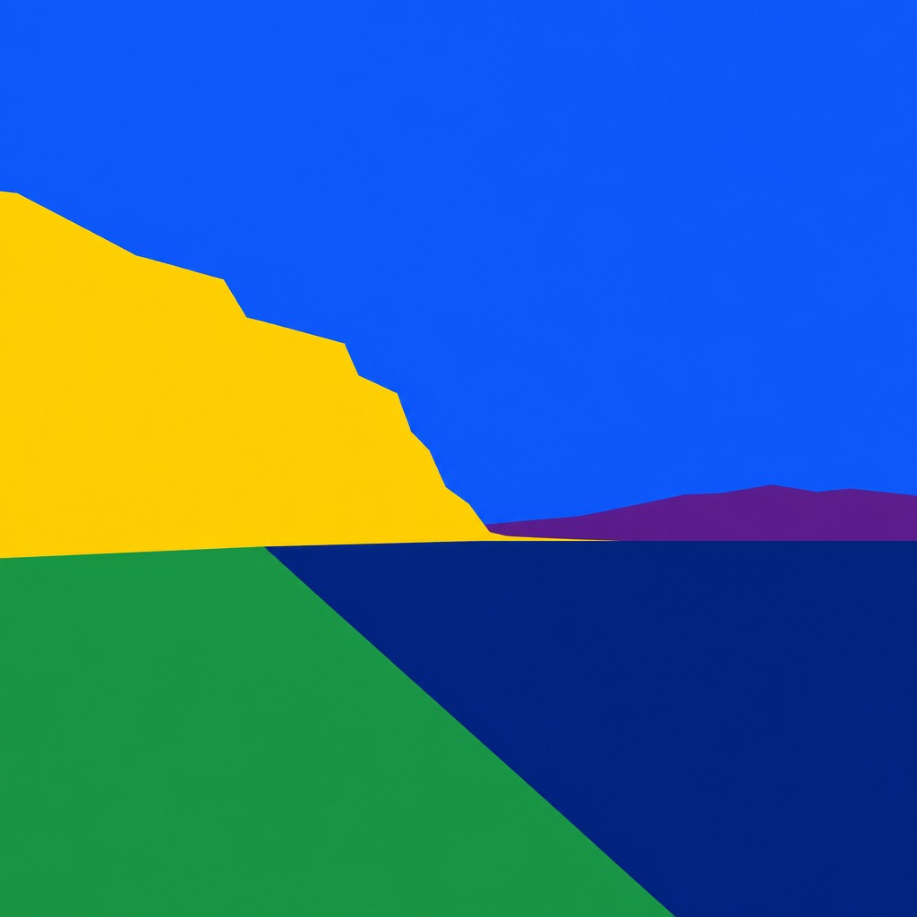
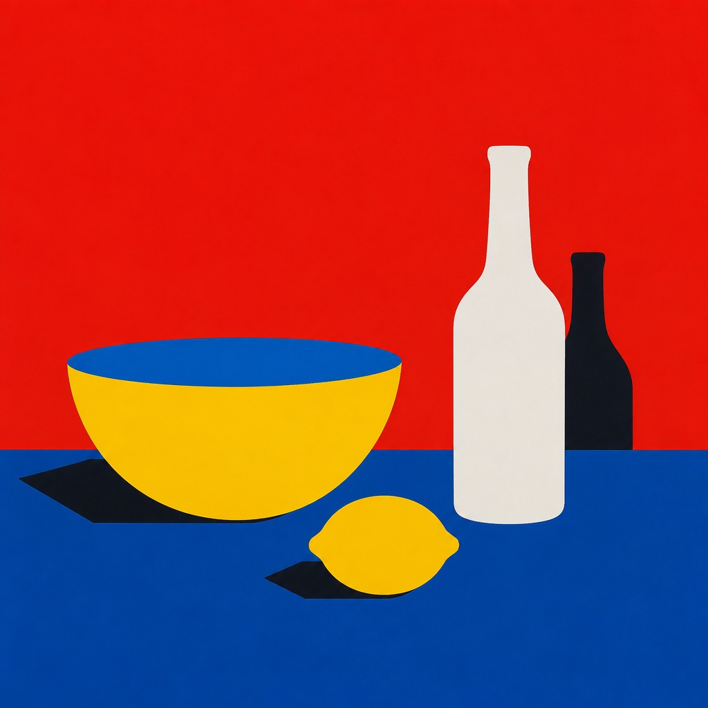
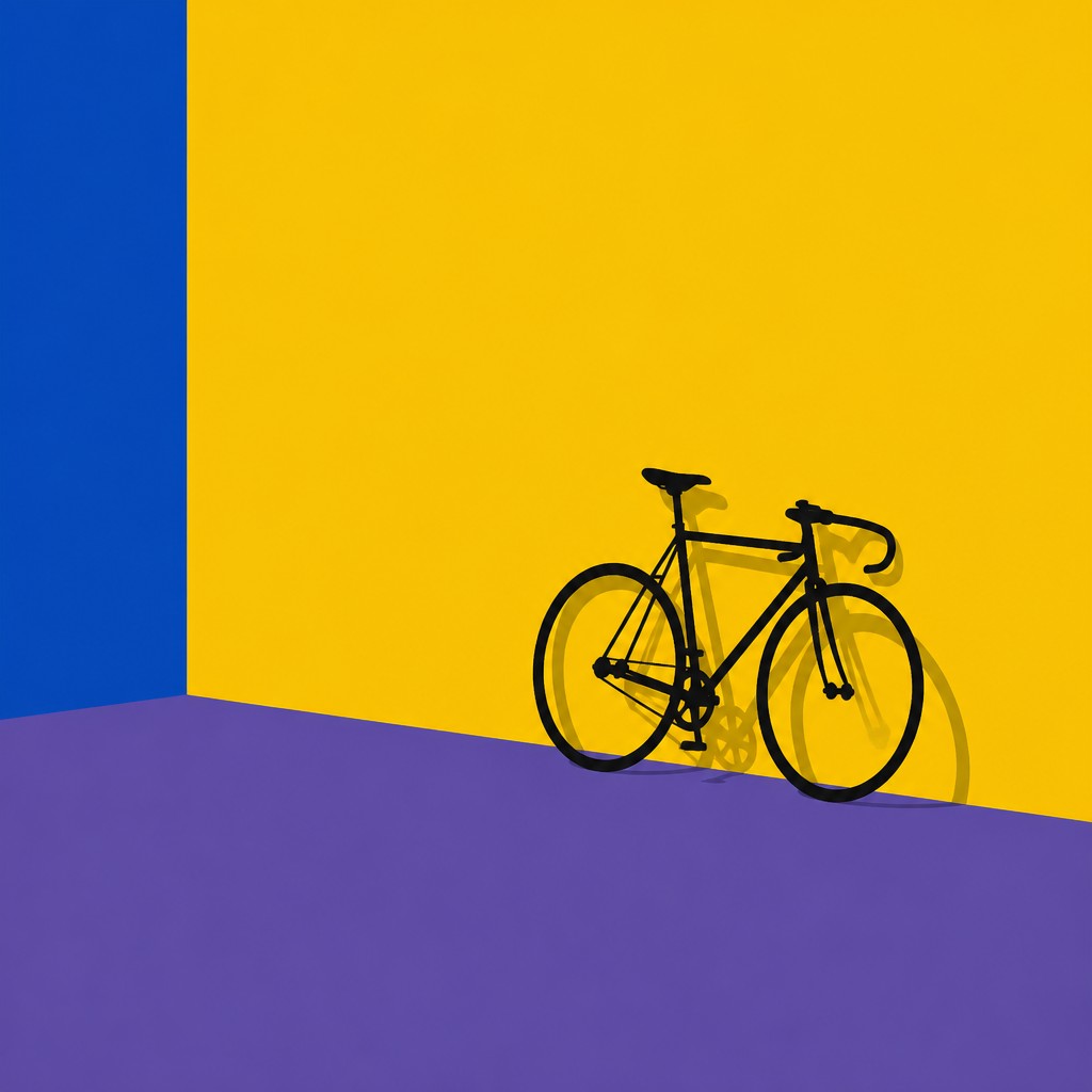
Color Field Minimalism Art Style also relies on large blocks of color, but it is more restrained and sharply defined. Because both styles prioritize color over narrative, detail, and recognizable imagery, people often compare them; the main difference is that one leans toward depth and atmosphere, while the other emphasizes clarity, reduction, and hard-edged simplicity.
Same Prompt, Both Styles
Each pair below was generated from the identical prompt — only the style changed.
“portrait of two people together”
“wide landscape with natural scenery”
“still life with everyday objects”
“bicyle resting against a wall”
Key Differences
| Color Field Abstract | Color Field Minimalism | |
|---|---|---|
| Edges | Often soft, diffused, or gently blended boundaries. | Clean, hard edges with crisp separation between planes. |
| Mood | Immersive, contemplative, and emotionally expansive. | Austere, controlled, and visually restrained. |
| Surface quality | May suggest depth through layered or luminous color. | Typically flat, matte, and non-illusionistic. |
| Visual complexity | Simple compositions that can still feel spacious and deep. | Even more reduced, with an emphasis on purity and order. |
| Color relationships | Uses chromatic interaction to create resonance and emotional tone. | Uses pure hue contrasts for clarity and precision. |
| Composition | Large fields may feel open, airy, or enveloping. | Planes are often arranged with strict balance and restraint. |
| Mood | meditative, expansive, solemn, immersive | meditative, austere, contemplative, restrained |
| Energy | calm | calm |
| Detail level | minimal | minimal |
| Color | large flat fields, saturated or subdued | bold flat hues, limited palette, high contrast |
| Texture | smooth, matte, softly edged | smooth, matte, hard-edged |
| Origin | mid-20th century New York | mid-20th century, United States |
| Best for | gallery prints, album covers, posters, brand backgrounds, editorial openings | gallery posters, album covers, branding, editorial spreads, wall art |
| Difficulty | moderate | moderate |
Which Should You Choose?
Choose Color Field Abstract Art Style if you want a more immersive, atmospheric result with softness, subtle depth, and emotional resonance. Choose Color Field Minimalism Art Style if you want a cleaner, more disciplined look with hard edges, flat surfaces, and a calm sense of order. If you want the viewer to feel surrounded by color, pick A; if you want color to read as precise structure, pick B.
Frequently Asked Questions
Are these two styles basically the same?
They overlap because both rely on large areas of color and avoid figurative imagery. The difference is in temperament: A tends to feel more atmospheric, while B is more severe and pared down.
Which style feels more emotional?
Color Field Abstract Art Style usually feels more emotional because it often uses soft transitions and expansive space to create mood. Color Field Minimalism can still be expressive, but it usually does so through restraint rather than overt atmosphere.
Which style is more suitable for a modern interior?
Both can work well in contemporary spaces, but they send different signals. A adds warmth and contemplative depth, while B contributes a cleaner, more architectural feel.
Do both styles use the same kind of color?
Both can use saturated or muted hues, but they handle them differently. A often explores how colors interact emotionally and spatially, while B emphasizes pure color as a clear, isolated field.