Flat Icon Design
Minimal flat icons with bold colors, simple shapes, and no shadows—ideal for modern UI, logos, and clean visual communication.
Instantly rendered in Flat Icon Design — or transform a photo


Flat Icon Design Gallery
Tap any artwork to explore it








What is Flat Icon Design?
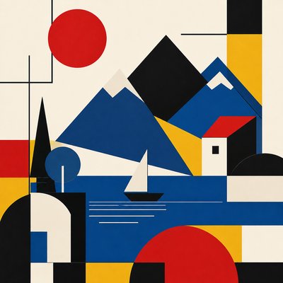
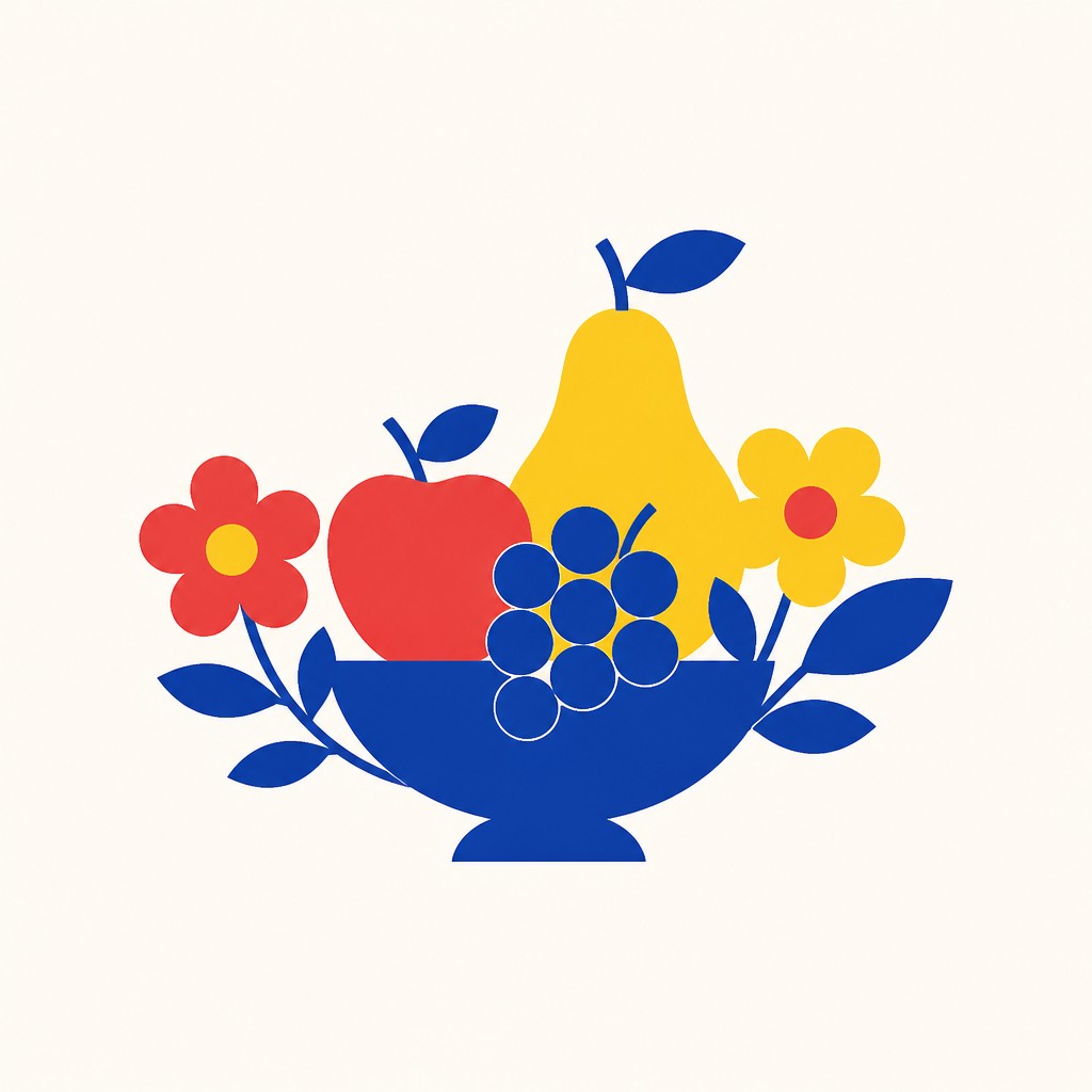
Flat icon design is a pared-down visual language built from simple geometric forms, solid color fills, and crisp outlines or edges. It removes illusionistic depth, gradients, shadows, textures, and complex detailing so that a subject can be understood at a glance, even at very small sizes. The result is a highly legible image that reads more like a sign or symbol than a picture.
Its visual identity comes from clarity and reduction. By compressing an object to its essential silhouette, flat icon design emphasizes recognition over realism, which is why it has become a standard for interfaces, apps, dashboards, and instructional graphics. The style usually relies on a limited palette, balanced negative space, and centered compositions that keep the icon scalable, consistent, and easy to read across screens and print.

Try It On Your Photos
Upload any photo and convert it into Flat Icon Design — drag the sliders to compare before and after.




What Defines Flat Icon Design
The signature details, up close
Simple geometric construction
Icons are built from circles, squares, rectangles, triangles, and clean curves. Complex subjects are reduced to the fewest shapes needed for instant recognition.
Solid color fills
Color areas are flat and uniform, with no gradients, highlights, or painterly blending. The palette is usually limited to two to four saturated or carefully muted hues.
No depth cues
Shadows, perspective, bevels, and atmospheric effects are absent or heavily minimized. The image stays completely flat so it reads cleanly as a symbol.
Crisp edges and scalable form
The silhouette is designed to remain clear at small sizes, which is why vector-like edges and balanced proportions matter. Even detailed objects are simplified into compact, readable shapes.

Centered, isolated composition
Icons are commonly placed in the middle of a plain background with generous negative space. This keeps attention on the symbol and makes the visual system consistent.

Functional visual hierarchy
Every element serves recognition, not decoration. Details are only included when they improve comprehension or differentiate one icon from another.
Try It
Create Videos in Flat Icon Design
Styles aren't just for stills — describe a scene or animate an image and get a short video rendered in Flat Icon Design. Press play to see this pond come to life.
Make a VideoFlat Icon Design Prompt Ideas
Start from an idea — each one opens the generator with the style ready to go. See all 40 Flat Icon Design prompts →

“close-up portrait of an elderly person with expressive weathered features”

“a cat lounging in a sunlit window”

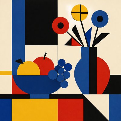
“bouquet of flowers in a glass vase”

“sailing ship on a stormy sea”
How to Create Flat Icon Design Art
Master the craft step by step — or skip straight to creating. Read the full guide →
- 1
Start from the silhouette
First reduce the subject to a single, unmistakable outline, then rebuild it from a few geometric parts. If the object is still readable in black as a tiny shape, it is probably close to the right level of simplification.
- 2
Use a limited palette
Choose two to four colors and keep them flat and solid. Reserve contrast for clarity between foreground and background rather than for shading or atmospheric effects.
- 3
Eliminate depth effects
Avoid gradients, drop shadows, texture, blur, and perspective distortion unless they are absolutely necessary for recognition. The goal is a clean symbol, not an illustrative scene.
- 4
Design for small-scale legibility
Check the icon at thumbnail size and simplify any detail that disappears. Thicken thin features, close open gaps, and make forms more distinct so the image survives reduction.
- 5
Build with vector logic
In digital tools, construct shapes with smooth curves, aligned edges, and consistent spacing. For traditional work, plan the icon as a precise graphic silhouette and keep surfaces evenly filled rather than rendered.
- 6
Prompt with structure and constraints
When generating images, specify the subject, flat vector treatment, solid colors, no gradients or shadows, and a plain background. Strong prompt constraints help the model stay within the graphic language of icon design.

The Story
History & Origins of Flat Icon Design
Flat icon design emerges from a long lineage of modern graphic simplification rather than from a single historical art movement. Its roots can be traced to early 20th-century graphic design, including the influence of modernism, Swiss style clarity, pictograms, signage systems, and mid-century corporate identity programs that prioritized function, legibility, and reproduction quality. In the digital era, these principles became especially useful for small-screen interfaces, where detailed illustration and shaded rendering often broke down.
The style expanded rapidly with the rise of web and mobile design in the 2000s and 2010s, especially as interface systems favored clean, modular icon sets. It was encouraged by responsive design, vector tools, and the need for graphics that could be rendered consistently across devices and resolutions. Over time, flat icon design became one of the defining visual languages of contemporary UI/UX, blending the functional goals of modernist design with the precision of digital vector graphics.
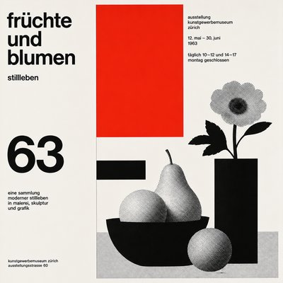
Influences: Flat icon design is closely related to modernist graphic design, Swiss style grid thinking, pictographic signage, and the broad tradition of visual simplification used in logos and wayfinding systems. It also draws from vector illustration and interface design conventions shaped by digital products. In spirit, it shares modernism’s emphasis on clarity and function, though it is more compressed and symbol-like than the work of canonical modernist designers whose principles of order and legibility helped define the broader visual environment in which icon design flourished.
Frequently Asked Questions
What defines flat icon design?
Flat icon design is defined by simple shapes, solid colors, and the absence of gradients, shadows, and texture. It emphasizes instant readability and scalability, which makes it ideal for small digital displays and interface systems.
How is it different from flat illustration?
Flat illustration can include more scene-building, storytelling, and decorative variety, while flat icon design is more distilled and symbolic. Icons usually isolate one subject and reduce it to a compact, standardized form.
Why does flat icon design look so minimal?
The minimal look is intentional because icons must remain clear at small sizes and in crowded layouts. Removing depth cues and extra detail makes the symbol easier to recognize quickly.
Where is flat icon design used most often?
It is used widely in mobile apps, websites, dashboards, infographics, operating systems, and product interfaces. It also appears in signage, educational materials, and branding systems that need clean visual consistency.
How do I make an icon look more professional?
Keep proportions consistent, align edges carefully, and limit the palette. Professional icons usually feel balanced and intentional because every curve, gap, and corner has been simplified for clarity.
Can flat icon design still show personality?
Yes, but personality comes from shape language, color choices, and proportion rather than from rendering effects. A rounded, friendly silhouette will feel different from a sharp, angular one even if both remain strictly flat.

Create your first Flat Icon Design artwork
Describe anything — or upload a photo — and see it in Flat Icon Design in seconds.
Make Something with Flat Icon Design
Compare Flat Icon Design
Related Styles
Discover similar art styles