Die-Cut Sticker Design
Die-cut sticker design uses bold outlines, flat color, and a cut-to-shape silhouette for clean, print-ready decals.
Instantly rendered in Die-Cut Sticker Design — or transform a photo


Die-Cut Sticker Design Gallery
Tap any artwork to explore it



What is Die-Cut Sticker Design?
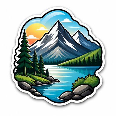
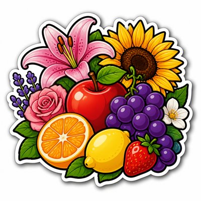
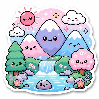
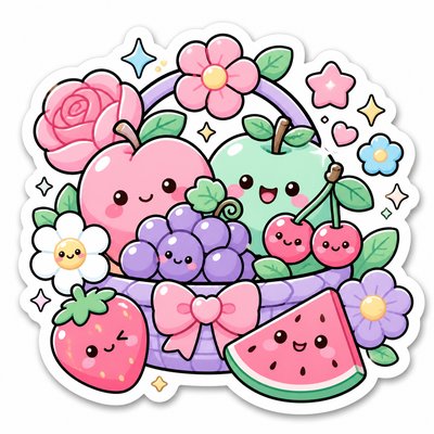
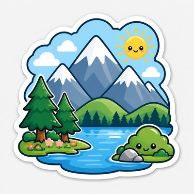
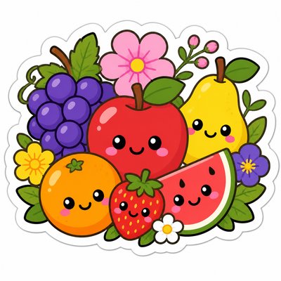
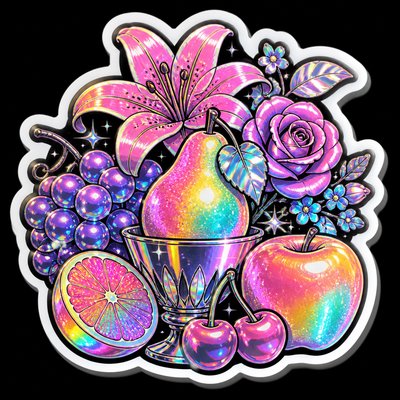
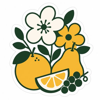
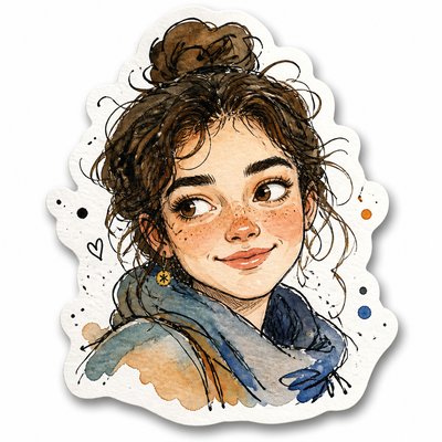
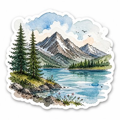
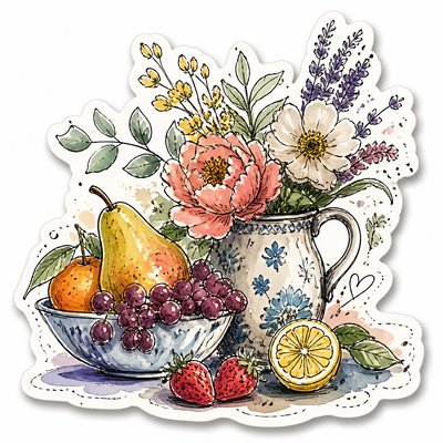
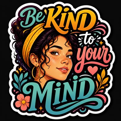
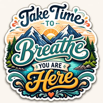
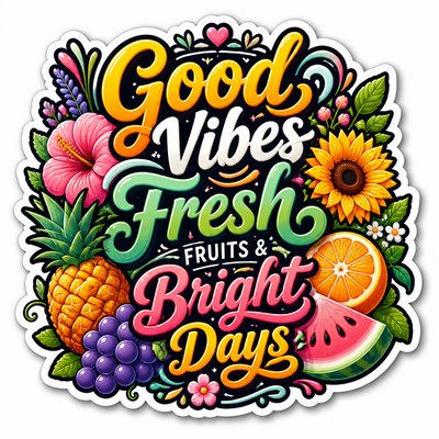
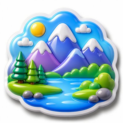
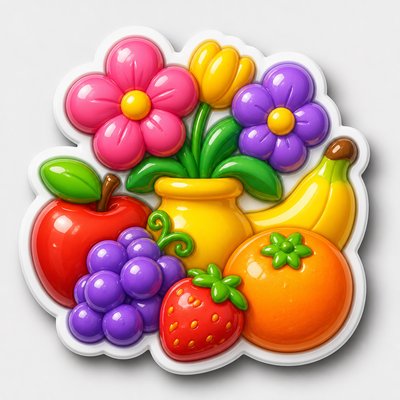
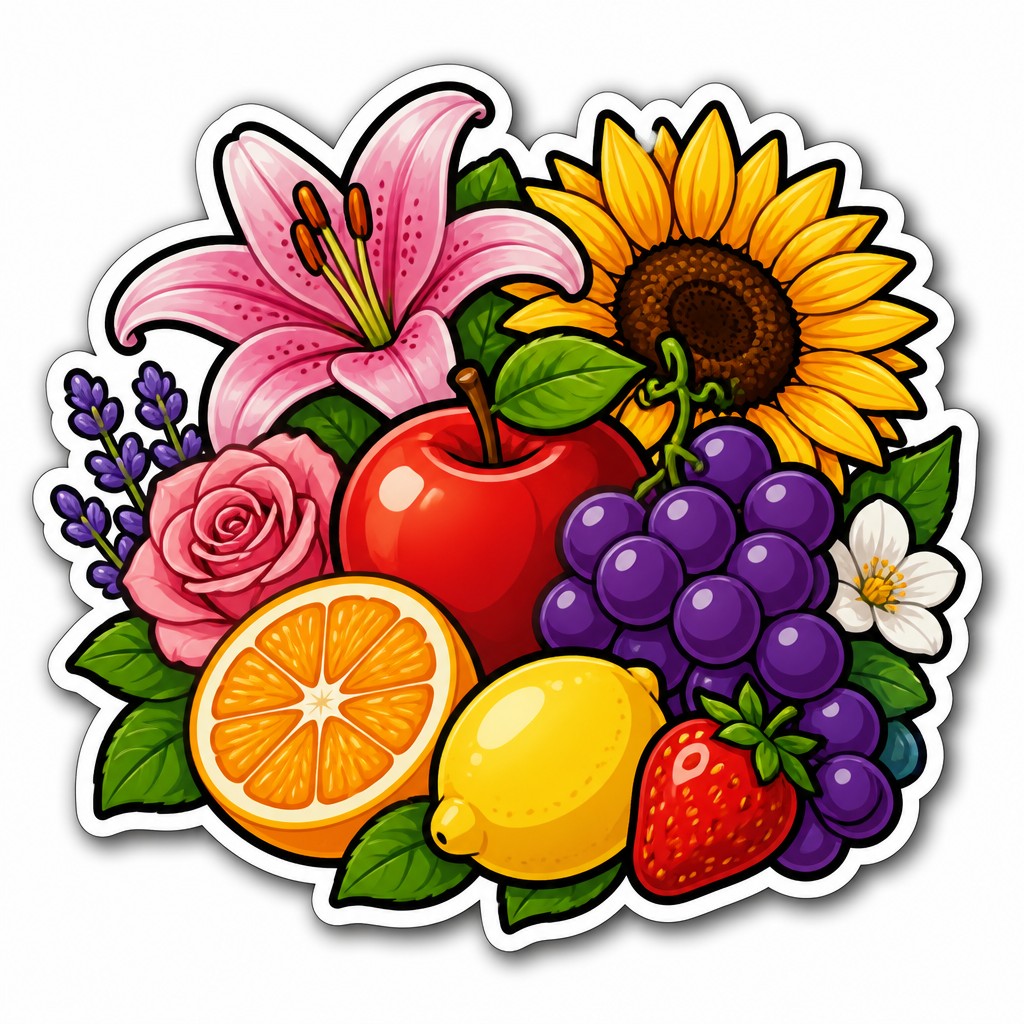
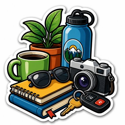
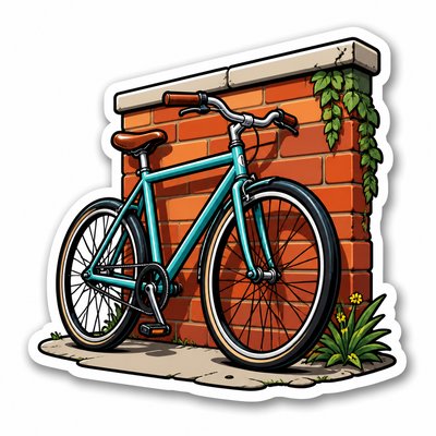
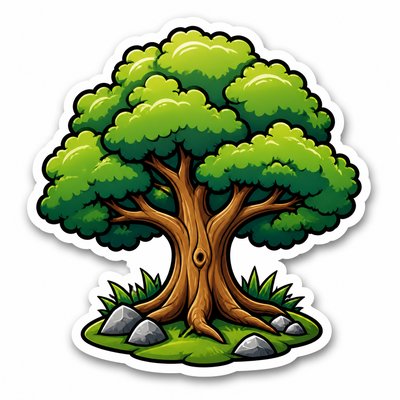
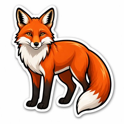
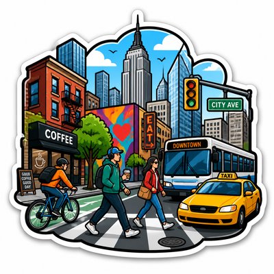
Die-cut sticker design is a graphic style built for decals that are cut precisely to the contour of the artwork rather than left on a rectangular backing. Its visual identity usually includes a tight silhouette, bold black outlines, simplified forms, flat color blocks, and a thin white border that helps the design stand out from any surface it is placed on.
The style looks the way it does because it is optimized for legibility, durability, and instant recognition at small sizes. Strong contour lines prevent the image from collapsing when reduced, while limited detail, saturated color, and controlled highlights keep the subject readable on laptops, water bottles, skateboards, packaging, and other everyday objects.

Try It On Your Photos
Upload any photo and convert it into Die-Cut Sticker Design — drag the sliders to compare before and after.



What Defines Die-Cut Sticker Design
The signature details, up close
Contour-following silhouette
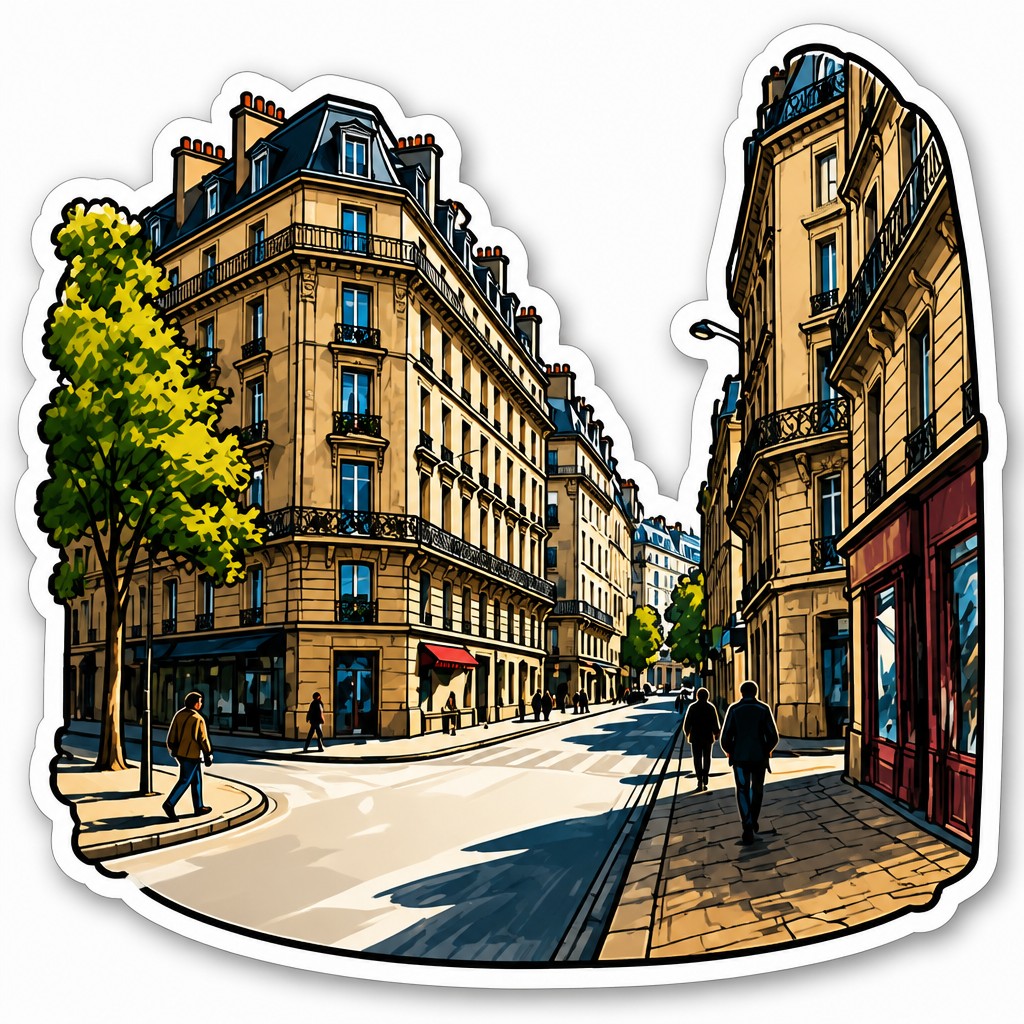
The artwork is cut to the exact outer edge of the design, so the composition must read as one unified shape. This gives the sticker a finished, custom-made appearance rather than a generic rectangle.
Bold outline structure
Thick black linework defines forms and separates color areas clearly. The outline also helps the subject remain legible when printed small or viewed at a distance.
Flat color with gentle depth
Colors are usually saturated and limited in number, with subtle gradients or soft shading added only where they support clarity. The look stays graphic rather than painterly.
White border separation
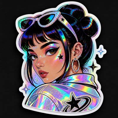
A narrow white die-cut margin often surrounds the artwork, helping it pop off the background and making the cut line visually clean. This border is a hallmark of professional sticker production.

Compact composition
The subject is usually tightly arranged to avoid awkward empty space inside the sticker shape. Negative space is controlled so the design feels cohesive and sturdy.

Glossy finish cues
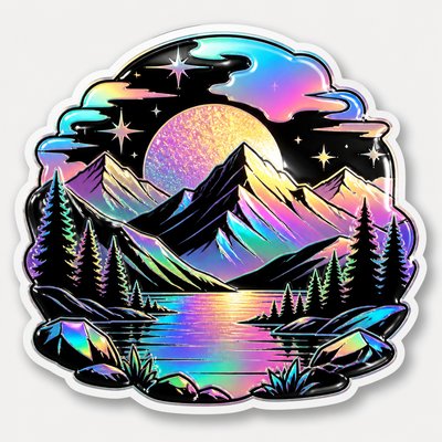
Small highlight streaks or specular accents suggest a laminated surface. These details give the sticker a polished, tangible quality.
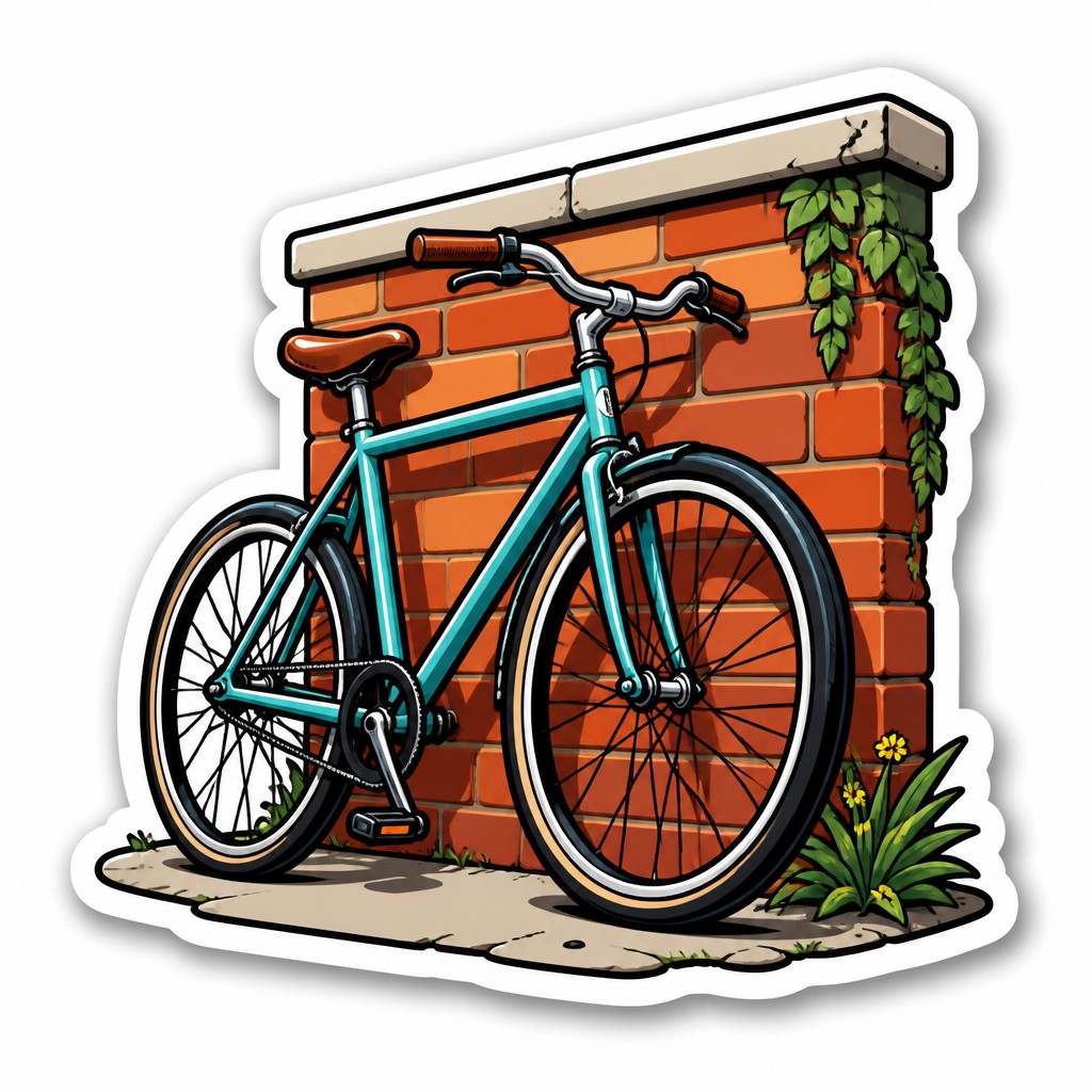
Print-ready clarity
Edges are crisp, shapes are simplified, and details are minimized to preserve readability at sticker scale. The design must work as a physical object, not just as a screen image.
Try It
Create Videos in Die-Cut Sticker Design
Styles aren't just for stills — describe a scene or animate an image and get a short video rendered in Die-Cut Sticker Design. Press play to see this pond come to life.
Make a VideoDie-Cut Sticker Design Prompt Ideas
Start from an idea — each one opens the generator with the style ready to go. See all 40 Die-Cut Sticker Design prompts →

“close-up portrait of an elderly person with expressive weathered features”
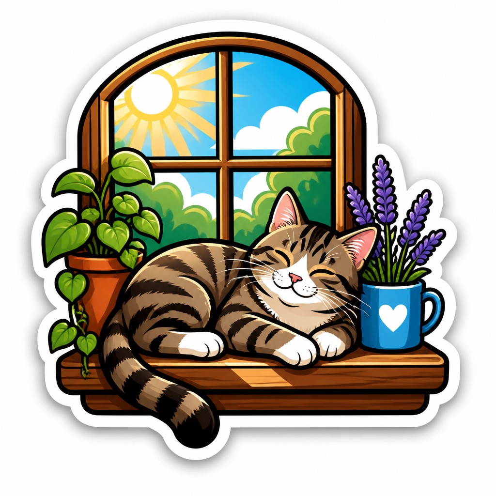
“a cat lounging in a sunlit window”
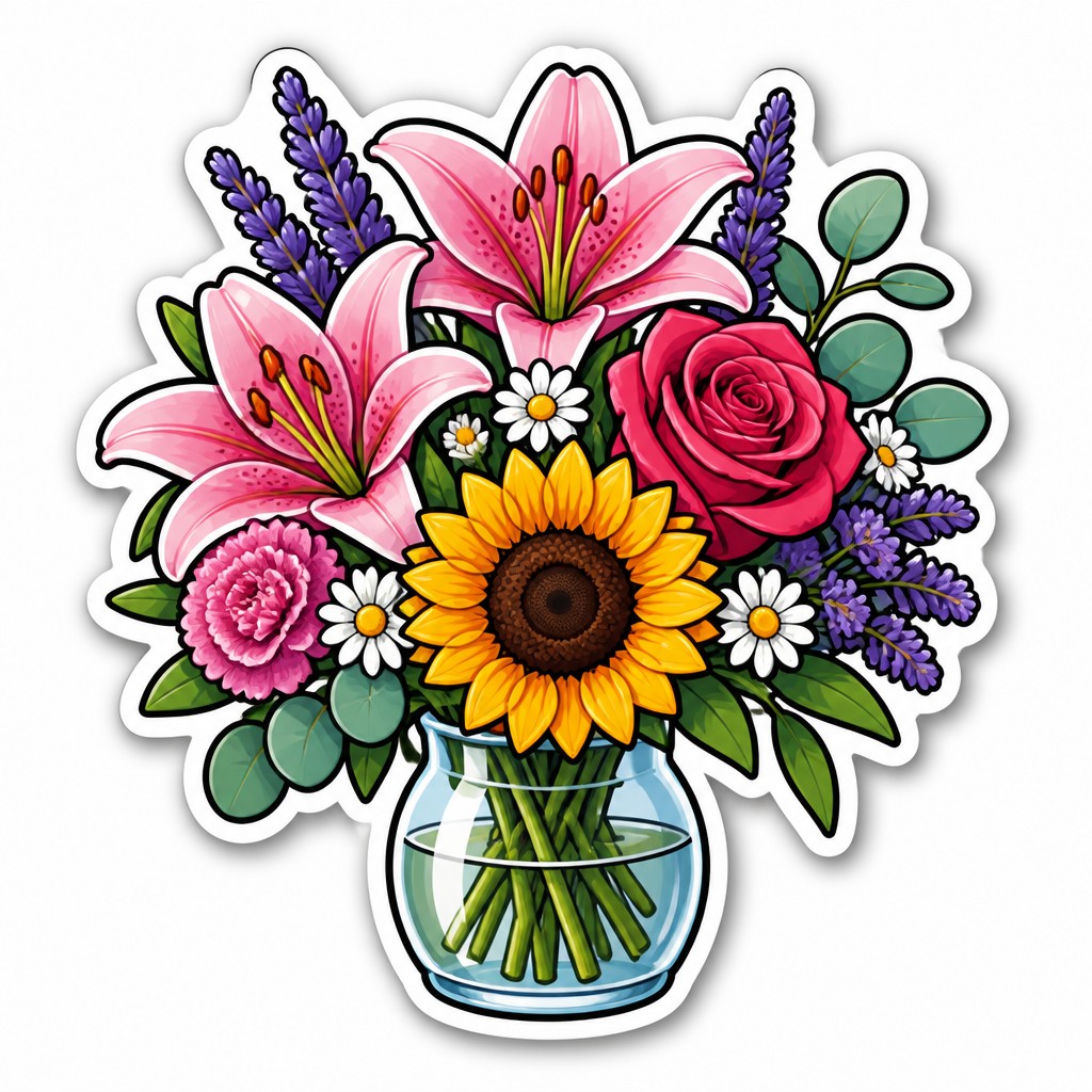
“bouquet of flowers in a glass vase”
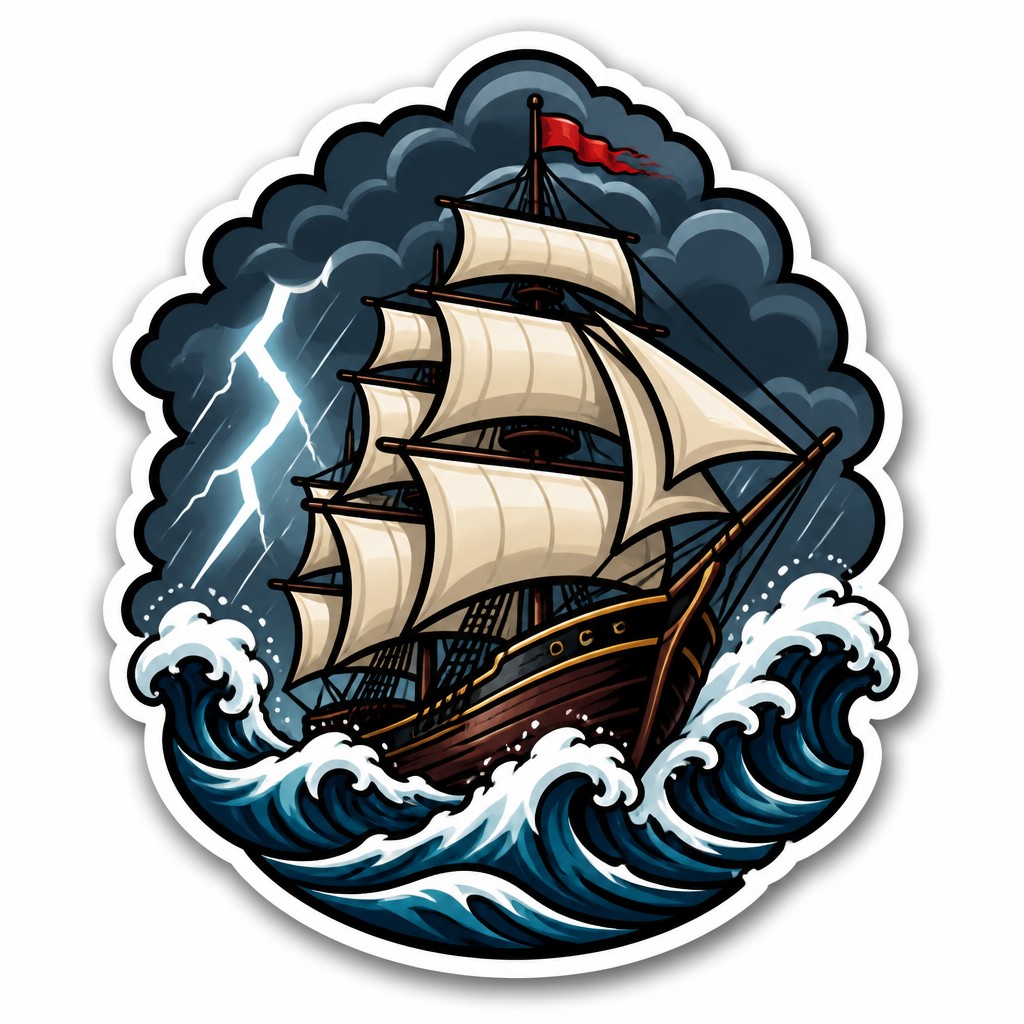
“sailing ship on a stormy sea”
How to Create Die-Cut Sticker Design Art
Master the craft step by step — or skip straight to creating. Read the full guide →
- 1
Design for a strong silhouette
Start by simplifying the subject into a clear outer contour before adding interior detail. Avoid fragile protrusions and tiny elements that may vanish in printing or cutting.
- 2
Use bold linework and limited shapes
In traditional illustration, ink the main forms with confident outlines and keep interior details sparse. In digital work, vector paths or clean digital brushes help maintain the crisp edge quality associated with stickers.
- 3
Build color in large, readable blocks
Choose a small palette and separate major forms with strong value contrast. Add subtle gradients only to suggest volume; the image should still read if flattened into solid colors.
- 4
Add a thin border and shadow
Create a white offset edge around the art to simulate the die-cut boundary, then place the sticker on a plain background with a soft drop shadow. This makes the final object feel like a real decal rather than an isolated illustration.
- 5
Keep the composition compact
Crop tightly around the subject and make sure the design fills the shape efficiently. For prompt-based generation, specify a cohesive silhouette, clean outlines, white cut border, isolated background, and print-ready edges.
- 6
Test at small size
Reduce the design to thumbnail scale and check whether the subject still reads instantly. If details disappear, simplify further before finalizing the cut line and export settings.
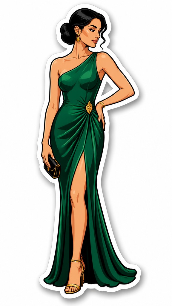
The Story
History & Origins of Die-Cut Sticker Design
Die-cut stickers developed from commercial print culture and the broader history of adhesive labels, product decals, and promotional graphics. Their visual logic draws from cartooning, comic inking, vector illustration, and logo design: all traditions that emphasize clear silhouettes, high contrast, and simple forms that reproduce cleanly in print.
In contemporary visual culture, the style has become especially associated with skate, streetwear, fandom, and maker communities, where stickers function as portable identity graphics. Digital illustration tools and print-on-demand production made it easier to design stickers with precise outlines and custom contours, but the aesthetic itself remains rooted in the practical demands of small-format graphic reproduction.
Influences: Die-cut sticker design sits at the intersection of comic-book inking, vector graphics, logo design, and commercial decal printing. Its clarity and contour emphasis recall the bold readability of cartoon art and the streamlined shapes used in branding, while its color blocking and polished finish echo contemporary streetwear graphics and fan-art sticker culture. Because it is an invented, production-oriented style rather than a historical movement, its lineage is better understood through these visual traditions than through a single school or canon.
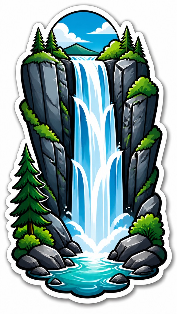
Frequently Asked Questions
What defines die-cut sticker design?
The defining feature is that the sticker is cut to the exact outline of the image instead of being left as a square or circle. Visually, the style also relies on bold outlines, simplified shapes, flat color, and a white border that separates the art from the surface beneath it.
How is it different from a regular sticker or label?
A regular sticker often has a standard geometric shape, such as a rectangle or circle, even if the artwork inside varies. A die-cut sticker follows the subject’s silhouette, which makes it look custom-shaped and more integrated with the image itself.
Why do so many die-cut stickers use thick outlines?
Thick outlines improve readability and keep the design from visually breaking apart at small sizes. They also create a clean edge that reproduces well in print and makes the cut shape easier to perceive.
Can this style be made by hand as well as digitally?
Yes. Hand-drawn designs can be scanned and prepared for print, especially if they use strong ink lines and simple shapes. Digital tools are often easier for refining contours, adding borders, and preparing exact cut paths.
Where is this style commonly used?
It is widely used on laptops, water bottles, skateboards, helmets, notebooks, packaging inserts, and promotional giveaways. It is also common in fan art, brand merch, event swag, and artist tables at conventions or markets.
What makes a design work well as a die-cut sticker?
The best designs have a clear silhouette, a strong focal subject, and enough contrast to read quickly from a distance. Avoid overly intricate textures or very thin details, since those can be lost in cutting and small-format printing.
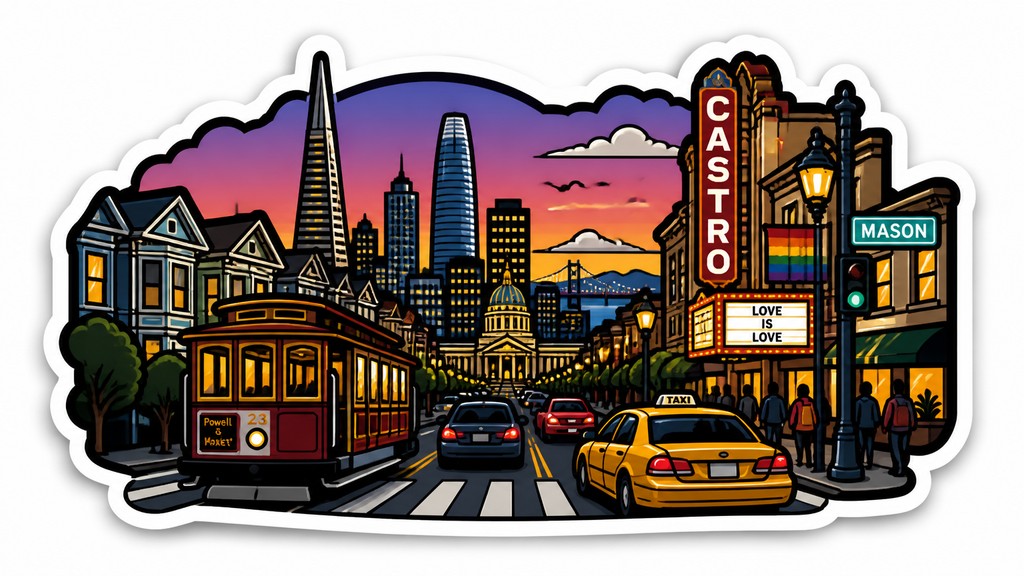
Create your first Die-Cut Sticker Design artwork
Describe anything — or upload a photo — and see it in Die-Cut Sticker Design in seconds.
Make Something with Die-Cut Sticker Design
Compare Die-Cut Sticker Design
Related Styles
Discover similar art styles