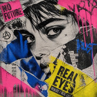
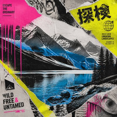
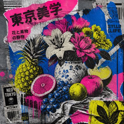
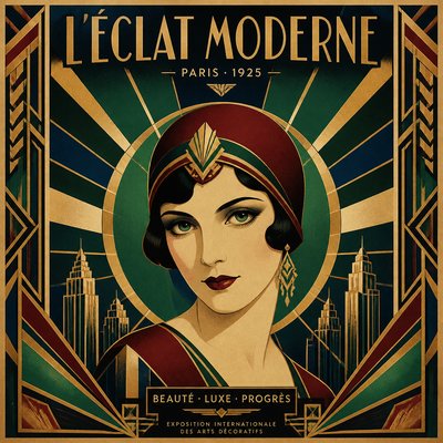
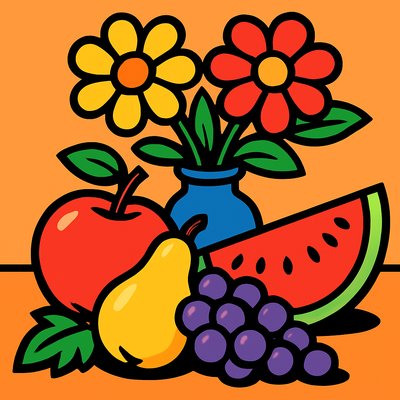
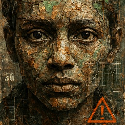
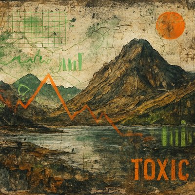
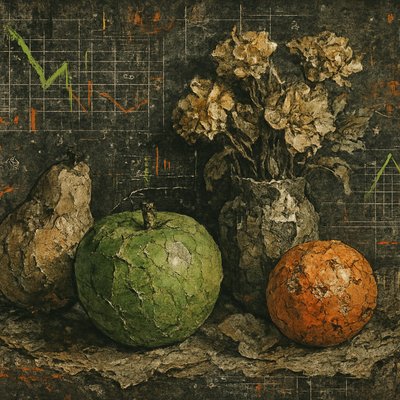
Movie Poster Design
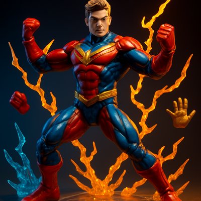
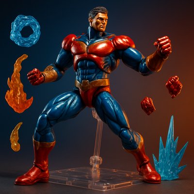
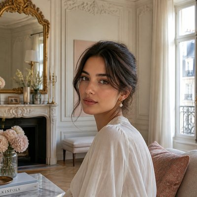
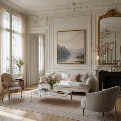
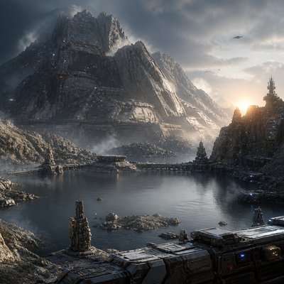
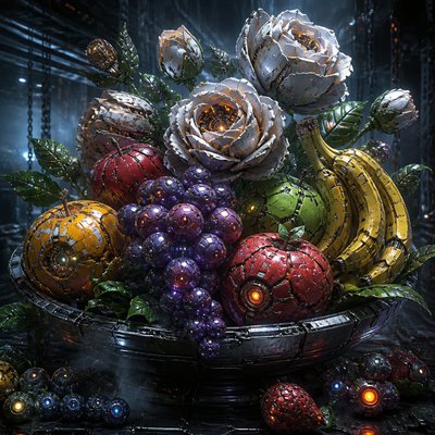
Dramatic cinematic posters with bold compositions, character montages, atmospheric lighting, and blockbuster color grading.
Instantly rendered in Movie Poster Design — or transform a photo
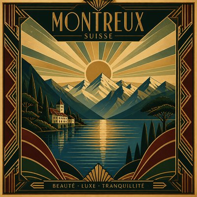
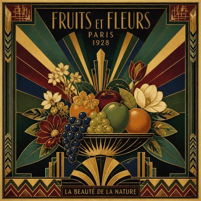
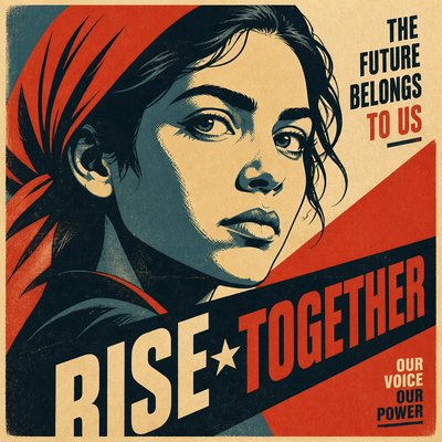
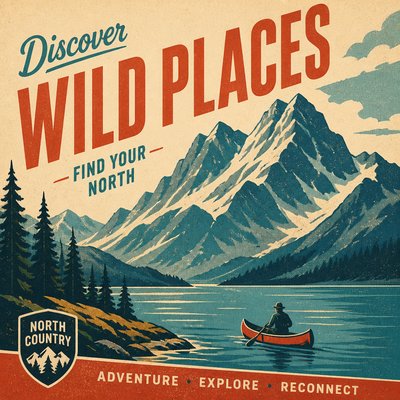
Movie Poster Design Gallery
Tap any artwork to explore it
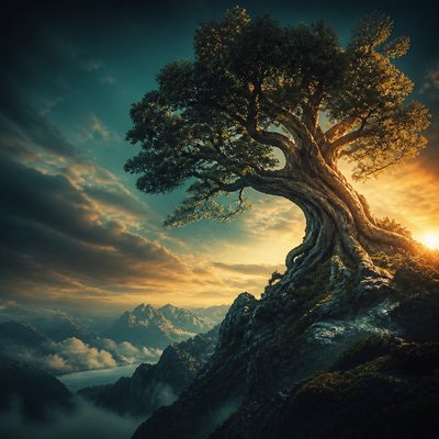
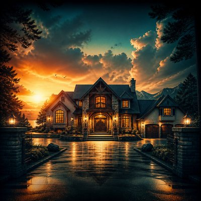
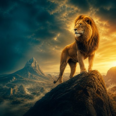
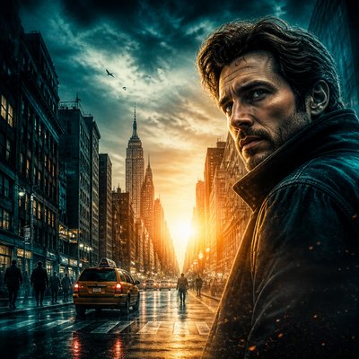
What is Movie Poster Design?
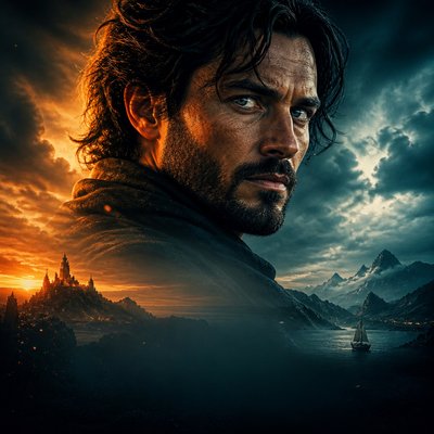
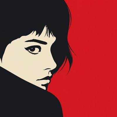
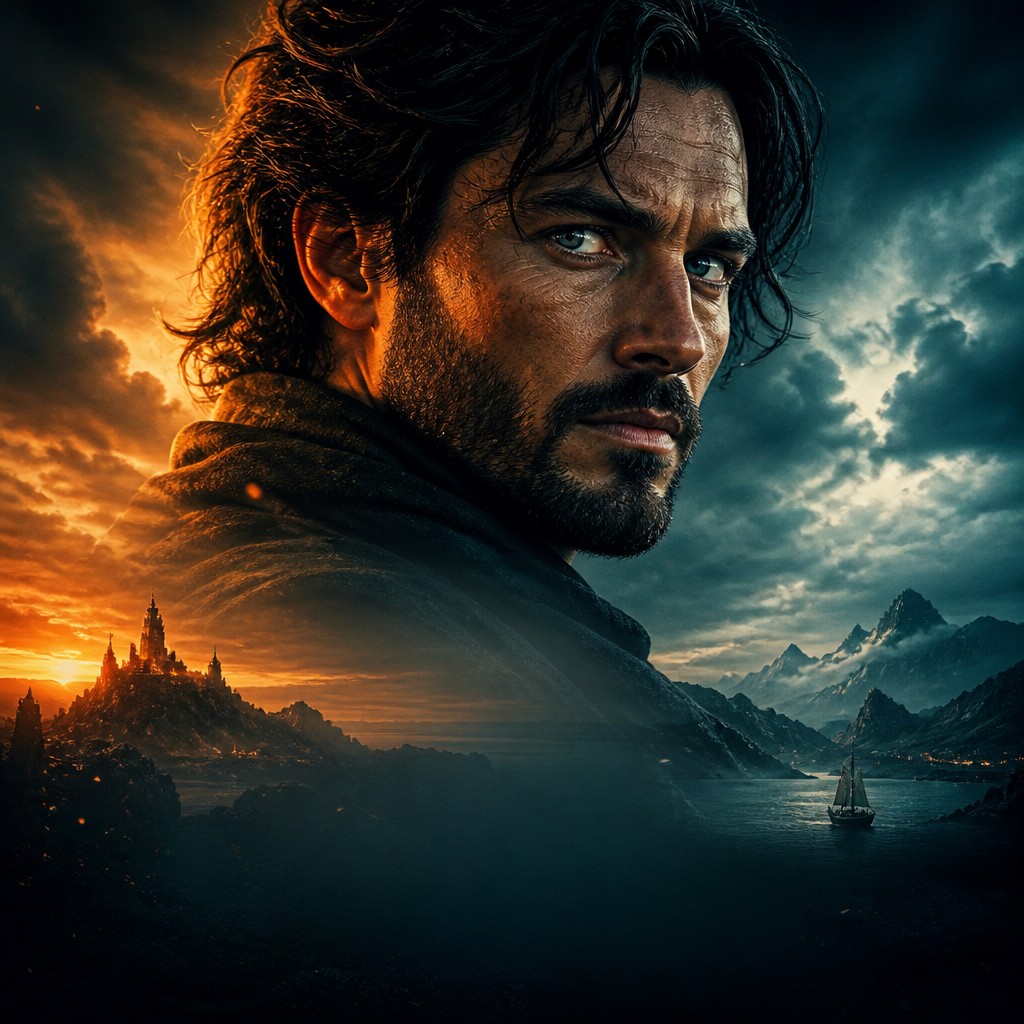
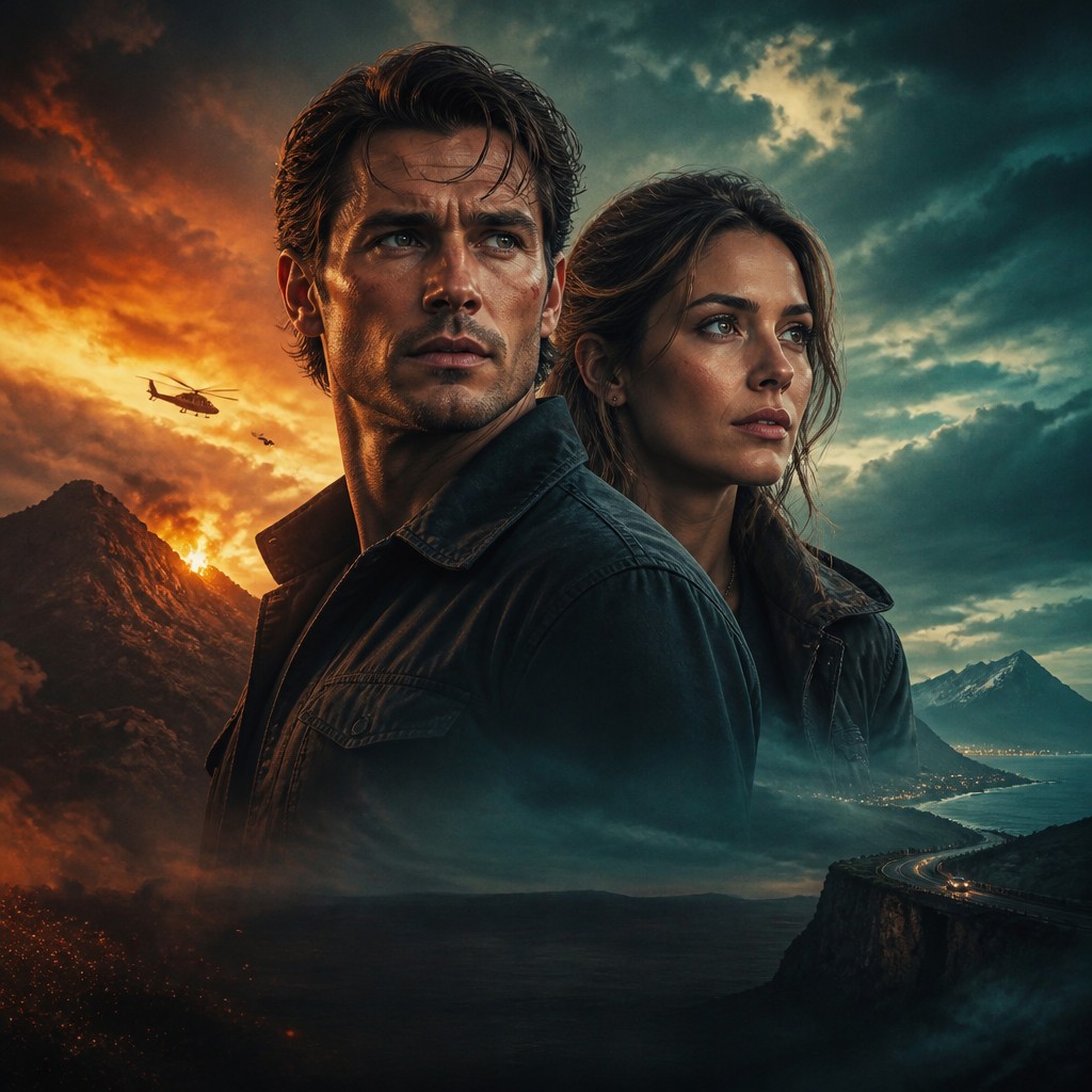
Movie poster design is a commercial image-making style built to sell a film through a single, instantly readable composition. It combines portraiture, narrative symbolism, typography-ready layout, and exaggerated lighting to communicate genre, mood, and stakes at a glance. The look is usually theatrical and polished, with characters arranged in layered scale relationships that suggest conflict, hierarchy, and story.
Its visual identity comes from the demands of marketing as much as from cinema itself. Posters must work from a distance, survive quick glances, and remain memorable in crowded public spaces, so they rely on strong silhouettes, centered focal points, expressive faces, and controlled negative space for titles and credits. Common effects such as rim light, smoke, glowing highlights, lens flare, and deep shadow create an epic, larger-than-life impression that makes the film feel emotionally and visually condensed into one image.
Try It On Your Photos
Upload any photo and convert it into Movie Poster Design — drag the sliders to compare before and after.


What Defines Movie Poster Design
The signature details, up close
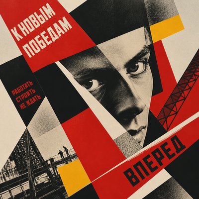
Layered character montage
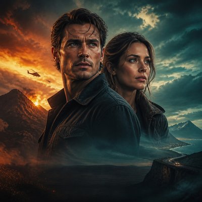
Multiple figures are stacked by scale and depth to suggest story relationships, often with a dominant hero in the foreground and supporting characters or threats behind. The arrangement creates instant narrative tension and a sense of ensemble cast.
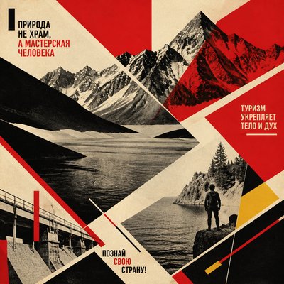
Heroic scale and forced perspective
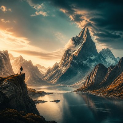
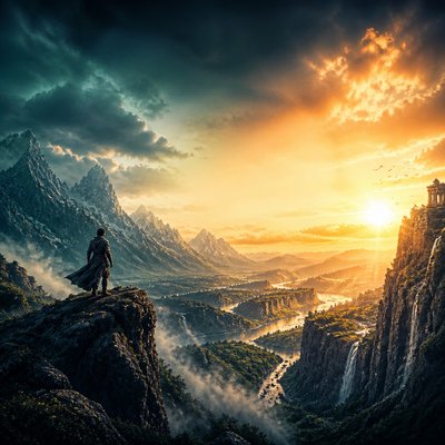
Main subjects are enlarged or positioned low in the frame so they feel monumental. Background elements may recede sharply to intensify drama and give the composition a cinematic, staged depth.
High-contrast lighting
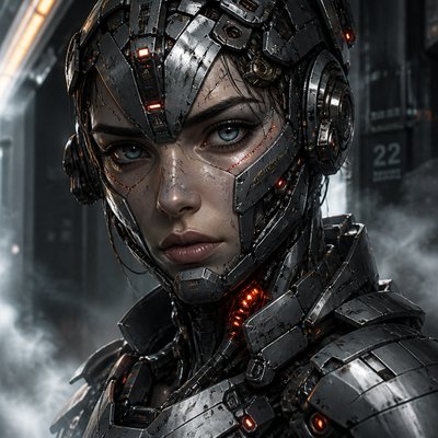
Faces and bodies are often rim-lit against dark environments, with bright highlights carving out silhouettes. This makes the subject readable and theatrical while adding a sense of spectacle.
Atmospheric effects
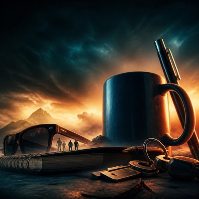
Smoke, haze, dust, sparks, rain, or clouds soften transitions between elements and add motion. These effects also help unify composited layers and create the impression of a scene unfolding beyond the frame.
Teal-and-orange color balance
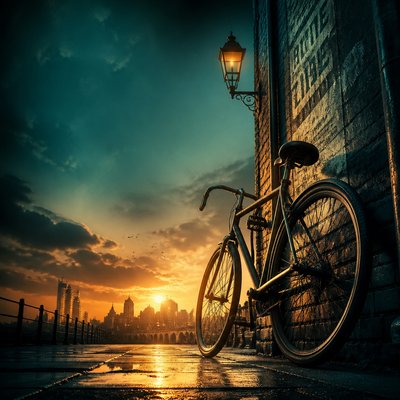
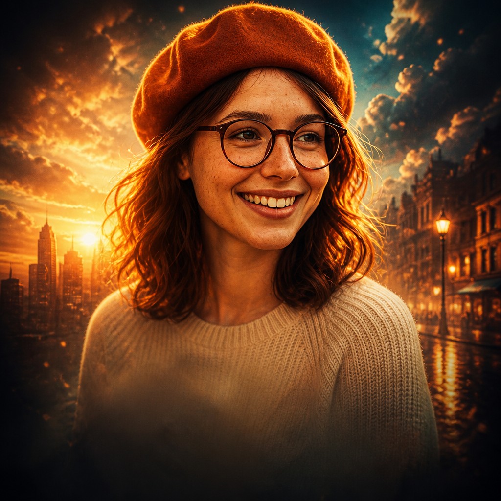
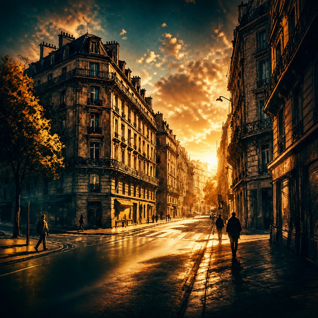
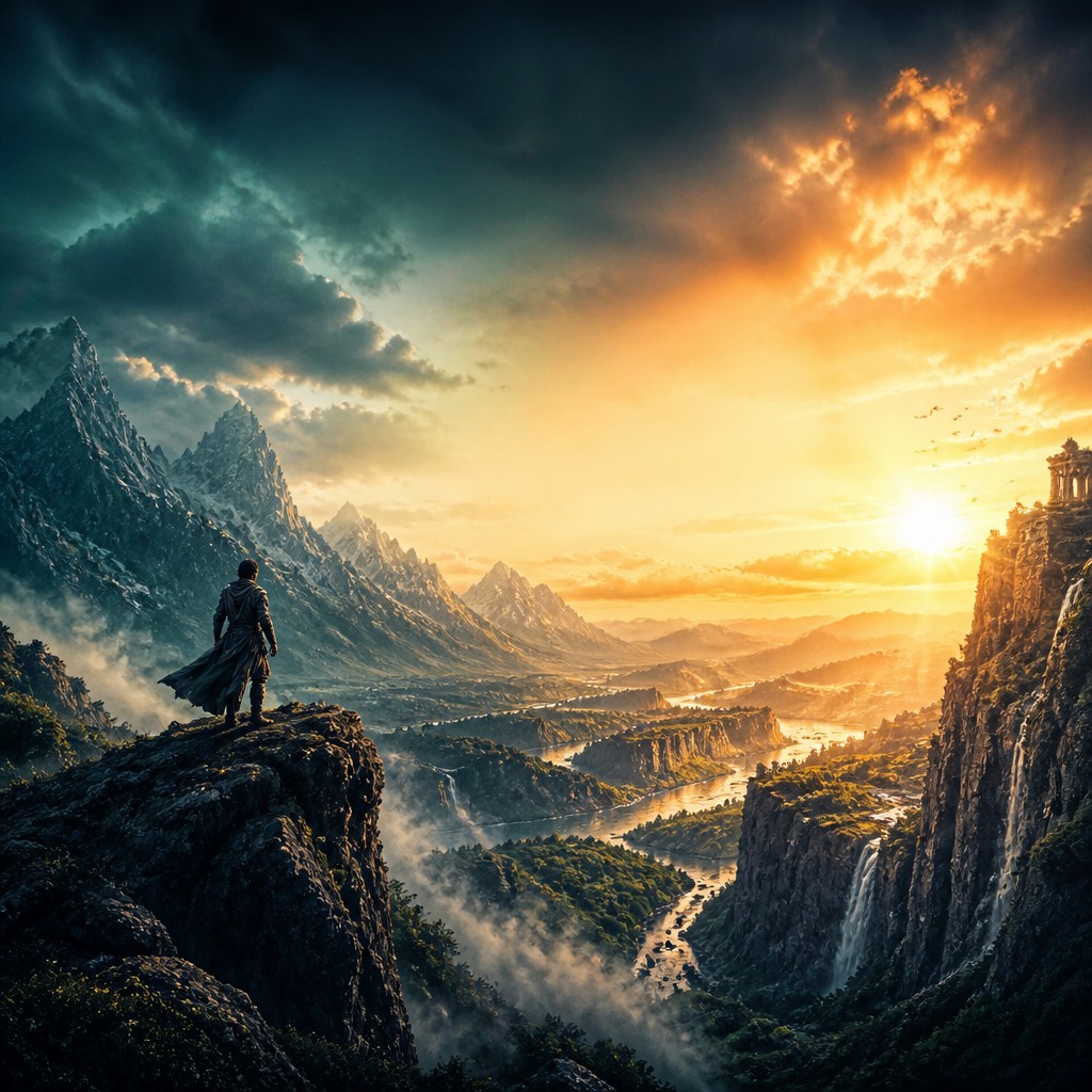
Warm skin tones and fiery highlights are often balanced against cool blue-green shadows and backgrounds. The contrast boosts separation, gives images a contemporary blockbuster feel, and supports the sense of emotional intensity.
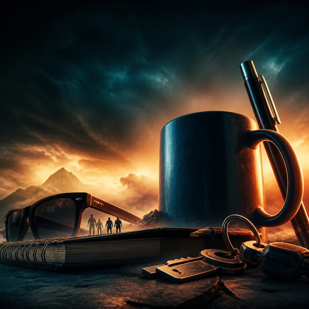
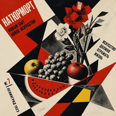
Typography-aware composition
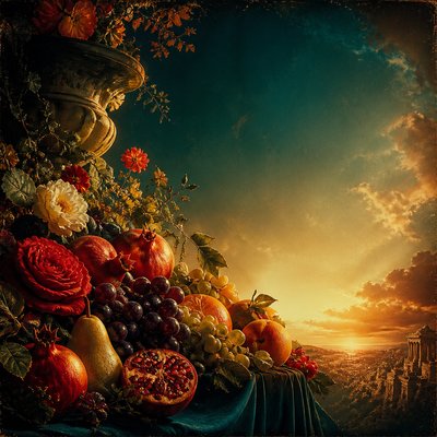
Even when no text is present, the layout usually leaves open areas for a title, billing block, or tagline. Negative space is treated as part of the design, not as empty background.
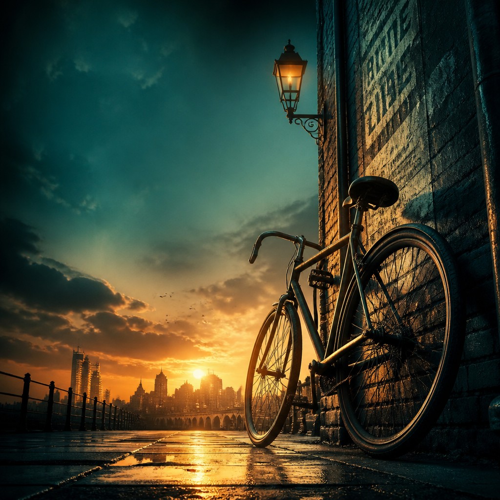
Glossy finish with film grain
The final image often combines polished rendering with subtle grain, vignetting, and contrast shaping. This keeps the work from feeling flat or clinical and gives it a printed, cinematic surface quality.
Try It
Create Videos in Movie Poster Design
Styles aren't just for stills — describe a scene or animate an image and get a short video rendered in Movie Poster Design. Press play to see this pond come to life.
Make a VideoMovie Poster Design Prompt Ideas
Start from an idea — each one opens the generator with the style ready to go. See all 40 Movie Poster Design prompts →
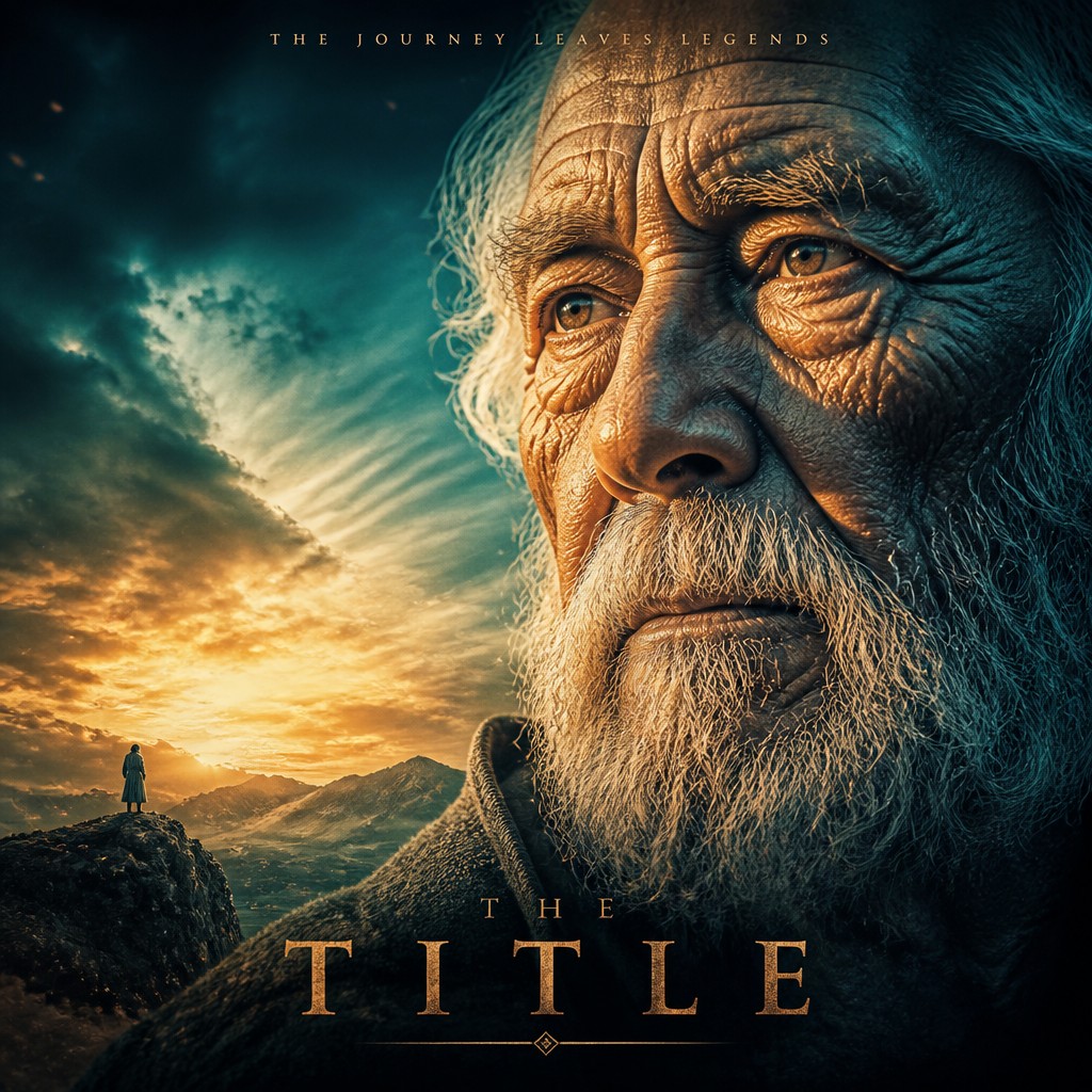
“close-up portrait of an elderly person with expressive weathered features”
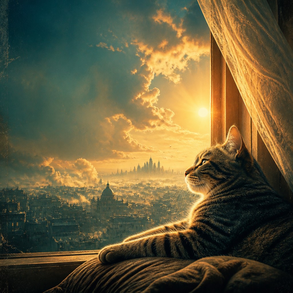
“a cat lounging in a sunlit window”
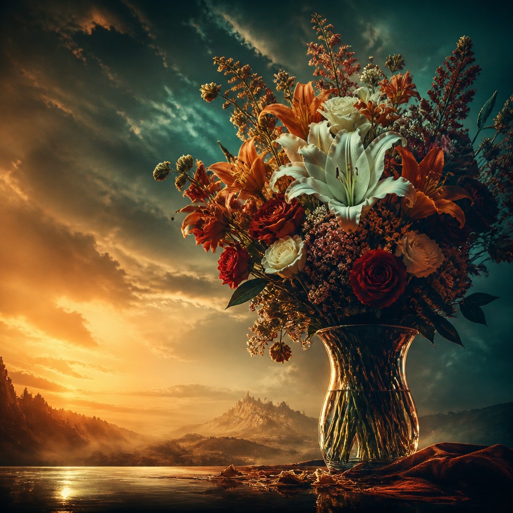
“bouquet of flowers in a glass vase”
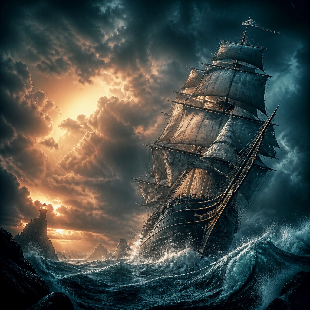
“sailing ship on a stormy sea”
How to Create Movie Poster Design Art
Master the craft step by step — or skip straight to creating. Read the full guide →
- 1
Build the composition around the story
Start by identifying the film’s central conflict, then arrange the lead character, ensemble, or key object so the eye moves naturally through the image. Use scale, overlap, and directional lines to guide attention to the most important face or symbol.
- 2
Design for readability at poster distance
Keep the silhouette strong and the focal point clear, because movie posters must communicate quickly. Avoid overcrowding the frame; leave controlled negative space where text would realistically sit, even if you are not adding typography yet.
- 3
Use cinematic lighting and color logic
Shape the scene with rim light, practical glow, and deep shadows, then balance warm highlights against cooler ambient tones. A restrained teal-orange grade is common, but any strong complementary palette can work if it supports mood and clarity.
- 4
Combine realism with selective exaggeration
Whether you are painting, compositing photos, or working digitally, make faces and costume details credible while amplifying scale, contrast, and atmosphere. The style succeeds when it feels plausible enough to believe, but dramatic enough to sell a spectacle.
- 5
Finish with print-like polish
Add subtle grain, vignette, bloom, and controlled contrast so the image feels like a designed poster rather than a raw frame grab. In digital or prompt-based workflows, specify layered depth, atmospheric haze, and glossy blockbuster finish to get the same effect.
- 6
Use prompt cues that imply layout
When generating images, describe the subject, genre, lighting, montage structure, and empty title space together. Phrases like layered depth planes, heroic scale, rim-lit edges, and balanced open area for title placement help steer the result toward a believable poster composition.

The Story
History & Origins of Movie Poster Design
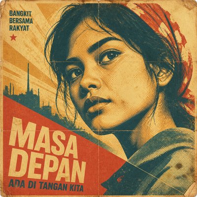
Movie poster design developed alongside the film industry in the early 20th century, when studios needed printed images for theater fronts, lobbies, and street advertising. Early posters drew on lithography, illustration, and poster art traditions from the late 19th century, but by the mid-century the style became increasingly photographic and composited, especially as Hollywood marketing standardized star-driven imagery and genre iconography.
From the 1970s onward, poster design absorbed influences from concept art, airbrushed illustration, and later digital compositing. The rise of blockbuster cinema encouraged more dramatic montage layouts, spectacle-driven lighting, and globally legible branding, while contemporary posters often blend photography, illustration, 3D rendering, and heavy postproduction. The style now exists as both a commercial design practice and a recognizable visual language associated with action, fantasy, science fiction, thriller, and prestige drama promotion.
Influences: Movie poster design draws from late 19th- and early 20th-century poster art, commercial illustration, portrait photography, and montage-based graphic design. It also overlaps with concept art, pulp magazine illustration, and the visual language of blockbuster cinema, where dramatic lighting and staged character hierarchy are used to communicate genre at a glance. In historical poster art, influential Art Nouveau and early modern poster artists helped establish the power of bold composition and clear silhouette, even though modern film posters evolved into a distinct commercial form.

Frequently Asked Questions
What defines movie poster design?
It is a composition-first style made to advertise a film, usually by combining one or more characters, a central concept, and a dramatic mood into a single image. The strongest examples use readable silhouettes, layered depth, and lighting that immediately signals genre and emotional stakes.
How is it different from concept art?
Concept art is usually created to develop a film’s world, characters, or scenes during production, while movie poster design is meant to market the finished or imagined film. Poster design tends to be more symbolic, more legible from a distance, and more careful about layout and negative space.
Why do so many posters use teal and orange?
Teal and orange create strong separation between skin tones, shadows, and backgrounds, making subjects stand out quickly. The combination also fits the high-energy, polished look associated with contemporary action, drama, and adventure marketing.
Can I make this style without using photographs?
Yes. Many posters are illustrated, painted, or digitally composited from scratch, and the style depends more on composition and lighting than on a specific medium. What matters most is clear storytelling, theatrical contrast, and a finish that feels like a designed promotional image.
What subjects work best in this style?
Ensemble casts, heroes, villains, monsters, spaceships, cities, and dramatic landscapes all work well because they can be arranged into strong visual hierarchies. The style is especially effective for action, fantasy, science fiction, thriller, horror, and adventure themes.
How do I make a poster feel cinematic instead of just busy?
Choose one dominant focal point and support it with secondary elements rather than giving every subject equal weight. Use atmosphere, lighting, and scale to unify the scene, and leave some space uncluttered so the composition feels intentional rather than crowded.
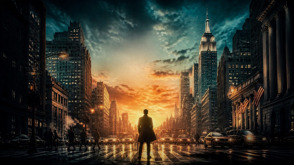
Create your first Movie Poster Design artwork
Describe anything — or upload a photo — and see it in Movie Poster Design in seconds.
Make Something with Movie Poster Design
Compare Movie Poster Design
Related Styles
Discover similar art styles