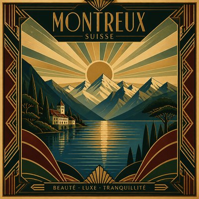
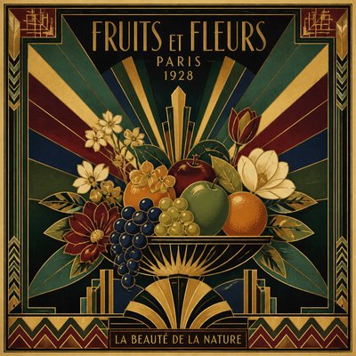
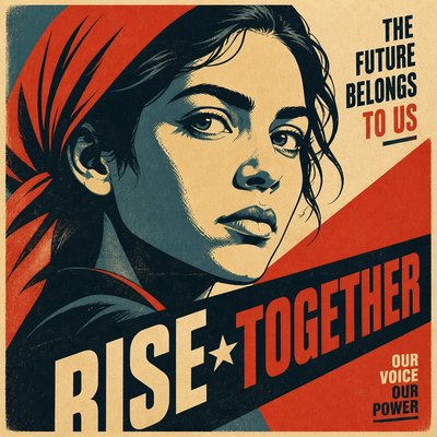
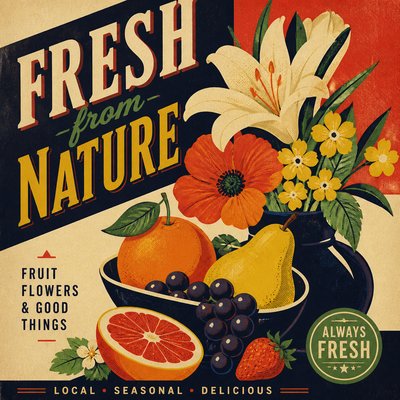
Concert Poster Design
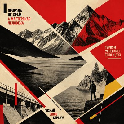
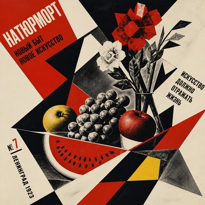
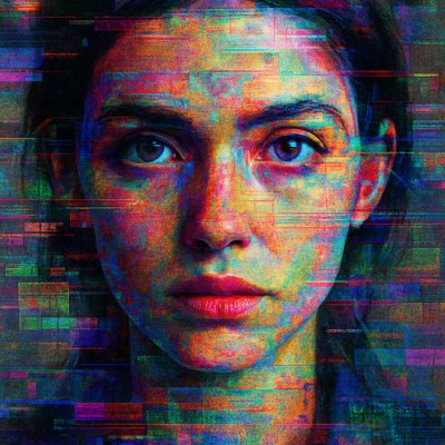
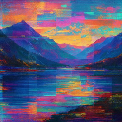
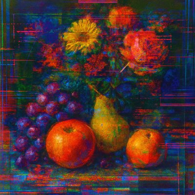
Bold music posters with screen-printed textures, psychedelic color, raw DIY energy, and high-impact graphic composition.
Instantly rendered in Concert Poster Design — or transform a photo
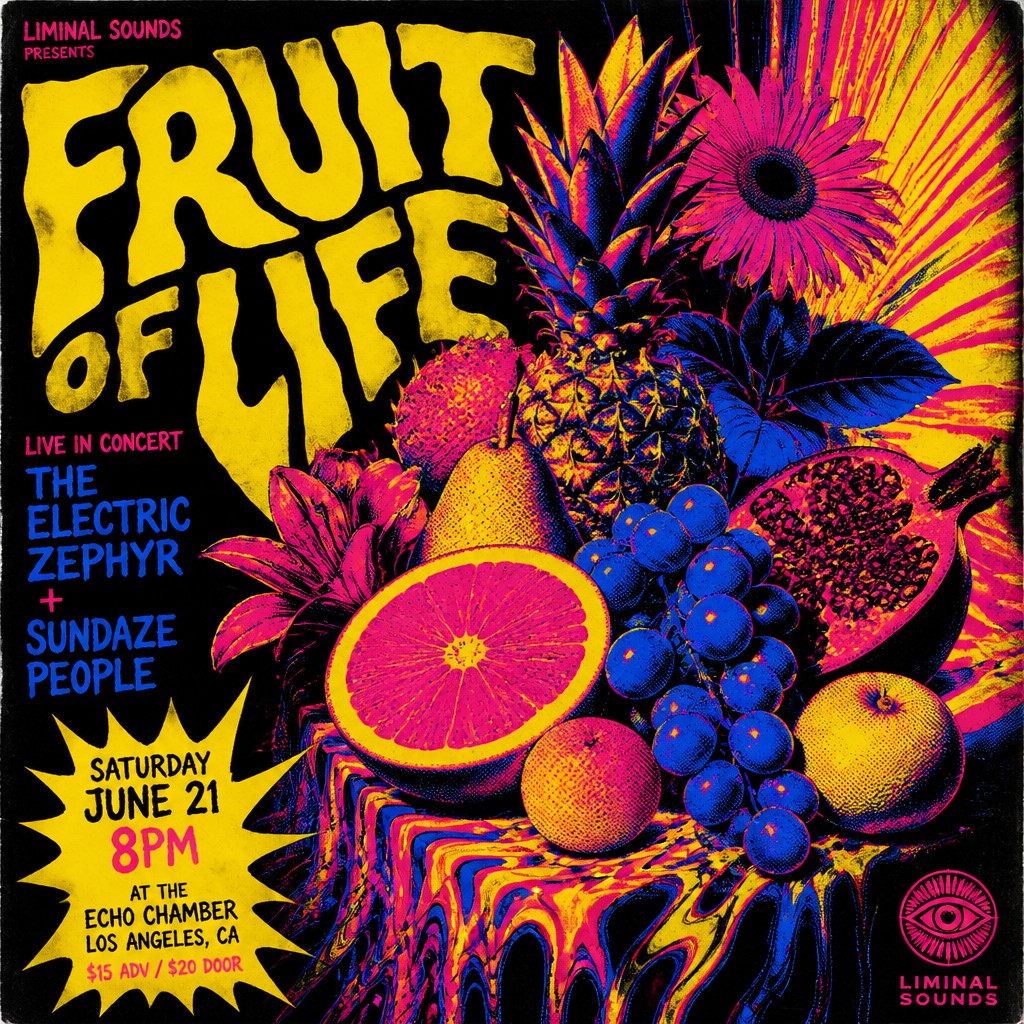
Concert Poster Design Gallery
Tap any artwork to explore it
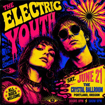
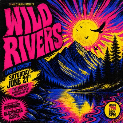
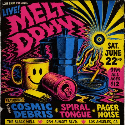
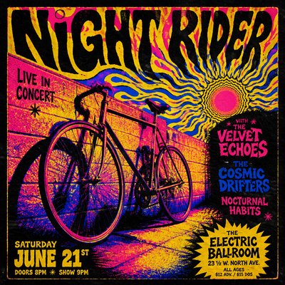
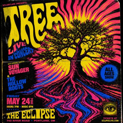
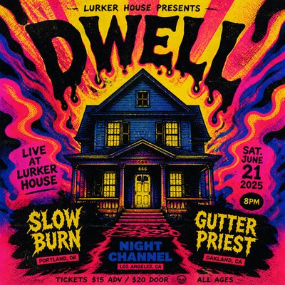
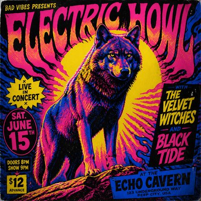
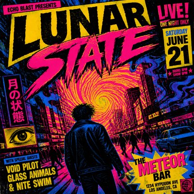
What is Concert Poster Design?
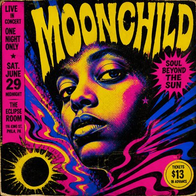
Concert poster design is a music-centered graphic style built for immediate impact at poster size: bold silhouettes, compressed typography, vivid color contrasts, and compositions that can be read quickly from a distance. It is not one single historical movement but a practical visual language that developed around live music promotion, especially where posters had to compete in crowded street environments, club foyers, and campus bulletin boards.
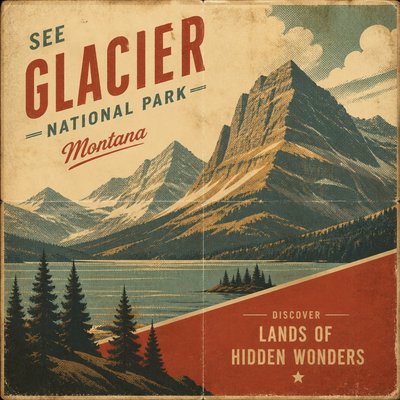
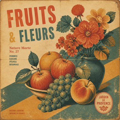
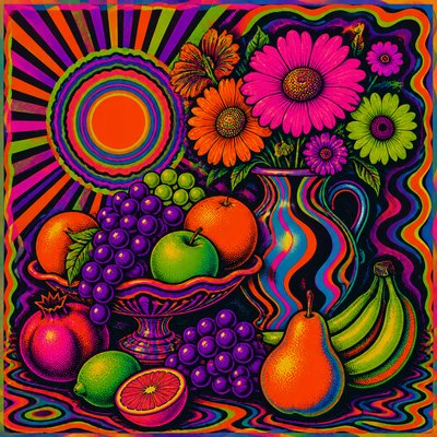
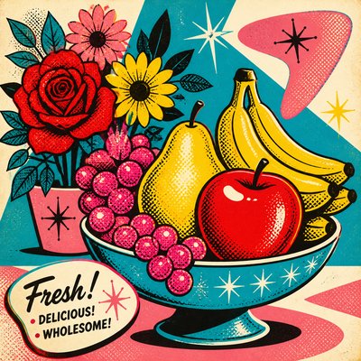
Its look often combines screen-print aesthetics, psychedelic distortion, punk-era roughness, and genre-specific cues such as gothic lettering, outlaw imagery, neon gradients, or metallic futurism. The style tends to feel energetic and handcrafted because it emerged from production methods that rewarded simplified forms, strong contrast, and repeatable shapes; even in digital work, those traits remain central to its identity.
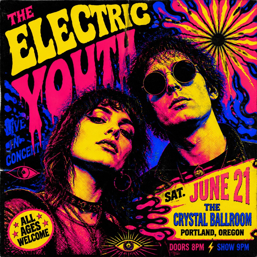
Try It On Your Photos
Upload any photo and convert it into Concert Poster Design — drag the sliders to compare before and after.
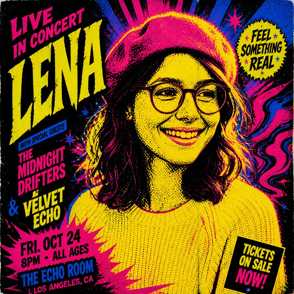

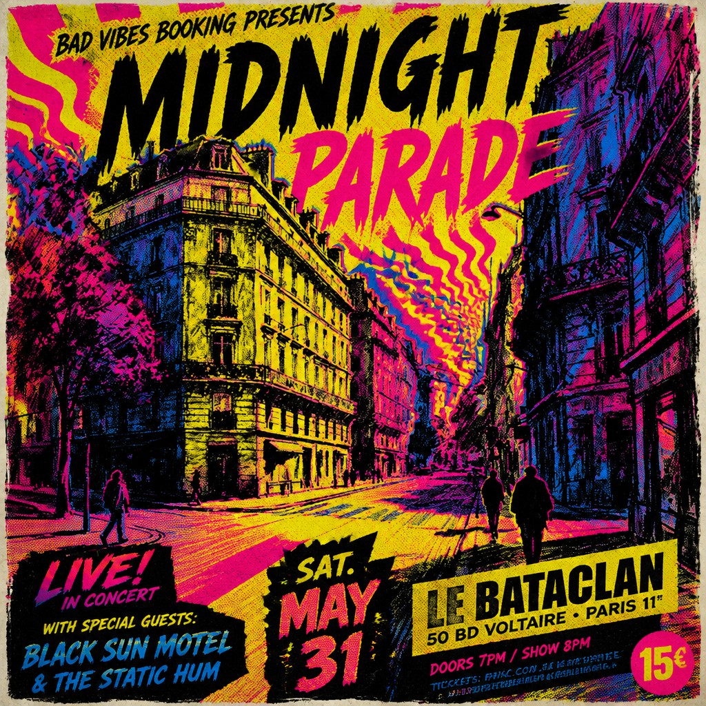

What Defines Concert Poster Design
The signature details, up close
High-contrast composition
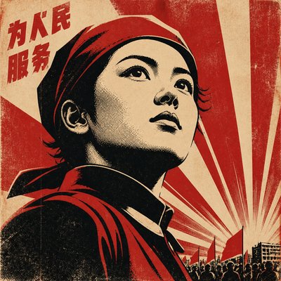
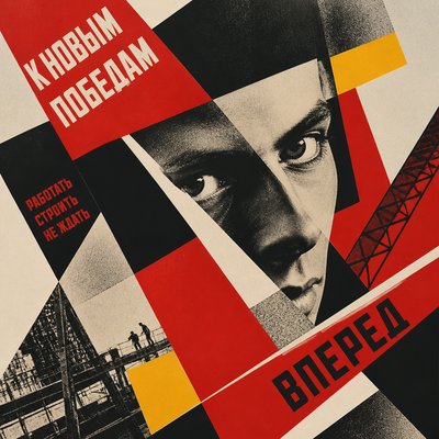
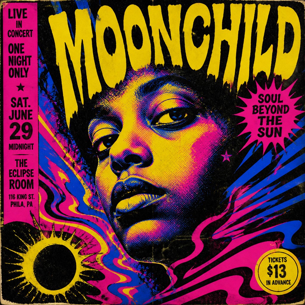
The layout is designed to read instantly, often with a dominant central image, a strong diagonal sweep, or a clear focal silhouette. Information is prioritized through scale and hierarchy so the performer name and event message remain legible at a glance.
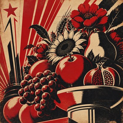
Screen-print texture
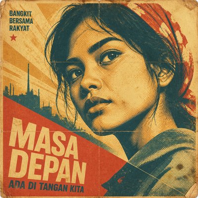
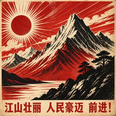
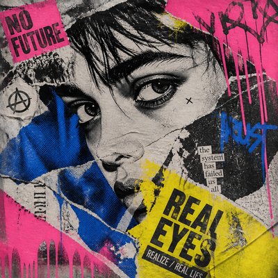
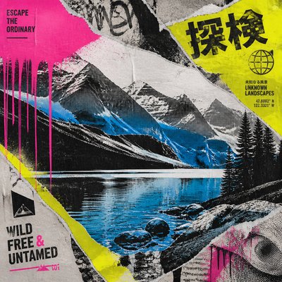
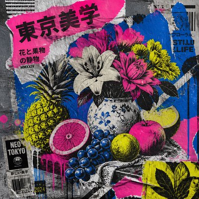
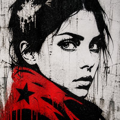
Visible halftones, ink overlap, misregistration, and worn paper effects are common, even when the piece is digitally produced. These imperfections signal print culture and give the image a tactile, handmade feel.
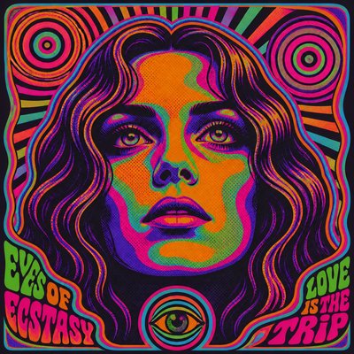
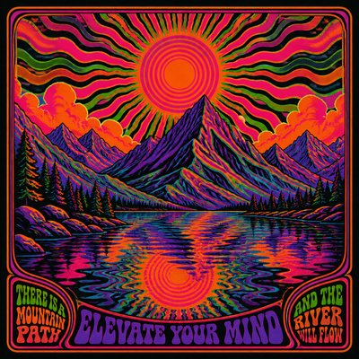
Psychedelic or expressive distortion
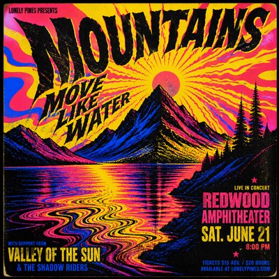
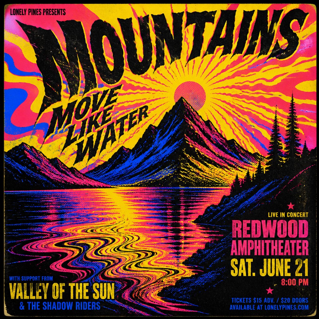
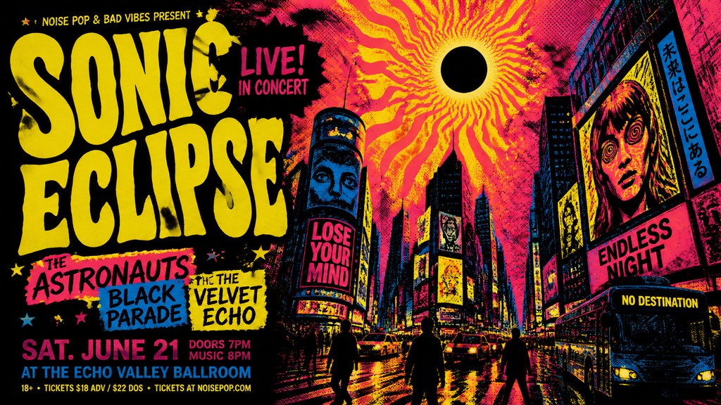
Liquefied forms, radiating lines, vibrating contours, and warped perspective appear frequently, especially in rock-oriented posters. These effects suggest sound, movement, and altered perception rather than literal realism.
Fluorescent and limited palettes
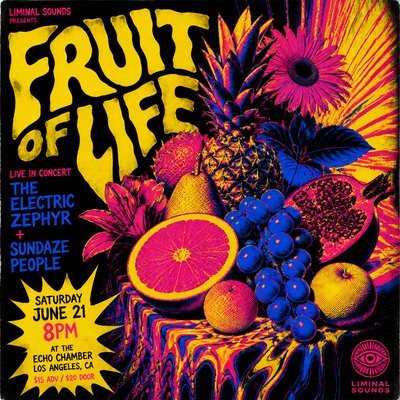
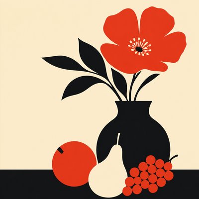
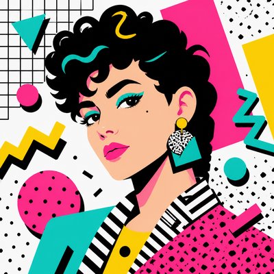
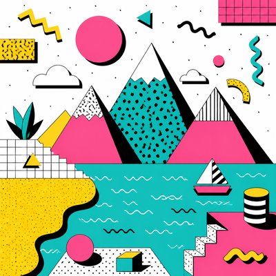
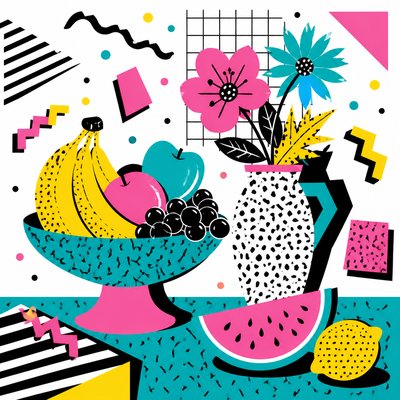
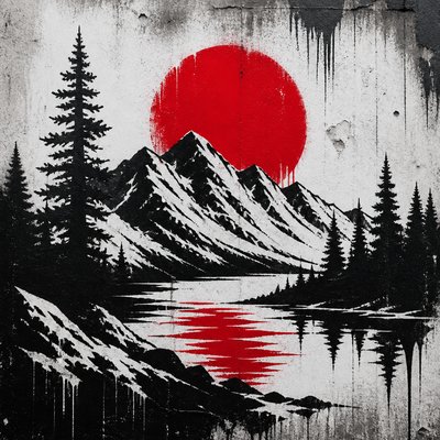
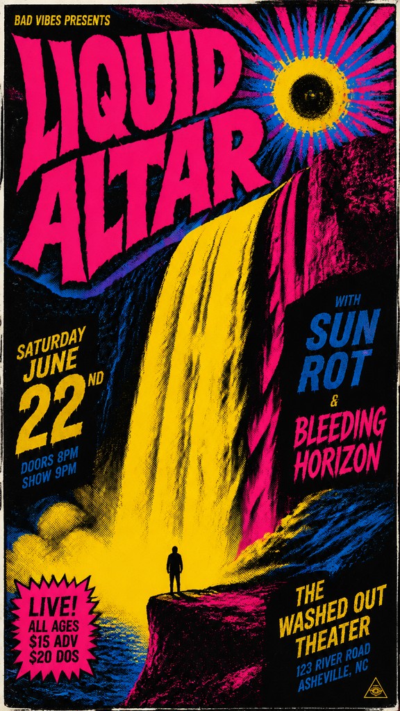
Many concert posters rely on a few intense colors, often including neon yellow, magenta, cyan, black, or duotone combinations. The restricted palette creates punch and print efficiency while making the image more memorable.
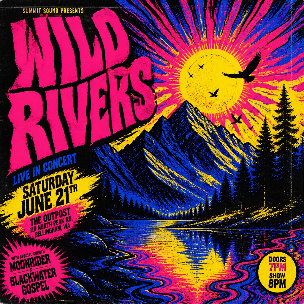
Genre-coded imagery
The visual language often reflects the music category: skulls, flames, snakes, chrome, stars, starscape imagery, noir figures, or floral psychedelia. These motifs help audiences recognize the event’s tone before reading the details.
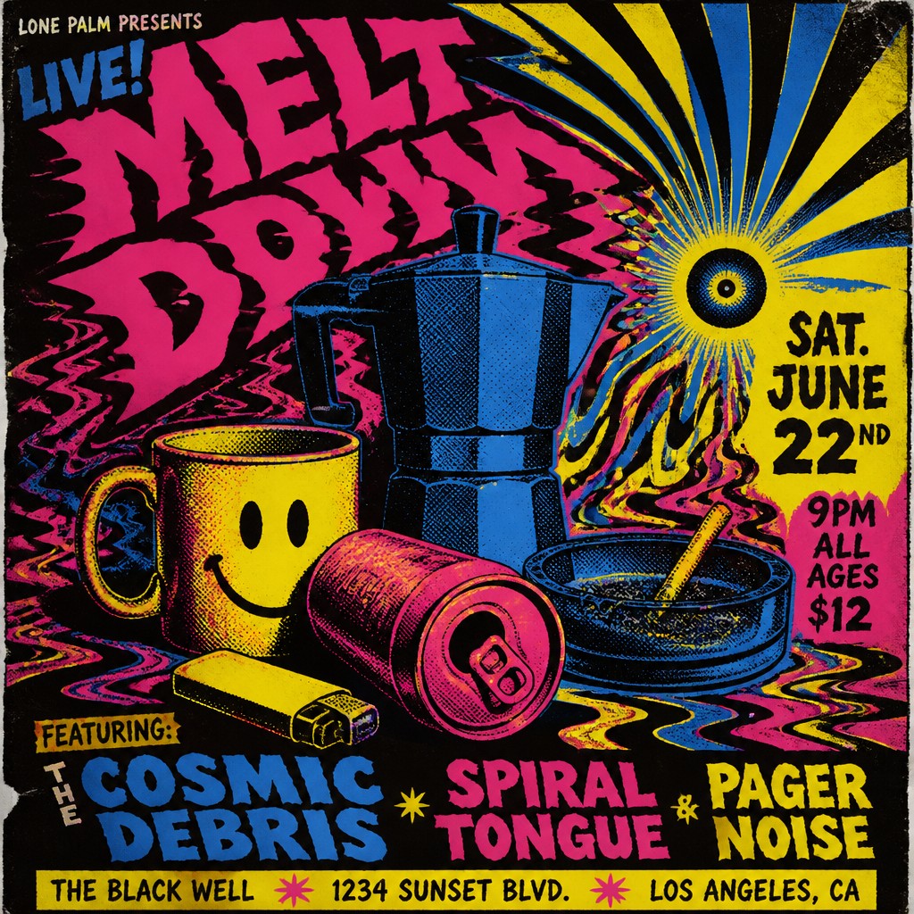
DIY and underground energy
Hand-lettered elements, rough edges, collage fragments, and visible construction marks often remain part of the final image. This unfinished quality links the poster to independent music scenes and small-run printing.
Try It
Create Videos in Concert Poster Design
Styles aren't just for stills — describe a scene or animate an image and get a short video rendered in Concert Poster Design. Press play to see this pond come to life.
Make a VideoConcert Poster Design Prompt Ideas
Start from an idea — each one opens the generator with the style ready to go. See all 40 Concert Poster Design prompts →
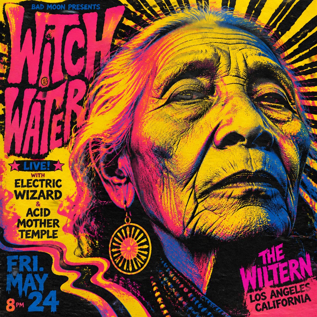
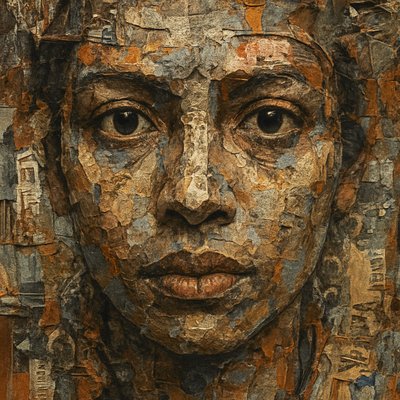
“close-up portrait of an elderly person with expressive weathered features”
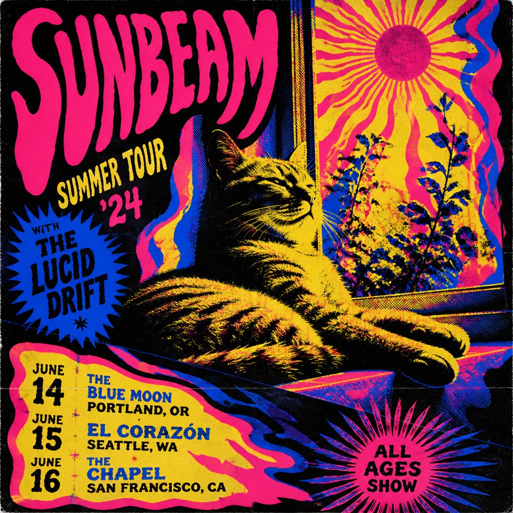
“a cat lounging in a sunlit window”
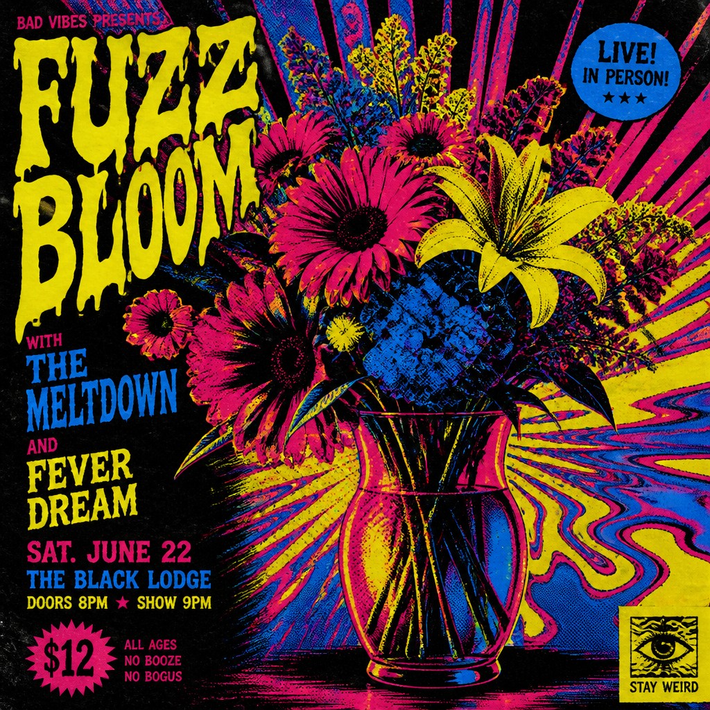
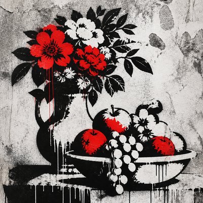
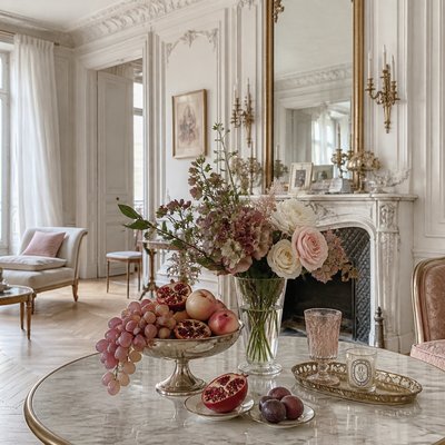
“bouquet of flowers in a glass vase”
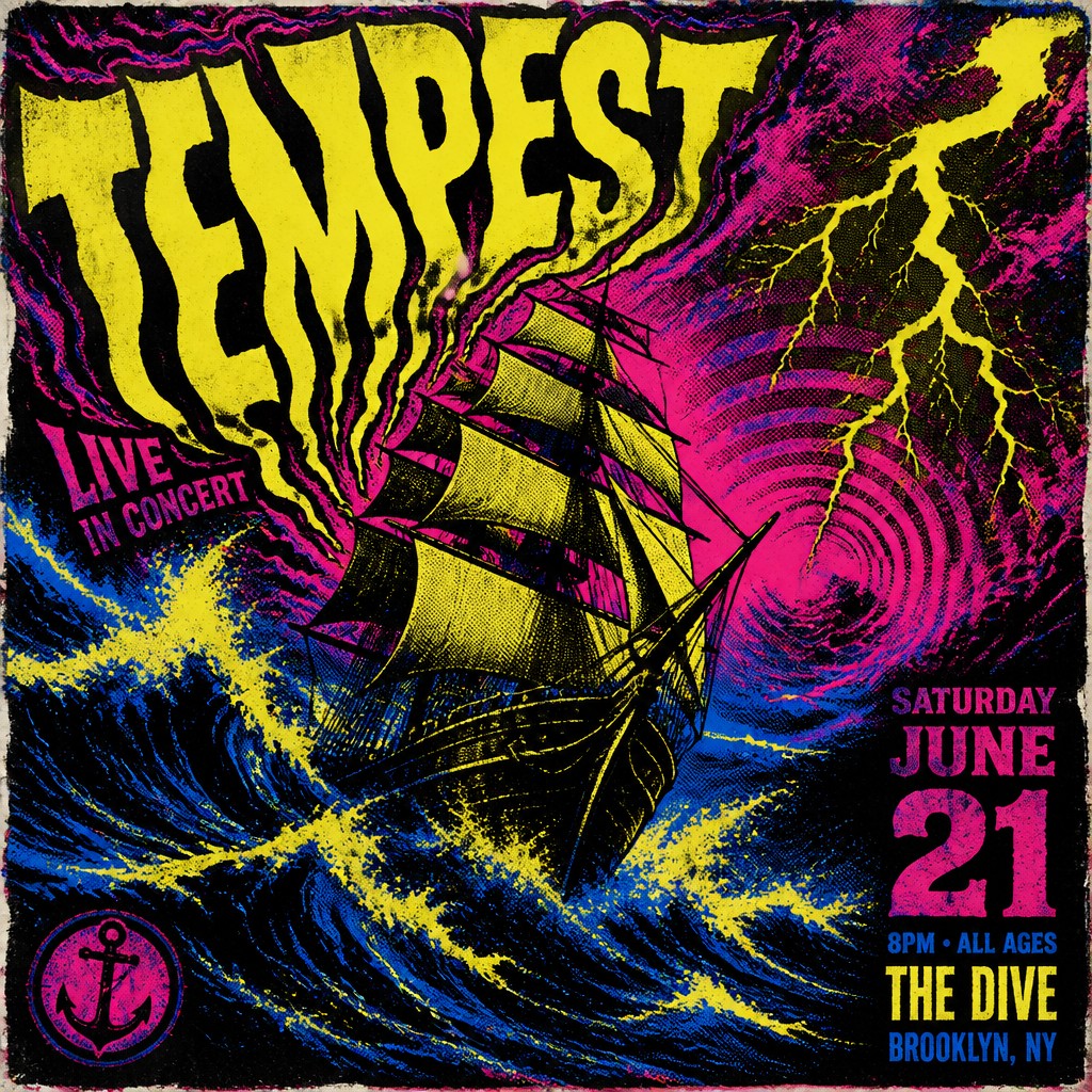
“sailing ship on a stormy sea”
How to Create Concert Poster Design Art
Master the craft step by step — or skip straight to creating. Read the full guide →
- 1
Build around legibility first
Start with a strong hierarchy: performer name, event title, date, and venue should be readable at poster distance. Use large type, a clear focal image, and enough contrast that the design works before the details are examined.
- 2
Use a limited ink palette
Choose two to four colors and make them do most of the work through contrast and overprinting. Traditional screen printing, risograph, or digital duotone workflows are especially effective for achieving the flat, punchy color relationships associated with the style.
- 3
Add print-process texture
Introduce halftone screens, rough edges, paper grain, and slight registration shifts to simulate real poster production. In digital tools, these effects should support the composition rather than obscure it.
- 4
Express the music through form
Match the imagery to the genre: psychedelic curves for rock, stark geometry for electronic acts, distressed collage for punk, or dark symbolic imagery for metal. The best posters translate sound into visual rhythm, not just decorative imagery.
- 5
Keep the composition forceful
Use diagonals, overlapping forms, and bold silhouettes to create motion and tension. For text-to-image prompts, specify the subject plus compositional language, such as 'explosive diagonal layout,' 'screen-printed ink,' and 'worn paper texture,' to steer the result toward poster design rather than generic illustration.

The Story
History & Origins of Concert Poster Design
Concert poster design grew out of the broader history of advertising lithography, gig flyers, and screen-printed music ephemera. In the 1960s, psychedelic posters for San Francisco rock venues such as the Fillmore helped define the genre’s visual vocabulary through warped lettering, saturated color, and dense patterning. At the same time, poster traditions from earlier commercial art, especially bold lithographic advertising, shaped the need for clarity, hierarchy, and high visibility.
Later decades added new branches: punk and hardcore flyers brought cut-and-paste collage, xerox grit, and anti-polished rawness; metal and electronic scenes introduced darker symbolism, angular typography, and luminous neon effects. Contemporary concert poster design draws from all of these lineages, preserving the readable, attention-grabbing function of the original printed poster while mixing analog textures with digital illustration, photo manipulation, and vector graphics.
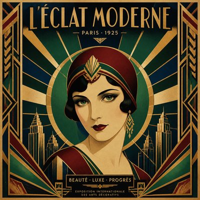
Influences: Concert poster design draws from psychedelic poster art of the 1960s, especially the work of major San Francisco psychedelic poster artists, as well as earlier lithographic advertising and later punk flyer culture. It also overlaps with poster traditions associated with the Vienna Secession and early modern graphic design, where strong silhouette, typography, and compositional clarity were central, though concert posters reinterpret those principles through music culture and print roughness.
Frequently Asked Questions
What defines concert poster design?
It is a graphic style made to advertise live music with maximum visual impact. The key features are bold composition, strong typography, vivid or limited-color printing, and imagery that suggests the sound or atmosphere of the performance.
Is concert poster design the same as psychedelic poster art?
Not exactly. Psychedelic poster art is one important branch of concert poster design, especially from the late 1960s, but concert posters also include punk, metal, indie, jazz, electronic, and experimental scenes. The broader style is defined by function and layout, while psychedelic poster art is a more specific visual subtradition.
Why do these posters often look rough or handmade?
That look comes from screen printing, photocopy flyers, risograph, and low-budget production methods that were common in underground music scenes. Even when the work is digitally made, designers often preserve misregistration, halftone grain, and worn-paper effects because they signal authenticity and energy.
What colors work best in this style?
High-contrast combinations usually work best, especially black with fluorescent yellow, magenta, cyan, orange, or red. Limited palettes are common because they improve readability and reproduce well in print, while also reinforcing the bold, poster-like feel.
How is it different from general graphic design?
General graphic design can be neutral, corporate, or information-driven, while concert poster design is intentionally expressive and attention-grabbing. It often uses more aggressive composition, more atmospheric imagery, and stronger genre cues to communicate the feel of a live event.
Where is concert poster design used today?
It is used for gig posters, tour announcements, album-related promotions, club nights, festival advertising, and collectible art prints. Many contemporary musicians and venues still use it because it can communicate identity quickly while also functioning as a standalone artwork.
Create your first Concert Poster Design artwork
Describe anything — or upload a photo — and see it in Concert Poster Design in seconds.
Make Something with Concert Poster Design
Compare Concert Poster Design
Related Styles
Discover similar art styles