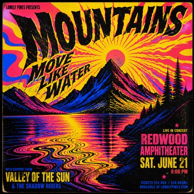
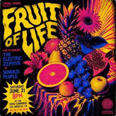
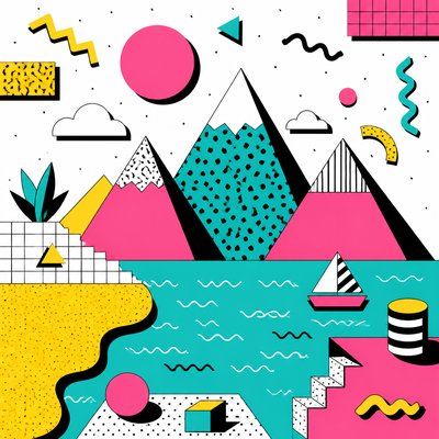
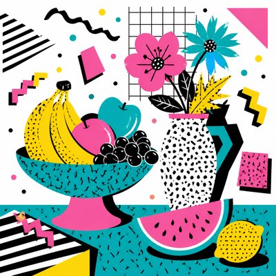
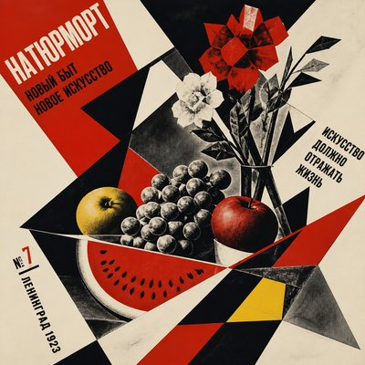
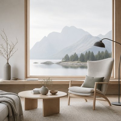
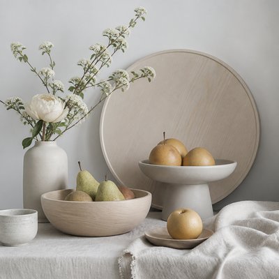
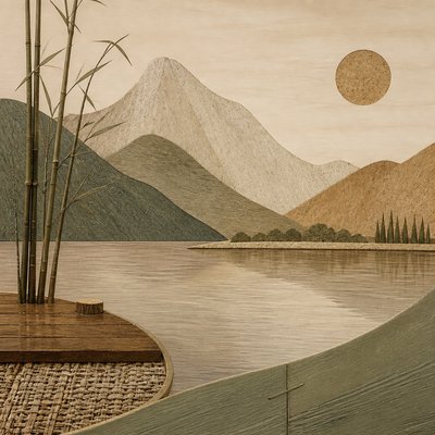
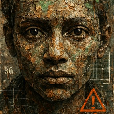
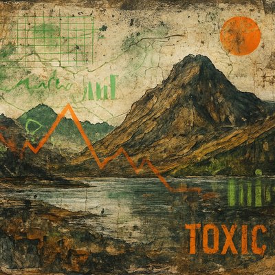
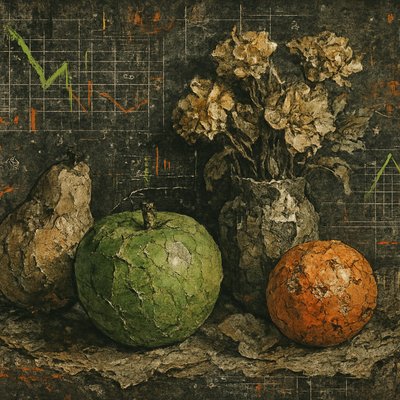
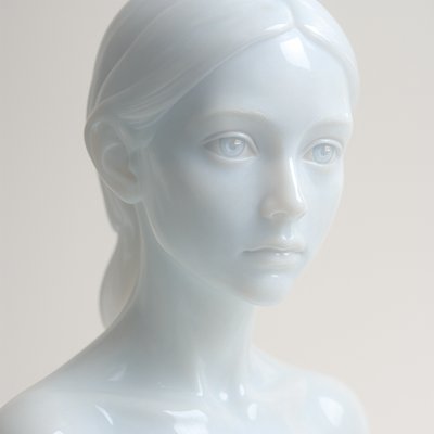
Minimalist Poster Design
Clean, high-impact posters built from negative space, limited colors, and essential shapes for clear visual communication.
Instantly rendered in Minimalist Poster Design — or transform a photo


Minimalist Poster Design Gallery
Tap any artwork to explore it



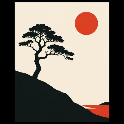
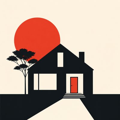


What is Minimalist Poster Design?
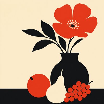
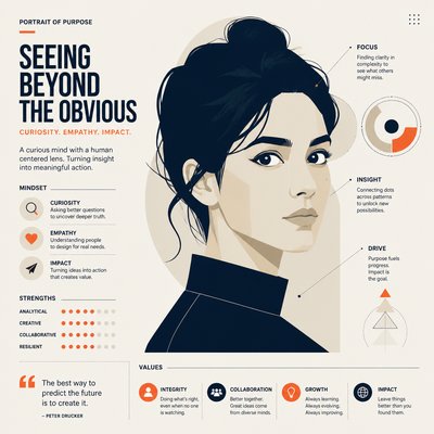
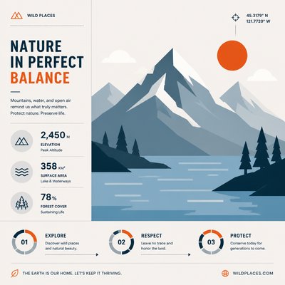
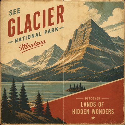
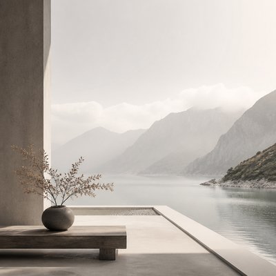
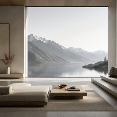
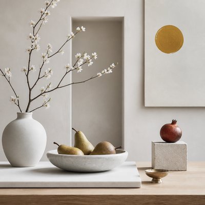
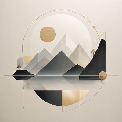
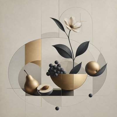
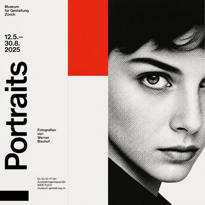
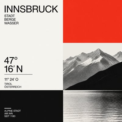
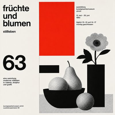
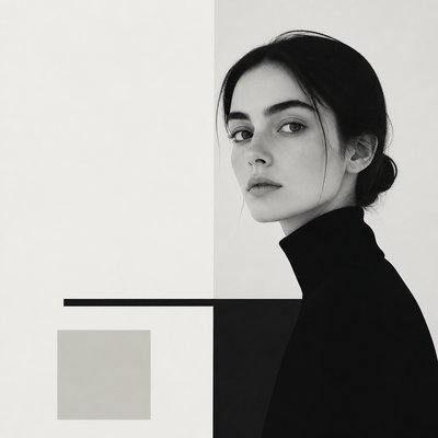
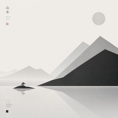
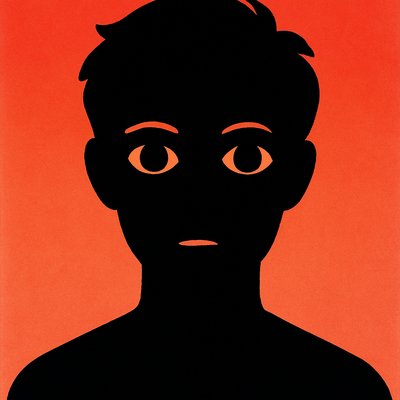
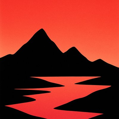
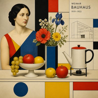
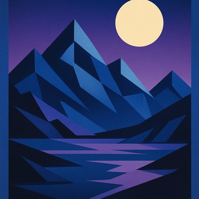
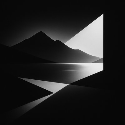
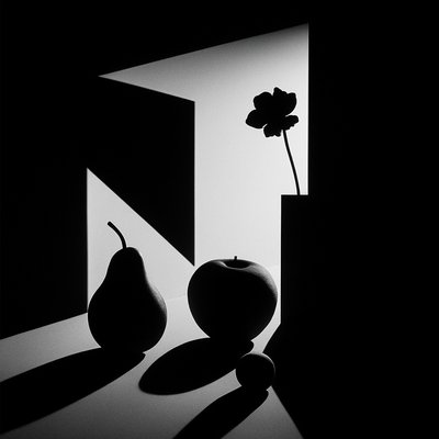
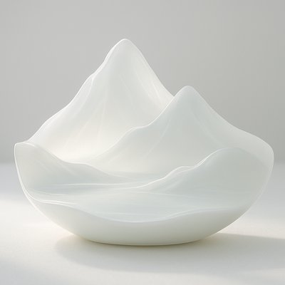
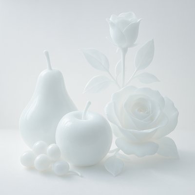
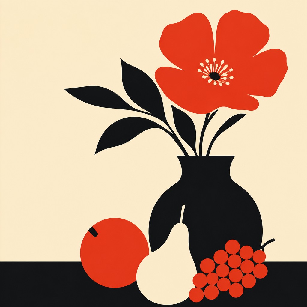
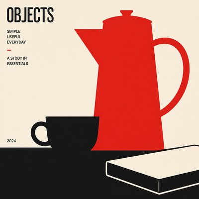
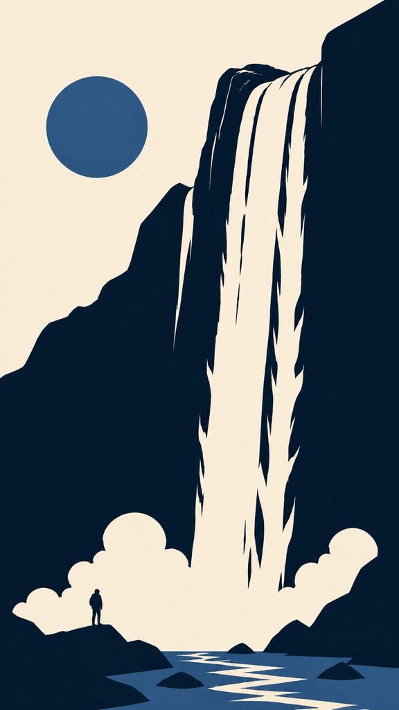
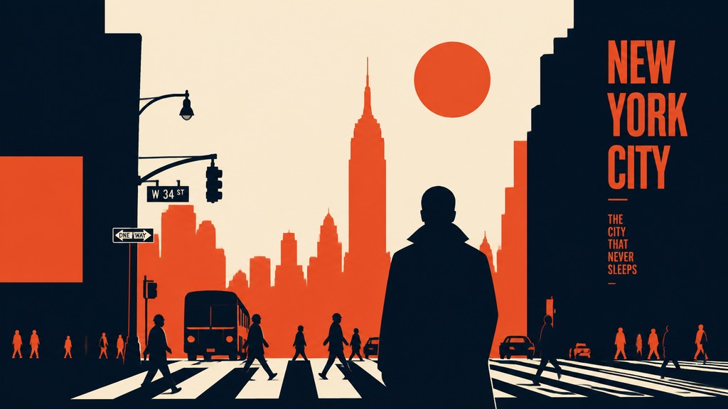
Minimalist poster design is a graphic style that communicates with the fewest possible visual elements: a limited color palette, large areas of negative space, simplified shapes, and a single clear focal point. Its purpose is not decorative accumulation but immediate readability, allowing an image or message to land quickly and forcefully.
The look is defined by subtraction. Instead of building depth through detail, texture, or elaborate rendering, minimalist posters rely on scale, placement, contrast, and composition. The result often feels orderly and modern, but it can also be tense, poetic, or symbolic because the empty space around the subject becomes part of the meaning.
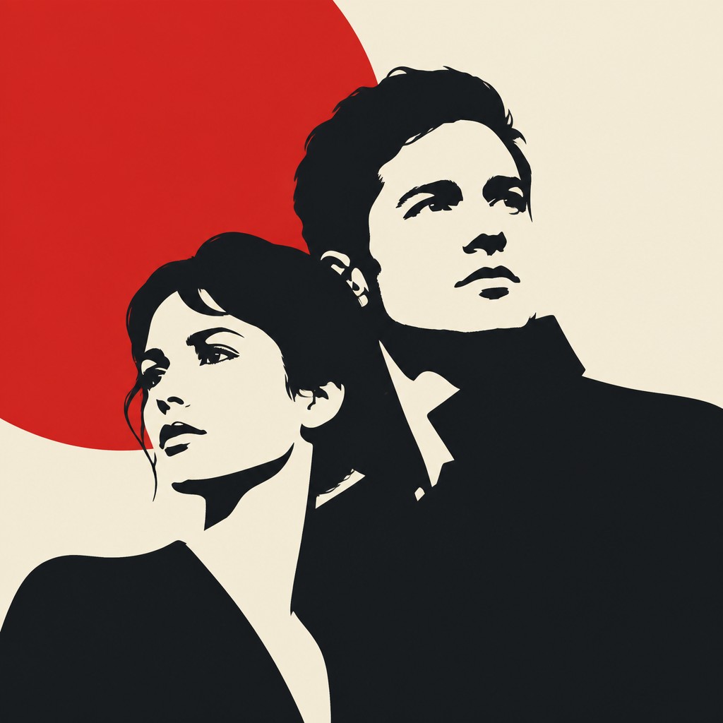
Try It On Your Photos
Upload any photo and convert it into Minimalist Poster Design — drag the sliders to compare before and after.


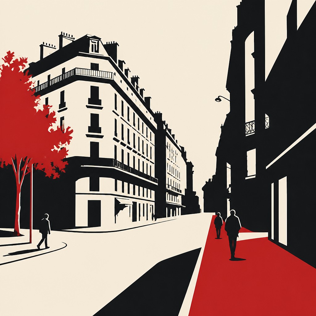

What Defines Minimalist Poster Design
The signature details, up close
Negative space as structure
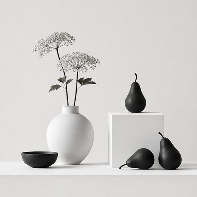
Empty areas are not filler; they organize the composition and often carry as much visual weight as the subject. This creates a calm, open field that makes the remaining forms feel deliberate and focused.
Limited palette
Most minimalist posters use two or three colors, often with strong contrast. Restricting color helps unify the image and keeps attention on shape, placement, and hierarchy.
Flat, simplified forms
Subjects are reduced to essential silhouettes, icons, or geometric components. Detail is removed so the image reads instantly and retains graphic clarity at small and large sizes.
Strong composition and balance
Placement is carefully calculated, often using asymmetry, alignment, and grid logic. A single object may be isolated to create tension, emphasis, or a sense of refined restraint.

High contrast and crisp edges
Hard boundaries between shapes and colors are typical, especially in vector-based work or screen-print-inspired imagery. This gives the design a sharp, disciplined finish.
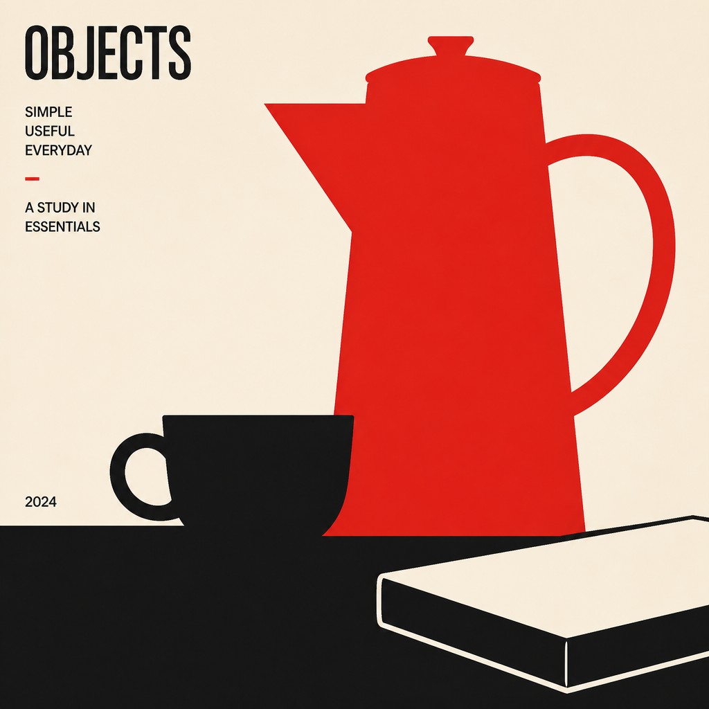
Typography that supports, not competes
When text appears, it is usually restrained, geometric, and integrated into the composition. Lettering often acts as a structural element rather than an ornate feature.
Try It
Create Videos in Minimalist Poster Design
Styles aren't just for stills — describe a scene or animate an image and get a short video rendered in Minimalist Poster Design. Press play to see this pond come to life.
Make a VideoMinimalist Poster Design Prompt Ideas
Start from an idea — each one opens the generator with the style ready to go. See all 40 Minimalist Poster Design prompts →
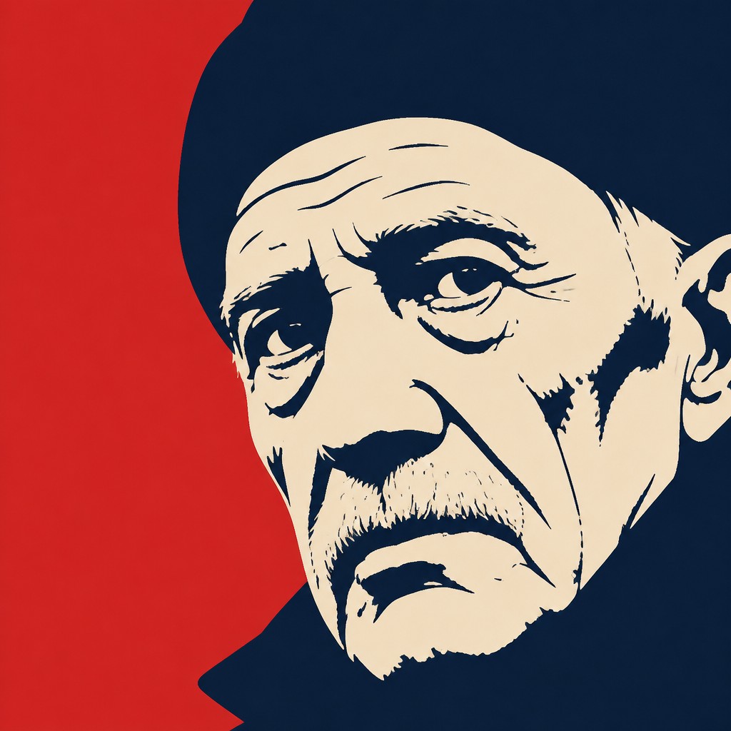
“close-up portrait of an elderly person with expressive weathered features”
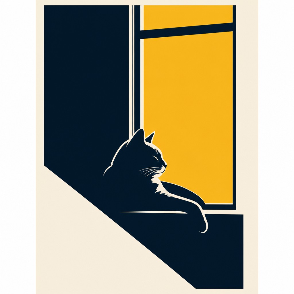
“a cat lounging in a sunlit window”

“bouquet of flowers in a glass vase”

“sailing ship on a stormy sea”
How to Create Minimalist Poster Design Art
Master the craft step by step — or skip straight to creating. Read the full guide →
- 1
Reduce the subject to essentials
Start by identifying the most recognizable contour, gesture, or symbol in your subject, then remove everything unnecessary. In traditional work, sketch multiple thumbnail compositions before committing; in digital work, build the image from simple vector-like shapes.
- 2
Use negative space intentionally
Leave large unoccupied areas so the viewer's eye can rest and the focal point can dominate. Treat blank space as a compositional element that shapes meaning, not as an area to be filled.
- 3
Limit your palette early
Choose two or three solid colors with clear value contrast, and avoid gradients or heavy texture. A restricted palette forces you to solve the design through composition and hierarchy rather than decoration.
- 4
Design for scale and legibility
Make sure the image reads from a distance by testing it at small sizes. Strong silhouette, simple contrast, and a single focal point are more important than fine detail in this style.
- 5
If using digital or AI tools, specify flatness and restraint
Prompt for flat silhouettes, crisp vector edges, dominant negative space, and screen-print-like color blocks. Avoid language that encourages gradients, complex textures, photorealism, or crowded scenes.
The Story
History & Origins of Minimalist Poster Design
Minimalist poster design grew out of 20th-century graphic design, especially the Swiss Style (International Typographic Style), modernist layout theory, and broader minimalist tendencies in art and design. Its visual logic was shaped by the rise of grid-based composition, sans-serif typography, flat color printing, and the belief that clarity and economy are strengths in visual communication.
The style also draws from earlier poster traditions, including early 20th-century European graphic design, screen-print poster culture, and modernist advertising. In contemporary practice, it remains common in cultural posters, editorial graphics, branding, event promotion, and concept-driven illustration, where the goal is often to create a concise image that can be understood at a glance.
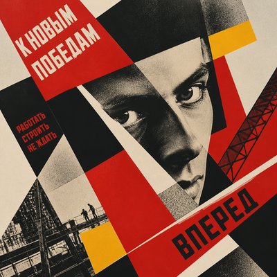
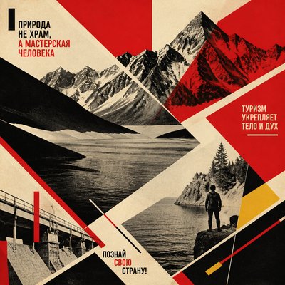
Influences: Minimalist poster design is closely related to Swiss Style graphic design, with its grid systems, sans-serif typography, and commitment to clarity, as well as to minimalist art's emphasis on reduction. It also echoes screen-print poster traditions and modernist visual communication; in the broader history of design, leading Swiss-style graphic designers and major modernist constructivist designers are often associated with the disciplined use of geometry, contrast, and compositional economy that informs this look.
Frequently Asked Questions
What defines minimalist poster design?
It is defined by reduction: a small number of shapes, a limited color palette, and large areas of negative space. The goal is to communicate a message or mood with maximum clarity and minimum visual material. The composition usually centers on one dominant idea rather than many competing details.
How is this different from general minimalism?
General minimalism can apply to interiors, product design, painting, or sculpture, while minimalist poster design is specifically a graphic communication style. Posters also have to solve hierarchy, legibility, and message delivery, so typography, scale, and layout play a bigger role. It is minimalism shaped by the needs of visual communication.
How is it different from flat design?
Flat design often refers to a broad digital aesthetic with simple shapes and no depth, but it can still be colorful and interface-driven. Minimalist poster design is more compositionally expressive and usually more selective, using emptiness and scale contrast to create a stronger poster-like impact. It is less about interface usability and more about visual persuasion or atmosphere.
What subjects work best in this style?
Subjects with a clear silhouette or symbolic core work especially well: people, architecture, animals, landscapes, objects, and event themes. The subject should be easy to simplify without losing identity. Complex scenes can work only if they are reduced to one strong idea.
Where is minimalist poster design commonly used?
It is common in cultural event posters, exhibition graphics, film promotions, editorial visuals, branding campaigns, and social-media announcements. The style is useful whenever a message needs to feel modern, clear, and memorable. Its simplicity also makes it effective for limited-color printing.
How do I make my poster feel sophisticated rather than empty?
Sophistication comes from control: disciplined spacing, accurate alignment, strong contrast, and a clear visual hierarchy. Every element should feel necessary, and the empty space should be deliberate rather than accidental. The design should appear resolved even when it contains very little.
Create your first Minimalist Poster Design artwork
Describe anything — or upload a photo — and see it in Minimalist Poster Design in seconds.
Make Something with Minimalist Poster Design
Compare Minimalist Poster Design
Related Styles
Discover similar art styles