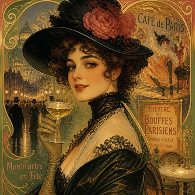
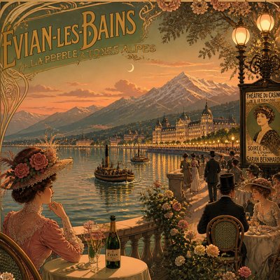
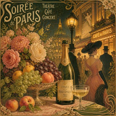
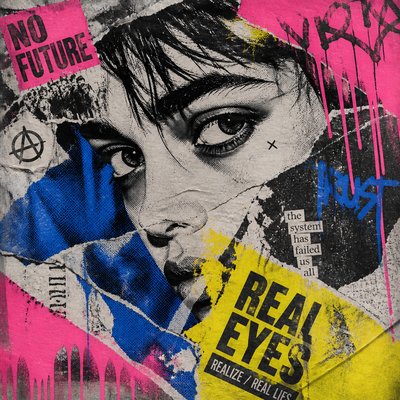
Art Deco Poster Design
Elegant 1920s–30s posters with geometric forms, metallic accents, sunbursts, and streamlined machine-age glamour.
Instantly rendered in Art Deco Poster Design — or transform a photo
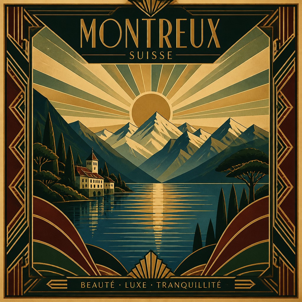
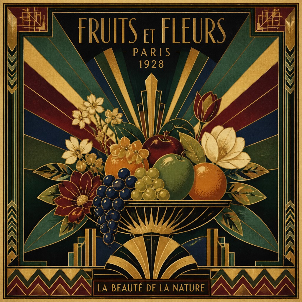
Art Deco Poster Design Gallery
Tap any artwork to explore it
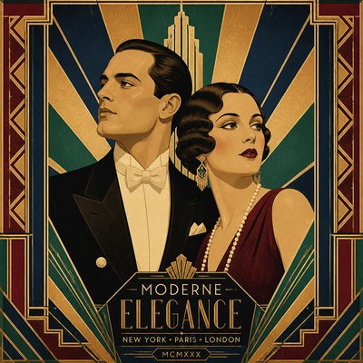
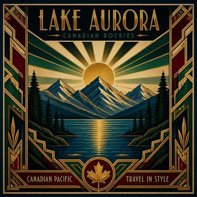
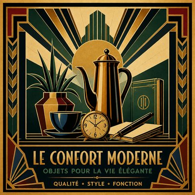
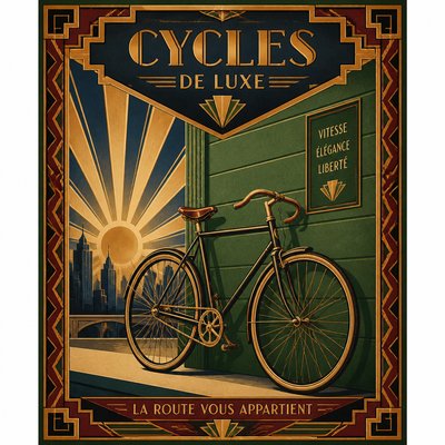
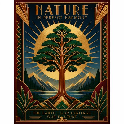
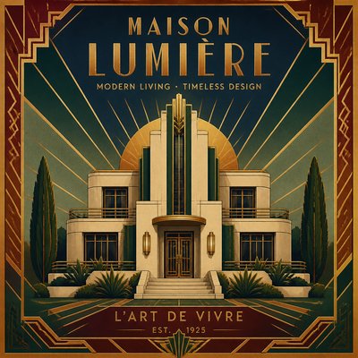
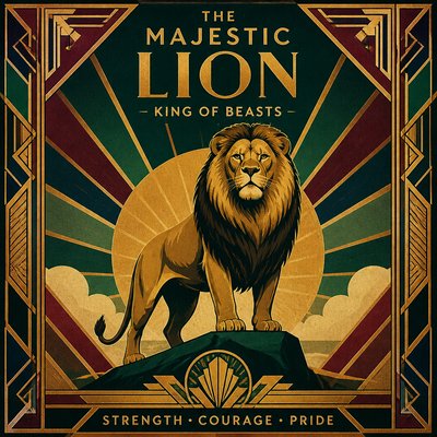
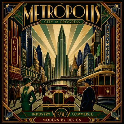
What is Art Deco Poster Design?
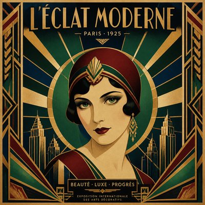
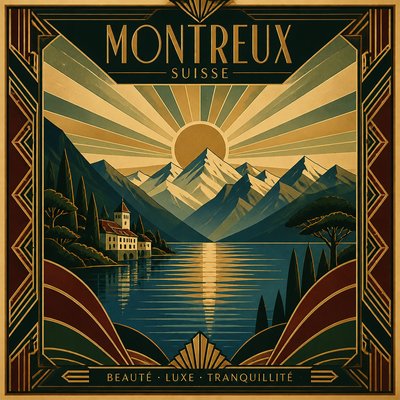
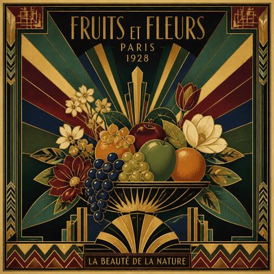
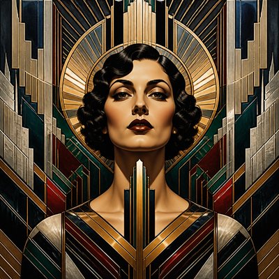
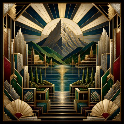
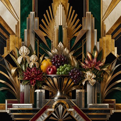
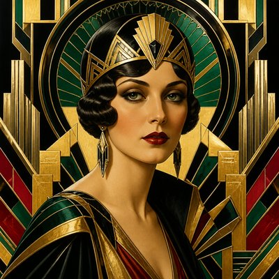
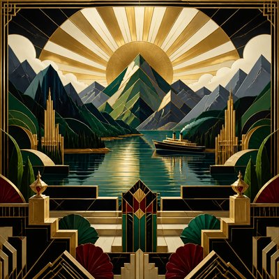
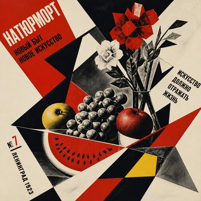
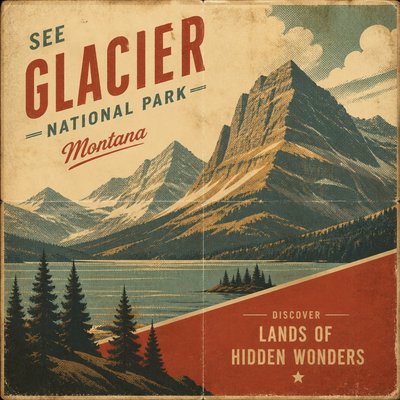
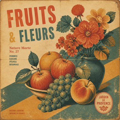
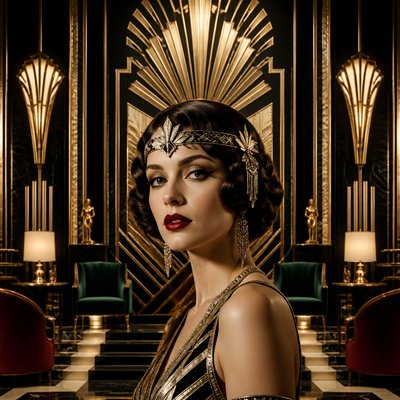
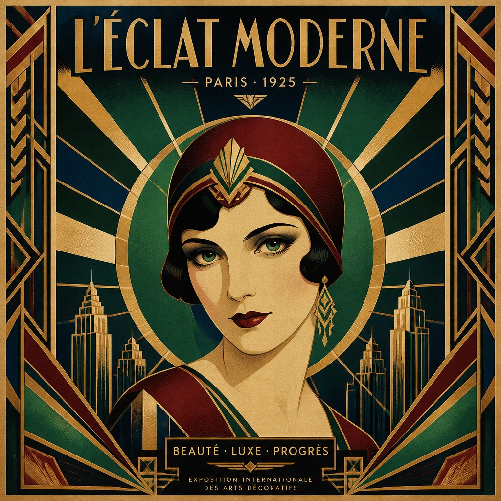
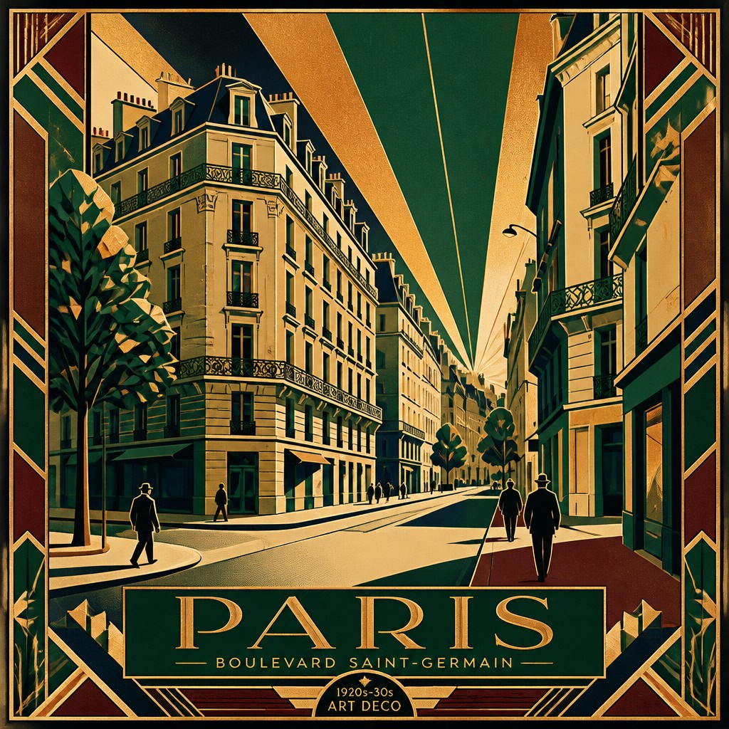
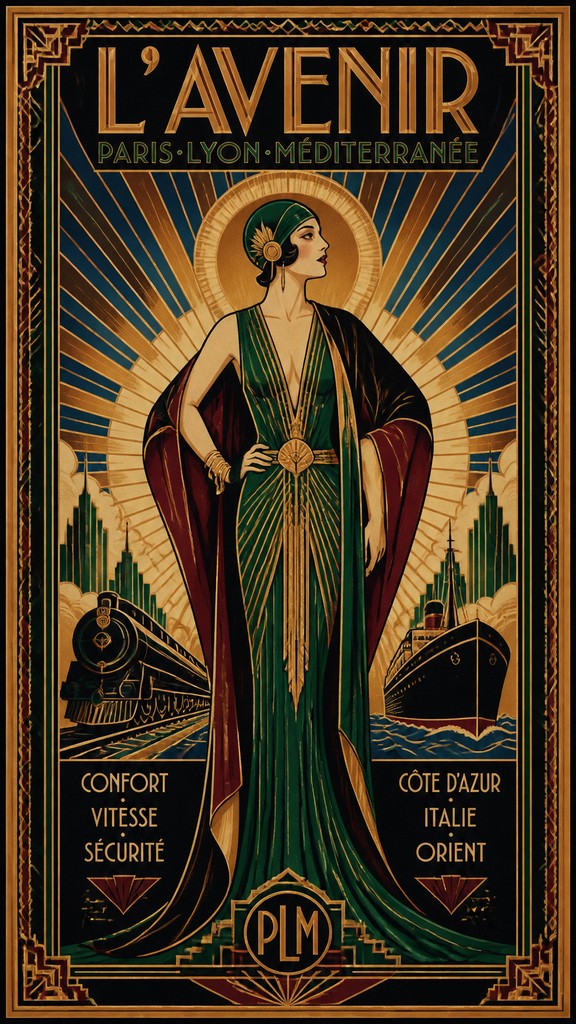
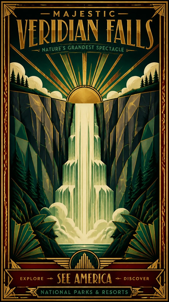
Art Deco poster design is a graphic style associated with the 1920s and 1930s that translates the broader Art Deco movement into bold, image-led advertising and publicity graphics. It is immediately recognizable by its streamlined silhouettes, geometric ornament, symmetrical layouts, and an air of polished luxury. Posters in this style often combine simplified figural forms with dramatic diagonals, radiating sunbursts, stepped forms, and decorative borders that frame the composition like a stage set.
The look developed for a world shaped by modern transport, electric light, fashion, skyscrapers, ocean liners, and mass media. Designers and commercial studios used flat color areas, strong contour lines, and metallic or jewel-toned palettes to communicate speed, elegance, and technological progress. The result is both decorative and highly legible: a poster style built to sell travel, theater, products, exhibitions, and events while projecting sophistication, cosmopolitanism, and machine-age glamour.
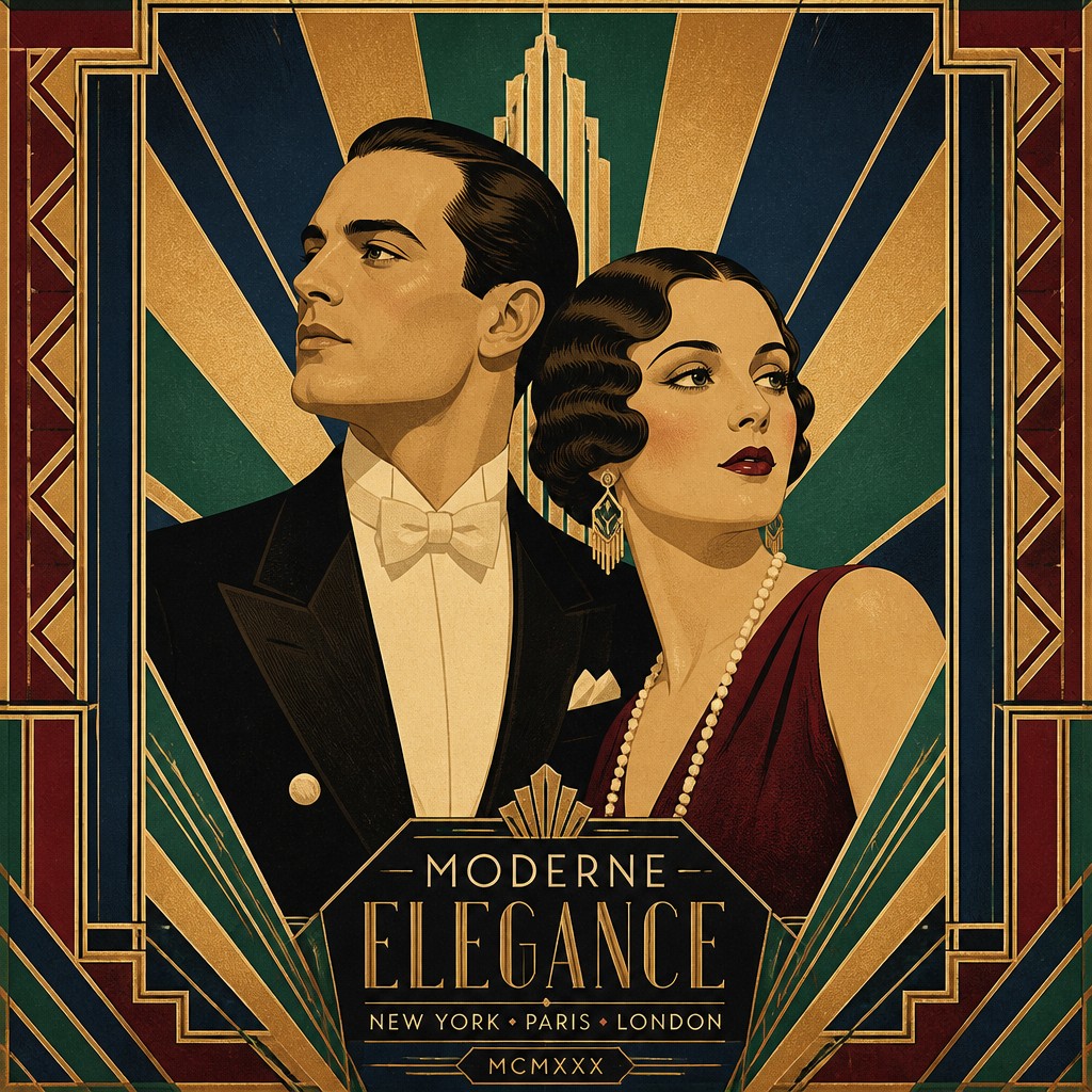
Try It On Your Photos
Upload any photo and convert it into Art Deco Poster Design — drag the sliders to compare before and after.
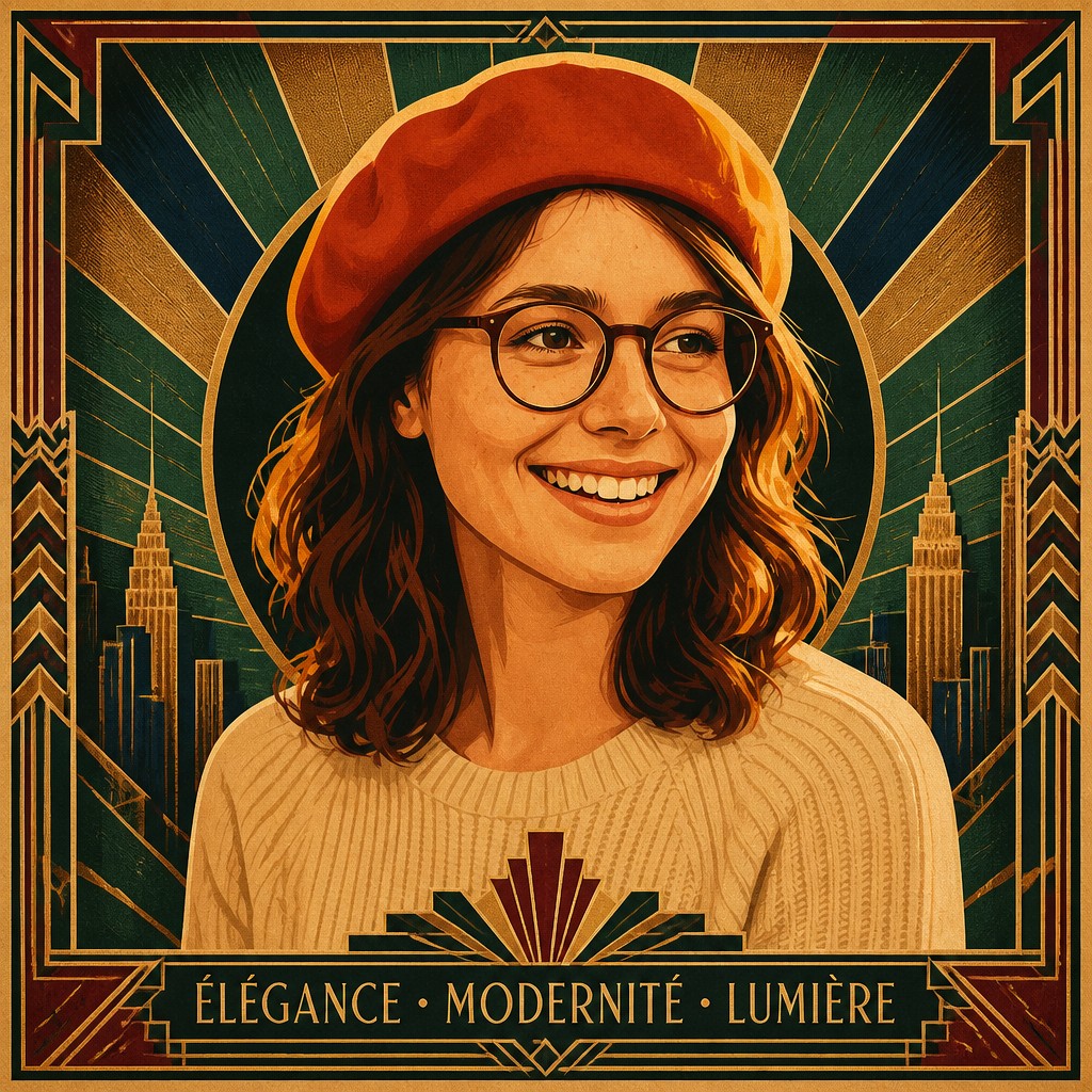


What Defines Art Deco Poster Design
The signature details, up close
Geometric composition
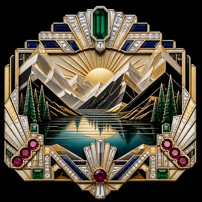
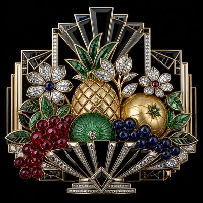
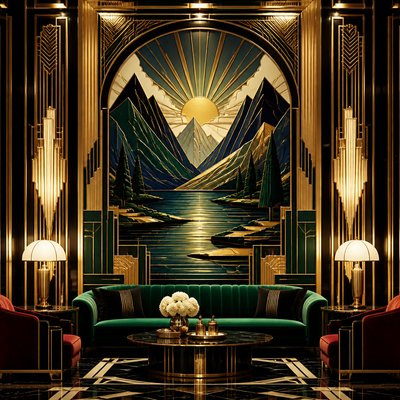
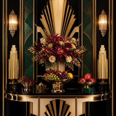
Compositions rely on triangles, circles, stepped forms, chevrons, and sunbursts. These shapes organize the poster into a clear, often symmetrical structure that feels engineered rather than painterly.
Streamlined forms
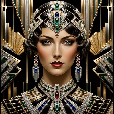
Figures, vehicles, architecture, and lettering are simplified into sleek contours and elongated silhouettes. Curves often meet sharp angles, creating a sense of movement and modernity.
Luxurious palette
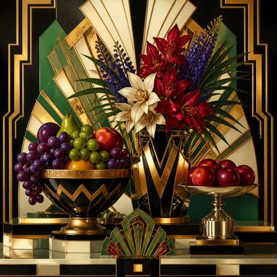
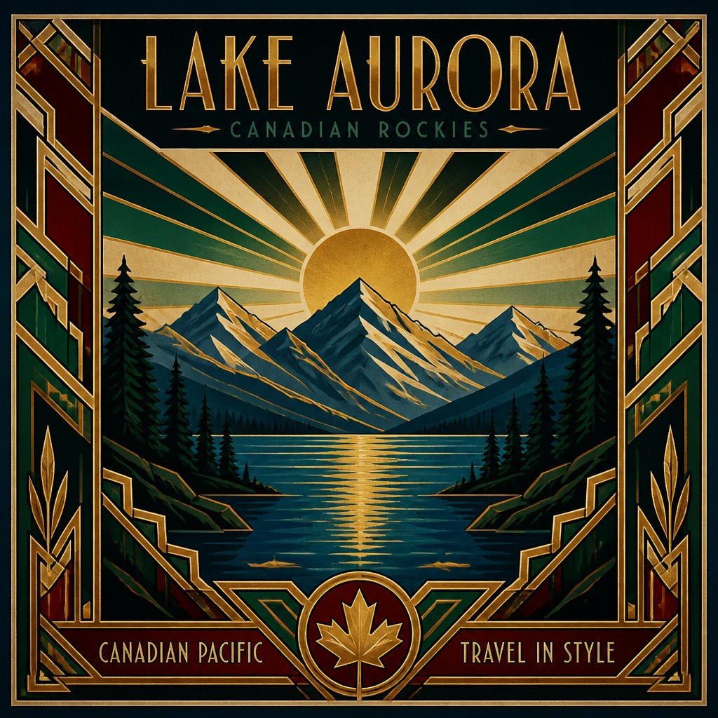
Common colors include emerald, sapphire, burgundy, cream, black, and warm metallics such as gold or copper. The palette is typically rich and contrasting, designed to feel elegant and theatrical.
Flat lithographic color
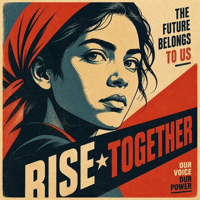
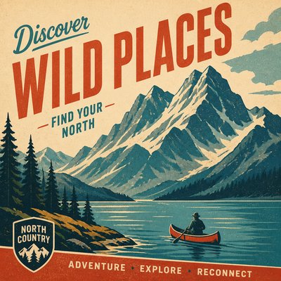
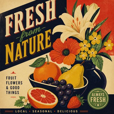
The image usually uses broad, unblended color planes with minimal shading or soft gradients. This reflects the limits and strengths of poster lithography, where bold areas of color reproduced clearly at scale.
Ornament with discipline
Decoration appears in borders, corner motifs, rays, zigzags, and stepped accents rather than in dense all-over pattern. Ornament is controlled and architectural, reinforcing the poster’s frame and hierarchy.
Machine-age glamour
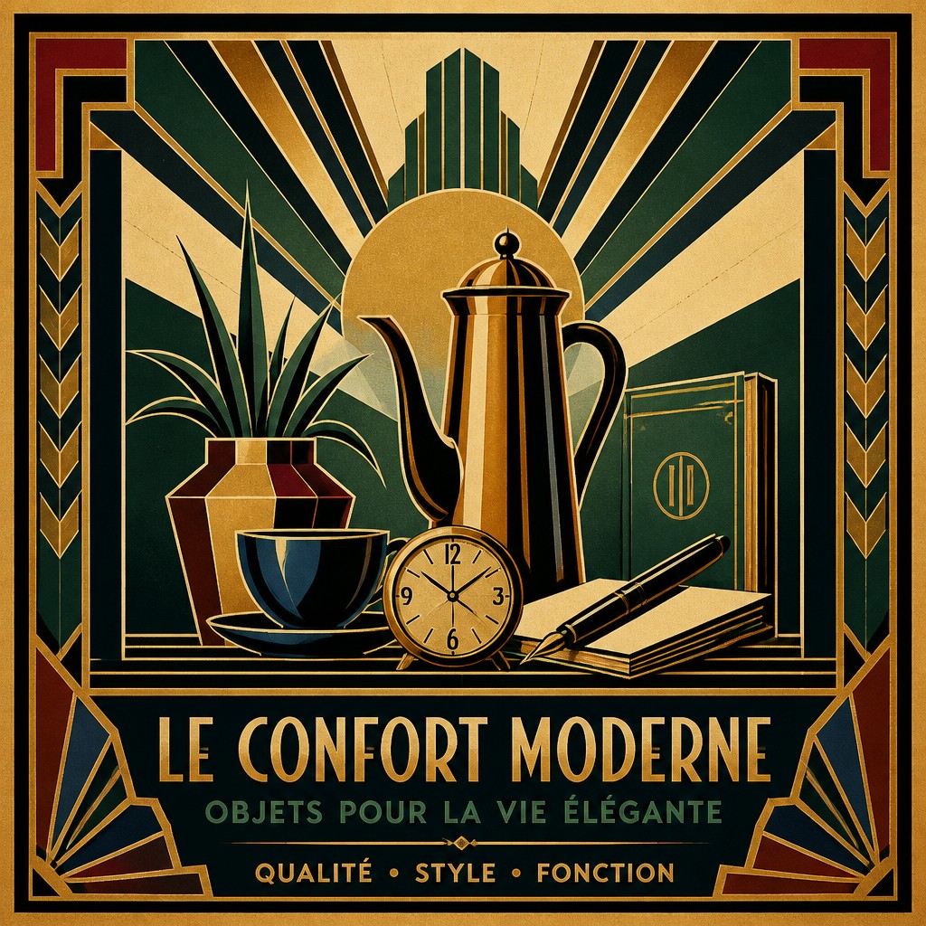
Subjects often reference trains, liners, city skylines, jazz age nightlife, fashion, aviation, or luxury goods. Even when depicting people, the mood is polished, modern, and optimistic rather than intimate or informal.
Try It
Create Videos in Art Deco Poster Design
Styles aren't just for stills — describe a scene or animate an image and get a short video rendered in Art Deco Poster Design. Press play to see this pond come to life.
Make a VideoArt Deco Poster Design Prompt Ideas
Start from an idea — each one opens the generator with the style ready to go. See all 40 Art Deco Poster Design prompts →
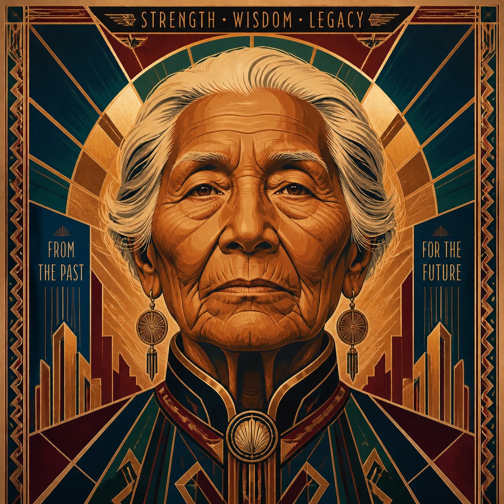
“close-up portrait of an elderly person with expressive weathered features”
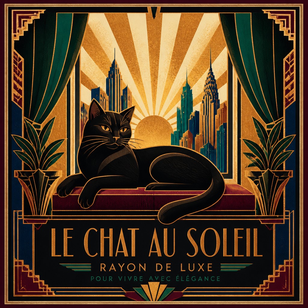
“a cat lounging in a sunlit window”
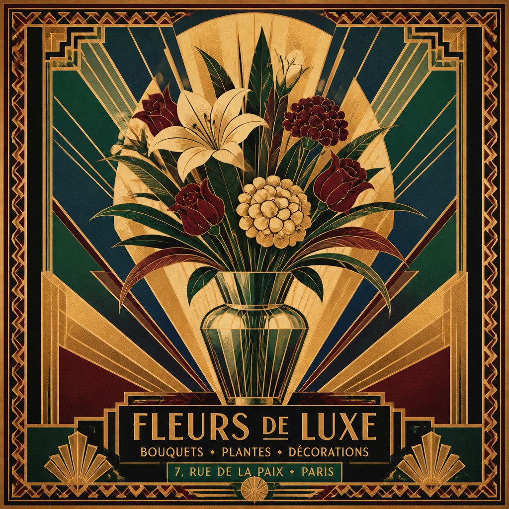
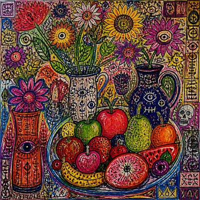
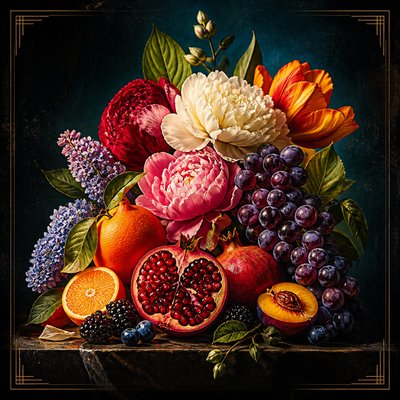
“bouquet of flowers in a glass vase”
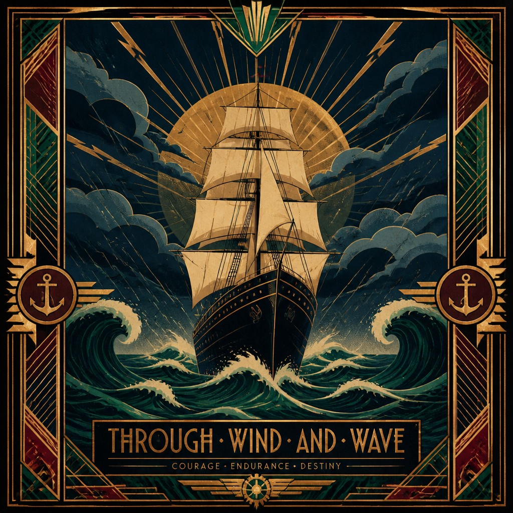
“sailing ship on a stormy sea”
How to Create Art Deco Poster Design Art
Master the craft step by step — or skip straight to creating. Read the full guide →
- 1
Build the composition around symmetry and hierarchy
Start with a strong central axis or a balanced diagonal structure, then place the main subject as a simplified silhouette. In a digital workflow, use clean vector-like shapes and clear negative space; in traditional media, block in the main forms before adding ornament.
- 2
Use flat colors and limited tonal modeling
Keep shading minimal and rely on large, even color regions. For print-like authenticity, suggest lithographic texture with subtle grain, slight paper aging, or restrained halftone rather than painterly blending.
- 3
Add decorative geometry with restraint
Integrate sunbursts, chevrons, zigzags, stepped edges, fan shapes, and border motifs to frame the subject. These details should support the layout, not clutter it, so every ornament reinforces the poster’s structure.
- 4
Choose a luxe, period-correct palette
Combine dark jewel tones with cream or black, then accent with metallic gold, brass, or copper effects. If working digitally, metallics can be simulated with controlled highlights; in traditional methods, use flat warm hues and high contrast to imply sheen.
- 5
Stylize typography and figure drawing
If letters are included, use tall, geometric, highly legible forms that echo the architecture of the image. Figures should be idealized and elongated, with elegant poses and simplified anatomy rather than naturalistic detail.
- 6
Prompt for poster language, not just a subject
When generating images, specify lithographic poster treatment, flat color planes, radiating geometry, ornamental border details, and vintage print grain. The subject alone is not enough; the prompt should instruct the system to render the subject as a designed poster composition.
The Story
History & Origins of Art Deco Poster Design
Art Deco emerged in the years before and after World War I and reached its peak in the 1920s and 1930s. The term comes from the 1925 Exposition Internationale des Arts Décoratifs et Industriels Modernes in Paris, which helped define the movement’s international profile. Poster design absorbed influences from Cubism, Futurism, Constructivism, ancient and non-Western ornament, and the streamlined aesthetics of modern industry, producing graphics that were both modern and decorative.
In poster form, the style flourished in travel advertising, rail and steamship promotion, theater publicity, world fairs, and luxury branding. A leading interwar poster designer is closely associated with the style’s poster language, while other related commercial artists working in the interwar period helped spread its visual vocabulary. After the 1930s, Art Deco gave way to wartime austerity and later modernist design, but its poster language remained influential in vintage revival graphics and nostalgic branding.
Influences: Art Deco poster design draws from Cubism’s planar simplification, Futurism’s sense of speed, Constructivism’s graphic force, and the decorative traditions of luxury print and exhibition design. Among canonical poster artists and designers, a leading interwar poster designer is especially important for defining the streamlined poster aesthetic, while the broader movement also intersects with the work of designers and illustrators active in Paris, London, Berlin, and New York during the 1920s and 1930s.
Frequently Asked Questions
What defines Art Deco poster design?
It is defined by geometric composition, streamlined forms, elegant symmetry, and a luxurious palette often accented with gold-like metallic tones. The style favors flat color areas, decorative borders, and a polished, modern mood. It is less about realism than about turning a subject into a refined graphic emblem.
How is it different from Art Nouveau?
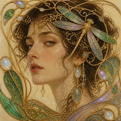
Art Nouveau usually has more organic, flowing linework, floral curves, and handcrafted irregularity. Art Deco is sharper, more symmetrical, more geometric, and more closely associated with machines, speed, and modern luxury. Both are decorative, but Art Deco is more architectural and streamlined.
How is it different from Mid-Century Modern poster design?
Mid-Century Modern posters often use simpler, lighter, and more playful layouts, with a stronger emphasis on minimalism and informal graphic clarity. Art Deco is typically more ornate, more symmetrical, and more theatrical, with richer colors and more explicit ornamental geometry. It also carries stronger associations with the interwar period and luxury advertising.
What subjects work best in this style?
Travel, theater, fashion, nightlife, architecture, aviation, and luxury products are especially natural fits because they match the style’s historical use. However, almost any subject can be adapted if it is simplified into strong shapes and composed like an advertisement or event poster.
How do I make my image look authentically period-correct?
Use flat lithographic color, limited gradients, geometric framing, and a restrained vintage print texture. Keep the subject idealized and elegant rather than realistic, and avoid modern visual cues such as photographic detail, neon effects, or overly complex rendering. Period typography and poster margins also help anchor the look.
Where is this style commonly used today?
It is widely used for event posters, boutique branding, travel imagery, album art, home decor prints, and vintage-inspired packaging. Designers also use it when they want to evoke old-world glamour, classic cinema, or the optimism of the machine age. The style remains recognizable because it balances ornament with strong graphic clarity.

Create your first Art Deco Poster Design artwork
Describe anything — or upload a photo — and see it in Art Deco Poster Design in seconds.
Make Something with Art Deco Poster Design
Compare Art Deco Poster Design
Related Styles
Discover similar art styles