Art Deco Poster Design vs Vintage Poster Design: What's the Difference?
Art Deco Poster Design draws from the 1920s–30s and emphasizes geometric forms, sunbursts, metallic-looking accents, bold symmetry, and streamlined glamour. It often feels polished, optimistic, and aspirational, using clean shapes and high-contrast composition to celebrate modernity, speed, and luxury.
Vintage Poster Design is a broader retro look inspired by mid-century to late-20th-century printed posters. It typically uses distressed textures, faded inks, nostalgic typography, and muted palettes to suggest age, print wear, and advertising history. People compare the two because both evoke earlier eras and printed ephemera, but they communicate very different moods: Art Deco feels refined and sleek, while Vintage Poster Design feels worn, nostalgic, and time-tested.
Same Prompt, Both Styles
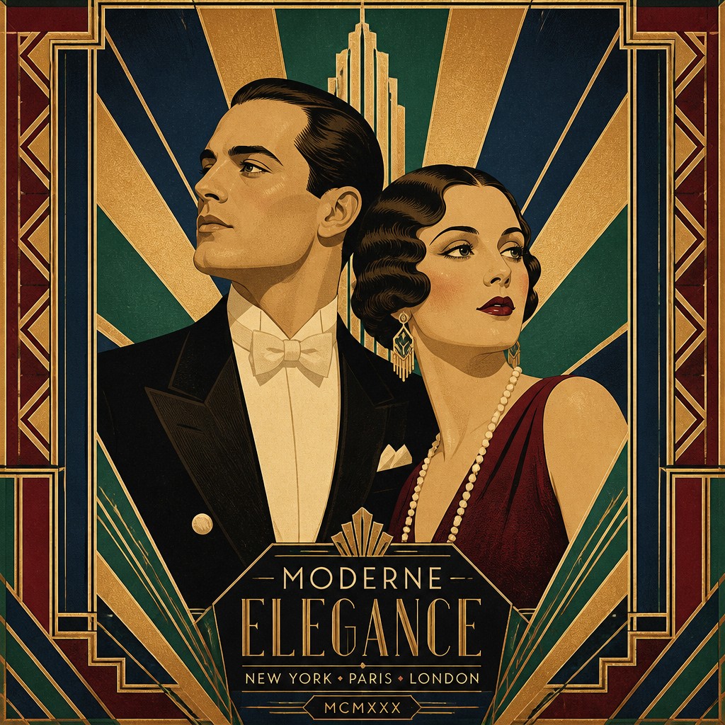
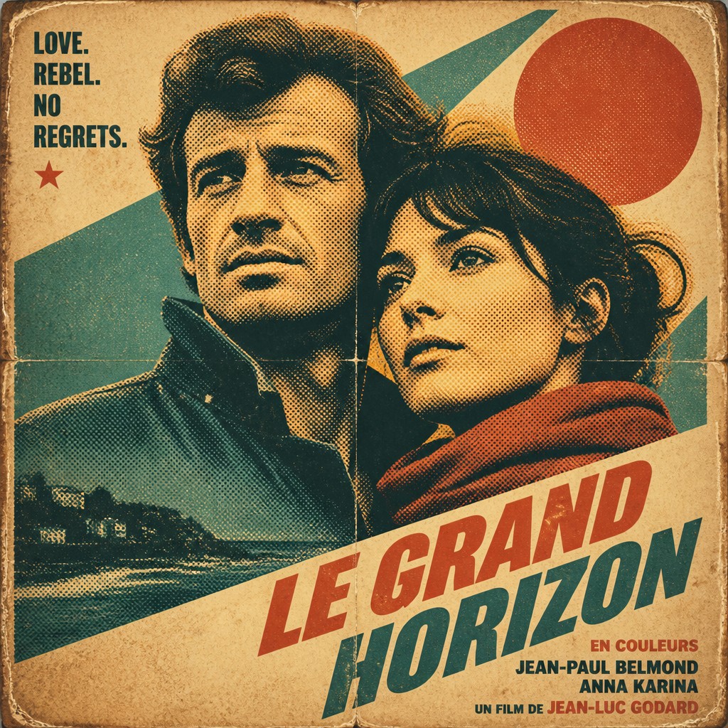
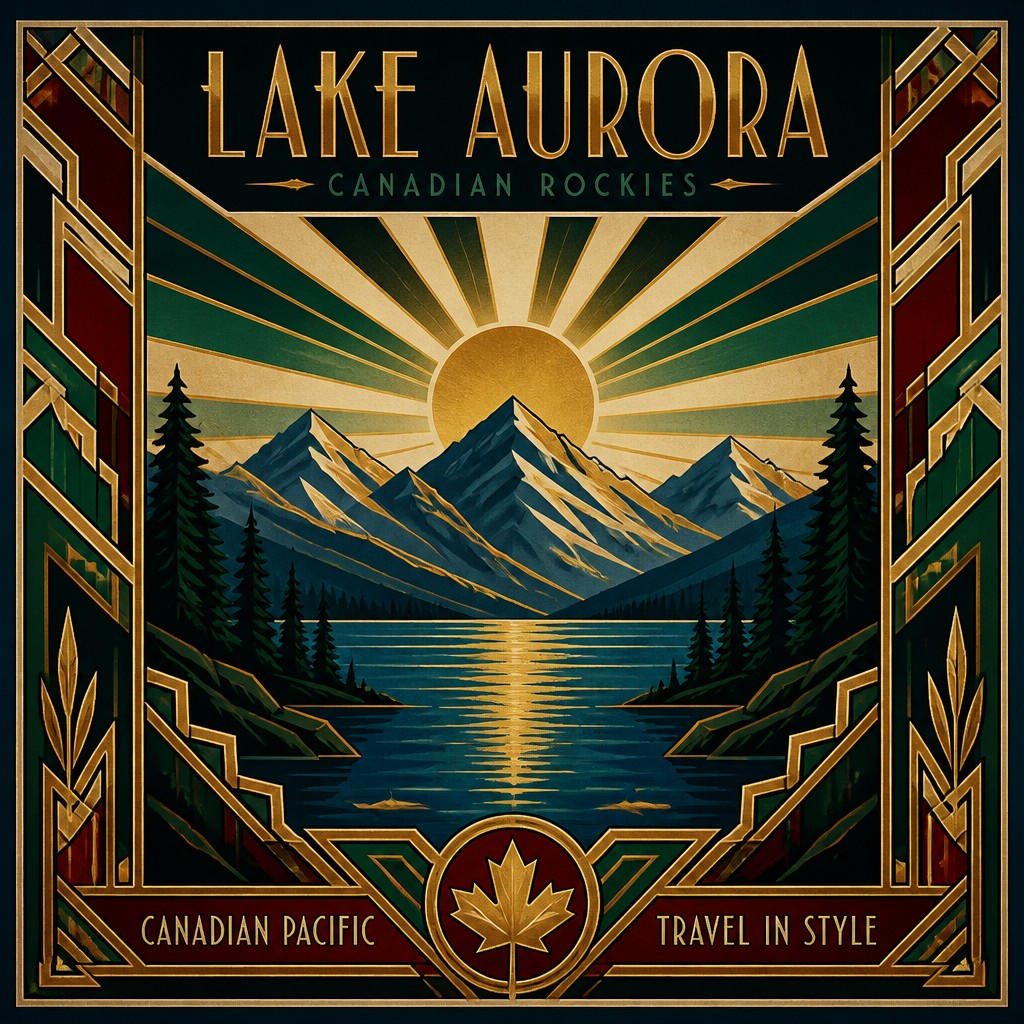
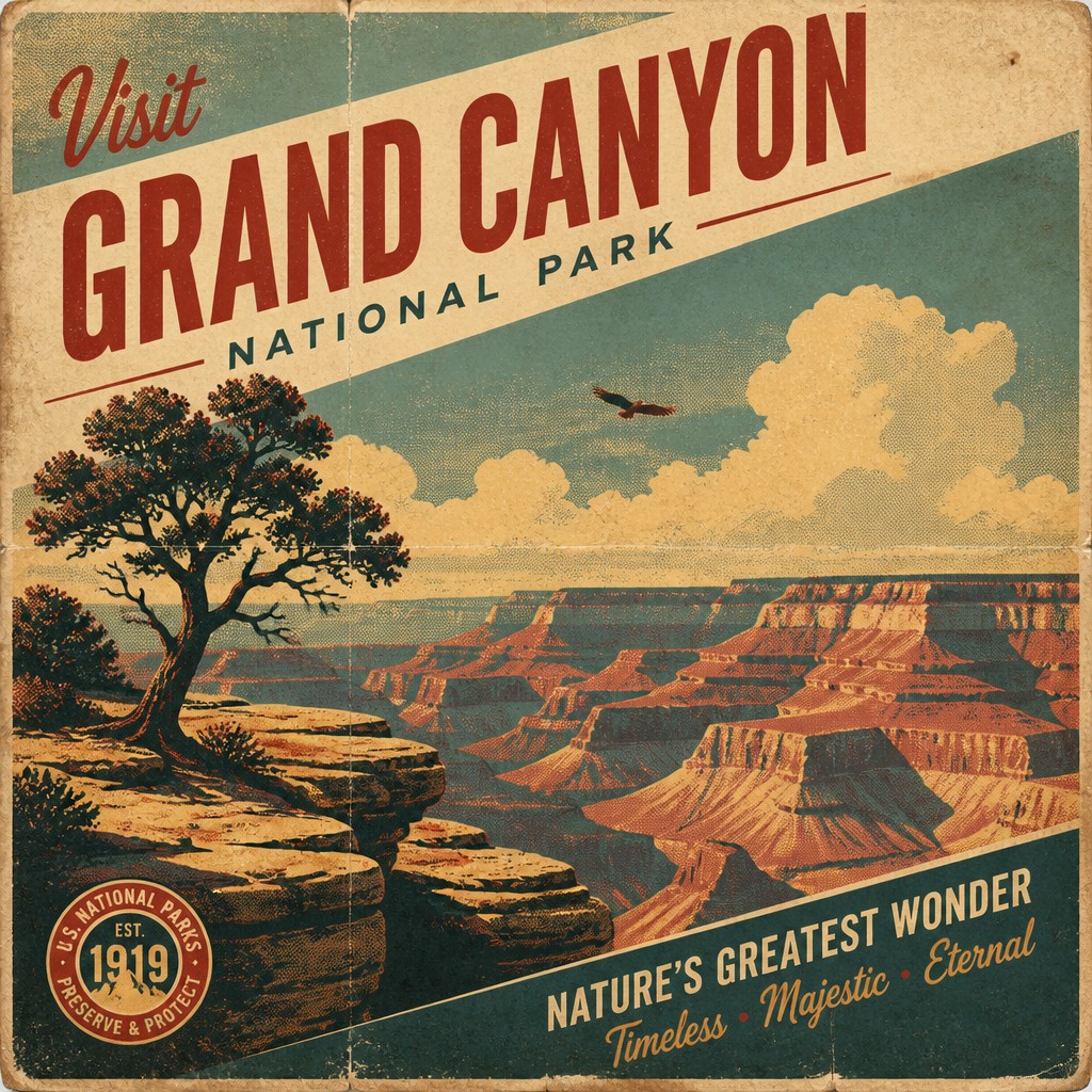
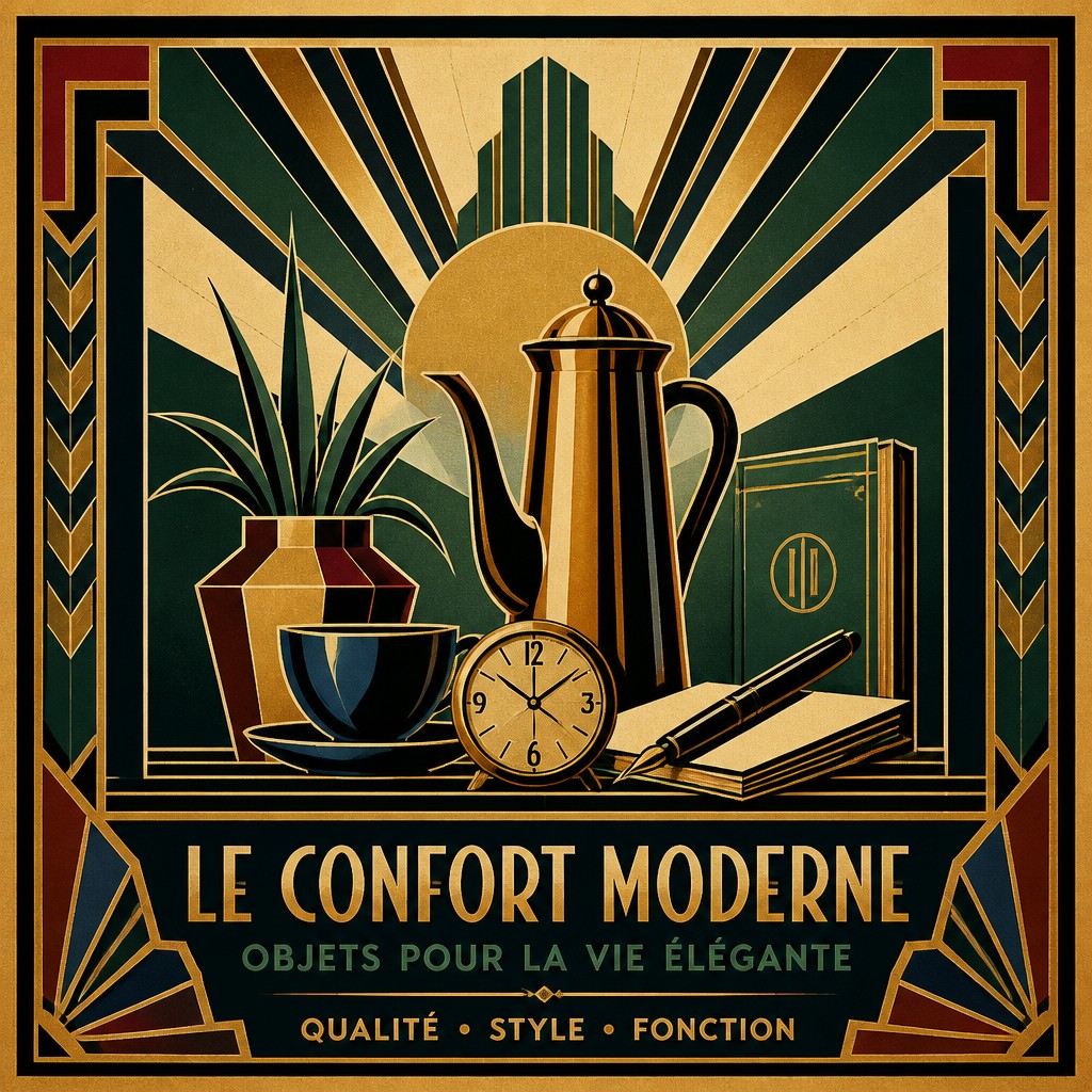
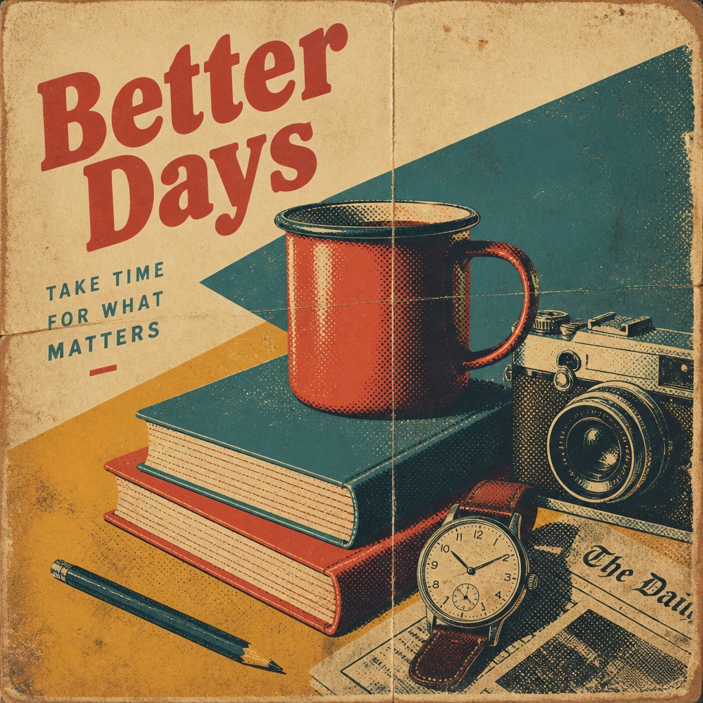
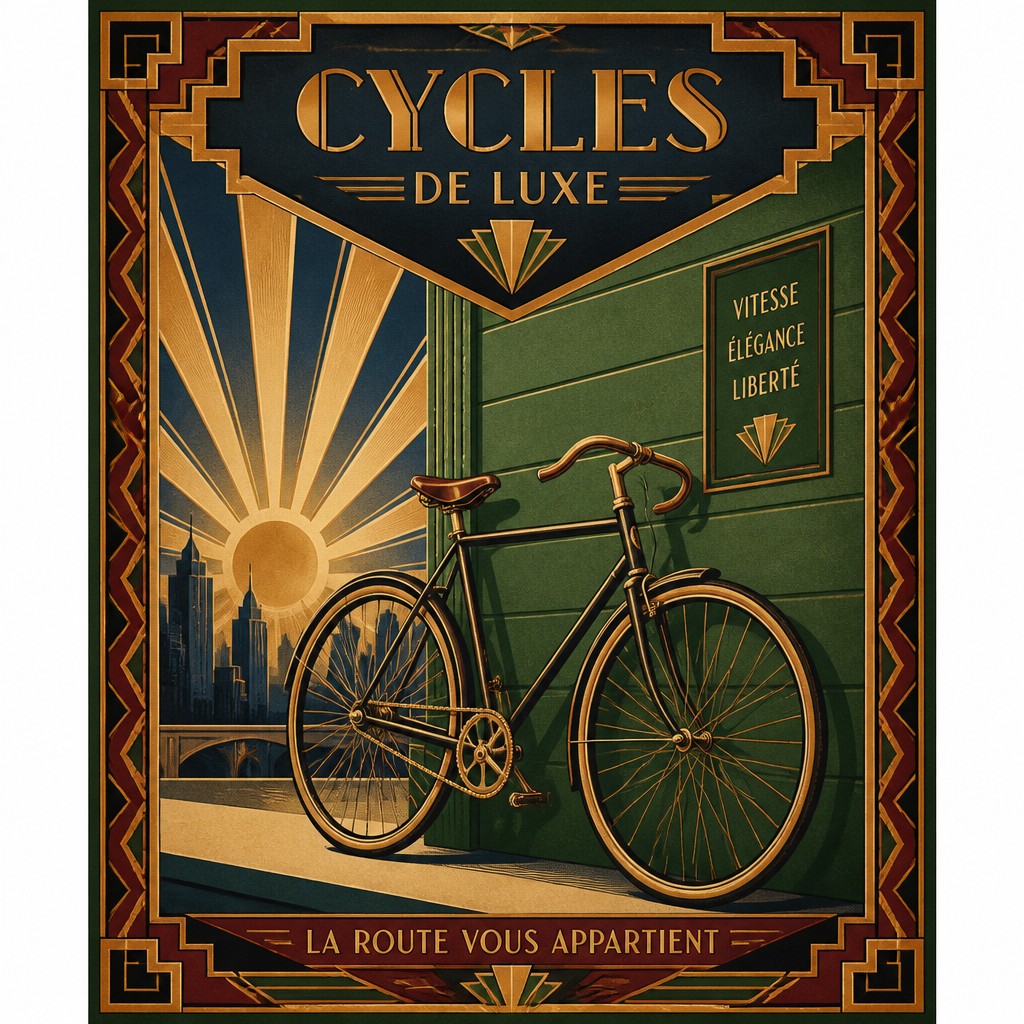
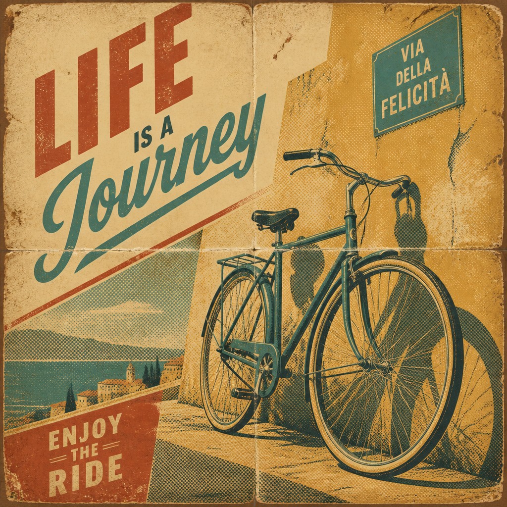
Each pair below was generated from the identical prompt — only the style changed.
“portrait of two people together”
“wide landscape with natural scenery”
“still life with everyday objects”
“bicyle resting against a wall”
Key Differences
| Art Deco Poster Design | Vintage Poster Design | |
|---|---|---|
| Era reference | 1920s–30s elegance, modernity, and machine-age glamour. | Mid-century to late-20th-century nostalgia and print history. |
| Line & form | Angular, symmetrical, and strongly geometric. | Looser, varied, and often less rigidly structured. |
| Texture | Smooth, polished, and clean-looking. | Distressed, grainy, worn, or screen-printed. |
| Color palette | Rich, contrasting colors with metallic or luminous accents. | Muted, faded, or weathered colors with softer contrast. |
| Typography | Stylized, elegant, and highly integrated with the layout. | Nostalgic, utilitarian, or aged-looking letterforms. |
| Mood | Luxurious, optimistic, and sophisticated. | Warm, nostalgic, and nostalgic-retro. |
| Mood | elegant, luxurious, confident, stylized, dramatic | nostalgic, bold, graphic, timeless |
| Energy | balanced | balanced |
| Detail level | detailed | moderate |
| Color | metallics, jewel tones, deep contrast | muted, limited, aged, high-contrast palettes |
| Texture | smooth, polished, graphic | distressed, grainy, weathered print wear |
| Origin | 1920s-1930s Europe and North America | early 20th century print advertising, Europe and US |
| Best for | posters, advertising graphics, event promotions, album covers, fashion branding, editorial illustrations | posters, album covers, event flyers, travel graphics, book covers, brand campaigns |
| Difficulty | advanced | moderate |
Which Should You Choose?
Choose Art Deco Poster Design if you want a sleek, upscale, and energetic look with strong geometry and a sense of modern glamour. Choose Vintage Poster Design if you want a softer, more nostalgic feel that looks aged, printed, and collected over time. In short, pick A for polished theatrical impact and B for retro warmth and authenticity.
Frequently Asked Questions
Are Art Deco and Vintage Poster Design the same thing?
No. Art Deco is a specific design movement with defined visual traits like symmetry, geometry, and glamour. Vintage Poster Design is a broader retro category that can include many older-looking poster aesthetics.
Which style looks more luxurious?
Art Deco usually looks more luxurious because it emphasizes shine, precision, and decorative geometry. Vintage Poster Design tends to feel more casual, nostalgic, and aged.
Which style is better for making a poster feel old?
Vintage Poster Design is usually better if you want a genuinely aged or screen-printed look. Its distressed textures and faded colors naturally suggest wear and history.
Can these styles overlap?
Yes, they can overlap in poster formats, bold typography, and retro references. However, Art Deco focuses on elegant order and stylized modernism, while Vintage Poster Design focuses on patina and nostalgia.