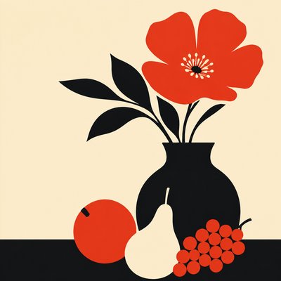
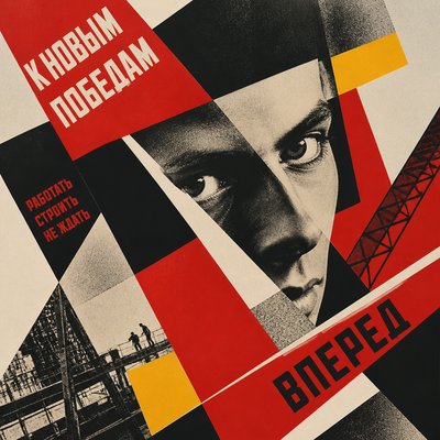
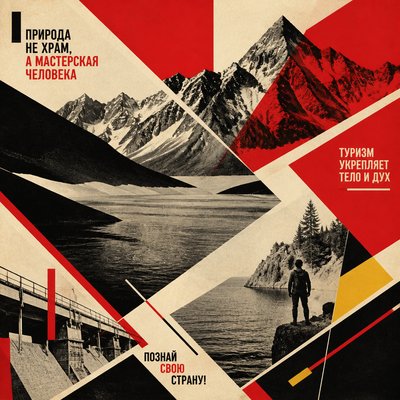
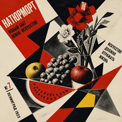
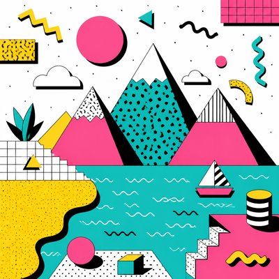
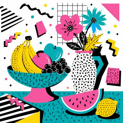
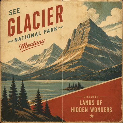
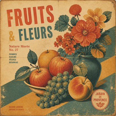
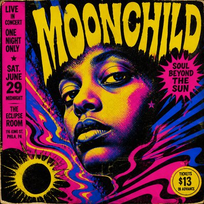
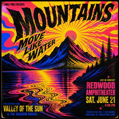
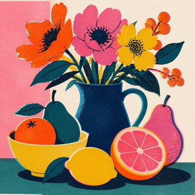
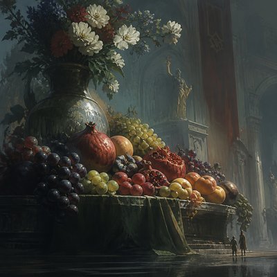
Swiss Style Poster Design
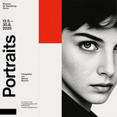
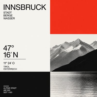
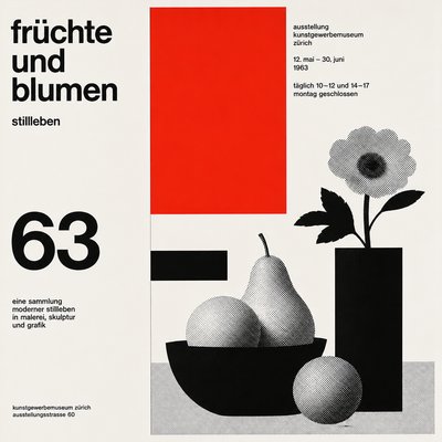
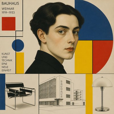
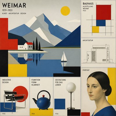
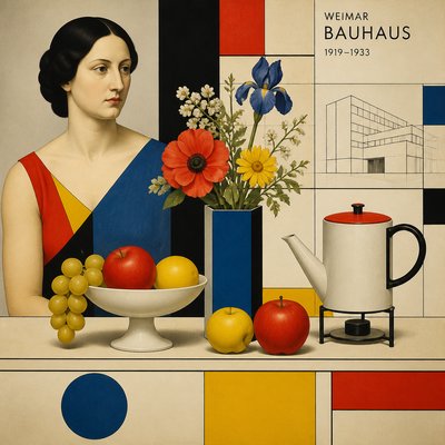
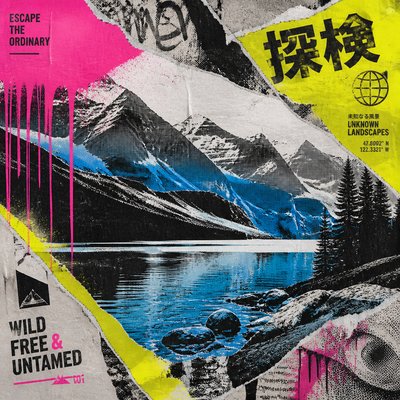
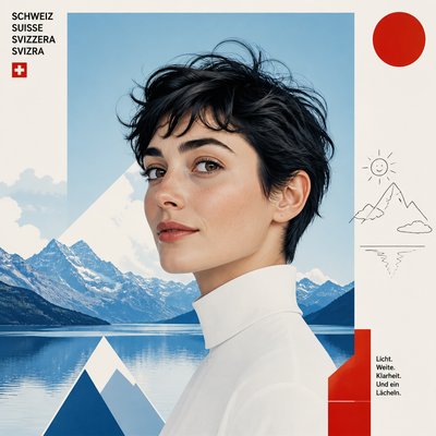
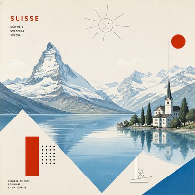
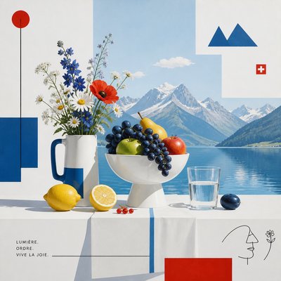
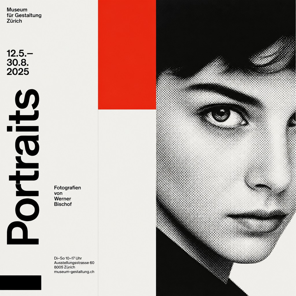
Grid-based poster design with bold typography, asymmetric balance, and strict Swiss International Typographic Style clarity.
Instantly rendered in Swiss Style Poster Design — or transform a photo
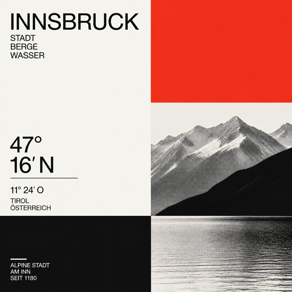
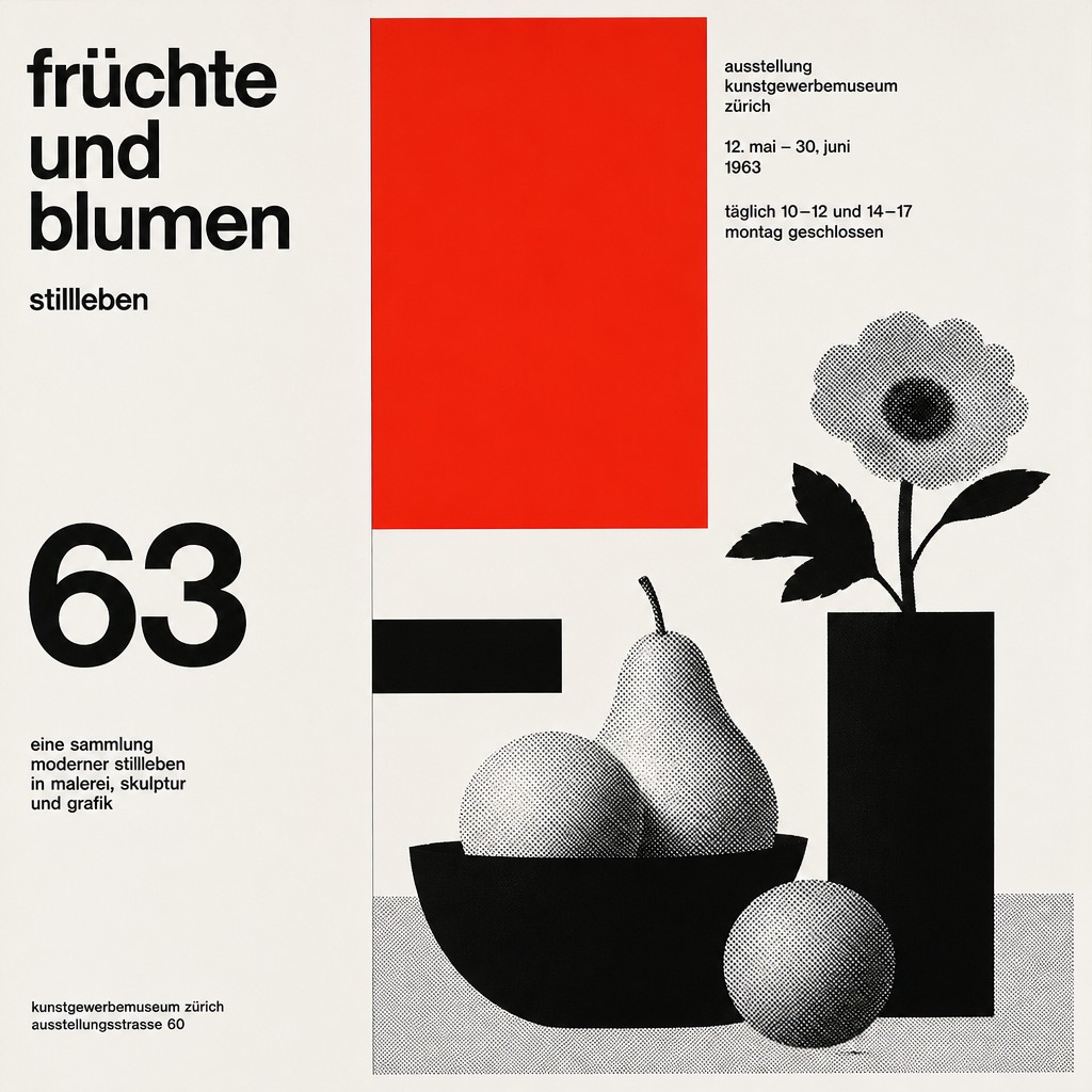
Swiss Style Poster Design Gallery
Tap any artwork to explore it
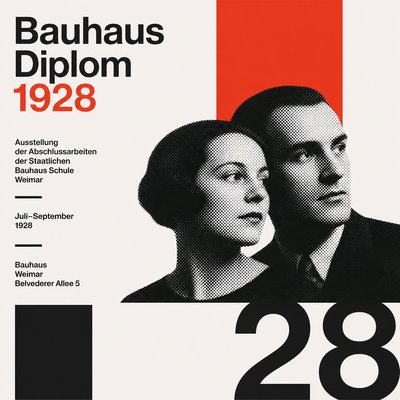
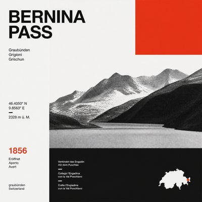
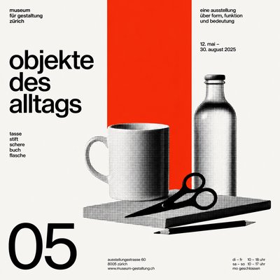
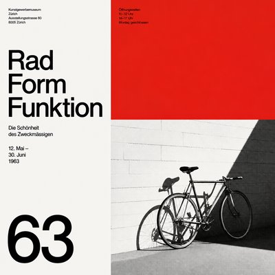
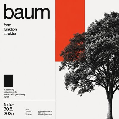
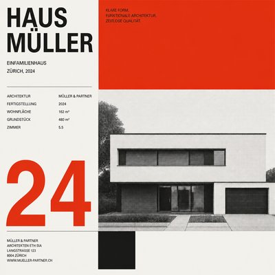
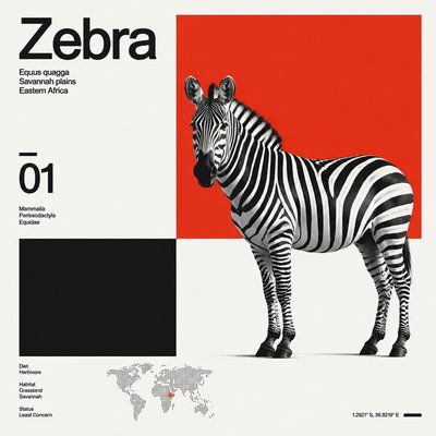
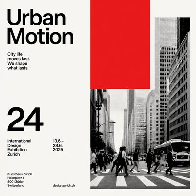
What is Swiss Style Poster Design?
Swiss Style Poster Design, also known as the International Typographic Style, is a modernist approach to graphic design that organizes information through grids, sans-serif typography, and disciplined visual hierarchy. It values clarity over ornament, using asymmetry, precise spacing, and restrained color to make messages legible and immediate.
Its visual identity comes from the belief that design should communicate objectively. Forms are reduced to essentials, type is treated as structure rather than decoration, and images are often cropped, flattened, or abstracted so they can work inside a rigorous compositional system. The result is a poster language that feels rational, ordered, and visually efficient.
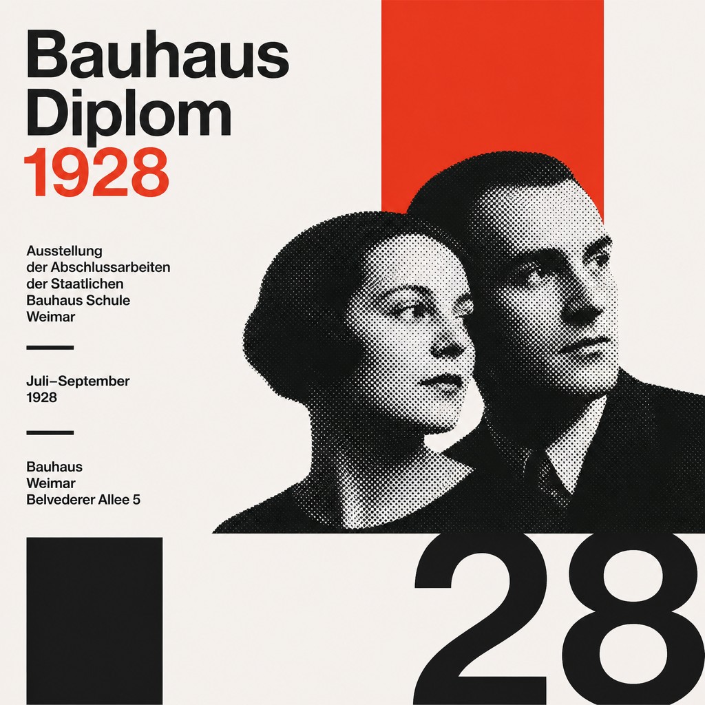
Try It On Your Photos
Upload any photo and convert it into Swiss Style Poster Design — drag the sliders to compare before and after.
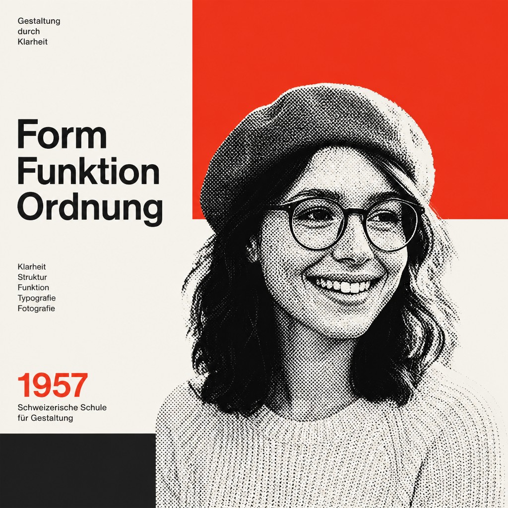

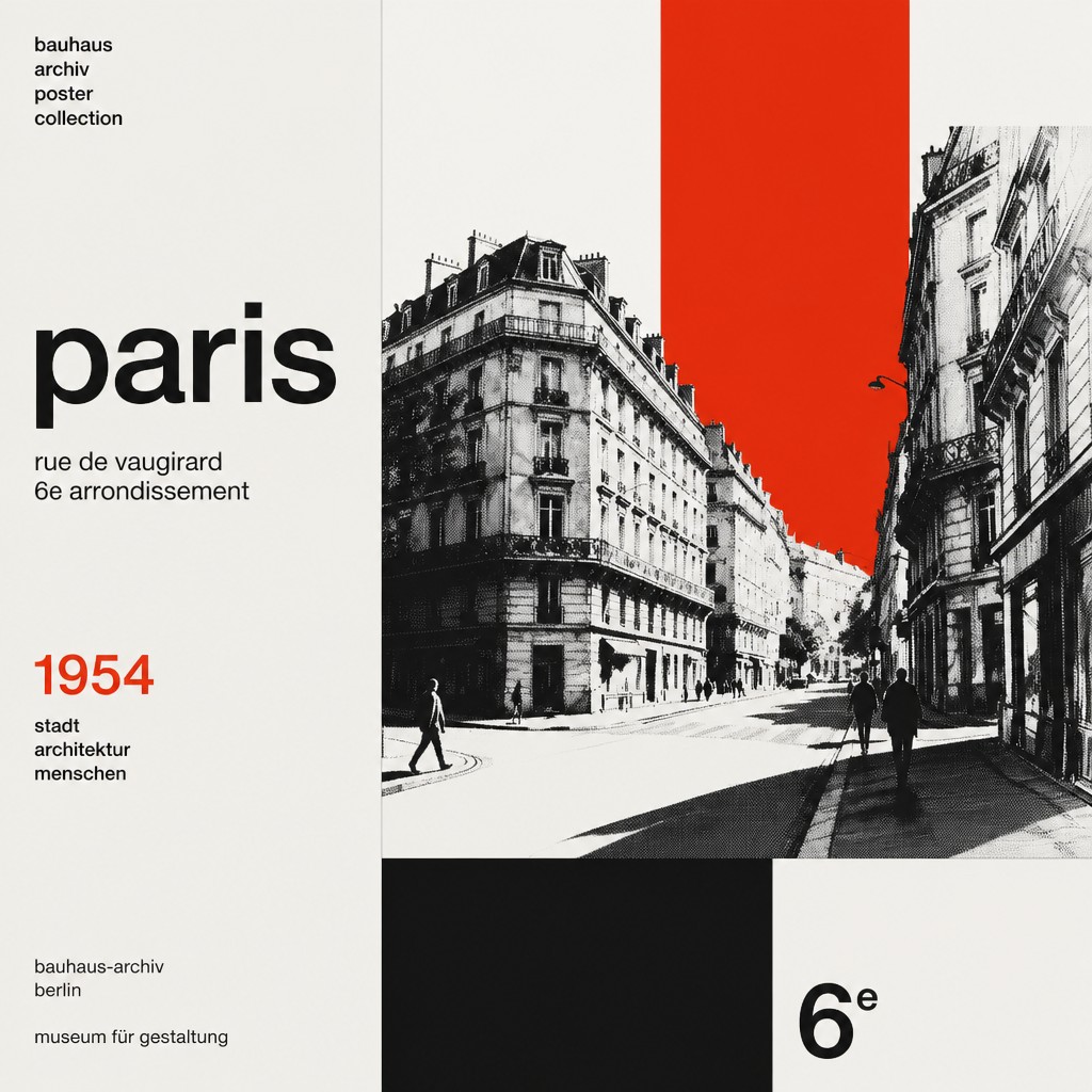

What Defines Swiss Style Poster Design
The signature details, up close
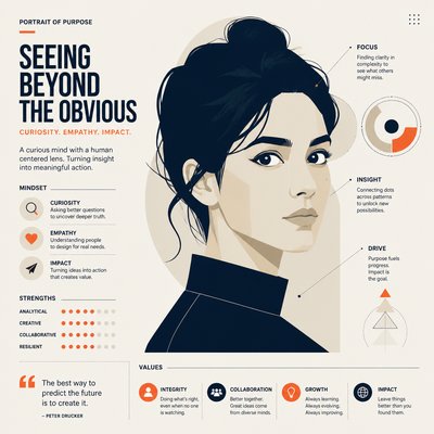
Grid-based composition
Layouts are structured on invisible or visible grids that control alignment, spacing, and proportion. This gives the poster an orderly framework even when the composition is asymmetrical.
Sans-serif typography
Clean grotesk or neo-grotesk typefaces are used for clarity and neutrality. Text is often set flush-left, ragged-right, with strong hierarchy and careful spacing.
Asymmetric balance
Instead of centered symmetry, elements are distributed dynamically across the page. The balance feels precise but not static, creating motion without visual clutter.
Minimal color palette
Swiss posters often use black, white, and one accent color, or a very limited palette. The restriction increases contrast and keeps attention on structure and content.
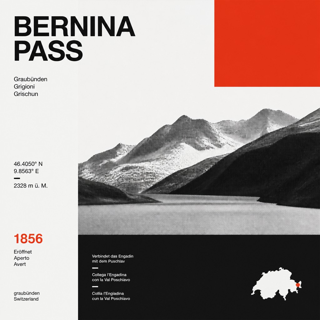
Objective imagery
Photographs, diagrams, or graphic symbols are simplified, cropped, or rendered in high-contrast treatment. Imagery is used to clarify meaning, not to create decorative atmosphere.
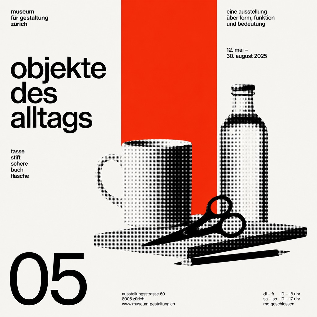
Generous negative space
Empty space is treated as an active compositional element. It supports legibility, establishes rhythm, and prevents the page from feeling overloaded.
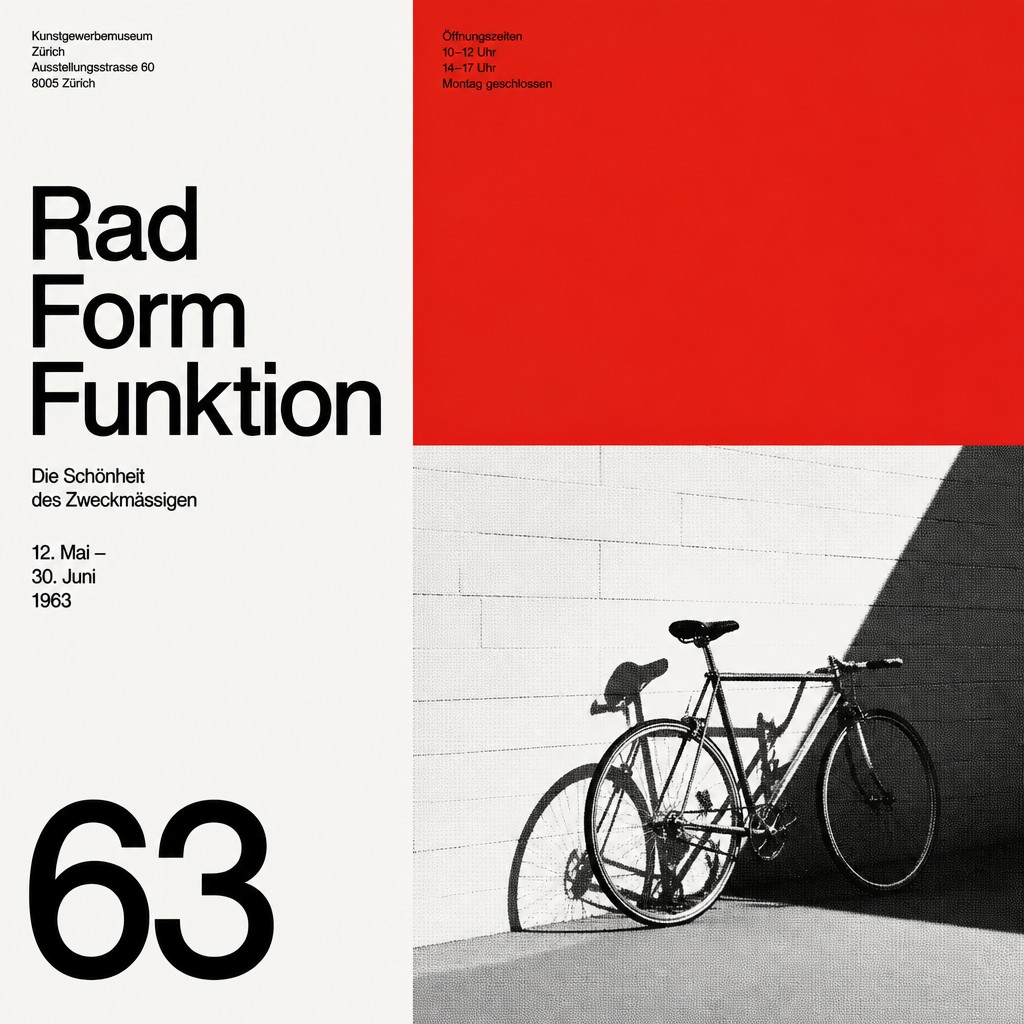
Typographic integration
Letterforms are not merely added at the end; they function as part of the overall architecture. Headlines, labels, and body text are integrated into the grid as visual forms.
Try It
Create Videos in Swiss Style Poster Design
Styles aren't just for stills — describe a scene or animate an image and get a short video rendered in Swiss Style Poster Design. Press play to see this pond come to life.
Make a VideoSwiss Style Poster Design Prompt Ideas
Start from an idea — each one opens the generator with the style ready to go. See all 40 Swiss Style Poster Design prompts →
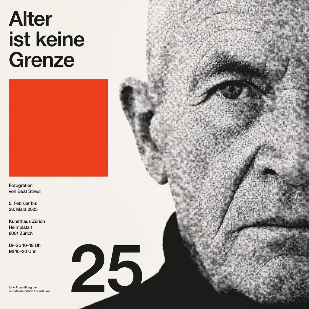
“close-up portrait of an elderly person with expressive weathered features”
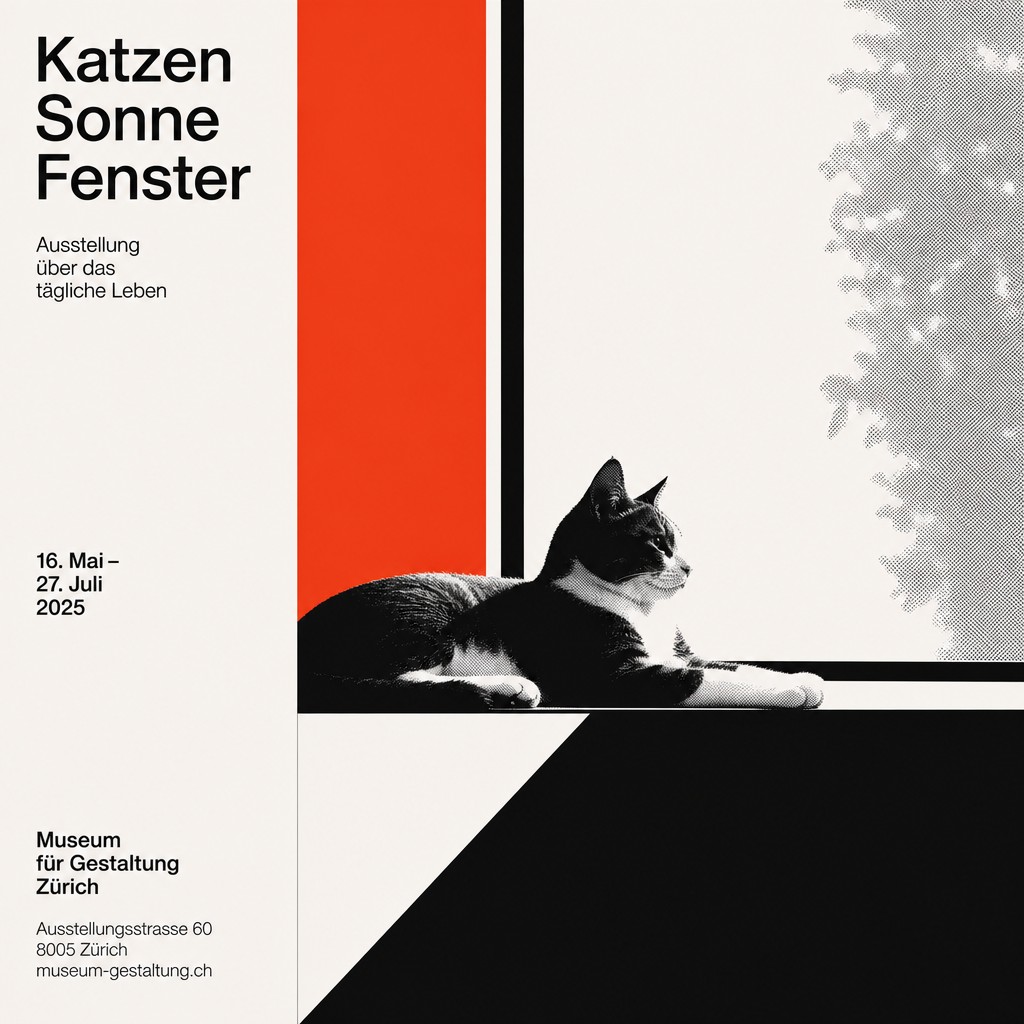
“a cat lounging in a sunlit window”
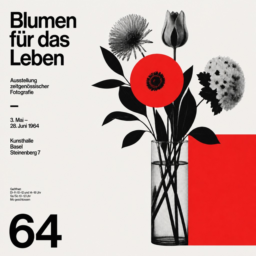
“bouquet of flowers in a glass vase”
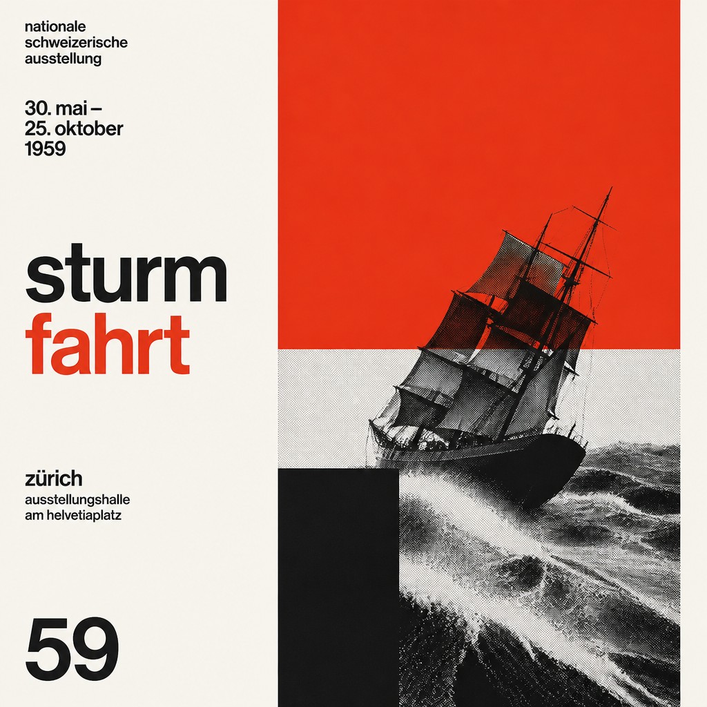
“sailing ship on a stormy sea”
How to Create Swiss Style Poster Design Art
Master the craft step by step — or skip straight to creating. Read the full guide →
- 1
Build the layout from a grid
Start with a strict column and baseline grid before placing any text or image. Align every element to that structure so the composition feels engineered rather than improvised.
- 2
Limit the palette
Use black and white with one strong accent color, such as red, blue, or yellow. Keep saturation controlled so hierarchy comes from placement and contrast instead of decoration.
- 3
Choose a neutral sans-serif
Set typography in a clean grotesk or neo-grotesk style and prioritize hierarchy through size, weight, and spacing. Avoid decorative effects, outlines, shadows, or stylized lettering.
- 4
Reduce imagery to essentials
If you include an image, crop it tightly, simplify it to graphic contrast, or convert it to a halftone or monochrome treatment. The image should support the message and sit cleanly within the grid.
- 5
Preserve negative space
Do not fill every area of the page; let empty regions shape the composition. In digital or prompt-based creation, explicitly request minimalism, razor-sharp edges, and asymmetric spacing.
- 6
Prompt for structural clarity
When generating, specify poster format, Swiss grid logic, flush-left type, limited palette, and essential forms. Strong prompts usually work better when they describe layout behavior as much as subject matter.
The Story
History & Origins of Swiss Style Poster Design
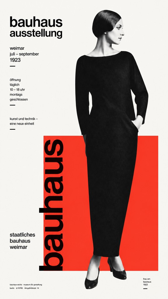
Swiss Style emerged in Switzerland in the 1940s and 1950s, particularly in Basel and Zurich, as designers sought a universal visual language for modern communication. It was shaped by modernist typography, the earlier Bauhaus emphasis on function, and postwar needs for clear public information, advertising, and cultural posters.
The style was developed and codified by leading Swiss graphic designers and typographic educators. Their work established the grid as a central organizing principle and helped define a visual system that spread internationally through design schools, corporate identity programs, and poster culture from the 1950s onward.
Influences: Swiss Style draws from early modernist graphic design, Bauhaus functionalism, and the broader European tradition of rational typography. Its most important historical figureheads include leading Swiss poster and identity designers and prominent postwar typographic systems specialists, whose poster and identity work helped define its visual grammar. It is also related to Constructivist clarity and the functional aims of twentieth-century corporate and public-information design.

Frequently Asked Questions
What defines Swiss Style poster design?
It is defined by grids, asymmetrical balance, sans-serif typography, and a highly restrained palette. The design goal is clarity: information should be organized so the viewer can read it quickly and without distraction.
Is Swiss Style the same as the International Typographic Style?
Yes. Swiss Style is the common name for the International Typographic Style, a modernist design approach that developed in Switzerland and spread internationally after World War II.
What fonts are commonly associated with this style?
The style is closely associated with neutral sans-serif typefaces, especially grotesk and neo-grotesk faces. Historically, designers used families such as Helvetica and Univers, but the broader principle is clarity rather than any single font.
How is it different from Bauhaus design?
Both are modernist and functional, but Swiss Style is more systematic and typographically disciplined. Bauhaus design often feels more experimental and expressive, while Swiss Style tends to prioritize grid logic, hierarchy, and editorial precision.
Where is Swiss Style used today?
It remains common in posters, museum graphics, wayfinding, corporate identity, editorial layouts, and public information design. Its principles are still used whenever designers want a clean, legible, and highly organized visual system.
Can I create a Swiss Style look from a photograph?
Yes. A photo can be adapted by cropping it tightly, converting it to high contrast, and placing it within a strict typographic grid. The key is to treat the image as one element in a structured layout rather than as the whole composition.
Create your first Swiss Style Poster Design artwork
Describe anything — or upload a photo — and see it in Swiss Style Poster Design in seconds.
Make Something with Swiss Style Poster Design
Related Styles
Discover similar art styles