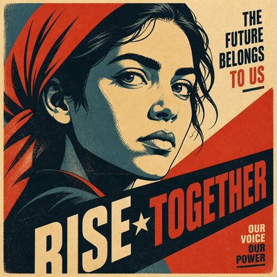
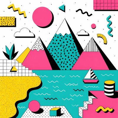
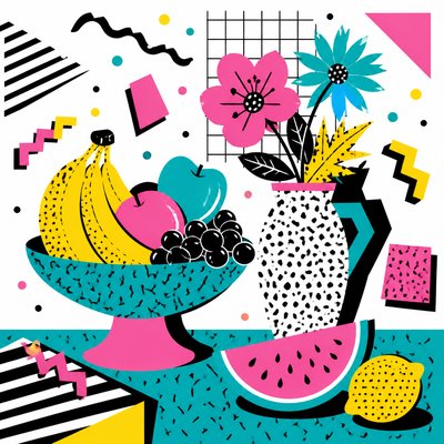
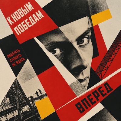
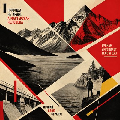
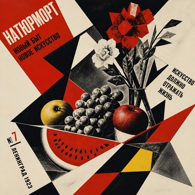
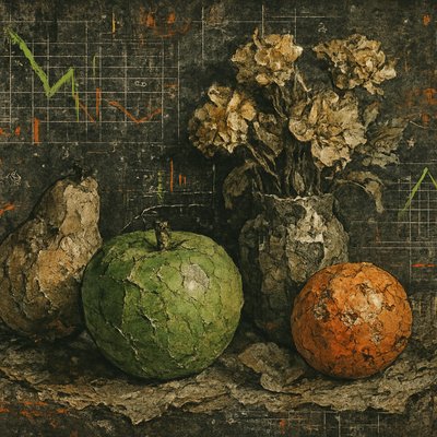
Infographic Poster Design
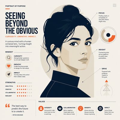
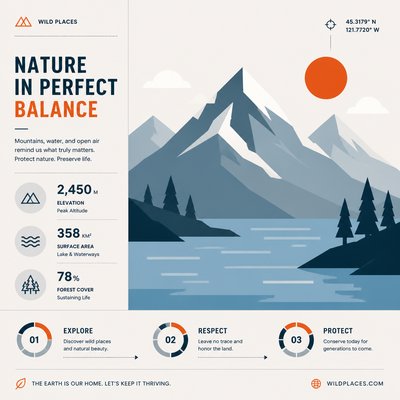
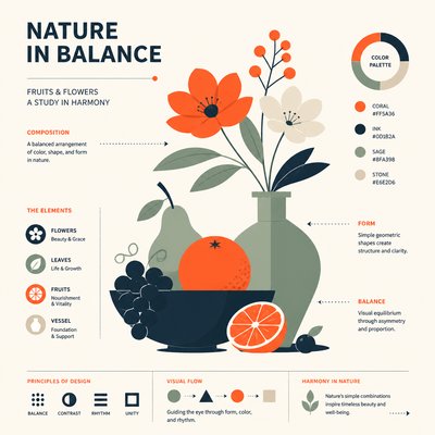
Clean, data-rich posters using grids, icons, charts, and bold typography to explain complex information with clarity.
Instantly rendered in Infographic Poster Design — or transform a photo
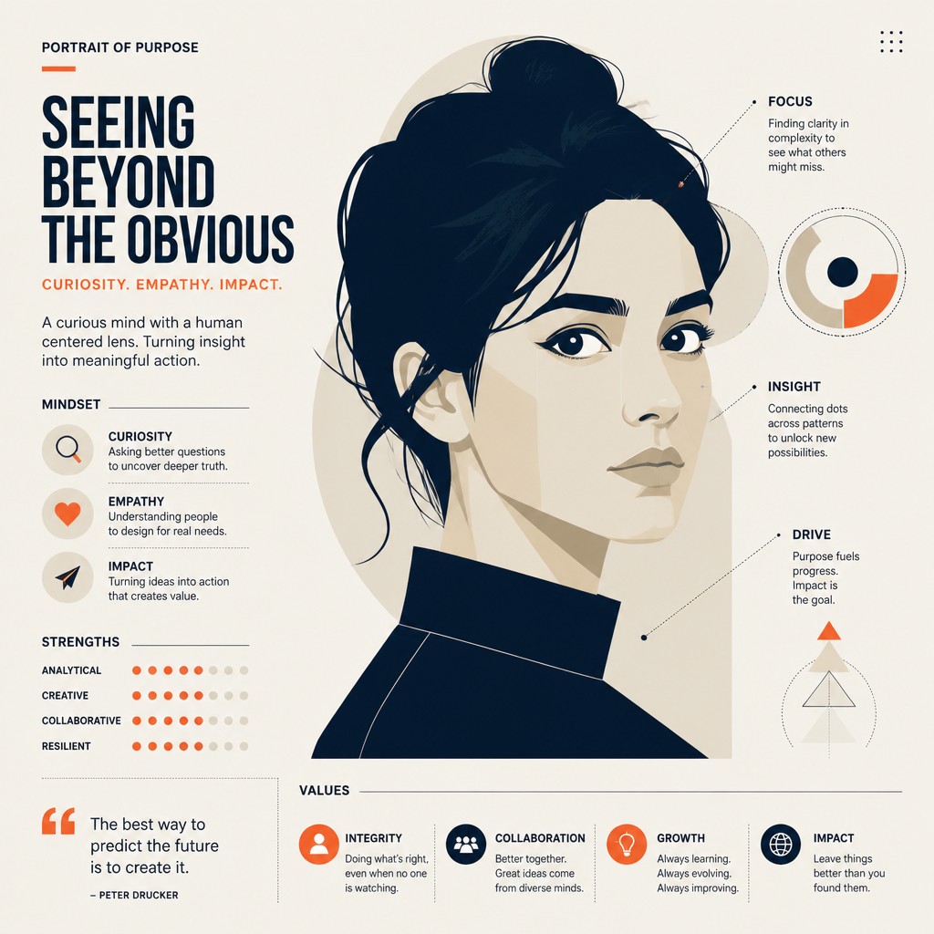
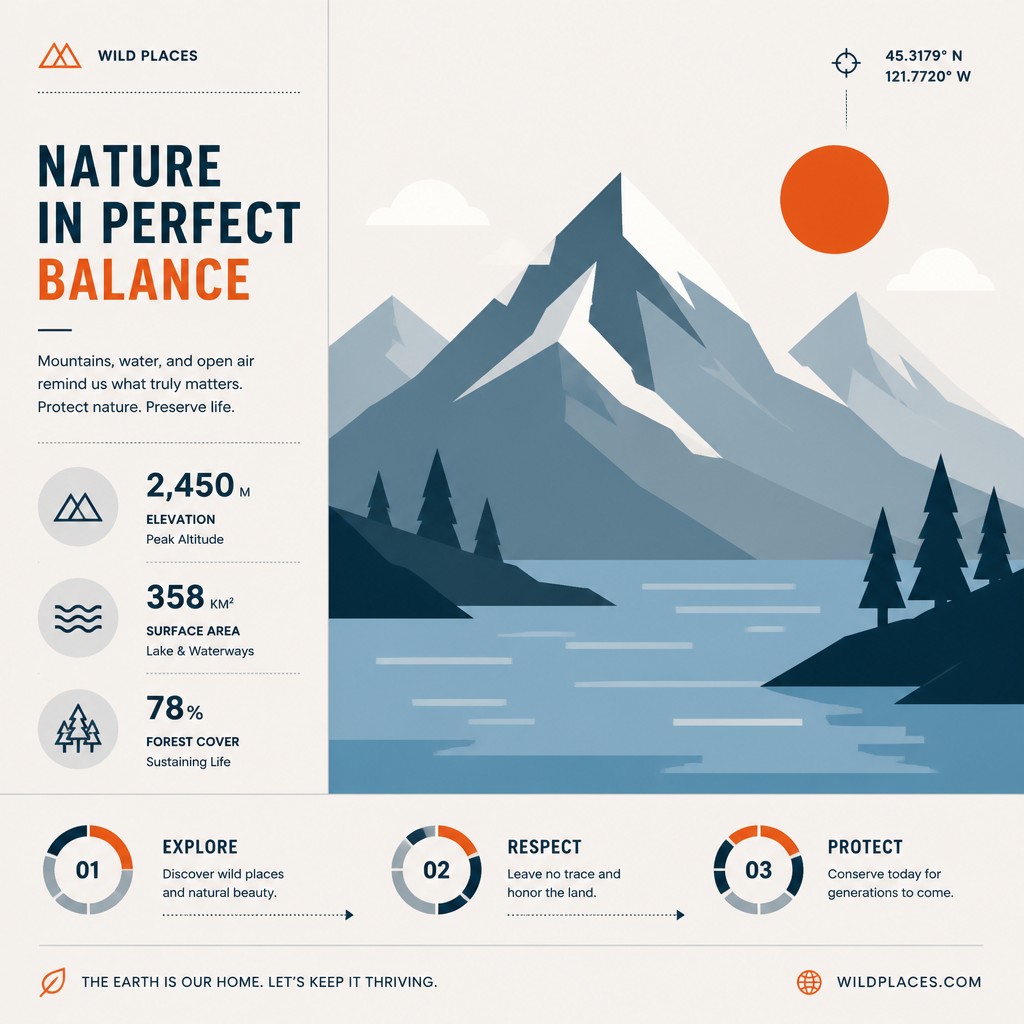
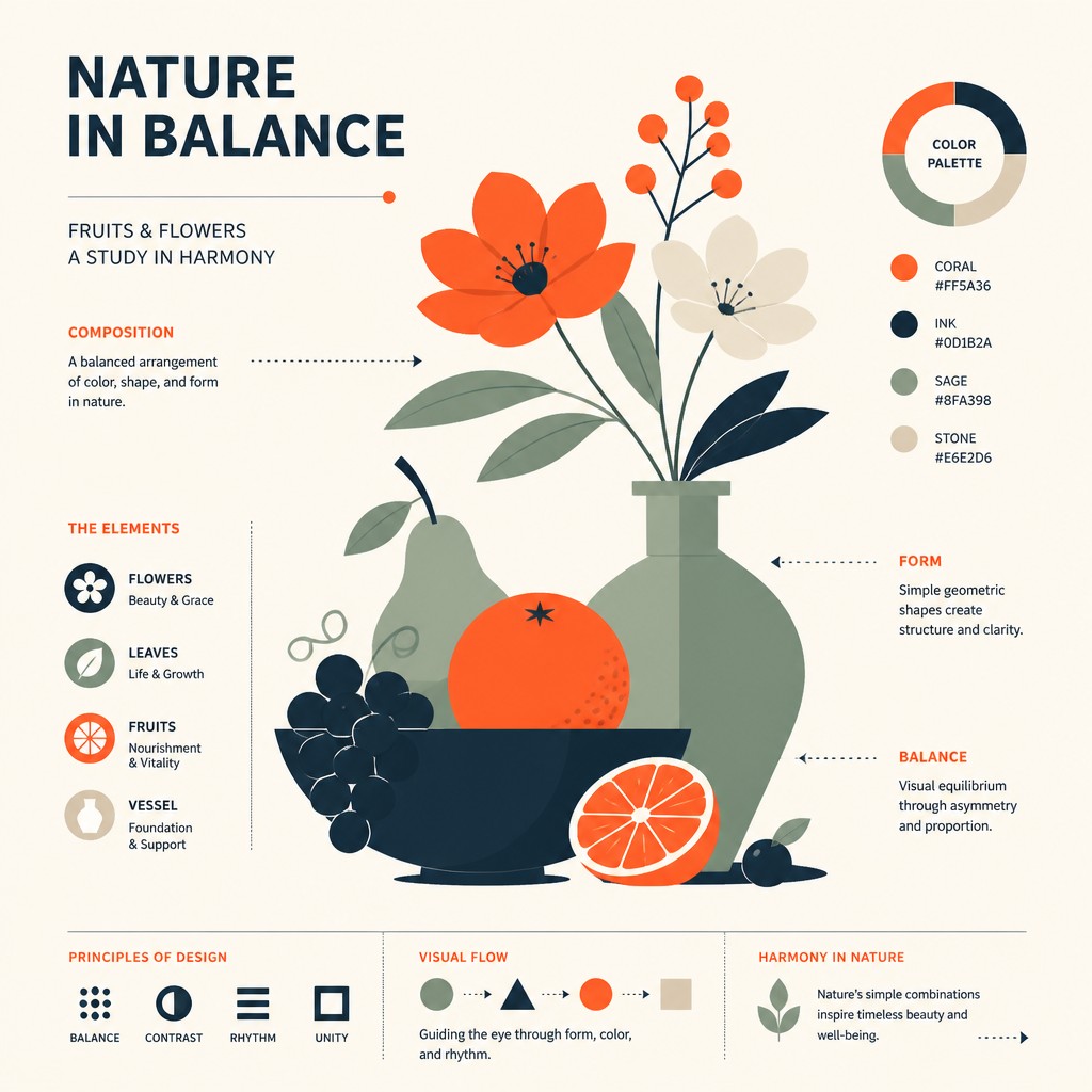
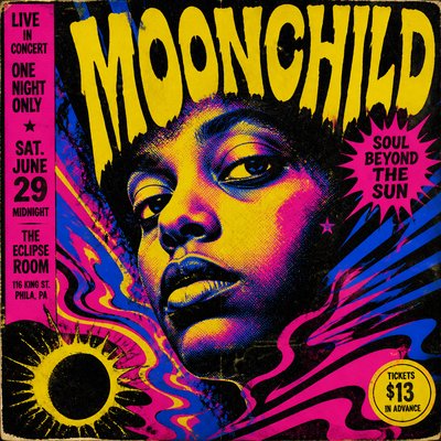
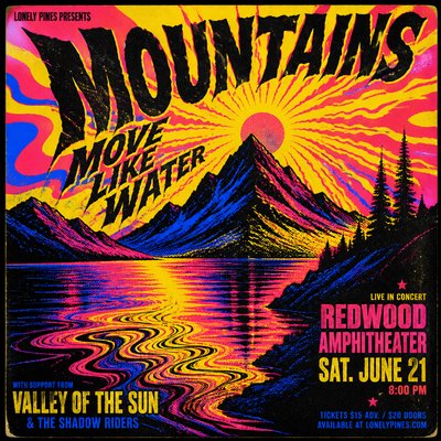
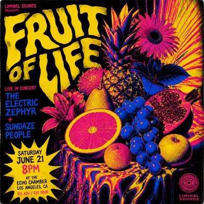
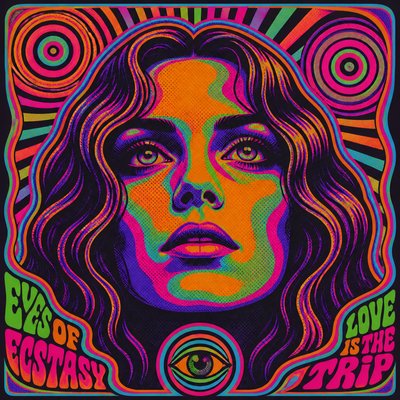
Infographic Poster Design Gallery
Tap any artwork to explore it
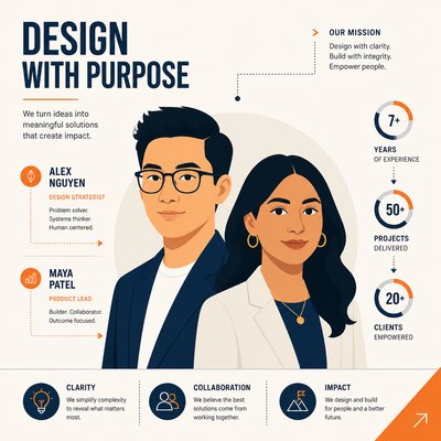
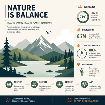
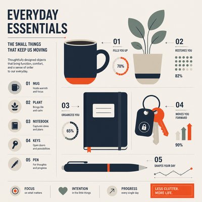
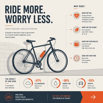
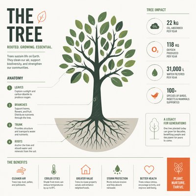

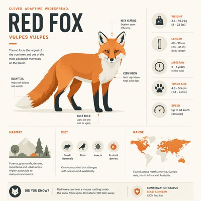
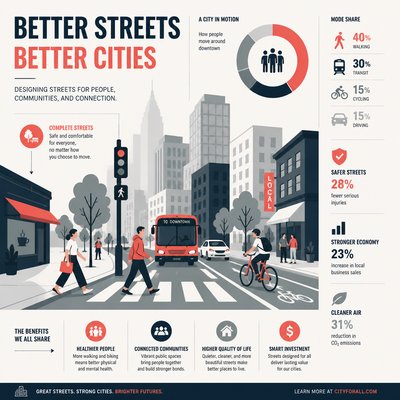
What is Infographic Poster Design?
Infographic poster design is a graphic style built to communicate complex information quickly and attractively through a combination of typography, symbols, diagrams, and structured layout. It is not primarily about illustration for its own sake; its visual logic comes from organizing facts, timelines, comparisons, processes, and hierarchies into a coherent visual system that can be understood at a glance.
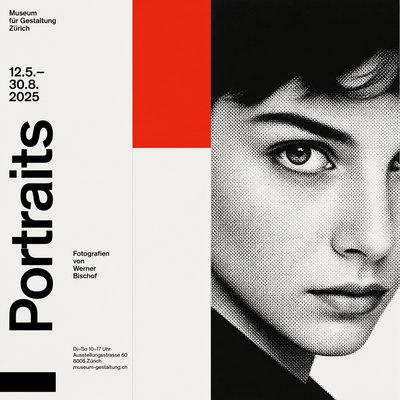
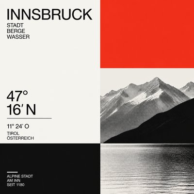
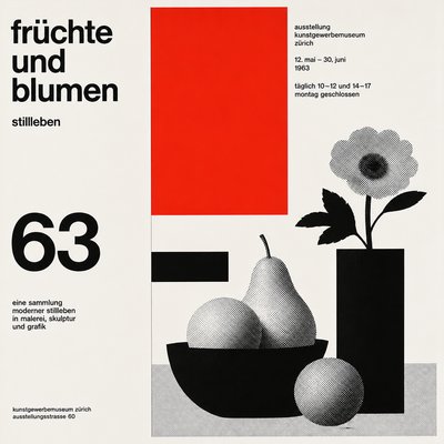
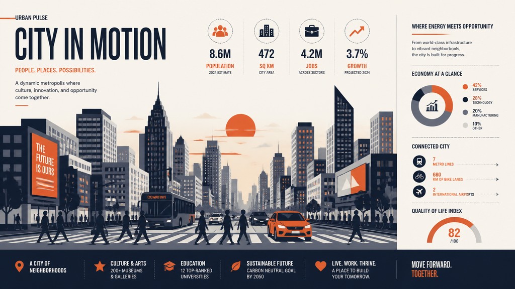
The style is defined by flat vector shapes, crisp edges, modular grids, simplified icons, arrows, labels, charts, and a disciplined use of color. Negative space is used actively to separate ideas and preserve legibility, while one accent color often guides the viewer’s eye through the composition. The result is a design language that feels analytical, modern, and highly legible, even when it becomes decorative or editorial in tone.
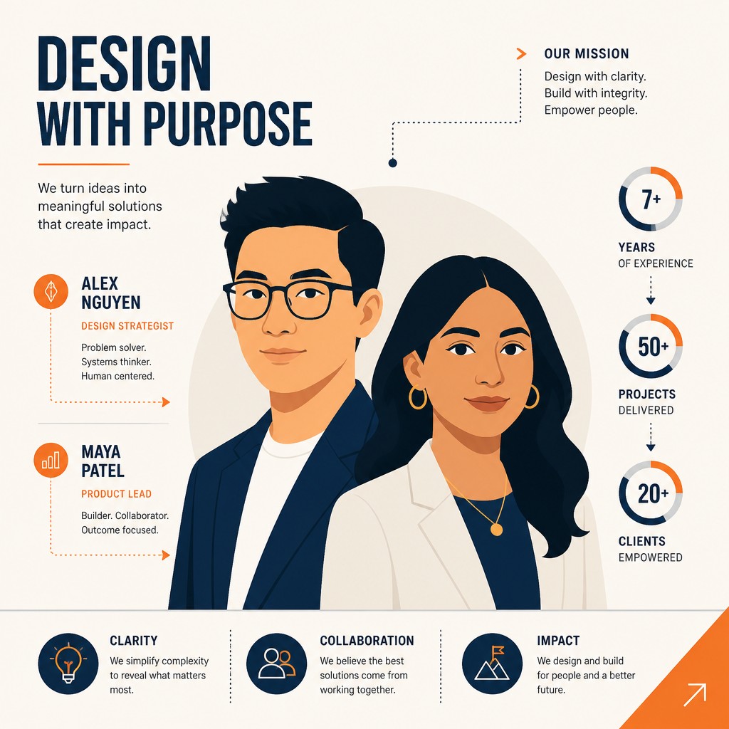
Try It On Your Photos
Upload any photo and convert it into Infographic Poster Design — drag the sliders to compare before and after.
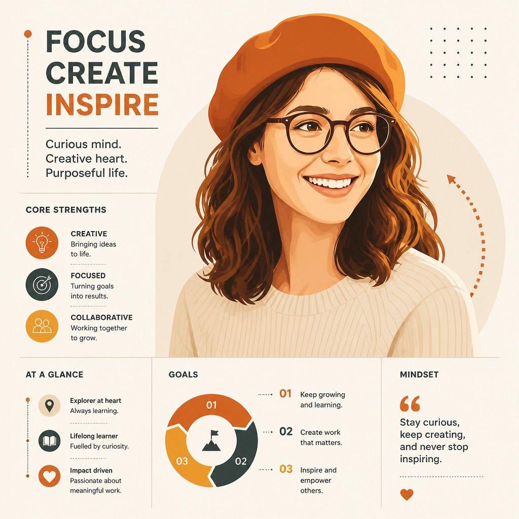

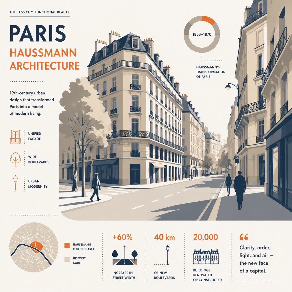

What Defines Infographic Poster Design
The signature details, up close
Grid-based composition
Layouts are organized on a modular grid with clear alignments and repeated spacing systems. This gives the poster a rational structure and helps viewers navigate multiple information blocks without confusion.
Typography as structure
Headlines, labels, captions, and numerical callouts are used as visual architecture rather than decoration. Type sizes, weights, and spacing create hierarchy and control the reading path.
Diagrammatic devices
Lines, arrows, connectors, segmented circles, legends, and callout labels are common. These devices show relationships, sequences, comparisons, and data flow at a glance.
Flat vector forms
The imagery is usually simplified into clean geometric shapes with no painterly texture or photographic realism. This keeps the design precise, reproducible, and easy to read.
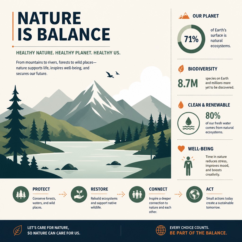
Controlled color palette
Most posters rely on a small set of colors, often with a single vivid accent against neutral backgrounds. Limited color reinforces hierarchy and prevents the page from becoming visually noisy.
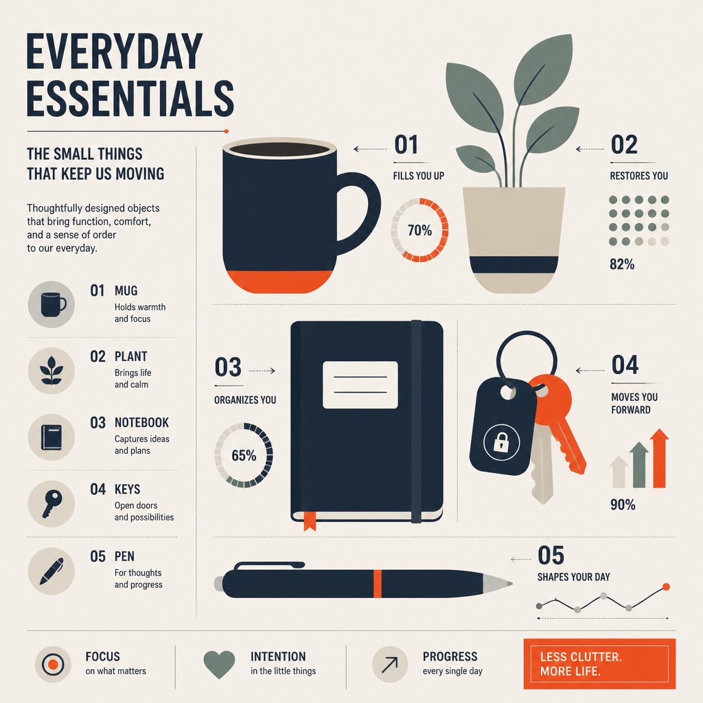
Iconic simplification
Objects, people, and systems are reduced to clear symbols or pictograms. The goal is recognition and information clarity, not expressive realism.
Try It
Create Videos in Infographic Poster Design
Styles aren't just for stills — describe a scene or animate an image and get a short video rendered in Infographic Poster Design. Press play to see this pond come to life.
Make a VideoInfographic Poster Design Prompt Ideas
Start from an idea — each one opens the generator with the style ready to go. See all 40 Infographic Poster Design prompts →

“close-up portrait of an elderly person with expressive weathered features”
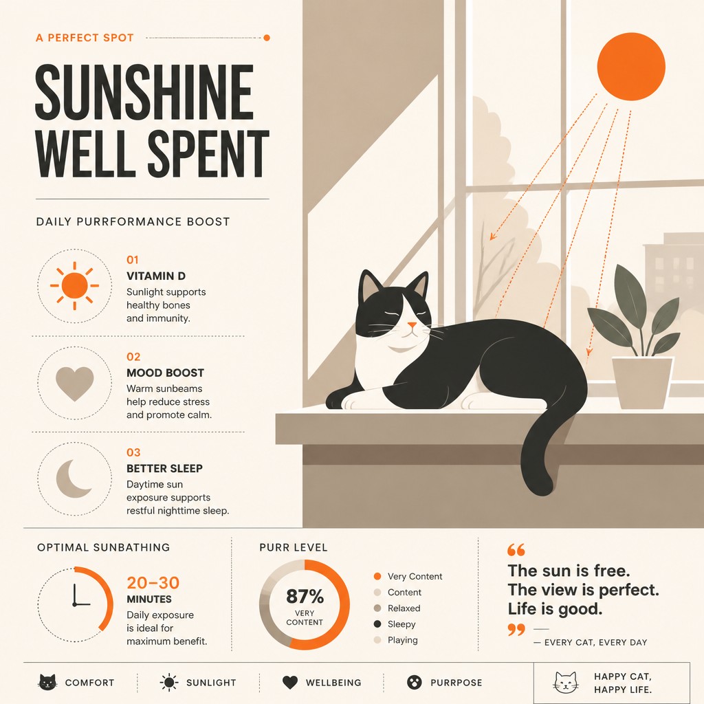
“a cat lounging in a sunlit window”
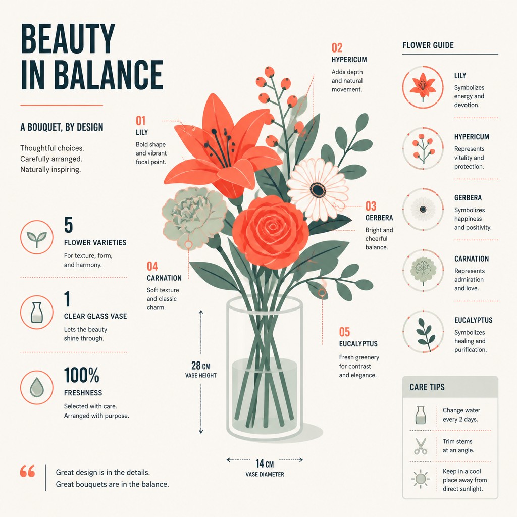
“bouquet of flowers in a glass vase”

“sailing ship on a stormy sea”
How to Create Infographic Poster Design Art
Master the craft step by step — or skip straight to creating. Read the full guide →
- 1
Build the layout first
Start by deciding the information hierarchy: headline, subhead, data blocks, supporting labels, and final takeaway. Place everything on a grid so the composition reads logically before any decorative elements are added.
- 2
Reduce content to visual units
Translate facts into charts, icons, timelines, numbered steps, and compact text blocks. If a detail does not help comprehension, remove it or convert it into a simpler graphic form.
- 3
Use one accent to guide attention
Limit the palette to a few coordinated colors and reserve one brighter hue for key data points, headings, or emphasis. This creates a clear path through the poster and keeps the design disciplined.
- 4
Keep shapes crisp and systematized
In hand-drawn or digital work, favor straight edges, consistent stroke widths, and repeated geometric motifs. For digital creation, prompt for flat vector rendering, modular grid alignment, and clean typography; for image-to-image, preserve structure and remove textures or painterly noise.
- 5
Design for reading distance
Test whether the poster communicates from far away and up close. A strong infographic poster should have a readable headline, an obvious hierarchy, and enough spacing that each section remains legible.
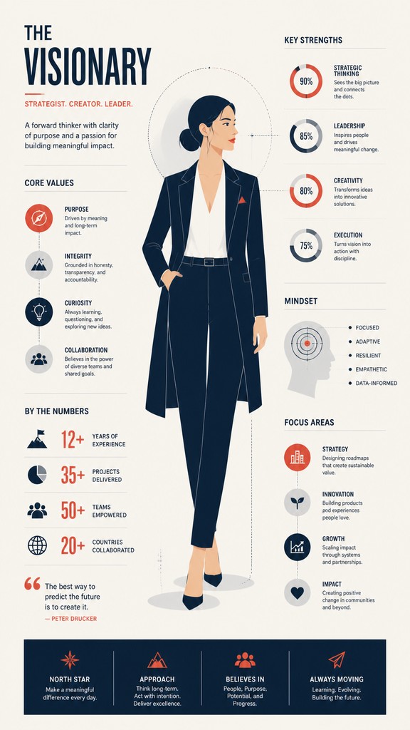
The Story
History & Origins of Infographic Poster Design
Infographic poster design grows out of a long tradition of information graphics, editorial design, public information campaigns, and modernist graphic design. Its visual principles are strongly related to 20th-century Swiss Style and other systems-based approaches to layout, where clarity, hierarchy, and grid structure became central to poster and publication design. It also draws from diagrammatic illustration, wayfinding graphics, and scientific visualization, all of which prioritize the rapid transmission of information.
In the late 20th and early 21st centuries, infographics expanded from institutional and educational contexts into magazines, museums, advertising, and digital media. Contemporary poster design often combines the restraint of modernist design with the polished flatness of vector illustration and the icon-heavy clarity of user-interface graphics. As a result, the style now sits at the intersection of editorial design, motion graphics aesthetics, and data visualization culture.
Influences: Infographic poster design is related to Swiss Style typography and grid systems, especially the work of leading Swiss typographic designers, as well as to modern information design, editorial illustration, and wayfinding graphics. It also shares visual logic with data visualization, technical manuals, scientific diagrams, and the clean flatness of contemporary vector design. In broader historical terms, its emphasis on order and legibility connects to Bauhaus principles and the functional clarity seen in the graphic work of influential Bauhaus-era and Art Deco-era graphic designers.
Frequently Asked Questions
What defines infographic poster design?
It is defined by the clear presentation of information through a structured layout, icons, charts, labels, and typography. The style prioritizes comprehension, hierarchy, and visual economy over realism or atmospheric effect.
How is this different from a regular poster?
A regular poster may focus on mood, branding, or a single image, while an infographic poster must explain something. Its design is built to organize data or processes, so the arrangement of text and graphics is central rather than secondary.
Is this style the same as minimalism?
Not exactly. It often uses minimalist forms, but its purpose is informational rather than purely aesthetic. An infographic poster can be dense with facts and labels while still looking clean and minimal.
What kinds of subjects work best in this style?
Subjects with steps, comparisons, systems, timelines, categories, or measurable data work especially well. Examples include science topics, health information, travel guides, statistics, educational content, and process explanations.
How do I make it readable instead of cluttered?
Use a grid, keep the palette limited, and create a strong hierarchy with typography. Break the content into small modules, leave generous spacing between sections, and avoid adding decorative elements that do not serve the information.
Can this style be used for digital illustration or image generation?
Yes. In digital workflows, it is well suited to vector illustration, layout software, and prompt-based generation that specifies flat shapes, charts, arrows, and precise alignment. If you are transforming an image, the best results usually come from simplifying detail and emphasizing structure.
Create your first Infographic Poster Design artwork
Describe anything — or upload a photo — and see it in Infographic Poster Design in seconds.
Make Something with Infographic Poster Design
Related Styles
Discover similar art styles