Propaganda Poster Design
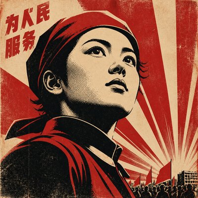
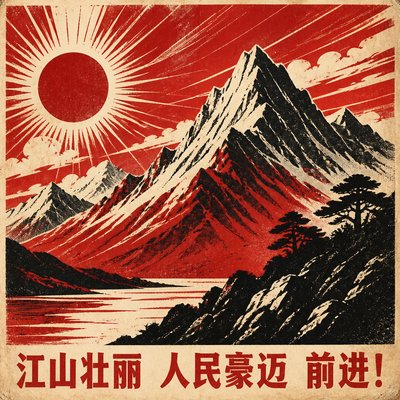
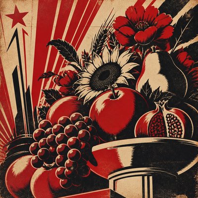
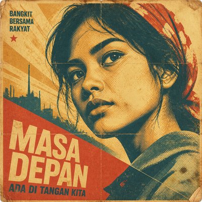
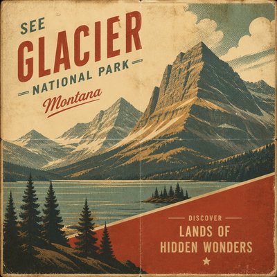
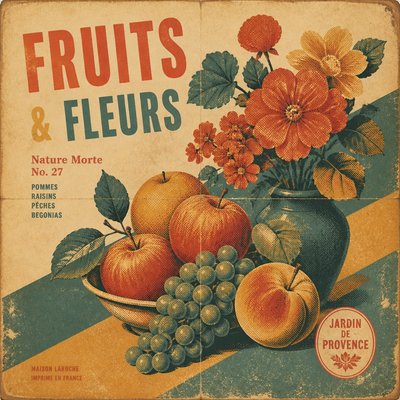
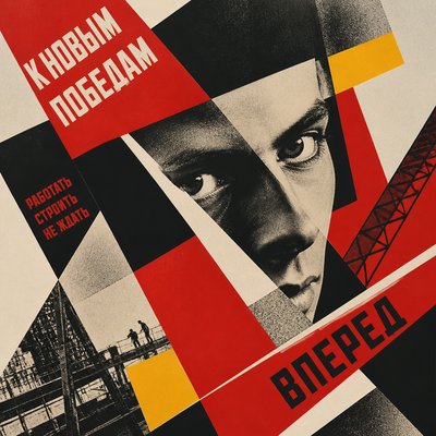
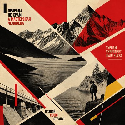
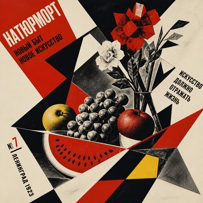
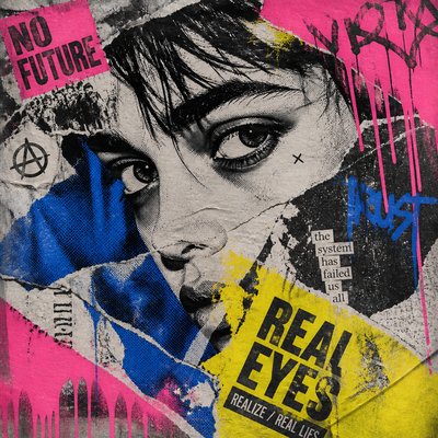
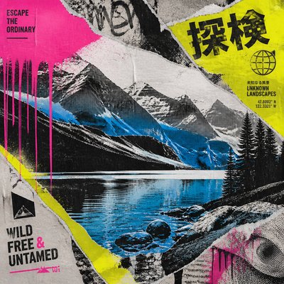
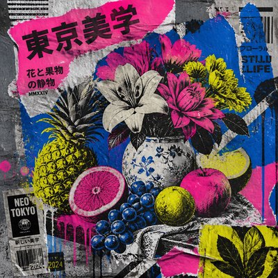
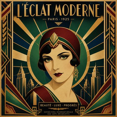
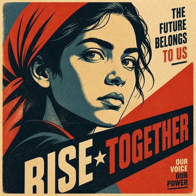
Bold political posters with limited colors, heroic silhouettes, and gritty print texture inspired by historic propaganda graphics.
Instantly rendered in Propaganda Poster Design — or transform a photo
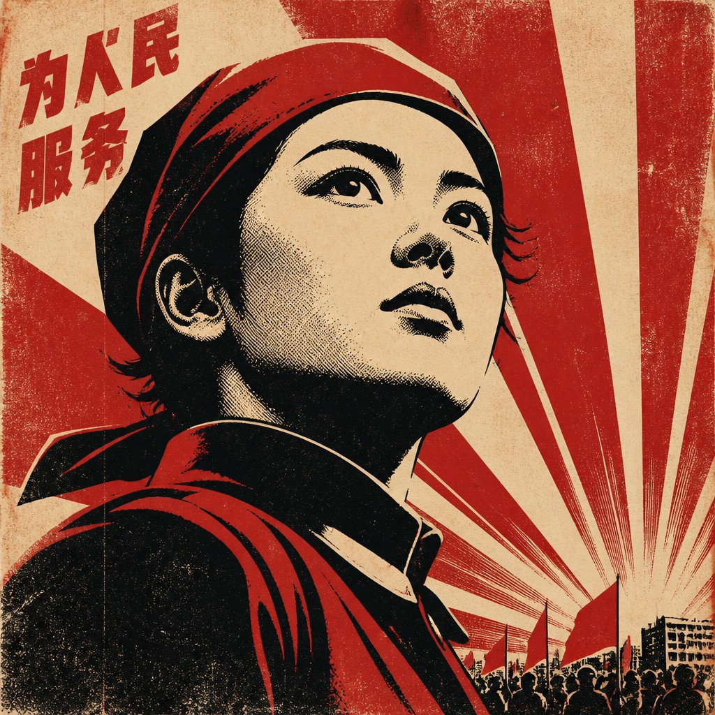
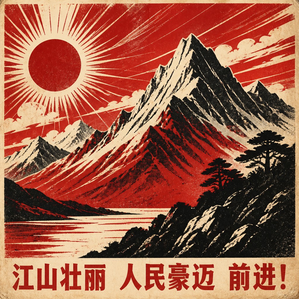
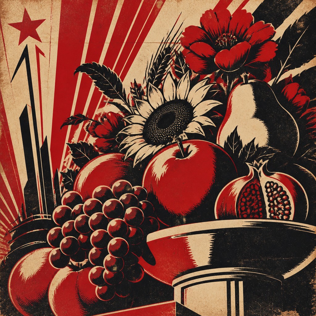
Propaganda Poster Design Gallery
Tap any artwork to explore it
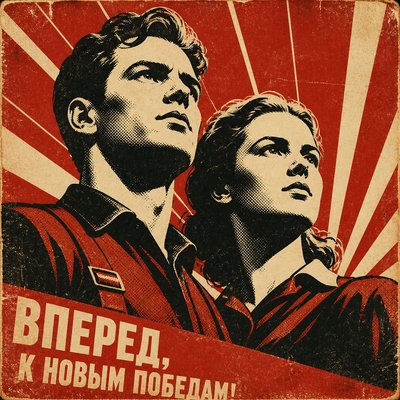
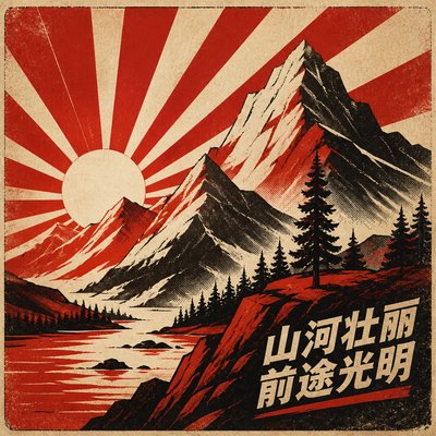
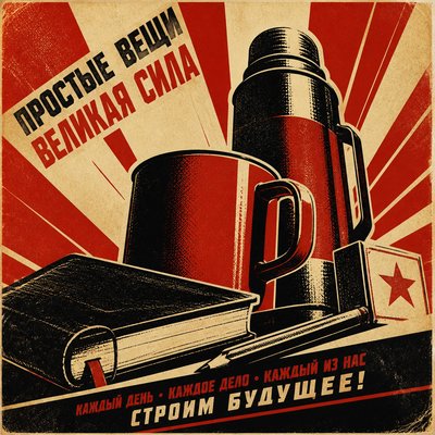
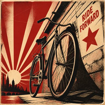
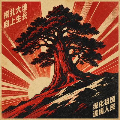
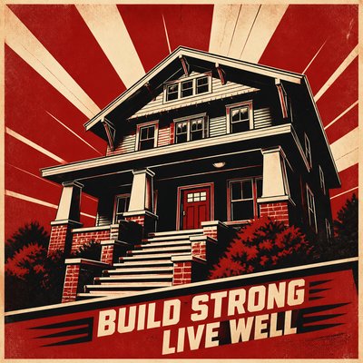
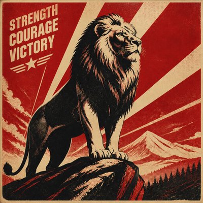
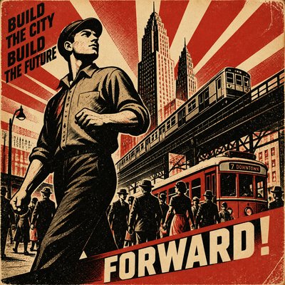
What is Propaganda Poster Design?
Propaganda poster design is a graphic style built around persuasion: it uses simplified imagery, emphatic slogans, and a tightly controlled palette to deliver a clear political or ideological message at a glance. The look is usually highly compressed and symbolic, favoring monumental figures, pointed gestures, and strong directional movement over realism or subtlety.
Visually, the style is defined by hard-edged shapes, sharp contrasts, and a sense of theatrical urgency. Deep reds, blacks, creams, and muted earth tones are common, along with diagonal compositions, radiating lines, and bold type that pushes the viewer toward a single reading. The aesthetic feels powerful because it borrows from mass-print media and public campaigning, where clarity, repetition, and emotional force mattered more than nuance.
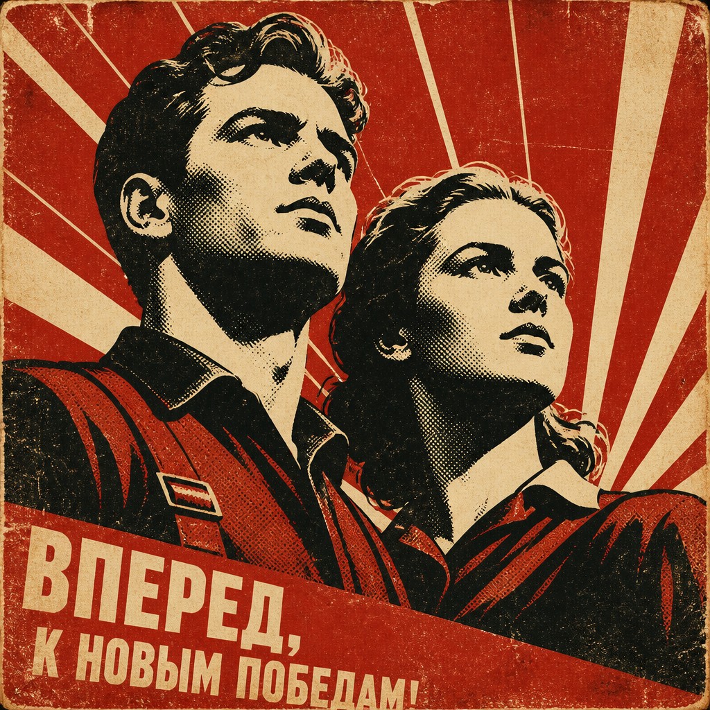
Try It On Your Photos
Upload any photo and convert it into Propaganda Poster Design — drag the sliders to compare before and after.


What Defines Propaganda Poster Design
The signature details, up close
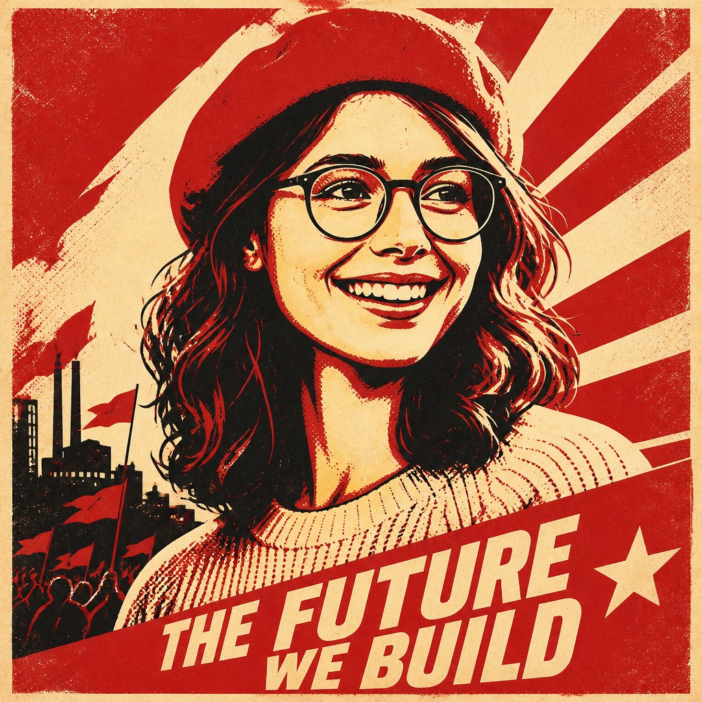
Limited, symbolic color palette
The style usually relies on only a few colors, often red, black, cream, or muted yellows. This restraint heightens contrast and makes the message readable from a distance.
Heroic monumental figures
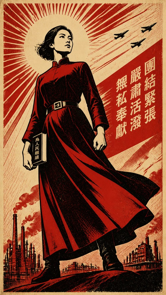
People are often shown larger than life, with upward angles, strong profiles, or raised arms. The figures are simplified into emblematic forms that suggest strength, unity, or resolve.
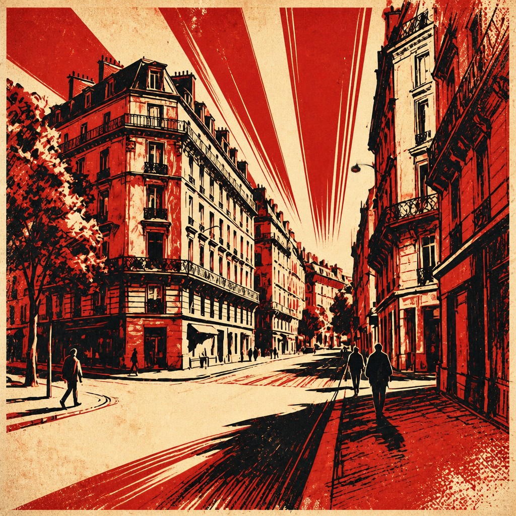
High-contrast silhouettes and bold shapes
Details are reduced so the image reads instantly as a poster rather than a scene. Hard edges and graphic silhouettes help the composition feel direct and forceful.
Dynamic diagonal composition
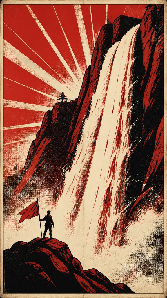
Slanted lines, rays, banners, and converging forms create momentum and direction. The layout often implies action, mobilization, or forward movement.
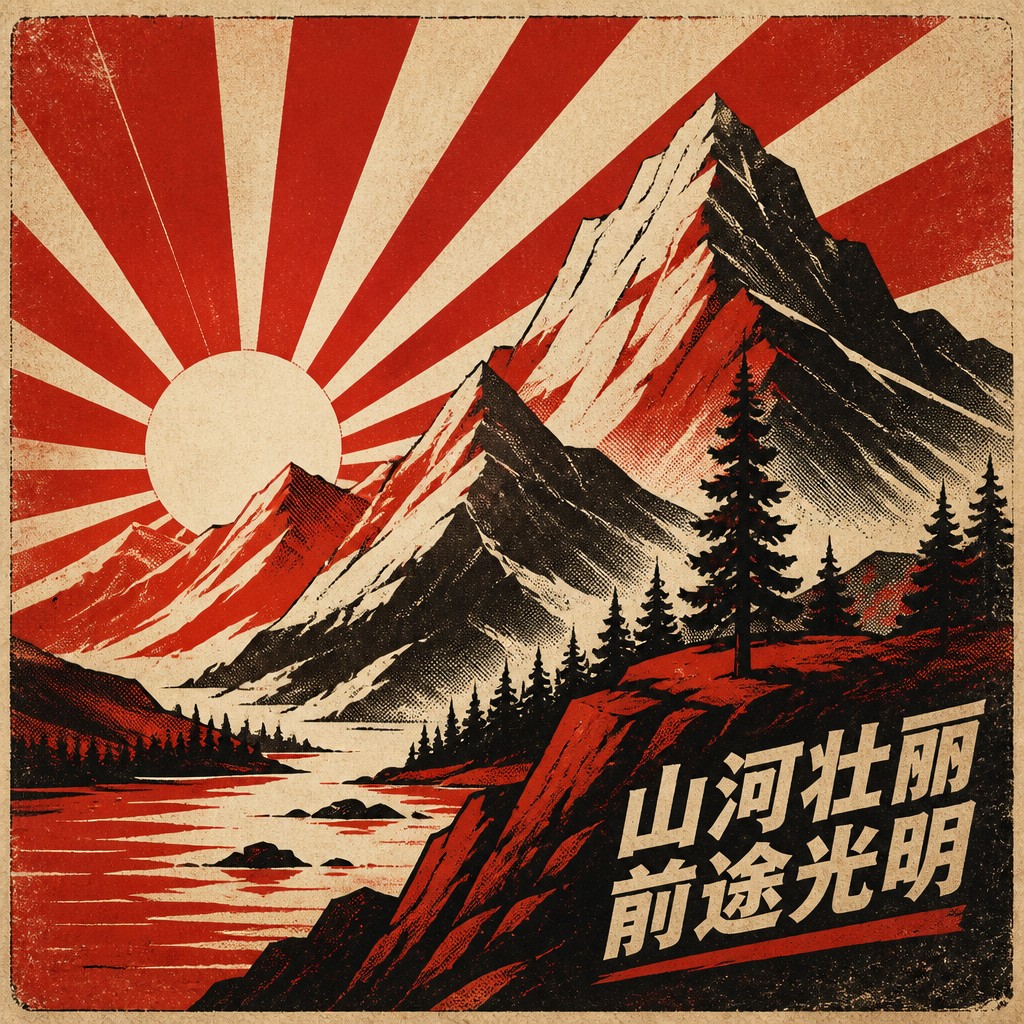
Print texture and distress
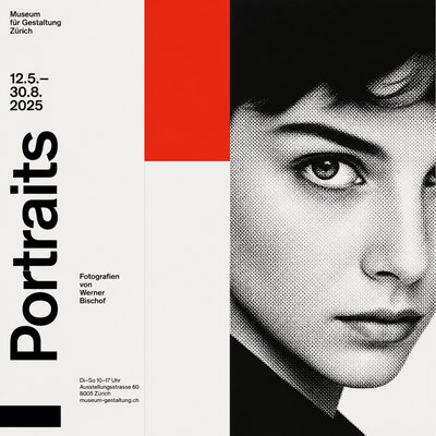
Visible halftone dots, grain, rough ink edges, and paper wear are common. These textures evoke older lithographic or screen-printed production methods.
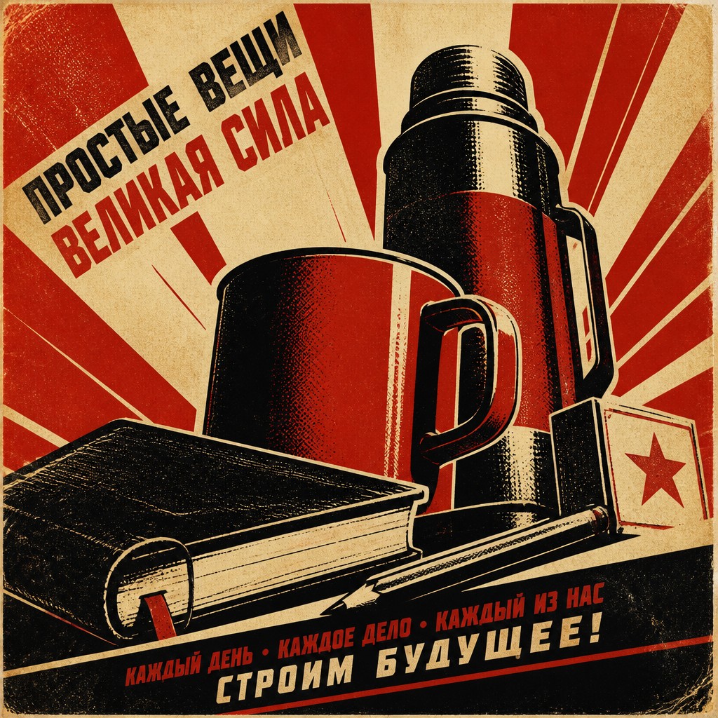
Commanding typography
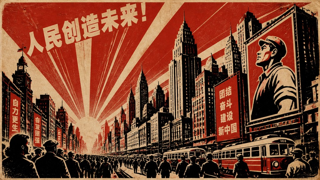
Heavy sans-serif lettering, block capitals, and short slogans are typical. The text is often integrated into the image so the message feels unified and unavoidable.
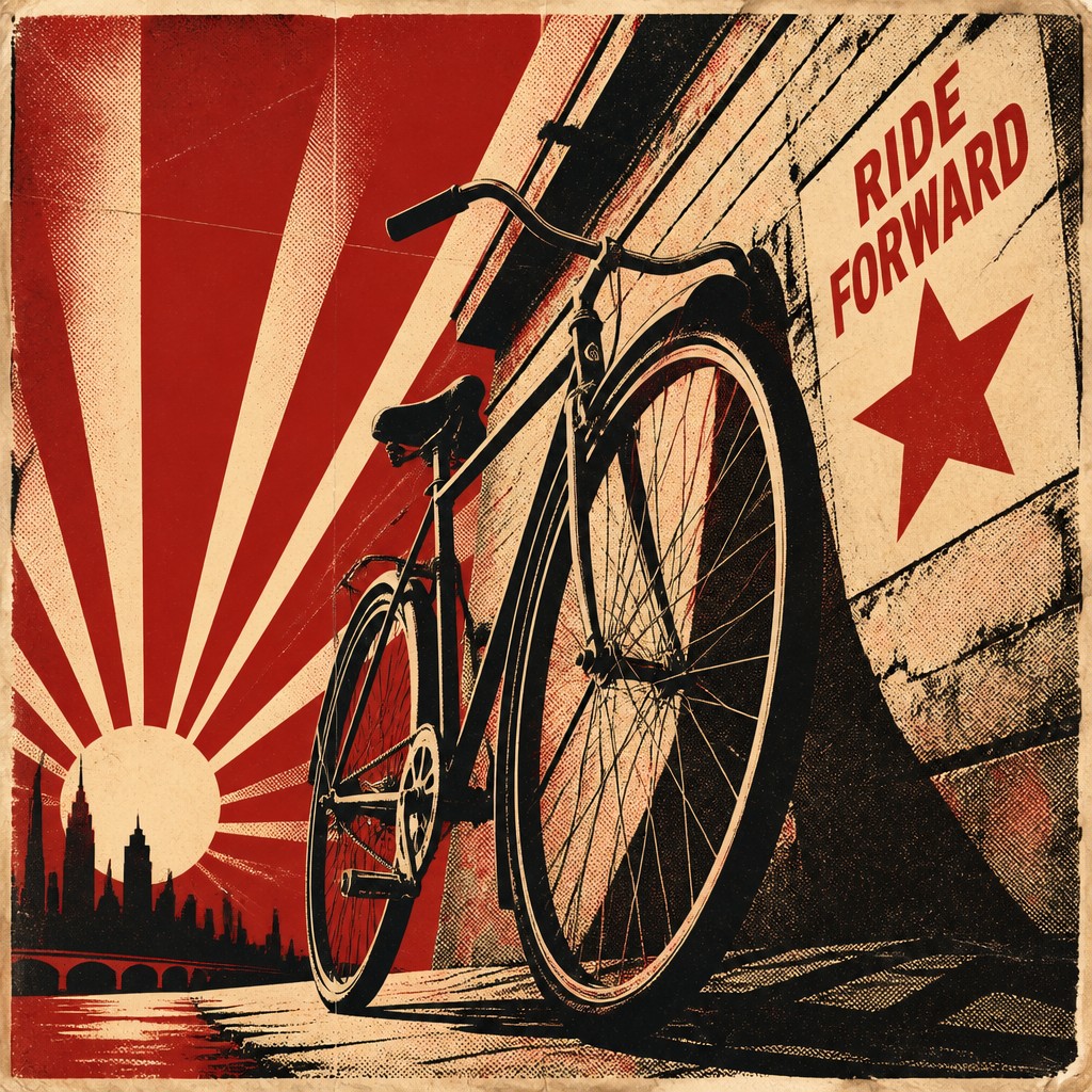
Emotional simplification
The design reduces complex ideas into a single visual claim. Symbols, gestures, and facial expressions are used to communicate allegiance, danger, sacrifice, or hope with minimal ambiguity.
Try It
Create Videos in Propaganda Poster Design
Styles aren't just for stills — describe a scene or animate an image and get a short video rendered in Propaganda Poster Design. Press play to see this pond come to life.
Make a VideoPropaganda Poster Design Prompt Ideas
Start from an idea — each one opens the generator with the style ready to go. See all 40 Propaganda Poster Design prompts →
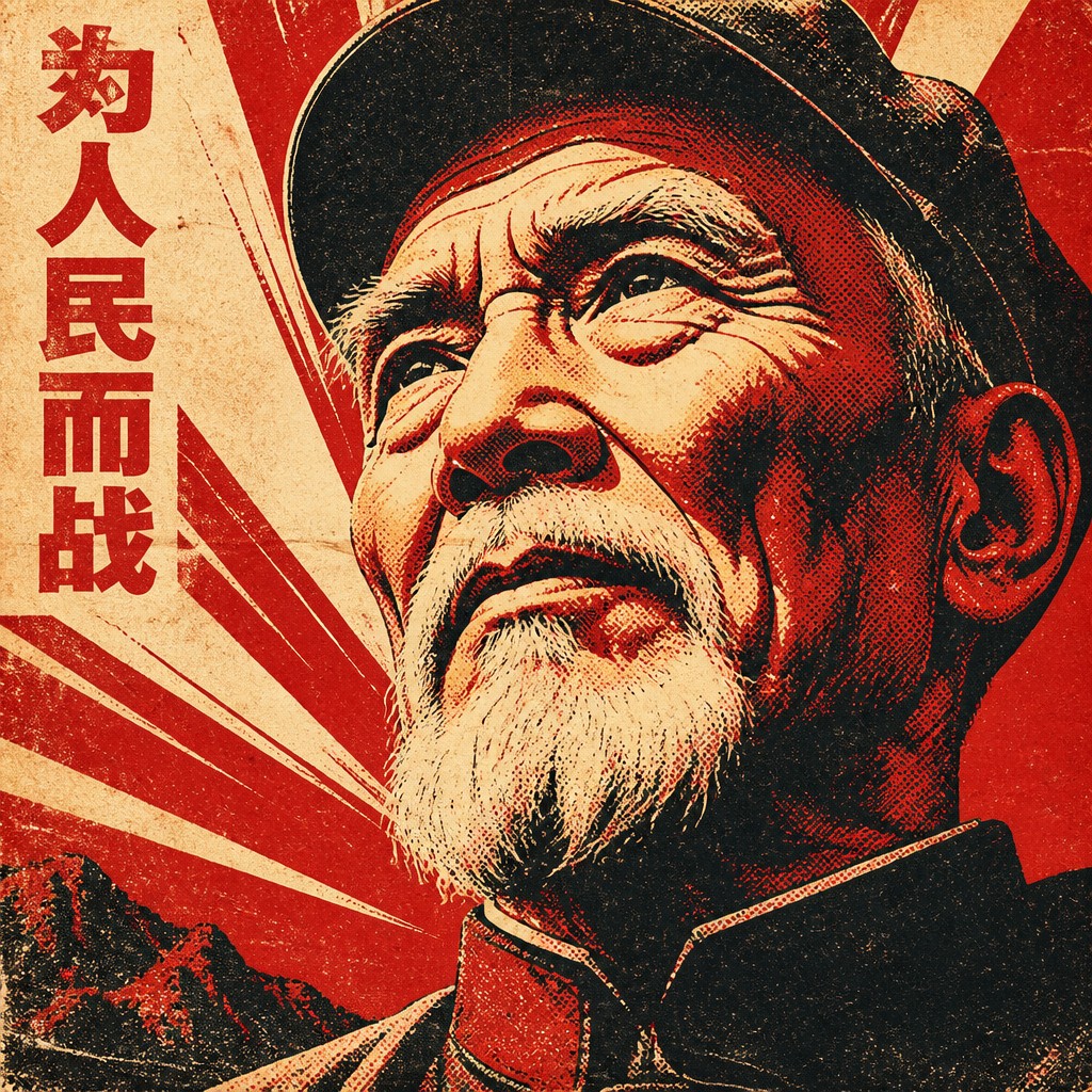
“close-up portrait of an elderly person with expressive weathered features”
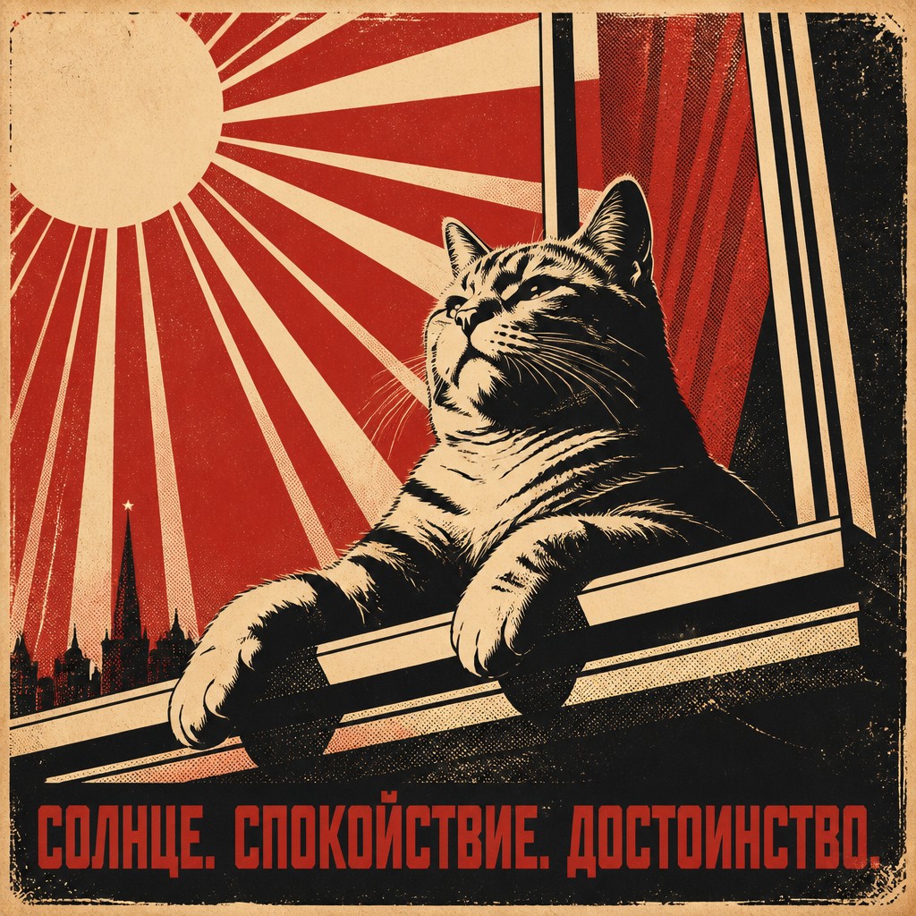
“a cat lounging in a sunlit window”
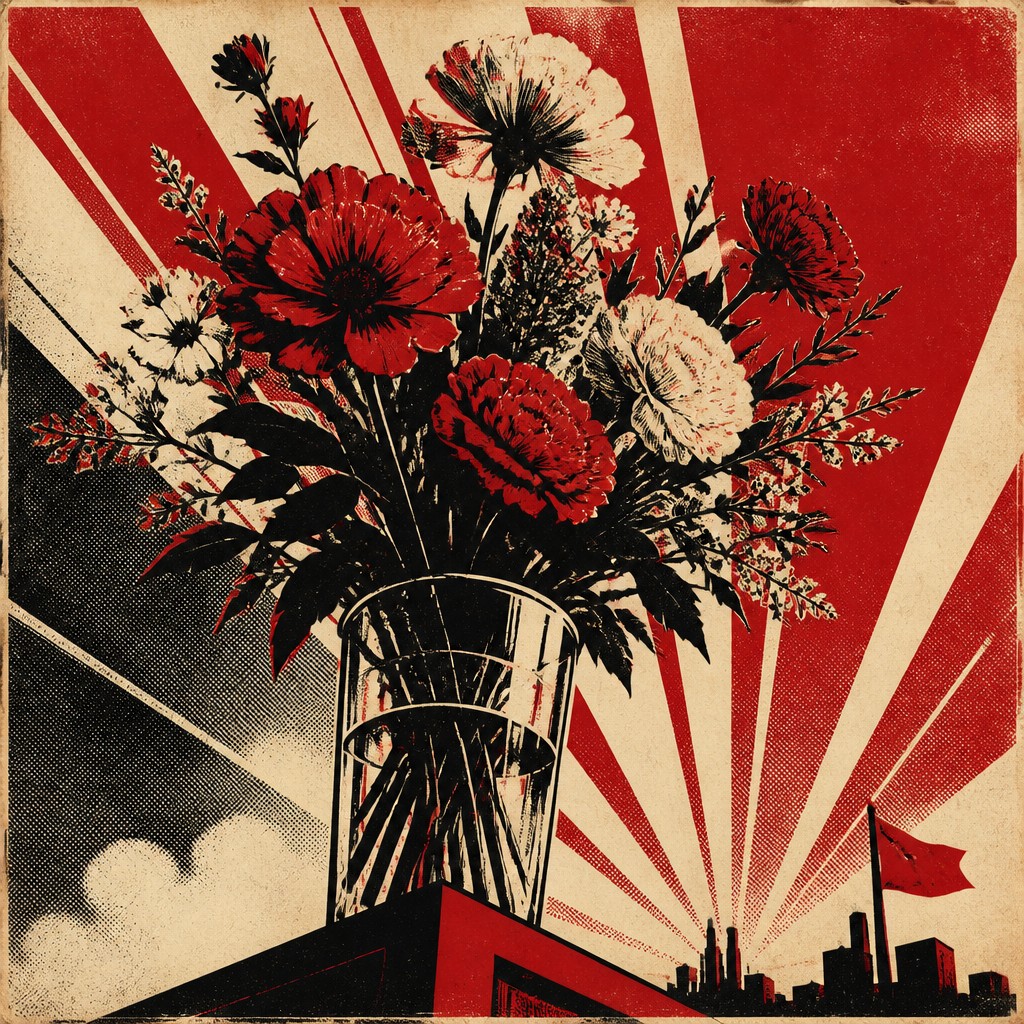
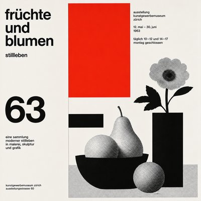
“bouquet of flowers in a glass vase”
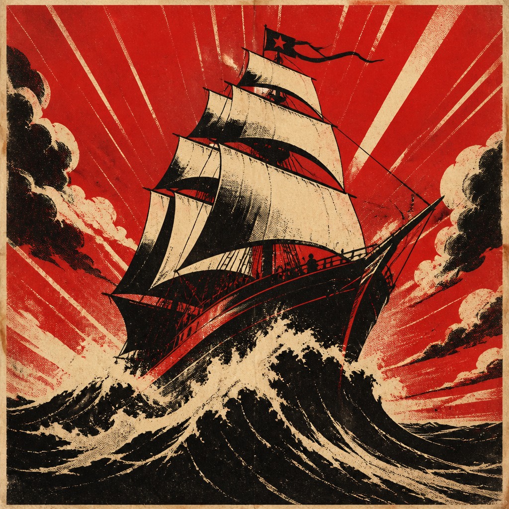
“sailing ship on a stormy sea”
How to Create Propaganda Poster Design Art
Master the craft step by step — or skip straight to creating. Read the full guide →
- 1
Design for instant readability
Start with a single message and reduce the image to the essential symbols needed to express it. Keep the silhouette clear, the focal point large, and the composition legible even at thumbnail size.
- 2
Use a restricted palette
Limit yourself to two or three strong colors and let contrast do the work. In traditional media, this can be achieved with flat gouache, linocut, or screen printing; in digital work, build the palette deliberately and avoid soft gradients.
- 3
Build drama with angle and scale
Use a low viewpoint, diagonal thrusts, and radiating lines to create urgency and monumentality. Enlarge the main subject relative to the background so the scene feels declarative rather than observational.
- 4
Add print-era texture carefully
Introduce halftone, ink bleed, paper grain, and distress only after the composition is strong. Too much texture can obscure the message, so keep it as a secondary layer that reinforces the vintage print feeling.
- 5
Make typography part of the composition
Choose bold, condensed, or blocky letterforms and place them as a visual element rather than a caption. In prompt-based generation, specify short slogans, poster layout, and strong central messaging so the text-and-image relationship feels integrated.
The Story
History & Origins of Propaganda Poster Design
Propaganda poster design developed most visibly in the late 19th and early 20th centuries alongside modern mass politics, industrial printing, and wartime public messaging. Its visual language was shaped by lithography, screen printing, woodcut, and later photomontage, all of which encouraged simplified forms, high contrast, and reproducible graphics that could be distributed widely in streets, factories, and public buildings.
The style became especially prominent during the Russian Revolution, the world wars, and mid-20th-century political campaigns, when governments and movements used posters to recruit, persuade, and mobilize. Its lineage also includes earlier satirical prints, revolutionary broadsides, and woodcut traditions, as well as modernist graphic design that emphasized flat color and geometric composition. In contemporary image-making, the style survives less as literal political propaganda and more as a recognizable visual shorthand for urgency, authority, and mass persuasion.
Influences: This style draws from Soviet revolutionary graphics, wartime recruitment posters, and early modern print culture, with clear ties to woodcut, lithography, and screen-print aesthetics. Related visual traditions include the bold simplification of German Expressionist prints, the flat color and graphic economy of Japanese ukiyo-e, and the poster design of leading Constructivist and politically engaged graphic artists, whose work helped define the power of modern political graphics.
Frequently Asked Questions
What defines propaganda poster design?
It is defined by persuasive intent translated into a highly graphic image: limited colors, strong symbols, heroic figures, and direct messaging. The style aims for immediate emotional impact and easy readability rather than realism or subtle atmosphere.
How is it different from retro poster design in general?
Retro poster design can refer to many eras and purposes, from travel ads to film posters, while propaganda poster design specifically uses the visual language of political persuasion. It tends to be more forceful, more symbolic, and more visually disciplined than general vintage poster aesthetics.
What colors work best in this style?
Deep red, black, cream, ochre, and muted blues are especially effective because they create strong contrast and feel historically grounded. A restricted palette is important: too many colors can weaken the poster’s authority and reduce its graphic impact.
What kinds of subjects suit this style?
Subjects that benefit from urgency, authority, or collective action work especially well, such as workers, soldiers, voters, athletes, inventors, or public service campaigns. It also works for fictional or satirical subjects because the style instantly signals persuasion and intensity.
How do I make it look authentic rather than generic?
Use compositional discipline: a single focal figure, sharp silhouettes, bold type, and print texture that feels integrated rather than pasted on. Authenticity comes from the logic of old reproduction methods, so avoid modern glossy rendering, soft lighting, and overly detailed realism.
Where is propaganda poster design used today?
Today it appears in editorial illustration, protest graphics, political commentary, retro-inspired branding, and cinematic or game key art. It is also used as a visual quotation when creators want to evoke mobilization, authority, or ideological messaging.
Create your first Propaganda Poster Design artwork
Describe anything — or upload a photo — and see it in Propaganda Poster Design in seconds.
Make Something with Propaganda Poster Design
Compare Propaganda Poster Design
Related Styles
Discover similar art styles