Propaganda Poster Design vs Art Deco Poster Design: What's the Difference?
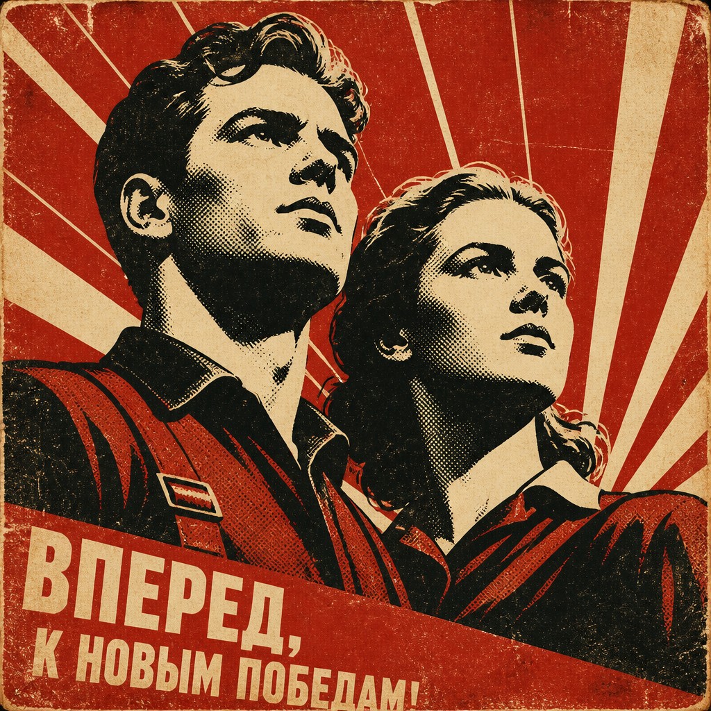
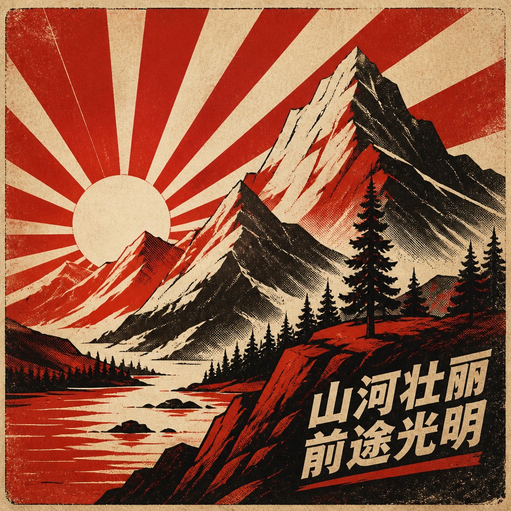
Propaganda Poster Design uses bold, simplified imagery to deliver a direct political or social message. It typically relies on limited color palettes, strong contrasts, heroic silhouettes, and rough print textures that suggest urgency, mass communication, and historical print methods.
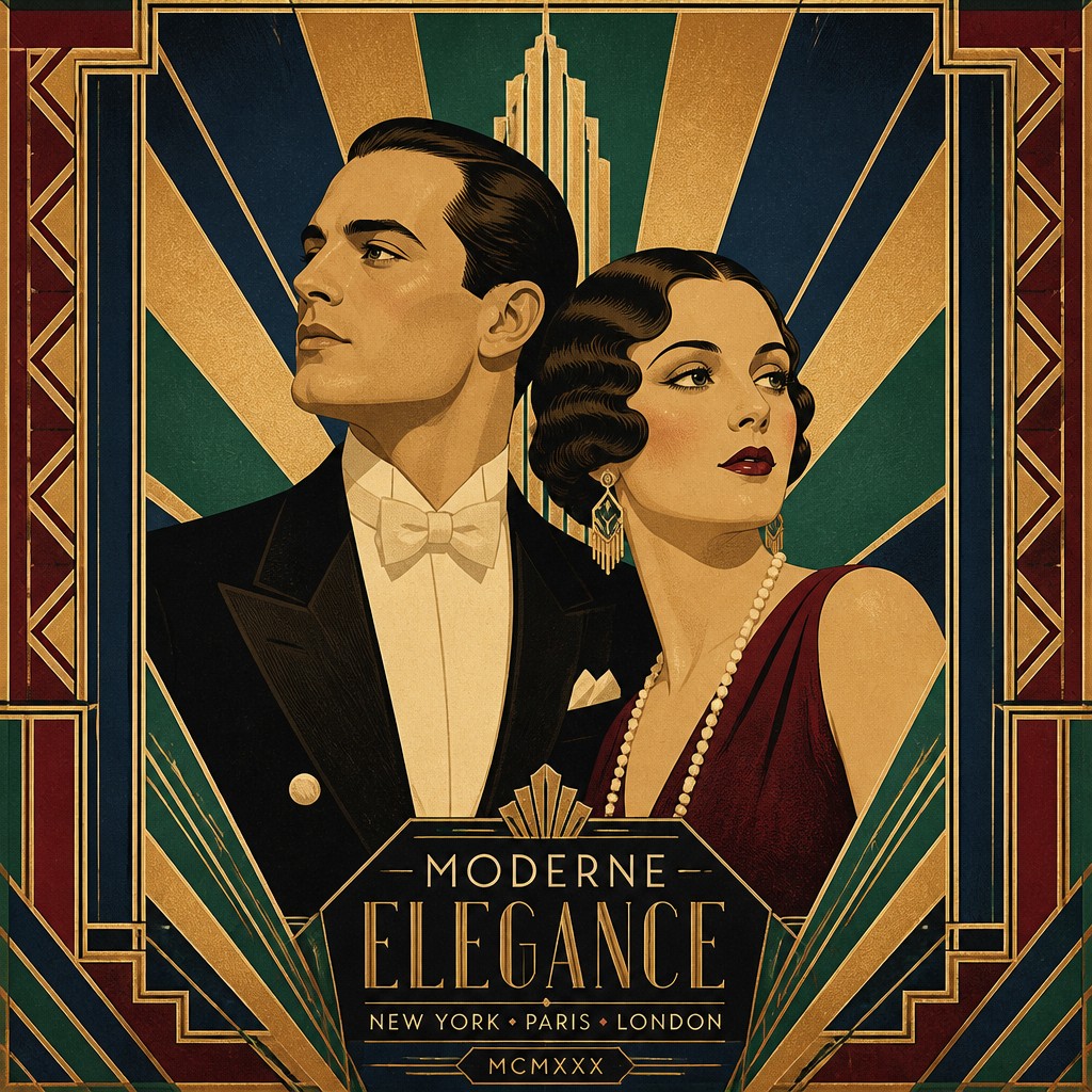
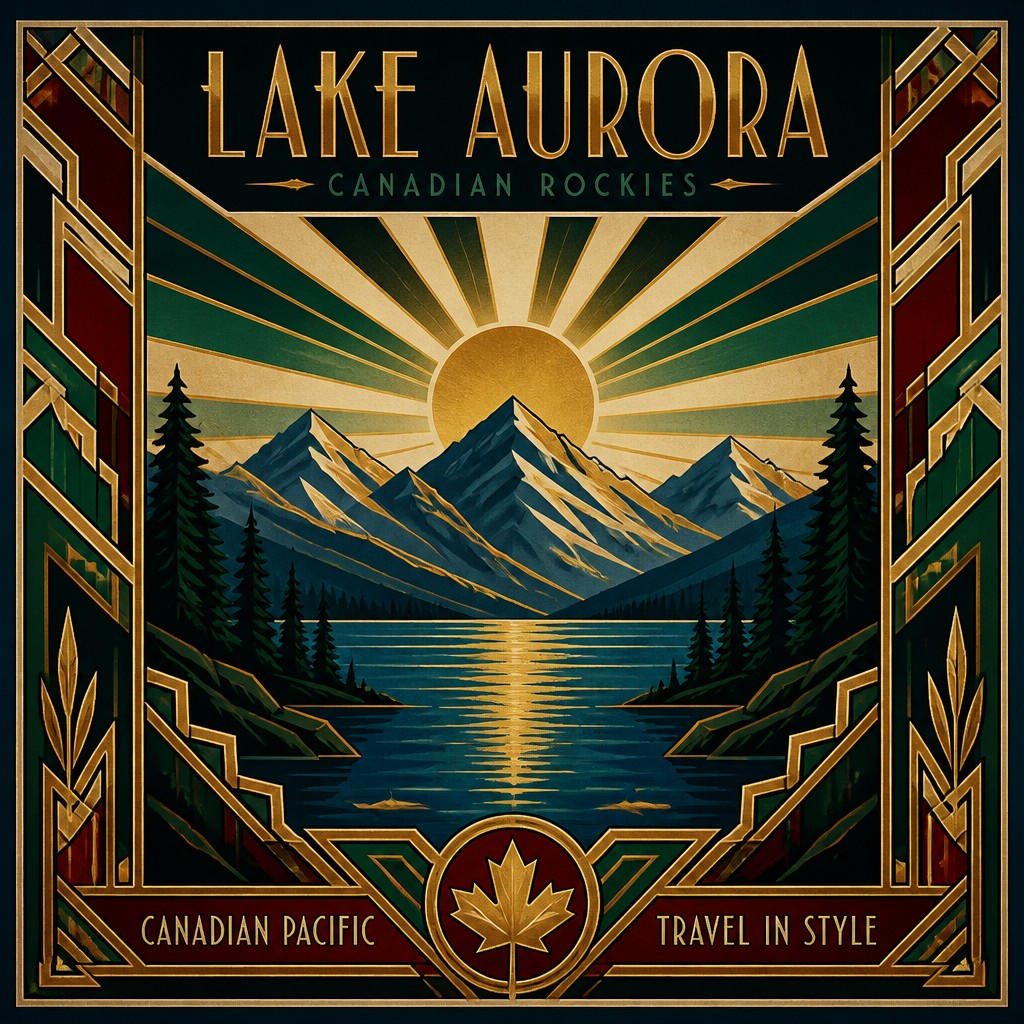
Art Deco Poster Design is a decorative commercial style from the 1920s and 1930s that emphasizes elegance, geometry, symmetry, and modern luxury. People compare the two because both use simplified shapes and strong visual impact, yet they differ in purpose: propaganda aims to persuade, while Art Deco aims to attract, impress, and celebrate modern style.
Same Prompt, Both Styles
Each pair below was generated from the identical prompt — only the style changed.
“portrait of two people together”
“wide landscape with natural scenery”
“still life with everyday objects”
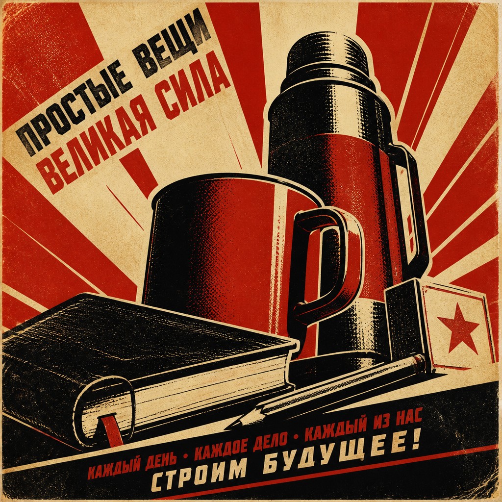
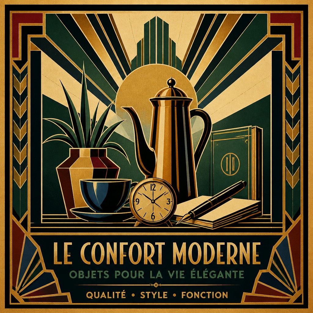
“bicyle resting against a wall”
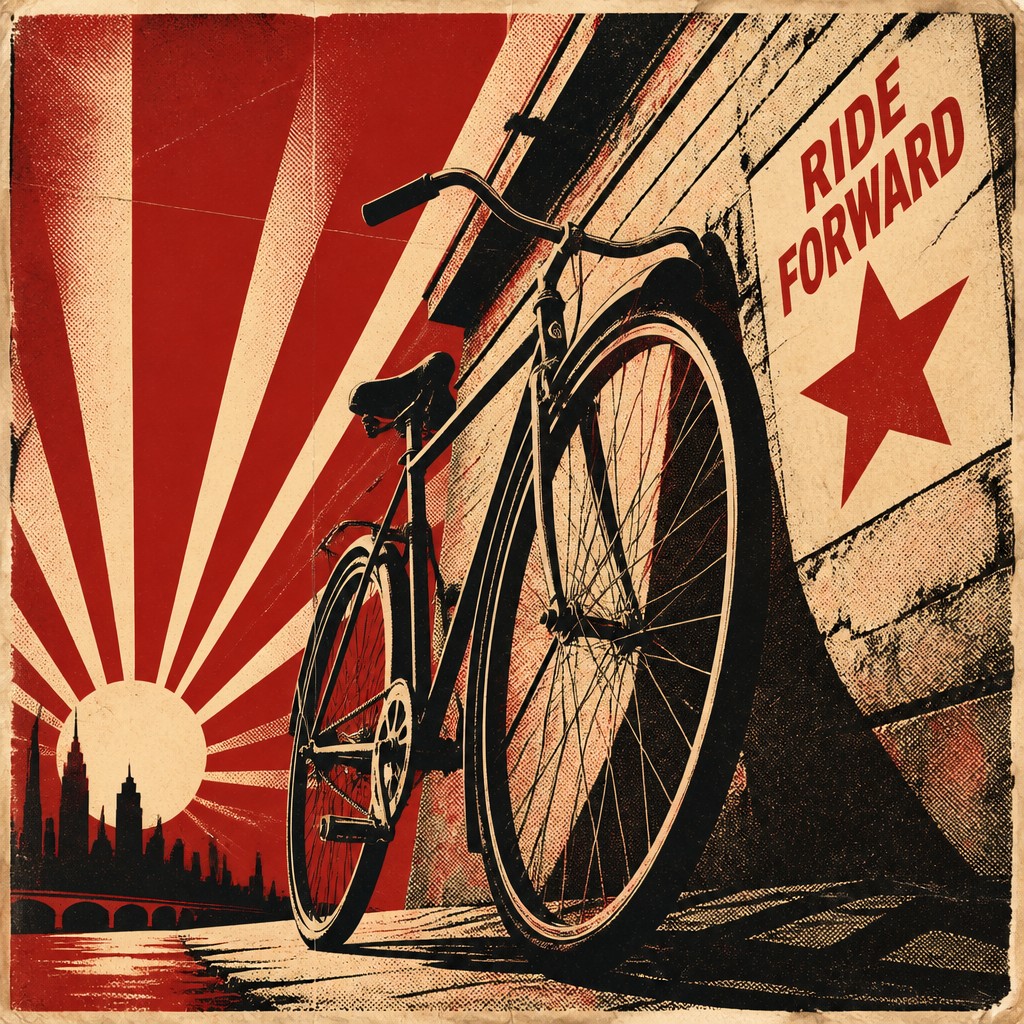
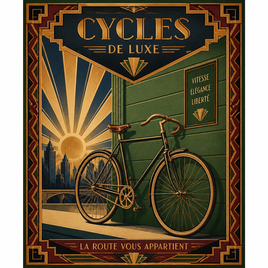
Key Differences
| Propaganda Poster Design | Art Deco Poster Design | |
|---|---|---|
| Purpose | Persuades audiences toward a political or social message. | Promotes products, travel, or modern sophistication. |
| Mood | Urgent, serious, defiant, or mobilizing. | Elegant, optimistic, polished, and glamorous. |
| Color | Limited palette with heavy contrast and strong reds, blacks, and creams. | Refined palettes with metallic tones, jewel colors, and rich neutrals. |
| Shape language | Bold silhouettes and simple, forceful forms. | Geometric patterns, stepped shapes, and streamlined curves. |
| Texture | Gritty, worn, and print-like with visible distress. | Smooth, crisp, and often highly polished. |
| Composition | Direct, centralized, and message-first. | Balanced, decorative, and rhythmically arranged. |
| Visual symbols | Crowds, raised arms, flags, machinery, or strong symbolic figures. | Sunbursts, zigzags, stylized architecture, and luxury motifs. |
| Mood | bold, authoritative, urgent, dramatic, rallying | elegant, luxurious, confident, stylized, dramatic |
| Energy | intense | balanced |
| Detail level | moderate | detailed |
| Color | limited, high-contrast, mostly flat colors | metallics, jewel tones, deep contrast |
| Texture | clean, screen-printed, slightly rough edges | smooth, polished, graphic |
| Origin | early 20th-century political poster art | 1920s-1930s Europe and North America |
| Best for | political posters, activist campaigns, editorial graphics, social messaging, album covers, historical-themed designs | posters, advertising graphics, event promotions, album covers, fashion branding, editorial illustrations |
| Difficulty | moderate | advanced |
Which Should You Choose?
Choose Propaganda Poster Design when you want a forceful, high-contrast image that feels historic, urgent, or ideologically charged. Choose Art Deco Poster Design when you want something sophisticated, ornamental, and modernist, with a sense of luxury, speed, and streamlined beauty. If your message should feel persuasive and confrontational, pick A; if it should feel chic and aspirational, pick B.
Frequently Asked Questions
Are these styles visually similar?
They can overlap in their use of simplified shapes and strong composition, but their intentions differ. Propaganda design is more confrontational and message-driven, while Art Deco is more decorative and polished.
Which style uses more color?
Art Deco posters often use a broader and more refined palette, including metallic-looking accents and rich contrasts. Propaganda posters usually stay closer to a few strong colors for maximum impact.
Can both styles look vintage?
Yes, both can feel vintage because they are rooted in early 20th-century print aesthetics. Propaganda tends to look rougher and more politically charged, while Art Deco feels more luxurious and design-focused.
Which style is better for a modern campaign poster?
Use propaganda-inspired design if you need urgency, clarity, and emotional force. Use Art Deco-inspired design if you want an elevated, stylish campaign with a sleek retro identity.