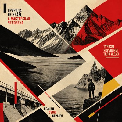
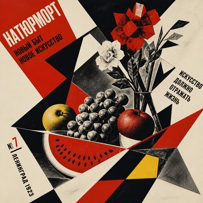
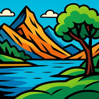
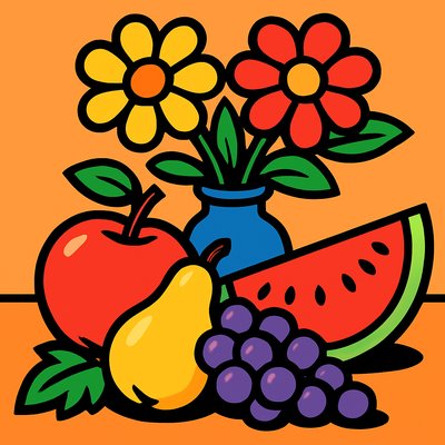
Psychedelic Poster Design
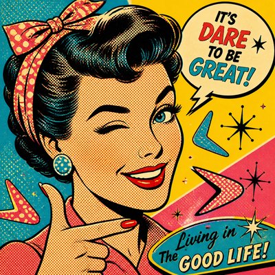
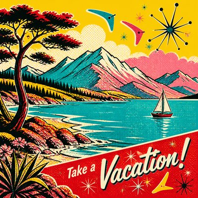
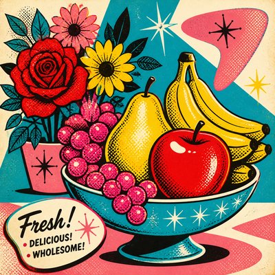
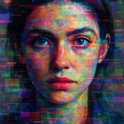
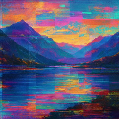
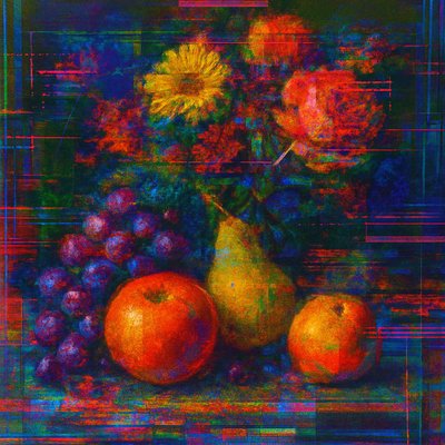
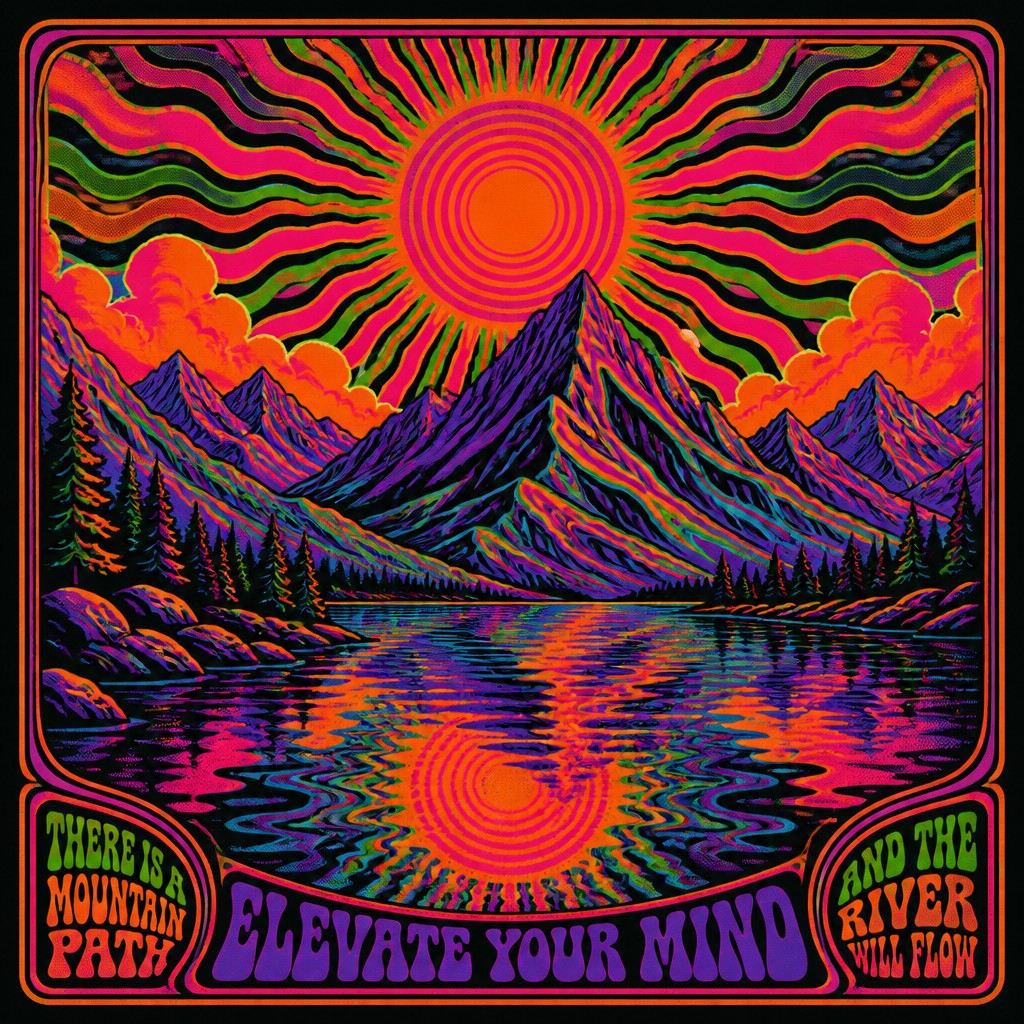
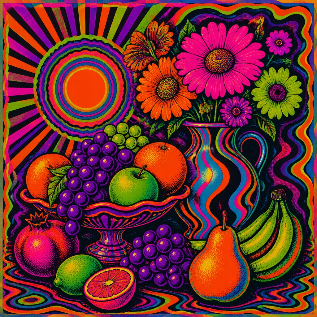
1960s-inspired poster art with warped lettering, neon colors, halftones, and trippy optical illusions.
Instantly rendered in Psychedelic Poster Design — or transform a photo
Psychedelic Poster Design Gallery
Tap any artwork to explore it
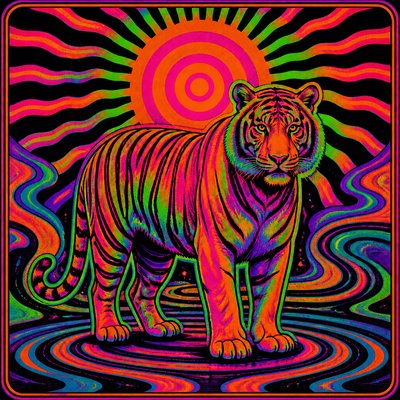
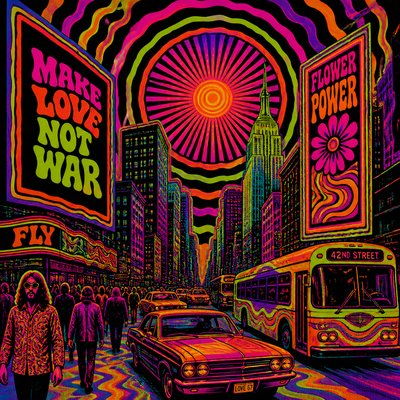
What is Psychedelic Poster Design?
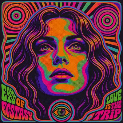
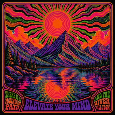
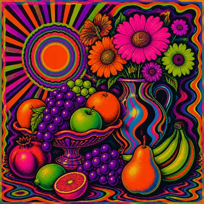
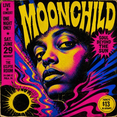
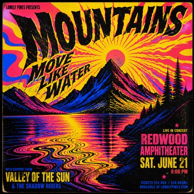
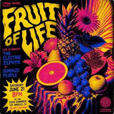
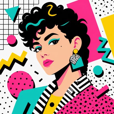
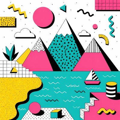
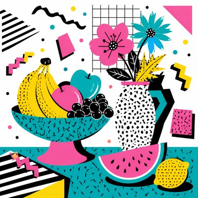
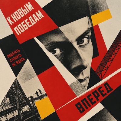
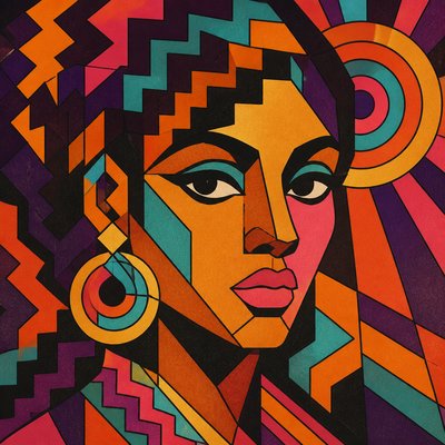
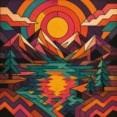
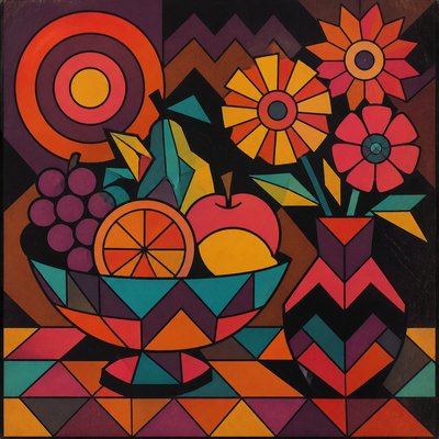
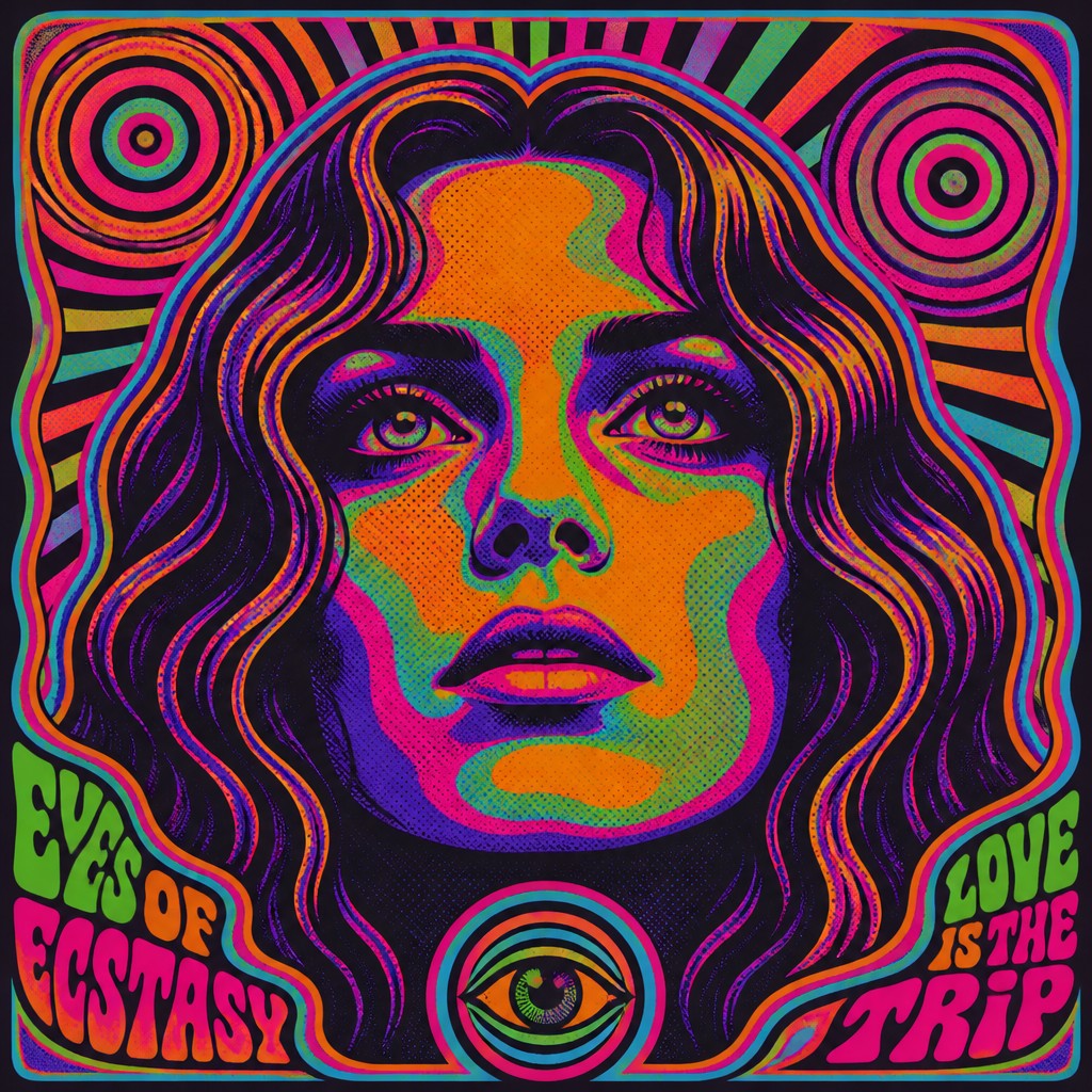
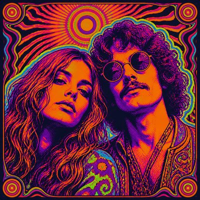
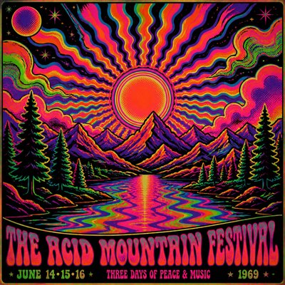
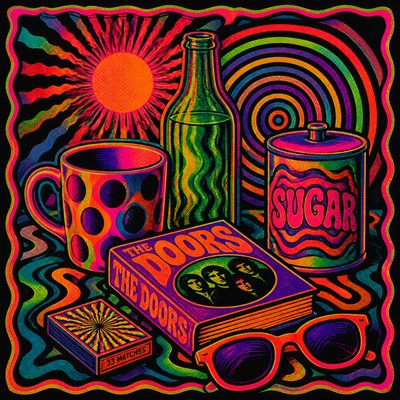
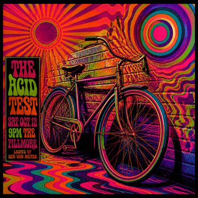
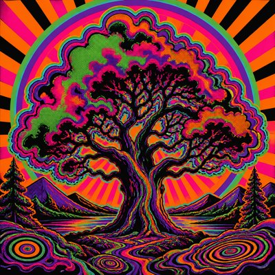
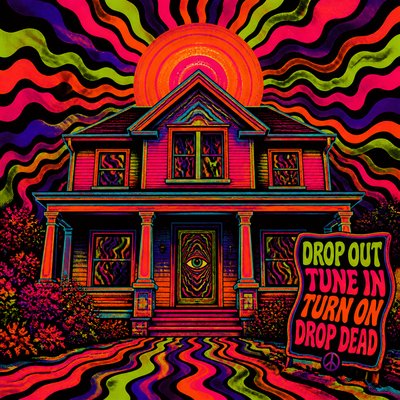
Psychedelic Poster Design is a graphic style associated with the visual culture of the late 1960s counterculture. It is defined by warped typography, saturated neon palettes, vibrating outlines, repeated patterns, and images that seem to pulse, melt, or expand under visual pressure.
The style often uses screen-print aesthetics, posterized color blocks, and optical effects such as concentric rings, radiating bursts, moiré textures, and impossible contours. Its look was shaped by poster art for rock concerts, underground events, and protest culture, where legibility, sensory overload, and a hallucinatory mood were often balanced in a single composition.
Try It On Your Photos
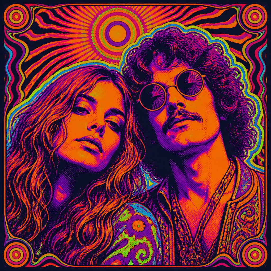
Upload any photo and convert it into Psychedelic Poster Design — drag the sliders to compare before and after.
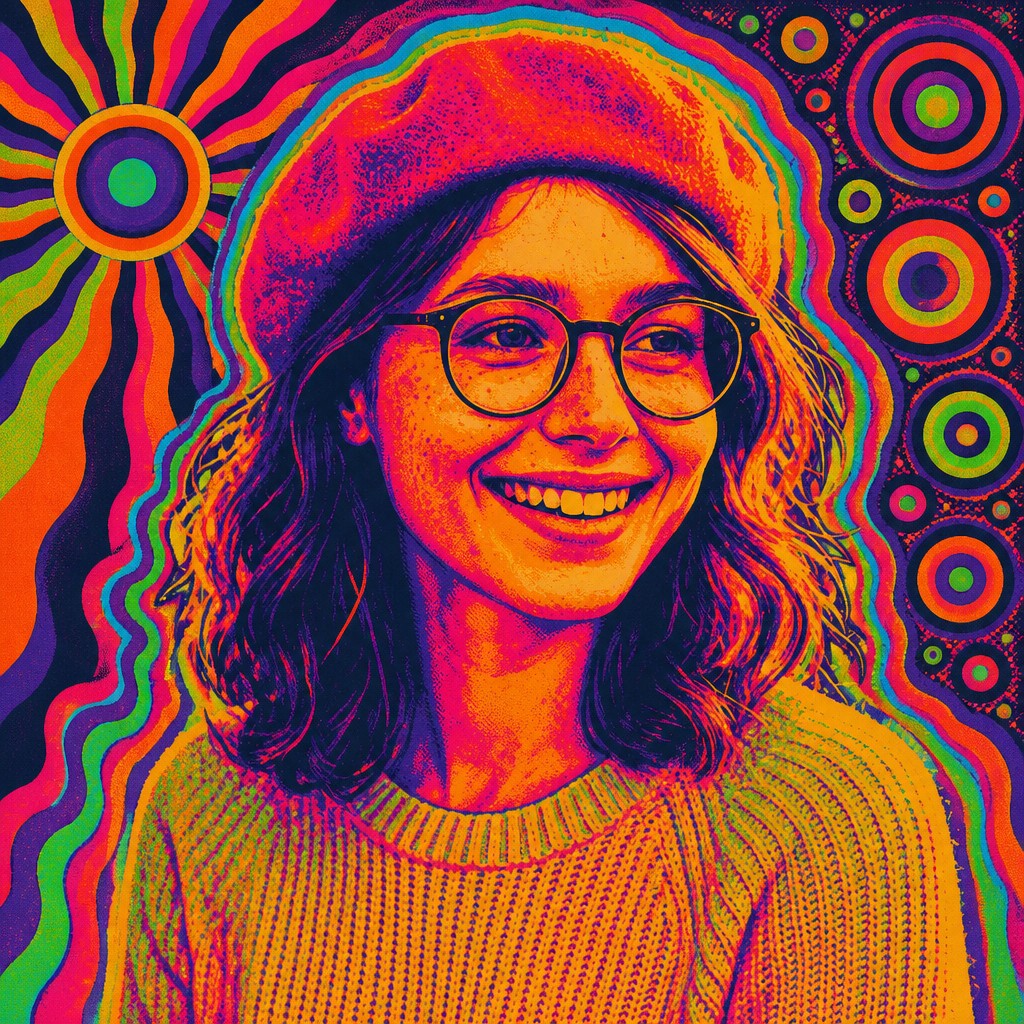

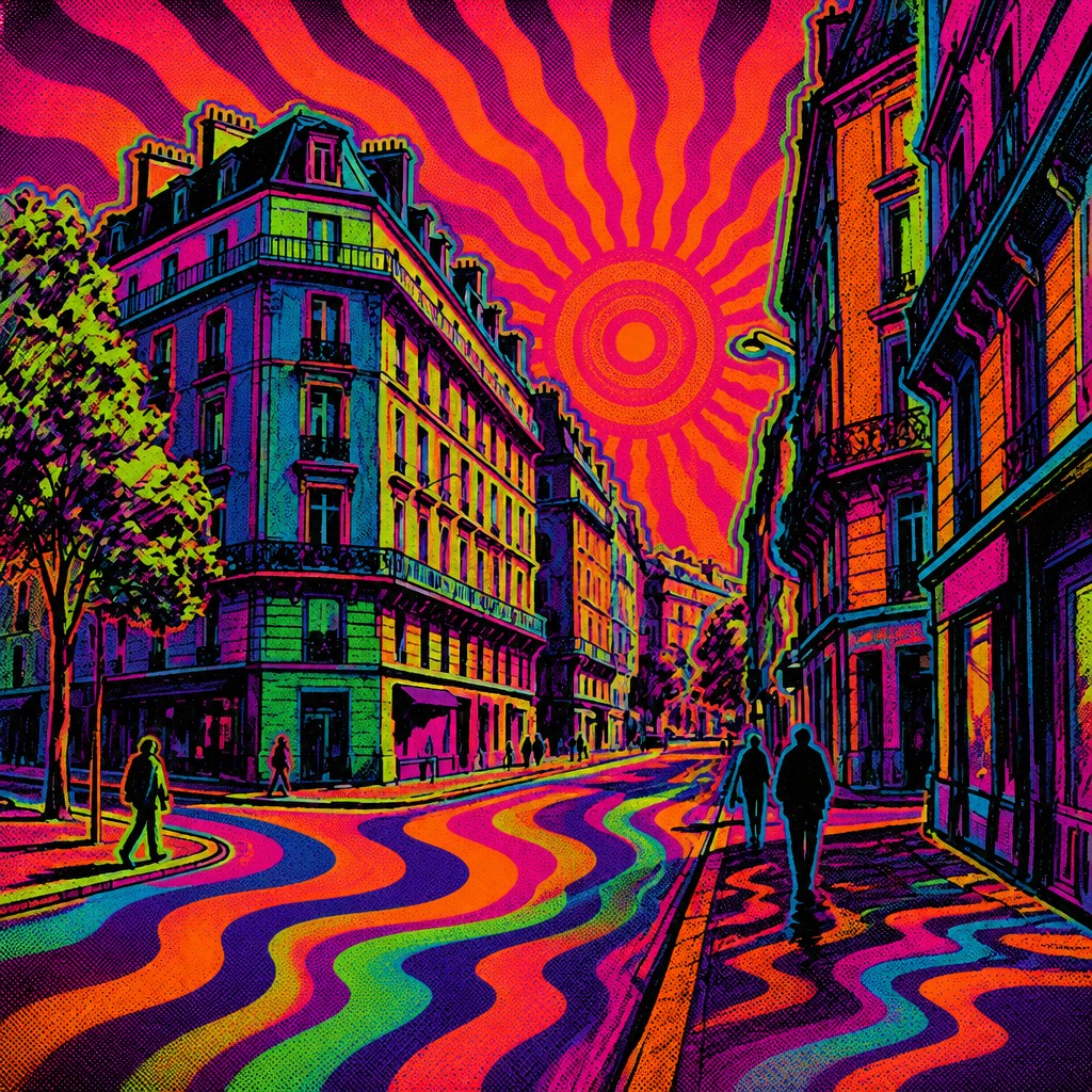

What Defines Psychedelic Poster Design
The signature details, up close
Warped, elastic typography
Letterforms are often stretched, bent, interlocked, or dissolved into the surrounding composition. Readability may be intentionally challenged so the text feels like part of the image rather than separate from it.
High-chroma, clashing color
The palette commonly uses hot magenta, acid green, orange, cyan, and purple in abrupt combinations. Complementary colors are placed side by side to create vibration and visual intensity.
Posterized shapes and hard edges
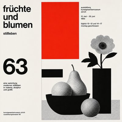
Forms are simplified into crisp, flat color areas with little modeling. Gradients, if present, are stylized and abrupt, echoing screen-print separations rather than painterly blending.
Optical motion effects
Repeated rings, radiating lines, and tightly packed curves create the sensation of movement or expansion. These devices can make a static poster feel unstable, humming, or almost animated.
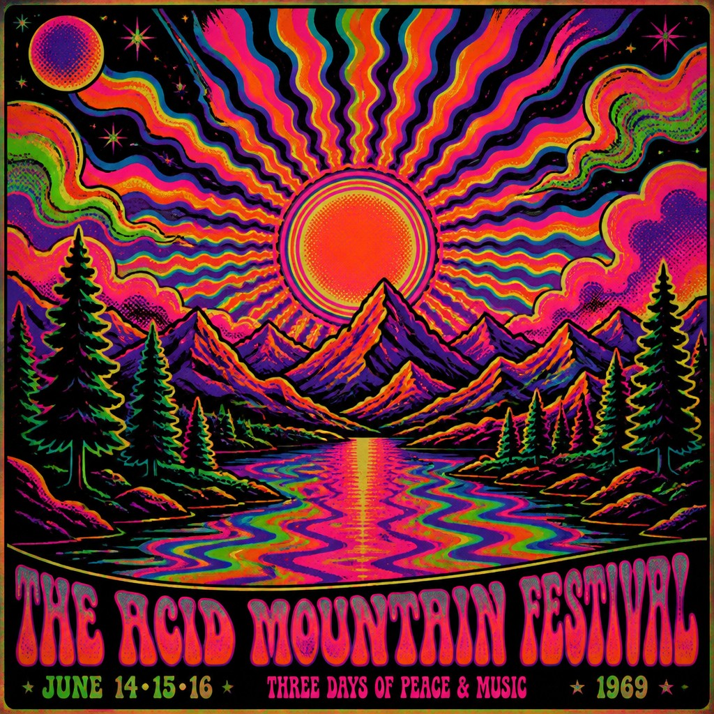
Screen-print texture
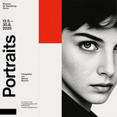
Visible halftones, misregistration, and ink textures are common. These imperfections are not treated as flaws; they are part of the authentic printed look.
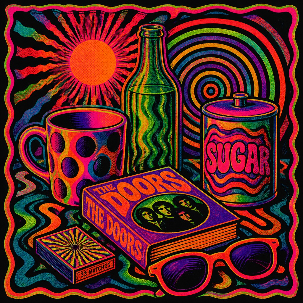
Organic surreal imagery
Faces, hands, plants, clouds, and figures are often altered into flowing, dreamlike forms. The imagery tends to feel ecstatic, fluid, and slightly disorienting rather than naturalistic.
Try It
Create Videos in Psychedelic Poster Design
Styles aren't just for stills — describe a scene or animate an image and get a short video rendered in Psychedelic Poster Design. Press play to see this pond come to life.
Make a VideoPsychedelic Poster Design Prompt Ideas
Start from an idea — each one opens the generator with the style ready to go. See all 40 Psychedelic Poster Design prompts →
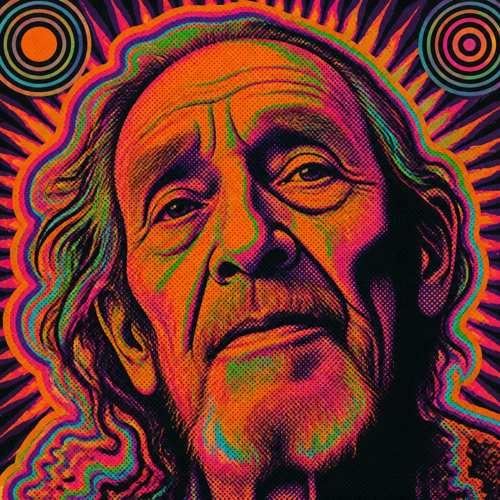
“close-up portrait of an elderly person with expressive weathered features”
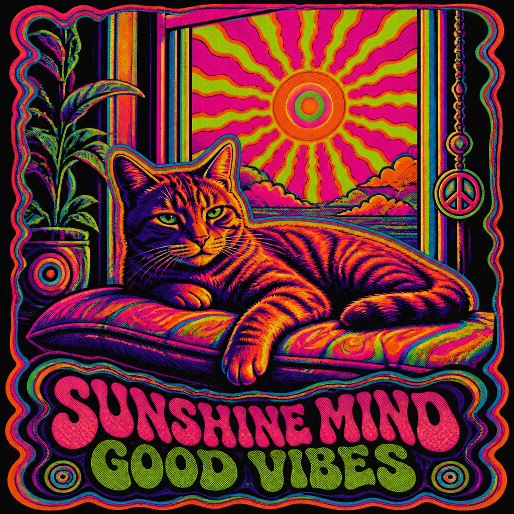
“a cat lounging in a sunlit window”
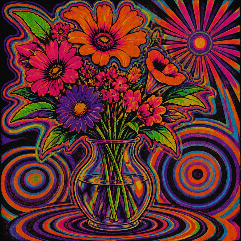
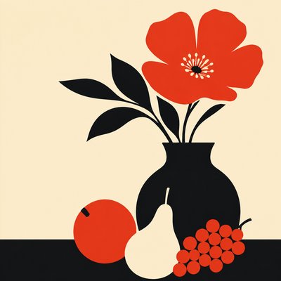
“bouquet of flowers in a glass vase”
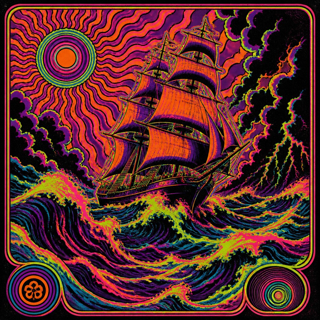
“sailing ship on a stormy sea”
How to Create Psychedelic Poster Design Art
Master the craft step by step — or skip straight to creating. Read the full guide →
- 1
Build around typography first
Start by treating the title as a visual shape, not just readable text. Push letters into curves, overlaps, and narrow spacing so the composition feels immersive while keeping the main words decipherable.
- 2
Use a limited screen-print palette
Choose 4-6 strong colors and place them in flat fields with abrupt transitions. Save black or deep violet for negative space so the bright inks feel luminous and the design retains strong contrast.
- 3
Add optical structure
Introduce sunbursts, concentric circles, repeating waves, or mirrored contours to create visual vibration. These devices work especially well when they radiate from a central figure, performer, or symbol.
- 4
Simulate print-making imperfections
In traditional work, use layered stencil or screen-print methods with slight misalignment between color passes. In digital work, add halftone textures, moiré interference, and subtle registration shifts to preserve the printed feel.
- 5
Prompt with motion and material cues
For text-to-image generation, specify both the subject and the print language: warped contours, fluorescent inks, posterized gradients, and halftone texture. Strongly describe the emotional tone as ecstatic, hypnotic, or mind-bending to steer the composition.
The Story
History & Origins of Psychedelic Poster Design
Psychedelic Poster Design emerged in the mid-to-late 1960s from the visual language of the counterculture in the United States and the United Kingdom, especially the San Francisco music scene, underground press, and concert promotion. It drew on Art Nouveau curves, commercial illustration, op art, comic-book graphics, and the logic of screen printing, which encouraged bold flat color and layered registration effects.
Rather than a single formal movement with a manifesto, it is best understood as a convergence of music promotion, youth culture, and print experimentation. Several influential San Francisco poster artists and related designers became closely associated with the look through posters that transformed lettering into image and made visual distortion part of the message.
Influences: This style is closely related to the poster art of the 1960s and to Op Art, especially the perceptual experiments of major geometric abstraction pioneers whose work explored vibration, repetition, and visual instability. It also borrows from Art Nouveau arabesques, underground comix, and commercial screen-print design, with several influential San Francisco poster artists and related counterculture designers helping define its historical look.

Frequently Asked Questions
What defines Psychedelic Poster Design?
Its defining features are warped typography, saturated neon color, optical motion effects, and screen-print-inspired texture. The style aims to create a sense of altered perception, as if the poster itself were breathing or vibrating.
Is this the same as psychedelic art?
Not exactly. Psychedelic art is broader and can include painting, album covers, illustration, and video, while psychedelic poster design specifically refers to a print and graphic-design format. The poster version tends to emphasize typography, high contrast, and reproducibility.
Why do these posters look so distorted?
The distortion is intentional and comes from both aesthetic choices and print processes. Designers used curved lettering, repeated forms, and bold color relationships to mimic altered states and to make the poster stand out from ordinary advertising.
What colors are most typical in this style?
Hot magenta, acid green, bright orange, cyan, purple, and black are especially common. The key is not just brightness but the way these colors clash and vibrate against each other.
How can I make a modern design feel authentic to this style?
Use flat color separations, visible halftone texture, and expressive warped type rather than modern glossy effects. Keep the composition dense but controlled, and let the poster feel hand-printed rather than digitally polished.
Where is this style commonly used today?
It appears in concert posters, festival branding, editorial graphics, apparel, album art, and retro-themed advertising. It is also used in contemporary digital illustration when artists want a nostalgic but intense visual language.

Create your first Psychedelic Poster Design artwork
Describe anything — or upload a photo — and see it in Psychedelic Poster Design in seconds.
Make Something with Psychedelic Poster Design
Compare Psychedelic Poster Design
Related Styles
Discover similar art styles