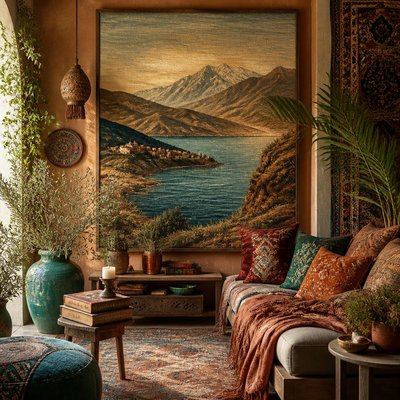
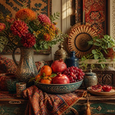
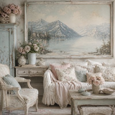
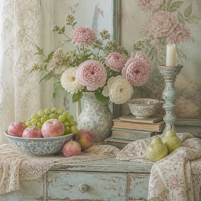
Vintage Poster Design
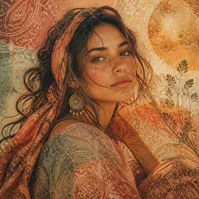
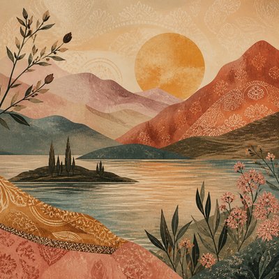
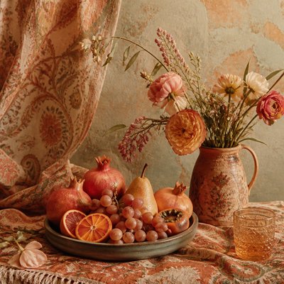
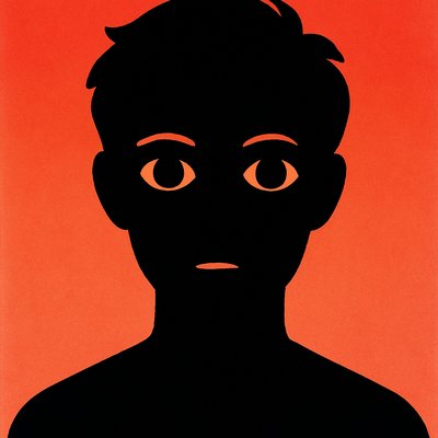
Retro posters with distressed textures, nostalgic typography, muted palettes, and screen-printed aging from mid-century to late-20th-century design.
Instantly rendered in Vintage Poster Design — or transform a photo
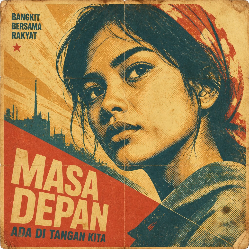
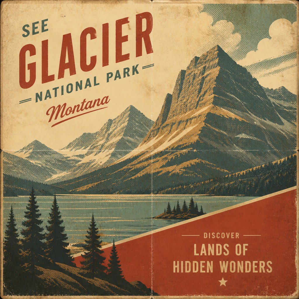
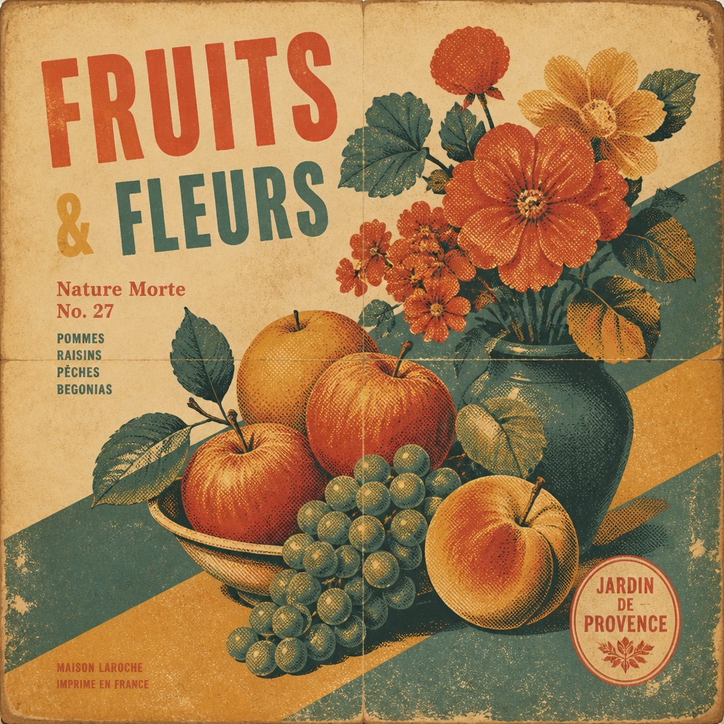
Vintage Poster Design Gallery
Tap any artwork to explore it
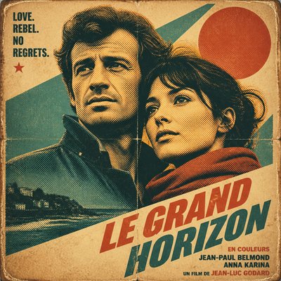

What is Vintage Poster Design?
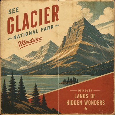
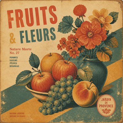
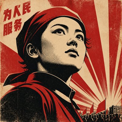
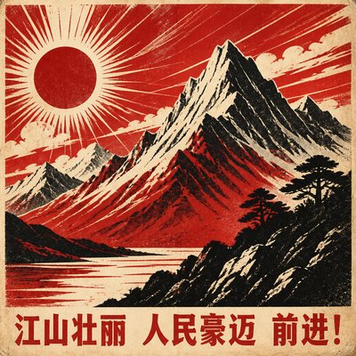
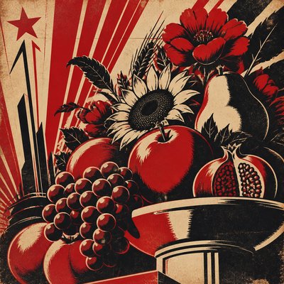
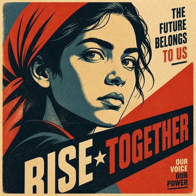
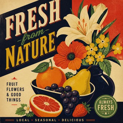
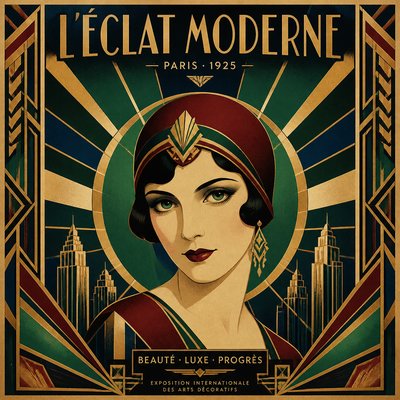
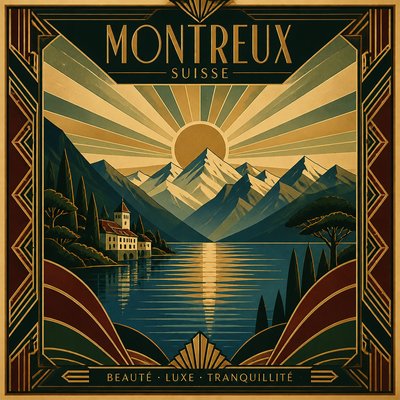
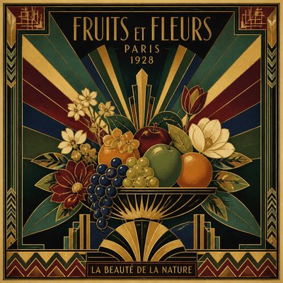
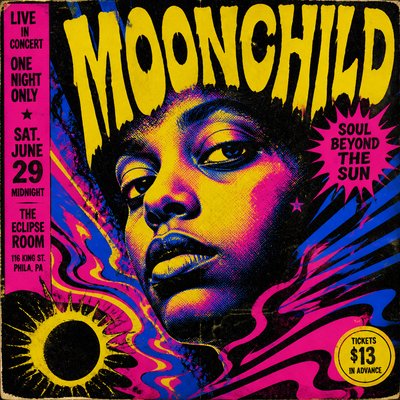
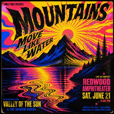
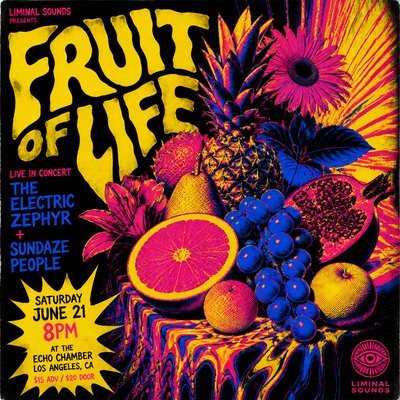
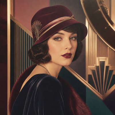
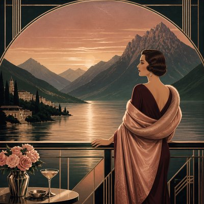
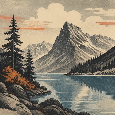
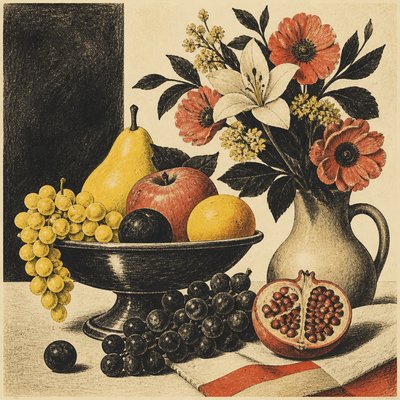
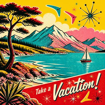
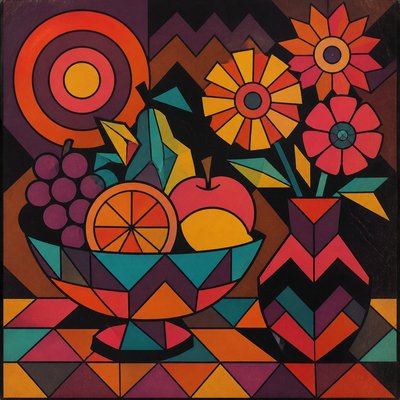
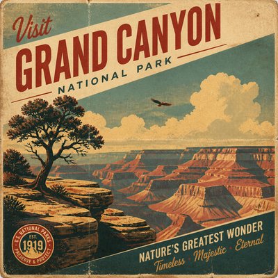
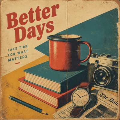
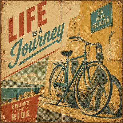
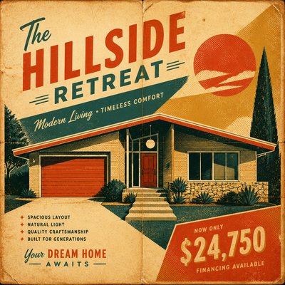
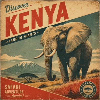
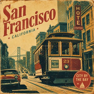
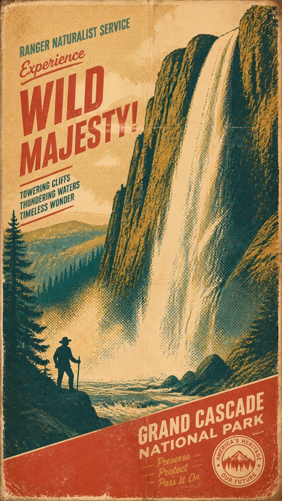
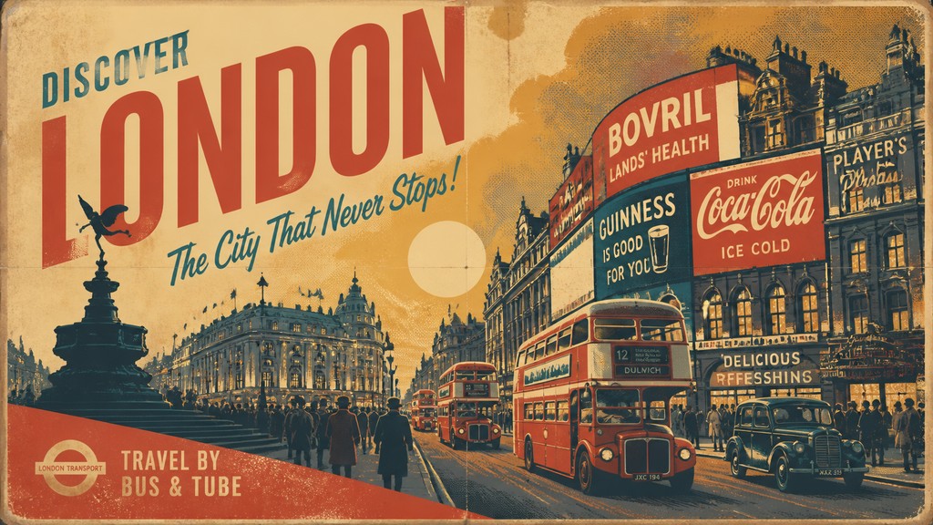
Vintage poster design is a retro visual language built from the look of printed advertising, event posters, travel posters, propaganda sheets, and exhibition graphics from the early 20th century through the late 1900s. It typically combines bold simplification, strong silhouettes, limited color, and typography that feels period-specific, whether the reference is Art Deco, wartime propaganda, mid-century travel promotion, or later screen-printed gig posters.
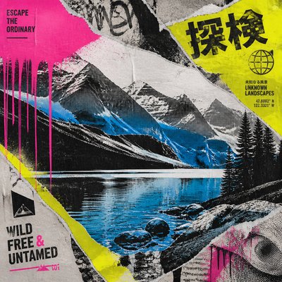
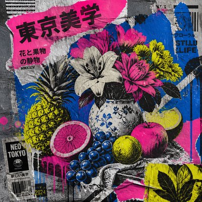
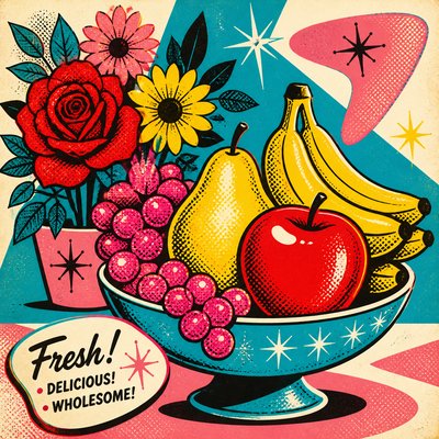
Its identity comes from the physical and technological limits of older print processes. Flat color areas, halftone shading, misregistration, worn paper, and ink grain all reflect offset lithography, letterpress, screen printing, and mass reproduction on aging stock. The result is an image that feels both graphic and weathered: clear enough to read at a distance, but softened by time, texture, and nostalgic color.
Try It On Your Photos
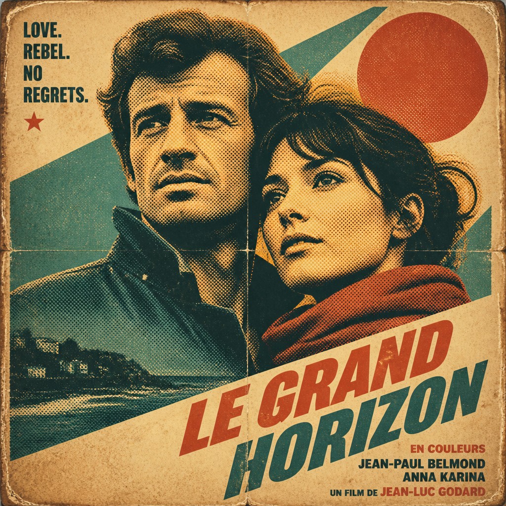
Upload any photo and convert it into Vintage Poster Design — drag the sliders to compare before and after.



What Defines Vintage Poster Design
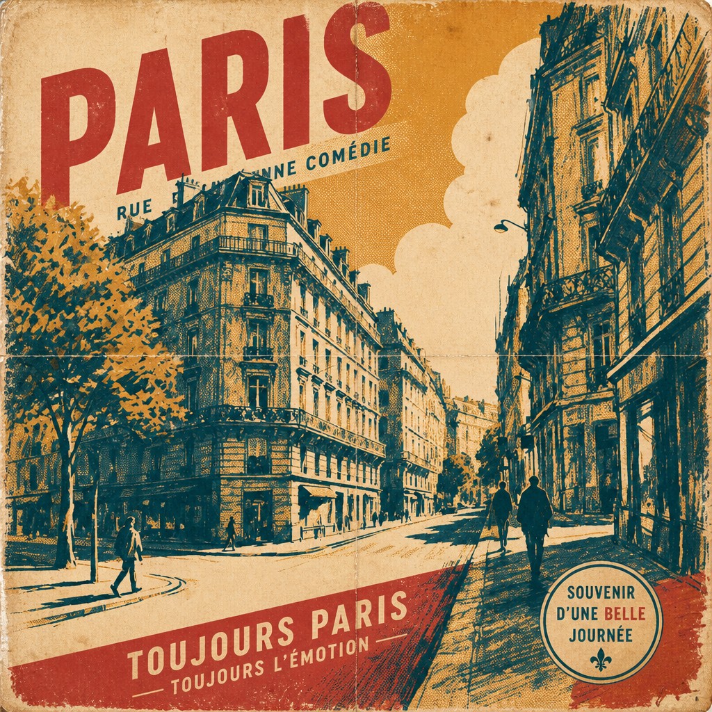
The signature details, up close
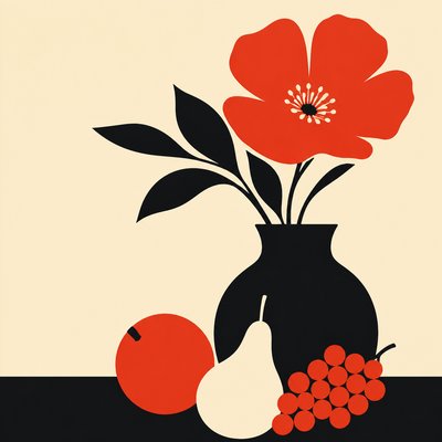
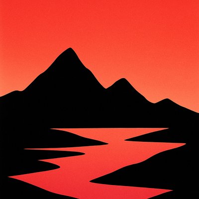
Bold silhouette-based composition
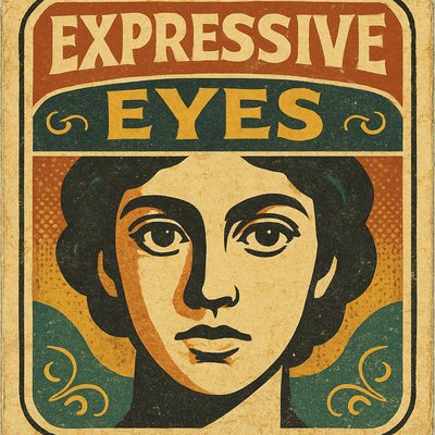
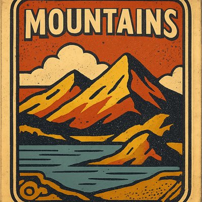
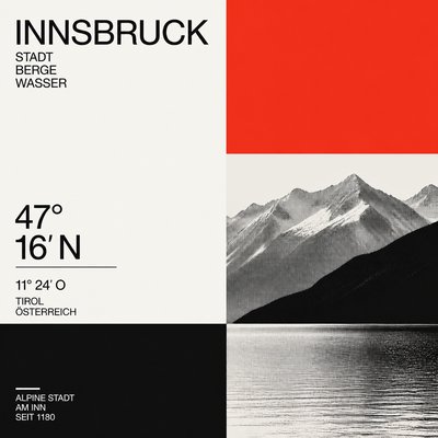
Subjects are reduced to clear, readable shapes with strong outline structure and a prominent focal point. This gives the poster instant legibility at a distance, just like commercial wall posters.
Limited, aged color palette
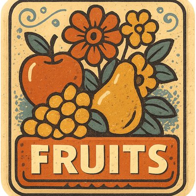
Colors often lean toward muted ochre, dusty teal, faded red, cream, sepia, and charcoal. The palette suggests sun-faded inks and older paper rather than modern full-spectrum brightness.
Halftone and print texture
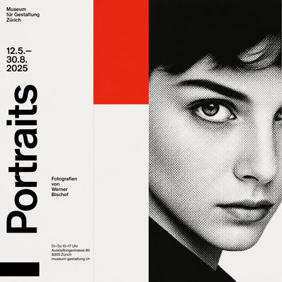
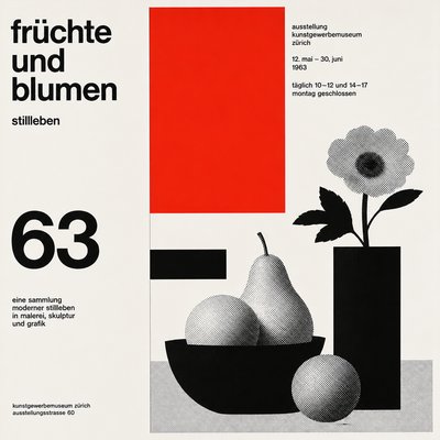
Shading is frequently built from dots, grain, or coarse screening rather than smooth digital gradients. Visible ink texture makes the image feel mechanically reproduced.
Registration imperfections
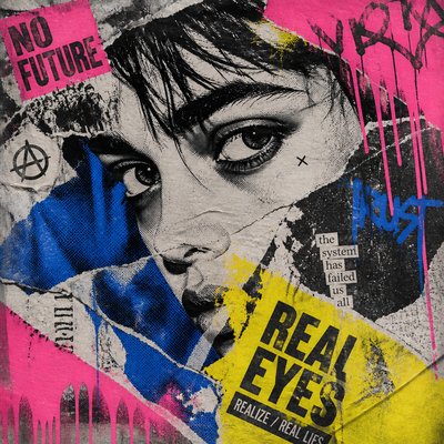
Slight color misalignment, overprint effects, and rough edges mimic the quirks of older printing presses. These small flaws are important because they signal physical print history.
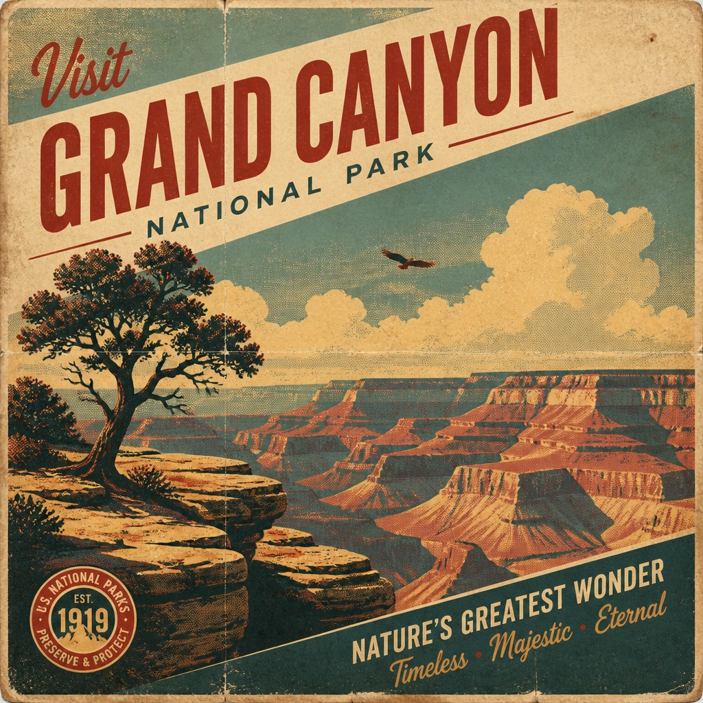
Distressed paper aging
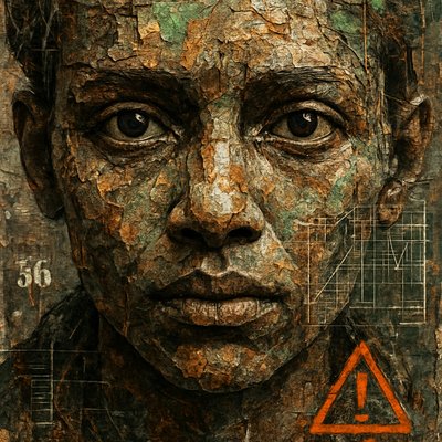
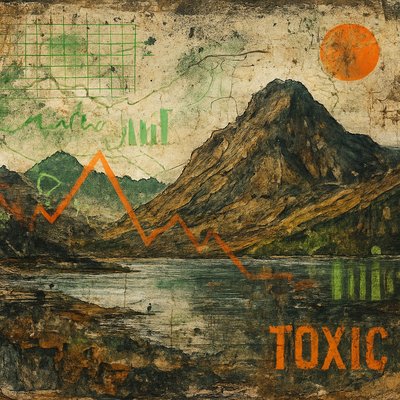
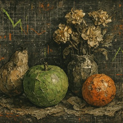
Fold marks, foxing, stains, edge wear, and cracked surfaces are common. The image looks handled, stored, and weathered, as if it has survived decades of use.
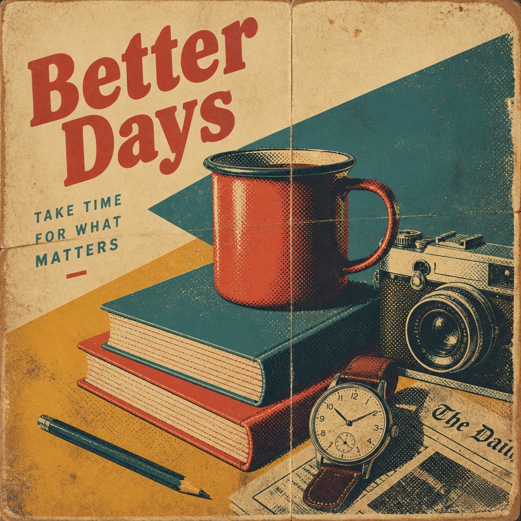
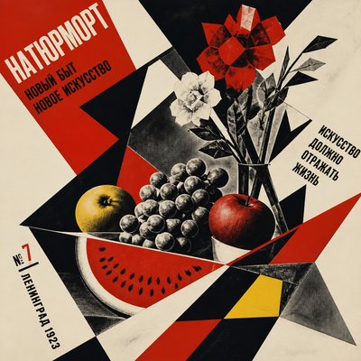
Poster-first typography
Lettering is usually expressive, condensed, and era-specific, often placed as a dominant design element. It may recall wood type, hand lettering, Art Deco display faces, or mid-century sans serifs.
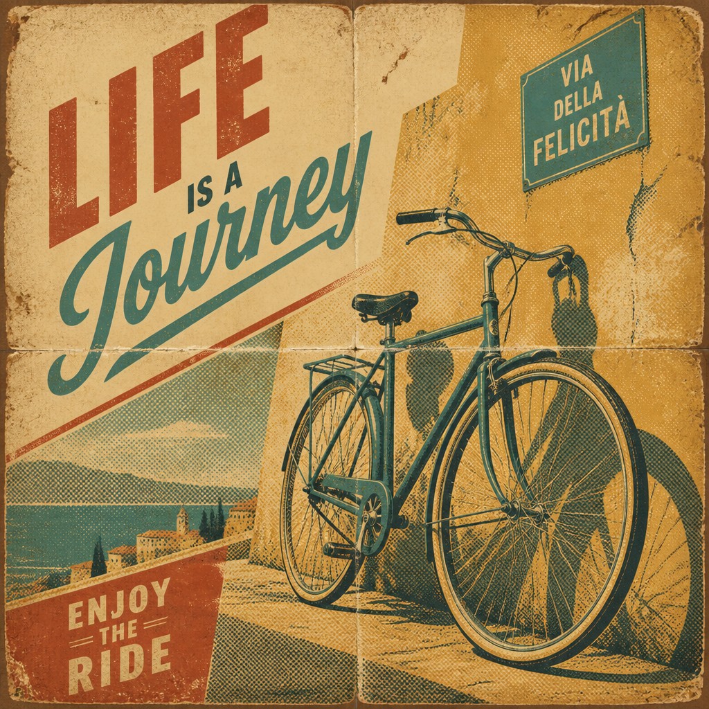
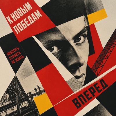
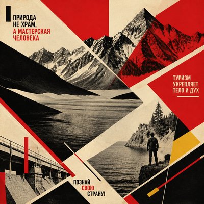
Diagonal, promotional layout
Composition often uses dynamic diagonals, stacked blocks, or asymmetrical arrangements to create movement. This echoes the persuasive urgency of advertising and event graphics.
Try It
Create Videos in Vintage Poster Design
Styles aren't just for stills — describe a scene or animate an image and get a short video rendered in Vintage Poster Design. Press play to see this pond come to life.
Make a VideoVintage Poster Design Prompt Ideas
Start from an idea — each one opens the generator with the style ready to go. See all 40 Vintage Poster Design prompts →
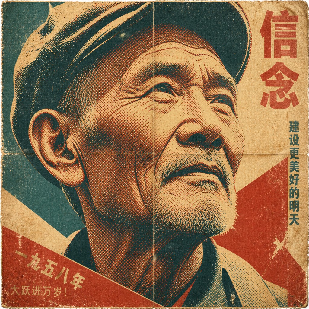
“close-up portrait of an elderly person with expressive weathered features”
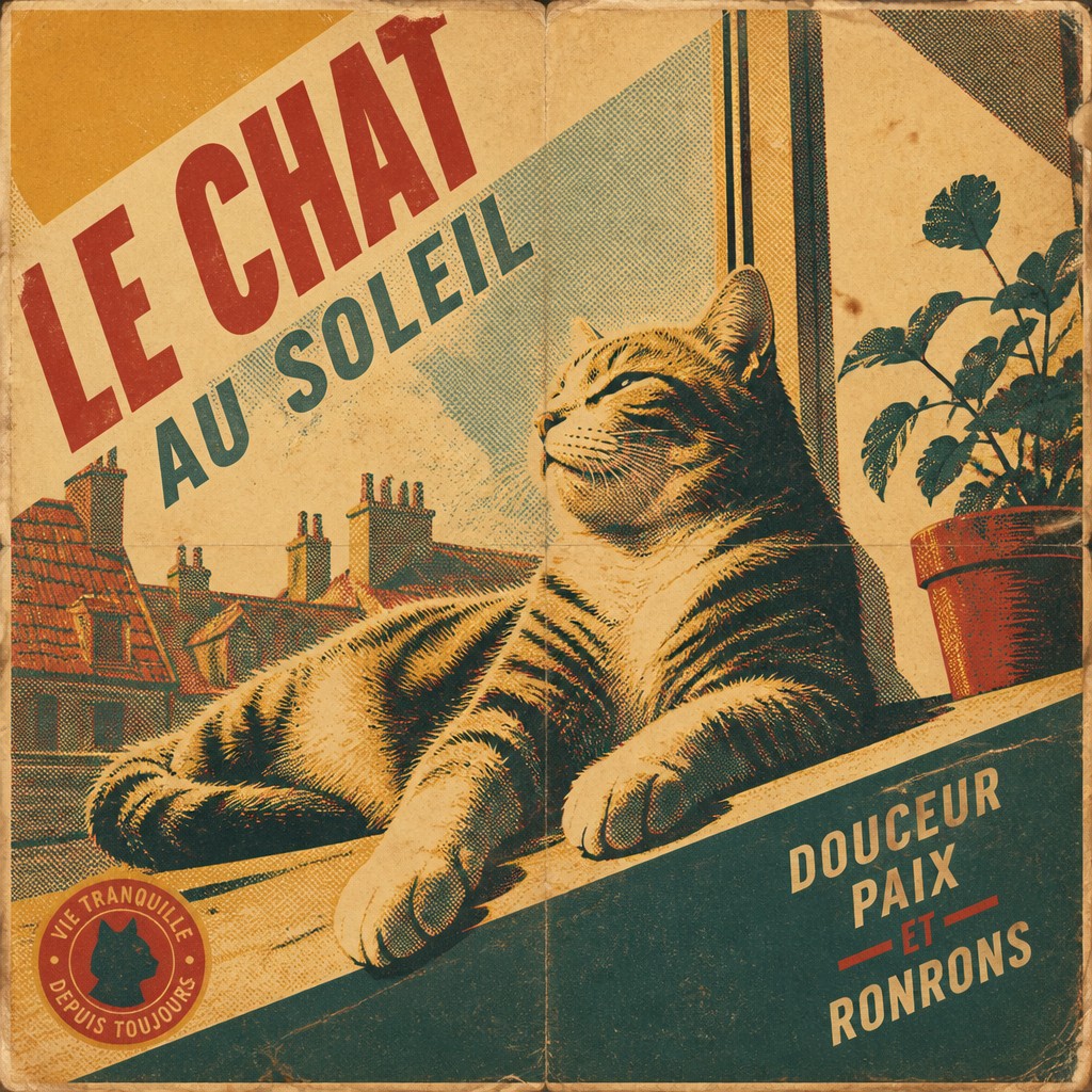
“a cat lounging in a sunlit window”
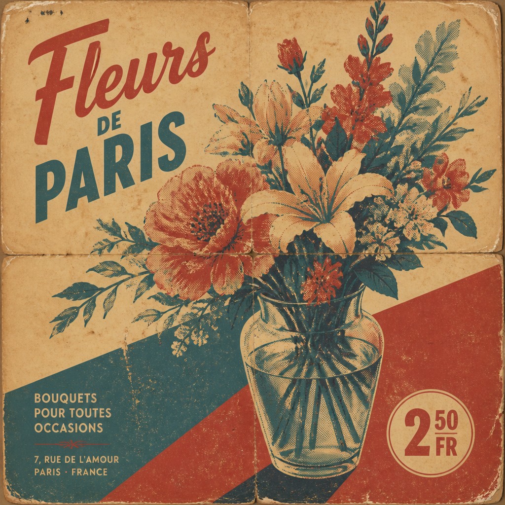
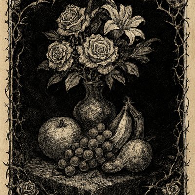
“bouquet of flowers in a glass vase”
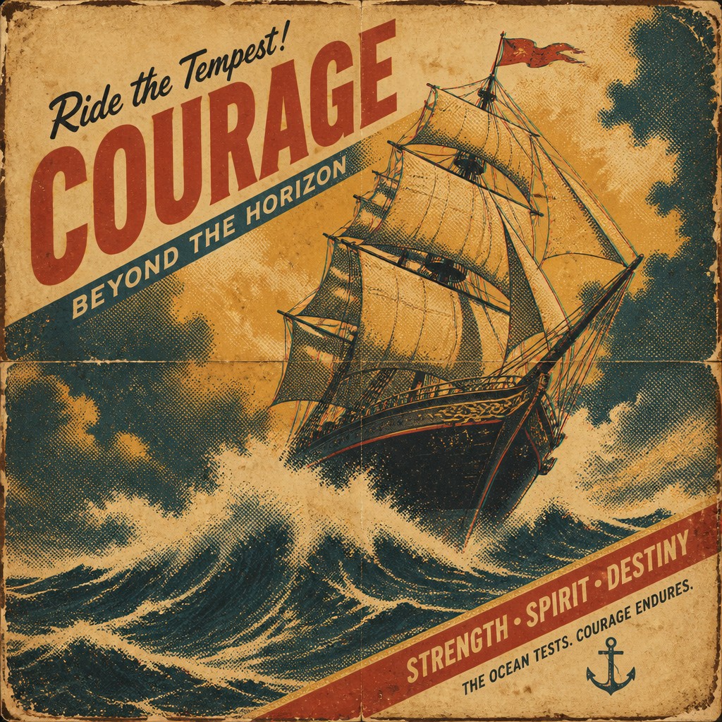
“sailing ship on a stormy sea”
How to Create Vintage Poster Design Art
Master the craft step by step — or skip straight to creating. Read the full guide →
- 1
Start with a poster composition
Build the design around one clear subject and a strong hierarchy of title, image, and supporting text. Use simplified shapes and a directional layout rather than a fully detailed scene.
- 2
Reduce the palette before adding texture
Choose a small set of faded, historically plausible colors and keep them flat. Avoid bright modern tones unless they are intentionally dulled or aged with overlays.
- 3
Use print-like shading and edges
In traditional work, simulate halftone with stippling or screen-like marks; in digital work, add grain, dot patterns, and slight blur or misregistration. Keep shadows graphic rather than painterly.
- 4
Treat typography as image architecture
Use type that feels period-correct and place it with deliberate spacing and hierarchy. For authentic results, adapt the lettering to the era you want to reference: Art Deco, mid-century, propaganda, or gig-poster.
- 5
Age the surface intentionally
Overlay paper texture, fold lines, edge wear, and foxing so the poster feels physically printed and stored. In image-generation prompts, ask for distressed paper, screen-printed ink, and slight registration misalignment.
- 6
Prompt with subject plus print cues
Describe the object or scene first, then specify vintage poster traits such as limited palette, halftone shading, and weathered paper. This keeps the image coherent while directing the style.
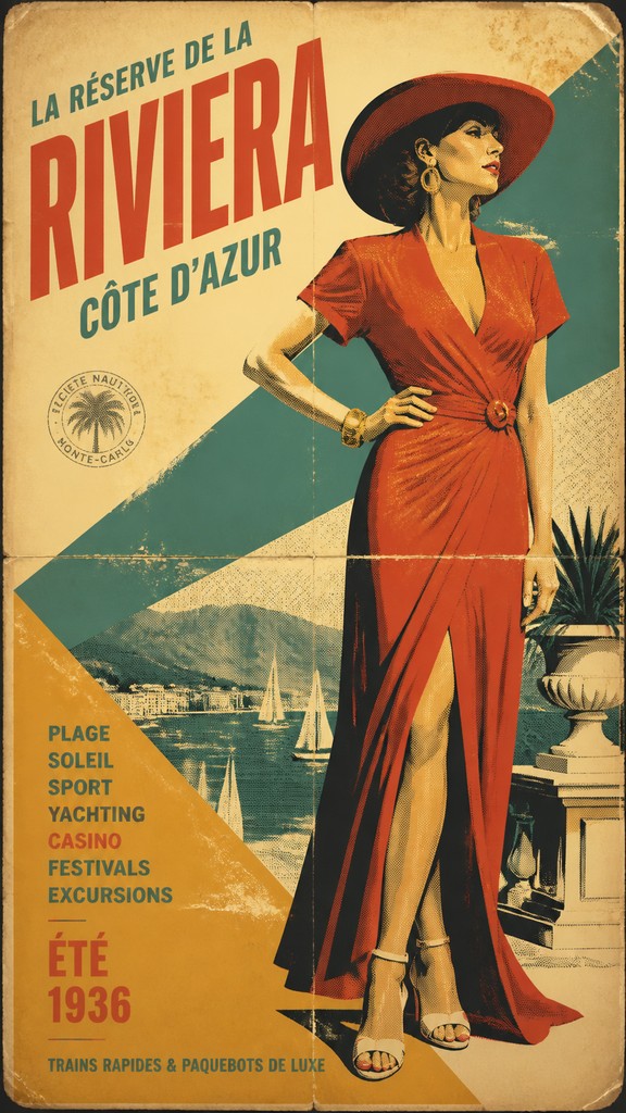
The Story
History & Origins of Vintage Poster Design
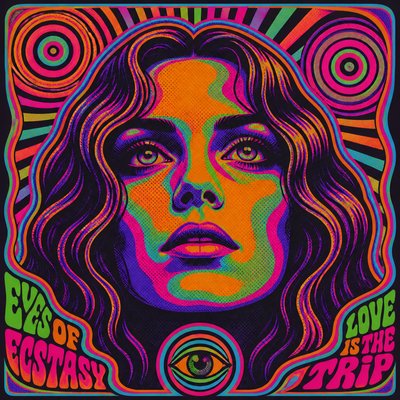
Vintage poster design is not a single historical movement but a contemporary umbrella term for poster aesthetics drawn from multiple periods of graphic history. Its roots include late-19th-century poster art, especially the lithographic advertising posters of leading French poster artists and the Art Nouveau posters of major decorative designers, followed by the geometric clarity of Art Deco, wartime propaganda graphics, mid-century travel and cinema posters, and the screen-printed gig posters and political prints of the 1960s through 1980s.
As a modern style, it developed from the reuse and revival of these older print idioms in branding, editorial illustration, music culture, and decorative design. Designers and illustrators borrow the visual cues of aged paper, limited inks, and period typography not to replicate a single era exactly, but to evoke historical authenticity and cultural memory through printed texture, simplified forms, and nostalgic composition.
Influences: Vintage poster design draws from late-19th-century lithographic posters by leading French poster artists and the decorative poster work of major Art Nouveau designers, as well as Art Deco graphics, wartime propaganda design, mid-century travel and advertising posters, and later screen-printed music posters associated with the counterculture. It also overlaps with editorial illustration, commercial typography, and modern retro revival design that deliberately quotes older print technologies.
Frequently Asked Questions
What defines vintage poster design?
It is defined by the look of older printed advertising and event posters: simplified imagery, limited color, period typography, and visible aging. The style often includes halftone dots, paper wear, and small printing imperfections that make the image feel physically produced.
Is vintage poster design the same as Art Deco?
No. Art Deco is one historical design movement with a specific geometric, luxurious, and streamlined look, while vintage poster design is a broader umbrella. A vintage poster may borrow Art Deco elements, but it can also reference propaganda, mid-century travel graphics, or screen-printed gig posters.
Why do vintage posters look worn or distressed?
The distressed look imitates aging paper, repeated handling, and older printing methods. In real posters, ink coverage, paper stock, and storage conditions all affected the final appearance, so the wear is part of the historical visual language.
What kind of typography works best?
Display type that feels era-specific works best: wood-type inspired lettering, condensed sans serifs, Art Deco faces, slab serifs, or hand-lettered titles. The key is that the typography should look integrated with the image rather than like a modern overlay.
How is this style used today?
It is common in event posters, music graphics, packaging, editorial illustrations, brand campaigns, and wall art. Designers use it when they want nostalgia, authenticity, or a handcrafted printed feel without copying one exact historical period.
How do I make a photo look like this style?
Simplify the photo into large shapes, reduce the palette, and add print texture and paper aging. A successful transformation usually emphasizes silhouette, contrast, and typography-like framing rather than preserving every photographic detail.
Create your first Vintage Poster Design artwork
Describe anything — or upload a photo — and see it in Vintage Poster Design in seconds.
Make Something with Vintage Poster Design
Compare Vintage Poster Design
Related Styles
Discover similar art styles