Isometric Icon Design
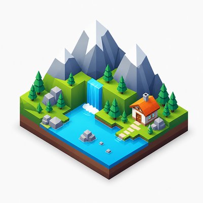
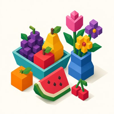
Clean 3D icons in true isometric projection with flat shading, crisp edges, and vibrant colors for apps, infographics, and UI.
Instantly rendered in Isometric Icon Design — or transform a photo

Isometric Icon Design Gallery
Tap any artwork to explore it



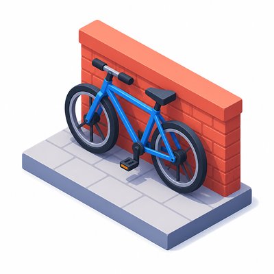
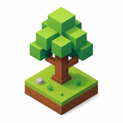

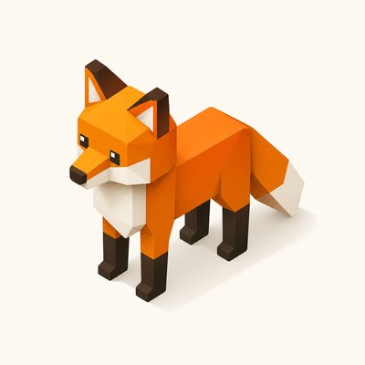

What is Isometric Icon Design?
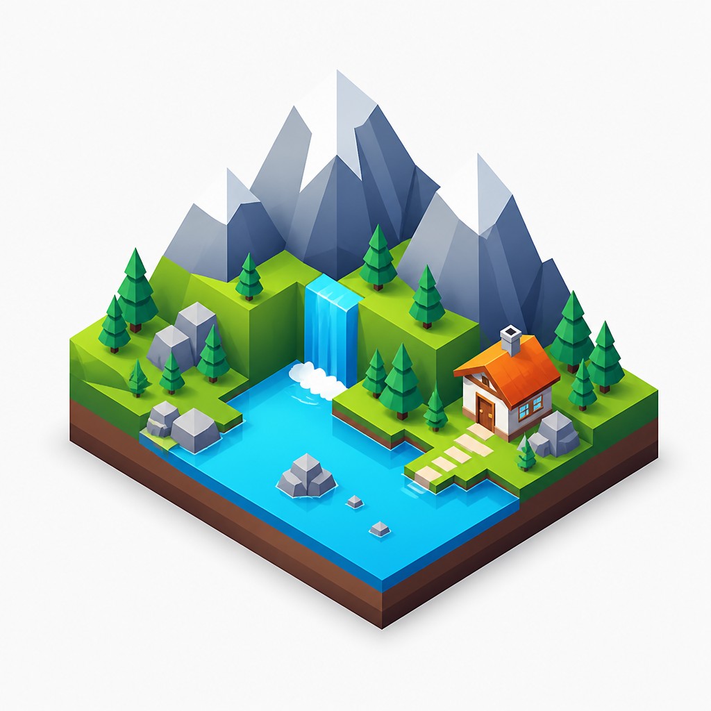
Isometric icon design is a modern illustration style that presents objects in a three-dimensional way while keeping all major edges parallel rather than converging toward a vanishing point. The result is a controlled, technical look: forms feel volumetric and spatial, but the image remains highly legible, orderly, and decorative. It is widely used for interface graphics, product explainers, dashboards, onboarding screens, and business visuals because it communicates structure quickly.
Its visual identity comes from the combination of geometric simplification, consistent angular construction, and selective shading. Surfaces are usually rendered as flat color planes with subtle gradients or shadows to indicate depth, while the overall composition often floats on a clean background with generous negative space. The style works well for complex subjects because isometric projection can show multiple faces of an object at once without the distortion of linear perspective.

Try It On Your Photos
Upload any photo and convert it into Isometric Icon Design — drag the sliders to compare before and after.


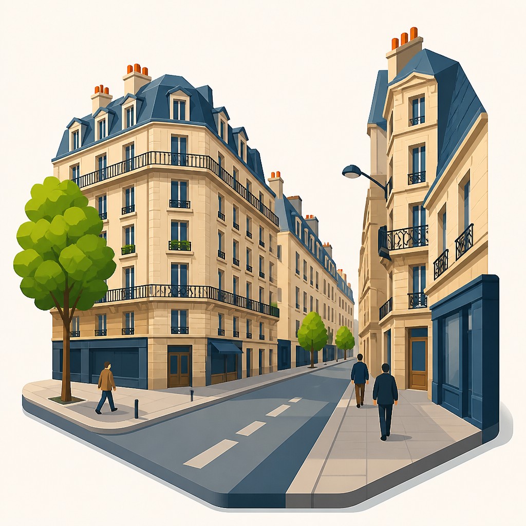

What Defines Isometric Icon Design
The signature details, up close
True isometric projection
Objects are drawn with parallel edges and no vanishing point, usually on a 30-degree axis. This keeps the image structurally coherent and gives it a precise technical look.
Geometric simplification
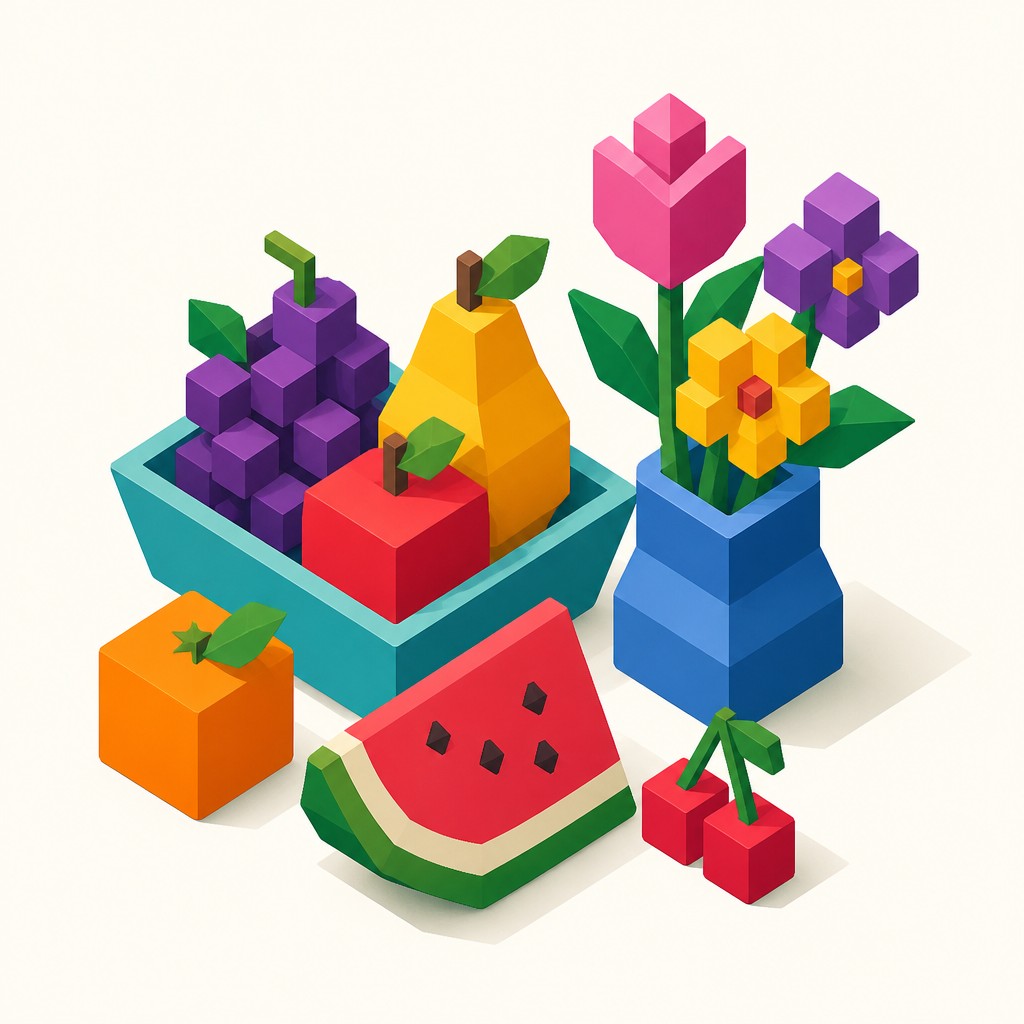
Real-world subjects are reduced to boxes, cylinders, planes, and other clean forms. Details are edited down so the icon reads instantly at small sizes.
Flat planes with controlled shading
Surfaces often use solid colors or subtle gradients rather than painterly texture. Light and shadow are simplified to emphasize volume without making the image look realistic.
Crisp vector-like edges
Outlines, corners, and interfaces are typically sharp and clean, with little or no sketchiness. This makes the style suitable for scalable digital graphics.

Vibrant color blocking
Colors are often saturated and separated into distinct areas to improve readability. Harmonized palettes help different components remain legible against one another.

Floating composition
Icons are frequently isolated on plain backgrounds with ample negative space. The subject appears centered or slightly offset, creating a tidy, presentation-ready layout.
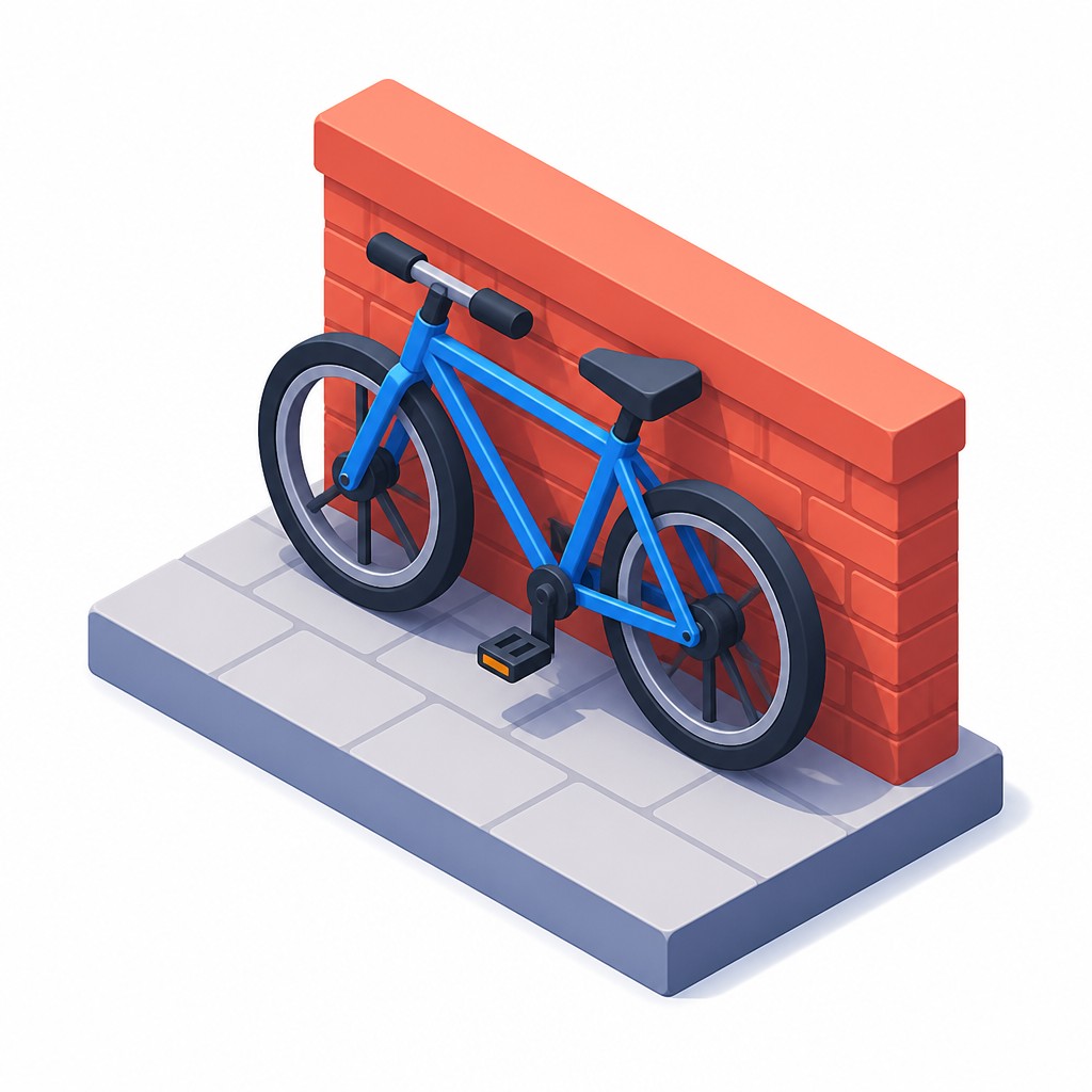
Soft ambient occlusion
Where surfaces meet, designers often add gentle shadowing to suggest depth and contact. These small tonal shifts help the geometry feel physically assembled rather than flatly stacked.
Try It
Create Videos in Isometric Icon Design
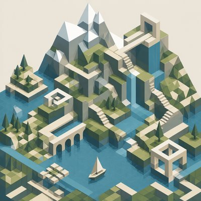
Styles aren't just for stills — describe a scene or animate an image and get a short video rendered in Isometric Icon Design. Press play to see this pond come to life.
Make a VideoIsometric Icon Design Prompt Ideas
Start from an idea — each one opens the generator with the style ready to go. See all 40 Isometric Icon Design prompts →
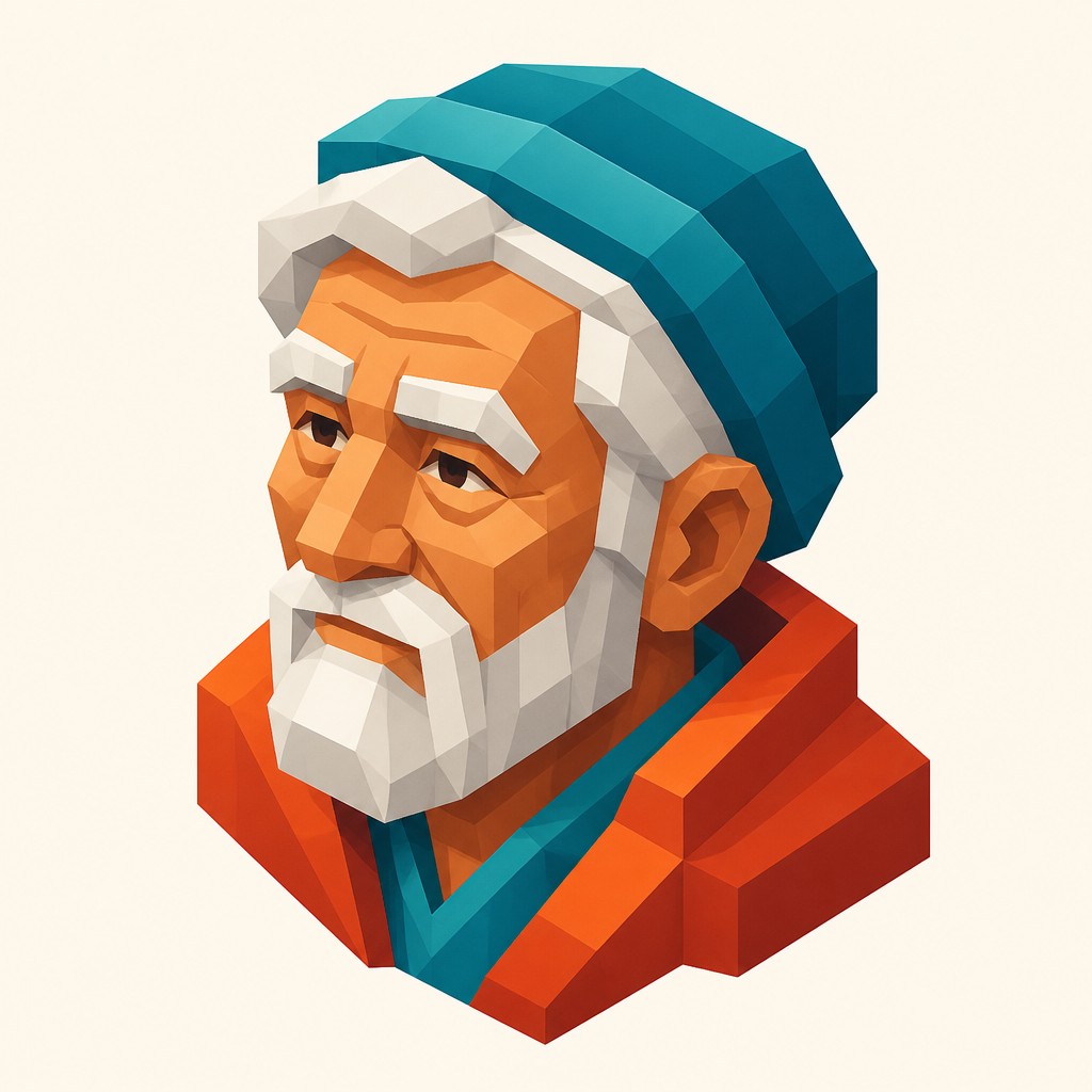
“close-up portrait of an elderly person with expressive weathered features”

“a cat lounging in a sunlit window”

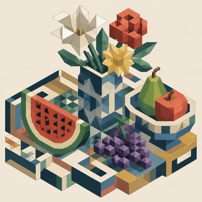
“bouquet of flowers in a glass vase”
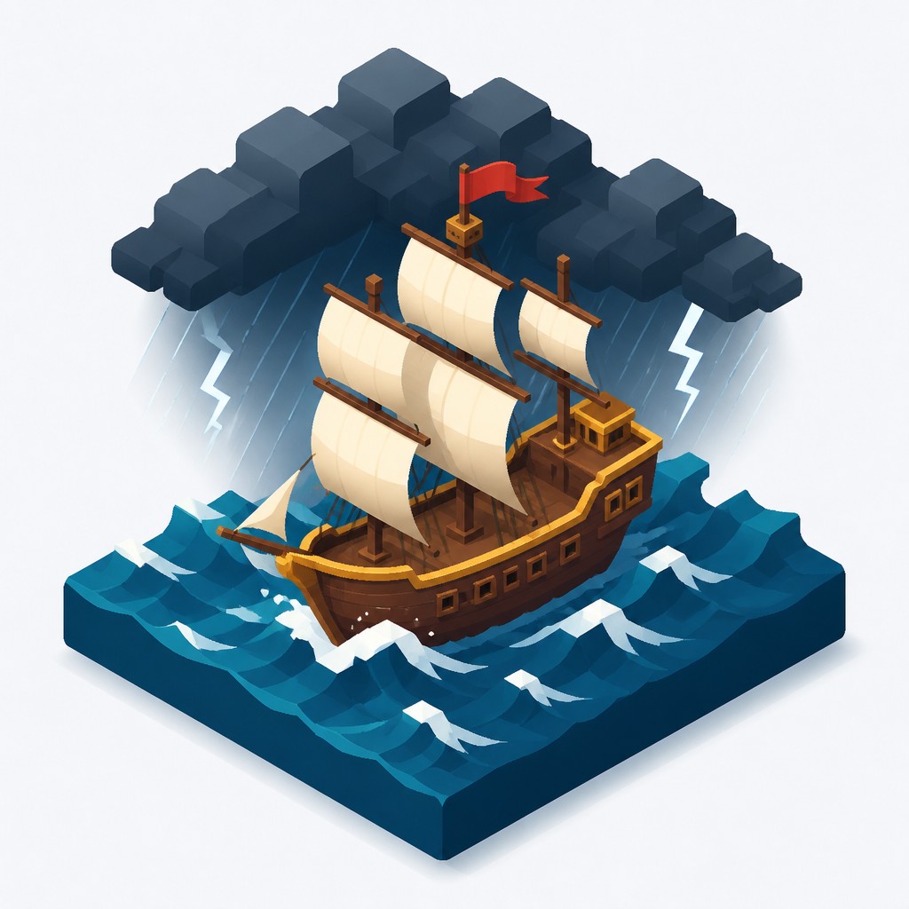
“sailing ship on a stormy sea”
How to Create Isometric Icon Design Art
Master the craft step by step — or skip straight to creating. Read the full guide →
- 1
Build from simple 3D forms
Start by reducing the subject to blocks, cylinders, and planes, then align those forms to an isometric grid. In hand drawing, keep edges parallel; in digital work, use guides or an isometric template to preserve the projection.
- 2
Limit detail and prioritize readability
Remove tiny textures, busy reflections, and unnecessary surface information. The icon should be understandable at a glance, especially when used in UI, presentations, or app graphics.
- 3
Use a restrained lighting system
Choose one consistent light direction, commonly from the upper left, and apply shading to only the visible planes. Keep shadows soft and directional so the object feels dimensional without breaking the clean graphic look.
- 4
Separate materials with color and tone
Assign each major face or component its own color block or value step. A compact palette with clear contrast helps the structure remain readable while still feeling polished.
- 5
Refine edges and spacing for a finished presentation
Maintain uniform line thickness if outlines are used, and leave generous negative space around the icon. For image generation, specify true isometric projection, flat surfaces, subtle gradients, soft ambient occlusion, and a tidy floating composition.
The Story
History & Origins of Isometric Icon Design
Isometric icon design is a contemporary graphic style rooted in technical drawing, axonometric projection, and 20th-century industrial illustration. Isometric projection itself long predates digital design and was used in engineering, architecture, and instruction manuals because it allows measurable forms to be represented clearly without perspective distortion. In the late 20th and early 21st centuries, designers adapted those principles for software interfaces, infographics, and branding.
Its recent popularity is closely tied to digital product design, where compact visuals need to convey systems, services, and workflows efficiently. The style draws from vector illustration, minimalist interface design, and corporate explainer graphics, as well as from the broader visual language of diagrams and game assets. Unlike a historical art movement with a single center or manifesto, it is an applied design aesthetic that evolved through practical needs: clarity, modularity, and visual consistency.
Influences: Isometric icon design is closely related to axonometric technical drawing, industrial illustration, infographic design, and vector-based UI graphics. Its clean modularity also echoes product schematics and instruction diagrams, while its color discipline and simplification align with modern minimalist design. In a broader art-historical sense, it draws on the rational spatial systems of technical illustration rather than on the expressive perspective traditions associated with early Northern Renaissance printmakers or architectural draftsmanship more generally.

Frequently Asked Questions
What defines isometric icon design?
The key feature is true isometric projection: parallel edges stay parallel, and the image does not use vanishing points. Combined with simplified geometry, flat shading, and clean edges, this creates a 3D look that remains highly legible.
How is it different from perspective illustration?
Perspective illustration imitates how objects appear to the eye, with lines converging in the distance. Isometric design deliberately avoids that convergence, so the form feels structured, schematic, and easier to read in small formats.
Where is this style commonly used?
It is common in app onboarding screens, SaaS marketing, dashboards, explainer graphics, feature illustrations, and presentation slides. It is especially useful when a design needs to depict systems, workflows, or product features clearly.
Can isometric icons have shadows and gradients?
Yes, but they are usually controlled and subtle. Soft gradients, ambient occlusion, and gentle cast shadows can add depth, but heavy realism or dramatic lighting usually weakens the clean graphic character.
What subjects work best in this style?
Objects with clear structure work especially well: devices, buildings, boxes, tools, vehicles, interfaces, and modular systems. Highly organic subjects can still work if they are simplified into geometric volumes.
How do I make a good isometric icon?
Start with a clear silhouette, reduce the subject to basic forms, and keep the projection consistent across the whole image. Then add limited shading and color separation so the icon reads quickly without visual clutter.

Create your first Isometric Icon Design artwork
Describe anything — or upload a photo — and see it in Isometric Icon Design in seconds.
Make Something with Isometric Icon Design
Compare Isometric Icon Design
Related Styles
Discover similar art styles