Hand-Drawn Icon Design
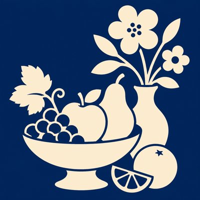
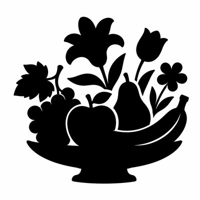
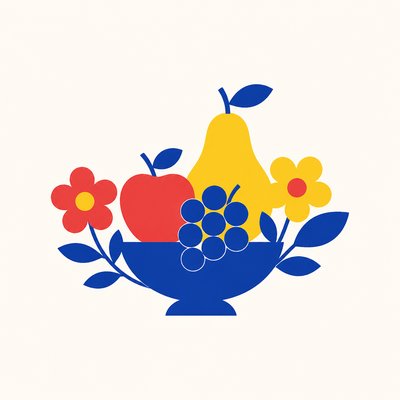
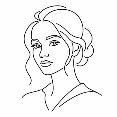
Organic, sketch-like icons with imperfect linework, paper grain, and hand-made charm for brand systems and illustrations.
Instantly rendered in Hand-Drawn Icon Design — or transform a photo
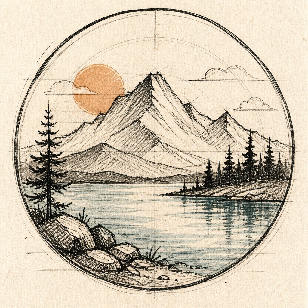
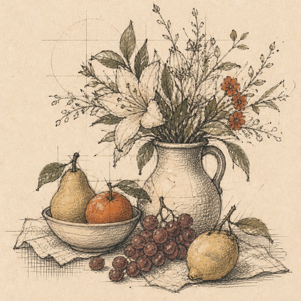
Hand-Drawn Icon Design Gallery
Tap any artwork to explore it

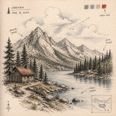
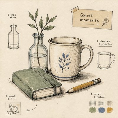
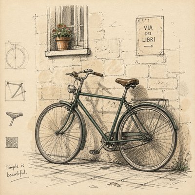
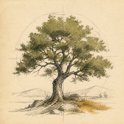
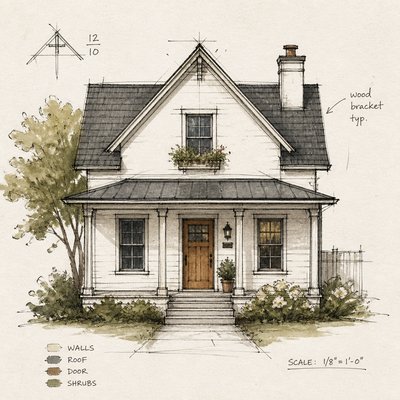
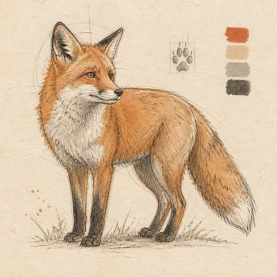
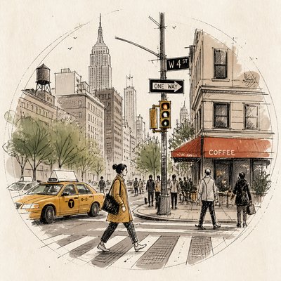
What is Hand-Drawn Icon Design?
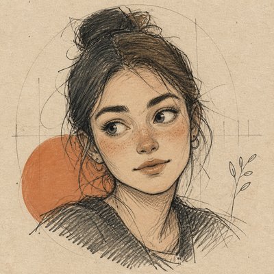
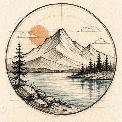
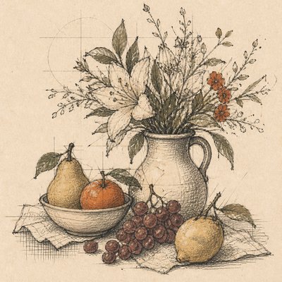
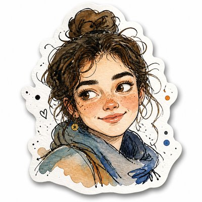
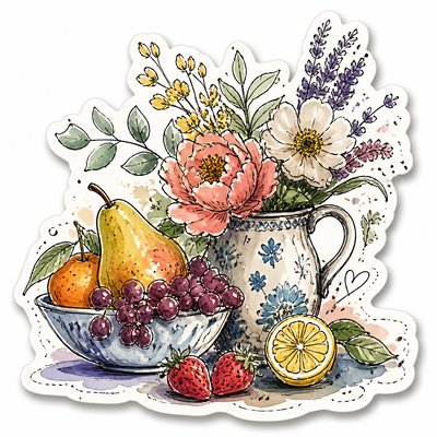
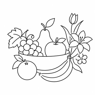
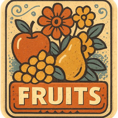
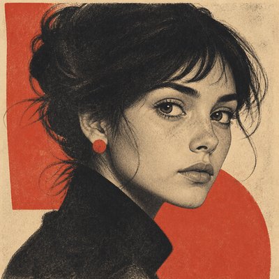
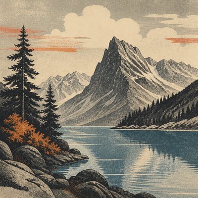
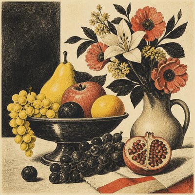
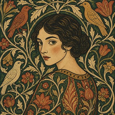
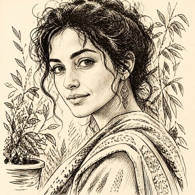
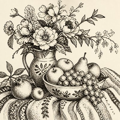
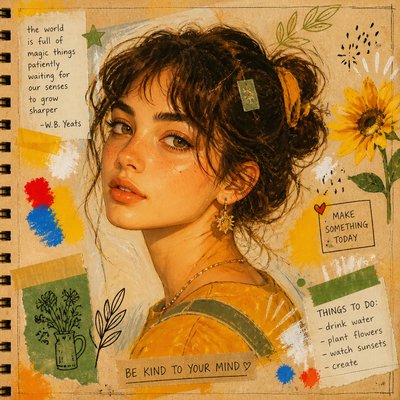
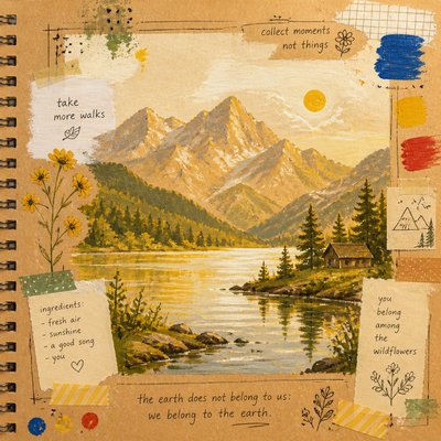
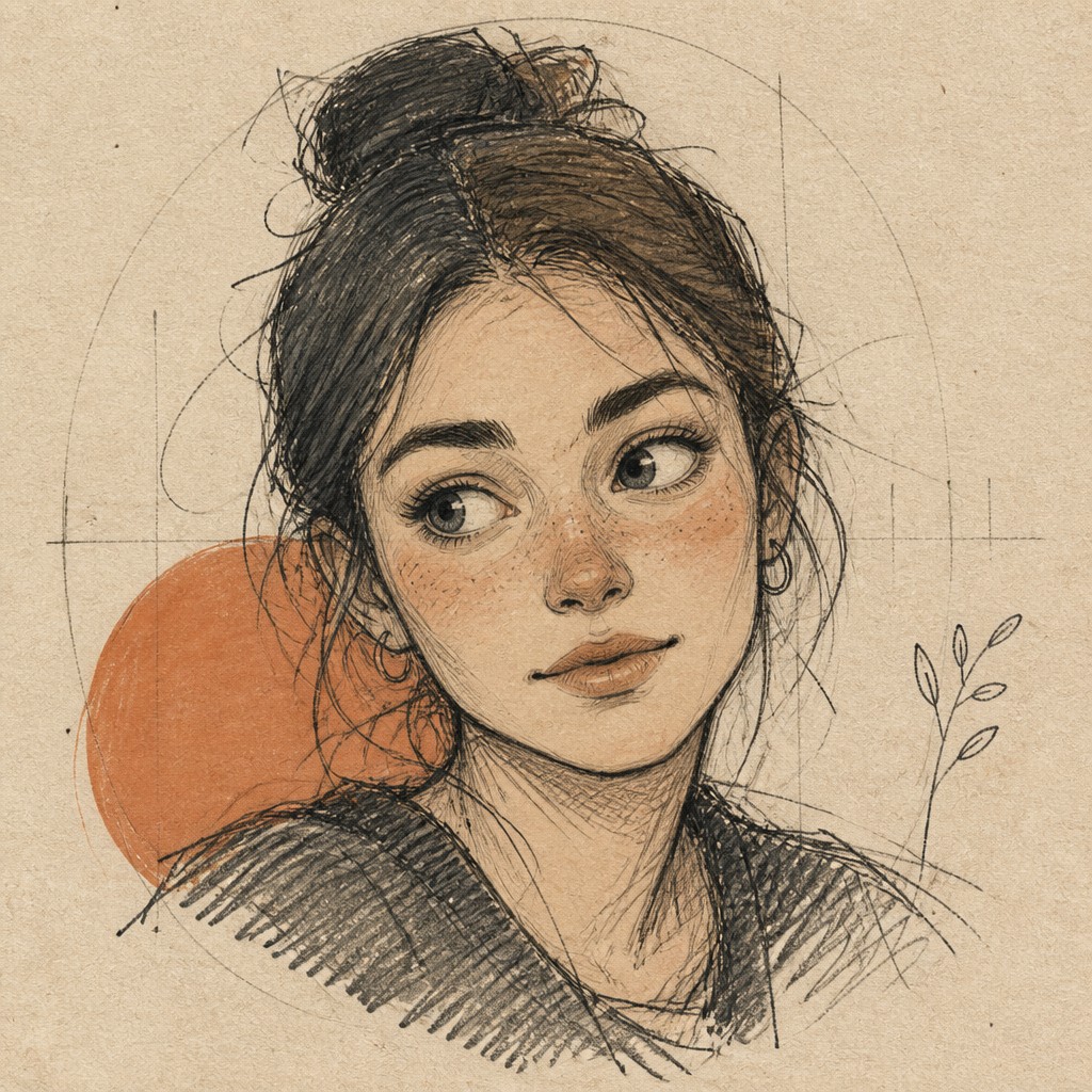
Hand-Drawn Icon Design is an icon style built around the look of a real sketch rather than a polished vector mark. It simplifies subjects into readable symbols, but keeps the uneven line weight, small wobbles, construction lines, and tactile texture that signal the artist’s hand.
The result is especially useful when a brand wants icons that feel friendly, artisanal, editorial, or human. Instead of looking mechanically precise, the forms suggest spontaneity and process: loose hatching, subtle asymmetry, muted color, and paper-like grain give even the simplest pictogram a lived-in character.
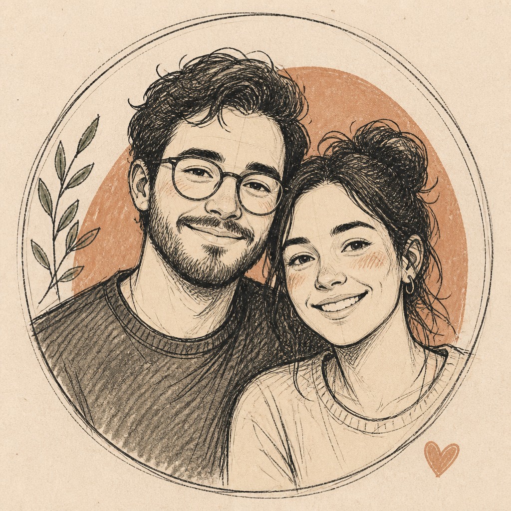
Try It On Your Photos
Upload any photo and convert it into Hand-Drawn Icon Design — drag the sliders to compare before and after.


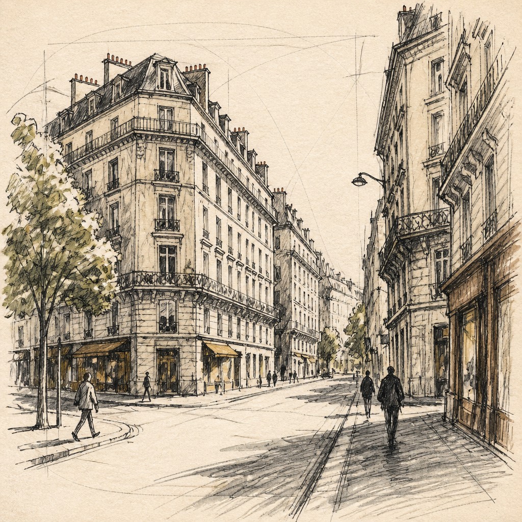

What Defines Hand-Drawn Icon Design
The signature details, up close
Simplified readable forms
The subject is reduced to an icon-like silhouette that remains instantly recognizable at small sizes. Details are removed unless they contribute to the symbol’s clarity.
Imperfect linework
Lines vary naturally in thickness and may wobble slightly, imitating pen, marker, pencil, or brush pressure. This irregularity is intentional and is what keeps the image from feeling mechanically traced.
Visible sketch process
Construction lines, erased edges, and exploratory marks are often left visible. These traces make the image feel observed and made by hand rather than finalized by software.
Loose shading and texture
Depth is often suggested through hatching, cross-hatching, stipple-like marks, or sparse shading rather than smooth gradients. Texture reinforces the analog sketchbook quality.
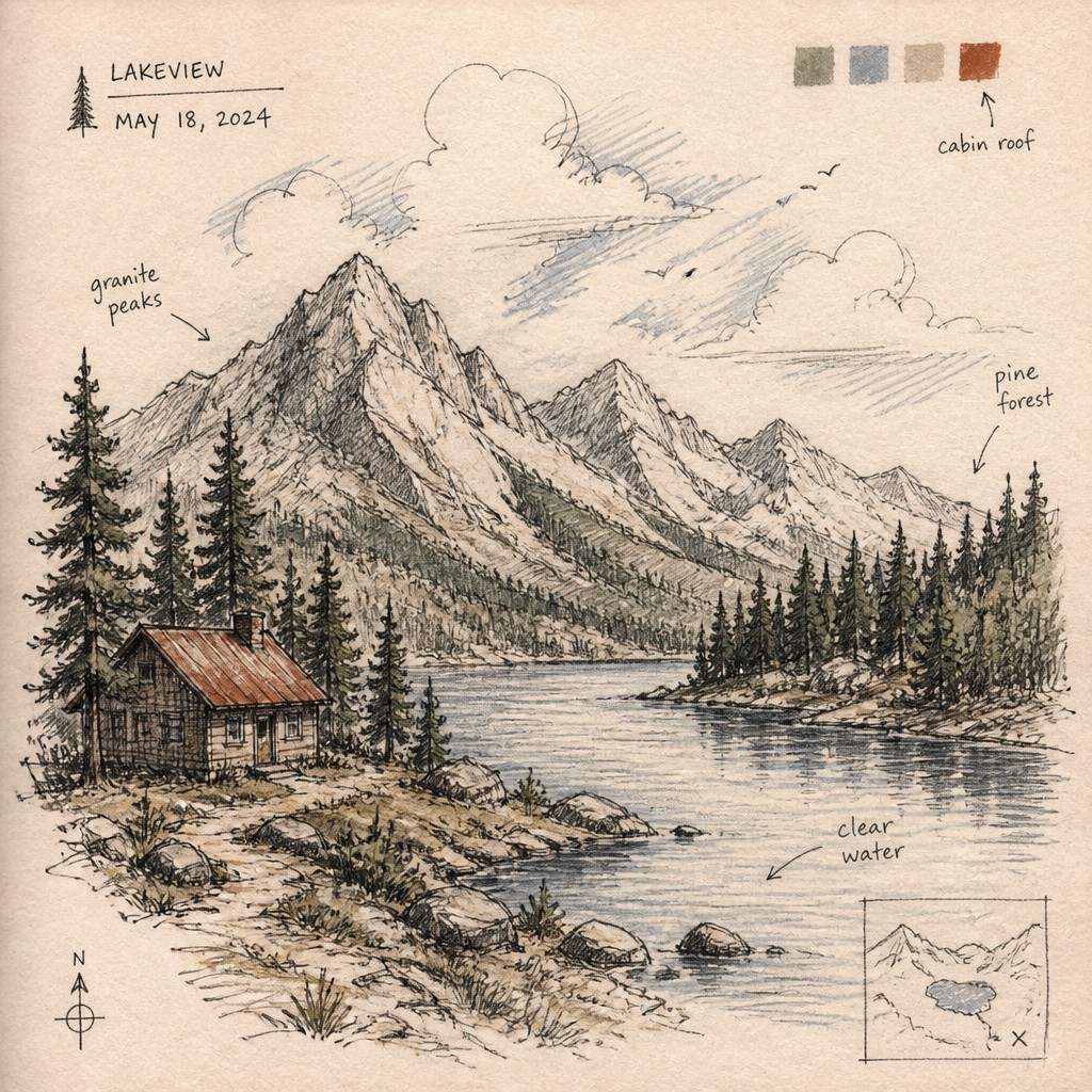
Muted palette with accents
Many versions use black, sepia, charcoal, or desaturated colors, sometimes with one restrained spot color. The palette supports the handmade feel and avoids overpowering the linework.
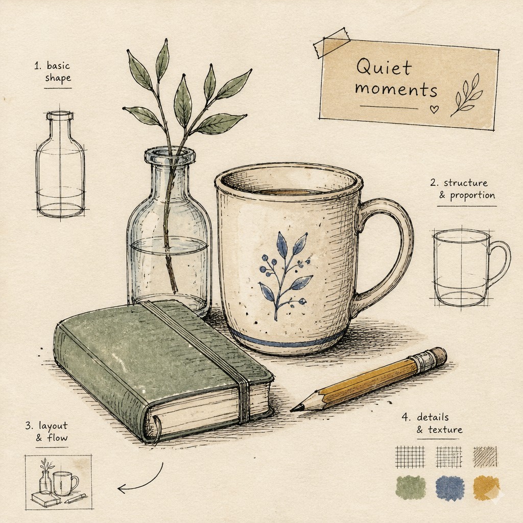
Paper and tool artifacts
Subtle paper grain, tooth, brush texture, or ink bleed may be visible. These material cues help the icon feel embedded in a physical drawing process.
Try It
Create Videos in Hand-Drawn Icon Design
Styles aren't just for stills — describe a scene or animate an image and get a short video rendered in Hand-Drawn Icon Design. Press play to see this pond come to life.
Make a VideoHand-Drawn Icon Design Prompt Ideas
Start from an idea — each one opens the generator with the style ready to go. See all 40 Hand-Drawn Icon Design prompts →
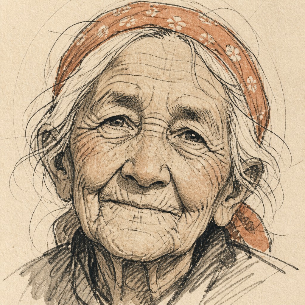
“close-up portrait of an elderly person with expressive weathered features”
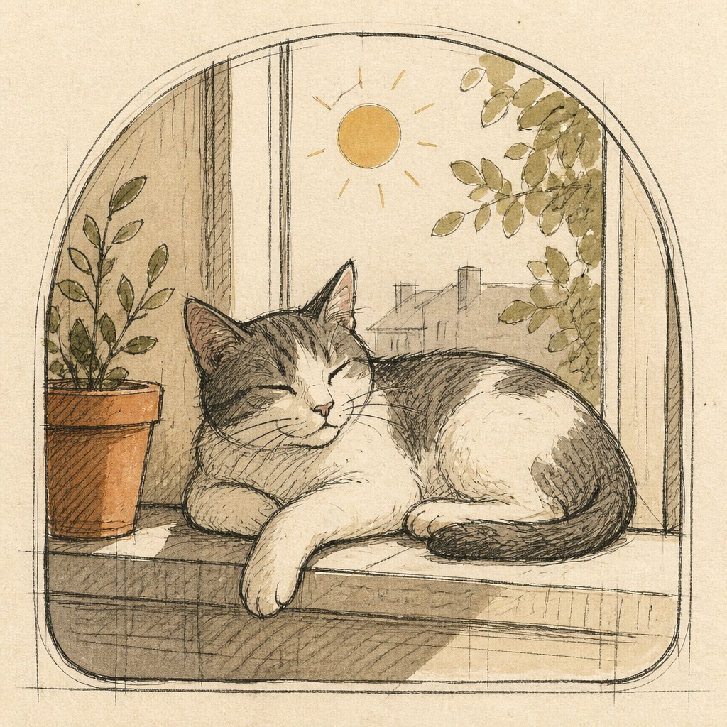
“a cat lounging in a sunlit window”
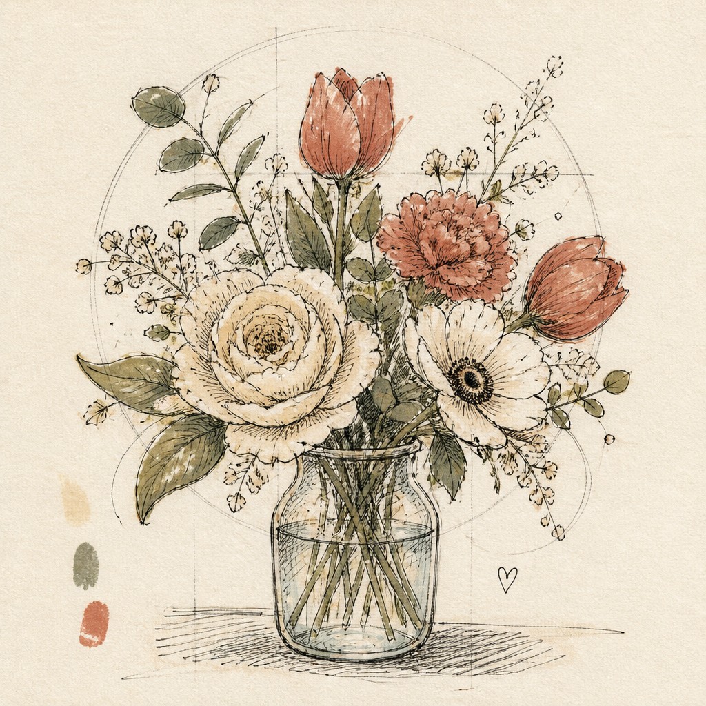
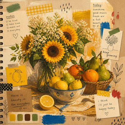
“bouquet of flowers in a glass vase”
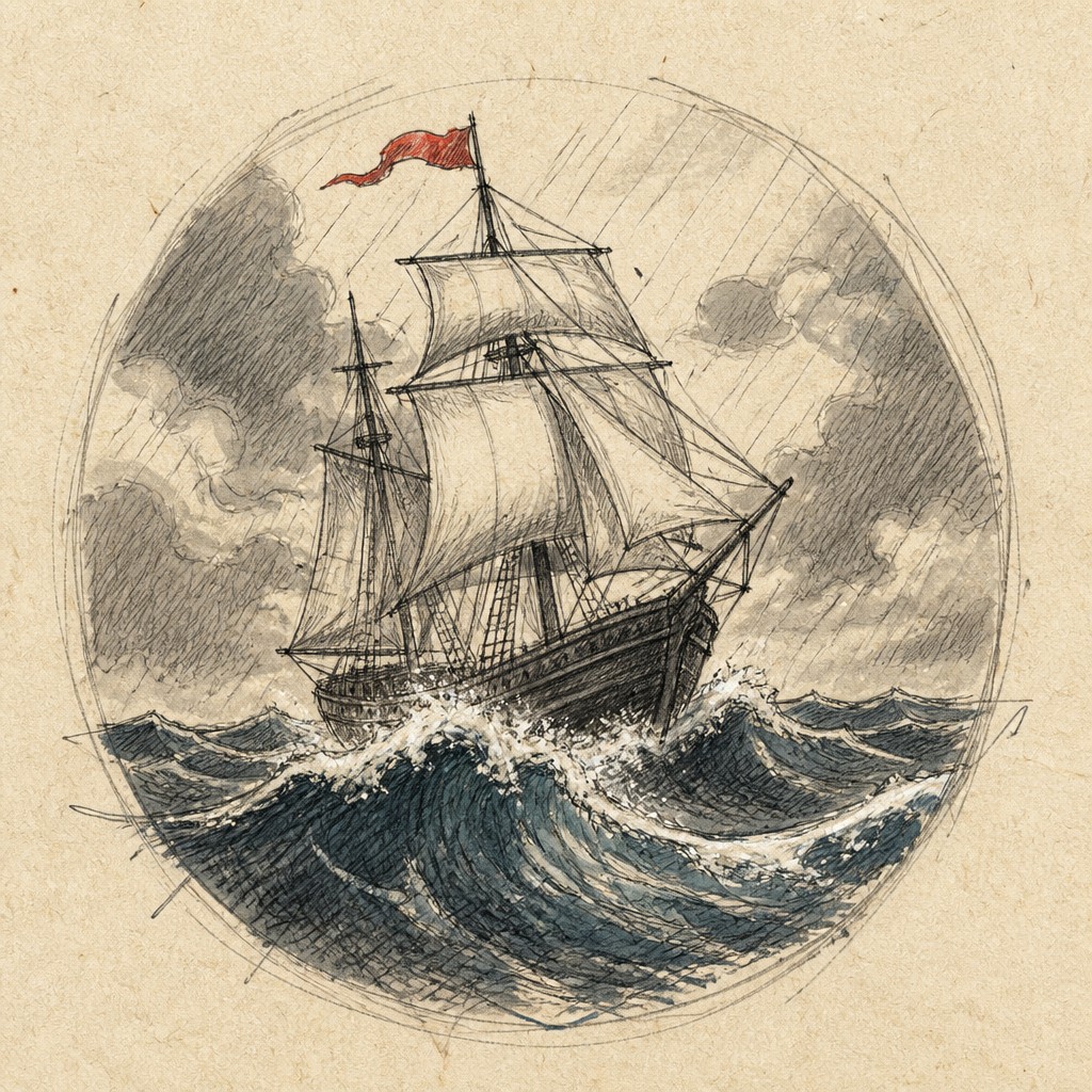
“sailing ship on a stormy sea”
How to Create Hand-Drawn Icon Design Art
Master the craft step by step — or skip straight to creating. Read the full guide →
- 1
Start with a strong silhouette
Reduce the subject to its most legible shapes before adding texture or shading. If the icon can be recognized in one second, the drawing can afford to stay loose without becoming confusing.
- 2
Draw as if you are sketching, not tracing
Keep line weight varied and allow small imperfections, especially in curves and corners. Leave a few construction marks or overlaps so the viewer can sense the order in which the drawing was built.
- 3
Use texture sparingly but deliberately
Add hatching, grain, or brush texture only where it supports form and depth. Too much texture can reduce icon readability, so keep the interior marks lighter than the contour.
- 4
Control the palette
Limit colors to a small set, often monochrome with one accent tone. In digital work, use textured brushes and a paper-grain overlay; in traditional work, choose pen, pencil, marker, or ink wash with visible stroke character.
- 5
Balance charm with clarity in prompt-based generation
Specify the subject, then ask for simplified linework, uneven hand-drawn contours, sketch marks, muted colors, and paper texture. Mention that the icon should remain clean and recognizable so the image does not become an uncontrolled sketch.
- 6
Refine for icon use
Test the image at small sizes and remove decorative marks that do not survive scaling. Whether you are drawing by hand or using digital generation, the final form should read clearly in a UI, logo system, or label set.
The Story
History & Origins of Hand-Drawn Icon Design
This style is not a single historical movement but a contemporary design approach that draws from several older visual traditions: sketchbook drawing, pen-and-ink illustration, early instructional diagrams, and the hand-rendered marks found in comics, zines, and artist notebooks. Its appeal grew alongside a broader design reaction against overly sterile digital graphics, especially in branding and interface illustration.
As digital design matured, many studios began mixing vector clarity with deliberately imperfect marks to create warmth and personality. Hand-drawn icons became common in identity systems, packaging, editorial illustration, hospitality branding, and digital products that wanted to feel approachable rather than corporate. Its lineage is therefore less about a canonical school and more about the continued value of visible human touch in graphic communication.
Influences: Hand-Drawn Icon Design draws from pen-and-ink illustration, sketchbook drawing, editorial spot art, and the handmade sensibility of zines and comics. It also overlaps with contemporary brand illustration and the broader return to tactile graphics in response to the flat, frictionless look of vector UI. In historical art terms, it shares a concern for visible mark-making with leading early modernist and postwar artists known for expressive line, cut-out simplicity, and witty drawing shorthand, though the style itself is primarily a modern graphic convention rather than a single movement.
Frequently Asked Questions
What defines hand-drawn icon design?
It is an icon style that keeps the clarity of a symbol while preserving the look of a human-made drawing. The defining traits are simplified forms, uneven line quality, sketch marks, and subtle texture.
How is it different from a clean vector icon set?
Clean vector icons emphasize precision, symmetry, and smooth uniform outlines. Hand-drawn icons intentionally keep imperfections and material traces, which makes them feel warmer and more personal.
Where is this style commonly used?
It is common in branding, packaging, editorial illustration, website graphics, app onboarding, menus, and lifestyle products. It works especially well when a project needs friendliness, craft, or a handmade tone.
Can hand-drawn icons still be professional?
Yes. Professional use depends on clarity, consistency, and restraint rather than polish alone. A well-made hand-drawn icon set has a coherent line language, controlled texture, and reliable readability at small sizes.
How do I keep the style from looking messy?
Use a limited palette, simplify the subject aggressively, and keep the same stroke behavior across the set. Leave enough imperfection to feel human, but not so much that the icon loses its shape or purpose.
What tools work best for making it?
Traditional tools include pencil, fineliner, brush pen, ink, and light washes on textured paper. Digitally, textured brushes, pressure-sensitive strokes, and paper overlays are useful; prompt-based image generation can also work if you specify sketchiness, line variation, and paper grain.
Create your first Hand-Drawn Icon Design artwork
Describe anything — or upload a photo — and see it in Hand-Drawn Icon Design in seconds.
Make Something with Hand-Drawn Icon Design
Compare Hand-Drawn Icon Design
Related Styles
Discover similar art styles