Skeuomorphic Icon Design
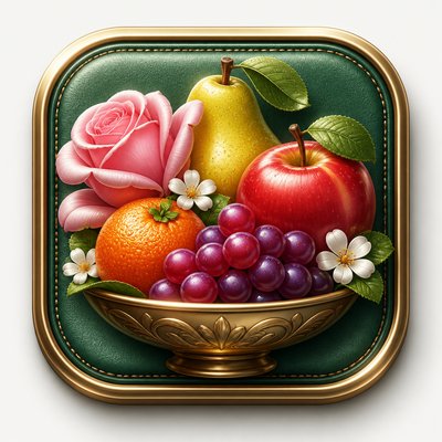
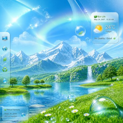
Realistic, polished icons with glossy highlights, shadows, and tactile textures inspired by early digital interface design.
Instantly rendered in Skeuomorphic Icon Design — or transform a photo


Skeuomorphic Icon Design Gallery
Tap any artwork to explore it




What is Skeuomorphic Icon Design?
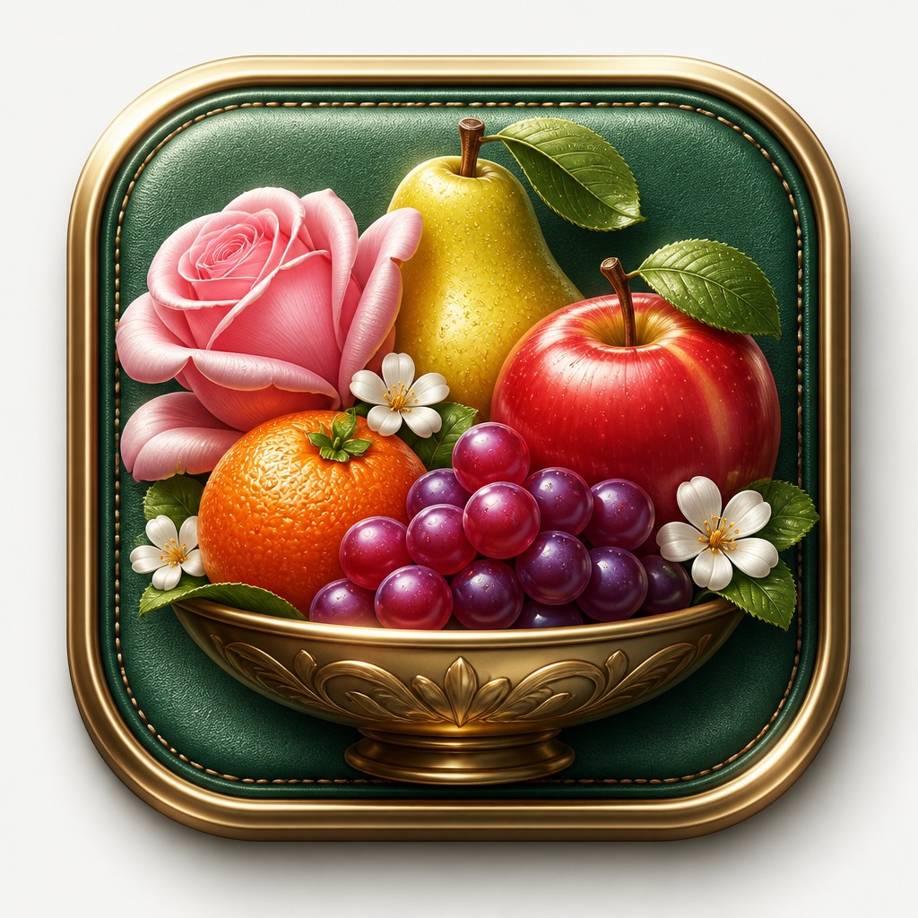
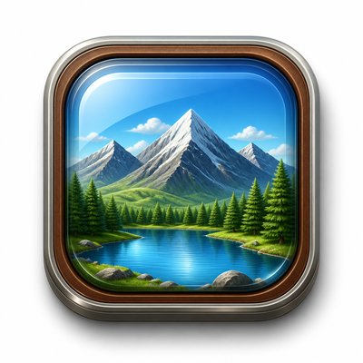
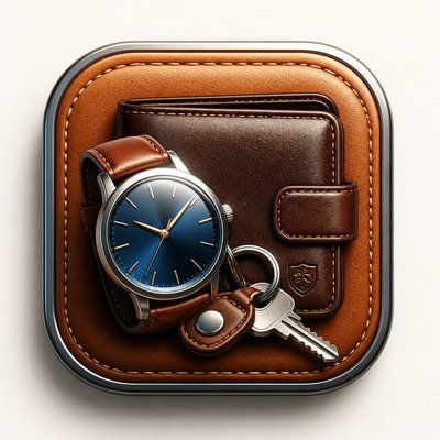
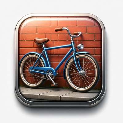
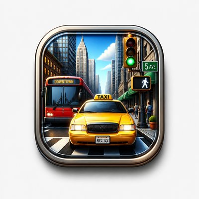
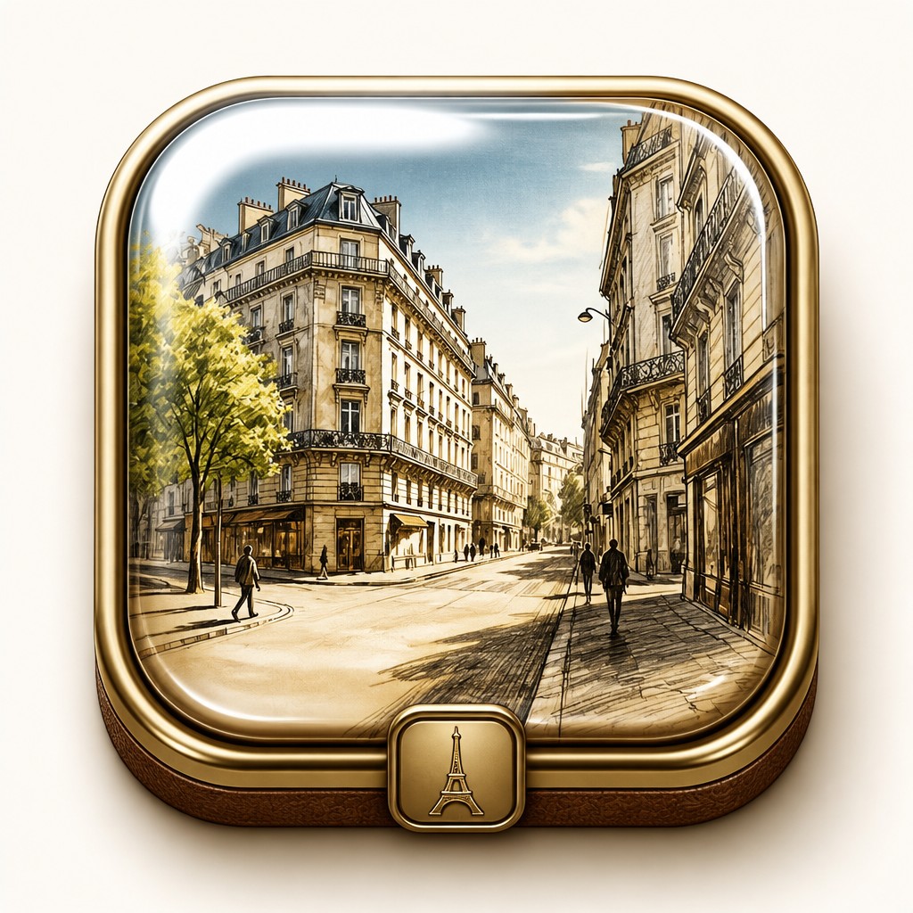
Skeuomorphic icon design is a visual style in which a digital icon is made to resemble a real-world object as closely as possible. Instead of flat symbols, it uses rendered volume, polished surfaces, beveled edges, shadows, gradients, and material cues like glass, leather, metal, paper, or plastic so the object feels tangible and instantly legible.
The style developed for user interfaces, where visual familiarity helped people understand unfamiliar digital functions. Its appeal lies in the way it combines clarity with simulation: the icon is simplified enough to read at small sizes, but detailed enough to suggest weight, sheen, depth, and touchable materiality. The result is a compact image that looks engineered, dimensional, and interface-ready.

Try It On Your Photos
Upload any photo and convert it into Skeuomorphic Icon Design — drag the sliders to compare before and after.



What Defines Skeuomorphic Icon Design
The signature details, up close
Object-based symbolism
Icons usually depict a concrete everyday object that stands in for a digital function, such as a camera, folder, envelope, or music player. The metaphor is intentionally literal and immediately recognizable.
Three-dimensional modeling
Forms are rendered with volume, curvature, bevels, and perspective so they appear physically sculpted. This dimensional treatment is central to the style’s realism.
Material realism
Surfaces imitate specific materials such as glass, chrome, leather, wood, paper, or plastic. Texture, reflectivity, and translucency help the icon feel like a manufactured object.
Glossy lighting effects
Highlights, specular reflections, and layered shadows simulate overhead studio lighting. These effects create the polished, consumer-product look that defines the style.
Centered, isolated composition
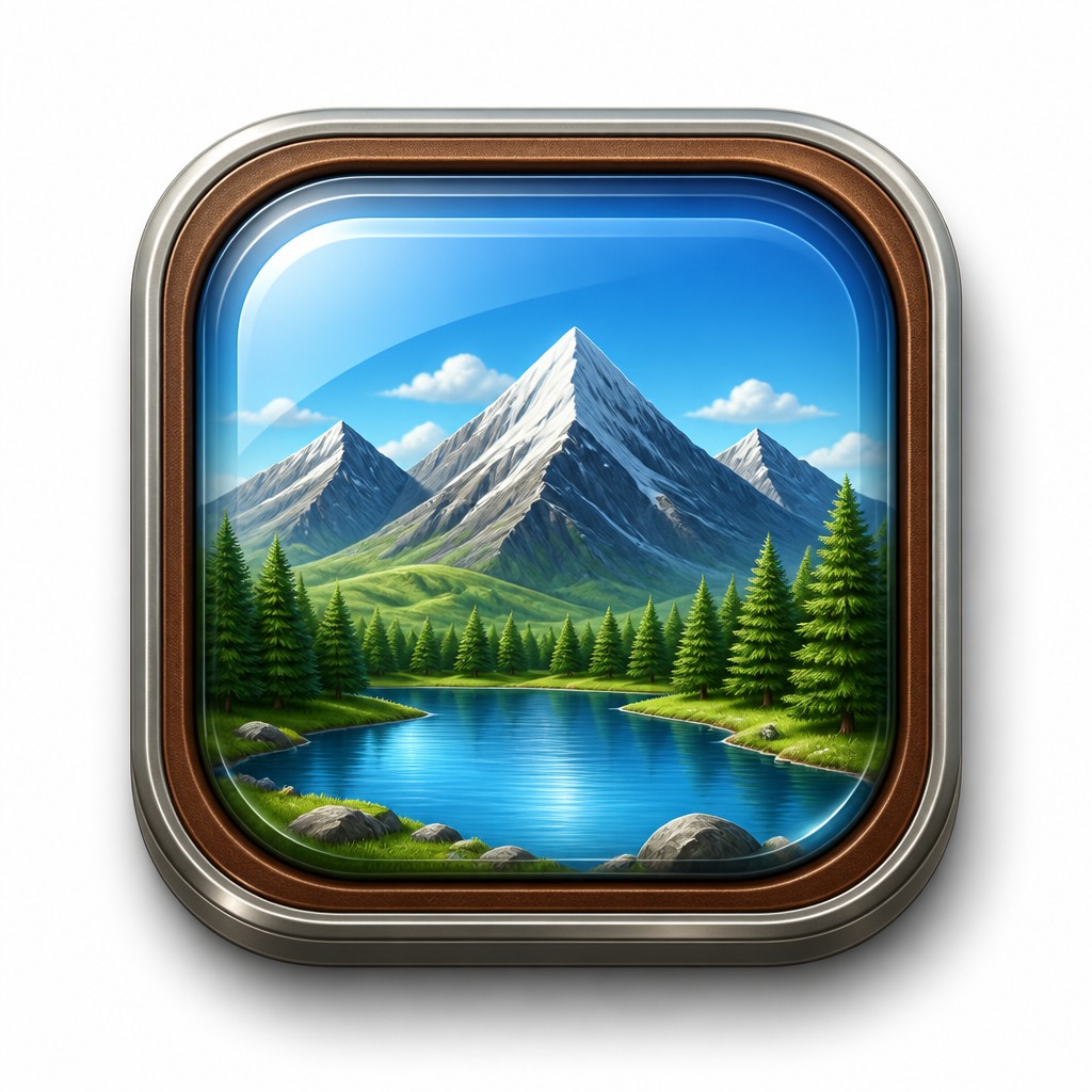
The subject is usually placed in the middle of a clean background with generous negative space. This keeps the icon legible and makes its silhouette easy to recognize.
Color gradients and saturation
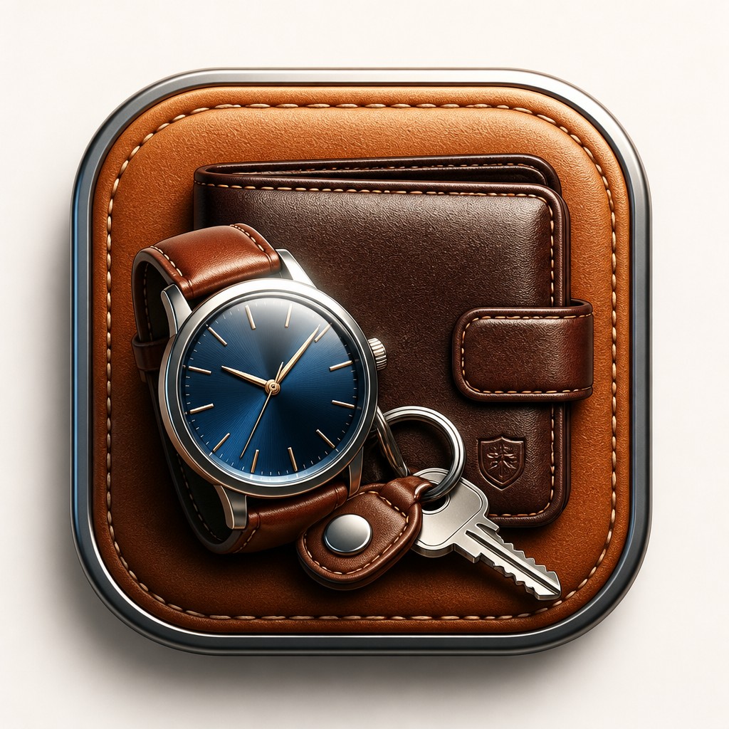
Smooth tonal transitions replace flat fills, and colors are often rich or saturated. Gradients reinforce roundness and help separate planes of the object.
Try It
Create Videos in Skeuomorphic Icon Design
Styles aren't just for stills — describe a scene or animate an image and get a short video rendered in Skeuomorphic Icon Design. Press play to see this pond come to life.
Make a VideoSkeuomorphic Icon Design Prompt Ideas
Start from an idea — each one opens the generator with the style ready to go. See all 40 Skeuomorphic Icon Design prompts →

“close-up portrait of an elderly person with expressive weathered features”

“a cat lounging in a sunlit window”

“bouquet of flowers in a glass vase”

“sailing ship on a stormy sea”
How to Create Skeuomorphic Icon Design Art
Master the craft step by step — or skip straight to creating. Read the full guide →
- 1
Start with a recognizable object metaphor
Choose a subject that can be translated into a simple app-like object, then reduce it to its most familiar silhouette and details. If the icon must communicate a function, make the metaphor obvious at small scale.
- 2
Build the form with light and depth
Model the object with strong highlights, inner shadows, and beveled edges so it reads as a physical item. In digital illustration, layer gradients and shadow passes rather than relying on outlines alone.
- 3
Use a material-first approach
Decide whether the icon should feel metallic, glassy, plastic, leather-bound, or paper-like, then apply surface behavior consistently. Matching reflections and texture to the chosen material is what makes the image convincing.
- 4
Keep the composition simple and centered
Isolate the subject on a neutral background and leave ample padding around it. Skeuomorphic icons work best when the silhouette is clean and the subject is not cluttered by extra props.
- 5
For prompt-based generation, specify rendering cues
Describe the object, then add language for polished three-dimensional rendering, beveled edges, glossy highlights, realistic materials, and layered shadows. Mention centered composition, clean background, and tactile dimensional realism to steer the result toward an icon rather than a scene.
The Story
History & Origins of Skeuomorphic Icon Design
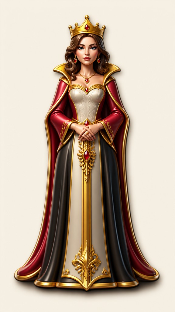
Skeuomorphism is rooted in a long design tradition in which new media imitate familiar objects from older media to make them easier to use. In interface design, it became especially prominent in the late 1990s and 2000s as desktop and mobile operating systems sought to make digital actions intuitive through visual metaphors such as notebooks, calendars, trash cans, switches, and dials.
Its aesthetic lineage draws from product rendering, industrial design illustration, and advertising graphics, as well as from the broader history of illusionistic representation in painting. While the style later declined in mainstream interface design as flat design rose in popularity, it remains a recognizable look in iconography, UI concepts, and retro-digital visual culture.
Influences: Skeuomorphic icon design is connected to industrial design rendering, product illustration, and interface metaphors from early computing, as well as to older traditions of trompe-l'œil and illusionistic realism. It also shares DNA with the polished presentation culture of late-20th-century consumer technology branding, where objects were shown as desirable, tactile, and engineered rather than purely functional.

Frequently Asked Questions
What defines skeuomorphic icon design?
It is defined by icons that mimic real objects through realistic materials, shadows, highlights, and dimensional modeling. The goal is to make a digital symbol feel physically familiar and easy to understand. Unlike flat icon systems, it emphasizes volume and surface realism.
How is it different from flat design?
Flat design removes most illusionistic depth and avoids realistic materials, while skeuomorphic design depends on them. Flat icons use simplified shapes and minimal shading; skeuomorphic icons use bevels, gloss, gradients, and layered shadows to imitate physical objects. The two styles often communicate the same function, but with very different visual language.
Why was this style used in interfaces?
It helped new users understand digital actions by borrowing familiar cues from the physical world. A trash can, folder, or envelope made sense because people already knew how those objects worked. The style made early software feel more intuitive and less abstract.
Is skeuomorphic design outdated?
It is less dominant in mainstream interface design than it once was, but it is not obsolete. It still appears in app icons, retro UI concepts, game graphics, and brand visuals that want a tactile or nostalgic digital feel. Many designers also use it selectively for emphasis or familiarity.
How do you make a skeuomorphic icon look convincing?
Use a clear object silhouette, realistic material cues, and consistent lighting. The most important details are the highlights, shadows, and surface texture that suggest a physical object. Overcomplicated scenes usually weaken the effect.
Where is this style commonly used today?
It is often used in app icons, software mockups, product UI concepts, and retro-inspired digital artwork. It also appears in brand systems, promotional graphics, and image generation prompts when a polished interface-ready look is desired.

Create your first Skeuomorphic Icon Design artwork
Describe anything — or upload a photo — and see it in Skeuomorphic Icon Design in seconds.
Make Something with Skeuomorphic Icon Design
Related Styles
Discover similar art styles