Glyph Icon Design
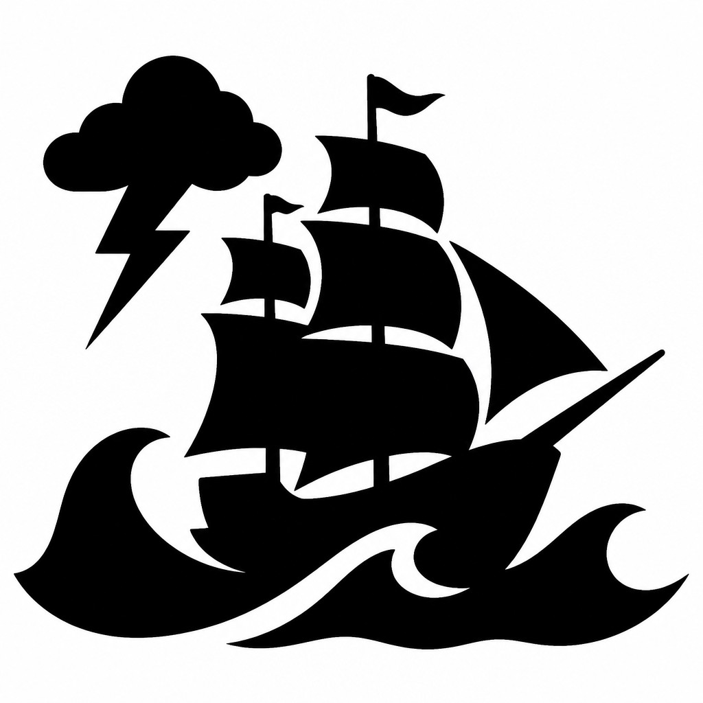
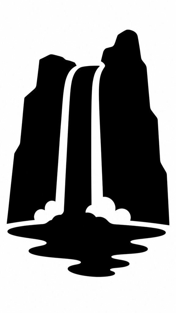
Bold black silhouette icons with no internal detail, designed for instant recognition, small sizes, and clean universal visual communication.
Instantly rendered in Glyph Icon Design — or transform a photo


Glyph Icon Design Gallery
Tap any artwork to explore it


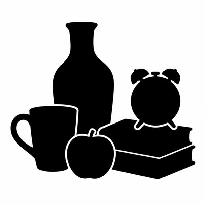
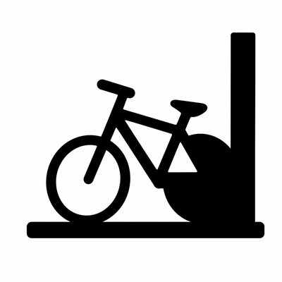
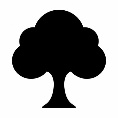
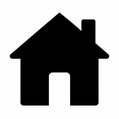
What is Glyph Icon Design?
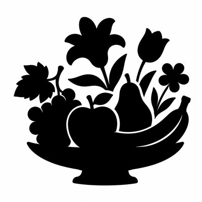
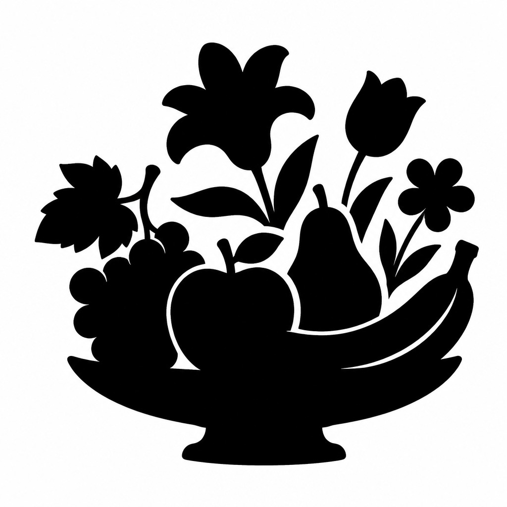
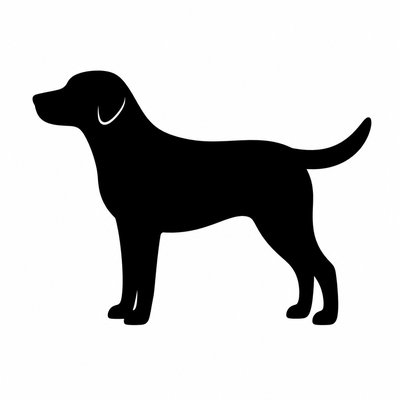
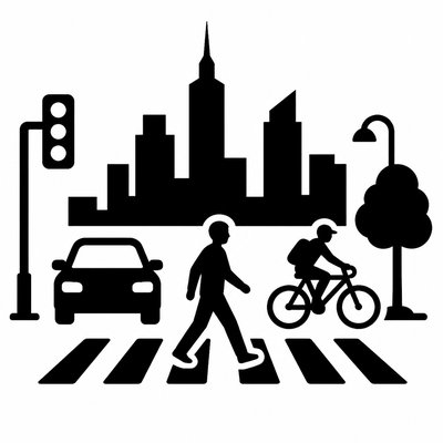
Glyph Icon Design is a highly reduced visual language in which a subject is condensed into a single filled silhouette. Instead of modeling form with linework, texture, or shading, it relies on the clarity of shape alone: one continuous contour, a flat solid interior, and a stark separation from the background. The result is instantly legible at small sizes and well suited to interfaces, signage, symbols, and systems of visual communication.
Its aesthetic identity comes from subtraction. Every detail that is not essential to recognition is removed, leaving only the most distinctive outline and proportion. Because the style depends on pure positive and negative space, it feels direct, neutral, and universal. The absence of internal detail also makes it especially effective where consistency, scalability, and rapid comprehension matter more than realism or expressive rendering.

Try It On Your Photos
Upload any photo and convert it into Glyph Icon Design — drag the sliders to compare before and after.


What Defines Glyph Icon Design
The signature details, up close
Single filled silhouette
The subject is rendered as one solid mass, usually black on white, with no line art or interior modeling. This creates maximum clarity and makes the icon readable even when scaled down.
No internal detail
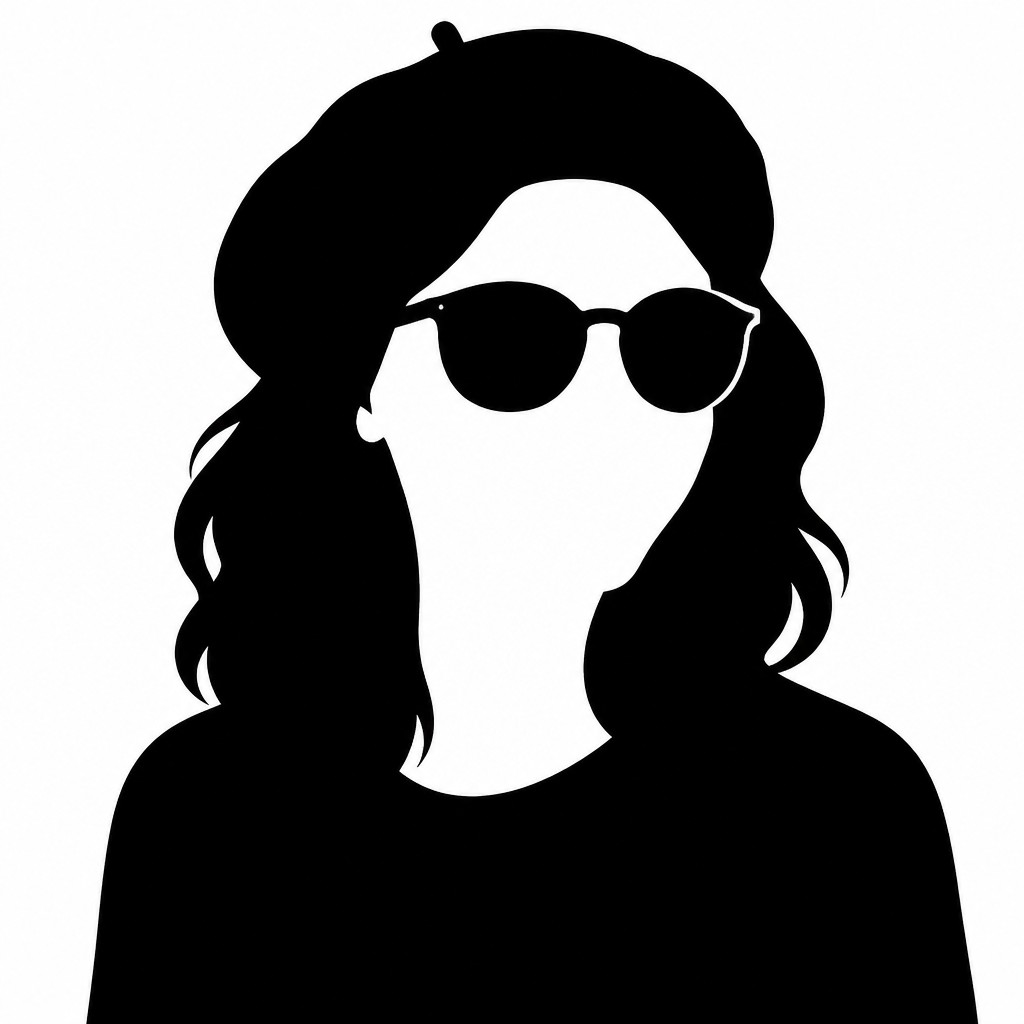
Windows, folds, textures, facial features, and surface information are omitted. Recognition depends entirely on the outer contour and the overall shape language.
Clean continuous contour
The outline is smooth, precise, and uninterrupted, often built from mathematically controlled curves and sharp corners. Visual noise is minimized so the form feels crisp and dependable.
High geometric simplification
Complex subjects are reduced to their most essential geometry. The design emphasizes distinctive proportions and readable structure rather than literal depiction.

Strong positive and negative space
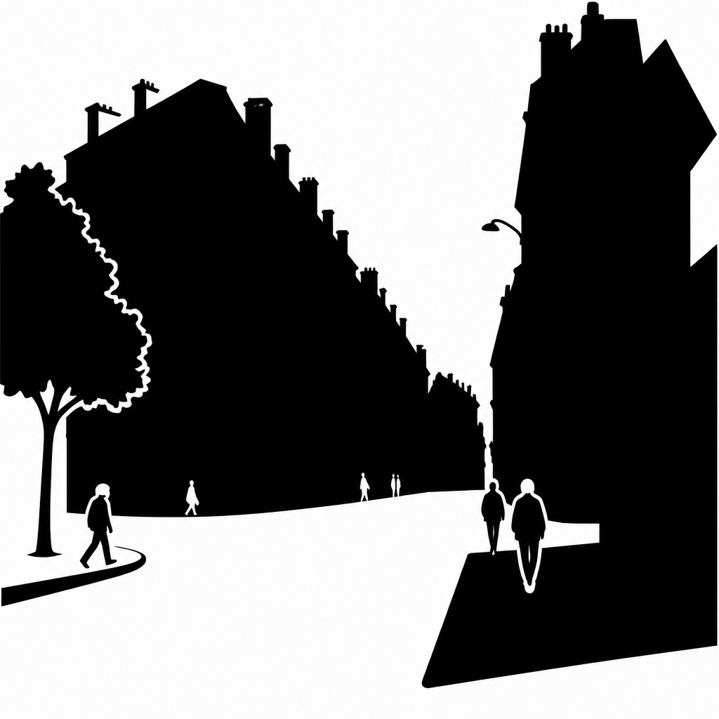
The silhouette is shaped so that its boundaries communicate clearly against the background. Balanced spacing helps the icon remain recognizable and aesthetically stable.
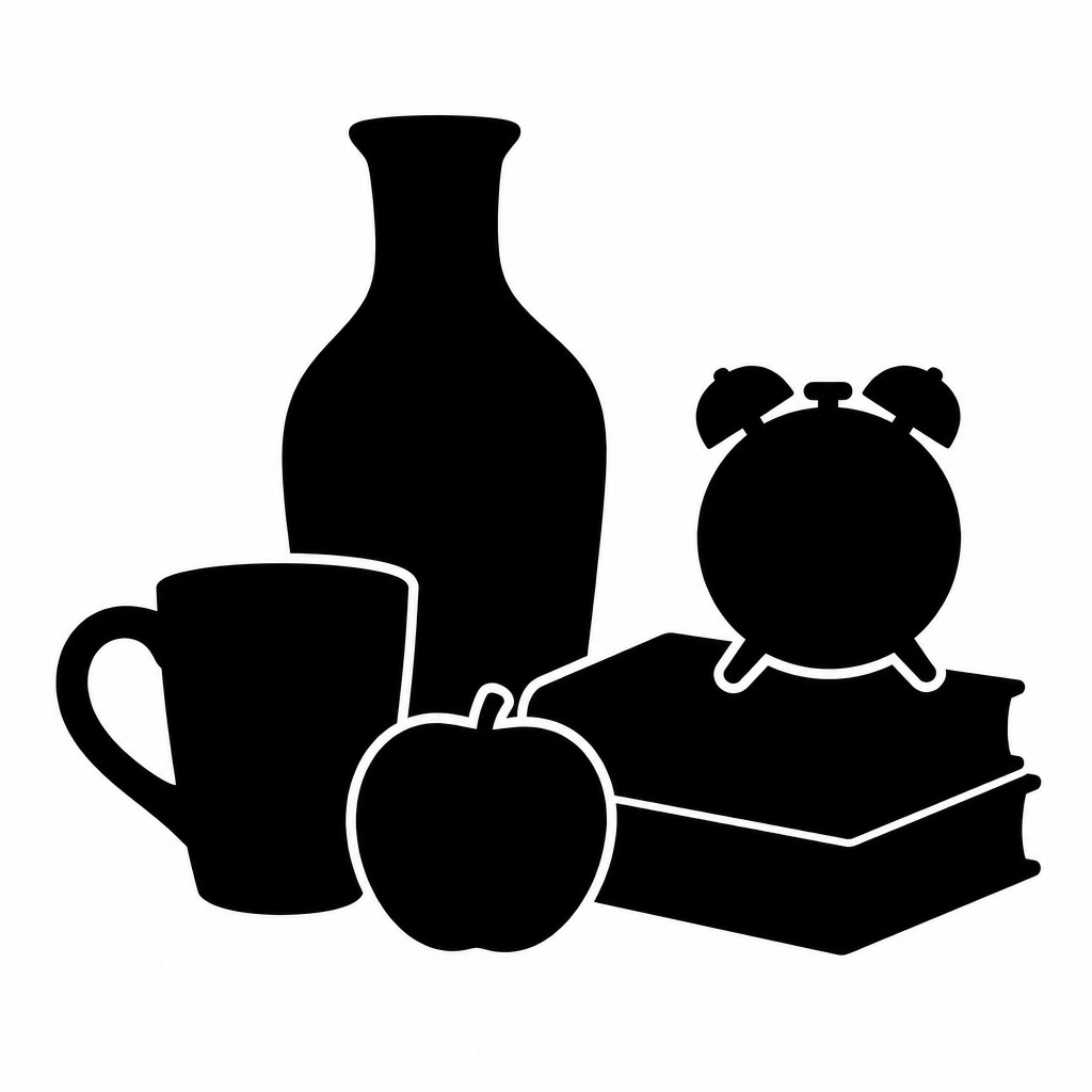
Pure two-tone presentation
The style typically uses only the icon shape and the background, with no gradients, shadows, or midtones. This strict contrast is central to its graphic authority.
Try It
Create Videos in Glyph Icon Design
Styles aren't just for stills — describe a scene or animate an image and get a short video rendered in Glyph Icon Design. Press play to see this pond come to life.
Make a VideoGlyph Icon Design Prompt Ideas
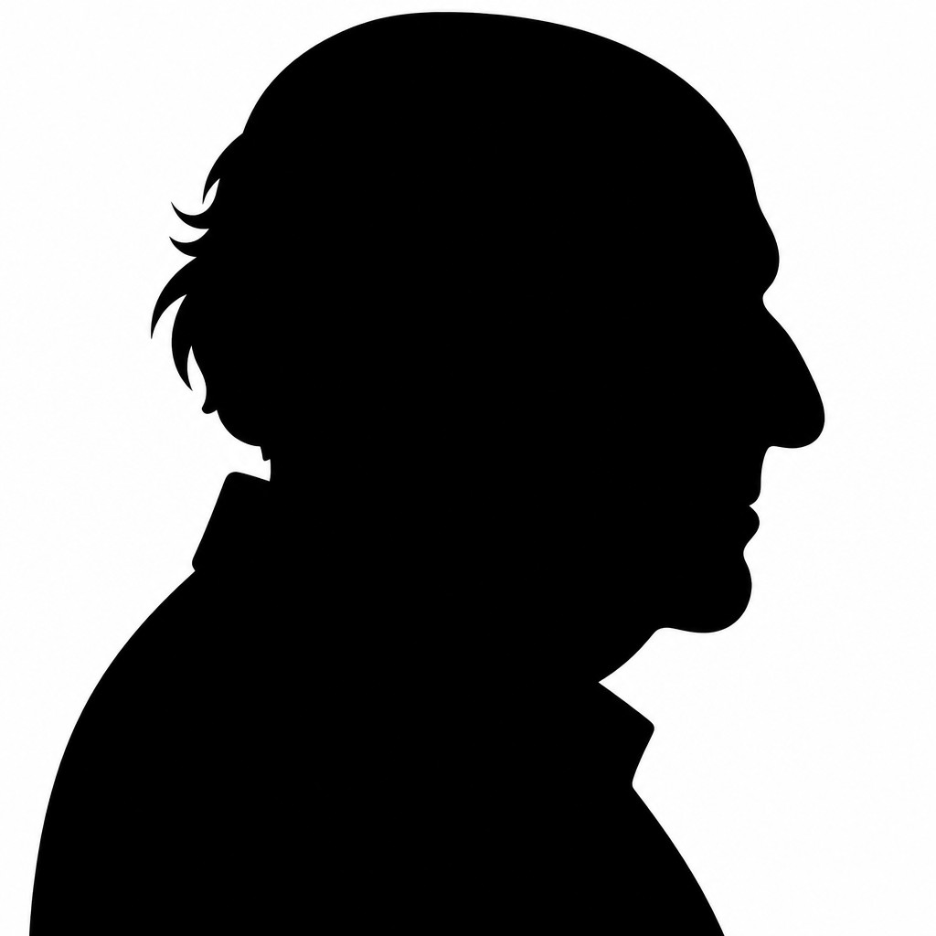
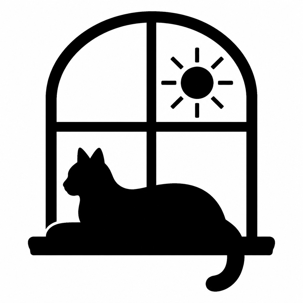
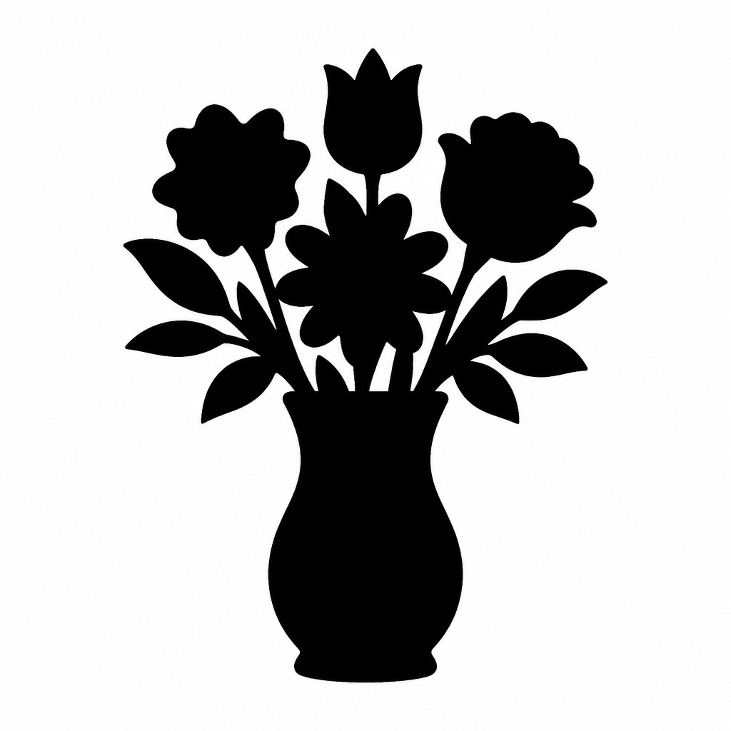
Start from an idea — each one opens the generator with the style ready to go. See all 40 Glyph Icon Design prompts →
How to Create Glyph Icon Design Art
Master the craft step by step — or skip straight to creating. Read the full guide →
- 1
Start from recognition, not realism
Choose the minimum set of features that still identifies the subject at a glance. Test the shape at very small sizes and remove anything that stops reading clearly.
- 2
Build one continuous silhouette
In vector software, draw a closed outline and merge shapes until the figure becomes a single filled mass. Avoid interior cuts unless they are absolutely necessary for recognition.
- 3
Use asymmetry and proportion carefully
Distinctive balance, posture, or tool placement often matters more than detail. Adjust negative space so the icon feels stable and visually centered.
- 4
Strip away all rendering effects
Do not use shading, outlines inside the figure, texture, or dimensional lighting. The style depends on flatness and the immediate contrast of black against white.
- 5
Test in real UI conditions
Check the icon at 16–32 px, in monochrome, and on different backgrounds to confirm legibility. If generating digitally, prompt for a solid black silhouette, no internal detail, and a stark white background.

The Story
History & Origins of Glyph Icon Design
Glyph icon design belongs to the long history of pictographic communication rather than to a single named art movement. Its visual logic draws from ancient symbols, heraldic silhouettes, semaphore-like simplification, and the modern design traditions of signage, wayfinding, pictograms, and interface icons. In the twentieth century, it was reinforced by Swiss and international typographic design, industrial standardization, and the need for symbols that could be read quickly across languages.
As digital interfaces became ubiquitous, the style developed into a practical standard for user experience design, mobile systems, and UI icon sets. The reduction to a flat silhouette was not merely an aesthetic choice but a functional response to small screens, varied resolutions, and the need for clear recognition at a glance. Today it remains a core visual language for app menus, toolbars, maps, safety symbols, and branding systems that depend on immediate clarity.
Influences: Glyph icon design is related to pictograms, heraldic emblems, wayfinding systems, and the minimalist logic of modern graphic design. It shares a lineage with Swiss Style clarity and the reductionist approach of influential postwar German graphic designers and pictogram-system designers, whose Olympic-era symbol sets helped define contemporary iconographic standards, as well as with broader traditions of symbol-making found in signage and print typography.
Frequently Asked Questions
What defines glyph icon design?
It is defined by a fully filled silhouette, extreme simplification, and the absence of internal detail. The subject must remain recognizable through outline alone, usually in a flat monochrome treatment.
How is it different from line icons?
Line icons use strokes to describe form, while glyph icons use solid shapes. Glyphs are often bolder and more legible at tiny sizes because they do not rely on thin outlines.
Where is this style commonly used?
It is widely used in app interfaces, toolbars, signage, maps, safety labels, and branding systems. Anywhere fast recognition and scalability matter, glyph icons are a practical choice.
Can glyph icons include interior cutouts?
They can, but only sparingly and only when the cutout is essential to identification. The core rule is that the icon should still read as a single bold silhouette with no decorative detail.
How do I make an object recognizable as a silhouette?
Focus on the most distinctive outer profile, not the surface details. Exaggerate the features that make the subject unique, such as a handle, beak, wing shape, or posture, while removing anything secondary.
Is this style suitable for branding?
Yes, especially for systems that need consistent, versatile marks across print and digital uses. Its simplicity makes it easy to scale, reproduce, and adapt while maintaining a clear visual identity.

Create your first Glyph Icon Design artwork
Describe anything — or upload a photo — and see it in Glyph Icon Design in seconds.
Make Something with Glyph Icon Design
Compare Glyph Icon Design
Related Styles
Discover similar art styles