Gradient Icon Design
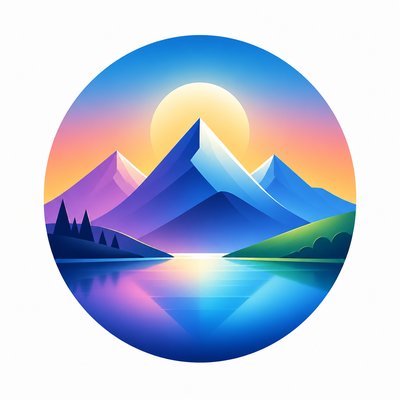
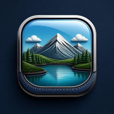
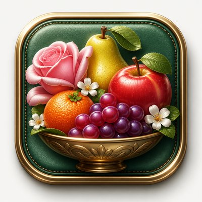
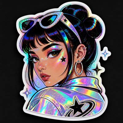
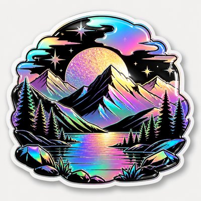
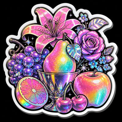
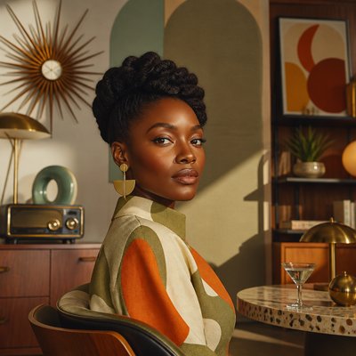
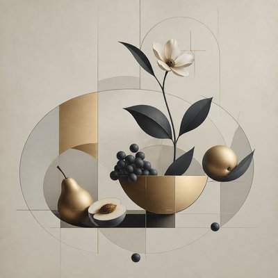
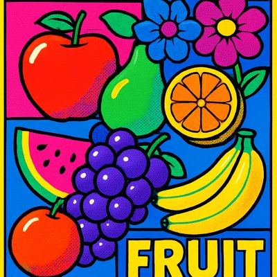
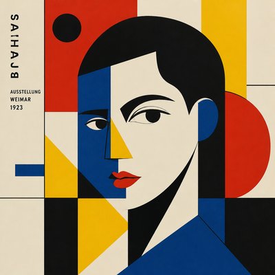
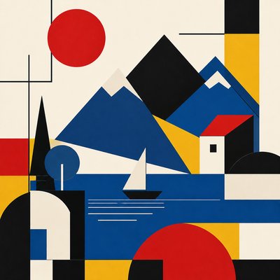
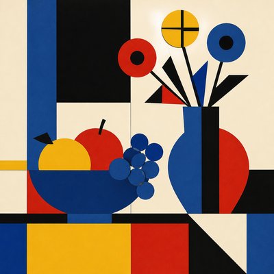
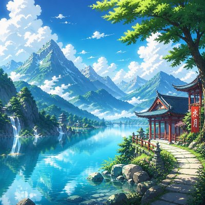
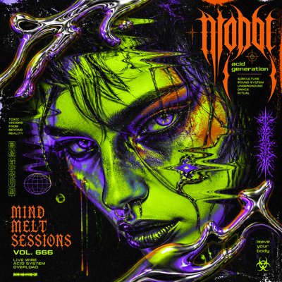
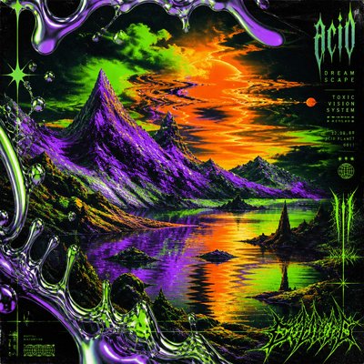
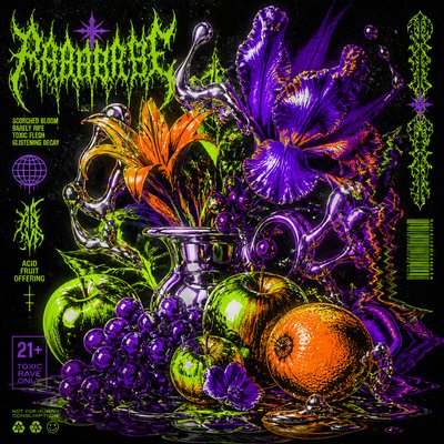
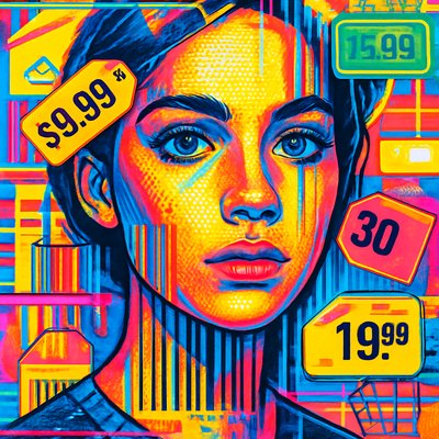
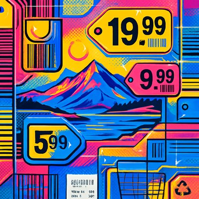
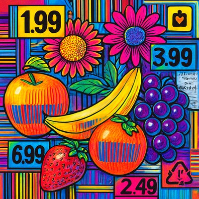
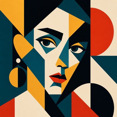
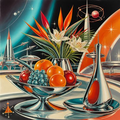
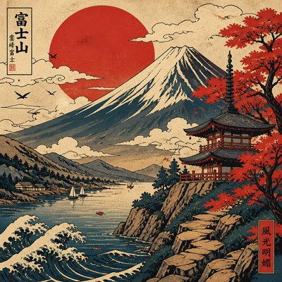
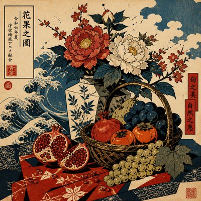
Modern icon style with smooth gradients, glossy depth, clean vector shapes, and polished app-ready clarity.
Instantly rendered in Gradient Icon Design — or transform a photo
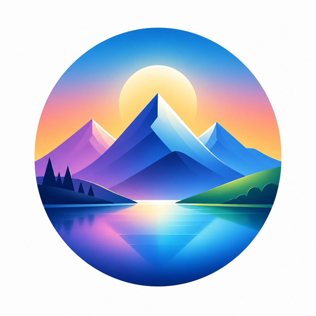

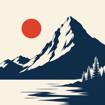
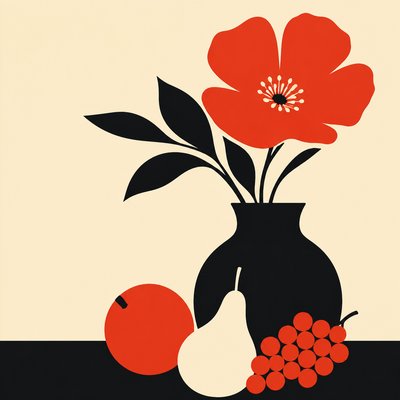
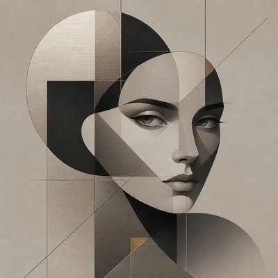
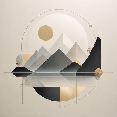
Gradient Icon Design Gallery
Tap any artwork to explore it

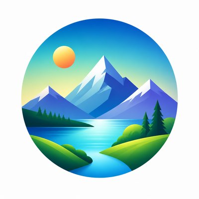

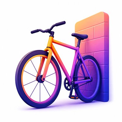

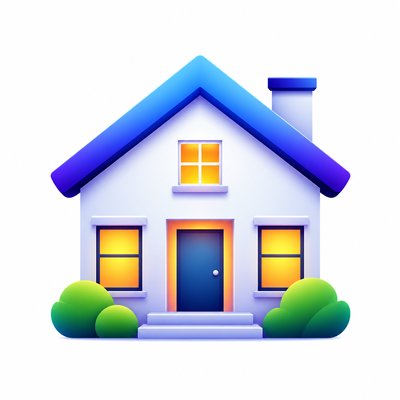
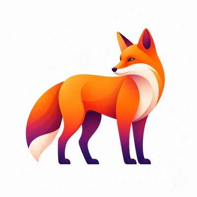
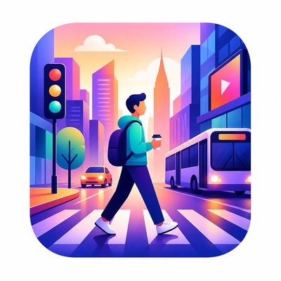
What is Gradient Icon Design?
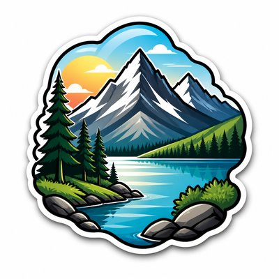
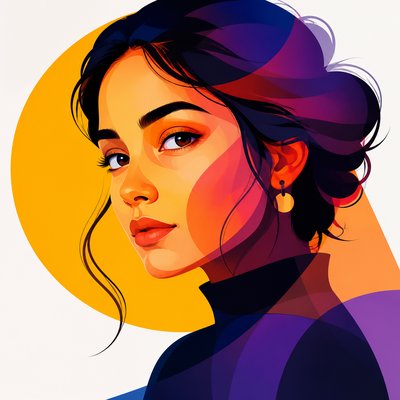
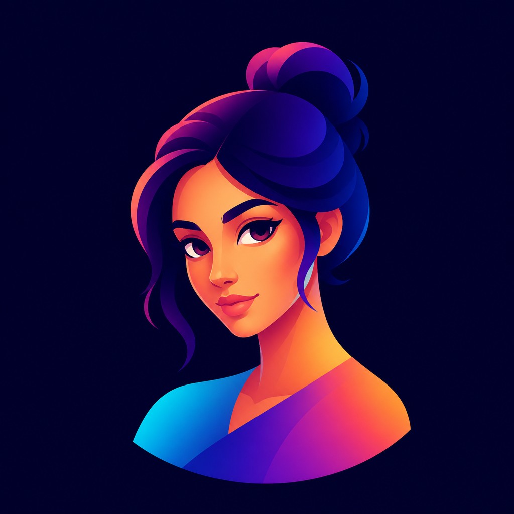
Gradient Icon Design is a contemporary visual style for icons and small graphics that combines simplified geometry with smooth color transitions, subtle depth, and a polished digital finish. Subjects are typically reduced to a strong central silhouette, then modeled with layered gradients, luminous highlights, and gently darkened edges to create form without sacrificing clarity.
Its visual identity comes from the demands of interface design: icons must read quickly at small sizes, feel coherent in sets, and remain visually distinct on screens of varying brightness and resolution. The style balances minimal structure with expressive color, borrowing the cleanliness of vector illustration and the dimensional cues of digital rendering to produce icons that feel modern, legible, and refined.
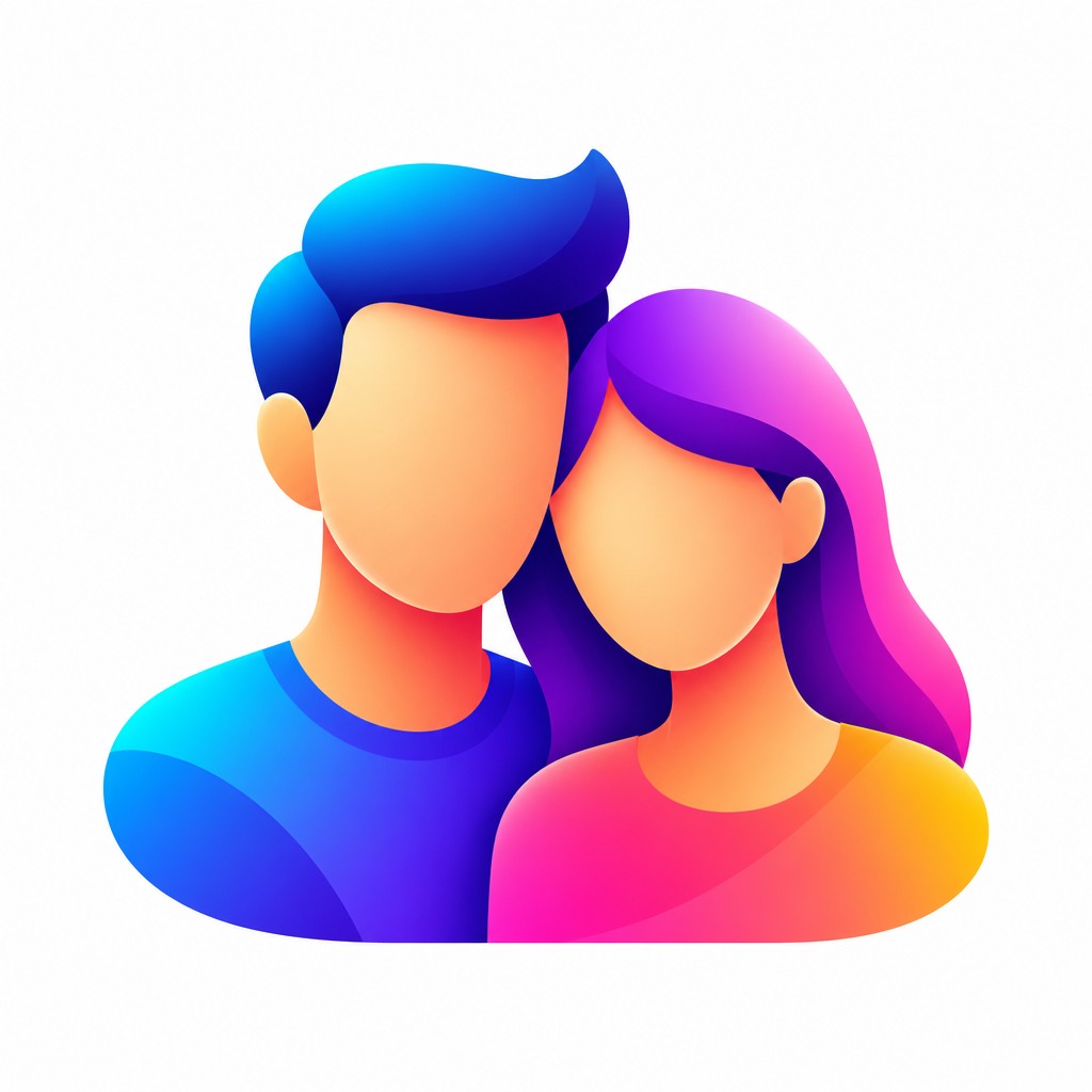
Try It On Your Photos
Upload any photo and convert it into Gradient Icon Design — drag the sliders to compare before and after.


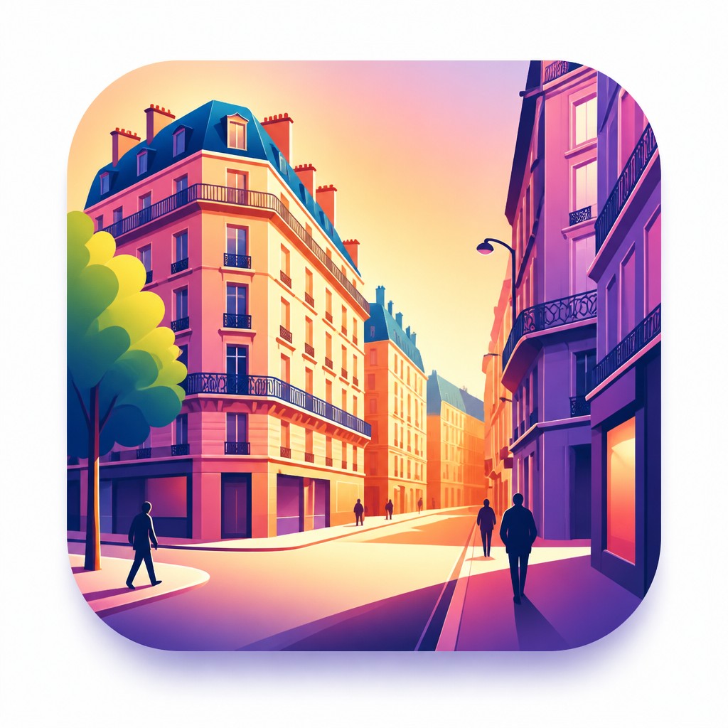

What Defines Gradient Icon Design
The signature details, up close
Simplified geometric silhouettes
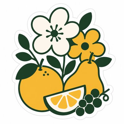
Objects are distilled into clear, compact shapes that can be recognized instantly. Excess detail is removed so the icon remains readable at small scale.
Smooth gradient modeling
Color transitions move gradually across surfaces to imply volume and material. These gradients often combine radial and linear patterns to shape the object without visible brushwork.
Glossy digital highlights
Bright highlight zones suggest a polished, screen-friendly surface. These accents create depth and energy while keeping the icon clean and modern.
Soft dimensional edges
Forms are usually defined by subtle shadowing and gently darkened rims rather than heavy outlines. This gives the icon a sense of depth without looking illustrative or hand-rendered.
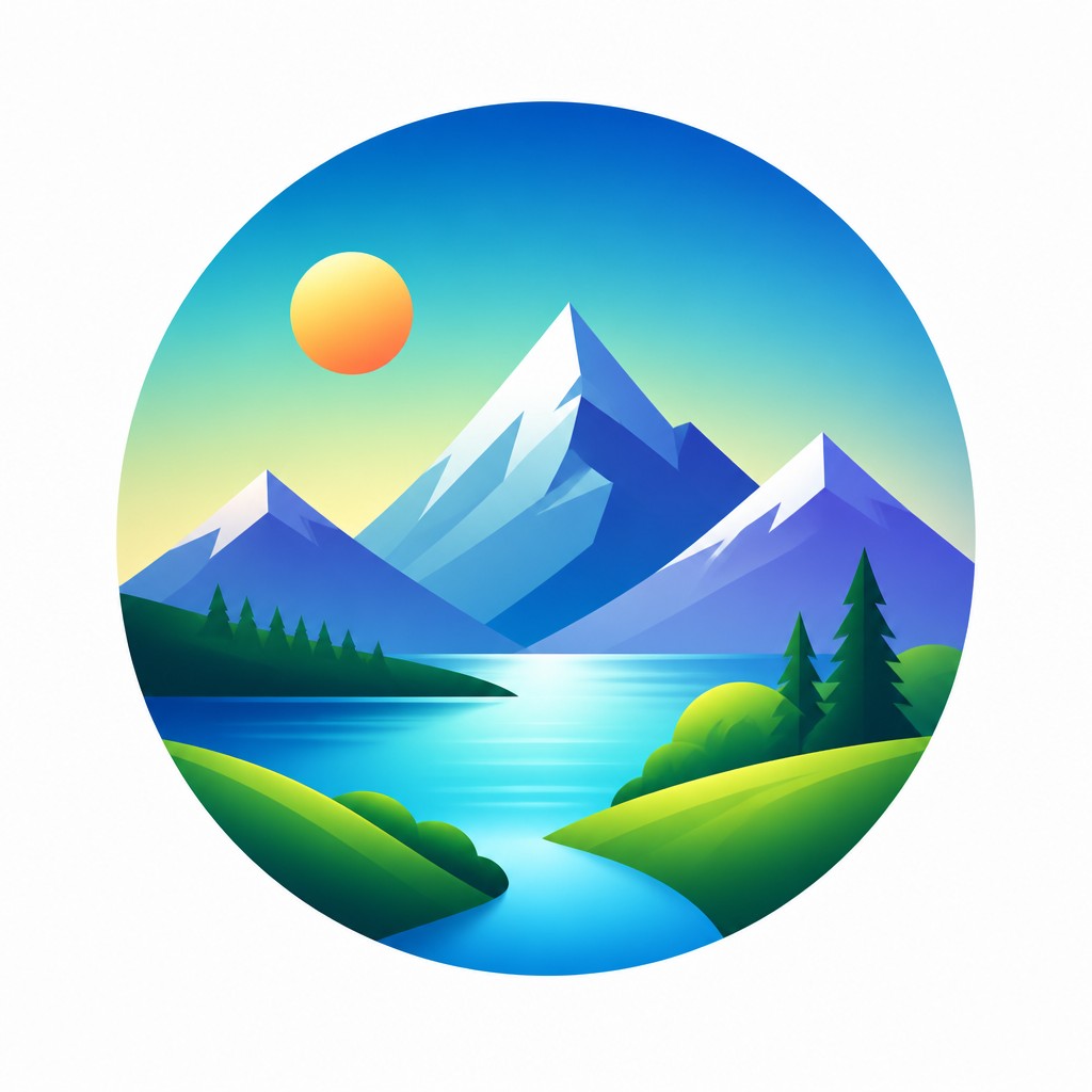
Harmonious color progression
Palettes commonly use analogous or complementary hues that transition smoothly from one to another. The goal is visual coherence, not high-contrast realism.

Balanced negative space
Icons are composed with generous breathing room so the silhouette remains legible and centered. Negative space is part of the design, helping the form stand out against interface backgrounds.
Try It
Create Videos in Gradient Icon Design
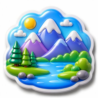
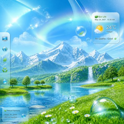
Styles aren't just for stills — describe a scene or animate an image and get a short video rendered in Gradient Icon Design. Press play to see this pond come to life.
Make a VideoGradient Icon Design Prompt Ideas
Start from an idea — each one opens the generator with the style ready to go. See all 40 Gradient Icon Design prompts →

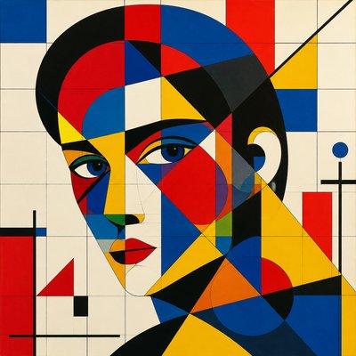
“close-up portrait of an elderly person with expressive weathered features”

“a cat lounging in a sunlit window”

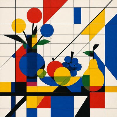
“bouquet of flowers in a glass vase”
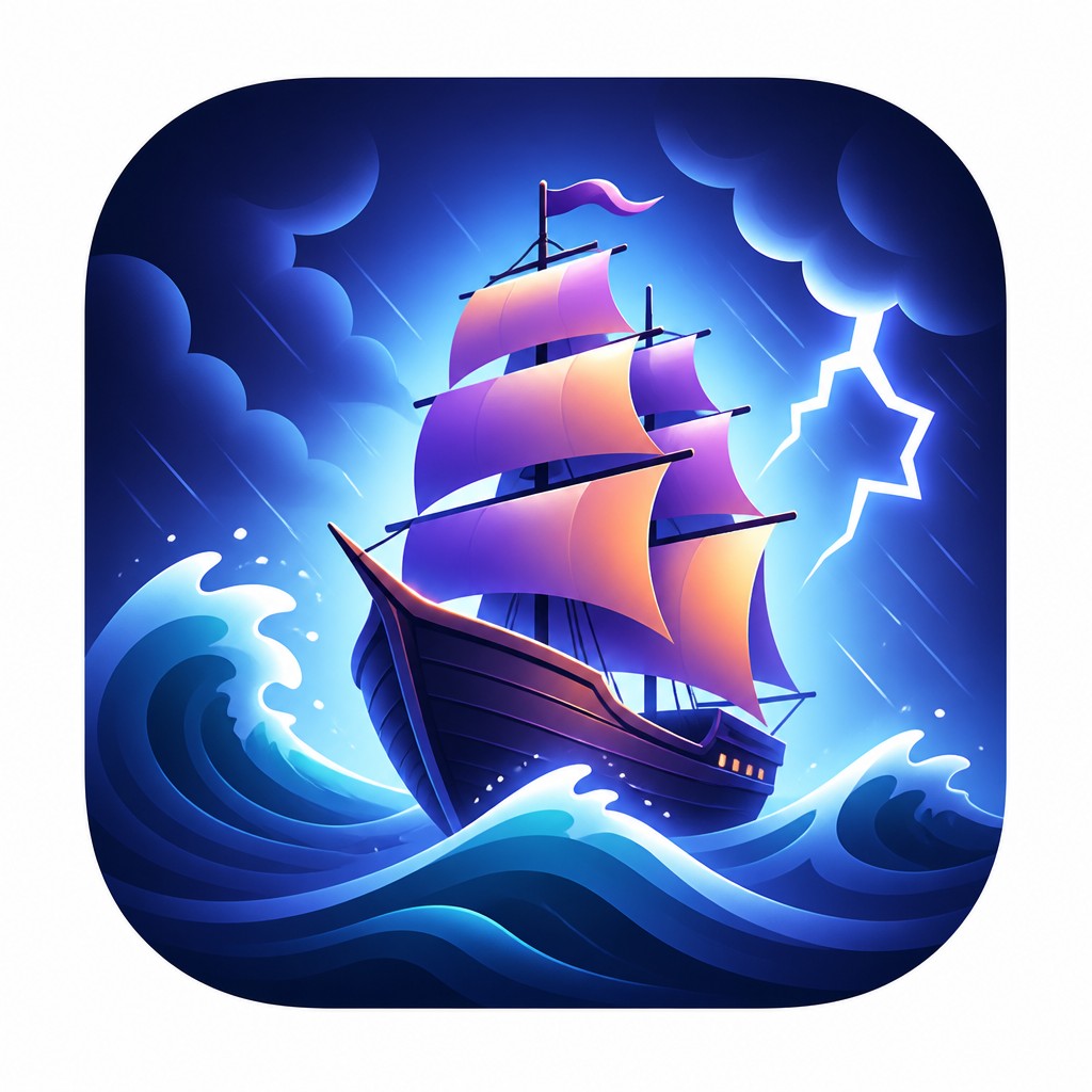
“sailing ship on a stormy sea”
How to Create Gradient Icon Design Art
Master the craft step by step — or skip straight to creating. Read the full guide →
- 1
Start with a strong icon silhouette
Begin by reducing the subject to its most recognizable outline and a few major internal shapes. If the form is not clear in black and white, the gradients will not rescue it.
- 2
Use gradients to describe volume, not decoration
Place light to dark transitions where a real surface would turn away from the viewer, such as edges, corners, and rounded faces. Keep the transitions smooth and controlled so the icon feels dimensional rather than painterly.
- 3
Limit the palette and plan color relationships
Choose a small set of harmonizing colors and let them shift gradually across the object. In digital work, use vector shapes or layered fills; in traditional media, you can approximate the look with airbrushing, marker blending, or carefully controlled glazing.
- 4
Add restrained highlights and shadows
Use bright highlight zones sparingly to suggest gloss, and keep shadows soft and localized. The effect should imply a luminous digital surface, not a fully realistic material study.
- 5
Compose for small-scale clarity
Test the design at icon size and simplify anything that becomes noisy or ambiguous. For prompt-based generation, specify clean vector edges, smooth luminous gradients, centered composition, and app-icon clarity.
The Story
History & Origins of Gradient Icon Design
Gradient Icon Design is not a historical art movement but a digital design language that emerged from late-20th- and early-21st-century interface graphics. It grew out of vector illustration, app-icon design, and the broader shift from flat symbolic marks toward more dimensional screen graphics as software, mobile devices, and branding systems demanded recognizability at a glance.
Its lineage includes the smooth color modeling of digital painting, the simplified geometry of pictograms, and the glossy surface effects popular in interface design, especially during the era of skeuomorphism and its later, more restrained successors. Contemporary versions preserve depth and polish while avoiding heavy realism, using gradient transitions as a functional tool for clarity, hierarchy, and visual appeal.
Influences: Gradient Icon Design draws from vector graphic design, pictograms, app icon systems, and the polished surface effects of late digital interface aesthetics. It also overlaps with the simplified geometry of modern logo design and, in its dimensional handling of light, with airbrush illustration and digital painting traditions that emphasize smooth tonal transitions. The result is less a single historical style than a convergence of interface-driven design principles and screen-based visual culture.

Frequently Asked Questions
What defines Gradient Icon Design?
It is defined by simplified icon shapes combined with smooth gradient fills, subtle depth, and polished highlights. The style keeps forms readable and compact while using color transitions to suggest volume and modern digital finish.
How is it different from flat icon design?
Flat icon design usually relies on solid colors with little or no shading, while Gradient Icon Design uses tonal transitions to create depth and surface variation. The extra modeling makes it feel more dimensional, but the structure remains clean and minimal.
How is it different from skeuomorphic icon design?
Skeuomorphic icons try to imitate real-world objects with more literal texture, material detail, and shadowing. Gradient Icon Design is more abstract and stylized, using color flow and highlight placement rather than realism to communicate form.
Where is this style commonly used?
It is common in app icons, dashboard graphics, interface symbols, product illustrations, and branding systems. It works especially well where a design needs to feel modern, friendly, and easy to recognize at small sizes.
Can this style be made traditionally, or is it only digital?
It is most associated with digital tools because gradients and vector edges are easy to control there, but the look can be approximated by hand. Airbrush, marker blending, gouache layering, and glazed paint effects can all produce a similar smooth dimensional feel.
What should I include in a prompt to get this look?
Ask for a simplified geometric subject, smooth luminous gradients, clean vector edges, soft dimensional depth, and bright highlight zones. Also request centered composition and balanced negative space so the result reads as an icon rather than a full illustration.
Create your first Gradient Icon Design artwork
Describe anything — or upload a photo — and see it in Gradient Icon Design in seconds.
Make Something with Gradient Icon Design
Compare Gradient Icon Design
Related Styles
Discover similar art styles