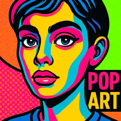
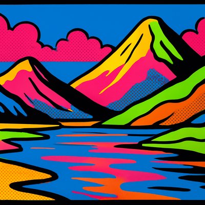
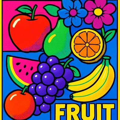
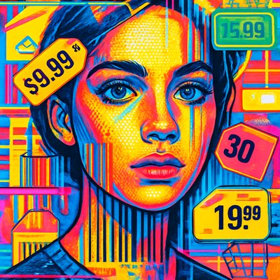
Neon Icon Design
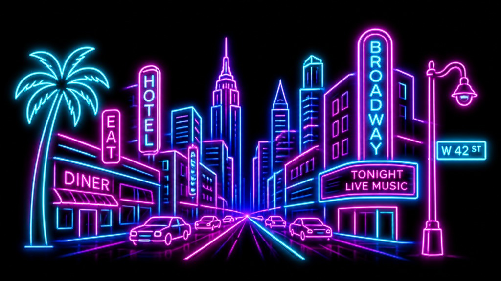
Glowing icon style with neon-tube outlines, bright cyan and magenta hues, dark backgrounds, and retro 1980s signage energy.
Instantly rendered in Neon Icon Design — or transform a photo
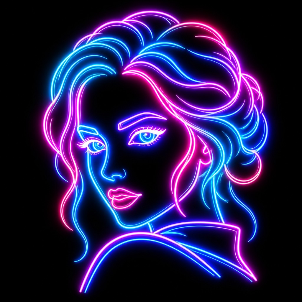
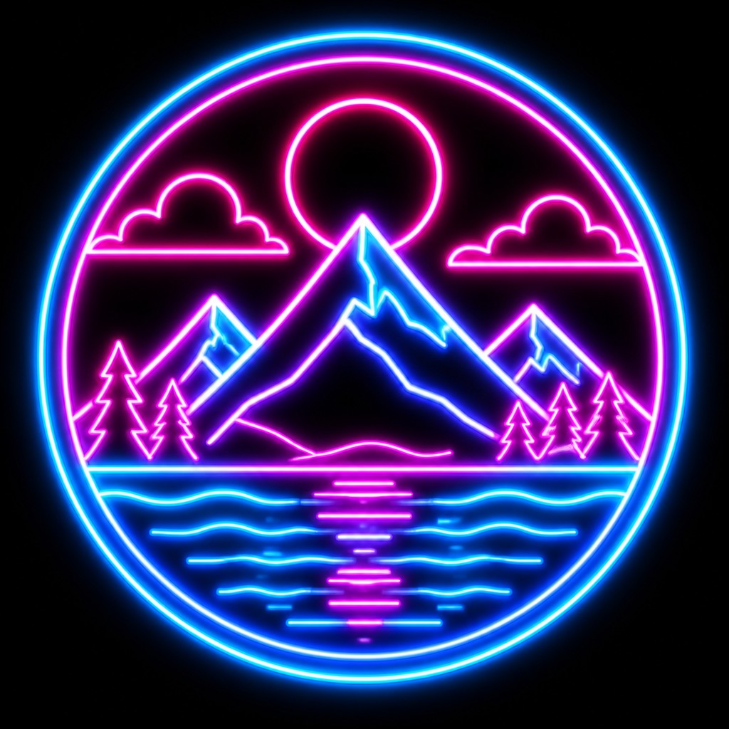
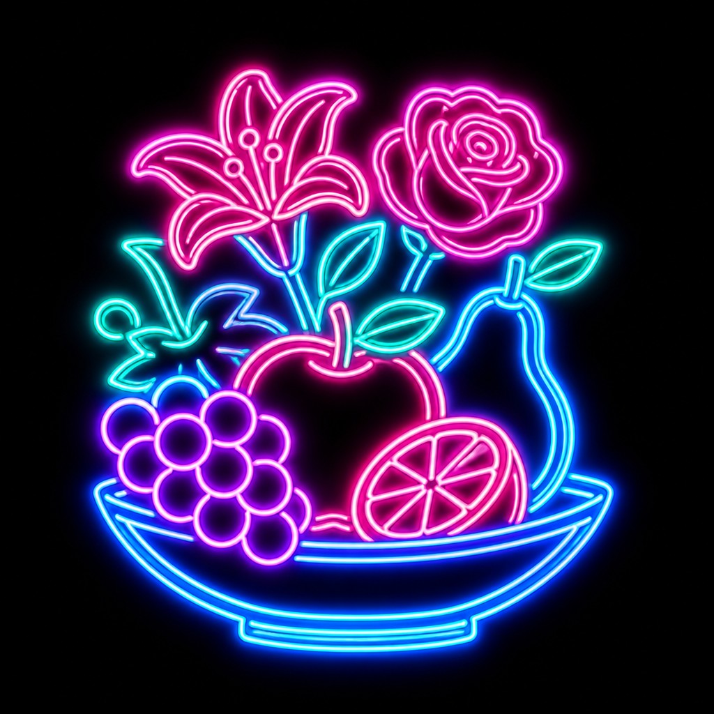
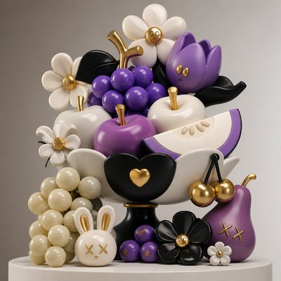
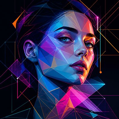
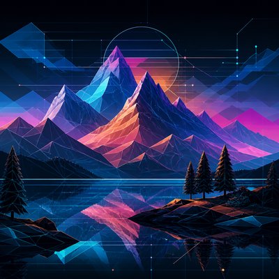
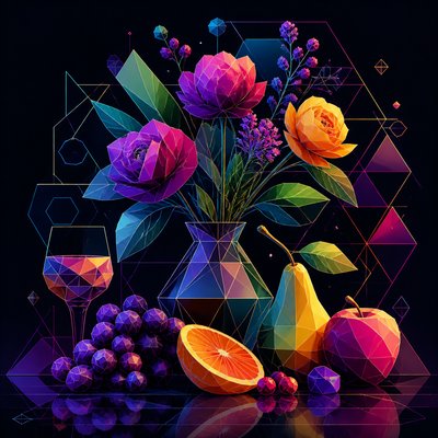
Neon Icon Design Gallery
Tap any artwork to explore it
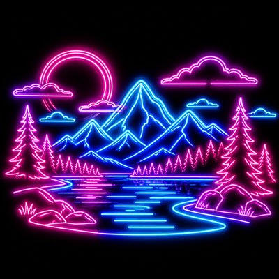
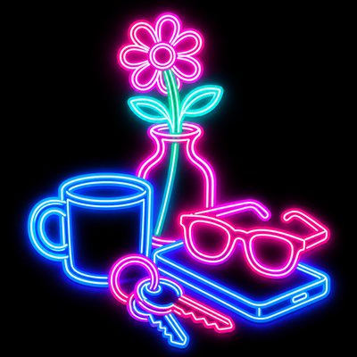
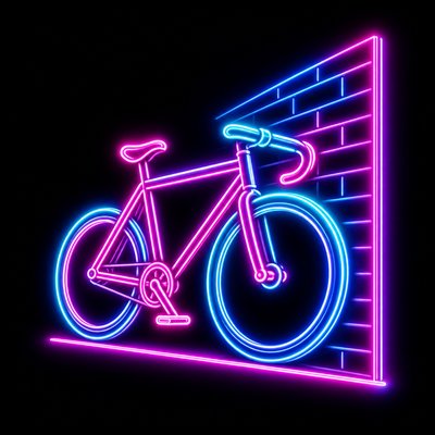

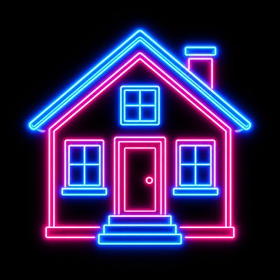
What is Neon Icon Design?
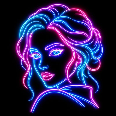
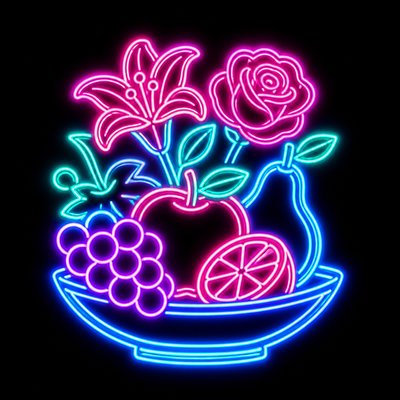
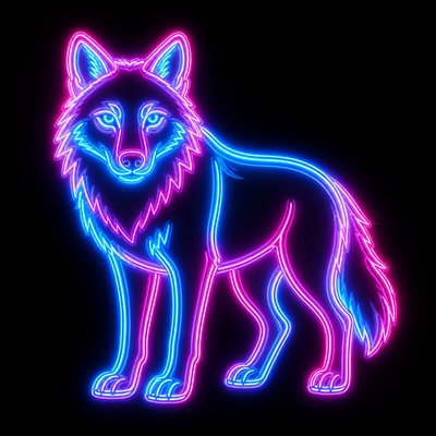
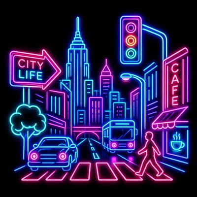
Neon Icon Design is a graphic style that turns simple symbols, objects, or characters into luminous sign-like emblems. Its core look is built from bold, minimal outlines that resemble bent glass neon tubes, usually in cyan, magenta, hot pink, and electric blue, set against a very dark background so the glow can dominate the image.
The style reads instantly because it combines strong silhouette design with intense atmospheric light. Soft halation, color bleed, and a clean double-line tube structure make each icon feel as if it is floating in negative space. Visually, it draws on the language of commercial neon signage, 1980s retro-futurism, and the simplified clarity needed for logos and UI icons.
Try It On Your Photos
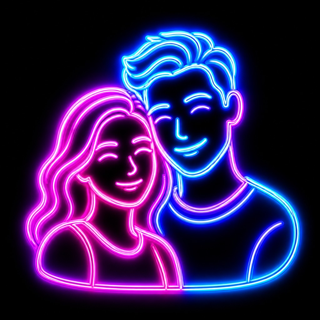
Upload any photo and convert it into Neon Icon Design — drag the sliders to compare before and after.


What Defines Neon Icon Design
The signature details, up close
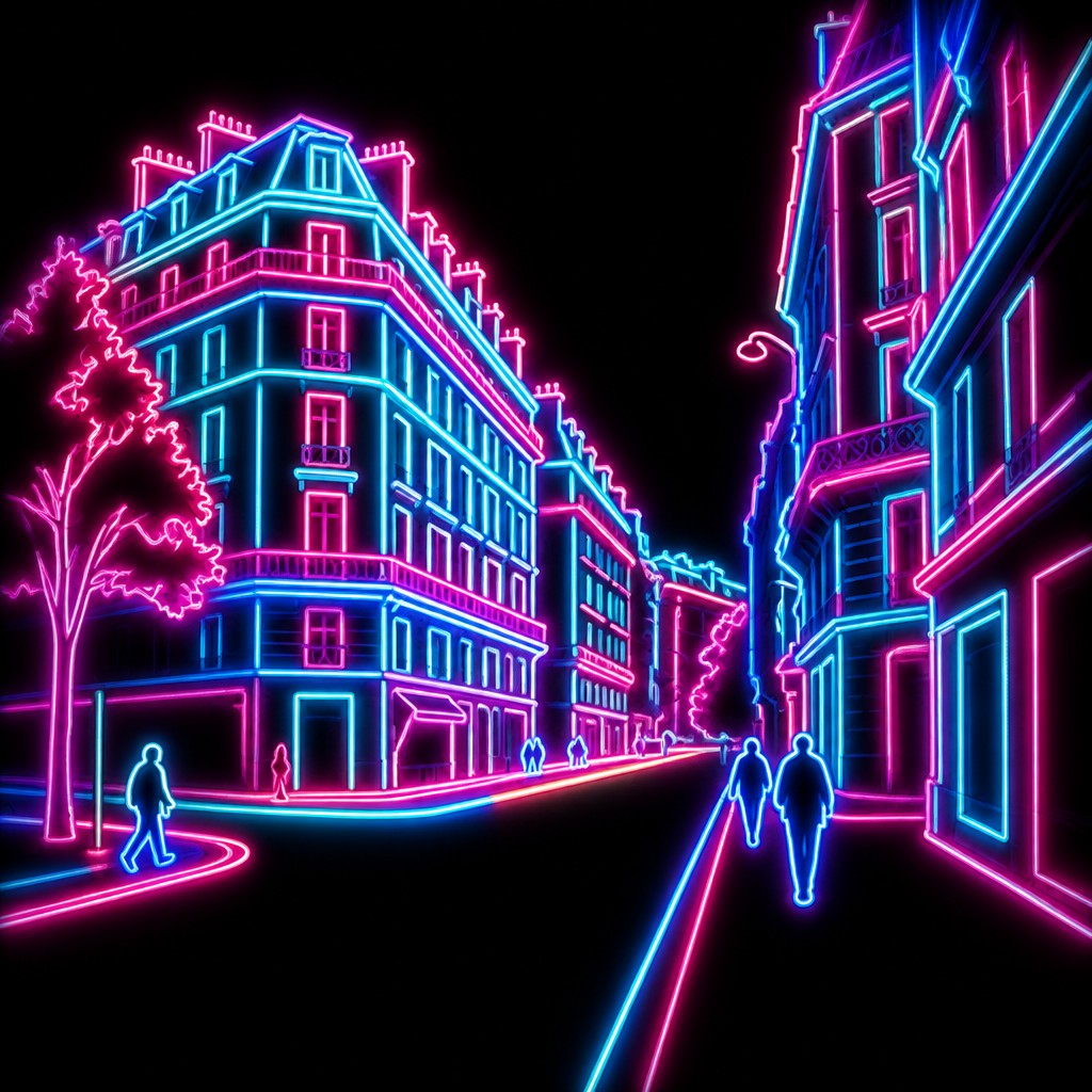
Luminous tube outlines
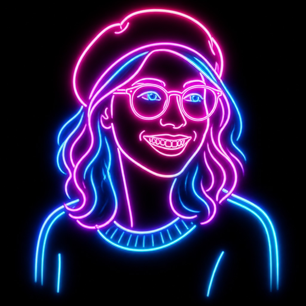
Forms are built from clean, continuous lines that imitate bent neon glass tubing. The outline is usually the main structural element, with minimal interior detail.
High-contrast dark ground
A deep black or near-black background is essential because it allows the glow to read clearly. The icon appears to emit its own light into surrounding darkness.
Electric color palette
Cyan, magenta, hot pink, and electric blue are the most common hues. These saturated colors create the synthetic, nightlife-driven feel associated with neon signage.
Soft halation and bloom
The edges of the tubing are surrounded by a visible halo. This bleed of light softens the icon's edges and makes it feel radiant rather than flat.
Minimal, emblematic silhouette
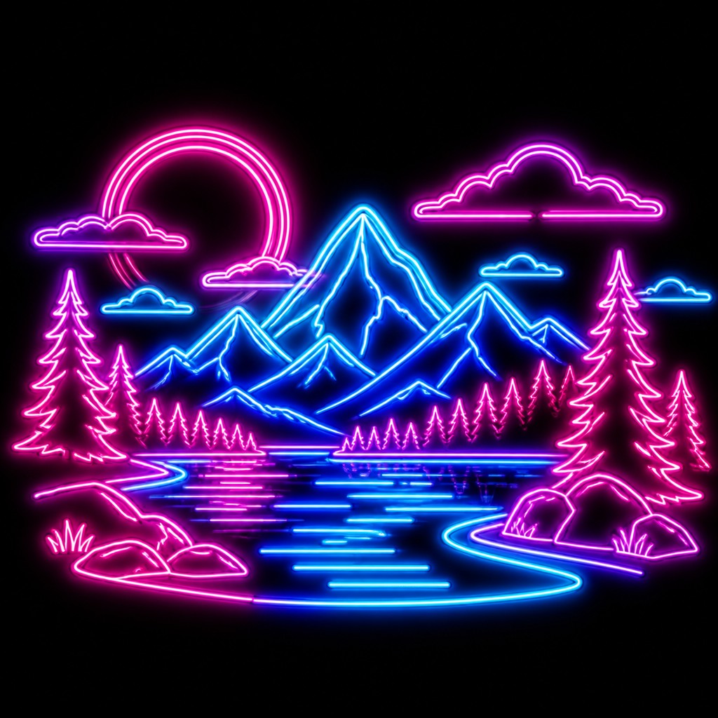
The subject is simplified into a strong, instantly recognizable symbol. Excessive texture and realism are usually avoided so the design remains sign-like.
Retro-1980s atmosphere
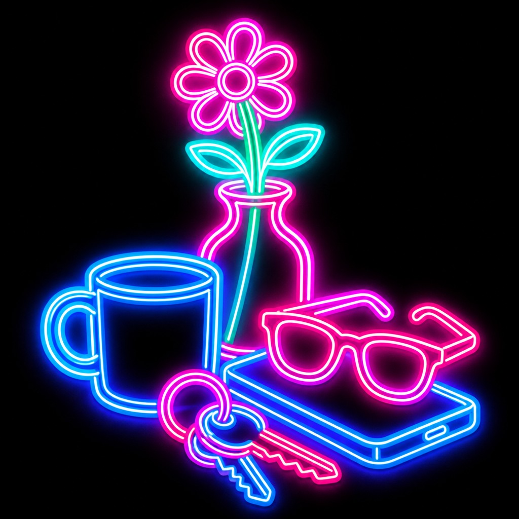
The overall effect often evokes arcade marquees, nightclub signage, and synth-era visual culture. Even when the subject is contemporary, the lighting gives it a nostalgic period feel.
Try It
Create Videos in Neon Icon Design
Styles aren't just for stills — describe a scene or animate an image and get a short video rendered in Neon Icon Design. Press play to see this pond come to life.
Make a VideoNeon Icon Design Prompt Ideas
Start from an idea — each one opens the generator with the style ready to go. See all 40 Neon Icon Design prompts →
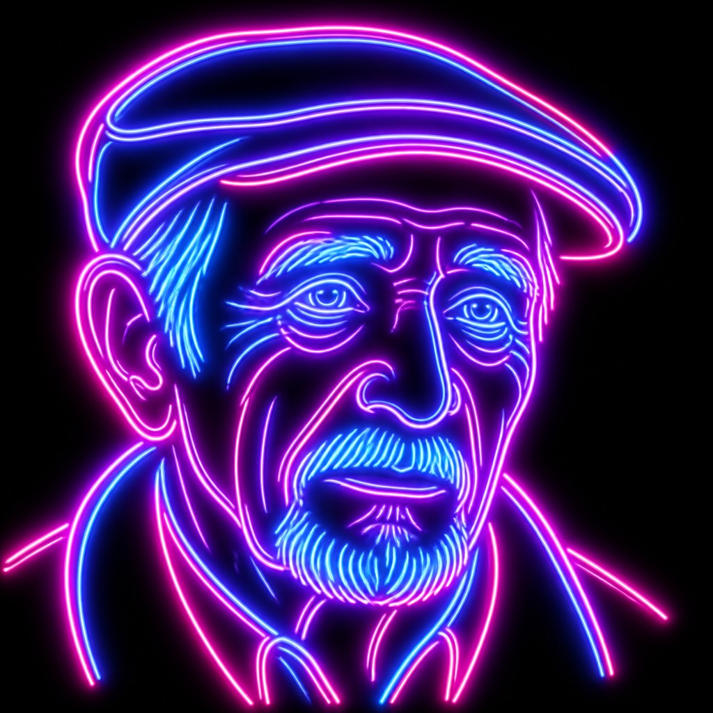
“close-up portrait of an elderly person with expressive weathered features”
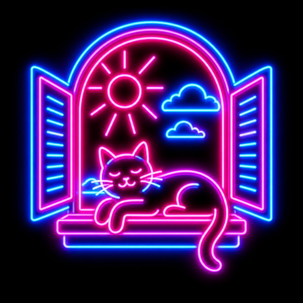
“a cat lounging in a sunlit window”
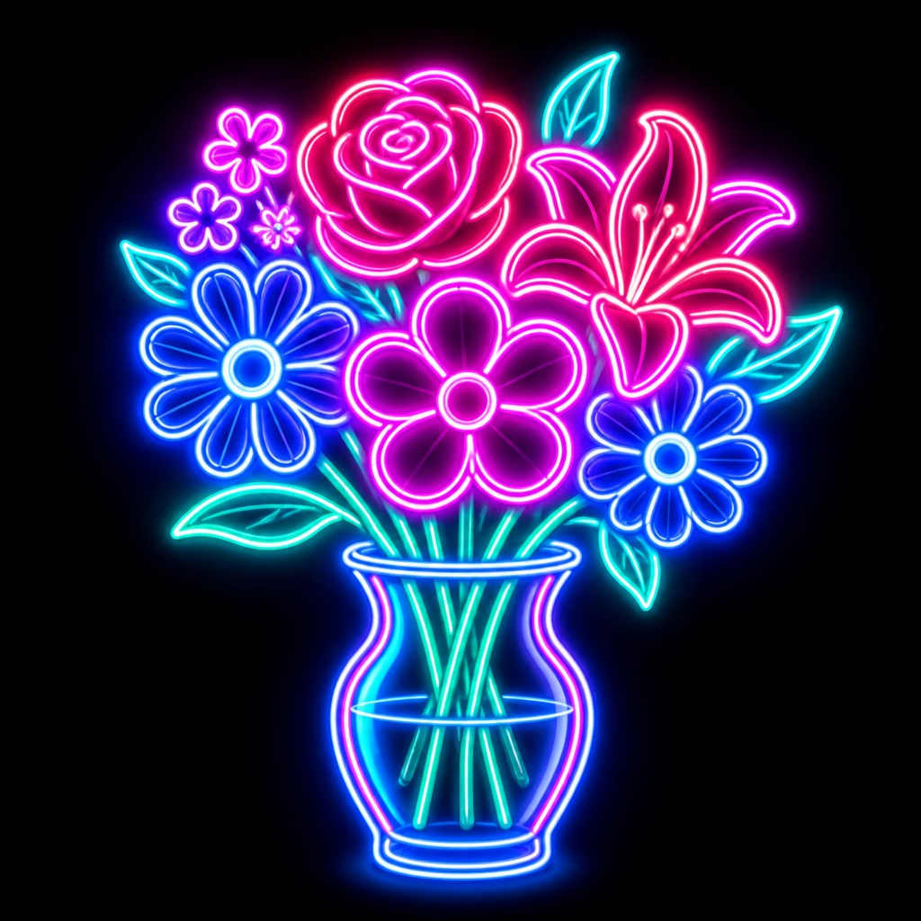
“bouquet of flowers in a glass vase”
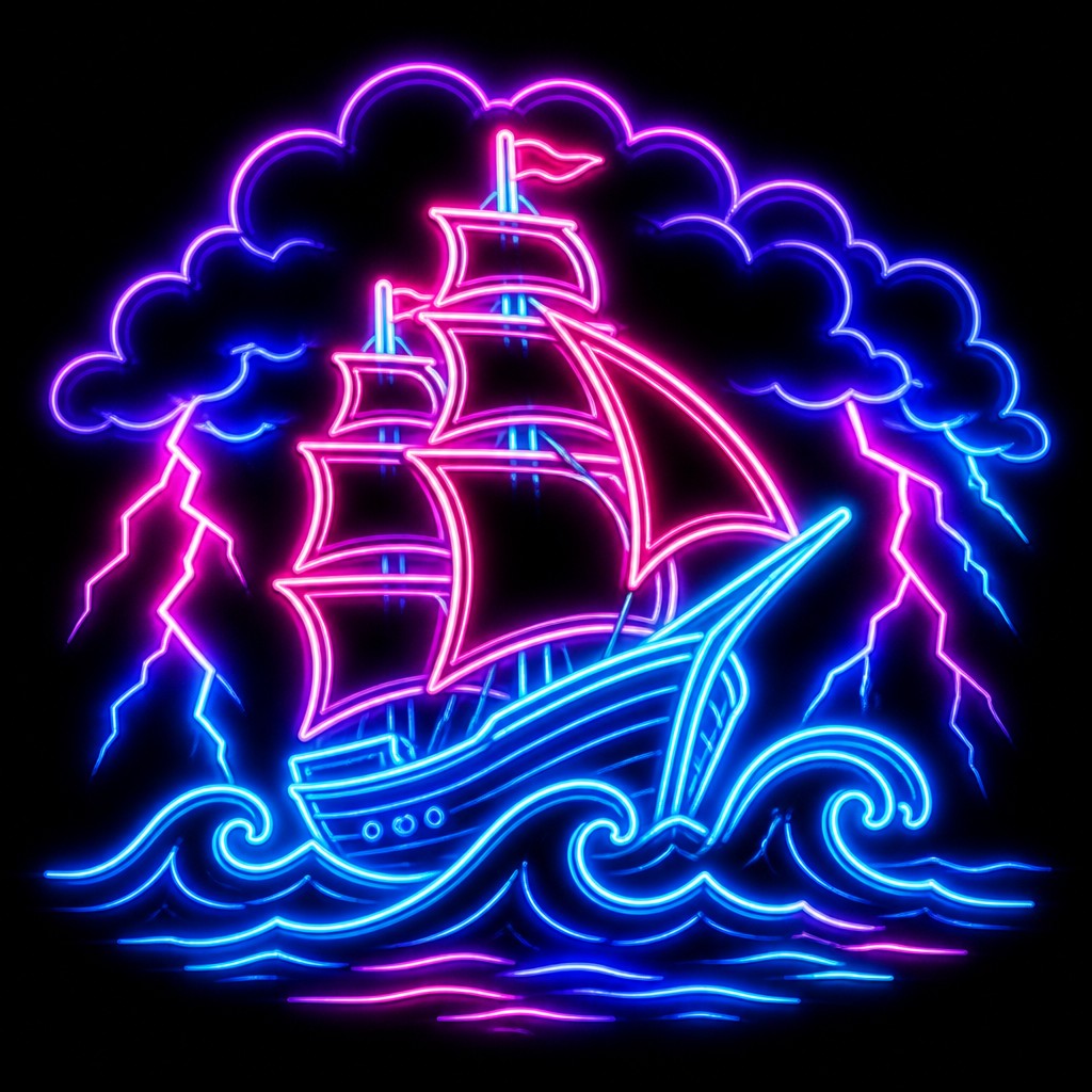
“sailing ship on a stormy sea”
How to Create Neon Icon Design Art
Master the craft step by step — or skip straight to creating. Read the full guide →
- 1
Start with a simple silhouette
Choose a subject that can be read at a glance, then reduce it to its most essential contours. In traditional work, sketch a clean outline first; in digital work, build the form as a vector-like shape or a simplified line drawing.
- 2
Use tube logic, not ordinary linework
Neon looks convincing when the stroke behaves like a glass tube with an illuminated core. Keep line thickness consistent and slightly rounded, and allow corners to bend or connect like signage tubing.
- 3
Control the glow carefully
Place a bright core line inside a softer outer halo, using layered opacity or blur to imitate halation. Too much bloom can flatten the icon, so preserve a crisp edge where the tubing is most legible.
- 4
Work against darkness
Use a deep black or very dark background to maximize contrast and make the color feel luminous. Leave negative space around the icon so the glow can breathe and read as emitted light.
- 5
Emphasize saturated neon hues
Favor a limited palette of vivid cyan, magenta, pink, and blue, with occasional violet or acid green accents. If working with paint or markers, choose high-chroma colors and add brighter highlights at the tube core.
- 6
Prompt for signage and glow effects
When generating digitally, describe the subject, the simplified icon form, luminous glass neon tubes, vibrant color, soft halation, and black background. Mention that the image should look like a retro sign or emblem floating in darkness.

The Story
History & Origins of Neon Icon Design
Neon Icon Design is not a historical movement in the traditional sense; it is a contemporary graphic aesthetic that synthesizes several older visual traditions. Its most direct lineage comes from neon advertising and storefront signage of the 20th century, especially the polished commercial look associated with mid-century urban nightlife and the bright, synthetic palette later romanticized by 1980s pop culture and retro-futurist design.
The style also inherits from modern iconography and logo design, where forms are reduced to their most legible contours, and from digital glow effects popular in motion graphics, album art, gaming visuals, and online interface culture. In digital and image-generation contexts, it has become a recognizable shorthand for energetic nightlife, cyberpunk-adjacent mood, and nostalgic electronic aesthetics.
Influences: Neon Icon Design draws from commercial neon signage, 1980s graphic design, and the simplified symbol language of logos and pictograms. It also overlaps with retro-futurism, synthwave, and cyberpunk visual culture, while borrowing the clean readability of modern icon design and the theatrical glow effects common in digital illustration and motion graphics.
Frequently Asked Questions
What defines Neon Icon Design?
It is defined by a simplified symbol or object outlined as if made from glowing neon tubes. The essential ingredients are saturated neon colors, a very dark background, and a visible halo or bloom around the strokes. The result should feel like a sign or emblem rather than a realistic illustration.
How is it different from synthwave or cyberpunk art?
Synthwave and cyberpunk are broader visual cultures that can include landscapes, characters, and narrative scenes. Neon Icon Design is narrower and more graphic: it focuses on isolated icons, symbols, or emblems presented with neon sign lighting. It can borrow the mood of those genres without adopting their full subject matter.
Can this style be used for logos and branding?
Yes, because it is inherently emblematic and high-contrast. It works well for nightlife brands, music visuals, entertainment graphics, and app or game icons that need a bold luminous identity. The key is to keep the silhouette simple enough to remain readable at small sizes.
What subjects work best in this style?
Subjects with clear outlines and instantly recognizable shapes work best, such as hearts, skulls, animals, musical symbols, cocktails, tools, or simple fantasy emblems. Complex scenes can lose clarity because the style depends on strong contour and negative space.
How do I make it look like real neon instead of just a glowing outline?
Use a bright inner core, a slightly thicker surrounding tube, and a soft outer glow that diffuses into the background. Real neon also tends to have rounded bends and a subtle unevenness from glass-tube construction, so overly perfect digital lines can feel less convincing.
Where is this style commonly used?
It appears in music visuals, event posters, nightlife branding, game icons, motion graphics, and retro-themed digital art. It is also common in social media graphics because the strong contrast and saturated color make it easy to recognize quickly.
Create your first Neon Icon Design artwork
Describe anything — or upload a photo — and see it in Neon Icon Design in seconds.
Make Something with Neon Icon Design
Related Styles
Discover similar art styles