Duotone Icon Design
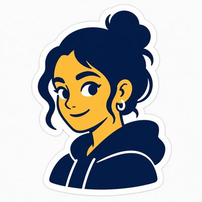
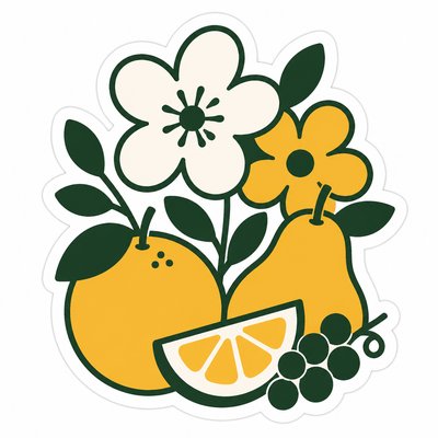
Minimalist icons built from exactly two contrasting colors, designed for clarity, brand consistency, and instant recognition.
Instantly rendered in Duotone Icon Design — or transform a photo


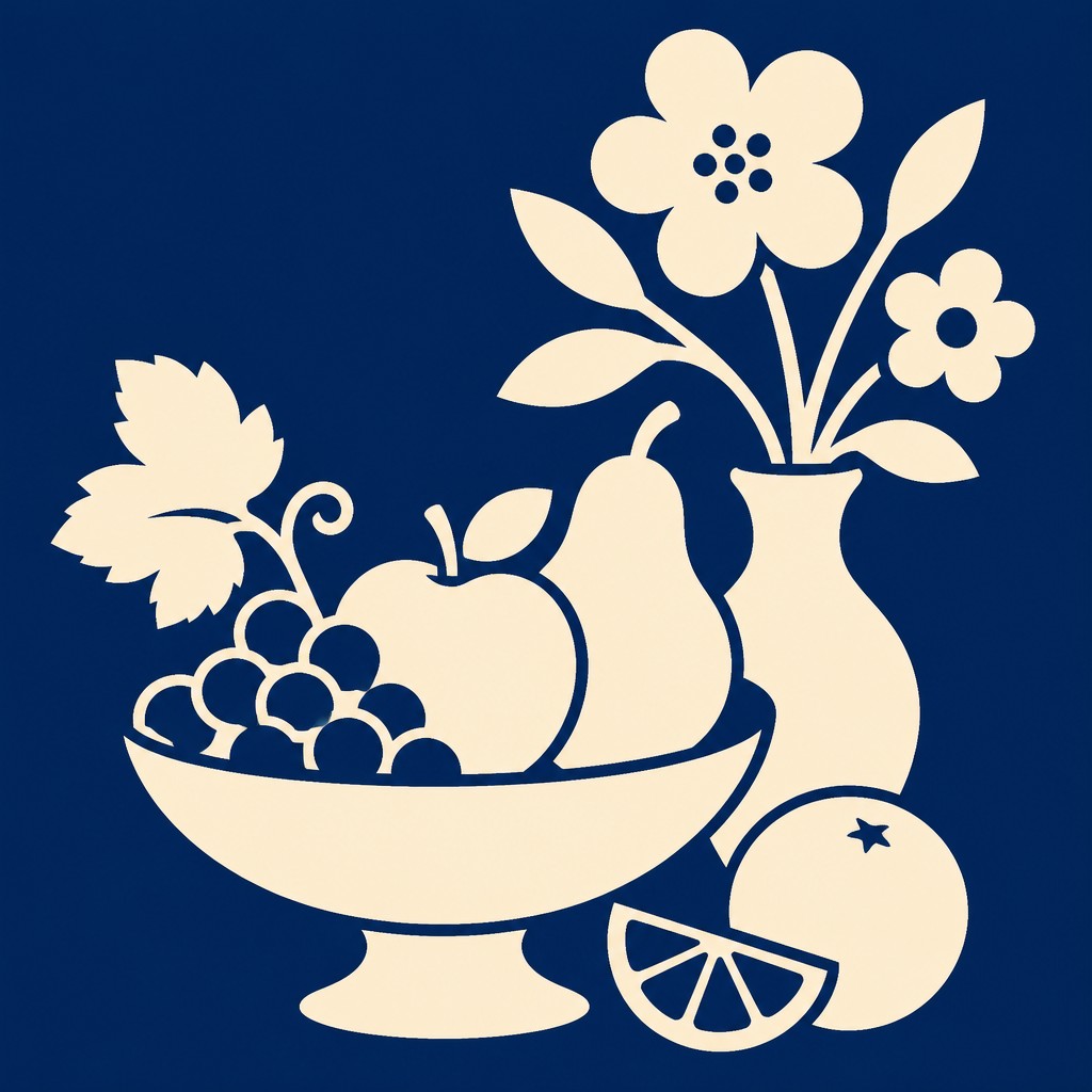
Duotone Icon Design Gallery
Tap any artwork to explore it



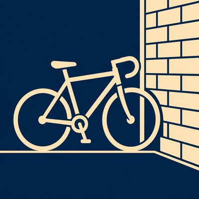


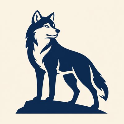

What is Duotone Icon Design?
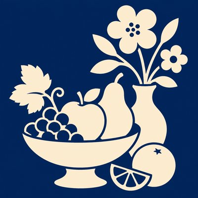
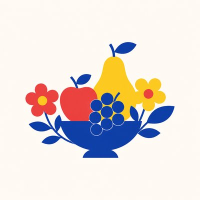
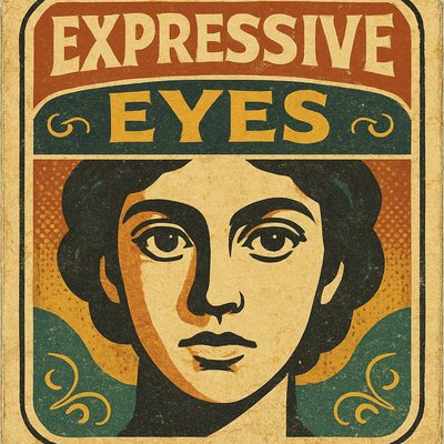
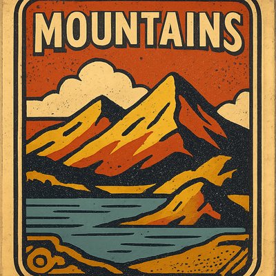
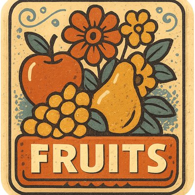
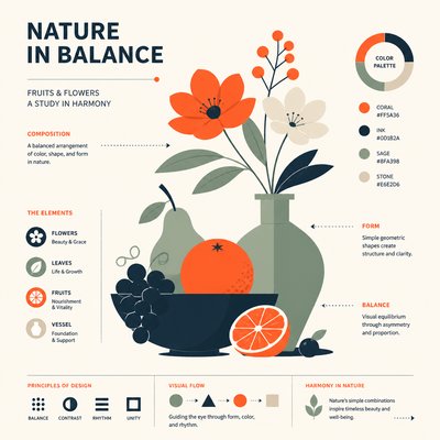
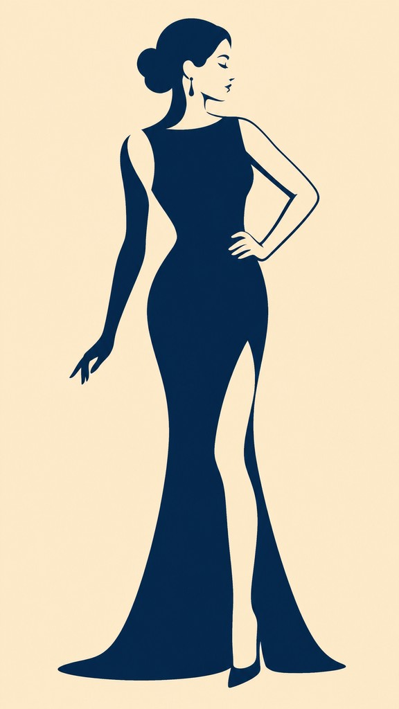
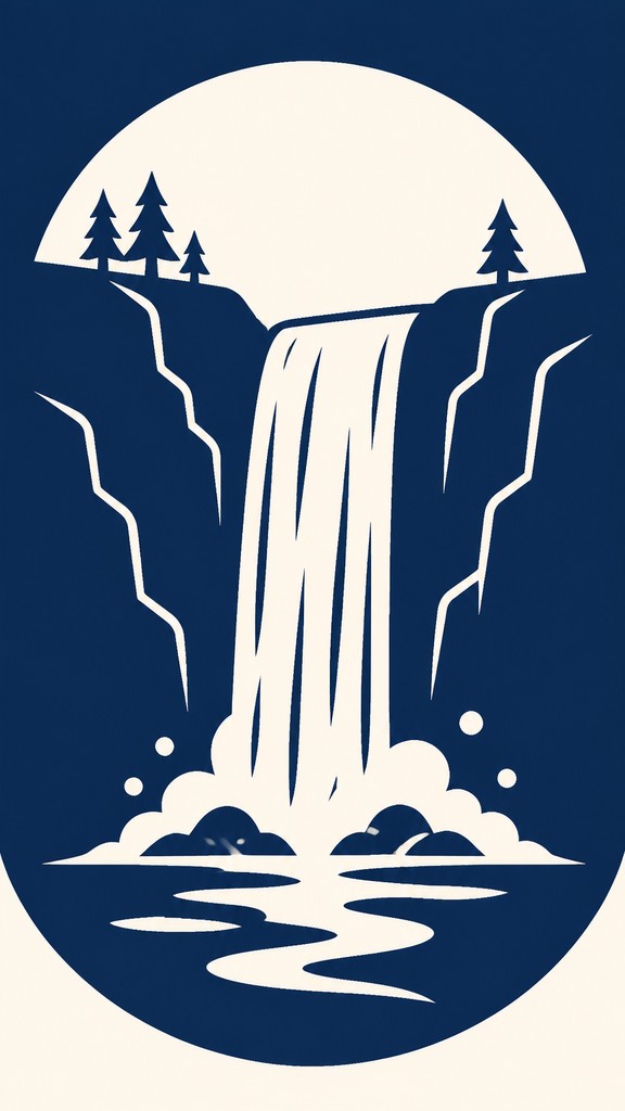
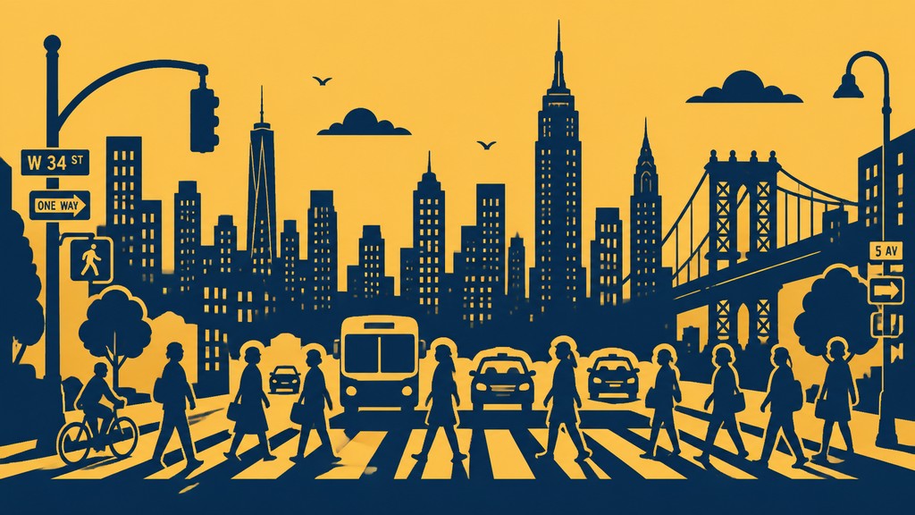
Duotone icon design is a graphic style in which an image is reduced to a simplified, instantly readable symbol made from only two flat colors. The subject is distilled to its essential silhouette and core details, with strong contrast doing most of the visual work. Rather than describing form through modeling or texture, the design depends on shape, proportion, and negative space.
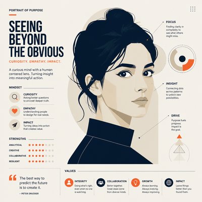
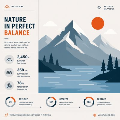
The result is clean, compact, and highly legible at small sizes. One color typically serves as the dominant fill, while the second color acts as an accent to separate forms, define depth, or highlight a key feature. This economy of means makes duotone icons especially effective in interfaces, branding systems, editorial graphics, and app design, where consistency and quick recognition matter more than realism.

Try It On Your Photos
Upload any photo and convert it into Duotone Icon Design — drag the sliders to compare before and after.


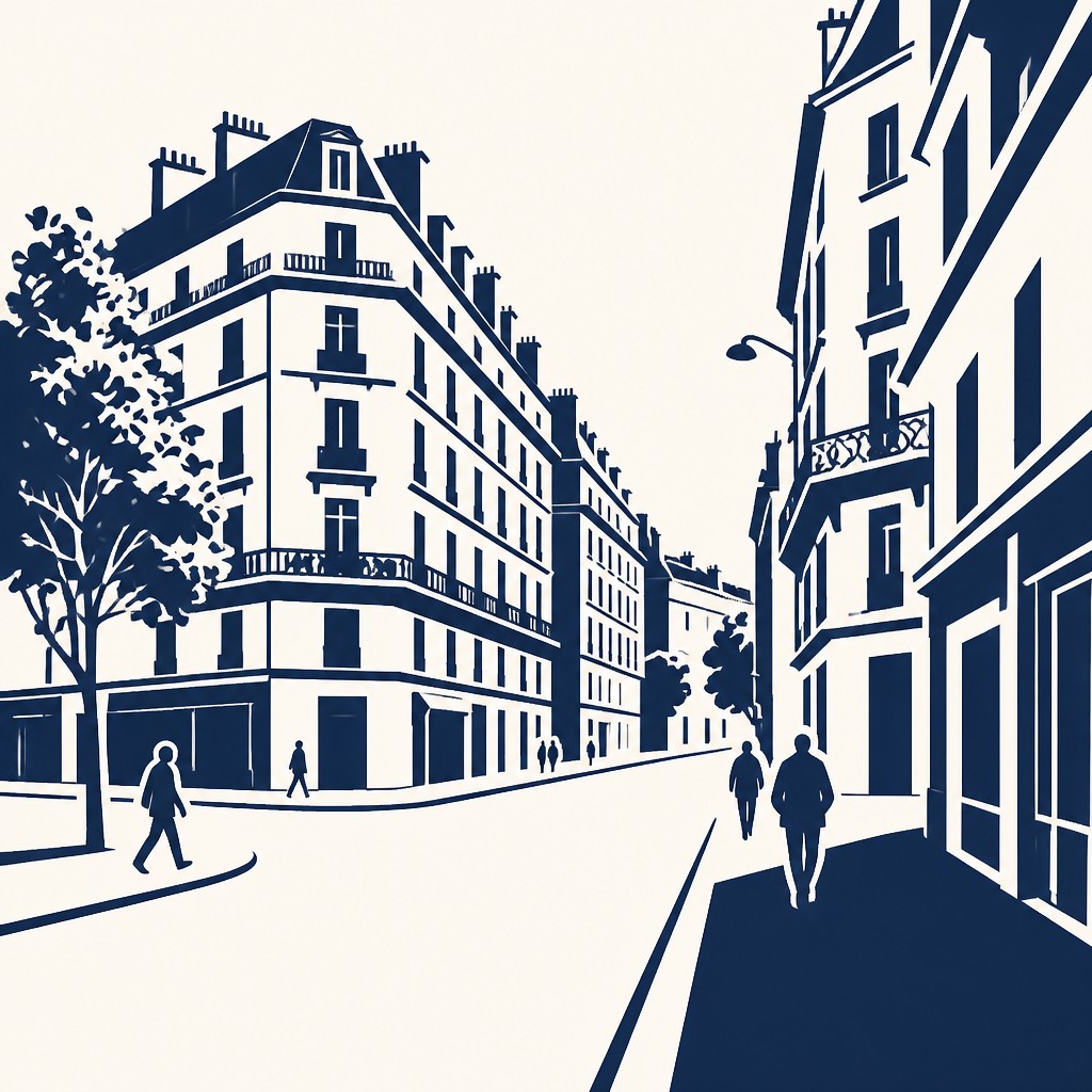

What Defines Duotone Icon Design
The signature details, up close
Exactly two colors
The image uses only two flat hues, usually with high contrast. This strict palette creates immediate visual separation and gives the icon a unified brand-ready appearance.
Simplified silhouette
Forms are reduced to their most recognizable outline and major internal divisions. Excess detail is removed so the subject can be identified at a glance.
Flat vector construction
The look is clean and digital, with crisp edges and smooth curves. There is no gradient, painterly texture, or volumetric shading.
Active negative space
Empty space is used as part of the design, not just as background. Gaps and cutouts help define the icon’s shape and improve readability.

Balanced geometry
The composition is usually carefully centered and proportioned for visual stability. Curves, angles, and spacing are arranged to feel intentional and modular.

Uniform visual weight
Line thickness and shape density remain consistent throughout the icon. This keeps the symbol cohesive and prevents any part from overpowering the rest.
Try It
Create Videos in Duotone Icon Design
Styles aren't just for stills — describe a scene or animate an image and get a short video rendered in Duotone Icon Design. Press play to see this pond come to life.
Make a VideoDuotone Icon Design Prompt Ideas
Start from an idea — each one opens the generator with the style ready to go. See all 40 Duotone Icon Design prompts →
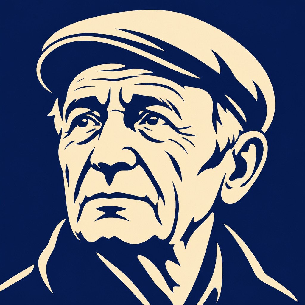
“close-up portrait of an elderly person with expressive weathered features”
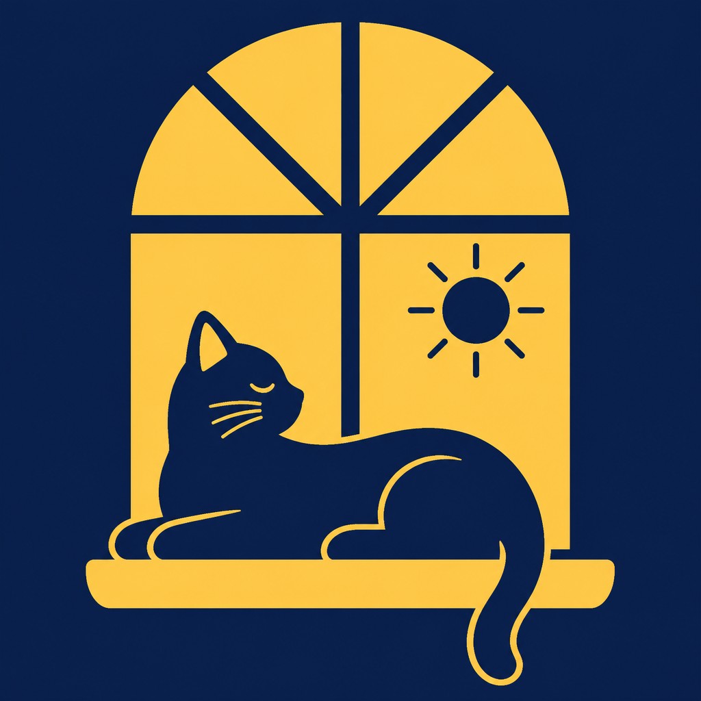
“a cat lounging in a sunlit window”
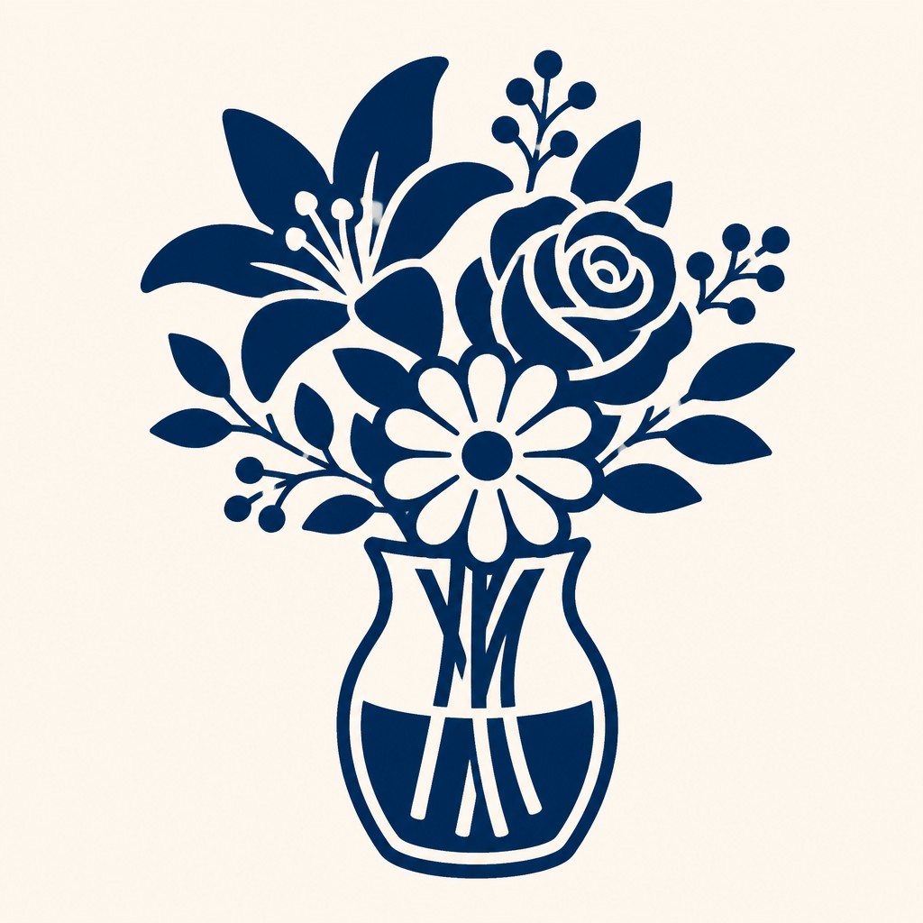
“bouquet of flowers in a glass vase”
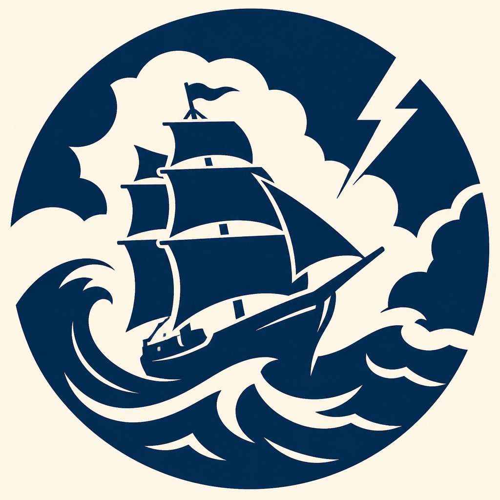
“sailing ship on a stormy sea”
How to Create Duotone Icon Design Art
Master the craft step by step — or skip straight to creating. Read the full guide →
- 1
Start with a recognizable silhouette
Begin by reducing the subject to its most essential outlines and omit secondary details. If the icon is unclear when scaled down, simplify it further before adding any accent shapes.
- 2
Limit the palette to two flat tones
Choose one dominant color and one contrasting accent with strong value separation. Avoid gradients, transparency, shadows, and textures so the two-color relationship stays explicit.
- 3
Design with negative space
Use cutouts and internal voids to suggest detail rather than drawing everything directly. This keeps the icon compact while preserving clarity and visual interest.
- 4
Keep geometry consistent
Match corner radii, curve behavior, and stroke logic across the whole icon set. In digital work, build on vector paths; in traditional work, plan with clean stencil-like shapes and even fills.
- 5
Test at small sizes
Shrink the icon repeatedly to verify that it remains legible as a favicon, app tile, or UI symbol. Remove any details that disappear at small scale.
- 6
If generating with prompts, specify constraints clearly
Describe the subject plus the two-color rule, flat fills, and vector-like simplicity. Emphasize that the icon should be minimal, centered, high-contrast, and free of shading or texture.
The Story
History & Origins of Duotone Icon Design
Duotone icon design belongs to the broader lineage of modernist graphic reduction, drawing on the clarity of Swiss-style design, pictograms, and mid-20th-century information graphics. Its emphasis on simplified contours and functional legibility also connects to logo design, signage systems, and the visual language of interface icons developed for digital products.
As screen-based design became central to everyday communication, two-color icon systems grew popular for creating scalable visual identities that remain coherent across devices and platforms. The style is not tied to one historic movement in the way that Cubism or Art Nouveau are; instead, it synthesizes principles from minimalist graphic design, vector illustration, and pictographic communication into a contemporary, utility-driven aesthetic.
Influences: Duotone icon design is closely related to modernist graphic design, especially the reductive visual logic of Swiss typography, pictograms, and signage systems. It also overlaps with corporate identity design and interface iconography, where clarity and consistency are prioritized over expressive rendering. For historical context, its discipline of simplification can be compared to the structural clarity of a leading mid-20th-century corporate identity designer’s logo work and the pictographic communication principles seen in public information design, though the style itself is a contemporary synthesis rather than a single historical school.
Frequently Asked Questions
What defines duotone icon design?
It is defined by the use of exactly two colors, simplified shapes, and strong contrast. The subject is reduced to a readable symbol rather than a detailed illustration, with negative space doing much of the descriptive work.
How is it different from flat design or regular vector icons?
Flat design can use many colors, while duotone icon design is restricted to two. Compared with general vector icons, duotone icons are more conceptually unified because the palette rule is part of the style, not just the drawing method.
Why are two colors used instead of one?
The second color helps separate major forms, create emphasis, and improve recognition without adding complexity. It also gives the icon more visual depth while preserving a minimal, brand-consistent look.
Where is this style commonly used?
It is widely used in apps, websites, dashboards, branding systems, editorial graphics, and product interfaces. The style works especially well wherever icons need to stay clear at small sizes and across many applications.
How do you make a duotone icon that still reads clearly?
Focus on one instantly recognizable silhouette and remove any detail that does not survive thumbnail scale. Use contrast, spacing, and internal cutouts to communicate the subject instead of relying on texture or shadow.
Can duotone icons be hand-drawn as well as digital?
Yes. Traditional sketches can be traced into clean shapes, but the final result should still feel vector-like and controlled. Digital tools are especially well suited because they make it easier to enforce consistent curves, flat fills, and exact color limits.
Create your first Duotone Icon Design artwork
Describe anything — or upload a photo — and see it in Duotone Icon Design in seconds.
Make Something with Duotone Icon Design
Compare Duotone Icon Design
Related Styles
Discover similar art styles