Duotone Icon Design vs Gradient Icon Design: What's the Difference?
Duotone icon design uses exactly two contrasting colors to build simple, highly legible icons. It relies on flat shapes, clear silhouettes, and strong visual separation so symbols stay recognizable at small sizes and across different backgrounds.
Gradient icon design uses smooth color transitions, glossy depth, and clean vector geometry to create a more dimensional, polished look. People compare these styles because both aim for modern clarity in digital interfaces, but they differ in mood: duotone feels strict and system-driven, while gradients feel richer and more expressive.
Same Prompt, Both Styles
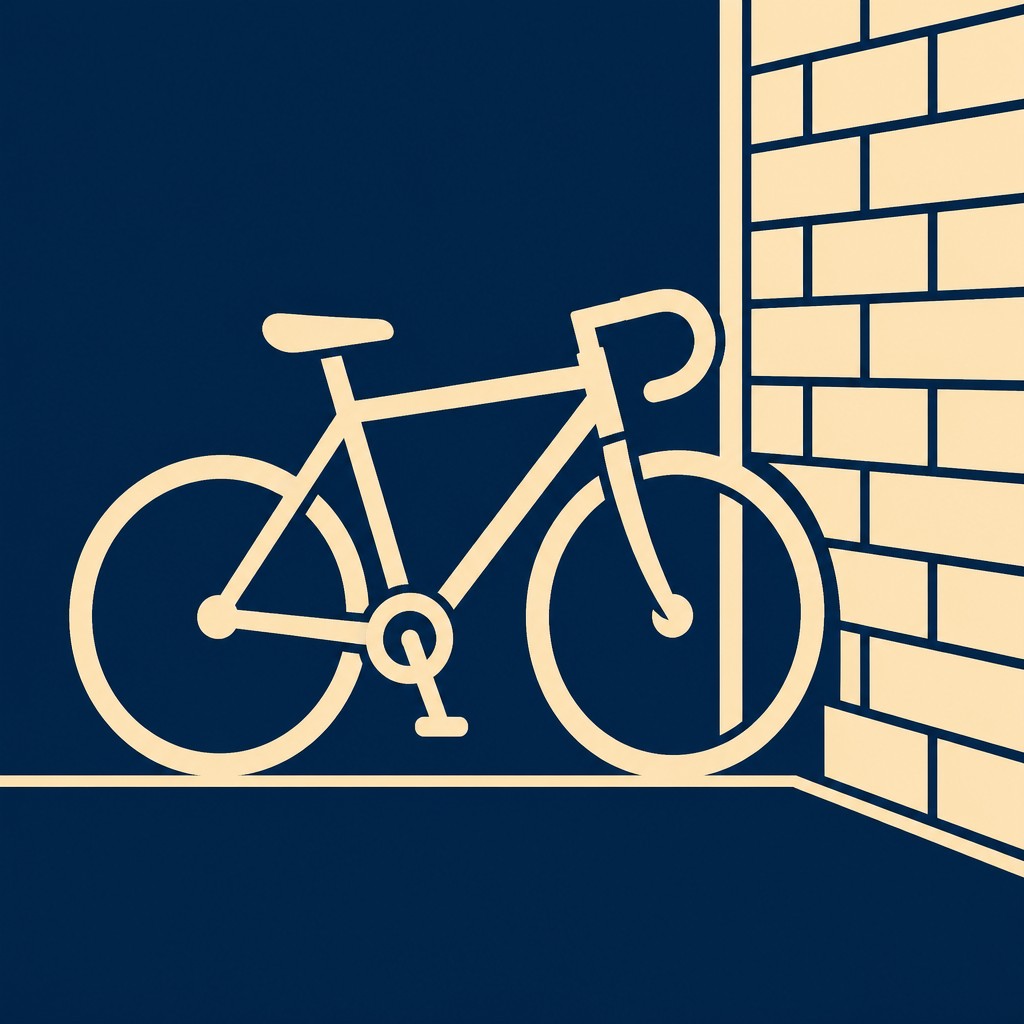
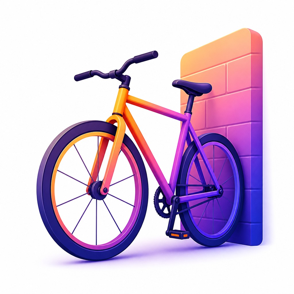
Each pair below was generated from the identical prompt — only the style changed.
“portrait of two people together”


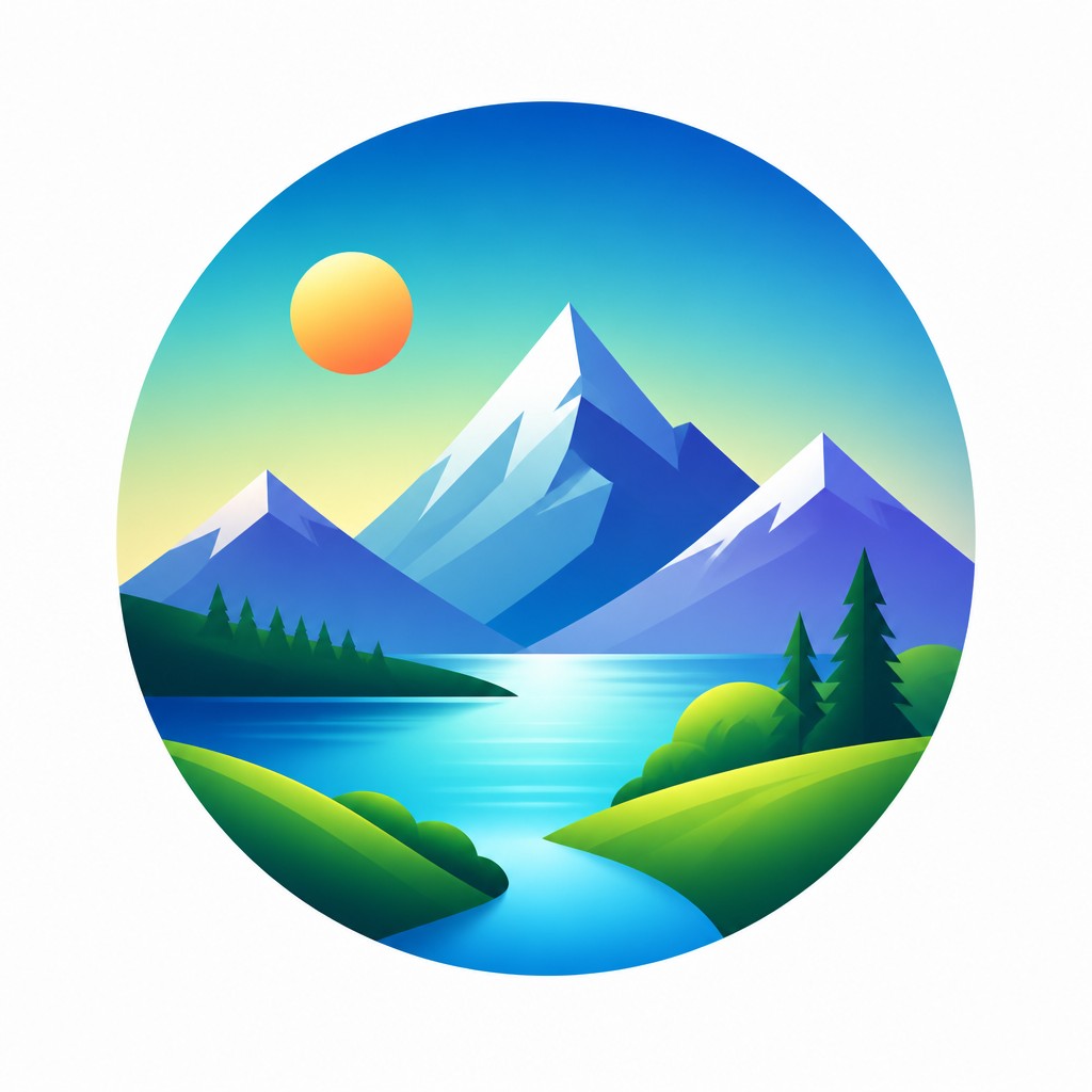
“wide landscape with natural scenery”

“still life with everyday objects”


“bicyle resting against a wall”
Key Differences
| Duotone Icon Design | Gradient Icon Design | |
|---|---|---|
| Color treatment | Exactly two contrasting colors, with no additional tones. | Multiple blended hues create smooth transitions and depth. |
| Visual depth | Mostly flat, with emphasis on shape and contrast. | Suggests volume through highlights, shading, and gradients. |
| Readability | Excellent at tiny sizes due to strong simplification. | Readable, but fine gradient details can soften at small scales. |
| Brand feel | Structured, restrained, and consistent across a system. | Polished, modern, and often more premium or lively. |
| Shape language | Depends on bold silhouettes and minimal internal detail. | Uses clean vector forms plus color to add dimension. |
| Use cases | Works well for interfaces needing uniformity and clarity. | Works well for apps, marketing, and visually expressive products. |
| Mood | clean, modern, bold, professional | polished, sleek, modern, playful |
| Energy | balanced | balanced |
| Detail level | minimal | moderate |
| Color | two flat contrasting brand colors | bright gradients, luminous highlights, soft shadows |
| Texture | flat, smooth, no surface texture | smooth, glossy, softly dimensional |
| Origin | digital-native aesthetic | digital-native aesthetic |
| Best for | app icons, UI systems, brand assets, infographics, wayfinding, editorial graphics | app icons, UI symbols, brand marks, infographics, mobile interfaces, product illustrations |
| Difficulty | beginner-friendly | moderate |
Which Should You Choose?
Choose duotone icon design if you need maximum clarity, strict brand consistency, or icons that must work well in small sizes and across many interface contexts. Choose gradient icon design if you want a more polished, contemporary look with richer visual appeal and can support slightly more complex rendering. In practice, duotone often suits systems and dashboards, while gradients fit products that want warmth, depth, or a more premium finish.
Frequently Asked Questions
Which style is easier to recognize at small sizes?
Duotone is usually easier to recognize because it depends on strong contrast and simplified shapes. Gradient icons can still work well, but subtle transitions may become less distinct when scaled down.
Which style is better for a consistent brand system?
Duotone is often better for consistency because the two-color rule creates a tight visual system. Gradient icons can also be consistent, but they usually require more careful control of color, lighting, and depth.
Do gradient icons always look more modern than duotone icons?
Not always. Gradient icons often feel more dimensional and polished, but duotone can look equally modern when paired with clean geometry and thoughtful color choices.
Can these styles be used together in one product?
Yes, but only with clear rules. A mixed system works best when one style is primary and the other is limited to specific contexts, so the interface does not feel visually inconsistent.