Line Art Icon Design
Clean single-line icons with clear silhouettes, uniform strokes, and minimal geometry for scalable, readable visual design.
Instantly rendered in Line Art Icon Design — or transform a photo


Line Art Icon Design Gallery
Tap any artwork to explore it



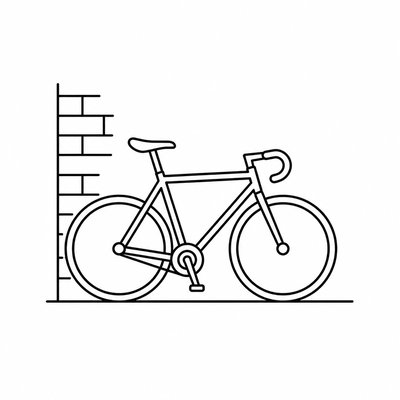
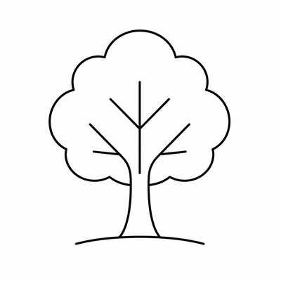

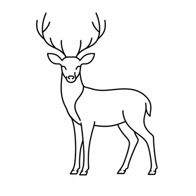

What is Line Art Icon Design?
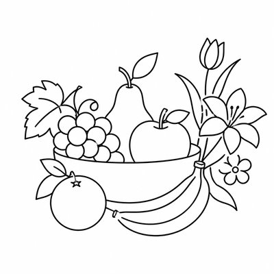
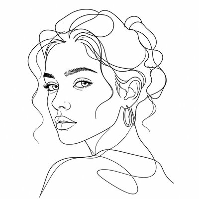
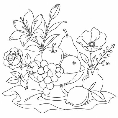
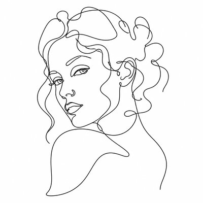
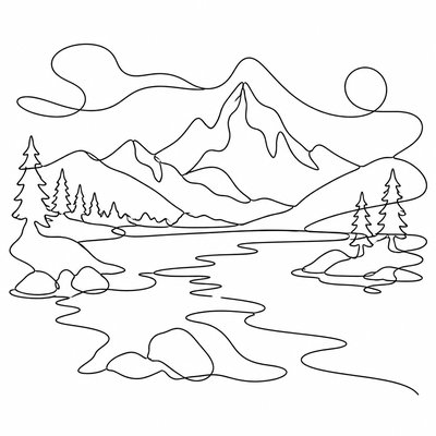
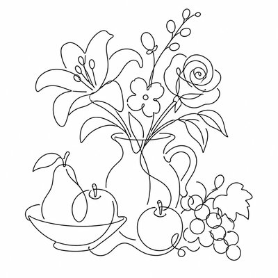
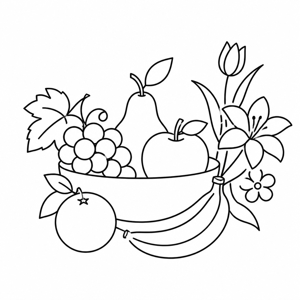
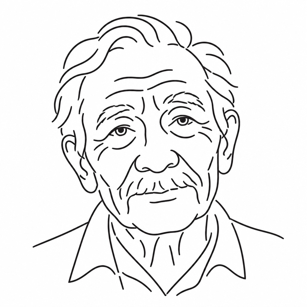
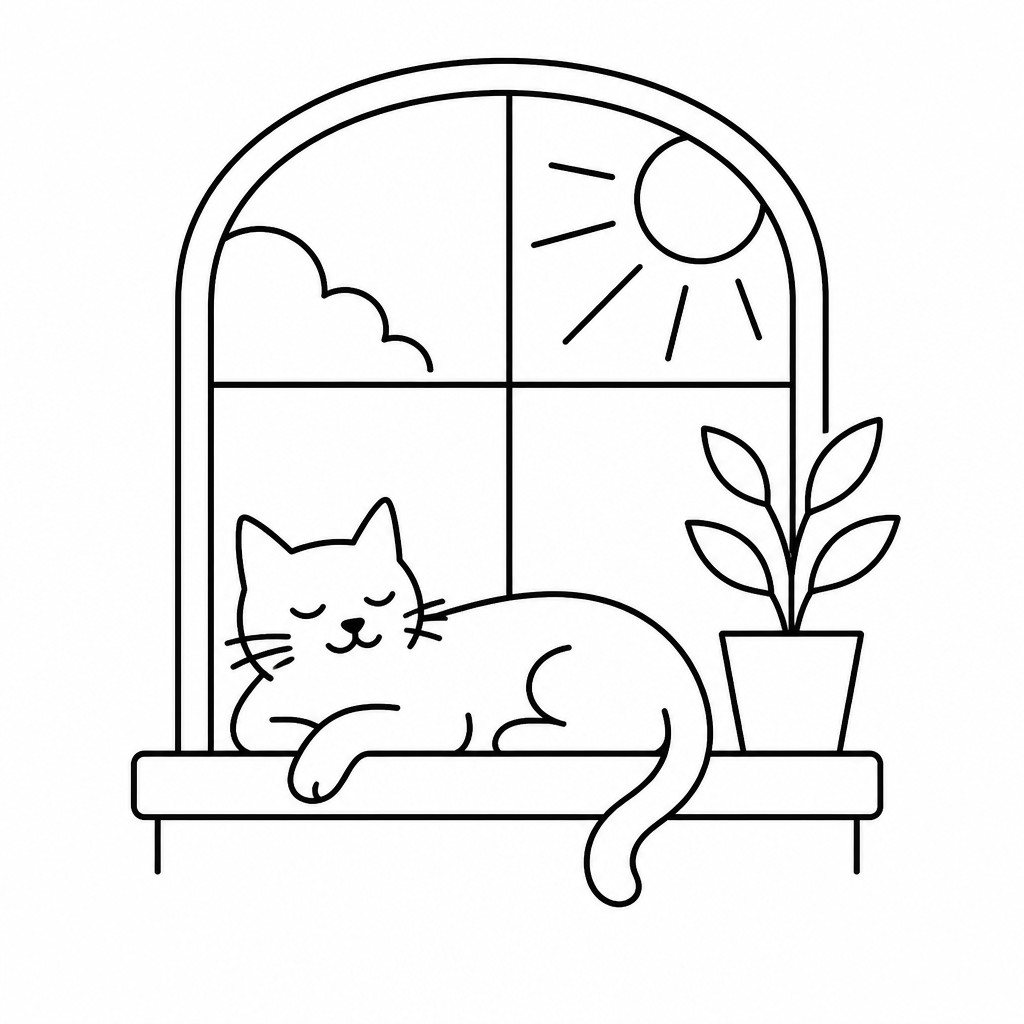
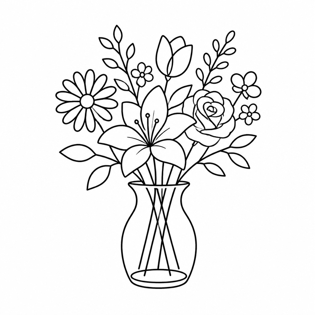
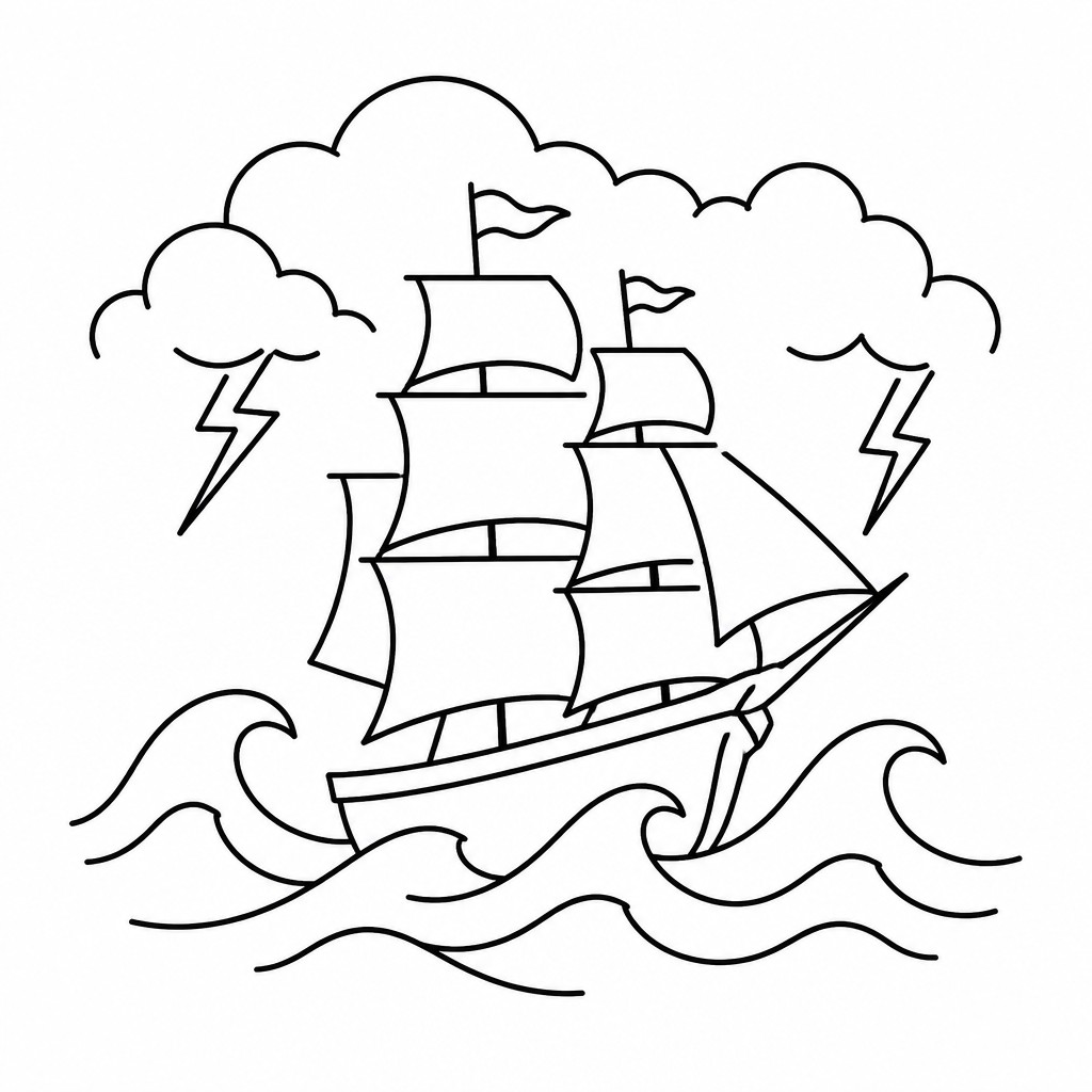
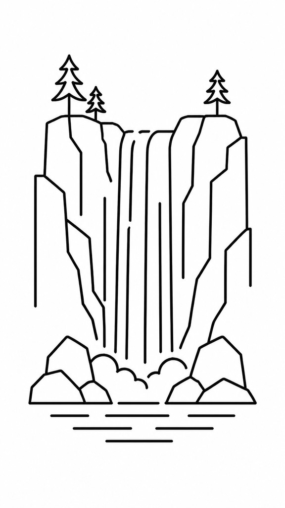
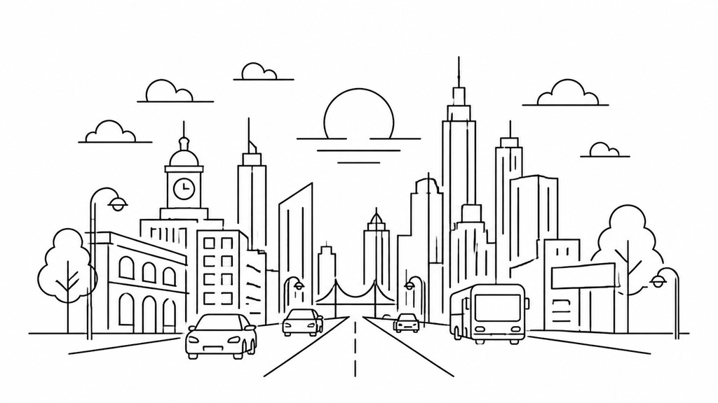
Line art icon design is a minimalist visual style in which objects, symbols, and scenes are reduced to their most essential outlines. The defining feature is a single-weight stroke that describes form without fill, shading, texture, or color, allowing the image to remain legible at very small sizes while still feeling elegant and precise.
Its clarity comes from careful simplification. Instead of modeling volume or atmosphere, line art icons rely on contour, spacing, and proportion to make the subject instantly recognizable. The style is common in interfaces, wayfinding systems, instructional graphics, packaging, and branding because it translates complex ideas into compact signs that read quickly and consistently.

Try It On Your Photos
Upload any photo and convert it into Line Art Icon Design — drag the sliders to compare before and after.


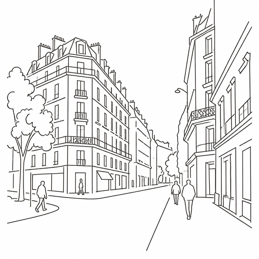

What Defines Line Art Icon Design
The signature details, up close
Single-weight strokes
The line thickness stays uniform throughout the icon, creating a clean and controlled appearance. This consistency is what gives the style its graphic clarity and makes icons feel part of one system.
Outline-first construction
Forms are described by contour rather than by filled shapes or tonal modeling. Interior details, if used at all, are reduced to a few essential lines.
High legibility at small sizes
Icons are simplified to retain their identity when scaled down. Strong silhouettes and uncluttered interiors help them remain readable in interfaces and labels.
Monochrome presentation
The style is usually rendered in a single color, most often black on white or reversed for dark themes. The absence of color keeps attention on structure and proportion.

Flat two-dimensional geometry
There is no attempt to simulate depth through shading or perspective. Curves, arcs, and straight segments are arranged with a disciplined, diagrammatic logic.

Balanced negative space
Empty space is part of the design, helping the icon breathe and preserving clarity. The composition is often centered and evenly weighted so the image feels stable.
Try It
Create Videos in Line Art Icon Design
Styles aren't just for stills — describe a scene or animate an image and get a short video rendered in Line Art Icon Design. Press play to see this pond come to life.
Make a VideoLine Art Icon Design Prompt Ideas
Start from an idea — each one opens the generator with the style ready to go. See all 40 Line Art Icon Design prompts →
How to Create Line Art Icon Design Art
Master the craft step by step — or skip straight to creating. Read the full guide →
- 1
Start with the simplest recognizable silhouette
Choose the fewest lines needed to identify the subject at a glance. Sketch the outer contour first, then add only the interior details that are necessary for recognition.
- 2
Keep the stroke uniform
Use one consistent line weight across the entire icon, whether drawing by hand with a pen or digitally with a vector brush. Avoid tapering, hatching, fills, and contrast that would break the system.
- 3
Design for small-size readability
Test the icon at tiny scales to make sure it still reads clearly. If a detail disappears or becomes ambiguous, remove it or simplify the geometry further.
- 4
Use a vector workflow when possible
In digital illustration, build the icon with clean paths and smooth curves so the result scales without loss of quality. Rounded joins, crisp endpoints, and evenly spaced gaps will make the drawing feel intentional.
- 5
Describe the subject with precise generation language
When using prompt-based generation, specify the object, the minimal contour treatment, monochrome linework, plain background, and absence of fills, shading, gradients, or texture. Strong prompt constraints help keep the result icon-like rather than illustrative.

The Story
History & Origins of Line Art Icon Design
Line art icon design is not a single historical movement but a modern design language with roots in several older traditions: outline drawing, pen-and-ink illustration, technical drafting, pictograms, and the reduced forms of modernist graphic design. Its logic also parallels early symbol systems and signage, where clarity and universal readability mattered more than realism.
As digital interfaces, mobile apps, and responsive design became widespread in the late 20th and early 21st centuries, single-weight icon systems became especially important. Designers favored simple contour-based icons because they scale well, reproduce cleanly across screens, and maintain visual consistency within user interfaces, toolkits, and brand systems.
Influences: Line art icon design draws from contour drawing, technical illustration, pictograms, and modernist graphic design. Its clarity and economy echo the reductive principles found in Bauhaus-influenced design and Swiss-style information graphics, while its reliance on outline and contour connects it to pen-and-ink illustration traditions and schematic sign systems used in public communication.
Frequently Asked Questions
What defines line art icon design?
It is defined by a single, consistent line weight used to describe a subject with minimal contours and no shading or fill. The goal is instant recognition and strong readability at small sizes.
How is it different from outline drawing?
Outline drawing can be expressive, varied, or illustrative, while line art icon design is more systematic and stripped down. Icons are usually built for clarity, consistency, and easy reproduction across a set.
Why do designers use this style so often?
It scales well, reproduces cleanly, and works in many contexts from apps to packaging to diagrams. Because it avoids tonal detail, it stays legible in small formats and across different display conditions.
Can line art icons have color?
Traditionally they are monochrome, because the style depends on line clarity rather than color relationships. Some design systems allow color as an accent, but the core icon usually remains a single-weight line drawing.
What makes a good line art icon?
A good icon has a clear silhouette, balanced spacing, and only the details needed for immediate recognition. It should remain understandable when reduced to a very small size.
Where is this style commonly used?
It is widely used in user interfaces, app navigation, instruction manuals, signage, editorial graphics, and brand identity systems. It is especially useful anywhere a clean visual language needs to communicate quickly.
Create your first Line Art Icon Design artwork
Describe anything — or upload a photo — and see it in Line Art Icon Design in seconds.
Make Something with Line Art Icon Design
Compare Line Art Icon Design
Related Styles
Discover similar art styles