Line Art Icon Design vs Hand-Drawn Icon Design: What's the Difference?
Line Art Icon Design uses clean, single-line forms, uniform strokes, and simplified geometry to create icons that stay clear at very small sizes and across many applications. It is often chosen for interfaces, products, and systems where readability, consistency, and easy scaling matter most.
Hand-Drawn Icon Design uses organic, sketch-like shapes, imperfect linework, and texture such as paper grain to create a more personal, crafted feel. People compare the two because they solve similar communication needs, but they create very different impressions: one feels precise and modern, while the other feels expressive and human.
Same Prompt, Both Styles
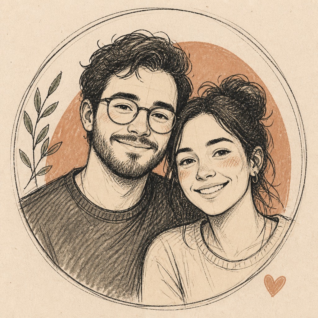
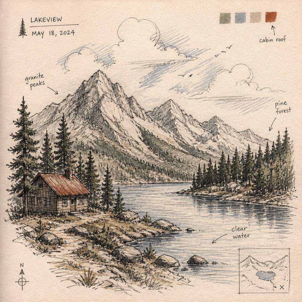
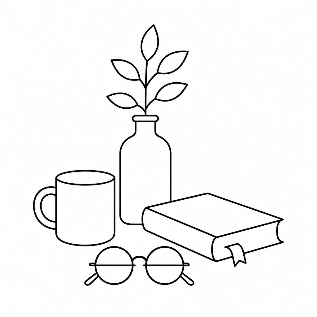
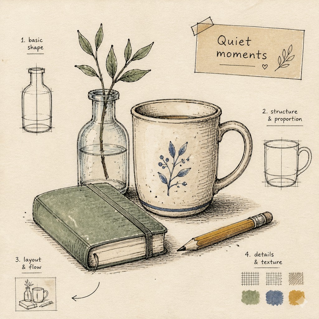
Each pair below was generated from the identical prompt — only the style changed.
“portrait of two people together”

“wide landscape with natural scenery”

“still life with everyday objects”
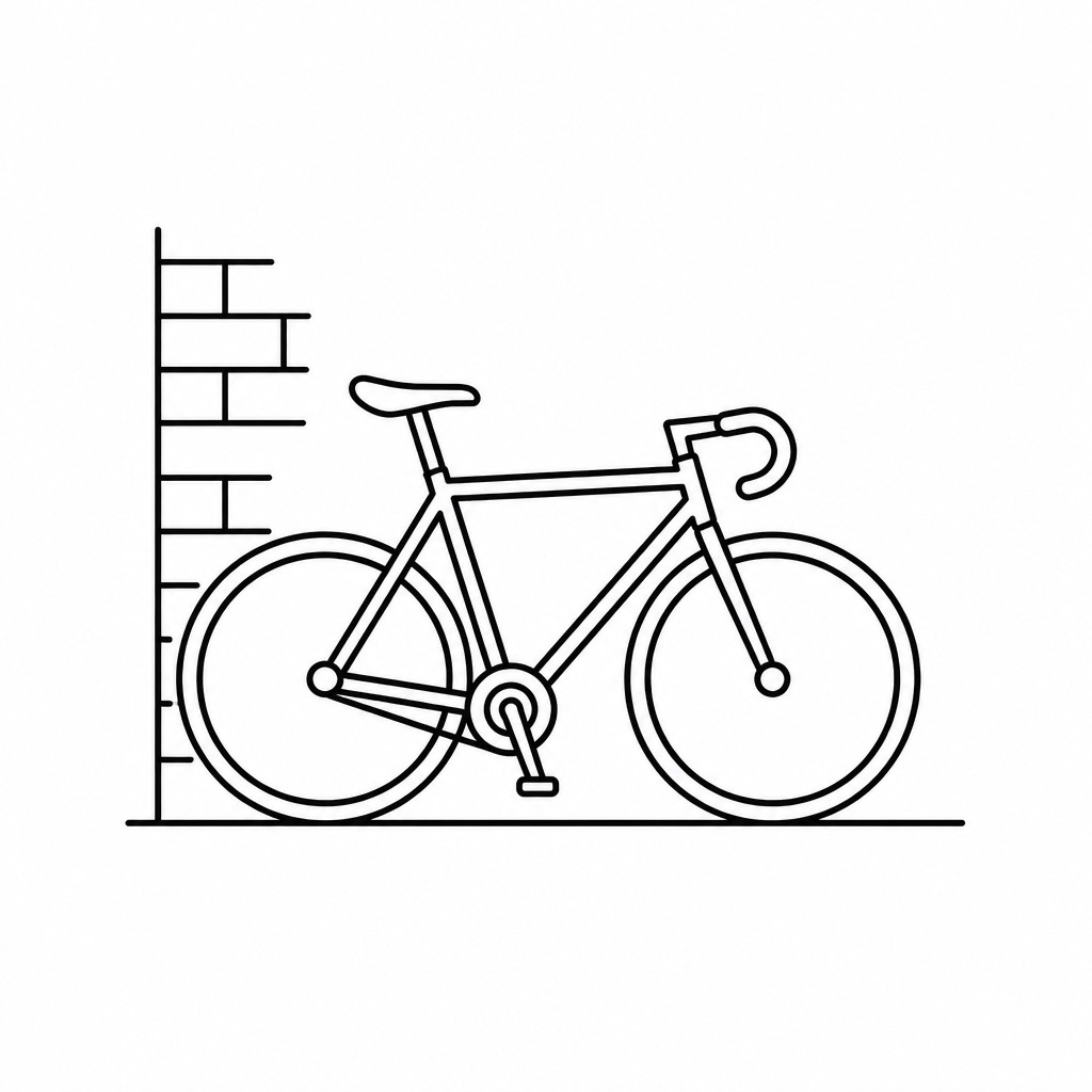
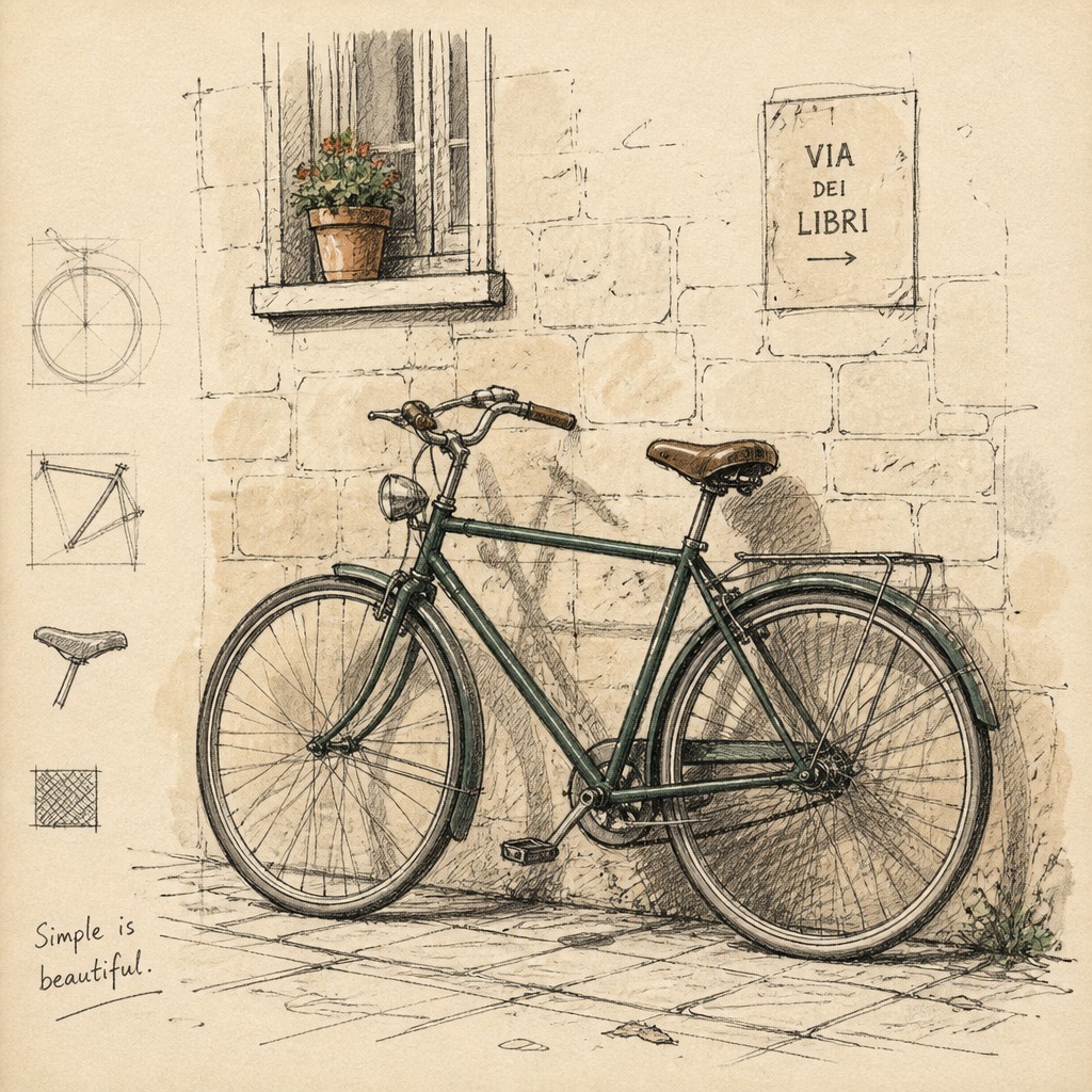
“bicyle resting against a wall”
Key Differences
| Line Art Icon Design | Hand-Drawn Icon Design | |
|---|---|---|
| Line quality | Smooth, uniform strokes with consistent thickness. | Varied, imperfect strokes that feel drawn by hand. |
| Shape language | Geometric, simplified forms with clear silhouettes. | Organic, loose forms with subtle irregularity. |
| Readability | Optimized for quick recognition at small sizes. | More expressive, sometimes less crisp when reduced. |
| Texture | Usually flat and clean with no surface grain. | Often includes paper grain, sketch marks, or rough edges. |
| Brand feel | Feels polished, technical, and systematic. | Feels warm, approachable, and handcrafted. |
| System consistency | Easy to standardize across a large icon set. | Relies more on stylistic variation and intentional imperfection. |
| Mood | clean, precise, minimal, modern | friendly, artisanal, imperfect, expressive, human |
| Energy | calm | calm |
| Detail level | minimal | moderate |
| Color | monochrome or limited neutral palette | mostly monochrome, muted accents |
| Texture | smooth, flat, no texture | sketchy lines, tactile paper grain |
| Origin | digital-native aesthetic | digital-native aesthetic |
| Best for | app icons, UI symbols, infographics, instructional diagrams, logos | brand systems, editorial graphics, packaging, wayfinding, social media, product UI |
| Difficulty | beginner-friendly | moderate |
Which Should You Choose?
Choose Line Art Icon Design when you need maximum clarity, scalability, and a disciplined visual system, especially for interfaces, dashboards, or product documentation. Choose Hand-Drawn Icon Design when the goal is to add personality, warmth, or a more artisanal brand voice, especially in editorial pieces, campaigns, or illustration-led systems. Many teams use line art for functional UI and hand-drawn icons for storytelling or accent moments.
Frequently Asked Questions
Which style is better for small icons in an interface?
Line Art Icon Design is usually better for small sizes because its clean silhouettes and uniform strokes remain legible. Hand-drawn icons can work, but texture and irregularity may reduce clarity when scaled down.
Can hand-drawn icons still be consistent?
Yes, but consistency comes from shared rules like stroke range, corner behavior, and texture treatment rather than perfect repetition. The style intentionally allows some variation so it feels human.
Does line art always look more modern?
Not always, but it often reads as more minimal, neutral, and system-oriented. The final impression also depends on proportions, spacing, and the surrounding brand design.
Are these styles interchangeable in one system?
They can be mixed, but doing so without a clear hierarchy may make the system feel inconsistent. A common approach is to use one style for core UI icons and the other for supporting illustrations or special content.