Flat Icon Design vs Glyph Icon Design: What's the Difference?
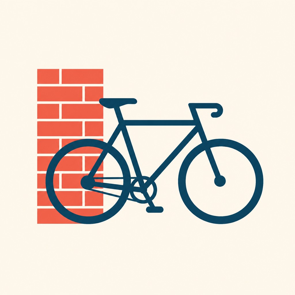
Flat Icon Design uses simplified shapes, bold color, and minimal detail to create clear, modern visuals. It often includes subtle geometric structure and can support branding, interfaces, and illustrations where a polished, contemporary feel is important.
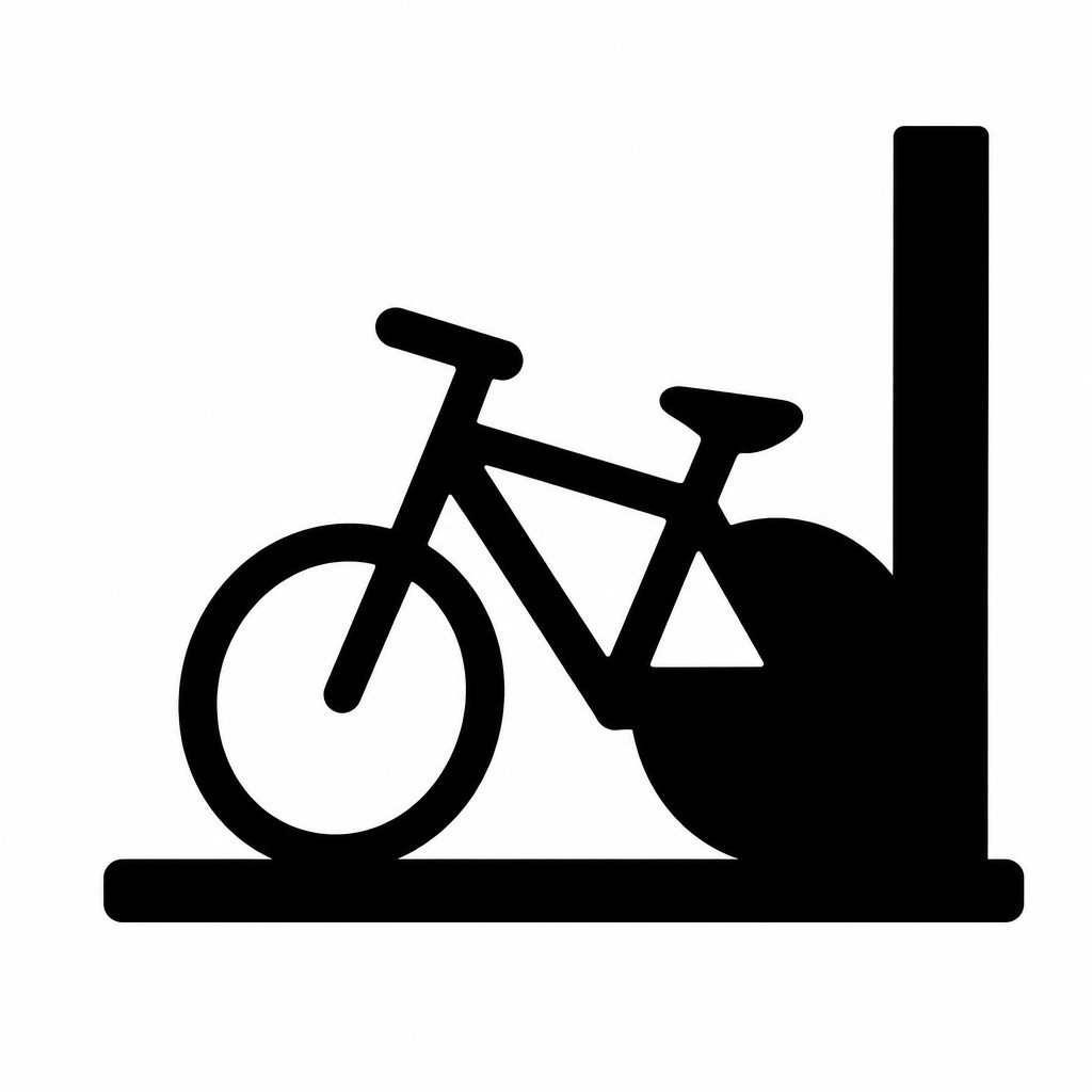
Glyph Icon Design uses solid black silhouette forms with no internal detail, prioritizing instant recognition at very small sizes. People compare the two because both rely on simplification and readability, but they serve slightly different goals: flat icons can feel more expressive and branded, while glyph icons are often more universal and compact.
Same Prompt, Both Styles
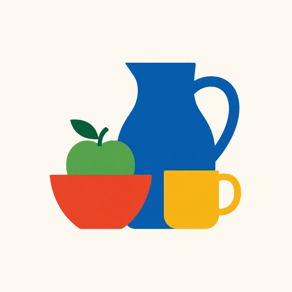
Each pair below was generated from the identical prompt — only the style changed.
“portrait of two people together”


“wide landscape with natural scenery”


“still life with everyday objects”

“bicyle resting against a wall”
Key Differences
| Flat Icon Design | Glyph Icon Design | |
|---|---|---|
| Color use | Uses bold colors to add meaning, hierarchy, or visual personality. | Usually monochrome black for maximum clarity and consistency. |
| Detail level | Simplified, but may include small shape variations and layered color areas. | No internal detail; only the outer silhouette defines the icon. |
| Recognition at small sizes | Readable at small sizes, though color and shape carry the message together. | Designed specifically for instant recognition when scaled down. |
| Visual tone | Feels modern, friendly, and often more brand-oriented. | Feels direct, utilitarian, and highly universal. |
| Best use cases | Good for UI systems, product branding, dashboards, and clean presentations. | Good for navigation, symbols, signage, and compact interface controls. |
| Flexibility | Easier to adapt to brand palettes and varied visual themes. | Works best when consistency and simplicity matter more than color. |
| Mood | clean, clear, modern, efficient | clean, clear, modern, functional |
| Energy | calm | calm |
| Detail level | minimal | minimal |
| Color | bold solid colors, high contrast | solid monochrome or simple high-contrast colors |
| Texture | smooth, flat, textureless | flat, smooth, textureless silhouettes |
| Origin | digital-native aesthetic | digital-native aesthetic |
| Best for | UI icons, apps, infographics, logos, navigation systems, presentations | app icons, UI symbols, signage, navigation systems, status indicators, pictograms |
| Difficulty | beginner-friendly | beginner-friendly |
Which Should You Choose?
Pick Flat Icon Design if you want a modern, branded look with color helping reinforce meaning or personality, especially in interfaces, marketing, or mixed visual systems. Pick Glyph Icon Design if your priority is instant recognition, extreme compactness, or a neutral universal look that must stay legible at very small sizes. In many projects, flat icons work better for featured visuals and glyph icons work better for small navigation or control elements.
Frequently Asked Questions
Are flat icons and glyph icons the same thing?
No. Both simplify imagery, but flat icons typically use color and shape to communicate, while glyph icons rely on solid silhouettes alone. The difference becomes most visible in branding and small-scale interface use.
Which style is easier to recognize at tiny sizes?
Glyph icons are usually easier to recognize at tiny sizes because they depend on a strong outer shape and avoid internal detail. Flat icons can also scale well, but color and shape must stay clear to remain readable.
Which style is better for user interfaces?
It depends on the role of the icon. Flat icons are often better for expressive UI systems and branded products, while glyph icons are often better for compact controls, navigation, and simple status symbols.
Can these styles be used together in one design system?
Yes, but they should be used intentionally. Many systems use flat icons for larger feature areas and glyph icons for small utility actions, as long as the visual rules stay consistent.