Isometric Icon Design vs Flat Icon Design: What's the Difference?
Isometric Icon Design uses true isometric projection to make icons feel like small 3D objects viewed from a consistent angle. It keeps shading flat, edges crisp, and colors bright, so the result stays polished and highly structured while still suggesting depth.
Flat Icon Design removes that depth cue and focuses on simple shapes, bold color, and minimal detail. People compare the two because both work well in digital products, but they communicate differently: isometric icons add dimension and realism, while flat icons prioritize clarity, speed of recognition, and visual simplicity.
Same Prompt, Both Styles
Each pair below was generated from the identical prompt — only the style changed.
“portrait of two people together”


“wide landscape with natural scenery”


“still life with everyday objects”


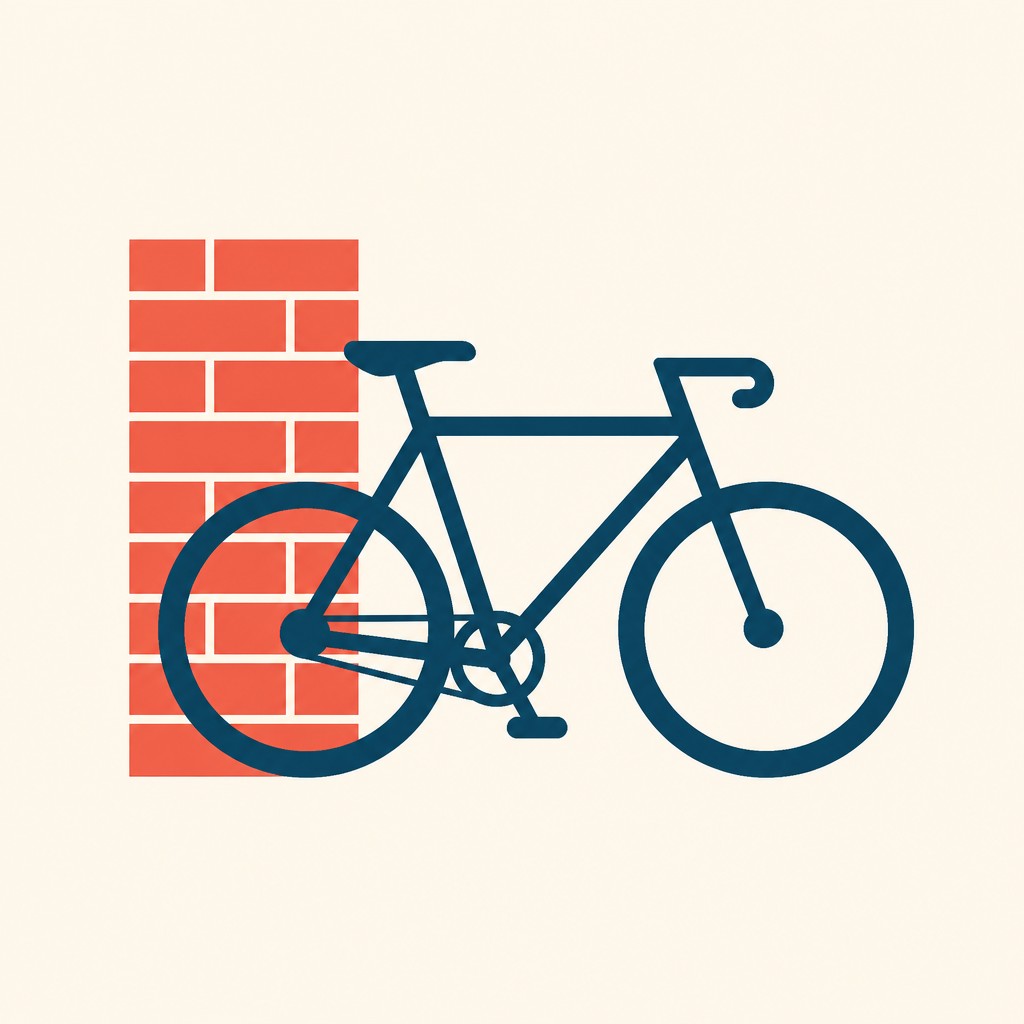
“bicyle resting against a wall”

Key Differences
| Isometric Icon Design | Flat Icon Design | |
|---|---|---|
| Depth | Shows visible 3D structure through isometric angles and flat shading. | Uses no depth cues; shapes stay visually level and two-dimensional. |
| Shape complexity | Uses more geometric detail to describe object volume and perspective. | Simplifies objects into basic silhouettes and clean, minimal forms. |
| Shading | Applies subtle, flat shading to separate planes without heavy realism. | Usually avoids shading entirely to keep the design direct and simple. |
| Visual style | Feels technical, structured, and slightly more illustrative. | Feels modern, minimal, and highly streamlined. |
| Readability at small sizes | Can lose detail when scaled down if the forms are too complex. | Often remains clearer at small sizes because the shapes are simpler. |
| Best use cases | Works well for dashboards, infographics, product explainers, and feature illustrations. | Works well for UI systems, logos, navigation icons, and concise communication. |
| Mood | clean, technical, orderly, modern | clean, clear, modern, efficient |
| Energy | balanced | calm |
| Detail level | moderate | minimal |
| Color | bright, limited palettes with crisp accents | bold solid colors, high contrast |
| Texture | smooth, flat-shaded, polished surfaces | smooth, flat, textureless |
| Origin | digital-native aesthetic | digital-native aesthetic |
| Best for | user interfaces, product explainers, dashboards, infographics, business presentations, app onboarding | UI icons, apps, infographics, logos, navigation systems, presentations |
| Difficulty | moderate | beginner-friendly |
Which Should You Choose?
Choose Isometric Icon Design when you want icons to feel dimensional, informative, and visually distinctive, especially for products that explain processes or showcase features. Choose Flat Icon Design when clarity, flexibility, and fast recognition matter most, such as in interfaces, branding systems, or small-scale icon sets. If your layout already has many visual elements, flat icons usually blend in more cleanly; if you need icons to stand out as mini illustrations, isometric is the stronger choice.
Frequently Asked Questions
Which style is easier for users to recognize quickly?
Flat icons are often faster to recognize because they rely on simple silhouettes and fewer details. Isometric icons can still be clear, but the added structure may take slightly more visual processing.
Are isometric icons just flat icons with shadows?
No. Isometric icons use a specific projection that represents objects at a consistent angle, which creates true geometric depth. Flat icons do not use that depth system and stay two-dimensional.
Which style works better in modern apps?
Both can work in modern apps, but the best choice depends on the interface. Flat icons are usually better for navigation and system UI, while isometric icons are often better for feature highlights, onboarding, and marketing visuals.
Can these styles be mixed in one design system?
They can be mixed, but only with clear rules. If some icons are isometric and others are flat, the system may feel inconsistent unless each style is assigned to a different purpose.